Squarespace Foundations
Squarespace turned its own brand manual into a website, and the chapter on type does not show you a finished letterform. What fills the screen is a letter bled off every edge, with a row of small blue squares still floating along its strokes — the bezier anchors, deliberately left in place. A manual is meant to explain how a thing is constructed rather than hand over the result. The page never scrolls. Six chapters sit on a carousel the reader turns with arrow buttons. Resn in Wellington built it.
Visit site ↗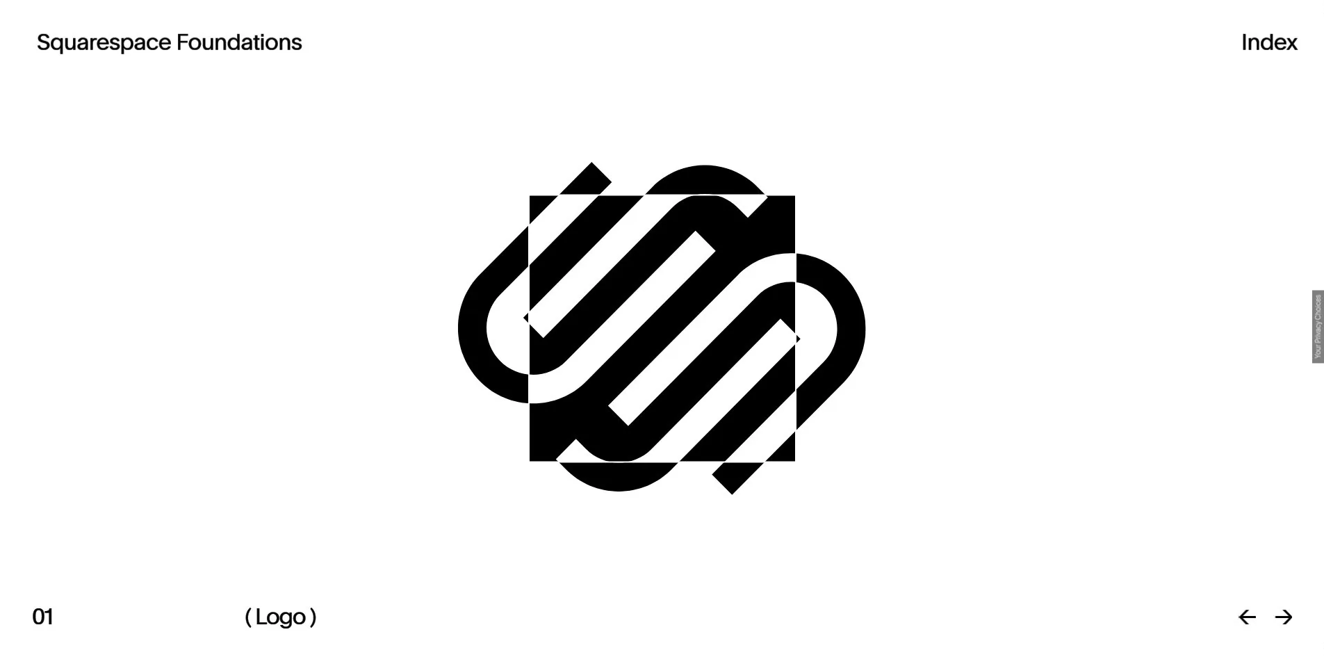
Concept
A brand manual is usually a PDF, one rule per page, read front to back. This one turns six rules into six rooms you walk into, and the order is not yours to skip, because only one thing is ever facing you on the carousel.
The Index lists all six: 01 Logo, 02 Typography, 03 Color, 04 Photography, 05 Campaign, 06 Motion. Each fills the viewport, with the chapter number at bottom left, the chapter name in brackets in the middle, and a pair of arrows at bottom right.
Chapter 01 is the logo. On white, the Squarespace cloud mark sits centred with a square laid over it, and wherever the two overlap, black and white swap. That is a blend mode, declared by a useBlendMode class on the body. The page of the manual that would normally cover clear space and minimum size becomes a picture you can read the construction from.
Chapter 02 is type, and it is the passage that makes the whole project stand up.
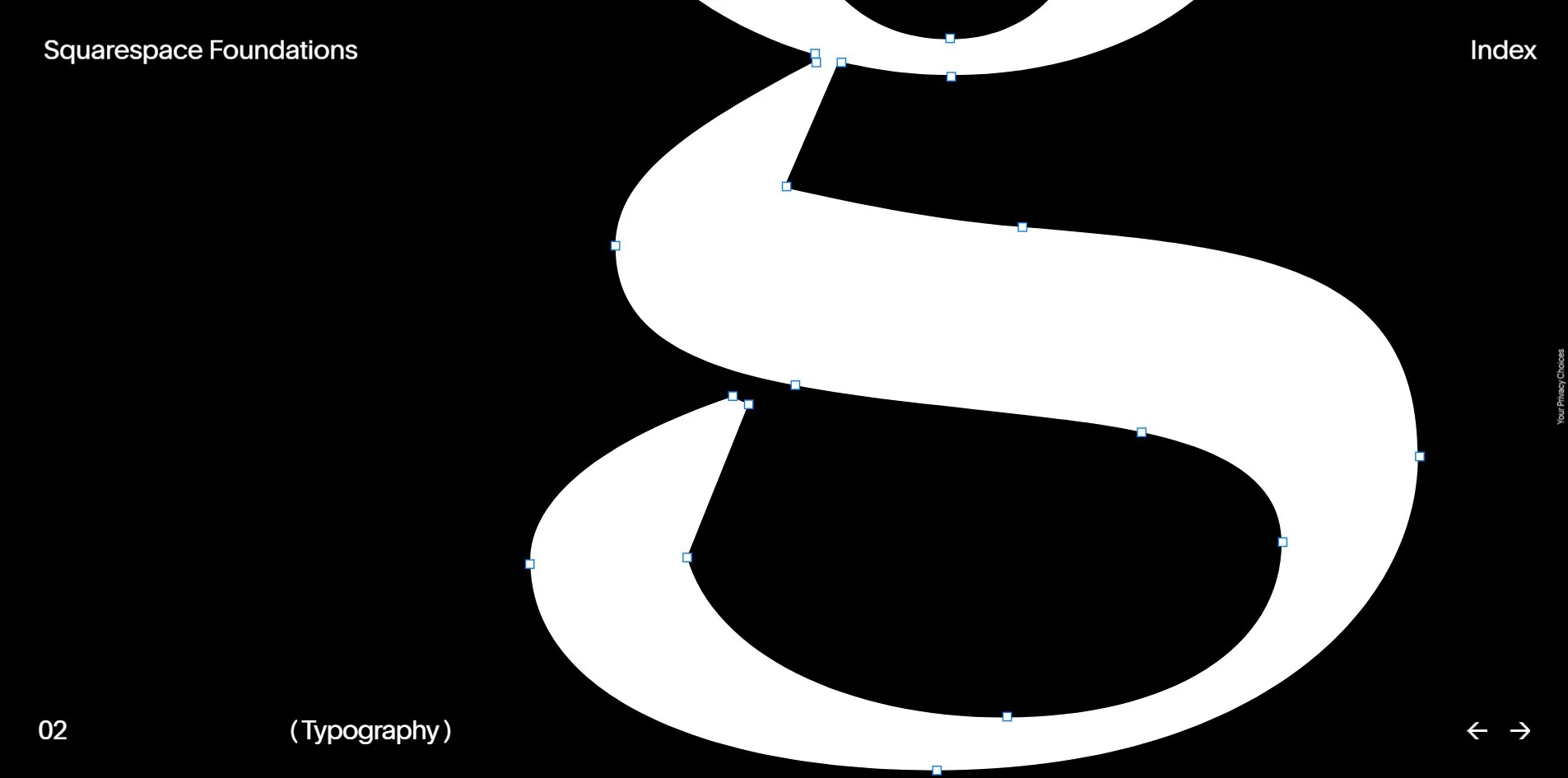
On black, a letterform enlarged past the edges of the frame, with small blue squares scattered along its strokes. Anyone who has drawn type or opened a vector editor recognises them as path anchors immediately. Leaving them on screen turns the typeface from a result back into a thing being drawn, so what the reader gets is not a picture of how the type looks but a record of how it was decided.
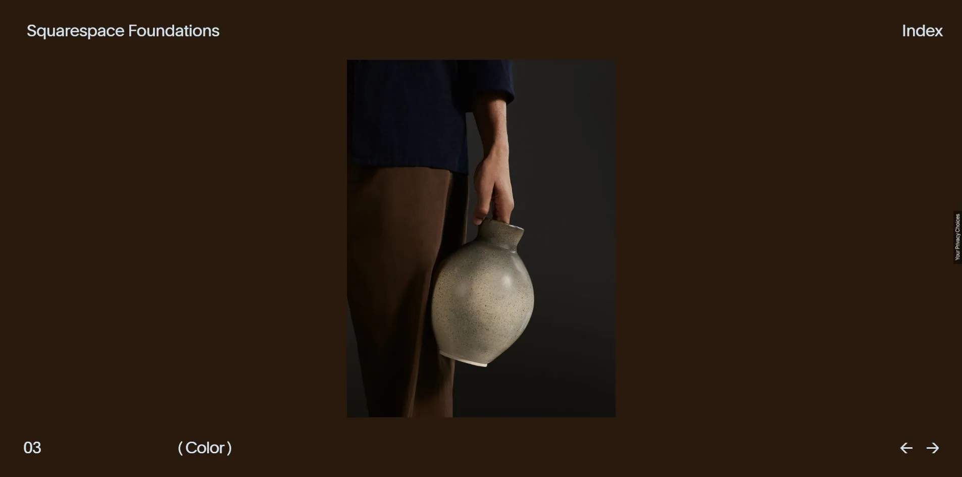
Chapter 03 is colour, and it works the opposite way. A photograph sits centred, a person carrying a ceramic jug, and the whole screen behind it is a deep brown continuous with the picture. This chapter lists no swatches at all. It gives one photograph and lets the reader take the temperature of the palette out of it.
Chapter 06 is motion, and the screen is six or seven video panels playing at once, product pages, posters and live footage. No rules are written down. The rhythm is simply handed over.
Six chapters in, what the reader has is six different ways of saying something rather than six identically formatted pages. A manual gets read to the end not by being complete but by changing its method on every entry.
Design
One typeface runs the whole site, Squarespace's own Clarkson.
Eighteen family variants are declared on the page and only six actually load: Clarkson at 300, 400, 500, 600 and 700, plus ClarksonSerifLightItalic. The other twelve, various serifs and condensed cuts, sit in the stylesheet unloaded, available but unused here.
Visible text is startlingly scarce. A census of the screen counts 304 Clarkson characters spread from 10px to 267px, plus 2 characters in that serif italic. Text barely works on this site. It only labels: the site name, the chapter number, the chapter name, Index, one privacy link.
Colour is the same. Three text values are visible, white on 579 elements, black on 6 and one pale grey on 4. The stylesheet does define a full brand palette, with --color-blue at #1823BC, --color-orange at #D2593B and --color-gold at #C59D3D, and not one of them appears in the interface layer.
All the colour comes from the content instead. Chapter 01 sits on white, chapter 02 on pure black, chapter 03 on a brown drawn out of the photograph. The interface retreats into neutrality in every chapter and lets that chapter's material set the temperature of the screen.
Of the 590 elements on the page, exactly 1 carries a border radius. A brand manual site taking restraint that far is demonstrating the point rather than stating it.
A toggle marked Dark sits at bottom left, with the aria-label Switch to light mode, so the whole system ships in two schemes.
Motion
How those anchor points in chapter 02 are made is the craft worth taking away here, because they are neither an image nor SVG.
That screen carries a 1920 by 945 canvas whose parent is classed riveStateMachine homeCarouselTypography__riv, and the page separately loads letters.riv and rive.wasm. The letterform and its anchors are a Rive state machine playing live, with the Rive runtime arriving as WebAssembly from unpkg, which accounts for most of that 528 KB of third-party weight.
Choosing Rive over SVG animation or video has clear reasoning behind it. Anchors that follow strokes while the strokes themselves deform is a binding that already exists inside the design tool, and exporting to Rive lets the runtime reproduce it without anyone rewriting path interpolation in the front end. Video would lose the vector crispness, and hand-written SVG animation would mean maintaining a great many coordinates.
Anyone copying it has a calculation to do. The Rive runtime is a wasm file, and using it once means carrying all of it, so the route only pays when the animation is genuinely past what CSS and SVG can manage. Here it drives the hero of an entire chapter, which earns it. Worth noting too that this site pulls the runtime from unpkg, handing part of its first screen to a third-party CDN, where self-hosting would be steadier.
Changing chapter is a carousel in perspective. The region filling the viewport is itself a button whose aria-label changes with the chapter to read things like Explore Photography, classed homeCarousel__perspective fill. The six chapters do not slide sideways, they rotate around an axis.
The bundle holds 212 matches for three, 94 for gsap, 20 for lenis and 6 for SplitText. Lenis plays an unusual part here. The html element carries both lenis and lenis-stopped while the body carries hideScroll. A smooth-scrolling library is loaded and then immediately switched off, because what this site wants from it is control over scrolling, not smoother scrolling.
Navigation comes three ways. The pair of arrow buttons at bottom right are labelled Previous and Next. The keyboard arrows genuinely work, and pressing right does change the chapter. The Index panel makes all six names clickable targets. Keyboard support is the thing a non-scrolling site most often drops, and this one did not.
Nothing here answers reduced motion. There is no prefers-reduced-motion rule anywhere in the stylesheet, and turning the preference on leaves the videos playing. Chapter 06, with six or seven clips running at once, is precisely the screen that needed an alternative.
Engineering
The foundation is Nuxt, with every asset under a _nuxt directory and 45 script files totalling about 1.89 MB of uncompressed text.
Opening the site and going through all six chapters transfers 60.3 MB across 148 files. Images account for 40.5 MB, video for 18.2 MB, script for 571 KB and fonts for 308 KB. There are two third parties. The Rive runtime on unpkg at 528 KB and TrustArc's privacy component at 58 KB.
The weight concentrates in a handful of files. The largest, 01@lg.mp4, is 12.4 MB, and several full-screen backgrounds such as set-6-bg-desktop@lg.webp and set-2-bg-desktop@lg.webp come to about 3.1 MB each. The page holds 19 video tags and 62 images.


All 19 of those videos are muted and looping, and not one is marked autoplay. Playback is script-driven, so whichever chapter is facing the viewer plays and the rest stay stopped. On a site that can show six or seven clips at once, that is a requirement rather than a refinement, since otherwise a dozen decoder streams open together.
The opening numbers look good: 275ms to first byte, 580ms to first contentful paint, 443ms to load, cumulative layout shift 0, and only two long tasks with the longest at 89ms.
That number needs one plain caveat, though. Twelve seconds into the probe run, the element recorded for largest contentful paint was still pageLoader__text, the line of type inside the loading animation. What gets painted in those 580ms is the loader itself, and the real content waits for tens of megabytes to arrive. A 60 MB site with pretty first-paint numbers usually has this shape. The loader paints early and the metric stops there. Judging a site like this means looking at time to usable, not time to first paint.
Accessibility is clearly divided. The language is declared, all 62 images carry alt text, no positive tabindex appears, the stylesheet holds 7 focus rules, arrow keys work, the arrow buttons and the Index button both carry aria-labels, and the label on the carousel region updates with the chapter.
What is missing is structure. The document has one landmark, main, with no header, no nav and no footer, even though there is a functional band at the top of the page and another at the bottom. There is also one H1 and nothing else, so none of the six chapter names is a heading. For a screen reader this page is one undivided block with no table of contents.
WPO took 7.40, while Markup and Accessibility tie for lowest at 7.00, which matches the points above.
Scores and Team
Both platforms gave it an award, a day apart.
| Award | Source | Date | Score |
|---|---|---|---|
| Site of the Day | Awwwards | 2026-09-01 | 7.38. Design 7.26 / Usability 7.38 / Creativity 7.58 / Content 7.41 |
| Developer Award | Awwwards | 2026-09-01 | 7.22. Semantics 7.20 / Animations 7.40 / Accessibility 7.00 / WPO 7.40 / Markup 7.00 |
| FWA of the Day | The FWA | 2026-09-02 | 83 POINTS, DAYS 3 |
Creativity at 7.58 is the highest of the four and Design at 7.26 the lowest, 0.32 apart. Design coming last on a brand manual by a studio of this standing looks odd until the individual cards are opened. Jota Marques of the Bahamas marked all four a 6, Artemii Lebedev of Serbia came in at 6.70, and the other three sat between 7.00 and 7.20. Nobody scored it high, so this result is a consistent reading of good but not startling rather than one category dragging it down.
At 7.22 the developer award falls 0.16 under the site total, which is rare in this library. The five cards run from 6.65 for Barry Baris Dogan of Austria to 7.55 for Nils Landrodie of France, less than a point apart. Markup and Accessibility tie at 7.00, matching a document with one landmark and one heading.
The FWA gave it 83 points on day 3. The two scales do not convert, so each can only be read for its own shape.
| Credit | Who | Record |
|---|---|---|
| Resn | Digital studio in Wellington, New Zealand | Awwwards: 83 works, SOTY 2, SOTM 11, SOTD 62, HM 77. 146 FWAs |
| Squarespace | Client | 12 FWAs |
Sixty-two Sites of the Day and 146 FWAs makes Resn the heaviest record in this library, and their profile states a budget of over 100,000 dollars. Squarespace itself carries 12 FWAs, so the company has been commissioning work of this kind for a long time.
A studio with two Sites of the Year making a brand manual for a website-building platform describes the project exactly. It is the manual, and it is also Squarespace showing what its own field looks like at the top.
Archive
- Award date
- 2026-09-02
- Awards
- Awwwards SOTD 2026-09-01, Awwwards DEV 2026-09-01, The FWA FOTD 2026-09-02
- Site
- https://brand.squarespace.com/
- Credits
- Resn, Squarespace
- Design
- graphic
- Build
- realtime
- Awwwards
- 7.38 / 10. Design 7.26 / Usability 7.38 / Creativity 7.58 / Content 7.41. Developer Award 7.22. https://www.awwwards.com/sites/squarespace-foundations
- The FWA
- 83 POINTS, DAYS 3. https://thefwa.com/cases/squarespace-foundations
- Stack
- Nuxt, GSAP, three.js, Lenis (loaded then stopped), Rive state machine on WebAssembly, the Clarkson family
- Total assets
- 60.3 MB across 148 files for all six chapters, of which images 40.5 MB, video 18.2 MB, script 571 KB, fonts 308 KB. Third party: unpkg 528 KB, TrustArc 58 KB
- Speed
- 275ms to first byte, 580ms first paint (which paints the loader), 443ms to load, layout shift 0, longest task 89ms
- Test conditions
- 1920×945, dpr 1, zoom 100%, cold profile. Page height 946px, the site does not scroll