Gionatan Nese '26
The portfolio of the Milan designer Gionatan Nese has four pages and not one of them has a scrollbar. Every page is exactly one viewport tall, so the wheel moves not the page but the field of white inside the canvas where the work floats, and dragging sideways carries it along with your hand. All-canvas sites usually pull navigation into the canvas too and ship no links at all. This one ships them. The four projects are real anchors you can open and share on their own.
Visit site ↗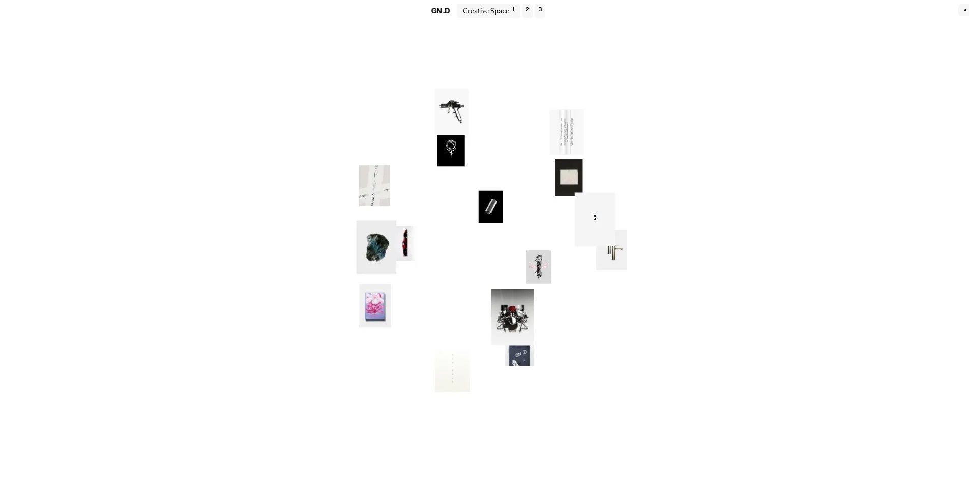
Concept
The problem a portfolio normally has to solve is ordering: which project goes first, how much room each gets, and how far a visitor scrolls before leaving. This one refuses to order anything. It spreads the work across an empty field and lets the visitor walk over to it.
What you arrive at is a nearly white screen with GN .D in small type at the top and three numbered tabs beside it. A dozen or so pieces of work sit scattered across the middle at different sizes and depths, a pendant on black here, a rendered spray gun there, an engine further along. None of them align to any grid.
Turn the wheel and the document stays put while the field moves. Hold and drag, and the whole field travels with your hand, coasting on after you release it. Images move in and out of frame as you go, and new ones appear once you have travelled far enough.
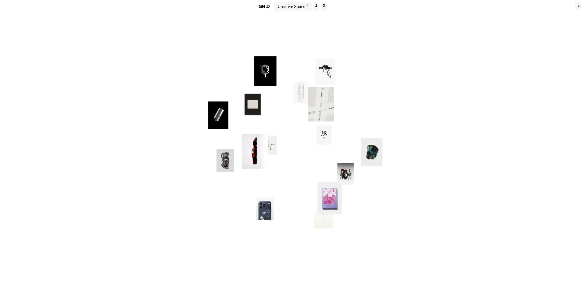
The approach hands something back to the visitor: how much to look at, in what order, and when to stop. What it gives up is any sense of how much there is, or of ever having reached the end.
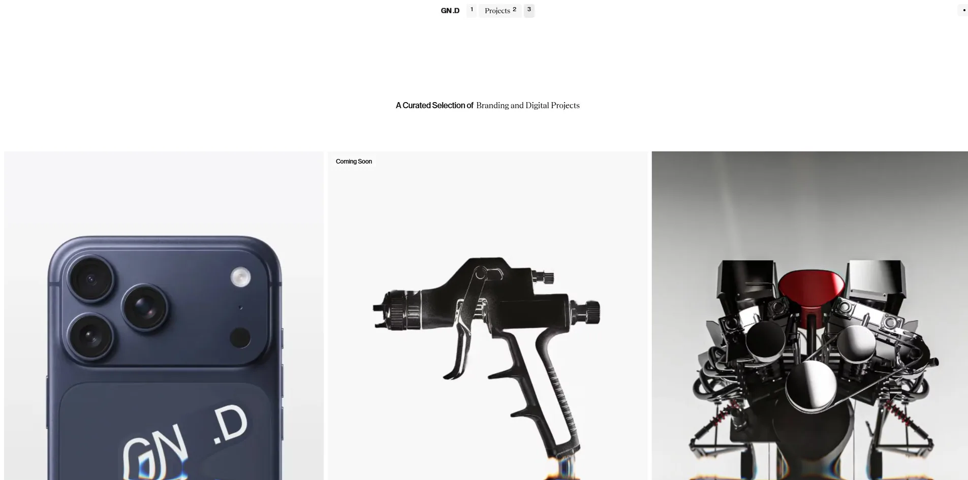
The second view is a conventional work page. Switch to Projects and the screen becomes a row of full-bleed 3D renders running horizontally, under a line reading A Curated Selection of Branding and Digital Projects. Four projects live here, plus one slot marked Coming Soon.
The third view, About, is a page of writing about how he works, split into Quality and Feel, saying roughly that he does not make things to fill space, and that design is not only how something looks but how it feels in the hand. He notes on that page that he is currently at DashDigital®.
It is worth noting that those three views are three real routes. Even though the visuals are almost entirely inside a canvas, the four project links are genuine <a> elements pointing at /projects/ferrari, /projects/erica-basile and the rest, so any of them can be opened or shared on its own. Plenty of all-canvas sites turn navigation into pure canvas events and ship no links at all. This one did not take that route.
Design
There is one rule governing the layout: text belongs to the DOM, imagery belongs to the canvas, and the two never overlap.
The consequences are extreme. The whole home route contains 176 DOM elements and every font size falls between 11 and 16px, because none of the large type is in the DOM. There are two text colours, black on 174 elements and white on 2. There are three background colours: white, a half-transparent pale grey, and one black.
That pale grey is rgba(237, 237, 237, 0.5) and it appears only on the navigation tabs at the top. Of the 176 elements on the page, exactly 5 carry a border radius, and they are those same tabs. A rounded corner on this site is therefore a functional marker. If it is round, you can click it.
There are two typefaces, divided by role rather than by size. The sans, LayGrotesk, carries 1,455 characters. The serif, Teodor, carries 56. Measured by rendered area, though, the sans occupies 12,787 square pixels and the serif 6,466, so 3.7% of the characters take up a third of the text area. The serif shows up in one fixed position. The line of description under a project name.
The best piece of craft is how those two faces are paired. At the top of the Ferrari project page, the word Ferrari is set in the bold sans and Design Exploration directly beneath it in the serif. One is the name, the other is what kind of thing it is, and the difference in letterform does the work that size or colour would normally have to do. The Projects headline uses the same move, with A Curated Selection of in bold sans and Branding and Digital Projects in serif.
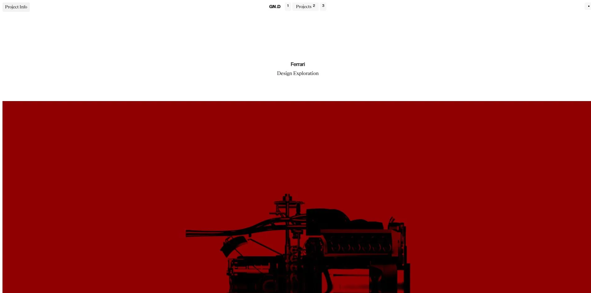
Below that white header the project page switches logic entirely, into a full field of Ferrari red with a near-black silhouette of the 330 P4 chassis lying in it. This is the first large area of colour anywhere on the site, and it is the only one, since Creative Space before it and About after it both return to white. Colour here is punctuation between sections rather than decoration.
All the shading on the 3D comes from a single 837 KB MatCap texture. That is an economical approach. Bake the lighting into a spherical texture up front, then sample it by surface normal at render time, so the scene needs no lights at all and metal and plastic read correctly straight from the map. The cost is that the lighting is fixed, so turning an object does not move its highlights. For display imagery that never needs the light to change, the trade pays.
Motion
The main interaction here is dragging and pushing, not clicking.
Turning the wheel moves the field inside the canvas, and the document's scrollY stays at 0 from first load to last. Hold the left button and drag sideways and the field follows, with a clear run of inertia after release. Images enter and leave as you travel, so the field has no edges and no bottom to reach.
There is a precondition anyone copying this should know. A document that does not scroll gives up the browser's own scrollbar, keyboard paging and trackpad inertia, and every one of those has to be rebuilt. This site rebuilt drag and wheel. It did not rebuild the keyboard.
More care went into the audio than into the visuals. Eight sound files are loaded and their names state their jobs: ENTER for arrival, MENU HOVER for passing over the menu, IMAGE HOVER for passing over a work, SOFT CLICK and SOFT CLICK 2 for two kinds of click, HIT for an impact, SCRUBBLE for the friction of dragging, plus one AMBIENT bed. Every gesture has its own sound, so dragging and clicking do not sound alike.
Sound is off by default. The small dot in the top right is the switch, and its label reads as an invitation to turn sound on. Nothing autoplays, which is the right call.
Nothing here answers the reduced-motion preference. There is no rule for it in the stylesheet, and turning the setting on leaves the canvas running exactly as before. For a site that puts all its content inside a canvas this is the preference that most needed catching, because there is no static fallback to retreat to.
The keyboard is the same kind of gap. There is not a single :focus rule in the stylesheet, and while the navigation tabs carry numbers, those numbers are printed on rather than wired up, so pressing 1, 2 or 3 does nothing. A keyboard user can Tab to the links and still cannot see where the focus is.
Engineering
Next.js and Turbopack do the building, and the visual layer is a single 1920 by 945 WebGL2 canvas driven by three.js r184. Render size matches display size exactly, with no supersampling.
First paint is decisively quick: 228ms to first byte, 432ms to first contentful paint, 468ms to load, and not a single layout shift anywhere, for a cumulative score of 0. That is uncommon on a WebGL site, and the reason is not complicated. The only DOM that has to paint first is that row of navigation, and the canvas arrives afterwards, so there is nothing available to be pushed around.
One visit transfers 20.3 MB across 55 files. The largest category is video at 11.5 MB spread over several webm files, the biggest of them 4.6 MB. Second is audio at 6.65 MB, and 6.5 MB of that total is the single AMBIENT bed.
Which is the problem. Sound is off by default, yet that 6.5 MB track has finished downloading before the visitor has touched anything, accounting for a third of the visit. The right move is to fetch it only once somebody turns sound on, since the other seven effects together come to under 150 KB and can safely load up front.
Imagery is handled frugally by comparison. The work images mix webp and jpg, the largest single file is 335 KB, most sit between 50 and 230 KB, and the whole set comes to around 2.1 MB, which is restrained for a portfolio built on images.
The accessibility fundamentals are in place: the page declares its language, all nine interactive controls have names, and no positive tab index appears anywhere. What is wrong is the pair already described, invisible focus and untouched reduced motion. Accessibility at 6.40 is the lowest of the six developer categories, and the judge Federico Pian gave that category a 5, which matches what is actually there.
Scores and Team
The site took awards on both platforms on the same day, and on Awwwards it took Site of the Day and the Developer Award together.
| Award | Source | Date | Score |
|---|---|---|---|
| Site of the Day | Awwwards | 2026-09-05 | 7.32. Design 7.28 / Usability 7.09 / Creativity 7.73 / Content 7.33 |
| Developer Award | Awwwards | 2026-09-05 | 7.27. Semantics 7.40 / Animations 7.60 / Accessibility 6.40 / WPO 7.80 / Markup 7.00 |
| FWA of the Day | The FWA | 2026-09-05 | 82 POINTS, DAYS 3 |
Creativity at 7.73 is the highest of the four design categories and Usability at 7.09 the lowest, 0.64 apart. That ranking is the site's position in miniature: it replaced the way you browse, which is what it won on, and which is also what leaves some visitors unsure where they are.
Scores came in at 7.00, 7.30, 7.00, 7.00 and 6.00. Four cluster between 7.0 and 7.3, and an independent art director in Turkey gave all four categories a 6.
On the developer side WPO at 7.80 is the highest of the six, which matches the measurements of a 432ms first paint and zero layout shift. Accessibility at 6.40 is the lowest, which matches too.
| Credit | Who | Awwwards record |
|---|---|---|
| Nese Gionatan | Milan, Italy, multi-disciplinary designer | 1 work, SOTD 1, Dev Award 1, HM 1 |
| Yousuf Soomro | Pakistan, creative front-end engineer working in WebGL | 2 works, SOTD 2, HM 2 |
Two people, one designing in Milan and one building in Pakistan. Soomro puts his age into the one-line description on his own Awwwards profile: creative front-end engineer, WebGL, 16 years old. This site is one of his two awarded pieces and his first award at The FWA.
Nese's profile carries only this one project, and that single project brought back a Site of the Day, a Developer Award and an honourable mention. He also lists his project budget and availability there, at 5,000 to 30,000 dollars, remote. What this portfolio is for is stated in the open.
Archive
- Award date
- 2026-09-05
- Awards
- Awwwards SOTD 2026-09-05, Awwwards DEV 2026-09-05, FWA FOTD 2026-09-05
- Site
- https://www.gionatannese.com/
- Credits
- Nese Gionatan, Yousuf Soomro
- Design
- spatial
- Build
- canvas
- Awwwards
- 7.32 / 10. Design 7.28 / Usability 7.09 / Creativity 7.73 / Content 7.33. Developer Award 7.27. https://www.awwwards.com/sites/gionatan-nese-26
- The FWA
- 82 POINTS, DAYS 3. https://thefwa.com/cases/gionatan-nese-26
- Stack
- Next.js, Turbopack, three.js r184, WebGL2, MatCap texture
- Total assets
- 20.3 MB, of which audio is 6.65 MB (the ambient bed alone 6.5 MB) and video 11.5 MB
- Speed
- 228ms to first byte, 432ms first paint, layout shift 0. Canvas at 60 fps, and the document does not scroll