Cerebrium
Cerebrium sells serverless compute for AI workloads. The magenta ribbon behind the opening screen coils into a sphere halfway down the page, and pressing and holding drives the camera into its surface until the screen is nothing but material. All three forms are one model. One model can hold three forms because a ribbon has no front and no back. Louis Paquet led the build out of Montreal.
Visit site ↗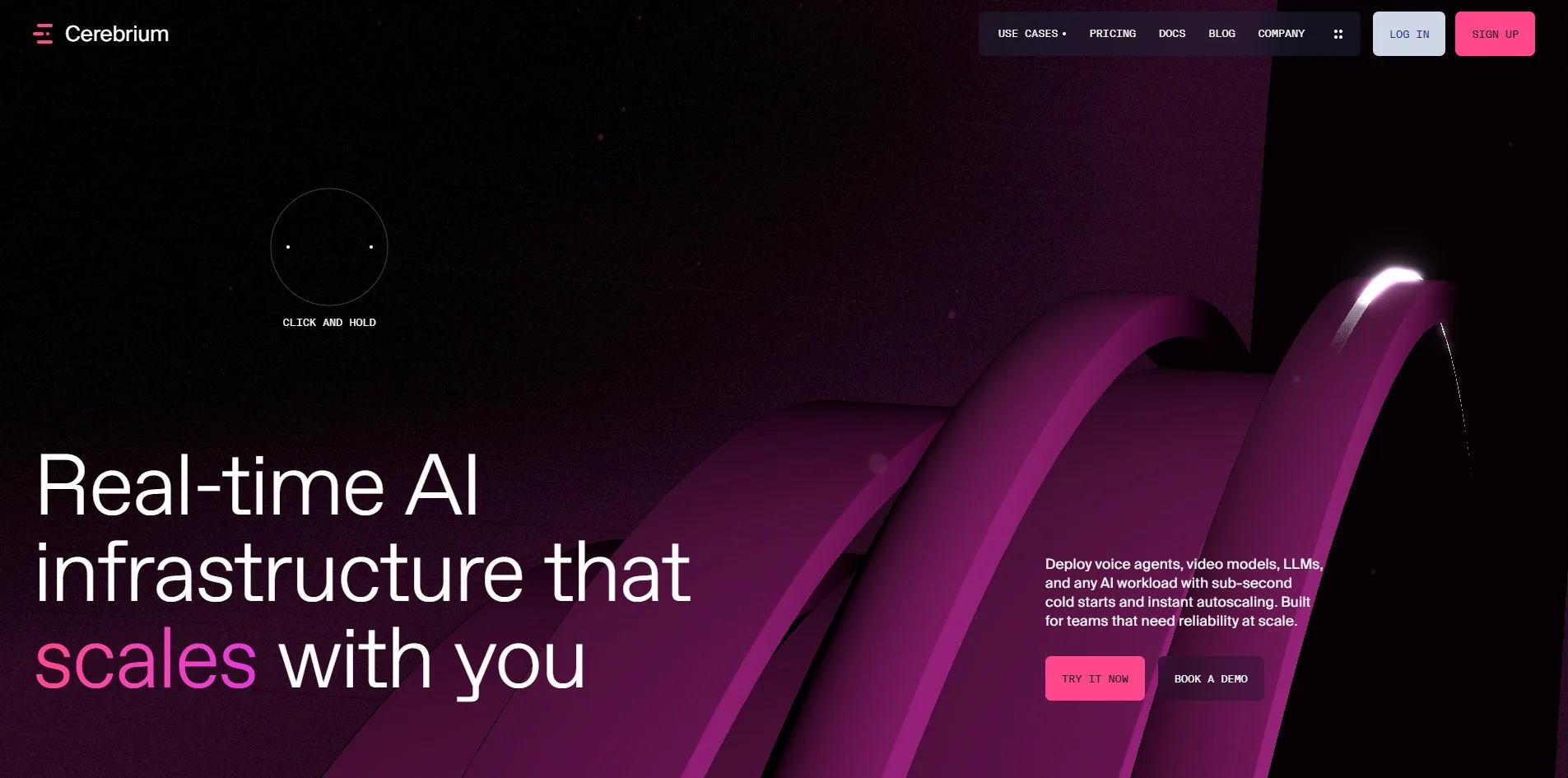
Concept
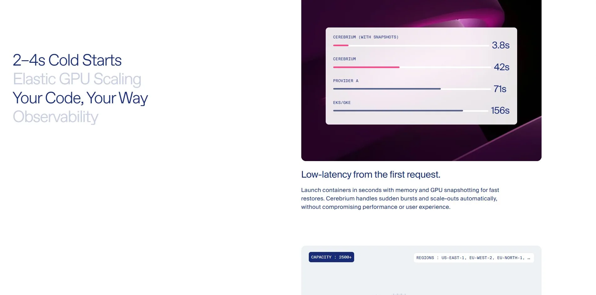
The question this site has to answer is a blunt one. Why not just run it on EKS yourself. The answer it gives is not an adjective, it is four numbers laid side by side in one chart.
That chart measures cold start. Cerebrium with snapshots at 3.8s, Cerebrium without at 42s, Provider A at 71s, EKS/GKE at 156s. Printing your own slow configuration in your own comparison chart is rare, and it is what makes the other three numbers credible, since a team willing to show the version where they look bad is not picking its rows.
The opening screen is just as direct. On the left a headline at 192px, Real-time AI infrastructure that scales with you, with the word scales tinted magenta. On the right a paragraph and two buttons. Behind them the magenta ribbon curls up from the bottom right with a thread of white light crawling slowly along its edge.
There is a prompt in the middle of that screen that only appears once the pointer moves. The pointer itself has been replaced by an open ring, with CLICK AND HOLD printed underneath it.
Hold, and the picture changes entirely. The camera drives into the surface of the ribbon, navigation and headline and buttons all leave, the 1920 by 945 viewport is nothing but folds of magenta and black, and the pointer shrinks to a small circle carrying two short dashes. Release and it pulls back out.
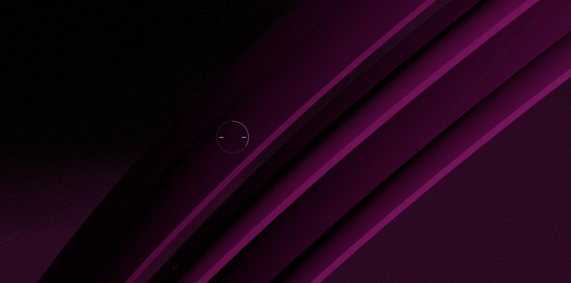
That gesture acts out what the product does. The whole page is about compute that expands instantly and collapses instantly, and the gesture does exactly that, growing on press and returning on release, with no loading and no navigation.
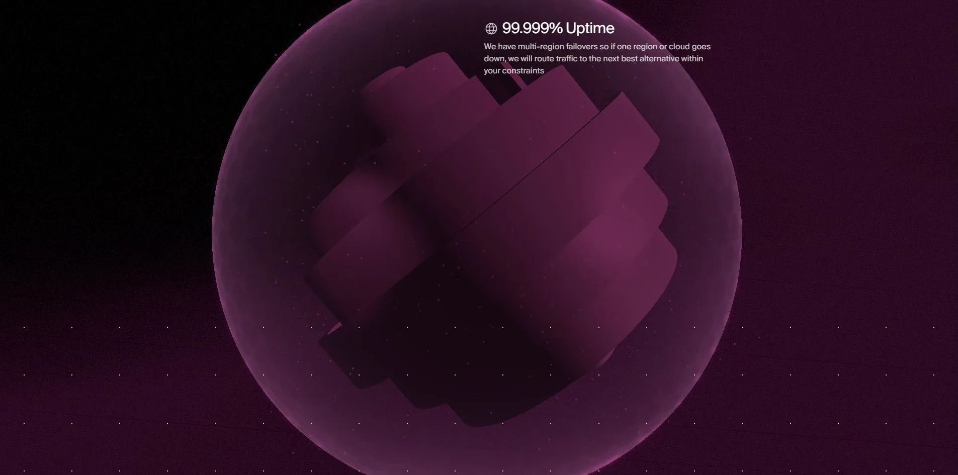
Scroll on and the ribbon has coiled into a sphere. A translucent shell surrounds it with loose magenta squares floating on the surface, beside a line reading 99.999% Uptime and a note about multi-region failover. This is the third state of one piece of geometry, first a band in the background, then a material you can drive into, finally a globe standing for worldwide distribution.
Design
The type system runs on one clean rule. Three faces occupying three size bands that never overlap.
Suisse Int'l Mono appears at 13px and nowhere else, one size carrying over sixteen hundred characters of labels, button text and small notes. Suisse Int'l spreads across nine steps from 15px to 41px for body, subheads and card copy, with 1,960 characters at 16px alone. ABC Favorit starts at 53px and goes up through 70, 88, 105 and 192, writing just 271 characters in total.
Not one step overlaps another. Monospace at 13px means label, anything above 53px means the start of a section, and everything in between is body. Dividing this way is steadier than dividing by weight, because size is a signal a reader picks up without being taught, while weight flattens out easily on a dark background.
One detail here has to be recorded exactly as found. The face carrying every large heading is named ABC Favorit Trial in the CSS, loaded from ABCFavorit-Light.woff2. Trial is the cut a foundry sends out for evaluation, and it does not normally go to production.
Colour splits in half, and the split is hard. The dark half is black with magenta, the light half is white with a navy #172B76 that lands on 3,482 elements by itself. Magenta #FF488B does one job in the light half, marking the buttons and the bar that stands for Cerebrium in the charts.
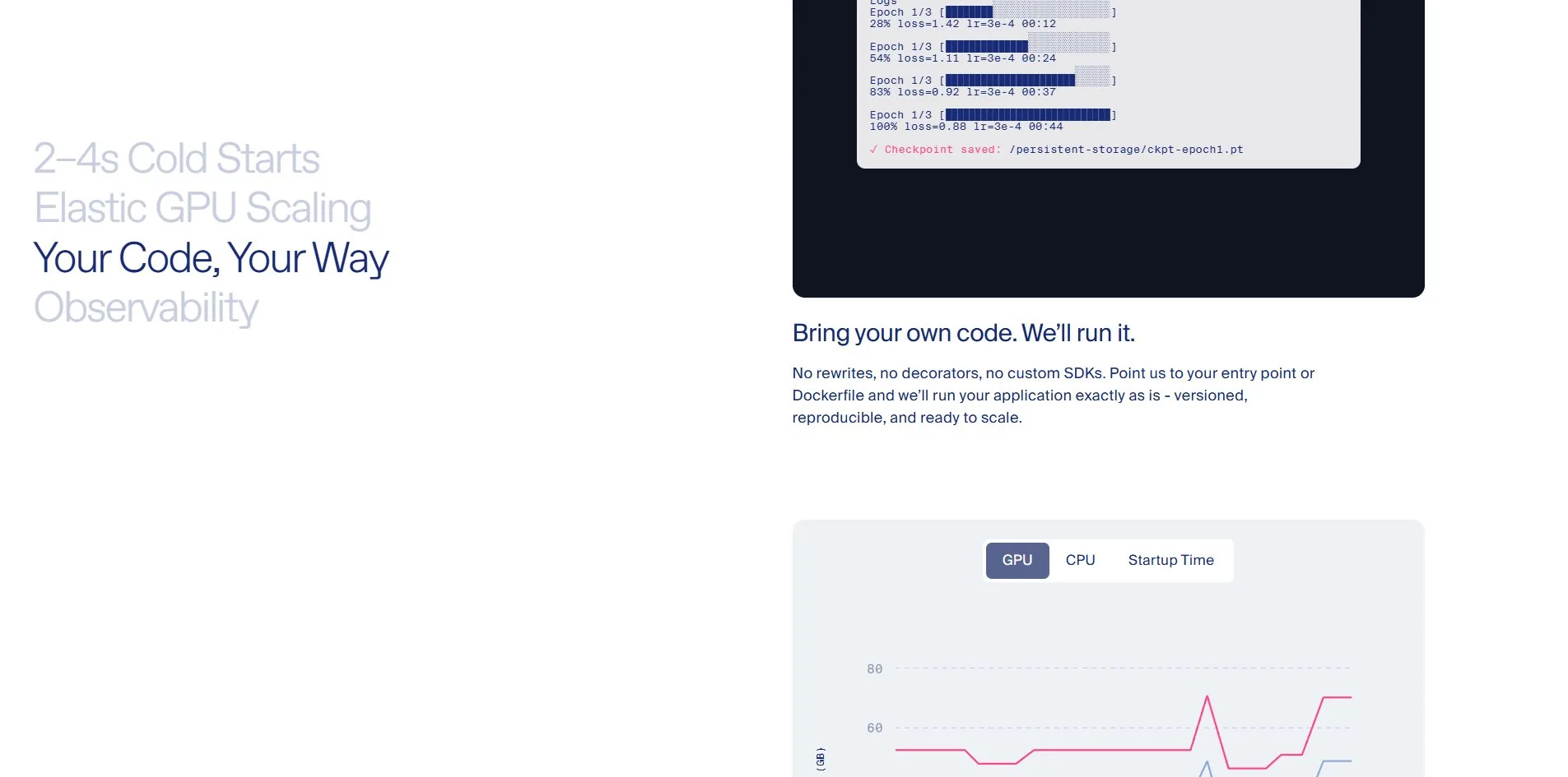
That index on the left is worth its own note. Four lines stacked vertically, 2–4s Cold Starts, Elastic GPU Scaling, Your Code Your Way, Observability, with the current section's line in navy and the other three in pale blue. It stays put while the content beside it scrolls section by section, and the colour moves with it. A reader always knows which of the four things they are in, and the whole signal is one difference in colour, with no progress bar, no numbering and no highlight block.
Rounded corners follow a rule too. Of 4,210 elements on the page, 421 carry a radius, exactly a tenth, and they cluster on cards, buttons and chart containers. Not one text block has one.
Motion
The globe is where the real craft is, because it is the same data as the ribbon in the header.
The 3D layer loads three glTF models whose filenames state their origin plainly. CEREBRIUM_part1_11_optimization.glb at 196 KB, CEREBRIUM_part2_4_optimization.glb at 592 KB and CEREBRIUM_circles_optimized.glb at 39 KB. All three start downloading at 371ms and are in by 462ms. The models are Draco compressed, with a separate 88 KB draco_decoder.wasm doing the decoding.
The names describe the pipeline by themselves, since part1 and part2 are one object exported in two pieces, circles is the force field. Ribbon, globe and field all share those 830-odd KB of geometry, and every difference between them is camera, material and scroll progress. The bundle holds 20 matches for ShaderMaterial, 19 for InstancedMesh and 2 for EffectComposer, so the materials are hand-written shaders, the floating squares on the field are instanced, and the whole thing goes through a post-processing pass.
Anyone working this way has to accept one precondition. Geometry that can hold three states must have no definite front or back. A spiral reads correctly coiled into a sphere and unrolled into a band, from any angle. Give it a face and the reuse collapses immediately.
How the hold is implemented can be read straight off the page. Pressing adds is-hero-hold-active to the html element and is-holding to the cursor element, and everything else is CSS transitions plus the camera push. Releasing removes both classes. The gesture creates no new DOM and fires no new requests.
Page transitions are Swup, declared by swup-enabled on the html element. Scrolling is Lenis, which appears 64 times in the bundle. GSAP appears 41 times but ScrollTrigger only twice, which means most entrance animations are fired by IntersectionObserver rather than driven by scroll position, and that is why the frame rate over the whole page is flat.
One small detail matches what the company sells. The html element also carries webgpu-is-ready, so the code has a WebGPU detection branch, though the canvas measured here holds a WebGL2 context at 1920 by 945 with no supersampling and no multisampling.
The dot field in the light half that reacts to the pointer is not WebGL at all. The c-interactive-dots container holds 100 DOM children and not a single canvas. The same site reaches for WebGL on its heaviest scene and for divs on a hundred-cell grid, which is a well-judged division.
Continuous scrolling measures 59 fps on average with a p95 frame cost of 18ms and 0.5% janky frames, essentially flat across 12,242px and 13 screens.
Reduced motion is effectively absent. There is one prefers-reduced-motion rule in the stylesheet, but it belongs to the cookie consent library and sets that dialog's transition duration to zero. Nothing the site itself animates, the ribbon, the globe, the character-by-character headline or the dot field, is covered by it.
Engineering
The foundation is Astro, with content from DatoCMS, images served off datocms-assets.com, deployed on Vercel. The interactive pieces are React 19.2.4 islands, and the page pulls 55 JavaScript files in total.
A visit on a cold cache comes to 2.67 MB across 117 files. Script accounts for 963 KB, the 3D and wasm arriving via fetch for another 928 KB, images 511 KB, fonts 108 KB, XHR 95 KB. For a site with 3D running full screen the whole way down, that is light.
Fonts come to three files and 108 KB, the thriftiest line on the list. Each face ships one weight, with no unused variant loaded anywhere.
Within that 963 KB of script, Google Tag Manager and the measurement libraries it pulls in account for 315 KB, a third of the total. It is also the only third party, with no pixel, no session recorder and no second analytics stack, which is restrained for a SaaS site.
Speed has to be read in two halves. First byte at 189ms, first contentful paint at 264ms, DOM interactive at 209ms, all of it quick because Astro ships static HTML and the first screen waits on no JavaScript. Cumulative layout shift is 0, with not one shift from start to finish.
The other half is slow. Largest contentful paint lands at 4,064ms on the H1. It arrives that late because the headline is split into individual characters and animated in, and until that animation finishes the browser considers the block unpainted. Loading also produces 6 long tasks, the longest 1,997ms, two seconds in which neither clicks nor keys respond.
A character-by-character headline is standard equipment on award winners, and what it does to largest contentful paint is rarely mentioned. The biggest text on the first screen is usually the LCP element, so giving it a two-second entrance pushes LCP back by two seconds. Having both means writing the final opacity of each character as 1 from the start and doing the movement with transform, so the text counts as painted on the first frame.
WPO took 7.00, second lowest of the six developer categories, which matches a 4 second largest contentful paint and that near two-second task.
Accessibility fails in two places, and both are the classic kind.
The first is the customer logo strip. Twenty-four links on the page wrap an img whose alt is an empty string. An empty alt means the image is decorative and a screen reader should skip it, but the link around it points at livekit.io, deepgram.com and vapi.ai. What a screen reader user hears is 24 links in a row with no names. Automated checks miss this, because the alt attribute is genuinely present. When an image is inside a link, the alt is not describing the picture, it is naming where the link goes.
The second is the pricing calculator. That page carries 4 sliders and a dropdown, none with an aria-label and none with an associated label. It is the one place on the site where a visitor actually inputs something, and it is precisely the place a screen reader user cannot operate.
Plenty is right as well: the page declares its language, header, nav, main and footer landmarks are all present, all 49 images carry an alt attribute, no positive tabindex appears anywhere, and the tabbed panels use correct tablist and tabpanel roles.
Scores and Team
| Award | Source | Date | Score |
|---|---|---|---|
| Site of the Day | Awwwards | 2026-09-10 | 7.39. Design 7.33 / Usability 7.43 / Creativity 7.38 / Content 7.55 |
| Developer Award | Awwwards | 2026-09-10 | 7.50. Semantics 7.40 / Animations 8.20 / Accessibility 7.60 / WPO 7.00 / Markup 6.60 |
The four design categories sit unusually close, with the highest, Content at 7.55, only 0.22 above the lowest, Design at 7.33. Design coming last on a site running full-screen 3D says the jury was not scoring how the picture looks but whether the thing gets said, and the light half of this site really is plain enough to pass for an ordinary SaaS template. The five judges returned 7.00, 7.30, 7.60, 7.00 and 6.80, with Etienne Pharabot of France highest and Artemii Lebedev of Serbia marking creativity a 6.
The developer votes spread much wider. Animations at 8.20 is the highest, matching a ribbon that changes form three times. Markup at 6.60 is the lowest and WPO at 7.00 next, and together they cover exactly the faults written up above. mChanh of Vietnam gave 8.35 while Nico Menezes of Brazil came in at 7.15, marking markup a 5, the lowest single number on the card.
| Credit | Who | Awwwards record |
|---|---|---|
| Louis Paquet | Montreal, Canada | 52 works, SOTY 1, SOTM 2, SOTD 41, HM 50 |
| KOKI-KIKO | Canada | 9 works, SOTM 2, SOTD 9, HM 9 |
| Domaine Public | Credited | Not listed |
| Deven Caron, Pier-Luc Cossette, Célia Lopez, Kim Levan, Mathis Biabiany | Credited | Not listed |
Louis Paquet's 52 works include 41 Sites of the Day and one Site of the Year, and nearly every entry on the list carries a DEV badge alongside, making him someone who holds up both halves of the job. His profile states a budget of 30,000 to 50,000 dollars, remote. All nine of KOKI-KIKO's works are collaborations with him.
Eight credits is a sizeable team for a SaaS home page, and it explains why every chart, terminal and map in the light half is its own purpose-built component rather than something out of a kit.
No entry for this site exists at The FWA.
Archive
- Award date
- 2026-09-10
- Awards
- Awwwards SOTD 2026-09-10, Awwwards DEV 2026-09-10
- Site
- https://cerebrium.ai/
- Credits
- Louis Paquet, KOKI-KIKO, Domaine Public, Deven Caron, Pier-Luc Cossette, Célia Lopez, Kim Levan, Mathis Biabiany
- Design
- spatial
- Build
- scroll
- Awwwards
- 7.39 / 10. Design 7.33 / Usability 7.43 / Creativity 7.38 / Content 7.55. Developer Award 7.50. https://www.awwwards.com/sites/cerebrium
- Stack
- Astro, React 19.2.4, three.js, WebGL2, Draco, Lenis, GSAP, Swup, Lottie, DatoCMS, Vercel
- Total assets
- 2.67 MB cold across 117 files, of which script 963 KB, 3D and wasm 928 KB, images 511 KB, fonts 108 KB. One third party only, GTM at 315 KB
- Speed
- 189ms to first byte, 264ms first paint, 4,064ms largest contentful paint, longest task 1,997ms, layout shift 0. 59 fps scrolling, p95 18ms
- Test conditions
- 1920×945, dpr 1, zoom 100%, cold profile. Page height 12,242px, about 13 screens