White Desert
Anyone can do frosted glass, but CSS backdrop-filter on its own gives you an even mist. The site for the Antarctic expedition company White Desert produces glass that refracts. The ice behind the five navigation buttons is pulled one way in places and pushed back in others, uneven the way real glass is. No canvas appears anywhere on the site, so that glass is built from CSS and SVG alone. Malvah in Cape Town made it.
Visit site ↗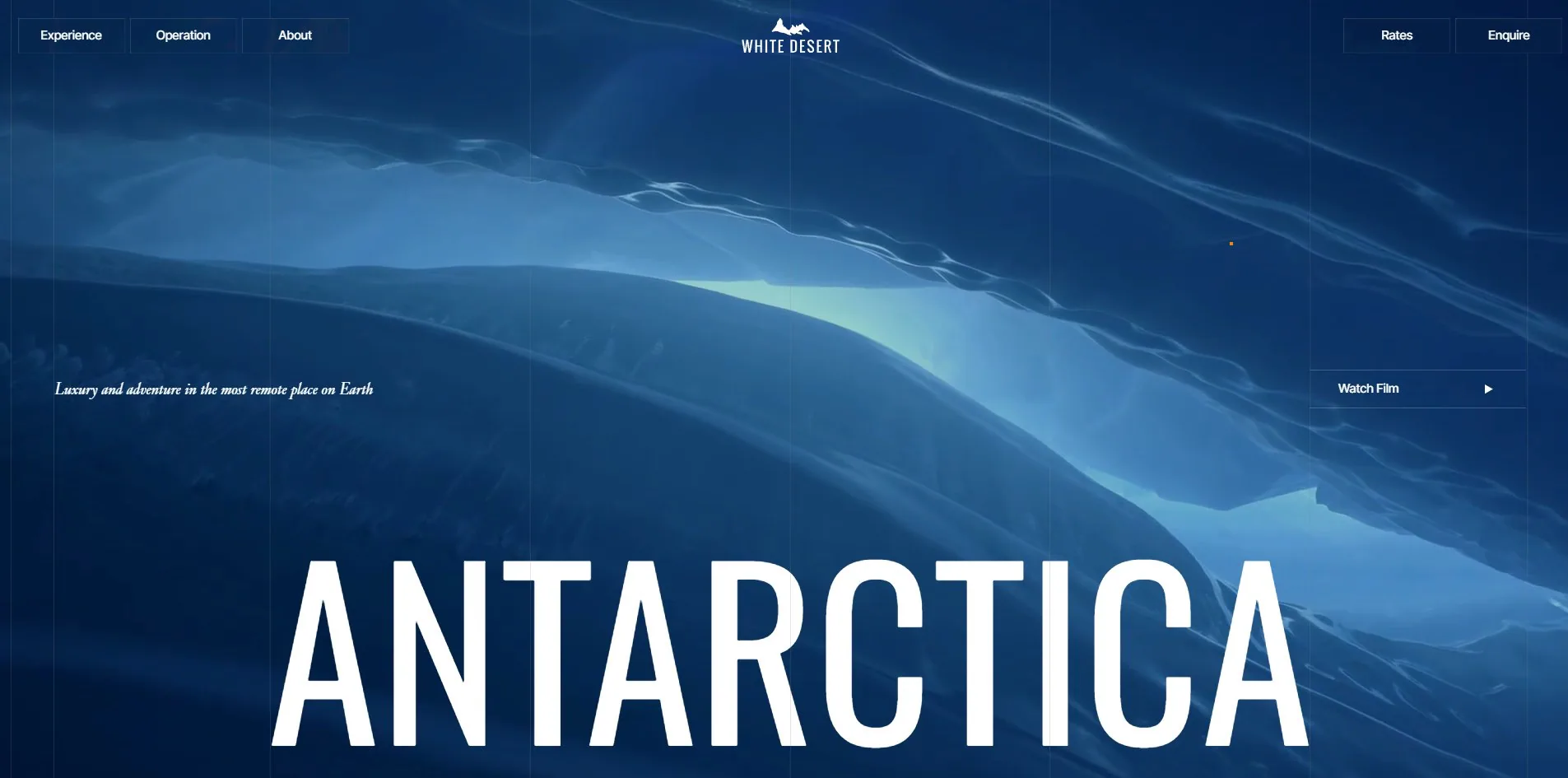
Concept
An expedition company normally opens with the scenery. Here is the ice, and here is where you would sleep. This site opens with the itinerary instead, laid out in the order of a boarding pass.
The first screen is a loop of Antarctic ice, a line of italic on the left offering luxury and adventure in the most remote place on Earth, and ANTARCTICA set at 347px across the full width beneath it. Trips, camps, the flight and the map follow in that order.
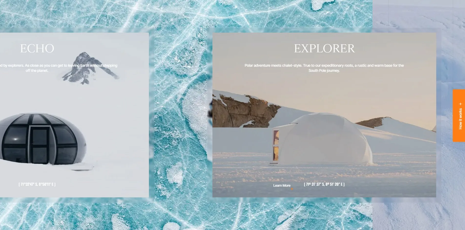
The camps run sideways. The page pins at one viewport tall while a 7,370px track travels horizontally underneath, bringing in three camp cards one at a time. Each card carries its own coordinates along the bottom, Explorer at 71º 31' 37" S, 8º 51' 20" E and Echo at 71°32'47" S, 8°50'11" E. Those are not decoration. A camp on the ice really is located by coordinate, and printing one is more honest than printing an address.
One screen further down states the whole idea in four letters. CPT — WFR, Cape Town to Wolf's Fang Runway, written the way airport codes are written. The letters are set in semi-transparent white over a photograph of a glacier with a single figure in an orange jacket walking across it. A block of data hangs at either side, 33º 58' 17" S 18º 36' 13" E for Cape Town on the left and 71° 31' S, 08° 48' E for Wolf's Fang on the right, with flying time 05:30 hrs, 4,220 km / 2,610 mi and -5°C / 23° F between them.
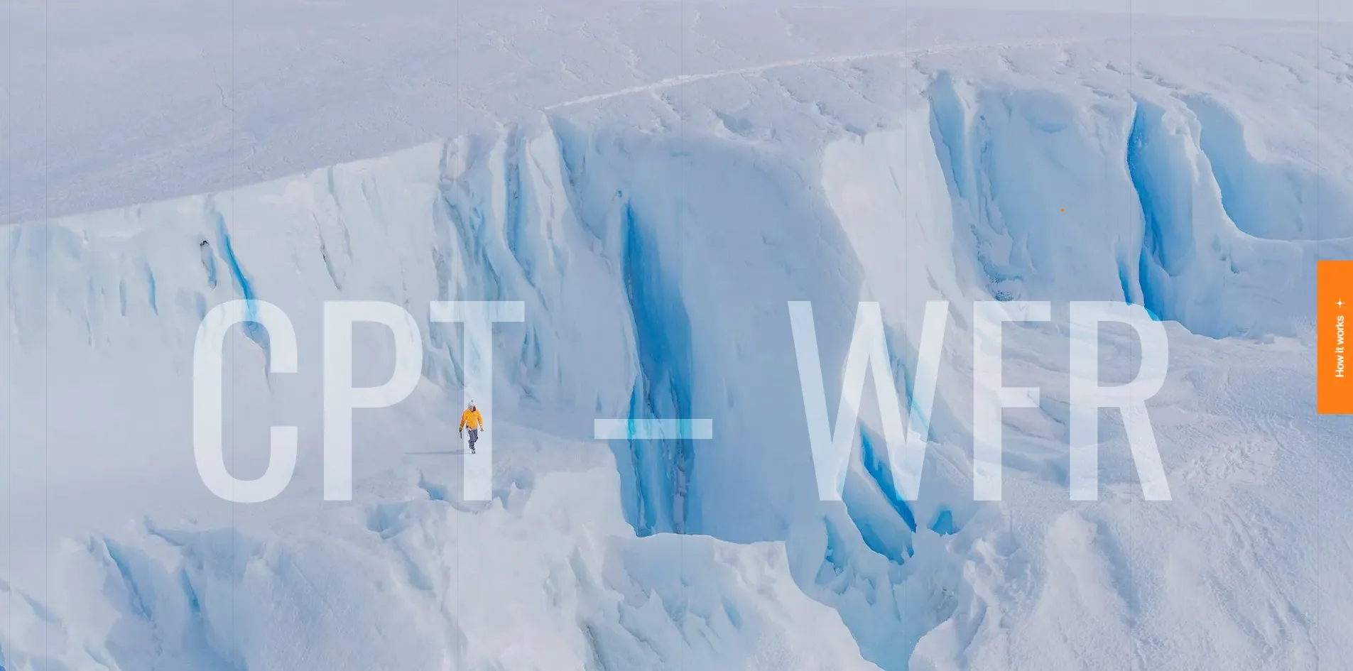
Writing a trip as flight information hands the reader something marketing copy never does. Distance, duration and landing temperature answer the first three questions anybody actually has: how far, how long, and how cold.
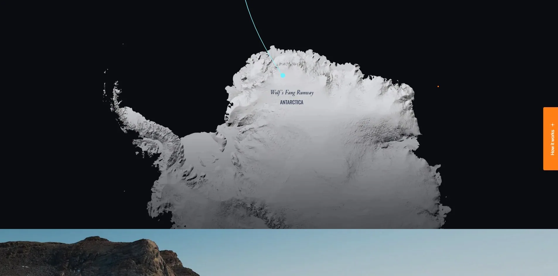
The last screen draws that route. On black, a terrain image of Antarctica, a cyan curve bending down from the top of the frame and landing on a dot that pulses, with Wolf's Fang Runway written beside it. This is the only saturated colour on the site. Cyan #6AF0FF appears on exactly two elements, both of them here.
Design
Three typefaces, divided by gaps in the size scale rather than by size itself.
Body text is Inter Tight, with 3,955 characters sitting at 15px and a bit over a thousand more spread across 11, 13 and 17px for labels and footnotes. The serif is Cardinal Classic Long, running nine steps from 20px to 152px and carrying every section title, camp name and pull quote.
Oswald is used in the most particular way of the three. The condensed face writes only 269 characters yet occupies the largest rendered area on the site, 1,297,028 square pixels, a fifth more than all 3,955 characters of body text. Its size list reads 15, 17, 20, then jumps straight to 277 and 347 with nothing in between. One typeface does two unrelated jobs here, small enough to be a label and large enough to be part of the landscape, and the gap in the middle is what keeps the two uses from being read as one scale.
Colour is held just as tight. There are two text values, a deep navy #1F2A44 on 342 elements and white on 483. Orange #FF7E15 lands in exactly two places on the whole page, the dot that follows the pointer and the vertical tab on the right reading How it works. The cyan only ever shows on the map.
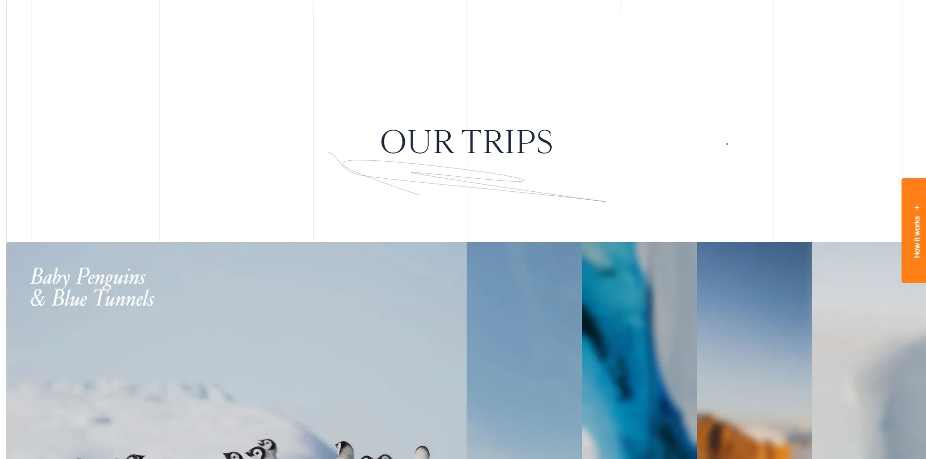
Which brings up the decision most likely to be mistaken for an oversight. A six-column grid sits permanently above the whole site, position fixed, z-index 2, opacity hard-coded at 0.1. It does not scroll, it does not change between sections, and it hangs there from the first screen to the footer.
Column guides normally live in Figma and get deleted before launch. This one was kept, and 0.1 is a well-judged value: on white it reads as very faint vertical lines, over a photograph it all but disappears, and on the black map screen it is invisible. The white sections gain a little structure and the dark content is left alone. Anyone copying it should know the route only works on a palette this restrained, because the moment a second saturated colour lands on the page, a grid at 10% turns into dirt.
The pointer was rebuilt too. At rest it is a 4 by 4 orange dot and nothing else. Move it over anything clickable and lines 12px long grow out of it in all four directions, dot and lines together forming a crosshair. A crosshair is the surveying and navigation symbol, which suits what this site is about, and it is more restrained than the usual expanding circle, since a circle covers what is underneath it while a crosshair only rules two thin lines across it.
Motion
The glass is the best piece of craft here, and the whole method is written into the DOM where anyone can read it.
Each glass element is three layers deep. The bottom one is liquid-glass__filter, carrying backdrop-filter: blur(3px) and an SVG filter. The middle one is liquid-glass__overlay, which holds the tint. The top one is liquid-glass__specular, which is nothing but an inset shadow, rgba(255, 255, 255, 0.2) offset by 0.35px, and that is the highlight along the edge of the glass.
What keeps it from looking like ordinary frosted glass is the SVG filter, a chain of three:
feTurbulence  type=fractalNoise  baseFrequency=0.008  numOctaves=2  seed=100
feGaussianBlur  in=noise  stdDeviation=2
feDisplacementMap  in=SourceGraphic  in2=blurred  scale=40  xChannelSelector=R  yChannelSelector=G
Generate a very low frequency fractal noise, soften it, then push the source pixels around using the red and green channels of that noise, at a strength of 40. What comes out is the uneven refraction of real glass, where the ice behind is not uniformly blurred but pulled slightly one way in places and pushed back in others. A backdrop-filter on its own gives you an even mist and cannot give you this.
The component is used 12 times on the home page, from the 130 by 43 navigation buttons up to the 960 by 720 camp cards, with Watch Film and the Flying time 05:30 hrs panel in between. The same three layers hold across a sevenfold difference in size with no change of implementation, which says it was written as a component from the start rather than tuned for the header.
Two things are worth knowing before copying it. A baseFrequency of 0.008 against a scale of 40 has been calibrated, and denser noise or a larger displacement starts smearing the text and making what is behind the glass unreadable, so the two numbers have to move together. The other is performance. Every backdrop-filter is its own compositing layer, twelve of which is comfortable while several dozen on one screen will start dropping frames.
Lenis and GSAP carry the scrolling. The bundle contains 206 matches for gsap, 18 for ScrollTrigger and 44 for lenis, with no three.js at all, on GSAP 3.13.0. The camps are a textbook ScrollTrigger pin plus horizontal move, the 7,370px track leaving a little over one screen of sideways travel once the viewport is subtracted.
The flight line is drawn just as plainly. That curve is a single cubic bezier 64 characters long, with stroke-dasharray set to 0px, 999999px and stroke-dashoffset pushed to grow it in. The technique is over a decade old and entirely sufficient here, because all it has to say is that a plane is heading south.
Continuous scrolling holds 60 fps the whole way, p95 frame cost 18ms, with not a single dropped frame across 24,013px and 25.4 screens.
Reduced motion is empty. There is no rule for it anywhere in the stylesheet, and turning the preference on leaves the opening video playing. Twenty-five screens of parallax plus an autoplaying loop is exactly the combination that troubles people sensitive to motion, which is precisely the case that needed catching.
Engineering
What makes this site worth studying is that its performance score and its actual payload look like they contradict each other.
A cold visit transfers 8.44 MB across 91 files. Video is 4.32 MB, served through Cloudflare Stream at 1920 by 1080, 17.5 seconds, muted and looping, with preload set to metadata. Images come to 2.19 MB, script to 1.29 MB, fonts to 545 KB.
Only a small part of that script belongs to the site. Google Tag Manager and the three measurement libraries it pulls in total 659 KB, the Facebook pixel is 191 KB, four HubSpot scripts for forms, banner, conversations and analytics add 121 KB, and then Clarity at 27 KB, Bing at 17 KB and Metricool at 6 KB. Analytics and marketing together come to 939 KB, three quarters of all script on the page.
WPO still took 8.00, the highest of the six developer categories, and the measurements back it: 181ms to first byte, 860ms to first contentful paint, 1.9s to load, cumulative layout shift of 0, and only three long tasks with the longest at 146ms.
Both things hold at once because what the first screen needs was cut to the bone. The document is 27 KB, stylesheets 34 KB, fonts 545 KB, so a little over 600 KB paints the opening view, with the video and all 939 KB of tracking queued behind it. A layout shift of 0 is not luck either. All 29 images go through next/image with their dimensions fixed in the HTML, 23 of them marked lazy, so space is reserved in advance and a late image only fills a box that was already there.
Every site with a marketing department faces the same position, because tags are a business requirement and cannot be cut. The answer here is not to cut them, only to make sure none of them stands in front of the first screen.
Images all come from Sanity's CDN at cdn.sanity.io/images/kq9qn5zn/production. The award page tags the site as Contentful, and there is no trace of Contentful anywhere in the page, while sanity appears 193 times in the document.
Accessibility is solid where it is solid: the page declares its language, both nav and main landmarks are present, all 29 images carry alternative text, and only 4 of 91 focusable controls lack a name. When the How it works panel opens, scrolling really does lock, with lenis-stopped on the html element and overflow clip on the body, and both position and scrolling return when it closes.
The gaps are concentrated. The stylesheet carries one focus-visible rule and no reduced-motion rule at all, and there is no skip link to the main content. Heading structure has a break in it as well, with a single H1 in the document but seven H3s appearing before the first H2. Those add up to accessibility at 7.00, the lowest of the six.
Scores and Team
| Award | Source | Date | Score |
|---|---|---|---|
| Site of the Day | Awwwards | 2026-09-11 | 7.31. Design 7.28 / Usability 7.27 / Creativity 7.21 / Content 7.74 |
| Developer Award | Awwwards | 2026-09-11 | 7.61. Semantics 7.40 / Animations 7.80 / Accessibility 7.00 / WPO 8.00 / Markup 7.60 |
Content at 7.74 is the highest of the four and Creativity at 7.21 the lowest, which is an unusual order for an award winner. Most sites win on novelty of technique and have content added afterwards. This one runs the other way, since flying time, distance, landing temperature and camp coordinates are themselves the content, and the scores say the jury read it that way too. Denys Koloskov of Ukraine gave content a 9, while the other four judges filled in a 7 across all four.
At 7.61 the developer score ends up above the 7.31 the site itself was given. WPO at 8.00 is the highest of the six, matching an 860ms first paint and zero layout shift. Animations at 7.80 is second, matching the glass and 25 screens without a dropped frame. Accessibility at 7.00 is last, and that matches as well. CSS_killer from Spain gave all six categories a 9 while Barry Baris Dogan from Austria came in at 6.90, a 2.1 spread and the largest disagreement on the card.
| Credit | Who | Awwwards record |
|---|---|---|
| MALVAH | Design studio in Cape Town, South Africa | 26 works, SOTD 21, HM 26 |
| Geoff Dawes | South Africa, designer | 14 works, SOTD 12, HM 14 |
| Usudo | United Kingdom, full stack web agency | 1 work, SOTD 1, HM 1 |
Malvah has turned 26 works into 21 Sites of the Day, a high strike rate, and the profile states the budget range openly at 30,000 to 50,000 dollars. All 14 of Geoff Dawes' works sit under Malvah, making him the studio's in-house designer rather than an outside collaborator. Usudo is a full stack agency in the UK with this as its only listed work, and White Desert is their first award.
The studio is in Cape Town, and the route this site describes starts in Cape Town.
Nothing for this site is listed at The FWA, and it carries no badge of theirs.
Archive
- Award date
- 2026-09-11
- Awards
- Awwwards SOTD 2026-09-11, Awwwards DEV 2026-09-11
- Site
- https://white-desert.com/
- Credits
- MALVAH, Geoff Dawes, Usudo
- Design
- cinematic
- Build
- dom
- Awwwards
- 7.31 / 10. Design 7.28 / Usability 7.27 / Creativity 7.21 / Content 7.74. Developer Award 7.61. https://www.awwwards.com/sites/white-desert
- Stack
- Next.js 15.5.7, GSAP 3.13.0, ScrollTrigger, Lenis, Sanity, Vercel, Cloudflare Stream. No canvas
- Total assets
- 8.44 MB cold across 91 files, of which video 4.32 MB, images 2.19 MB, script 1.29 MB, fonts 545 KB. Third-party tracking 939 KB
- Speed
- 181ms to first byte, 860ms first paint, 1.9s to load, layout shift 0. 60 fps throughout continuous scrolling, p95 18ms
- Test conditions
- 1920×945, dpr 1, zoom 100%, cold profile. Page height 24,013px, about 25.4 screens