Warm & Fuzzy
Neutral Studio built the site for the creative company Warm & Fuzzy on one typeface, and only one weight of it. From a 14px label to a 137px headline, hierarchy never rests on stroke thickness and rides entirely on size, which is why the font file for the whole site comes to 14 KB. The page is cut into full-bleed bands of colour, electric blue, black and white in turn, each carrying an all-caps label in its bottom left corner.
Visit site ↗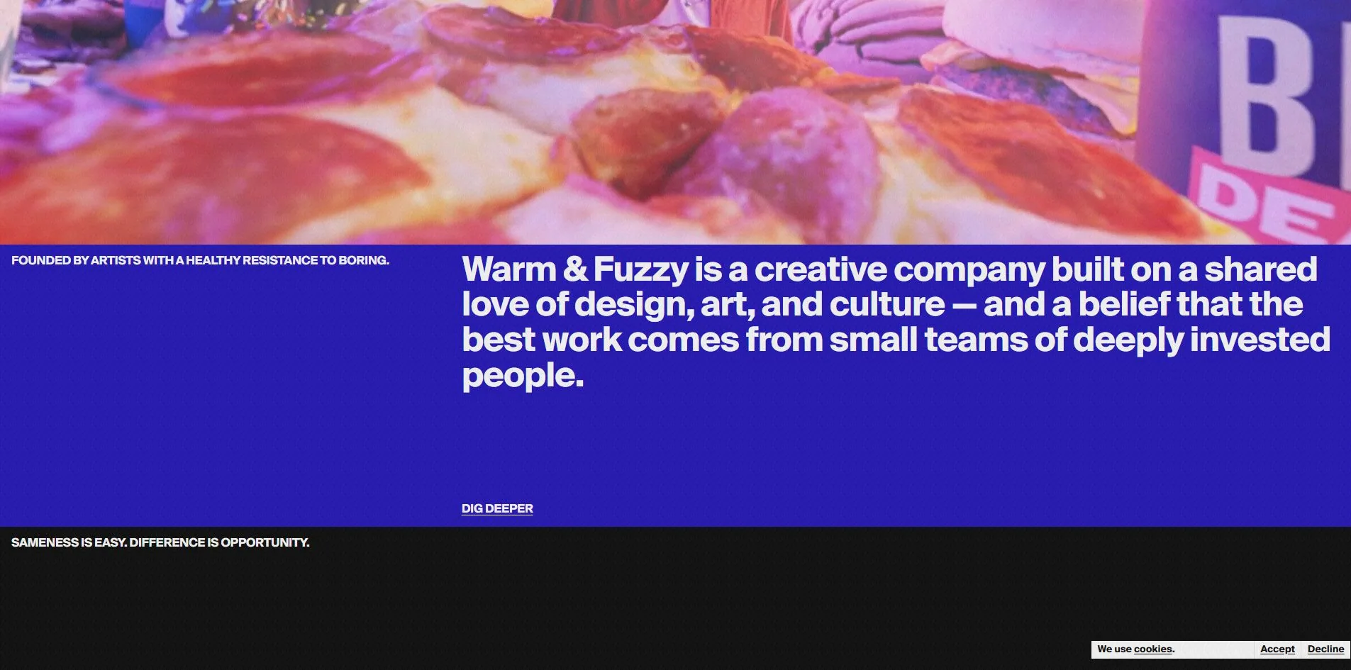
Concept
An agency site has an old problem. The work itself is all over the place, and forcing it together produces a mess. This one solves it by making the layout a fixed set of slots, so that the variety in the content becomes a rhythm instead.
From top to bottom the page is a run of full-width colour bands, each in a single flat colour. The blue one carries the company's own description, the black one a slogan, the white one the work. There are no transitions between bands and no gradients, just hard cuts.
Every band carries an all-caps label pinned to its lower left, like a section name in a magazine. The blue one reads FOUNDED BY ARTISTS WITH A HEALTHY RESISTANCE TO BORING, the black one SAMENESS IS EASY. DIFFERENCE IS OPPORTUNITY. The position never changes and the content always does.
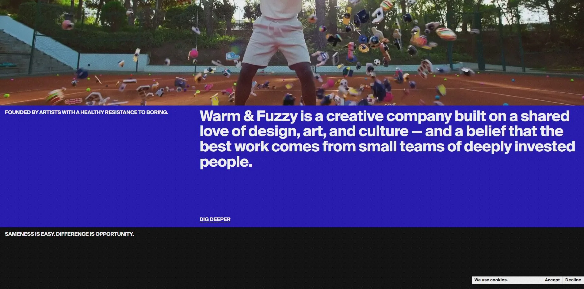
What makes the grid clever is that it will hold anything. The video slot at the top proves it. One pass is a close-up of a pizza crowded with pepperoni, graded pink and purple. The next is a tennis court with dozens of pieces of sports equipment flying up off the clay. The two have nothing in common in colour, subject or pace, but because they occupy the same slot above the same blue band, they read as one system.
The copy follows the same discipline. The services list is laid out flat at eight items, Direction, Production, Live Experiences, Design, Animation, Visual Effects, Editorial & Finishing, and AI & Emerging Tech, each followed by a number giving how many projects that discipline currently has in progress: design 14, animation 22, visual effects 11, live experiences 2.
A company willing to publish the live project count for each line of business is uncommon. It states the strong areas and the weak ones in the same breath, and the fact that live experiences stands at 2 is not hidden. That is probably why Content is the highest of the four scores.
Design
One typeface, one weight, from 14px to 137px.
The site loads only Suisse Intl, one 14 KB font file. All 2,135 characters on the page come from it, spread across more than eight million square pixels. There is no distinction of family between heading and body, and no distinction of weight either, only of size.
The risk with that is a hierarchy that turns to mush, and two things hold it up here. First, the size range is close to tenfold, and 137px next to 14px on the same screen leaves no doubt about which is the heading. Second, every block of text has its own background colour, so white type on blue and white type on black already belong to different sections without weight having to say so.
The colour discipline is equally hard. Text is only ever white or black, white on 407 elements and black on 265. Backgrounds are electric blue rgb(25, 11, 182), pure black and pure white, with one 5% white used for fine dividers. Of 693 elements on the page, 3 carry a border radius.
The sharpest piece of work is the footer. WARM & FUZZY runs across the full width of the page, and not in Suisse Intl but in a heavy grotesque with almost no straight corners and very tight counters. That letterform is the opposite of the cool Swiss sans doing all the other work, and it appears in this one place only.
Better still is the thing sitting on the letters. A three-dimensional object covered in stickers tumbles slowly above the footer and settles between the Z and the Y of FUZZY, nudging the two apart. It is not a still image, it keeps moving, so every arrival at the footer lands it in a slightly different position.
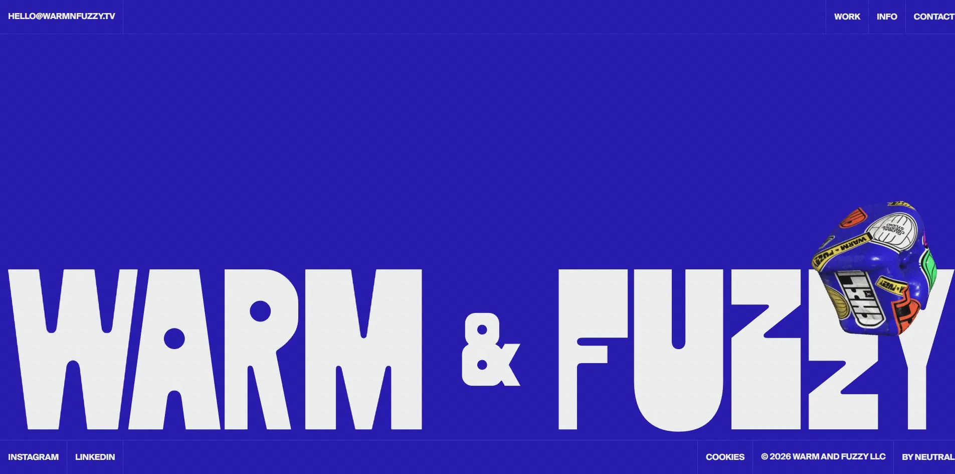
That move is worth taking. Footers are usually where effort stops, and here the site's only display letterform and its only 3D object both live there, giving the whole journey an ending rather than letting it fade out.
Motion
There is one easily-missed decision in the scrolling. The document itself does not scroll.
The page height is always exactly one viewport, and what actually scrolls is a container inside it more than eight thousand pixels tall, with Lenis driving that container. The advantage is that the easing is entirely under script control, with neither the browser's scrollbar nor its native inertia interfering. The cost is that everything depending on window scroll position has to be rebuilt, including anchor jumps, the browser's own scroll restoration, and most third-party scroll listeners.
The moving shapes along the top use a set of small 2D canvases rather than images or SVG, wrapped in a component called animated shape, and there are seventeen of them on the page. Drawing simple shapes on a canvas means they can change frame by frame without needing an image prepared for every state.
There are three films, all muted, autoplaying and looping. That is the right call, since muted autoplay is what browsers permit, and looping keeps something moving in that top slot without the visitor having to do anything.
Reduced motion gets 22 rules, which is conscientious coverage.
Engineering
The build is Next.js and the scrolling is Lenis.
The first paint figures are clean: 170ms to first byte, 400ms to first contentful paint, 405ms to load. Largest contentful paint happens at the same moment as first paint, both at 400ms, landing on the headline at the top. Cumulative layout shift is 0, with no shifts at all. Loading produces a single long task of 194ms.
Zero layout shift is uncommon on a site this full of video and animation. The reason is in the layout. Every piece of content here lives inside a band whose height was decided in advance, so video and shapes drop into frames that already exist rather than pushing their neighbours around when they load.
Fonts are frugal too. The whole site carries one 14 KB font file, because one family in one weight needs no separate download for bold.
Accessibility gets a lot right. The page declares its language, header, navigation, main and footer landmarks are all present, all forty-odd interactive controls carry names, none of the twenty-odd images is missing alternative text, and status and alert roles are used where they belong.
Focus, though, is completely invisible. The count of :focus rules in the stylesheet is zero, and the outline style on links is set to none. Browsing with a keyboard, you can move between links and never know which one you are on. Accessibility at 7.20 is the second lowest of the six developer categories, and the Dutch judge gave that category a 6.
There is a contrast worth noting here. This site is thorough on exactly the things an automated checker reports, semantics, markup and alt text, and empty on focus visibility, which is just as basic but does not always get flagged.
Scores and Team
| Award | Source | Date | Score |
|---|---|---|---|
| Site of the Day | Awwwards | 2026-09-12 | 7.26. Design 7.35 / Usability 7.03 / Creativity 7.35 / Content 7.40 |
| Developer Award | Awwwards | 2026-09-12 | 7.52. Semantics 7.60 / Animations 7.60 / Accessibility 7.20 / WPO 7.20 / Markup 7.60 |
Content at 7.40 is the highest of the four, which is rare on an award-winning site, where content is normally the weakest link. The content here really is substantial, with the services laid out at eight items and a live project count against each one.
Usability at 7.03 is the lowest, which lines up with keyboard focus being invisible.
The panel returned 7.00, 7.00, 7.00, 7.00 and 7.40, four identical sevens and one slightly above. A distribution that flat usually means a site with no obvious weakness and nothing that startles anybody either.
At 7.52 the developer score lands above the site total. Semantics, animations and markup all sit at 7.60, with performance and accessibility tied lowest at 7.20. Marking performance that low is a little surprising against a measured 400ms first paint and zero layout shift.
| Credit | Who |
|---|---|
| Neutral Studio | Design and development |
| Paulo Ferreira Jorge | Creator |
| Warm & Fuzzy | Client |
The last line of the footer reads BY NEUTRAL, so the studio put its own credit inside the client's footer, which is not common on agency-built sites.
The FWA lists nothing for this site.
Archive
- Award date
- 2026-09-12
- Awards
- Awwwards SOTD 2026-09-12, Awwwards DEV 2026-09-12
- Site
- https://www.warmnfuzzy.tv/
- Credits
- Neutral Studio, Paulo Ferreira Jorge, Warm & Fuzzy
- Design
- graphic
- Build
- dom
- Awwwards
- 7.26 / 10. Design 7.35 / Usability 7.03 / Creativity 7.35 / Content 7.40. Developer Award 7.52. https://www.awwwards.com/sites/warm-fuzzy
- Stack
- Next.js, Lenis, Suisse Intl in a single weight, 2D canvas shapes
- Total assets
- One 14 KB font file, three muted looping films, seventeen animated canvases
- Speed
- 170ms to first byte, 400ms first paint, layout shift 0, longest task 194ms