Cartier - Le Chœur des Pierres
The high jewellery piece makemepulse built for Cartier puts five loose stones on white silk and nothing else. Choose one and the whole screen turns that stone's colour. It was never given its own microsite. It lives inside the production cartier.com instead, which hands it roughly twenty languages and every shop update for free. A piece that sells nothing at all runs on the same chassis as the shop.
Visit site ↗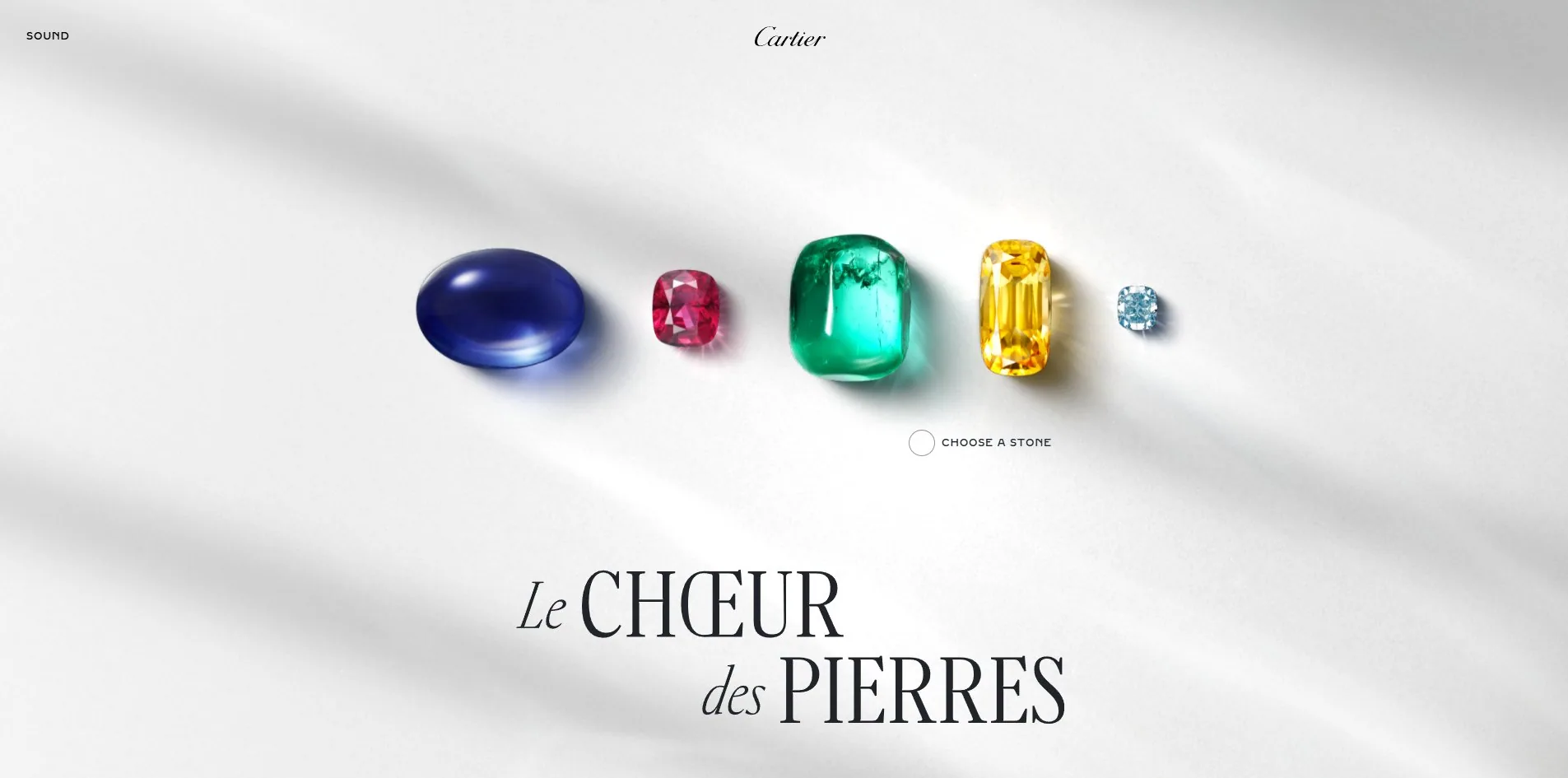
Concept
A high jewellery site usually starts from the finished piece. Here is the necklace, and here is a paragraph about the craft. This one runs the other way and starts from the raw material.
The first screen holds five loose stones and nothing else, resting on creased white silk with light raking in from the upper left and a small pool of soft shadow under each one. No product names, no prices, no navigational hints, just a small circle in the middle and a line reading choose a stone.
Choose the emerald and the whole screen turns deep green. That green is not a flat background, it is a layer of caustic light with slowly drifting highlights, like looking through water. The necklace hangs in the centre, its name OLORRA set below, and an arrow underneath invites you to scroll on.
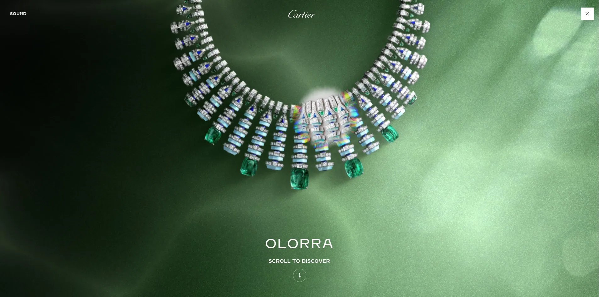
That step is where the concept lands. The colour of the stone does not just determine the finished piece, it determines the entire room you are standing in. Five stones are five completely different worlds, and whichever one a visitor picks is the one they walk into.
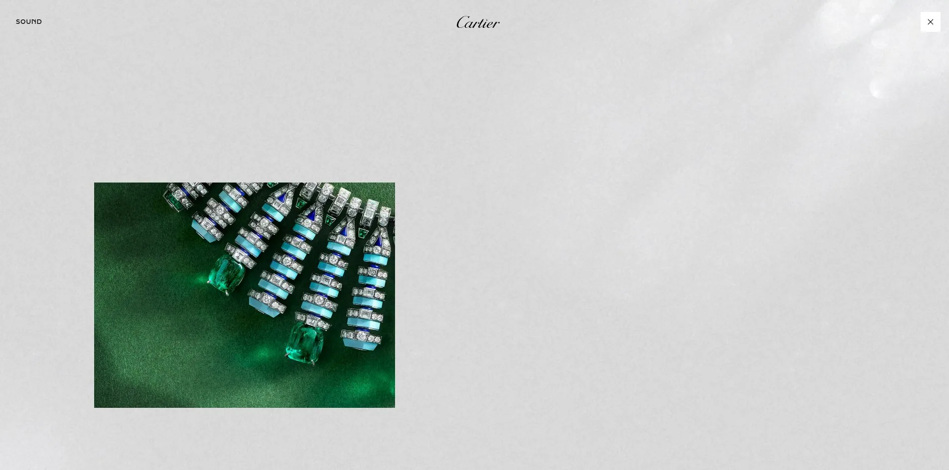
Scrolling further pushes in to a section of the necklace, the green turning from mist into velvet, close enough to show the inclusions inside each emerald and the sapphire triangles between the turquoise batons. The team's own statement says another interaction lifts the finished piece away to reveal the guaché beneath it, the hand-painted design drawing. Putting the finished object and the drawing in the same position is the other half of the sentence those five loose stones started: a stone at one end, a painting at the other, and the jewellery in between.
Design
Cartier has its own typefaces, and this piece uses only those two.
Headings are set in Fancy Cut Pro, a serif of extreme contrast with strokes running from hairline to heavy and sharp joins between them. Body text is Brilliant Cut Pro, a clean sans with tight apertures, carrying 3,849 characters across the page. The display face carries only 782, yet occupies the largest area of any type on the site.
How the title is set is worth studying too. Le CHŒUR des PIERRES is broken over two staggered lines, with the lowercase Le and des in italic and the capitalised CHŒUR and PIERRES upright, two letterforms alternating inside one phrase. That is an old rule from jewellery advertising. Shrink the articles and connecting words into italic so the nouns stand up by themselves.
On colour, the interface layer is essentially black and white. Pure black is the text colour on 2,398 elements and a second near-black on 779. Across 3,184 elements on the page, exactly 2 carry a border radius.
All the actual colour comes from the content. Each of the five stones brings its own palette, and choosing one hands that palette the whole screen. The interface deliberately retreats into neutrality and gives every bit of saturation to the photography. Anyone building a product showcase can follow the same logic. The plainer the interface, the louder the product's colour.
The light is where the real skill shows. On the silk screen the shadows are soft with a little dispersion in them, and the creases carry very gradual shifts of tone. Inside a stone's world the background is a moving layer of caustics, with the shape and drift of the bright patches reading like light under water. Neither of those is a still image, and both change slowly enough that you never notice anything moving, only that the picture is alive.
Motion
There are two interactions, choosing and scrolling, and nothing else.
Choosing a stone is a single click followed by a full-screen transition. Inside a stone's world, scrolling down advances the story, first the whole necklace and then a closer view of one part of it.
The 3D layer uses four glTF models whose filenames state their jobs plainly: one is the stone selection scene, one is the finished product shot, and two are the guaché, a plain version and one with depth-of-field blur. All four use Basis Universal compressed textures, with a dedicated worker script doing the decoding.
That choice matters. Basis keeps textures compressed in video memory, and running the decode in a worker keeps it off the main thread. For an experience that has to sit inside a production shop page, this is a hard requirement, because the main thread is already carrying a cart, a login and payment components, and the 3D layer cannot compete with them for it.
Audio comes as four files with equally clear jobs: one music bed for the landing, another for the inner pages, one click sound and one hover sound. The two music beds are 640 KB each, making them the heaviest assets on the page after script. The toggle sits in the top left, labelled SOUND.
On reduced motion, the stylesheet carries 33 rules, far more than most sites manage. Those come from Cartier's own design system rather than being written for this piece, but they do reach the transitions on the page.
Engineering
What makes this page worth studying is that it is an experience and a shop at the same time.
The foundation is Adobe Experience Manager, whose clientlib and a 1.12.4-aem build of jQuery are both visible in the page. The experience layer is Nuxt. Two stacks in one document come to 3,184 elements and 112 requests.
One visit transfers 3.57 MB across 78 files. Script accounts for 1.4 MB, audio for another 1.4 MB, and images and fonts together for under 700 KB.
Part of that 1.4 MB of script has nothing to do with this piece. A contract cancellation form at 356 KB, a mini bag at 180 KB, a login button at 170 KB, PayPal express checkout at 142 KB and Apple Pay express checkout at 93 KB all load on an editorial page that sells nothing. Together that is close to 950 KB, heavier than the entire 3D payload.
This is the direct bill for building the experience inside the production shop. What it buys is real. The piece rolls out across roughly twenty languages with the shop, updates with the shop, and needs no separate deployment. What it costs is the shop's whole inheritance, including those two dialogs, one for cookie consent and one that detects location and asks whether you would rather use a different country's store. Anyone who wants to see the five stones has to answer two questions about something else first.
Speed itself holds up. First byte at 483ms, first contentful paint at 976ms, largest contentful paint at 2,976ms. Cumulative layout shift is only 0.0011, essentially nothing, which is careful work on a page carrying this many elements. Loading produces 11 long tasks with the longest at 381ms, spread out rather than stacking into one freeze.
Accessibility splits sharply. What comes from the design system is thorough: the page declares its language, the header, navigation and main landmarks are all present, and the stylesheet carries 79 focus rules. But of the two hundred-odd images on the page, the overwhelming majority carry no alternative text, and images are essentially what this page is. For somebody using a screen reader, the five stones, the necklace and the drawing are all blank.
Scores and Team
| Award | Source | Date | Score |
|---|---|---|---|
| FWA of the Day | The FWA | 2026-09-13 | 82 POINTS, DAYS 11 |
The FWA publishes no category scores here, only a statement from the team. They describe the project as an immersive journey in which a visitor picks a stone, enters its world, discovers the jewel it inspired, and finally lifts the finished piece away to reveal the hand-painted drawing underneath. The statement also singles out two things. A deliberately restrained interface, and the fact that the experience is integrated into cartier.com and rolled out across roughly twenty languages.
The second of those is clearly visible in what the site actually does. It really does live inside the production site, and it really does carry the production site's full weight. Presenting that as an achievement rather than a compromise is the right call, because an experience that ships in twenty languages with the shop is worth more than a beautiful isolated microsite.
| Credit | Who | FWA wins |
|---|---|---|
| makemepulse | French creative studio | 98 |
| Alexandre Saad | Creator | 2 |
| Alexis Demachy | Creator | 3 |
| Cartier | Client | 1 |
makemepulse carries 98 FWAs, which stands out sharply on this list. The two individual credits hold two and three between them, which says the weight is on the studio rather than on any one person. Cartier itself is credited as well, with one.
Nothing for it turns up at Awwwards. It was never a standalone site in the first place, only a section inside a shop, so submitting it as a site would not really work.
Archive
- Award date
- 2026-09-13
- Awards
- The FWA FOTD 2026-09-13
- Site
- https://www.cartier.com/en-fr/lechoeurdespierres
- Credits
- makemepulse, Alexandre Saad, Alexis Demachy, Cartier
- Design
- cinematic
- Build
- canvas
- The FWA
- 82 POINTS, DAYS 11. https://thefwa.com/cases/cartier-le-choeur-des-pierres
- Stack
- Adobe Experience Manager, Nuxt, jQuery 1.12.4-aem, glTF, Basis Universal compressed textures
- Total assets
- 3.57 MB, of which script is 1.4 MB and audio 1.4 MB
- Speed
- 483ms to first byte, 976ms first paint, 2,976ms largest contentful paint, layout shift 0.0011