Léo Parpeix - Portfolio 2026
A rendered sculpture studio, a plaster flower standing on a plinth, and the technical drawing of that same flower hanging on the wall beside it. This is a portfolio built to find work, and Awwwards scored its animation 8.40, the highest of the six developer categories. Getting into the room takes 31 MB of download, and the largest words inside it are misspelt.
Visit site ↗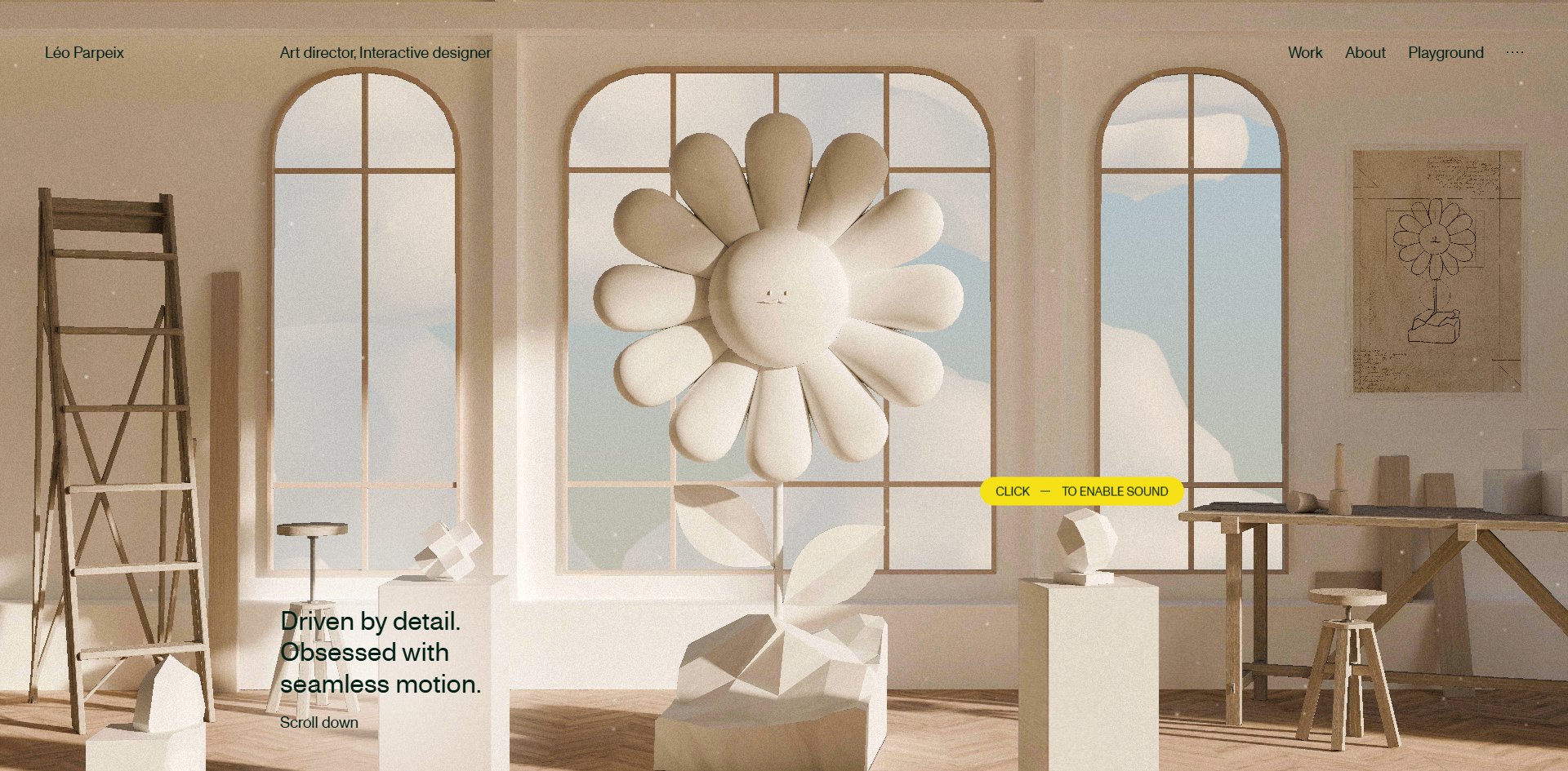
Concept
A portfolio is usually a wall with pictures hung on it. This one is a room, and you go inside.
What opens is no poster. It is a 3D sculptor's studio: cream plaster walls, three arched windows, a herringbone wooden floor, a ladder leaning against the wall, a few plinths holding small geometric studies. On the central plinth stands a plaster daisy with a face, and on the wall to the right hangs a technical drawing of that same flower.
Putting the finished object and its drawing in one room says everything the site has to say in a single picture. Beside it sits one line of text: Driven by detail. Obsessed with seamless motion.
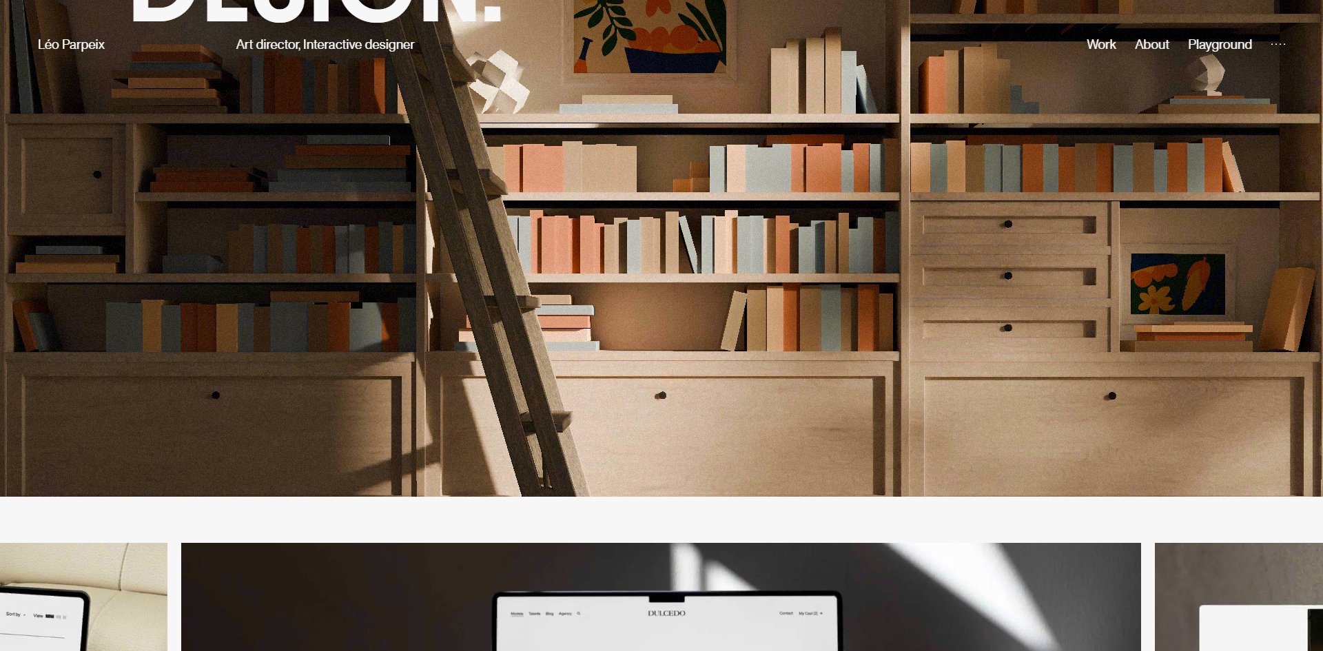
Each section brings another room. The library is warm timber shelving, pastel book spines, a leaning ladder and a few cut-paper pictures. Eighty-nine compressed textures and six 3D models carry these environments.
The most distinctive move is that the site points at the fun instead of hiding it. Midway down the page a 3D bee flies past with a line of small text below it: click to feed the bee. The same approach runs on the cursor, where moving the mouse brings up a small yellow pill reading click to turn sound on.
The site does not hide its easter eggs and wait for you to find them, it tells you where to click. For a portfolio that is a smart trade: hidden extras go undiscovered by most visitors, while stating them plainly gets people to actually try.
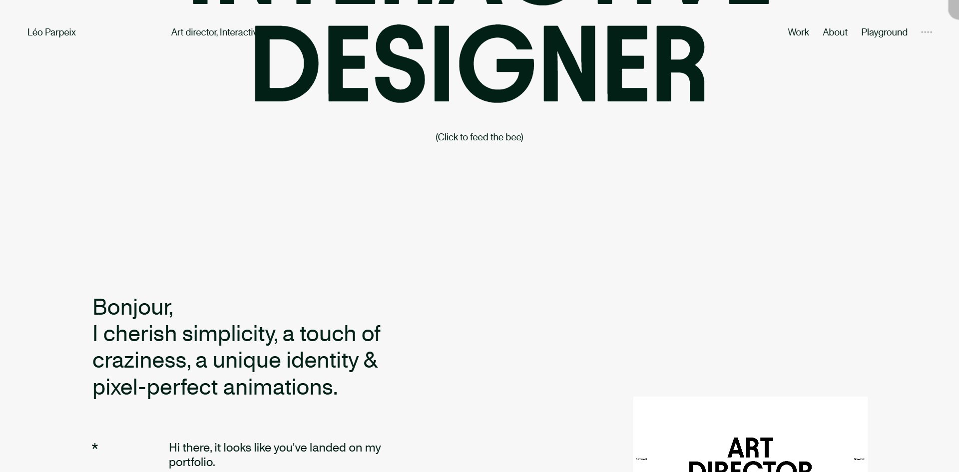
Saying so keeps people on the page longer. Two things are given up for it. Opening the site means downloading 31 MB, 25 of it texture, which is a great deal of furnishing for one room. And the whole approach points attention at the room rather than at the work displayed in it, with twenty-odd projects ending up compressed into one table and a strip of thumbnails.
Soft light, matte plaster, shallow depth of field, plain timber: everyone doing 3D product visualisation in the past few years has used this look, and he did not invent it. What is original is the flower: a small handmade object with a face on it, turned into a personal mark and reused across the whole site.
Design
Colour is used extremely sparingly, and the black here is not actually black. The site has three text colours: pure black in 631 places, a very dark ink green in 592, and an off-white in 94. That ink green is so dark you would not call it green, and nearly all the large type is set in it.
Every warm tone in the 3D scenes is rendered rather than set in CSS, so the CSS side looks almost bare by comparison. That division is worth noting: the picture handles the picture and the interface handles the interface, with neither borrowing colour from the other.
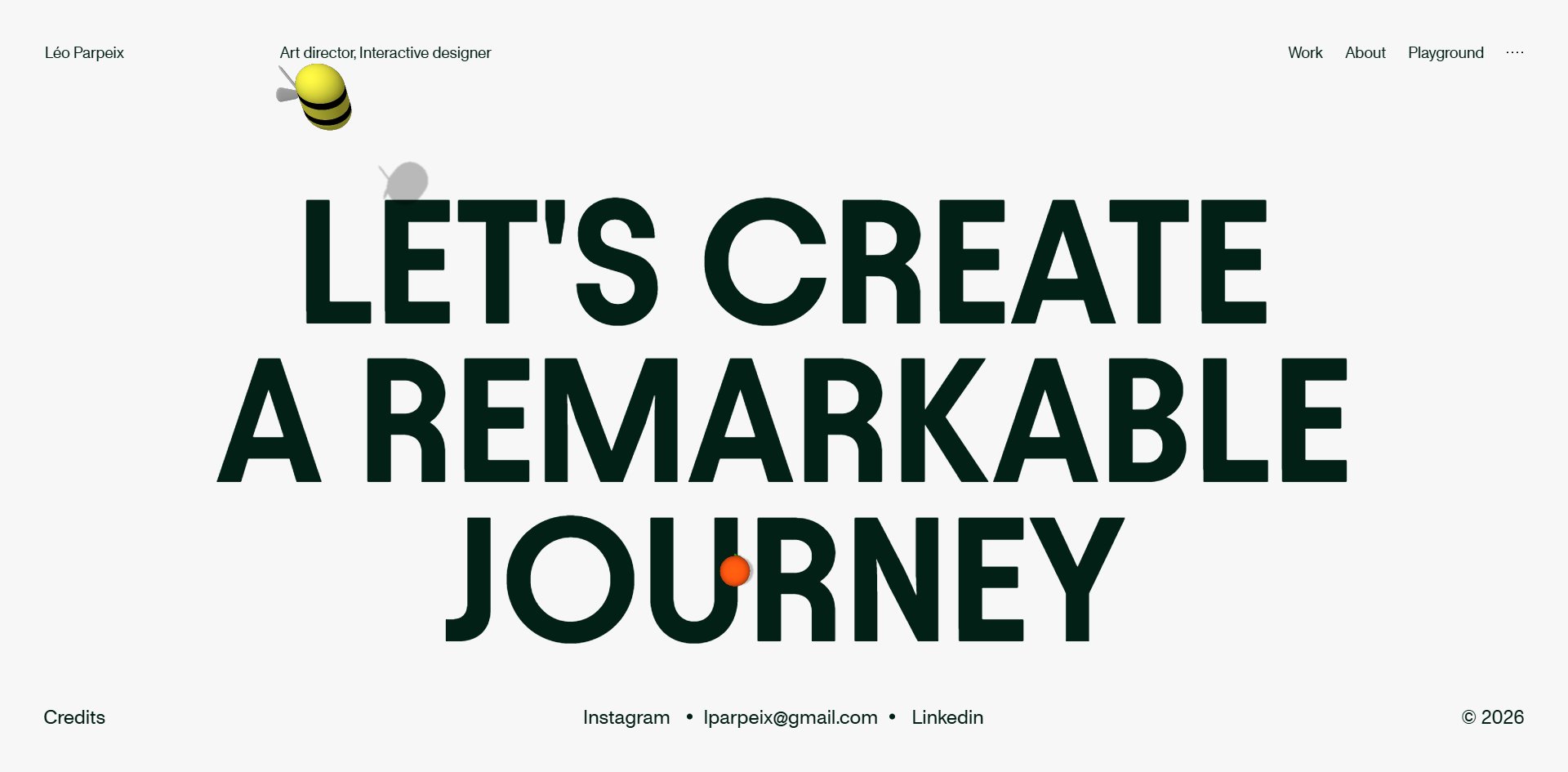
Saturated colour barely appears at all. There are four bright things on the whole site: the bee, the yellow pill that follows the mouse, the yellow drag tag on the project strips, and a single orange dot lodged in the counter of the U in the footer's JOURNEY. Yellow is reserved for "you can touch this" and appears nowhere else.
There are two typefaces. One handles large type only, writing 247 characters but covering 5.19 million square pixels at sizes from 19 to 216px. The other handles body copy, writing 9,712 characters across 3.44 million square pixels. So two and a half percent of the words cover sixty percent of the area, and the whole page rests on a handful of enormous words.
Almost nothing is rounded: 1,103 elements have right angles and four carry a slight radius.
Three kinds of image take turns. The 3D interiors back every section. Project thumbnails and video, twenty-odd of them, are arranged into draggable horizontal strips. And then there are the flower and the bee, which belong to no scene and simply float on the layout.
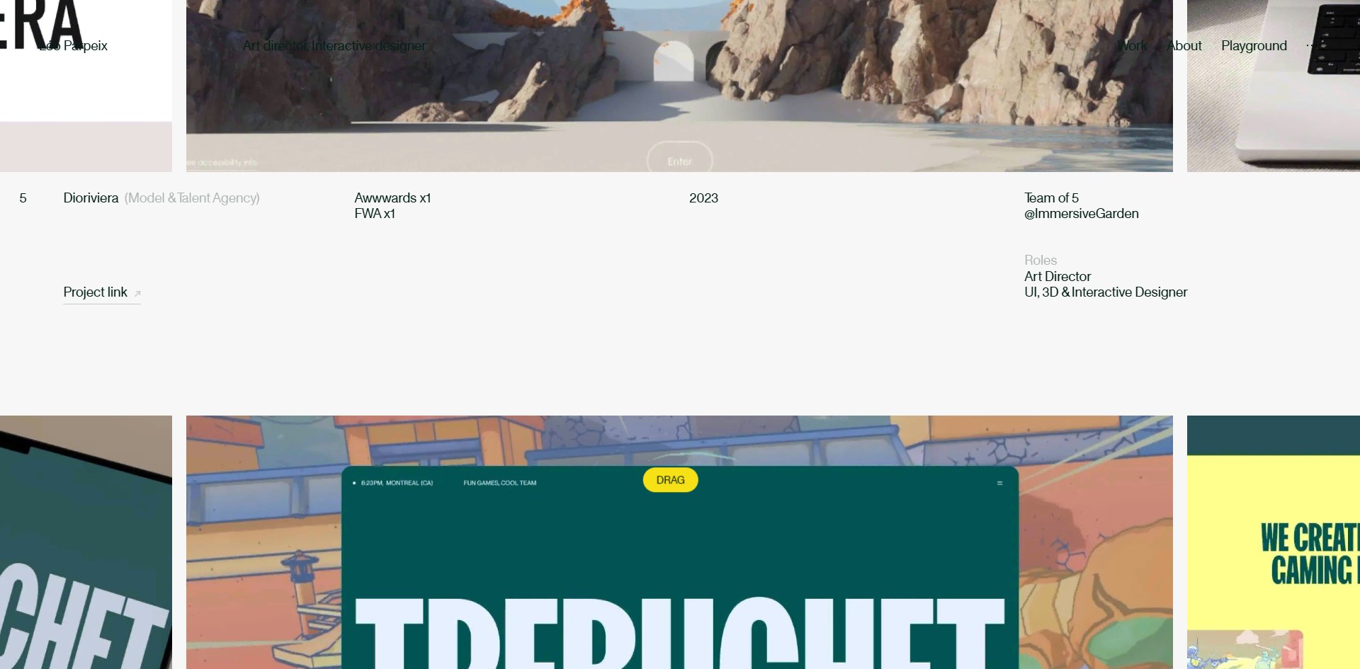
The best content decision is the Archives table. It replaces the usual big-image-and-title portfolio grid with rows giving the year, how many awards the project won, how many people were on the team, which agency it was made at, and what he personally did. The Dioriviera row says a team of five at ImmersiveGarden with his role given as art director plus UI, 3D and interactive designer.
A portfolio built to find work that volunteers "I was one of five" is unusual in this category. Where other portfolios fill the space with big pictures, this one fills it with information, and being straight about it actually helps the reader judge what he can do.
There is one hard typographic fault. The word Passionnate is misspelt, the correct form being Passionate, and it is set at 216px. A portfolio that opens by claiming attention to detail carries a spelling error at the largest size on the site.
Motion
When you scroll, what moves is not the page. It is a camera walking forward through the rooms.
The picture layer is two three.js canvases, one of which renders at 3840×1890 while displaying at 1920×945, exactly twice the size. That is not a high-resolution display doing it, it is a deliberate choice to supersample by two. The cost is four times as much pixel shading work, and what it buys is 3D edges with no aliasing at all.
Nothing else on the site asks this much of the graphics card, which goes a long way towards explaining the animation score. Anybody wanting clean 3D should remember the trade: supersampling beats any post-process anti-aliasing, and the GPU cost really is four times over.
Smooth scrolling comes from Lenis. The two frame-rate figures want reading separately: 60.1 fps sitting still with nothing dropped, and 58.9 fps while scrolling. Split across twelve stretches that reads 60, 55, 49 and then nine straight sixties. The dropped frames cluster in the handover from the 3D opening screen into the content, and once past it the page holds steady all the way down.
Page stability is very good, with no movement at all for a visitor sitting still, and the layout and the largest piece of content arriving at almost the same moment. Achieving that on a 31 MB 3D site means they draw the structure first and bring assets in afterwards.
Sound is four tracks at a default volume of 0.7, and it only starts once you click. The site does say so, but in a way that is easy to miss. The cue lives on that yellow pill following the mouse, and while the mouse is still the pill shrinks to nothing. Anybody who does not move the mouse will think there was no warning at all.
The signature small touch is the bee, which drifts with the page and responds to a click.
Nothing at all answers the reduce-motion preference. There are no matching rules in the stylesheet and no check in the code, so the number of animations running is identical whether the setting is on or off.
Engineering
A single-page application built with Vite, one main file. Two three.js canvases, Howler for audio, Lenis for scrolling.
One visit downloads 31.8 MB, most of it 89 compressed textures at 25.5 MB. The filenames read like a scene list: the front and back layers of trees at 1.7 and 1.6 MB, the floorboards at 1.5 MB, the ground at 1.4 MB, the stone at 1.25 MB. Geometry is six files at 2.3 MB, the largest named scene_v15.glb, with the version number in the filename telling you this scene went through fifteen passes. The rest is 2 MB of images, 785 KB of audio, a 327 KB decoder, 435 KB of script and 109 KB of font.
Choosing KTX2 compressed textures is the right call: they stay compressed in video memory, so 25 MB of download does not balloon several times over on the graphics card the way ordinary PNG would. The cost is that a first visit has to finish downloading all of them, with no batching at all. That is a clear trade worth working through if you are building something similar: the texture format determines memory use and the loading strategy determines how long the first visit waits, and those are two separate decisions.
First paint is good in spite of all that, with the layout appearing in three to six hundred milliseconds, because the 3D assets are only fetched by code after the page has loaded.
Accessibility is the weakest part of this site. Two things are done right: the page declares its language, and all 24 images carry empty alt text with none missed.
The rest is essentially empty. The page has one <main> landmark and nothing else, with no header, navigation, footer or section markers and no element declaring what role it plays. There is no skip-to-content link. The only H1 on the site is that 18.67px wordmark in the header, while the largest type on the page, including the 216px INTERACTIVE DESIGNER and that misspelt Passionnate, is all marked as H2.
Several sentences are broken across consecutive headings, so "let's create", "a remarkable" and "journey" arrive as three separate headings. Visually that is one sentence over three lines. A screen reader announces three headings.
There is no focus outline at all. Browsing with the keyboard, you cannot see where you are anywhere, and the first press of Tab lands on the sound button, which has neither a name nor any text. So a keyboard user is stuck on arrival, unable to tell where they are or what pressing it would do.
Scores and Team
| Award | Source | Date | Score |
|---|---|---|---|
| Site of the Day | Awwwards | 2026-09-14 | 7.69. Design 7.79 / Usability 7.34 / Creativity 8.04 / Content 7.63 |
| Developer Award | Awwwards | 2026-09-14 | 7.47. Semantics 7.00 / Animations 8.40 / Accessibility 7.00 / WPO 7.20 / Markup 7.40 |
Creativity is the only one of the four above 8, and Usability is lowest. Five jurors returned 7.00, 7.20, 7.00, 7.40 and 7.40, tightly grouped with nothing far below the rest, so the design side is in broad agreement.
The gap is far wider on the developer side, and the jury has already said it plainly: animation at 8.40 sits well above everything else while semantics and accessibility tie lowest at 7.00. The clearest single card comes from the Ukrainian juror, who gave animation a perfect ten and gave semantics, accessibility and performance a six each.
The card lines up with the site almost point for point. On the motion side the page never shifts and scrolling holds 58.9 fps. On the semantics side there is one landmark and no role markers at all.
| Credit | Who | Awwwards record |
|---|---|---|
| Léo Parpeix | France, art director and interactive designer at Locomotive | 5 works, SOTD 1, HM 5 |
| Thoma Lecornu | No findable Awwwards profile | — |
This is Parpeix's first Site of the Day after five honourable mentions. His Awwwards profile names Locomotive as his employer and carries the line that he is looking for freelance work at a good agency.
The portfolio has a very clear commercial purpose and every decision on the page serves it, including that table volunteering the team sizes. For somebody looking for work, honesty is more persuasive than overstatement.
Archive
- Award date
- 2026-09-14
- Awards
- Awwwards SOTD 2026-09-14, Awwwards DEV 2026-09-14
- Site
- https://www.leoparpeix.com/
- Credits
- Léo Parpeix, Thoma Lecornu
- Type
- portfolio
- Awwwards
- 7.69 / 10. Design 7.79 / Usability 7.34 / Creativity 8.04 / Content 7.63. Developer Award 7.47. https://www.awwwards.com/sites/leo-parpeix-portfolio-2026
- Stack
- Vite, three.js r153, Howler.js, Lenis, KTX2 compressed textures
- Total assets
- 31.8 MB, of which 89 compressed textures are 25.5 MB and 3D models 2.3 MB
- Speed
- Layout at 380 to 590ms, no layout shift. 60.1 fps stationary, 58.9 fps scrolling, slowest stretch 49 fps