ZIRKA Interceptor
A live Kyiv clock across the top, your own mouse coordinates ticking in the corners, and every line of body copy set in 11px monospace as though a machine had printed it. A Ukrainian company sells a counter-drone interceptor this way, by making you believe there is real hardware running on the other side of the screen. One visit downloads 30 MB, and keyboard users cannot see where they are.
Visit site ↗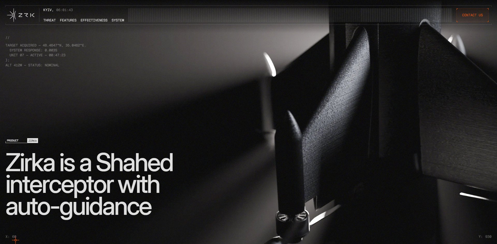
Concept
Most product sites write copy telling you how good the machine is. This one writes none of that. It makes the page itself behave like a piece of equipment that is switched on, with a clock running and readouts updating.
A clock runs at the top of the page, seconds ticking over, showing the time in Kyiv. The bottom corners permanently display X: 0 and Y: 0, which are your mouse coordinates. A thin ruler across the top fills with orange as you scroll down. The block of text in the upper left of the first screen is not copy but telemetry laid out like source code: it opens with //, closes with };, and in between says target acquired, gives coordinates, reports a system response of 0.003 seconds and states that unit 07 is active, with one more line after the closing brace giving an altitude of 412 metres and a status of nominal.
Not one of those numbers is useful information. None of them tells you range, payload or price. They are there to give the page the feel of equipment in operation.
The boldest decision is setting all the body copy in 11 to 13px monospace. Across the whole site the monospace writes 4,530 characters and the headline face only 1,151, and the monospace never goes above 13px while the headline face never goes below 19.
Headlines are for people. The body copy reads like something a machine printed. A company selling weapons to a defence ministry uses that split to step out of advertising voice: it does not sound like a pitch, it sounds like a report.
The effect does not come free, and there are two costs. The first is legibility, because forty screens of content run through a single 11px setting and it becomes tiring. The second is subtler: some of those numbers are real and some are not. The Kyiv clock is real. The target-acquired lines are set copy. The site never distinguishes between them, and the whole persuasive effect rests on you being unable to tell.
Military head-up displays and terminal interfaces: defence-tech sites have settled into this language over the past few years, and none of it starts here. What is genuinely original is not on screen. It is the decision to take the orange out of the role of an accent colour and lay it over every documentary photograph as a filter.
Design
Colour is where the discipline is hardest. Three CSS variables describe the entire system: orange #fc4f00, near-black #050505, off-white #ddd. The site has ten text colours, which in practice means the off-white at four opacities, one dark grey step, plus the orange and the black. The orange appears in 55 places. That dark grey step appears in 810.
In other words most of the text on this site is deliberately dimmed, and the orange is what gets lifted out of the dark. Anyone chasing this kind of restraint should note that the trick is not using less orange, it is pushing everything else down far enough.
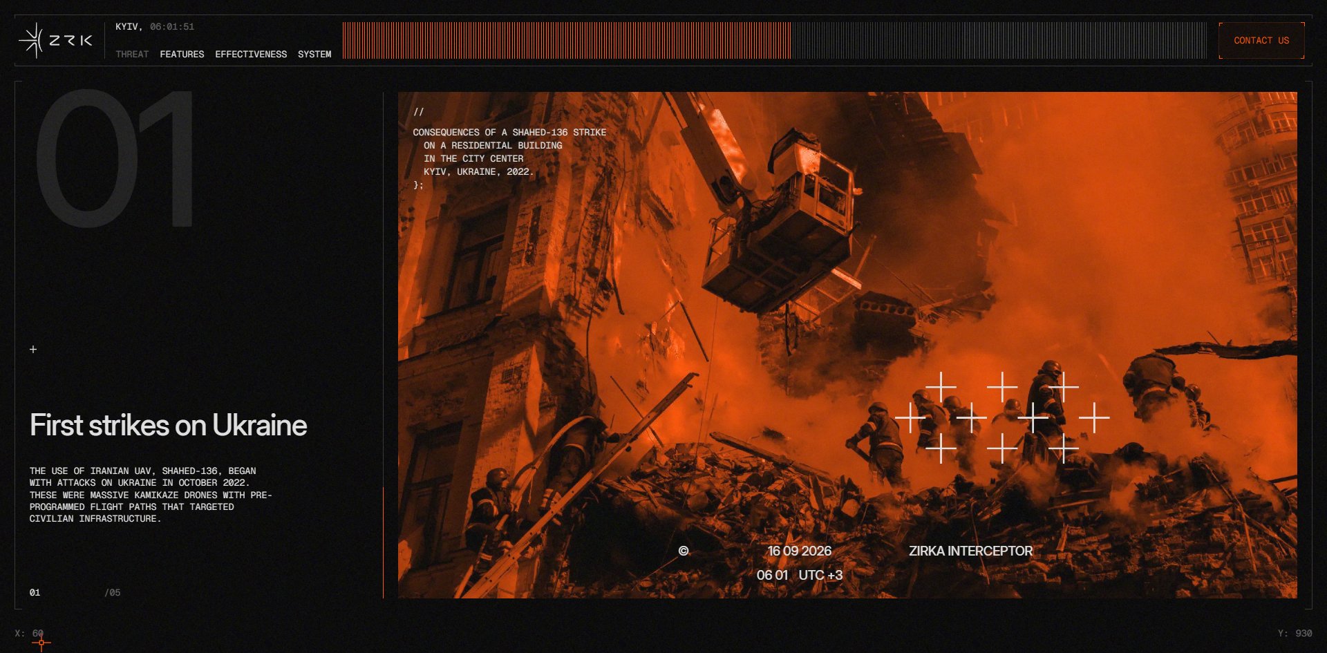
How the orange is used matters more than the value, because it is not only an accent colour but a filter laid over photographs. In the chapters about the threat, documentary photographs of firefighters working on a burning apartment block are duotoned entirely in that orange, with white crosshairs set over them and a timestamp along the bottom drawn from the same live clock as the header.
So photographs taken long before end up looking like a feed coming in right now. The same orange runs through the progress ruler, the bar chart, the button outlines and the photographs, and that is how the photographs join the interface, reading as instrumentation rather than illustration.
The geometry is equally uncompromising. Across 1,786 elements the border radius is zero, and not one button, card or label is round. Combined with crop marks in the corners and a great deal of one-pixel rule, the page reads as a technical drawing rather than a web page.
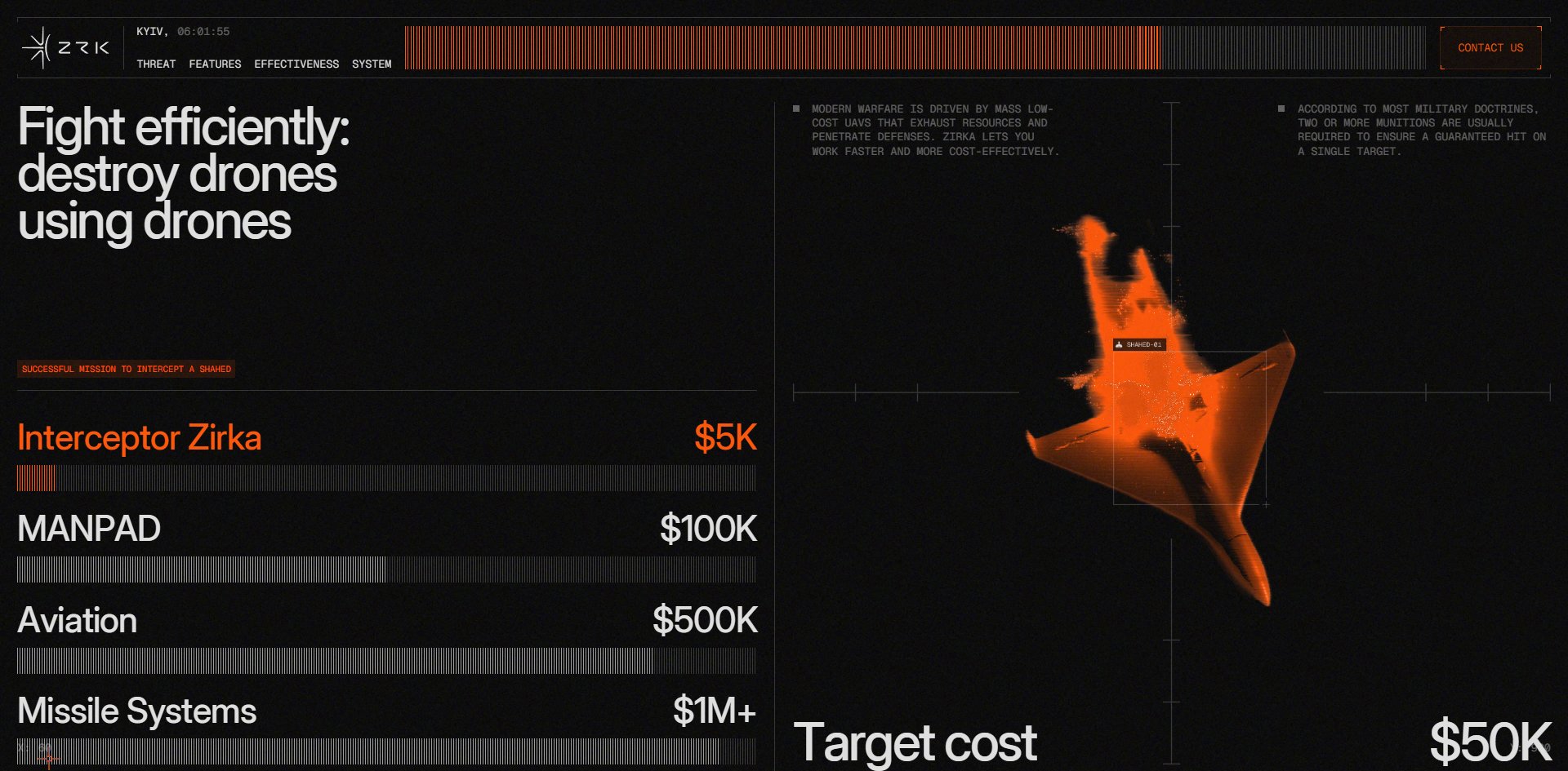
One stretch of information design is extremely solid. The cost comparison lays four options out as horizontal bars: this interceptor at five thousand dollars, a shoulder-launched missile at a hundred thousand, scrambling aircraft at half a million, a missile system above a million. Beside them sits an orange point-cloud render of the target drone inside a box with an ID number, above the line target cost fifty thousand. The bars are filled with the same vertical hatching as the progress ruler rather than solid colour.
The entire commercial argument lands on one screen without a single adjective. This is the most instructive stretch on the site: the numbers do the talking, and nobody had to write "exceptional value".
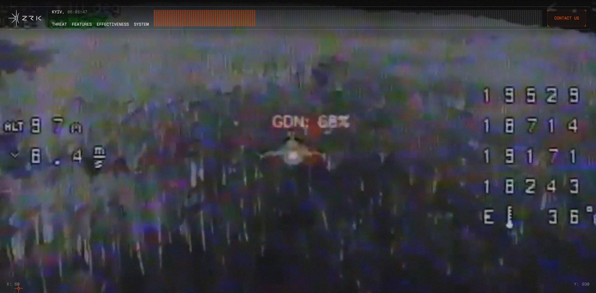
Product photography, documentary photography and simulated footage, and the lines between them are sharp. Product photography is shot near-black in very low light with only hard specular edges surviving. Documentary photography is always orange duotone. The third group is simulated thermal and gun-camera footage full of noise, scan lines and seven-segment readouts, and that screen happens to be the slowest on the site. All three are dark. There is no bright surface anywhere.
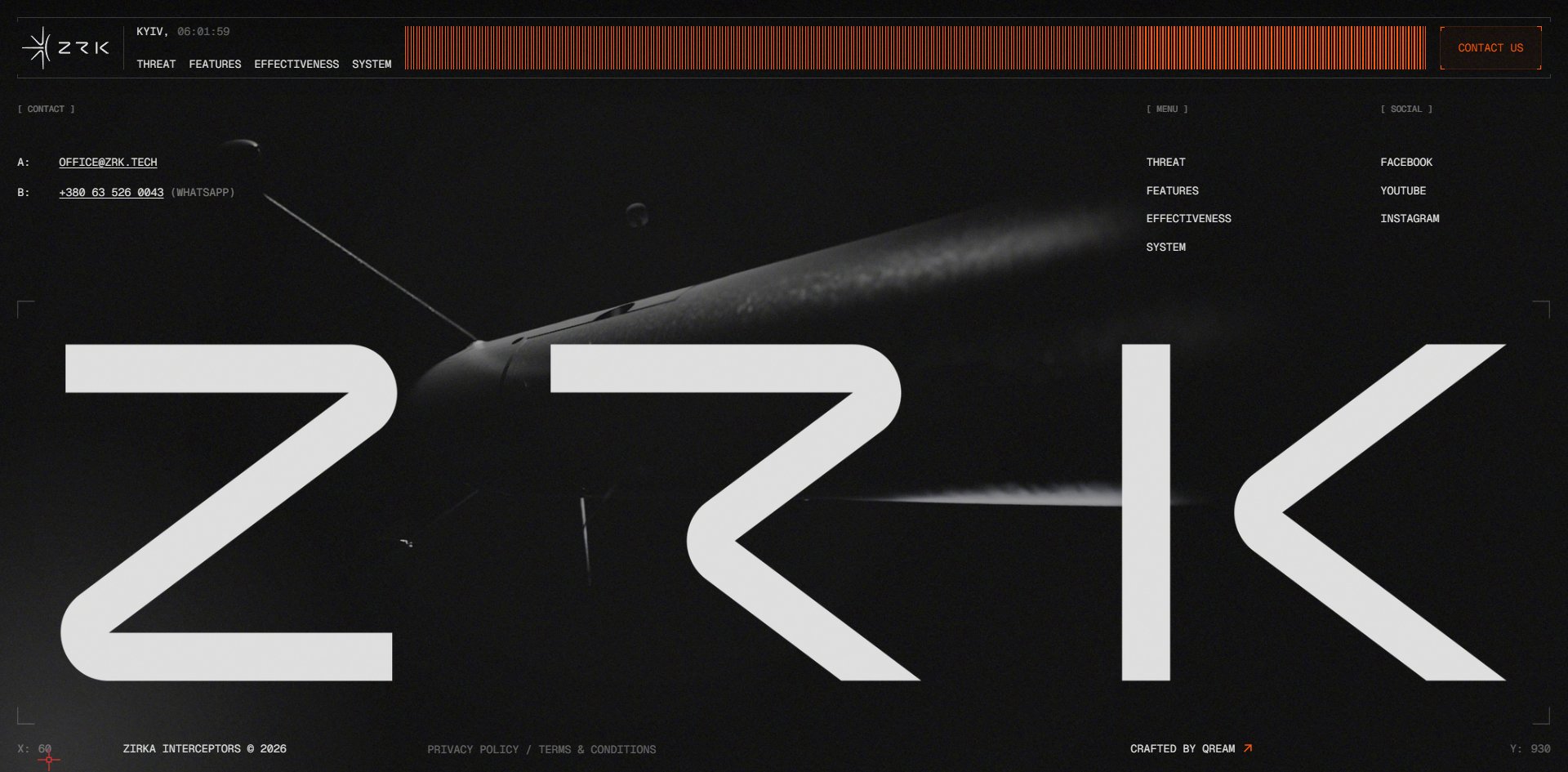
The finest piece of work is the footer, where the three letters ZRK span the full width with the airframe showing through the counters and the wing crossing the K.
Motion
From top to bottom there is exactly one thing to do, and that is scroll.
Scrolling drives a sequence of 458 numbered WebP images drawn frame by frame into two canvases, one in the first screen and one in the product section further down. There is no WebGL anywhere. The effect is of a camera tracking around the airframe.
GSAP is used with surprising restraint: 45 scroll triggers, not one pinned element, and only two tied to scroll progress. The remaining 43 are simple play-on-entry animations. Forty screens without pinning anything, with all the depth coming from that image sequence rather than from hijacking the scroll. That is worth remembering: a long page can build depth without pinning.
Lenis takes over the scroll with lerp set to 0.05. That is a slow value, so the page keeps gliding for a while after you let go, and against 39.6 screens of length it takes a lot of wheel to reach the bottom.
The mouse pointer is taken over completely. The system cursor is hidden and the site draws its own 28×28 orange targeting reticle using difference blending, so it inverts to dark automatically whenever it passes over something light. Move it onto a nav link and the reticle rotates ninety degrees into a vertical bar while the word gets struck through. Acquire, then cross out. It is the most on-theme small move on the site.
A site with this much movement on it ignores the reduce-motion preference completely. Turn the setting on and all 98 animations carry on running. There are no matching rules in the stylesheet and no check in the code. A site running a 458-frame image sequence under a one-megabyte animated grain overlay with simulated video noise on top ignores the setting entirely.
Engineering
This is a Webflow site, carrying Webflow's own markers and jQuery plus five Webflow code chunks. The custom layer is externally hosted GSAP, ScrollTrigger, Observer and Lenis, with Observer loaded twice. Both canvases are ordinary 2D canvases rather than WebGL.
One visit downloads 30.3 MB. Images account for 494 requests and 24.5 MB, of which 489 are that WebP sequence at 23.3 MB. Video is 7 files and 5.2 MB with the largest at 4 MB. There is also a single grain GIF at 1.1 MB, spending a megabyte of animated image on something a small tiling texture would have done.
The real problem is not the size but the timing. That image sequence is requested all at once: the first frame goes out at 316 milliseconds and the 229th at 538, all of it before the page has finished loading. Whether or not a visitor ever scrolls that far, 23 MB leaves the server in the opening fifth of a second.
That is worth watching for anyone building long pages. The same image sequence loaded in chunks on demand versus dispatched all at once makes an enormous difference to the visitor, especially on mobile networks.
Page stability is also a problem. A visitor sitting perfectly still on the first screen watches the page shift more than sixty times, accumulating a layout shift score of 0.20, which sits right on Google's "needs improvement" boundary. All of it comes from the first screen's own entrance animation and has nothing to do with scrolling.
There are two frame-rate figures and they point opposite ways. Sitting still gives 60 fps with nothing dropped, which looks perfect. Measuring while scrolling gives 57.2 fps on average, and splitting the page into twelve stretches gives 60, 60, 60, 50, 59, 60, 60, 60, 60, 60, 58, 52. The two troughs are the simulated gun-camera screen and the footer.
Measuring only the stationary figure leads to a completely wrong conclusion, which is a common mistake when checking performance.
This is where the site falls down hardest, and several of the failures are basic. The page never declares its language. There is one H1, fifteen H2s and no H3 at all, and four of those 96px H2s only form a complete sentence when read together, set as a staircase indent. Visually it is one sentence over four lines. A screen reader hears four headings.
Three links point at #, and the phone number in the footer does nothing when clicked because it was never made into a dialling link. Browsing with the keyboard, you cannot see where the focus is anywhere, because the outline is set to zero with nothing put in its place.
Images are handled correctly: 132 of 133 carry empty alt text and only one genuinely missed it. Empty alt is the right markup for decorative images, so that is not a fault.
One more error should not have shipped. The nav reads THREAT, FEATURES, EFFECTIVENESS, SYSTEM from left to right, but clicking them jumps to positions 18,679, 14,469, 11,968 and 32,758 down the page. The first three walk backwards through a page nearly forty screens long. When the nav order and the content order disagree, visitors lose their place.
Scores and Team
| Award | Source | Date | Score |
|---|---|---|---|
| FWA of the Day | The FWA | 2026-09-14 | 82 POINTS, DAYS 6 |
On the project page Qream say they set out to do three things: explain the product's advantages, explain the scale of the threat from Russian strike drones, and explain where this interceptor sits within the wider air defence system. The page does all three in a deliberately staged order, with the threat narrative taking five stacked chapters numbered 01 to 05, the specification after it, and the cost comparison last.
| Credit | Who | FWA wins |
|---|---|---|
| Qream Design Agency | Kyiv design company | 7 |
| Vladyslav Larushkin | Kyiv, describes himself as a Webflow developer | 2 |
| Yehor Herasymenko | Kyiv, digital designer | 4 |
| Illya Bilyk | Kyiv, 3D and motion design | 5 |
All four credits are in Kyiv and every kind of work has somebody attached to it: the company, the Webflow developer, the designer, the 3D and motion work. That is uncommon among award winners, where the credits usually stop at company level or leave a whole discipline out.
The developer's own profile opens with the word Webflow, which matches the markers on the page exactly and saves any guessing.
Qream are regulars, with several other projects in the 81 to 83 range under the same names. This is their seventh FWA. Awwwards has no entry for this site, and the site carries no award badges, with its only outbound links going to three social accounts.
Archive
- Award date
- 2026-09-14
- Awards
- The FWA FOTD 2026-09-14
- Site
- https://www.zrk.technology/
- Credits
- Qream Design Agency, Vladyslav Larushkin, Yehor Herasymenko, Illya Bilyk
- Type
- product
- The FWA
- 82 POINTS, DAYS 6. https://thefwa.com/cases/zirka-interceptor
- Stack
- Webflow, jQuery, GSAP 3.15.0, ScrollTrigger, Observer, Lenis
- Total assets
- 30.3 MB, of which 489 WebP frames are 23.3 MB, video 5.2 MB and a grain GIF 1.1 MB
- Speed
- First paint 380 to 740ms, layout shift 0.20. 60 fps stationary, 57.2 fps while scrolling, slowest stretch 50 fps