Aspen Search
Switch this site to dark and it does not dim. Each cell flips its own black and white, so the light and dark rhythm of the layout survives untouched. It is the website of a quantitative finance headhunting firm, laid out in cells like a newspaper page and faultlessly clean. The weight is the problem: eight source images account for 86% of everything the page downloads.
Visit site ↗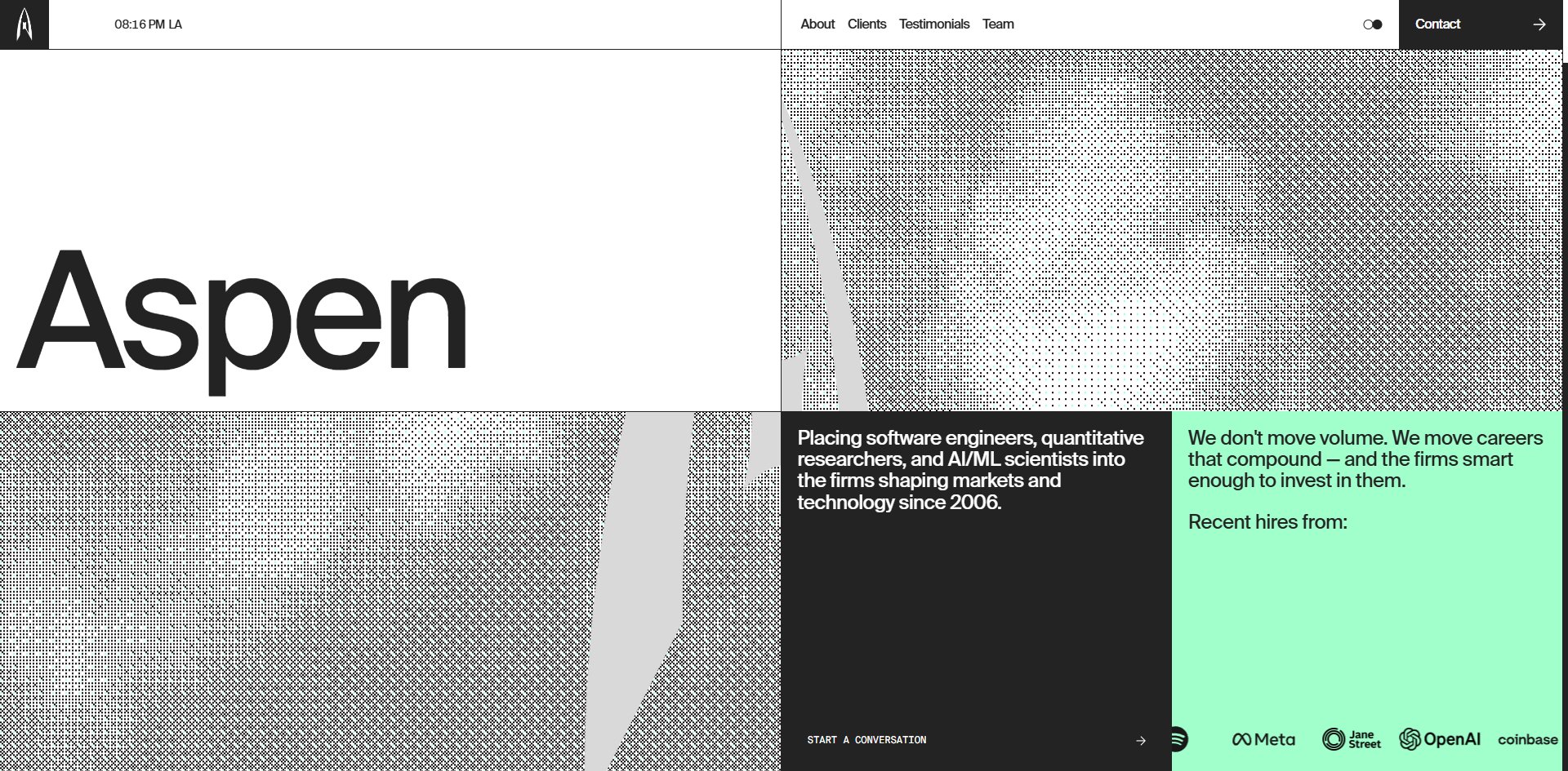
Concept
Headhunting happens entirely online. This firm has laid its website out like the page of a newspaper.
Its basic unit is not the block but the cell. The page is built from rectangles separated by solid rules, each holding exactly one thing: a giant word, a paragraph, a number, or a picture. Colour belongs to the cell and never to the type, so the text is always near-black or pure white while white, black, grey and mint are all cell backgrounds. That is how a newspaper page is put together, not how a web page usually is.
The cleverest decision is how the light and dark switch works. Flip to dark and the black cell with white text becomes a white cell with black text, the white cell holding the big word goes black, and the block of mint does not move at all.
The page does not go dark. It flips cell by cell. The rhythm of light and dark across the layout stays exactly as it was, and only the polarity of each cell changes.
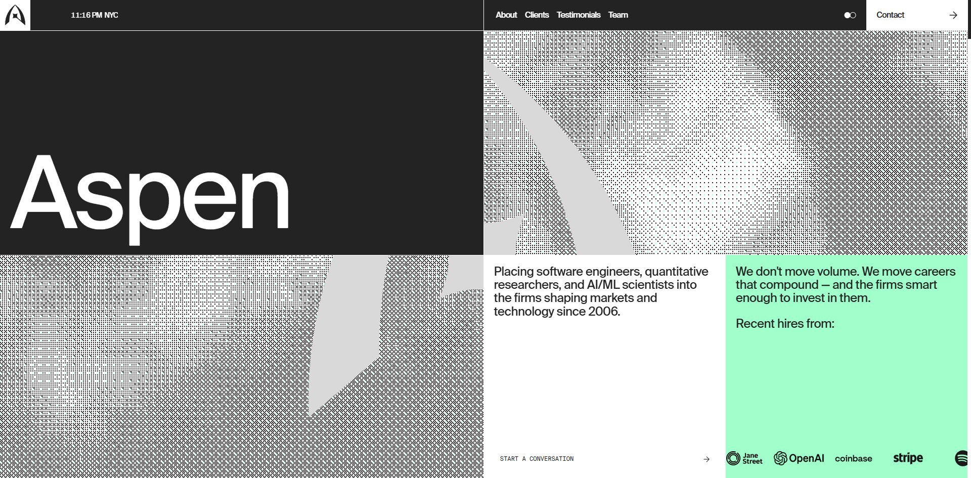
The whole effect takes two CSS variables, one for the background and one for the text. Both themes share one layout with nothing redrawn for dark, which is the real benefit here. If you want two themes without maintaining two designs, this is a cheap way to get there.
There are two problems with it. The first is that the mint does not flip. It stays the same in both themes, so in dark it is much brighter than everything around it and becomes the loudest thing on the page.
The second problem is speed. The layout appears in 456 milliseconds, but the largest picture block takes nearly three seconds. For those two and a half seconds you are looking at a page that has been laid out but not yet illustrated.
Swiss grids and newspaper layout: this way of working has been around for decades. What is new is that cell-by-cell flip.
Design
How the typefaces split the work and how little colour is spent are two sides of one rule. There are two faces: a text face writing 5,621 characters at 14 to 202px, and a monospace writing 1,026 at 12 to 14px only. The monospace never scales up and handles labels, button text, lists and counters.
The rule is plain: anything to be read as data is monospaced, anything to be read as speech is not. The reader never has to work it out, because the letterforms say which it is.
There are five text colours, near-black in 704 places, pure white in 315, and the other three in fewer than ten between them. The Awwwards page says this site uses two colours, which for text is exactly right.
Backgrounds are another matter, and this is where the most interesting decision sits. By area the order runs white, a grey step, near-black, and then mint in twelve places: the statistic cells, the square bullets in the service lists, the team name plates, the schedule-a-call bar. Nowhere else at all.
The effect is that any green on the page is guaranteed to be something you are meant to look at, without a word of explanation.
Further down there is a more interesting set still. Each company in the client list brings its own brand colour, deep blue, teal and navy taking a small block each. Select a company and the preview panel on the left takes that company's colour. The site quotes its clients' colours as raw material rather than normalising them into its own palette. For anybody presenting client work, this is a way to respect the other brand without breaking your own system, because those colours are confined to one fixed-size rectangle.
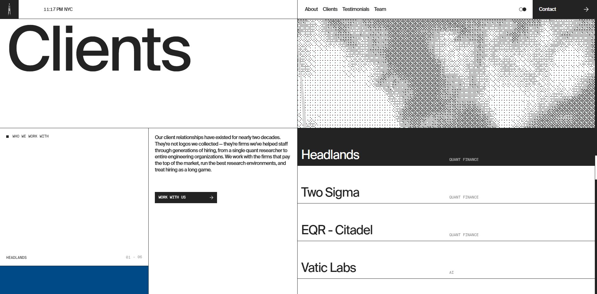
The border radius is zero. Across 948 elements, not one rounded corner.
Imagery comes from four sources, each with its own territory. The first is the halftone dot screen, computed live in WebGL, with the pale shape emerging from the dots being the brand mark itself, an aspen leaf. The second is black and white portraiture, appearing only in the team section, staggered with mint name plates. The third is thin-line diagrams on black, a radial fan and a dotted orbital ring, appearing only in the services section. The fourth is the client logo marquee.
Only the second group is actually photography. The rest is drawn or computed.
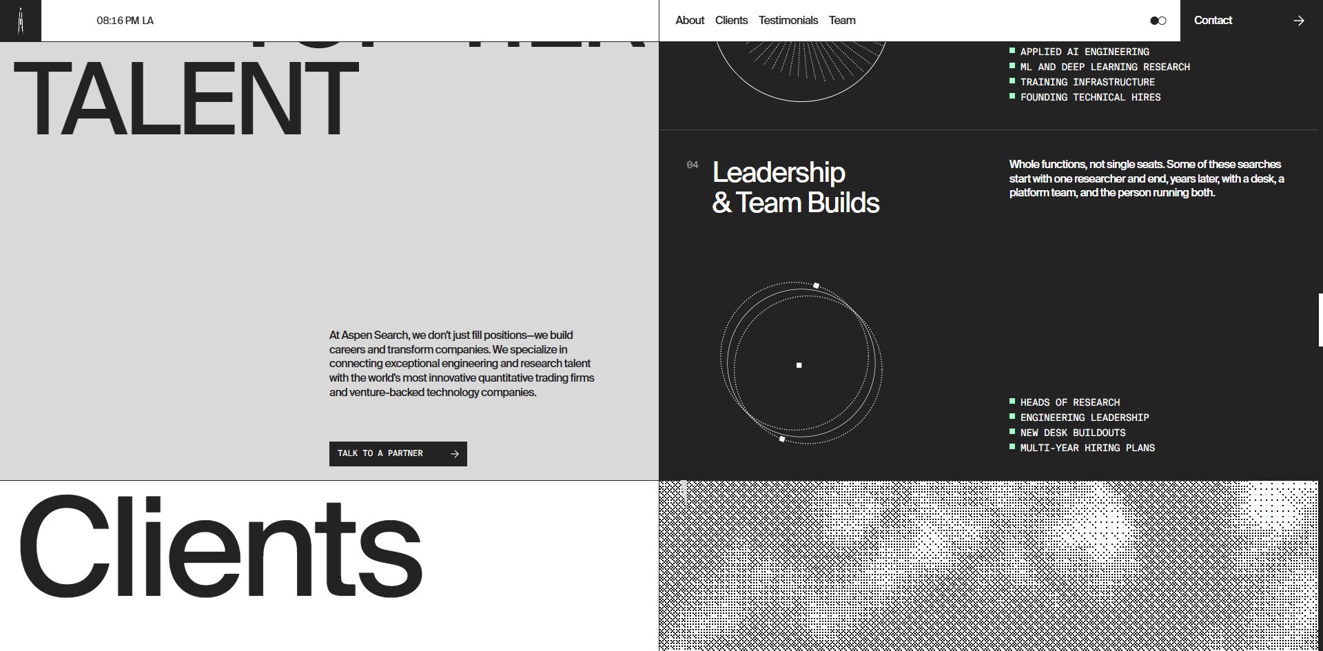
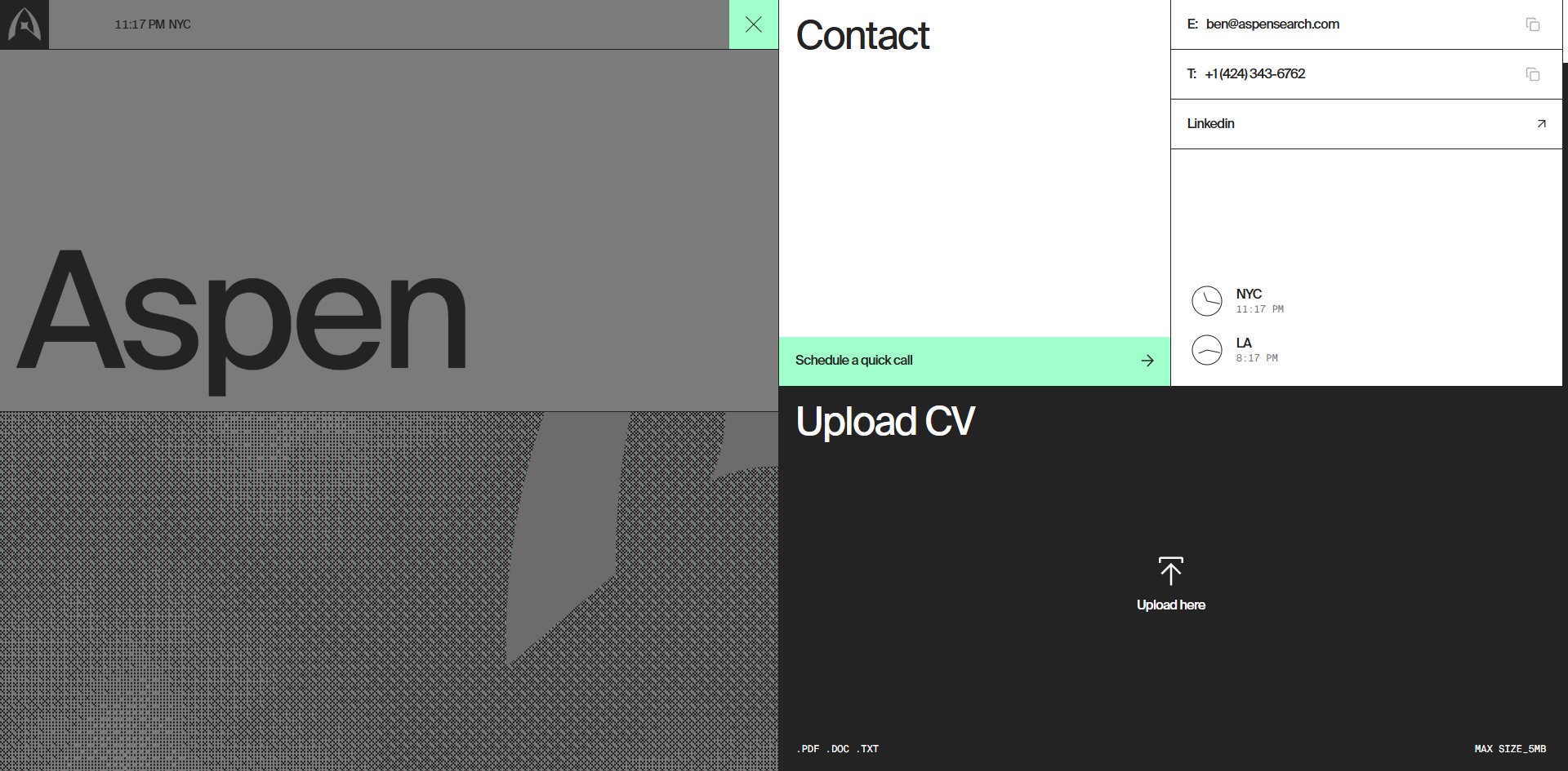
That clock at the top is the cleverest component on the site. It is not ordinary text. Each digit is a strip running from 0 to 9 that slides up and down to change value, like an old flip clock. The same component is reused on the testimonial counter. The clock itself alternates between New York and Los Angeles, and the contact panel gives each city a round dial. That is not decoration. Those are their two offices.
Motion
The thing worth reaching for is the light and dark switch in the header. It is given a prominent spot, and Awwwards named it among the highlights. Your choice is remembered, so opening the site again gives you what you picked, without flashing white before it goes dark.
Everything else is restrained, and all of it is linked rather than layered. Clicking a row in the client list opens nothing: that row flips to reverse and the preview panel beside it changes to that company. Testimonials sit in a carousel of nine with forward and back arrows. Clicking Contact slides a half-screen panel in from the right with one-click copy on the email and phone, a dial for each city, and a drop zone for a CV taking PDF, DOC and TXT up to 5MB.
The scroll layer belongs to Lenis, and the two frame-rate figures agree with each other for once: 60 fps sitting still and 59.9 fps while scrolling, with eleven of twelve stretches at 60 and the twelfth at 59. Five WebGL canvases run at the same time and nothing drops below 59, which is rare on a site running that many.
One thing here is handled more thoroughly than most sites manage, and that is the reduce-motion preference. Turn the setting on and the animations drop from two to zero while the canvas count drops from five to four. It does not just stop animating, it removes a WebGL canvas outright. That is worth learning from: responding to this preference does not have to mean only switching animation off, it can also mean rendering one layer less.
Engineering
Next.js built with Turbopack, 33 code chunks totalling 736 KB, content managed in Sanity and analytics through Umami. There are four CSS variables in total, two of them for the theme.
Five separate WebGL canvases carry the picture layer, all driven by three.js, ranging from 1913×1941 down to 478×442. The halftone dots are not baked into the files. Source art is downloaded as PNG, decoded, and fed into a pipeline whose render targets step down from 1913 to 384 to 128, with the dots computed at render time.
The problem is entirely in that source art. One visit downloads 6.9 MB, of which eight source images account for 6 MB, or 86%. The most extreme is a 518×514 PNG at 926 KB, where the same image completely uncompressed would only be 1,040 KB, so it is essentially unsqueezed. Another at 618×516 costs 777 KB, and four at 1254×1254 run from 590 KB to 1,211 KB.
A page whose only visual output is black and white dots ships six megabytes of lossless colour original to get there. Anyone attempting this should note that if the dots are computed at render time, almost all the colour information in the source is thrown away, so lossless is the wrong format to be shipping.
Page stability is excellent: a visitor sitting still sees almost no movement, with a cumulative layout shift of 0.0006 across only two events. That does not contradict the picture taking three seconds. The layout arrives first and holds the space open, so the images land late without pushing anything around. That is the right way to handle slow imagery.
Accessibility needs saying from both sides. What is done right is substantial: the page declares its language, all 38 keyboard-selectable elements have names, the carousel and theme buttons are described, all 40 images carry empty alt text with the client names given separately as heading text, and the page ships structured data for search engines.
What is done wrong is three things: two 200px words are both marked as H1, there is no navigation landmark, and there is no skip-to-content link.
The strangest finding is the focus outline. The stylesheet clearly defines a two-layer outline, 2px white plus 4px mint, and the browser does consider the element to be in keyboard focus. Yet with the focus on it the area looks exactly as it does without, not one pixel different.
That outline has never been drawn. Somebody wrote it, in the brand colour, so it was done deliberately, and it does not take effect. This is a bug rather than an omission. One of the credited developers puts accessibility in his own bio, which makes it all the more unfortunate.
Scores and Team
| Award | Source | Date | Score |
|---|---|---|---|
| Site of the Day | Awwwards | 2026-09-15 | 7.48. Design 7.54 / Usability 7.27 / Creativity 7.70 / Content 7.39 |
| Developer Award | Awwwards | 2026-09-15 | 7.32. Semantics 7.20 / Animations 7.60 / Accessibility 7.40 / WPO 7.40 / Markup 7.20 |
Of the four scores Creativity is highest and Usability lowest, 0.43 apart. The weighting runs exactly the other way: Usability is 30% of the total and Creativity only 20%. This site won on the category that counts for less.
The spread tells you more than the average. Five jurors returned 7.00, 7.60, 6.00, 7.20 and 7.00. Three cluster between 7.0 and 7.2, one gives 7.60, and one pushes all four categories down to 6.00. That last is an independent art director from Turkey, the only flat low card in the room.
On the developer side, animation at 7.60 sits clearly above the other five while semantics and markup tie lowest at 7.20. That matches what is actually there: the scroll frame rate is faultless, and the page really does carry two H1s and no navigation landmark.
| Credit | Who | Awwwards record |
|---|---|---|
| Edoardo Lunardi | Vienna, Austria, creative engineer | 8 works, SOTD 5, Dev Award 5, HM 8 |
| Elliott Mangham | UK, long-term development partner | 16 works, SOTD 3, HM 13 |
| Louis Saville | No findable Awwwards profile | — |
Lunardi's own profile states that he sits on the Awwwards jury. Mangham describes himself as a long-term development partner to design agencies, specialising in careful micro-interactions, accessibility and performance.
None of the three credits is a designer, and this site's highest score is Creativity. Who made those layout decisions is not something the credits can answer.
Archive
- Award date
- 2026-09-15
- Awards
- Awwwards SOTD 2026-09-15, Awwwards DEV 2026-09-15
- Site
- https://www.aspensearch.com/
- Credits
- Edoardo Lunardi, Elliott Mangham, Louis Saville
- Type
- corporate
- Awwwards
- 7.48 / 10. Design 7.54 / Usability 7.27 / Creativity 7.70 / Content 7.39. Developer Award 7.32. https://www.awwwards.com/sites/aspen-search
- Stack
- Next.js, Turbopack, three.js r185, Lenis, Sanity, Umami
- Total assets
- 6.9 MB, of which eight source images are 6.0 MB, the largest 1,211 KB
- Speed
- Layout at 456ms, largest picture near three seconds, layout shift 0.0006. 60 fps stationary, 59.9 fps scrolling