See What Eye See: Eye Condition Simulator
Simulators like this usually start clear and let you watch the picture fall apart. This one starts at the far end: you arrive with your sight already damaged and have to drag the slider back up to see what healthy looks like. It covers eight eye conditions, and that slider answers only to a mouse, so keyboard users cannot reach the one thing the site is for.
Visit site ↗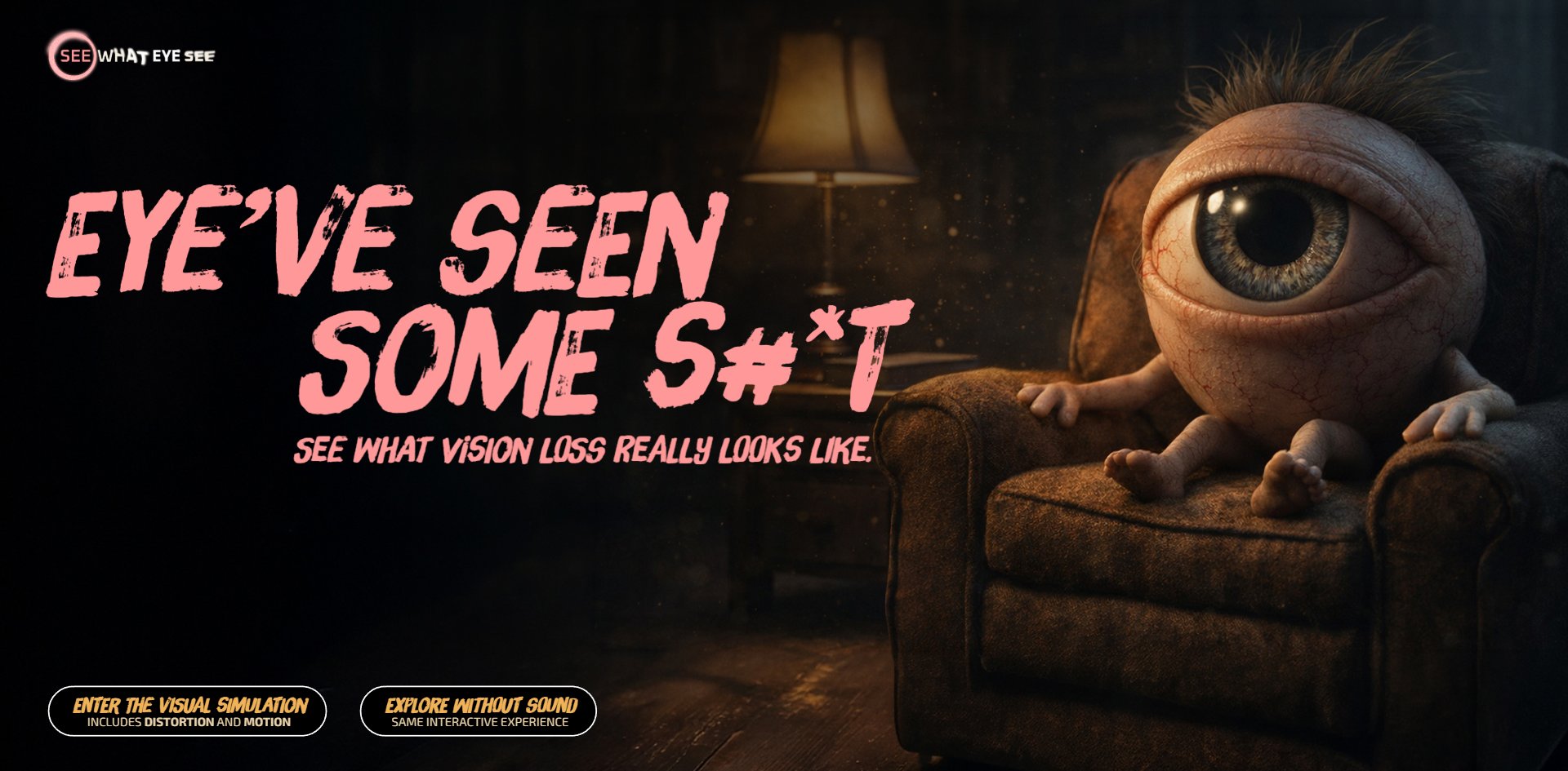
Concept
The opening is a scary joke whose job is to get you through the door. Once the door shuts the joke leaves, and everything after it is said straight.
You open it onto a giant eyeball with hair, hands and feet, sitting in an armchair in a dim living room, next to a line of pink brush lettering: EYE'VE SEEN SOME S#*T. Click through one level and the mood changes completely. The page turns into straight explanatory writing, with a small note at the bottom reminding you this is only a rough approximation and that symptoms differ from person to person. Click into a specific condition and the first line is a pink italic disclaimer, followed by writing that sounds like a doctor.
The two voices are cut apart cleanly, and not a trace of the joke is left in the medical writing. The joke's job is to pull you in, and once you are in, it steps aside.
The clever move is the direction of the slider. On all eight condition pages, the slider starts at the worst year: double vision at year three, tunnel vision at year twenty, with no exception anywhere. You have to drag upward yourself to find out what healthy eyes see.
The ordinary version of this leaves you watching decline happen to somebody else. Here the order is reversed, so your sight is taken first and you have to earn it back.
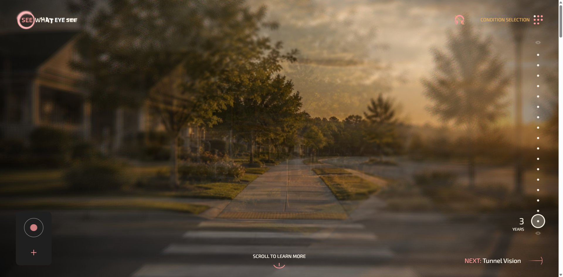
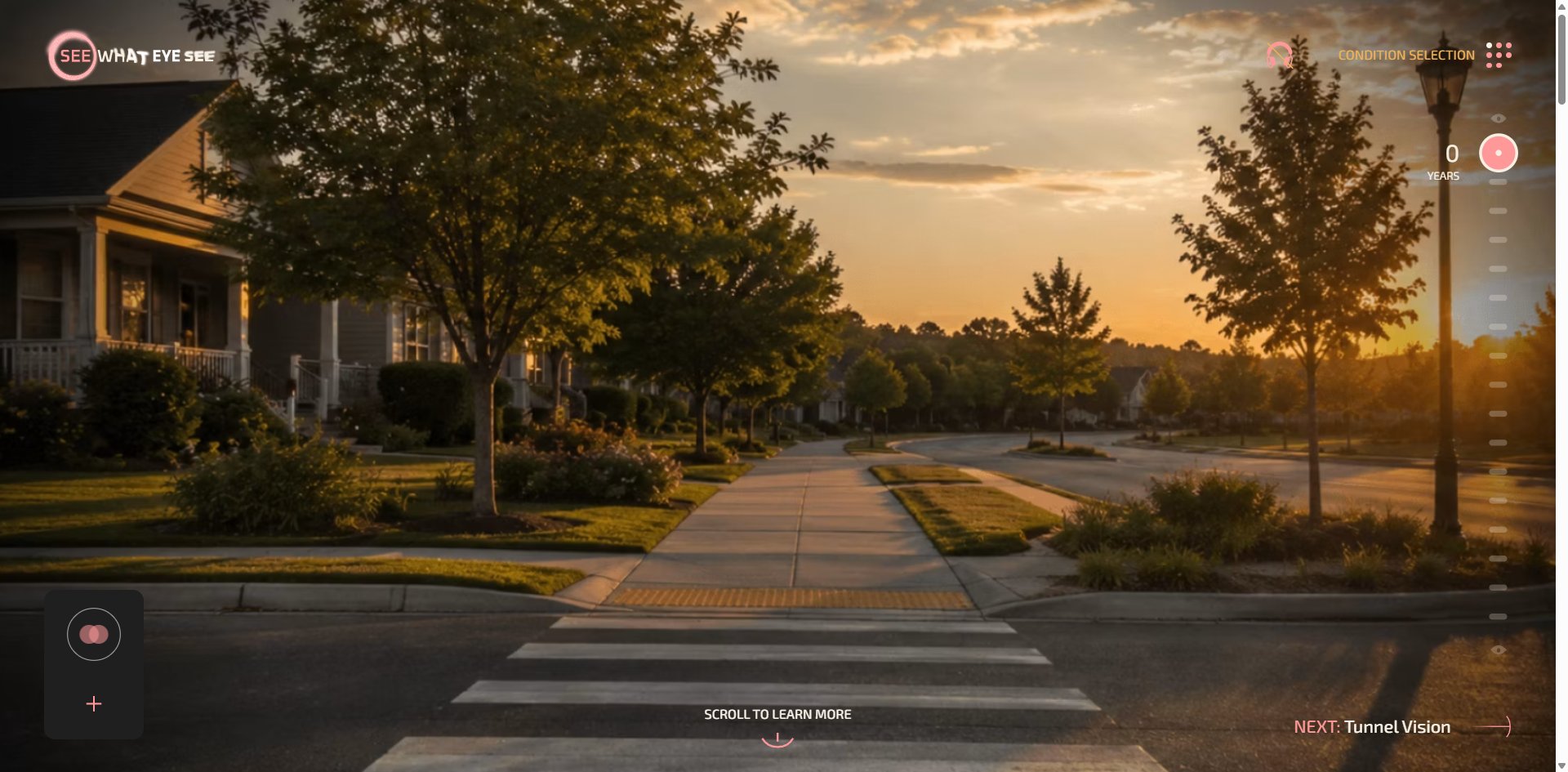
The same sidewalk, the same evening light. One is blurred and doubled under a layer of dots, the other sharp enough to read the siding on the house and the individual leaves. The small effort you are asked to make is exactly the distance between those two pictures.
The opening carries two risks. The swearing and the eyeball are not obviously funny to somebody who is actually losing their sight, and that is a risky move in health communication. More practically, the page opens blurred with nothing to tell you this is deliberate, so a first-time visitor may well think it simply has not finished loading.
The eyeball character comes out of Pixar-style animated shorts and the brush lettering off street posters and horror movie one-sheets, and neither is new. What is genuinely original is not on screen at all. It is the decision itself: to put the slider starting point at the worst year.
Design
The way the two typefaces divide the work is a hard rule, not a rough tendency. The site uses exactly two: the brush face writes 224 characters and the text face writes 4,174. What matters is the size. The brush face never goes below 68px and the text face never goes above 32px, so the two never overlap.
The result is that 5% of the words take up nearly a quarter of the visible area. Everything with feeling in it is handwritten and everything that gives you information is machine-set, with no transition zone. The benefit is immediate: you know whether a sentence is trying to move you or to inform you before you have read a word of it.
Colour is used just as sparingly. There are five text colours on the whole site. Near-black appears in 746 places, cream in 68, pink in 19, amber in 5. The fifth is a deep red used in exactly 8 places, all of them the cause labels marked as possibly needing urgent medical attention.
One colour, one job, and it is the most important job on the page. That is a smart piece of information design: whether something is urgent is visible from whether the label is filled deep red, without having to read the qualifying sentence after it.
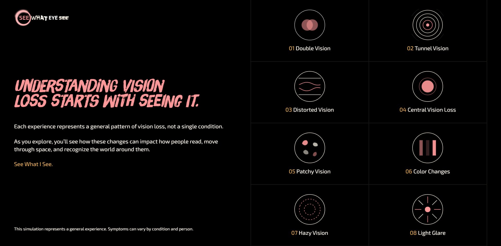
Circles are everywhere on this site, and not one of them is drawn in CSS. Only 8 elements are genuinely rounded, all of them 68px-tall buttons, against 434 with square corners. Every circle and arc lives in SVG or in a Rive animation: the iris-shaped logo, the eight condition icons, the ticks along the slider track, the big arc where a dark block cuts into the cream background, the fan of resource cards before the footer.
So the page layout is rectangular while its visual language is round, and the two belong to different technical layers. Anyone wanting this effect should note that the round parts are built as graphic assets, not as layout.
The imagery splits three ways, and each way has one job. The eyeball character appears only at the start and the end, carrying the emotion. Photographic footage appears only inside the simulator, carrying the evidence, with a different everyday scene per condition: a sidewalk, a kitchen, a café, a supermarket aisle. The third is a 35mm film strip running diagonally across the cream background, every frame the same evening highway with the doubling getting worse frame by frame, labelled AT 8 MONTHS, AT 1 YEAR, AT 16 MONTHS.
The site explains time twice. The slider on the right does it vertically and this film strip does it horizontally, the two at right angles to each other.
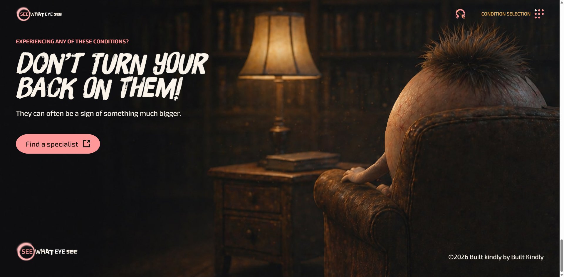
The nicest piece of work is in the footer. The headline reads DON'T TURN YOUR BACK ON THEM, and in the picture the eyeball has literally turned its back on you. The headline and the image are one joke and neither is spare.
Motion
Everything hinges on the vertical slider down the right-hand side, and none of it has anything to do with scrolling.
It moves continuously and stops wherever you let go, while the year above it jumps in whole numbers. The track has a fixed seventeen ticks drawn on it, but double vision has only four stops from zero to three and tunnel vision has twenty-one.
The ticks do not match the stops, which makes them decoration. It is the one place the control misleads you, and worth avoiding if you build something similar.
One turn of the wheel, and Lenis moves the page 71, 62, 54, 45, 40, 34 then 29 pixels on successive frames, each a little less than the last at a steady ratio near 0.87, which works out to a lerp of about 0.13 and takes forty frames to settle. The tail runs long and drags a little through the longer reading sections.
The distortion moves as well. The doubling is not a fixed offset but a slow drift, which matches what the page itself explains: the second image slides sideways, vertically or diagonally.
The reduce-motion preference is answered halfway. Turn prefers-reduced-motion: reduce on and the site's one CSS animation genuinely stops, but all four canvases keep running at 60 fps and the distortion and drift never pause for a frame.
The opening screen explicitly warns that the experience includes distortion and motion, and the layer that actually distorts and moves ignores the setting. For somebody sensitive to motion sickness, turning that preference on protects them from essentially nothing.
Engineering
The page is server-rendered with Nuxt and built in Vue components. The picture layer works like this: the whole site shares one fixed three.js canvas and the DOM scrolls over it. That is why the top block of a condition page contains neither an image nor a canvas of its own, because the picture comes from that shared surface underneath.
Scenes are built from one photograph plus one depth map. The footer pair is a 2160×1590 JPEG against a 1080×795 depth map, and the depth map does the parallax. The pupil that follows your mouse on the opening screen runs on the same mechanism. Worth noting the ratio if you want to copy this: the depth map only needs half the resolution of the photograph.
The eight condition icons are not images but Rive animations running on small 121×121 canvases. That explains the largest single file in the asset list: the Rive runtime at 700 KB, pulled from the public unpkg CDN.
Opening a condition page downloads 2 MB in total, and that runtime is a third of it, and all it buys is a handful of small icons. Next comes 467 KB of Adobe Fonts across three files, one of them 363 KB on its own. There is also a glow image loaded straight off assets.codepen.io, so a real public health project is serving a CodePen asset in production, which is not something to do.
Speed is not a problem. The first paint lands between 800 and 900 milliseconds, and scrolling holds 60 fps with not one dropped frame across eight screens of content.
On accessibility, the groundwork is better than most sites manage. The page declares its language, all 16 keyboard-selectable elements have names, the tab order makes sense, the info panel marks its expanded state correctly, even the scroll cue is a selectable button, and the focus outline is left as the browser drew it.
Which is exactly why the one omission stands out. The slider that controls the years is a group of SVG shapes that never tells the browser it is a control and cannot be selected with the keyboard. None of those 16 selectable elements sits inside it.
People who only use a keyboard cannot open this site's main feature. Nor can screen reader users, because those shapes have no name. A site about vision impairment built its one central function in a way that these people cannot use.
The remaining problems are small by comparison: 12 of 14 images have no alt text, there is no skip-to-content link, and condition pages start their headings at H2 with no H1 above them.
There is also a plain piece of waste. The opening screen offers two doors, one marked as including distortion and motion and the other saying no sound, same experience. Choose the second and the 1.9 MB background track downloads anyway, which is 99.8% of everything that step transfers. People who explicitly asked for no sound still download the whole track.
Scores and Team
| Award | Source | Date | Score |
|---|---|---|---|
| FWA of the Day | The FWA | 2026-09-15 | 84 POINTS, DAYS 5 |
On the FWA project page the team describes their own work like this: a browser-based eye condition simulator built with three.js and GSAP, where dragging a slider lets you experience central vision loss, tunnel vision and double vision.
That sentence misses the point that actually lands. What sticks is not that you can drag, it is that you already cannot see before you touch anything. They describe a demo tool. What they made is harder than that: it takes your sight away first and makes you earn it back.
| Credit | Who | FWA wins |
|---|---|---|
| Built Kindly | US studio | 1 |
| Jesper Landberg | Swedish creative developer | 40 |
| David Lubofsky | Newtown, Connecticut | 4 |
Built Kindly and David Lubofsky are the same person. Both FWA profiles list the same phone number and the studio's contact address is his own name. So this is a small studio's first FWA, and they hired a forty-time winner for the hardest part. Lubofsky's own profile says he works on disease education platforms and interactive reading, which puts this project right in his territory.
Nobody is credited as designer, CGI artist, copywriter or medical adviser, and the two most expensive things on this site are the photoreal 3D and the doctor-voiced copy. Three names do not cover the work on the page, so somebody is clearly missing from the list.
Awwwards has no entry for this site, and the site itself carries no award badges at all. Its outbound links go to the National Eye Institute, a clinical trials database and several ophthalmology associations. It never intended to be read as a portfolio piece.
Archive
- Award date
- 2026-09-15
- Awards
- The FWA FOTD 2026-09-15
- Site
- https://www.seewhateyesee.org/
- Credits
- Built Kindly, Jesper Landberg, David Lubofsky
- Type
- awareness
- The FWA
- 84 POINTS, DAYS 5. https://thefwa.com/cases/see-what-eye-see-eye-condition-simulator
- Stack
- Nuxt, Vue, three.js r185, Rive, Lenis, GSAP, DatoCMS, Adobe Fonts
- Total assets
- 2.0 MB for one condition page, of which the Rive runtime is 700 KB and fonts 467 KB. The opening screen adds a 1.9 MB music track
- Speed
- First paint 800 to 900ms. 60 fps throughout scrolling