Hobro Digital
A face in close-up, a red laundromat, a truck throwing up dust on a desert road, a city at night through an aeroplane window. A design agency cut eight shots like these into 57 seconds and set them looping on the first screen of its own site. No WebGL anywhere, and it won on both Awwwards and the FWA on typographic craft alone. The fourteen case write-ups that would persuade you best only appear once you click.
Visit site ↗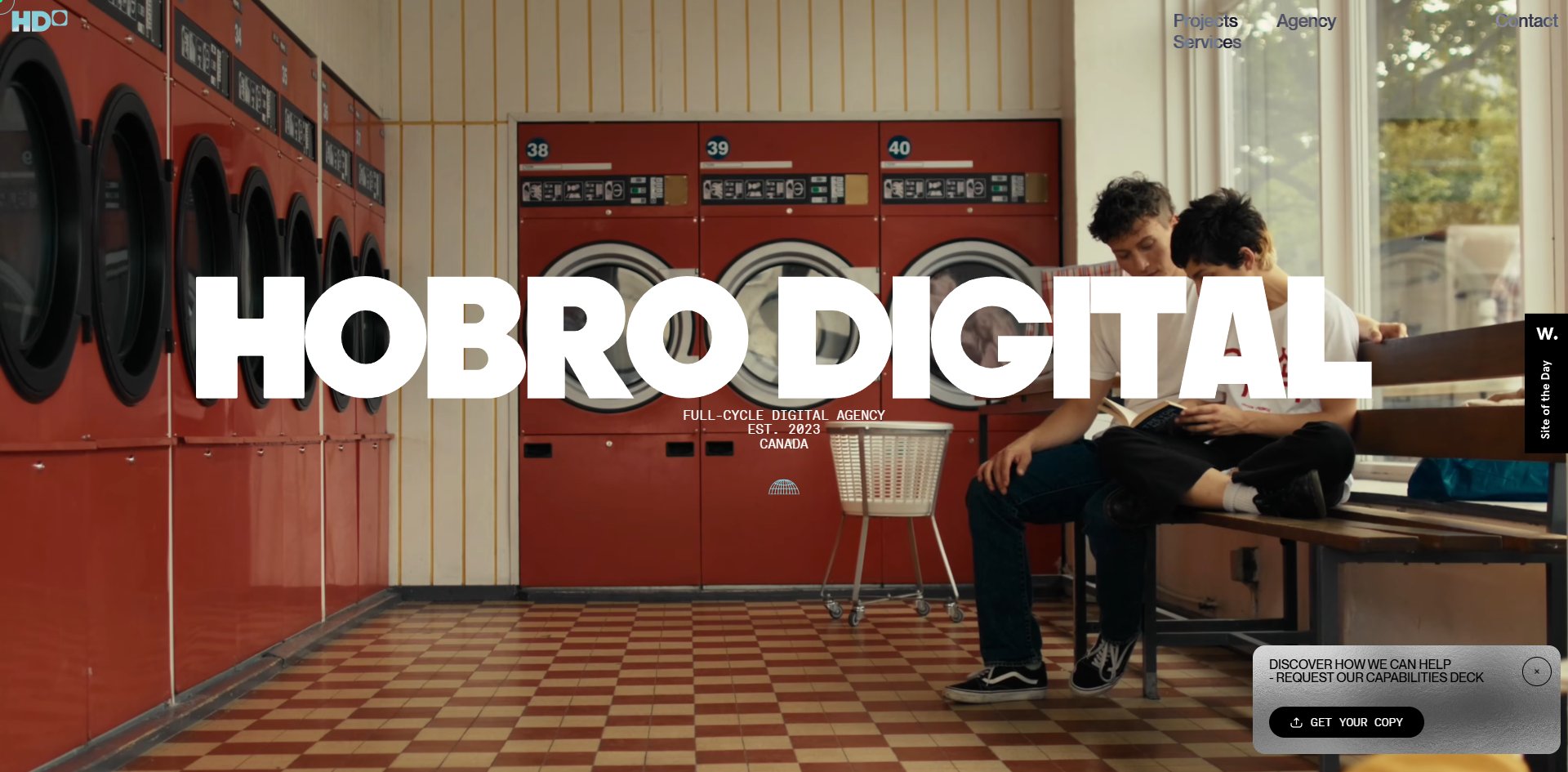
Concept
The first screen is the most valuable space an agency site has, and almost everyone spends it on work. This one spends it on a minute of unexplained footage, betting the whole thing on being remembered.
The film runs 57 seconds on a silent autoplaying loop. Besides the laundromat and the truck, the remaining shots are a slow red fluid, a 3D printer building a white faceted object, a rendered still life, and a living room at dusk. Nothing connects any of them, which is exactly the effect it wants.
The picture changes eight times and the HOBRO DIGITAL wordmark, with FULL-CYCLE DIGITAL AGENCY, EST. 2023, CANADA beneath it, never moves once. The only fixed thing on the first screen is the name of the company.
What the trade buys is recognisability: gradients, 3D props, terminal styling, WebGL vitrines, none of the category standard kit appears, and the site separates itself from its competitors within one screen. In a category where everybody looks the same, that is the cheapest and most effective way to stand apart.
What it gives up is clarity. The first screen cannot say who this is. Eight shots tell you nothing about what the company does, and you have to scroll to find out.
The section that does say it comes immediately after. The page cuts to black and sets white type: we create premium digital experiences that express brand stories through design craft, functional tech and strategic thinking. Underneath sits the headquarters in Calgary and a team distributed across North America and Europe, closing on four words, VISION. CLARITY. FLOW. EXECUTION.
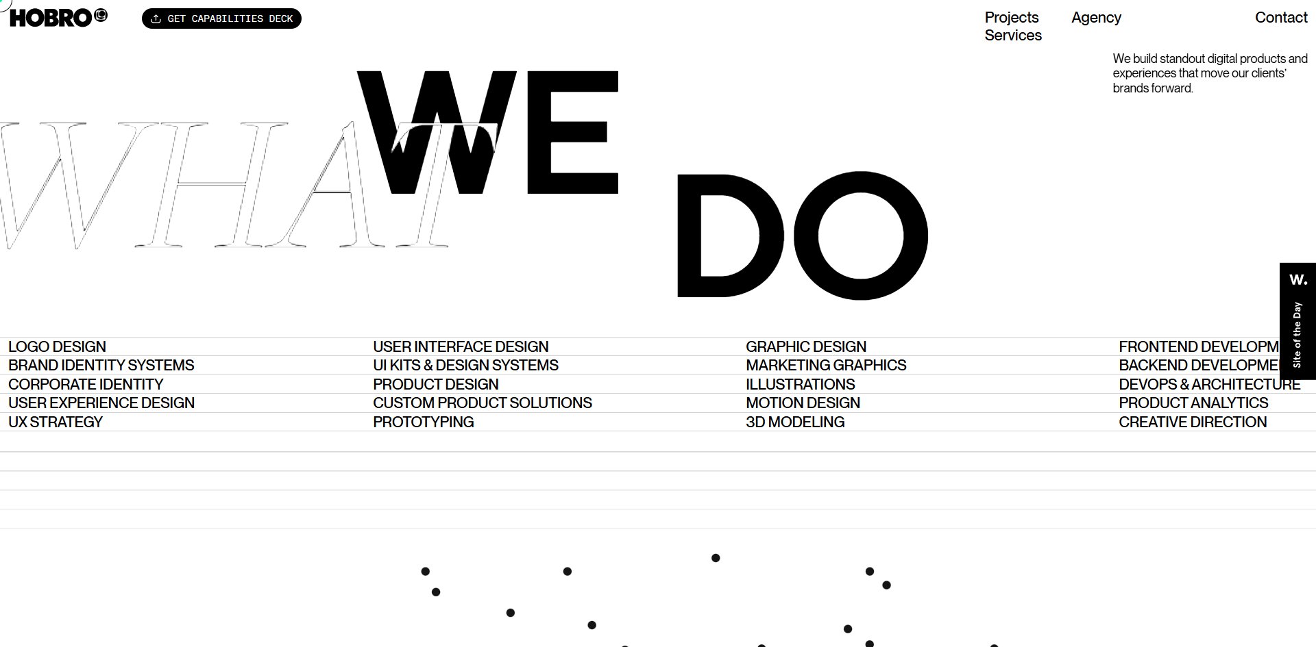
Only the third section returns to white, a four-column service list running from logo design all the way to product analytics, twenty entries laid out in full.
The real content is buried deeper still. Each of the 14 cases opens into a full project write-up with narrative and tags, but scrolling only ever shows you a thumbnail and one line of small type. The most persuasive material sits behind a deliberate click, and a juror who scrolls without clicking sees something handsome but thin.
That is the easiest trap to fall into with portfolio-style sites: you assume visitors will click in, and most of them only scroll once.
Low-light still-life macro, enormous sans-serif type, hairline specification tables: this is the settled approach of magazines and fashion catalogues moved onto a web page, and none of it starts here. It is executed exactly, which is why Design scored highest of the four categories. The jury has seen this language before, which is why Creativity scored lowest. Those two facts share one cause.
Design
That HOBRO DIGITAL line on the first screen is not typeset. It is twelve separate SVG letter files, with the left and right halves loaded into two containers and animated separately. The white letterforms sit on top of the film, and across all eight scene changes they never give up any of that space.
Text over image is not occasional here, it is the method. Counting across the page there are 24 places where large type overlaps a picture or video by more than ninety percent, including 100px type over video and 240px type set letter by letter over it.
Hierarchy comes almost entirely from size rather than weight. Of 401 pieces of text on the site, 335 use the same weight, which is 84%, and the other three weights account for 66 between them. One weight covers the whole site and the hierarchy comes from size alone, jumping from 12px to 290px.
This is worth learning from. Too many weight changes make a page look busy, while stretching the size range to twenty times over makes the hierarchy obvious on its own. The manifesto section is that method at its limit: a full-width giant headline, then a centred mid-size paragraph, then 12px type in the bottom-left corner, three levels of volume from a shout to a whisper.
Four typefaces divide the work strictly, and the strictness is in the sizes. The text face writes 12,572 characters and the monospace only 2,952, and that monospace is locked between 12 and 16px and never scales up anywhere. Small type stays small type and never promotes itself to a heading. The display face appears exactly nine times, always at 240px. Italic is a rule rather than an ornament: the emphasised word in a sentence switches to italic, at least seven times across the site, from a 45px counter to a 290px word.
The most extreme piece of colour discipline is the brand green. It is used in exactly one place on the whole site, the 6×6px custom cursor dot. Choosing a brand colour and then almost never using it is serious restraint.
The imagery comes from four places: the opening film, low-light indoor still-life macro, pre-rendered 3D scenes, and client case photography. The manifesto section opens on a sliced stone sphere in a sunset meadow with 240px italic set over it. All four are stitched together by the same typography and the same colour discipline, which is why they read as one language rather than four.
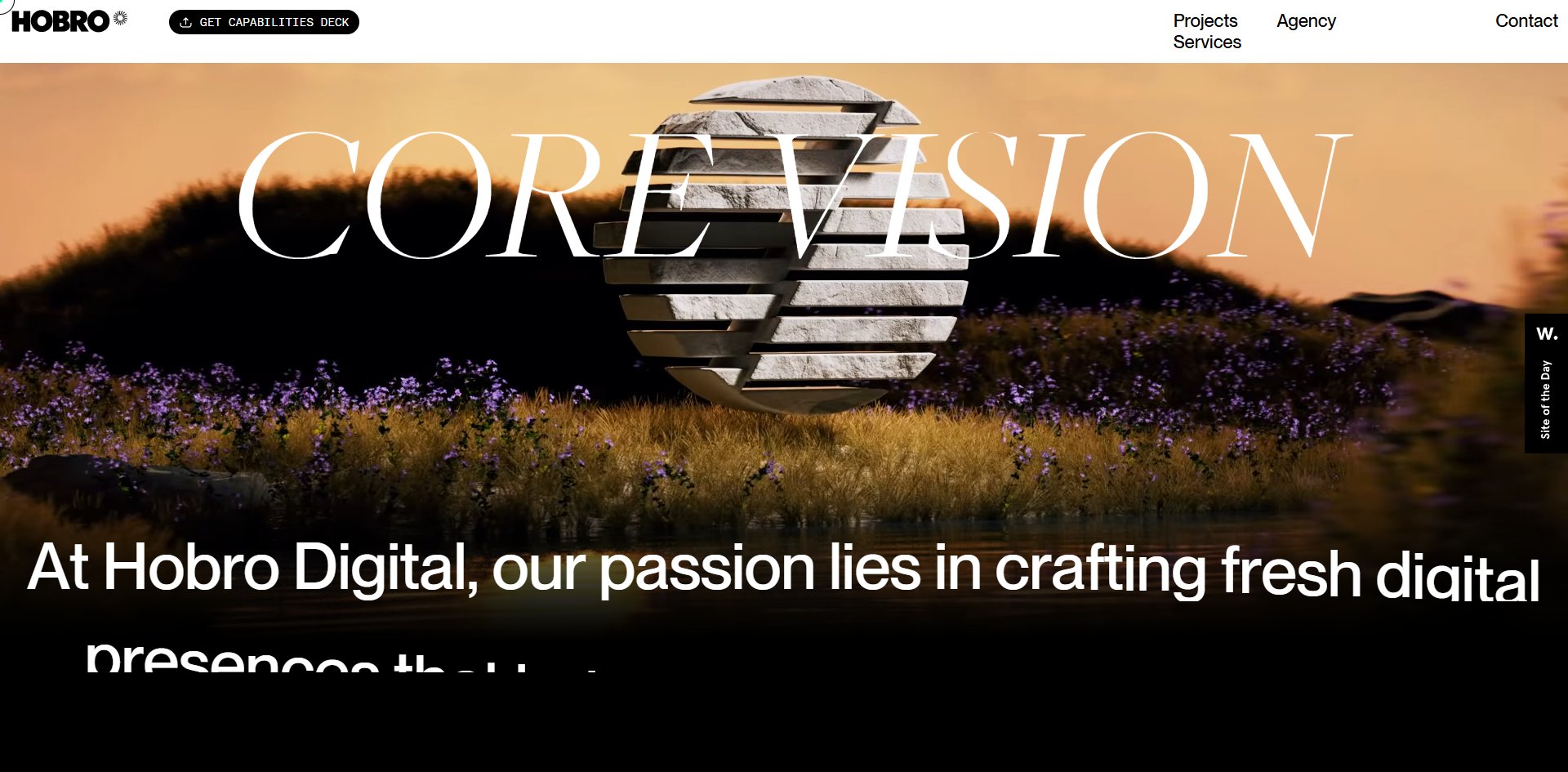
Nine sections across 20 screens, separated without a single rule line. The page is white throughout except for two sections that paint themselves black: the statement near the top and CORE VISION further down.
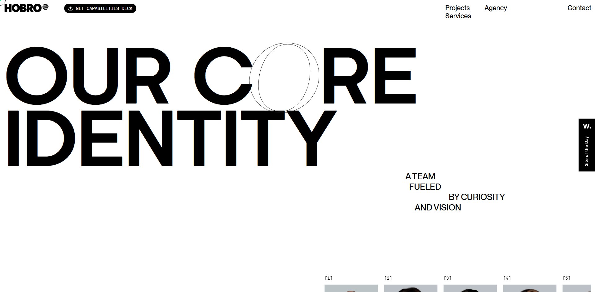
The detail work is dense. The O in OUR CORE IDENTITY is a separate SVG image rather than a letter from the font. Subheads are set as a staircase, each line indented further right. The 24 team members are numbered 1 to 24 in monospace. Every case thumbnail carries four small arcs at its corners forming a bracket.
Motion
There is one thing to reach for here, and that is opening a case study. Scrolling alone never tells you it is there.
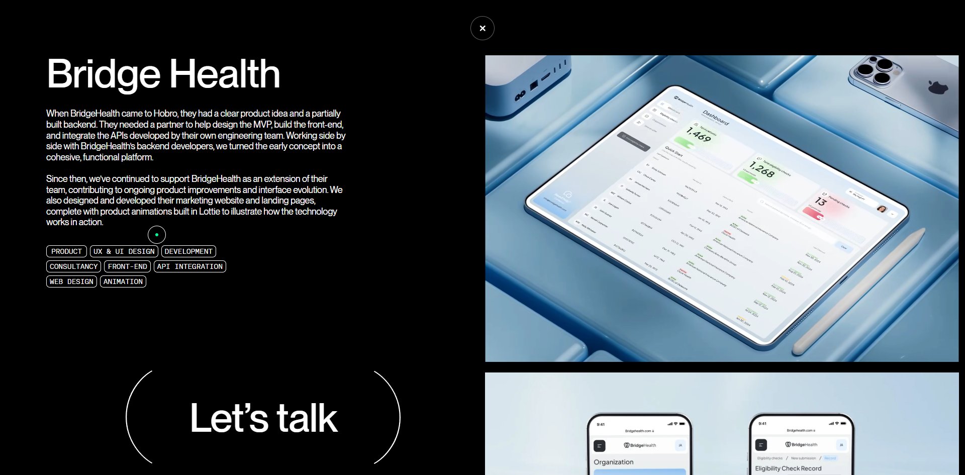
Clicking a case thumbnail expands a full-screen black project write-up: the title and two paragraphs of narrative on the left, 8 to 11 monospace discipline tags below them, a full case image on the right that scrolls on its own, and a giant let's talk button at the bottom framed by an arc. Page scrolling is stopped while the overlay is open and restored when it closes. All 14 cases have one.
The scroll layer never takes your wheel away. All 147 scroll triggers neither pin anything nor follow scroll progress, so 20 screens run straight through. The feel is deliberately heavy: after one wheel turn the movement decays from 87 pixels down to 22, is still moving thirty frames later, and takes close to half a second to settle.
Against that large-scale typography it genuinely reads as weight, and it also means half a second of extra wait whenever you want to land precisely on a particular screen. That is a trade rather than a mistake, but it is worth thinking through on a long page: are visitors here to read, or to find something.
The team row is a draggable horizontal slider. Drag it 800 pixels, let go, and inertia carries it another 40 before it hits the boundary. It is the only thing on the site you drag.
The cursor is a 6×6 pixel brand green dot, damped so it trails the pointer by about three pixels, becoming an outlined ring over buttons. Text arrives letter by letter and the logo morphs from a two-letter monogram into the full name.
The trouble is where the best material sits. Scrolling end to end is comfortable throughout and leaves you with no memorable moment, because the best material is all inside the overlay and a juror has to click in before any of it counts.
Engineering
Pure DOM and CSS, with no canvas and no WebGL anywhere. The stack is GSAP with seven paid plugins, plus Lenis and a Lottie player, peaking at 467 animations running at once. There is one piece of redundancy: the ScrollSmoother plugin is loaded and never enabled, and Lenis is what actually drives the scroll.
The page makes 191 requests and downloads 15.8 MB, of which forty video files account for 9.9 MB and seventy-four images for 4.2 MB, against 489 KB of script and 197 KB of font. The single heaviest file is that first-screen film, at 5.1 MB.
The page declares 60 video tags and actually loads 18, with the rest never starting to download. So that 9.9 MB is already the economical figure, and the approach is worth copying: a video-heavy site should let the browser fetch only what is on screen.
Only half the speed figures can honestly be written as a single number. Three visits measured first paint at 212 milliseconds, 344 milliseconds and 1,088 milliseconds, a spread of nearly five times where one number would mean nothing. What is stable is the time to largest content and the amount the page shifts, both nearly identical from one visit to the next, with the largest content landing on that first-screen video both times.
The frame rate is likewise two numbers pointing opposite ways. Measured while scrolling it holds 60 fps end to end with no stutter across 20 screens. But stopping in the case section drops it to 30 fps, because 4 to 6 videos are decoding at once, some of them off screen, while that 5.1 MB first-screen video is still playing long after it has scrolled away. Pausing them returns it to 60 immediately.
This is the thing to watch on any video-heavy site: smooth scrolling does not mean smooth when stopped, and the moment a visitor stops to look closely is exactly when they need it most.
Accessibility is largely good with a few holes. The page declares its language, all four landmark types are present, and 210 images have alt text with nothing missed. The problems are 8 of 71 controls without names, no skip-to-content link, and four places using positive tab order values. The hardest one to defend is a single rule responding to the reduce-motion preference, on a site that peaks at 467 running animations.
Scores and Team
The site won on both platforms, 18 days apart.
| Award | Source | Date | Score |
|---|---|---|---|
| Site of the Day | Awwwards | 2026-08-29 | 7.29. Design 7.46 / Usability 7.05 / Creativity 7.04 / Content 7.26 |
| Developer Award | Awwwards | 2026-08-29 | 7.35, above the seven-point line, awarded |
| FWA of the Day | The FWA | 2026-09-16 | 83 POINTS, DAYS 7 |
The two scales do not convert into each other, so all you can read is how the categories rank within each one. Nineteen Awwwards jurors scored it, and Design at 7.46 is the highest of the four categories with Creativity at 7.04 the lowest. Overall scores run from 6.3 to 9.2 with a median of 7.0, and that 9.2 is clearly an outlier with the other 18 cards all between 6.3 and 8.0.
That ranking is the site's own conclusion: the craft is there and the idea is not new.
The FWA gives no breakdown but does give something Awwwards does not, the team's own statement. They attribute the win to design, motion and technology coming together. The picture supports the first two and not the third. With no WebGL anywhere, technology here means implementation quality rather than a visible claim.
Two unrelated juries choosing the same work 18 days apart says a great deal about how finished it is.
| Credit | Who | Record |
|---|---|---|
| Hobro Digital | Calgary, Canada, founded 2023, 24-person distributed team | First FWA win, one Awwwards SOTD |
The FWA credit stops at company level, but the site's own team page lists all 24 people with their titles: founder, art director, front-end lead, motion and 3D designer, plus five front-end developers, two back-end, four project managers and three in testing.
Three things read out of that list. This is their own site, so there is no client budget and no client content to work around and the money can all go into execution. They are new to the FWA, winning on their first submission, so the jury was reading the finish rather than the name. And the ratio of six front-end developers to one 3D designer is the same fact as zero WebGL and 147 DOM triggers, seen from the staffing side. Team composition drives technical choices, and the reverse is true as well.
Archive
- Award date
- 2026-09-16
- Awards
- Awwwards SOTD 2026-08-29, Awwwards DEV 2026-08-29, FWA FOTD 2026-09-16
- Site
- https://hobro.digital/
- Credits
- Hobro Digital
- Type
- agency
- Awwwards
- 7.29 / 10. Design 7.46 / Usability 7.05 / Creativity 7.04 / Content 7.26. Developer Award 7.35. https://www.awwwards.com/sites/hobro-digital
- The FWA
- 83 POINTS, DAYS 7. https://thefwa.com/cases/hobro-digital
- Stack
- GSAP with seven paid plugins, Lenis, dotLottie, pure DOM, no WebGL
- Total assets
- 15.8 MB across 191 requests. Video 9.9 MB, images 4.2 MB, largest single file 5.1 MB
- Speed
- First paint 212 to 1,088ms. 60 fps while scrolling, dropping to 30 fps parked in the case section