A24
Ravi Klaassens, an independent developer in the Netherlands, turned twelve A24 films into twelve spinning 3D discs, each face the cover design for one film, and the whole thing weighs 1.3 MB. It is that light because a disc face is flat. Seven webp textures on simple geometry are all it takes. This is not A24's own site. He made it himself.
Visit site ↗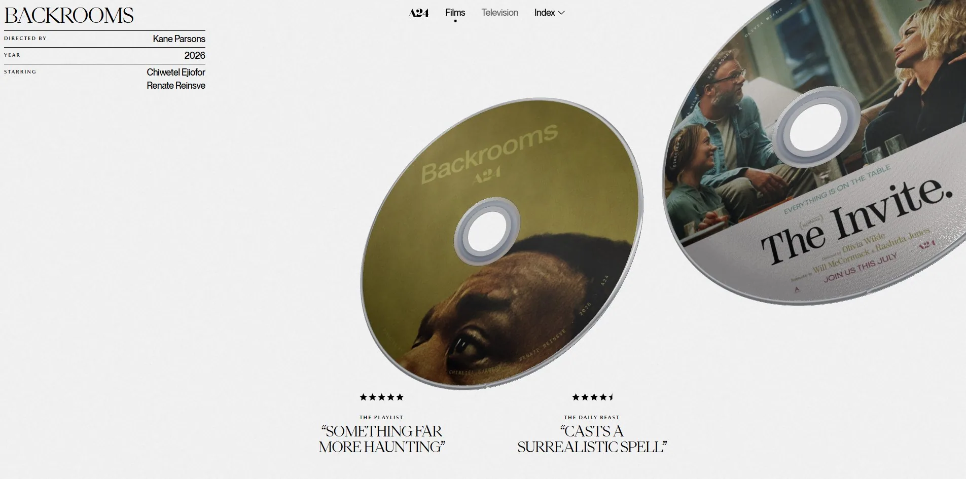
Concept
A24's own website is organised the way streaming organises things. Work in a grid, click through for a synopsis. Klaassens did not follow that. He turned each film back into a disc you could pick up.
It opens on a pale grey field with a disc standing just right of centre, tilted slightly, showing the sheen across its face and the plastic ring at its centre. A small information block sits in the top left, divided by hairlines into three rows: DIRECTED BY, YEAR, STARRING. Directly under the disc are five stars and a quotation, with its source printed above it, THE PLAYLIST or ROGEREBERT.COM.
Push the wheel and the page itself does not move, the row does. The discs slide sideways, the one nearest centre growing while the far ones shrink and tip to a steeper angle. The panel top left follows the focus, and so does the quotation below.
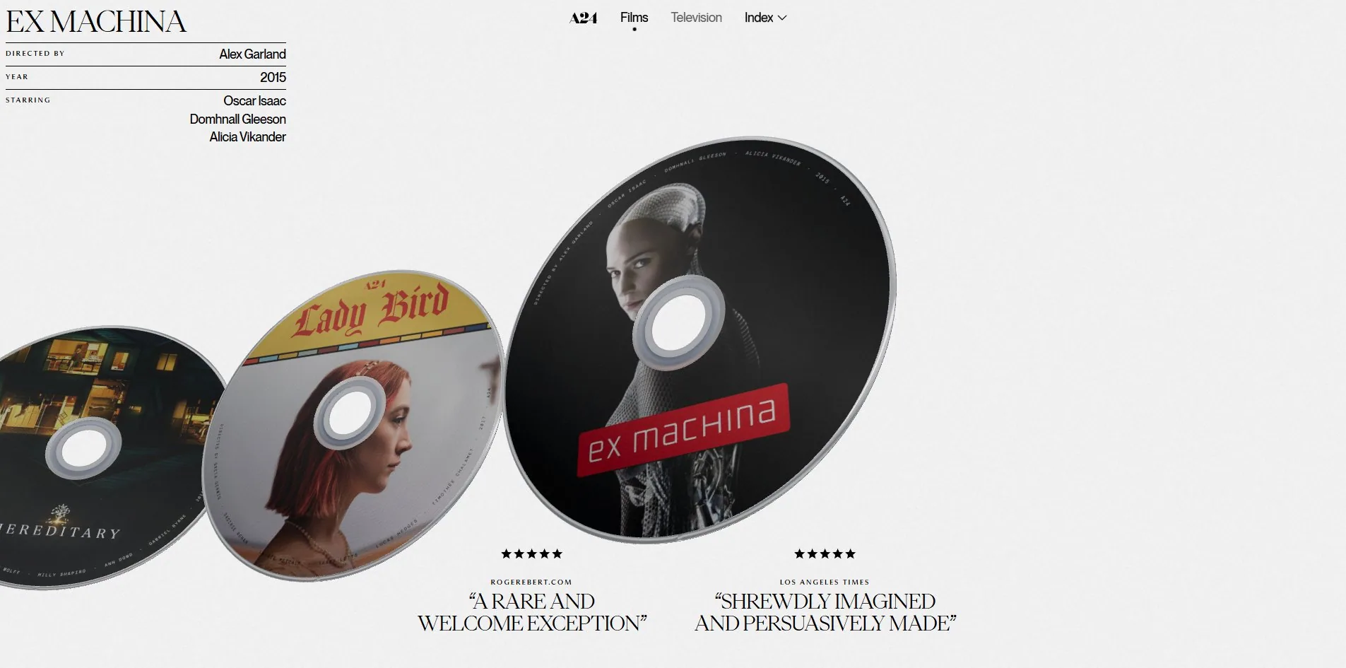
The faces are each film's real disc artwork rather than a poster thumbnail, and that decision is what makes the whole project work. A poster is made for a wall, a disc face is made for a hand. It has to work around a hole in the middle, set type along a circular path, and fit a full cast list into a small ring. Putting those faces on stage as the main visual brings back an entire body of graphic design that streaming quietly retired.
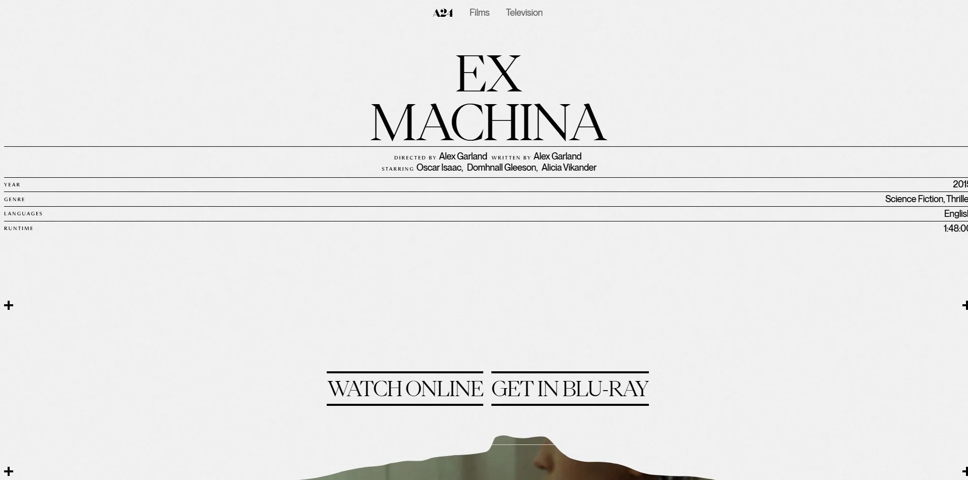
Click a disc and you land on a real route, of the form /production/ex-machina. That page keeps following the logic of a physical disc: director, writer, cast, year, genre, languages and runtime set as a table one row at a time, with two buttons below reading WATCH ONLINE and GET IN BLU-RAY. The blu-ray option is not nostalgic decoration, it is where the whole concept lands.
There is something the approach cannot reach. There are only twelve discs, and A24's catalogue runs far past that, so this is a selection rather than an index. The dropdown at the top, labelled Index 12, admits as much.
Design
Three typefaces, each with its post held strictly.
The display face, PPEiko, is a high-contrast serif carrying only 146 characters across the whole site, at sizes up to 160px. The text face, PPNeueMontreal, carries 3,597 characters, all between 10 and 18px. The third, PPMuseum, carries 50 characters, every one of them at exactly 10px.
Measured by rendered area the contrast comes out clearly. Those 146 serif characters occupy 67,349 square pixels while the 3,597 sans characters occupy 64,304. So the large type, 3.8% of the characters on the site, takes slightly more of the screen than every line of body copy put together.
What the third face is for is the sharpest decision here. All 50 of those PPMuseum characters are 10px labels, DIRECTED BY, WRITTEN BY, STARRING, YEAR, GENRE, RUNTIME. On the back of a physical disc case those words are set in their own small face. They are not content, they are the name tags for content. Giving them a typeface of their own carries that sleeve convention across intact.
Only three colours really work here. Black appears on 602 elements, the pale grey ground #f2f2f2 on 6, and a warmer grey, rgb(214, 211, 209), on 55. Of 663 elements on the page, exactly 6 carry a border radius.
Separation is done entirely with hairlines. On a film page a full-width rule sits between the title and the table, another between every row of it, and small crosses mark the corners as crop marks would. That is print practice rather than web practice, and it comes from the same place the discs do.
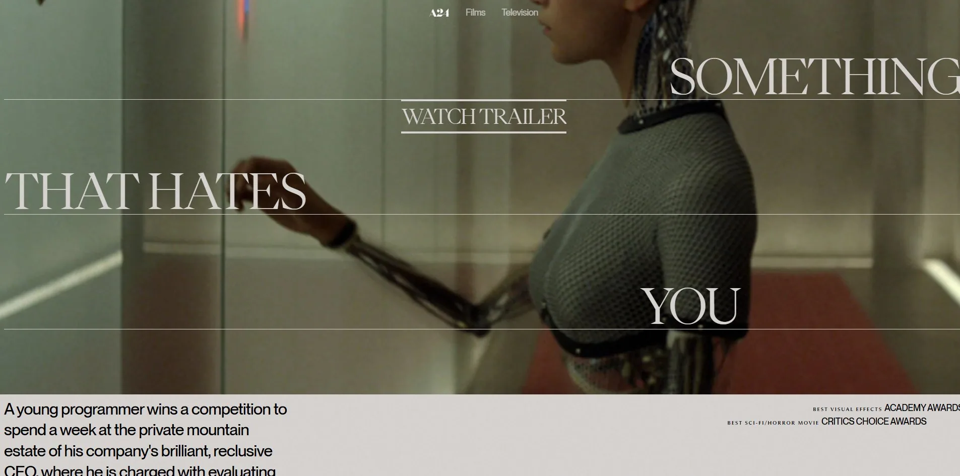
The only full-colour area anywhere in the layout is the film still. It fills the screen while the tagline is broken into three parts laid over it, each part sitting on its own hairline and staggered left and right. Here the type is pale against a dark still, the one moment in the page where the light and dark relationship flips.
Motion
There is one interaction, and it goes sideways.
Turning the wheel drives the discs sideways, and the document's scrollY never leaves 0. Dragging works too, with inertia after release. The discs do not merely translate as they move, they change scale and tilt at the same time, smaller and steeper the further they are from focus, which is why the row reads as having depth rather than being a flat conveyor.
The layer driving it is three.js r178 with GSAP, page transitions go through Barba, and smooth scrolling through Lenis. The division is worth noticing. The home route does not scroll, so Lenis has nothing to do there, and only once you are inside a film page, where the document becomes 3,738 pixels and roughly four screens tall, does it start working. Two scroll models in one site, each owning its own part.
Reduced motion is handled more seriously here than on most sites. The stylesheet contains four blocks for the preference, and the selector on the first one is *, ::before, ::after, a master switch that flattens transitions and animations on every element at once. The other three cover the loading indicator, the trailer lightbox and the scroll hint.
Anyone taking this away should know where it stops. A master switch turns off CSS animation, and it cannot turn off a render loop inside a canvas. With the setting on, the canvas is still there and the discs still push. Finishing the job means reading the preference in script as well and bringing that layer down too.
Engineering
Astro does the building, and the visual layer is a single 1920 by 945 WebGL2 canvas driven by three.js r178, rendering at display size with no supersampling.
The number worth talking about is the payload. One visit transfers 1.3 MB across 21 files. Seven disc images in webp account for 1,034 KB, three woff2 fonts for 245 KB, one avif grain texture for 35 KB, and script and styles make up the rest.
That figure is possible because of one judgement. A disc does not need a 3D model. The face is flat, so seven flat images map onto simple circular geometry, the tilt and scale are handled by transforms, and the sheen by the material. Swap in real disc models with full texture sets and the same picture costs tens of megabytes. Anyone building a product display can take the boundary from this. When the object is flat or nearly flat, a texture plus a transform is enough, and reaching for a model is waste.
The disc images come from Bunny's CDN with a version number on the filename, so a new artwork means a new number and the caching story stays clean.
First paint is quick too, 251ms to first byte and 412ms to first contentful paint. Cumulative layout shift is 0.0022, spread across 11 tiny movements you would never notice.
One thing is a genuine fault, though. During loading there is a single long task of 1,162 milliseconds, well over a second in which the main thread is occupied and neither clicks nor the wheel respond. Largest contentful paint is dragged out to 4,344ms for the same reason. The type appears fast, but being able to use the thing means waiting out that second. A long task like this usually comes from building the entire scene in one go, and splitting it across a few frames breaks it up.
Accessibility gets some things right: the page declares its language, there are navigation and main landmarks, and the stylesheet carries 21 focus rules, so keyboard focus is visible. What it gets wrong is that 12 of the 33 interactive controls are anchors with no accessible name, which a screen reader can only announce as a link. Film pages also present twelve second-level headings before a first-level one arrives, so the order runs backwards.
Scores and Team
| Award | Source | Date | Score |
|---|---|---|---|
| FWA of the Day | The FWA | 2026-09-17 | 83 POINTS, DAYS 4 |
No category scores are published at The FWA, only the maker's own one-line statement, in which he calls this an experimental, non-commercial project retelling A24's filmography as a 3D disc-based experience built around discovering its standout titles.
The important words there are non-commercial. A24 did not commission this and no client set requirements, which is why it can cover twelve films, put a blu-ray button on the page, and skip search and filtering entirely. As a sample of how far a self-directed portfolio project can be taken, this site is a good one.
| Credit | Who | FWA wins |
|---|---|---|
| Ravi Klaassens | Enschede, Netherlands, independent design and development | 2 |
One credit, designing and building. His FWA profile describes his practice as R—K, an independent design and development studio working on digital presence for ambitious brands, and the contact line says there is no office.
This is his second FWA. The first was his own studio site, R—K Design & Code, at 82 points. Both awarded pieces are his own. One an introduction, the other a demonstration.
Awwwards lists nothing for it, and the site carries no award badges.
Archive
- Award date
- 2026-09-17
- Awards
- The FWA FOTD 2026-09-17
- Site
- https://a24.raviklaassens.com/
- Credits
- Ravi Klaassens
- Design
- spatial
- Build
- canvas
- The FWA
- 83 POINTS, DAYS 4. https://thefwa.com/cases/a24
- Stack
- Astro, three.js r178, GSAP 3.15.0, Barba, Lenis, Bunny CDN
- Total assets
- 1.3 MB, of which seven disc images are 1,034 KB and three fonts 245 KB
- Speed
- 251ms to first byte, 412ms first paint, longest task 1,162ms, layout shift 0.0022