Boc.Studio
Open boc.studio and the first thing on screen is not a home page but an orange-red band across the middle of a film. Touch it and it bends, let go and it springs back like a string pulled tight. Scroll once and the band folds its text away, rises to the top and becomes the header of the whole site. The Barcelona brand studio Boc.Studio has a single page of work, and each of its nine projects is a strip of film that keeps moving on its own. 
Visit site ↗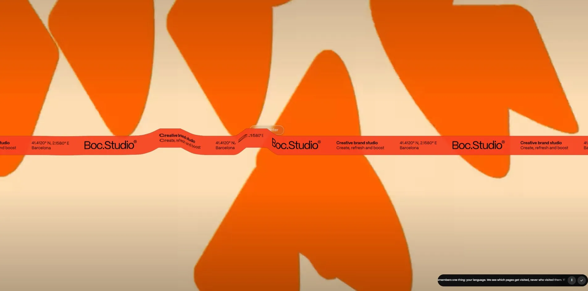
Concept
Boc.Studio is run by Jordi Canals and Oriol Bada. They do brand identity, creative direction, 2D motion, AI production and 3D animation, for clients including Audi, Skoda, Hays and the restaurant brand Yaba. A brand studio's site usually introduces the studio first and shows the work second. This one turns that around. The whole site is one list of work, and the studio's own story sits behind a button in the middle of the header labelled INFO.
The introduction is handed to the opening. An 18-second looping film of their own projects fills the screen, and an orange-red band runs across its centre carrying three things on a loop, the wordmark, the line Creative brand studio with Create, refresh and boost, and the coordinates 41.4120° N, 2.1580° E beside the word Barcelona. Who they are, what they do, where they are, all on one band. The band is alive. The cursor pushes it out of shape and it bounces back. Click or scroll and the text collapses into the wordmark, which slides to the top left, the band rises and narrows into the header, the film leaves, and the list of work appears. The opening plays on every visit.
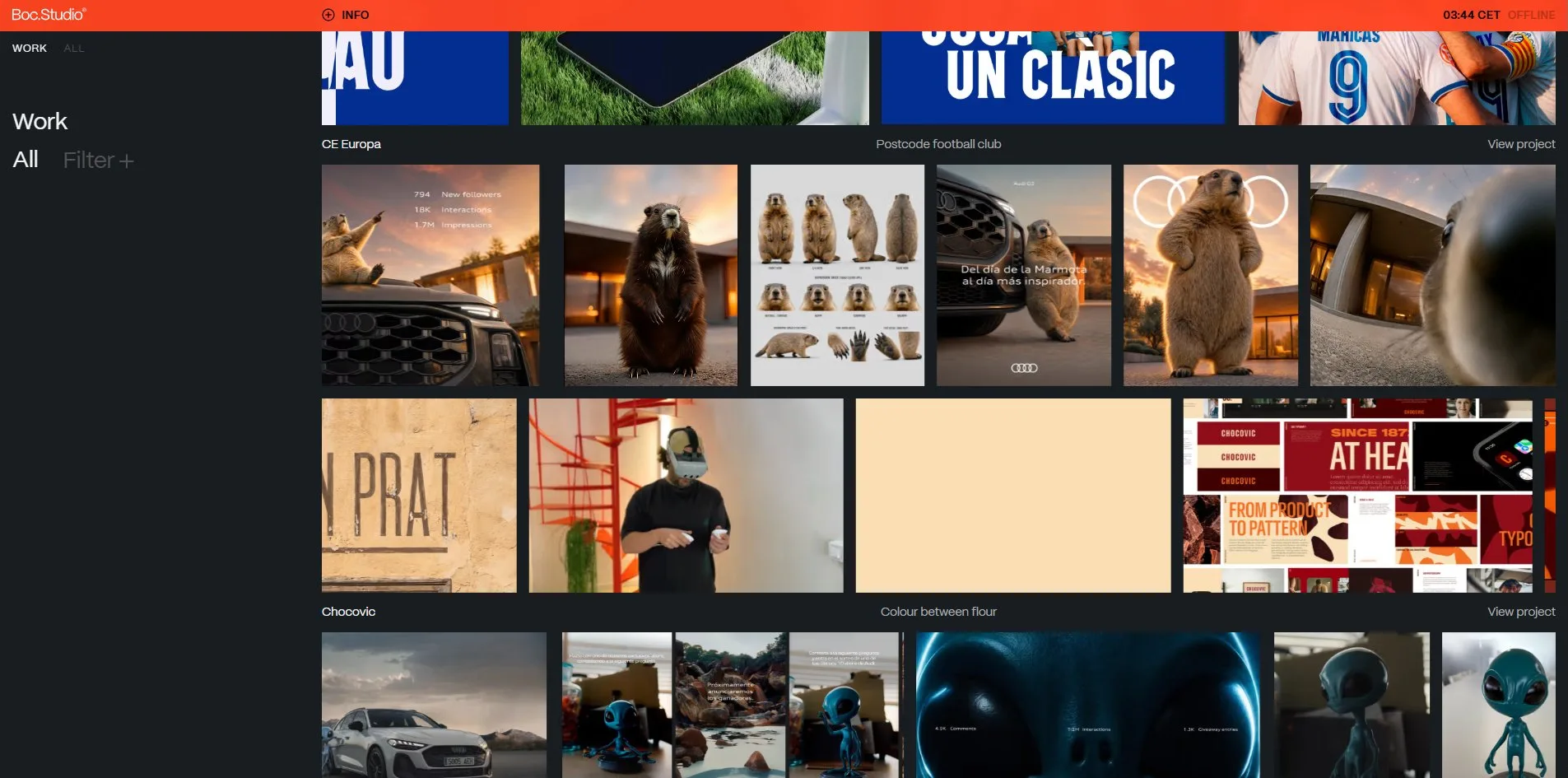
The work is nine strips of film. Each strip belongs to one project, a row of images joined end to end and moving left at a constant speed, anywhere from 9 to 31 frames, landscape at 420 by 236 pixels and portrait at 190 by 236, with a caption line underneath giving the name, a tagline and View project. Rest the cursor on a strip and it grows by a fifth while one to six of its frames turn into silent looping clips. The page is 2.8 screens tall, and its content moves sideways rather than down.
Every project has a case page. CE Europa is a brand refresh for a hundred-year-old football club in the Gràcia district of Barcelona. The page has two columns, a fixed sidebar on the left with five chapters under the title, Context, Insight, Idea, Application and Impact, and on the right 20 screens of pictures and film. The chapters turn themselves as you scroll. Reach a section and its chapter opens while the previous one folds. Context recounts that ten clubs founded La Liga in 1928 and that a century later, with football an industry, this club stayed in its postcode. Application describes a tool that generates a pattern for the club, a different image for every match.
A clock in the top right shows Barcelona time with Online or Offline beside it, and it reads Online between half past nine and six. The whole clock is a button. Hover and a pill saying Say hola! pops up, click and it opens a mail to hola@boc.studio. There is no cookie banner, only a scrolling line in the bottom right explaining that there is nothing here to consent to, that the site sees which pages get visited and never who visited them.
Design
The layout keeps to a single rule. The work fills the right, everything else retreats to the left and the top. The sidebar is 391 pixels wide and holds only the word Work at 28 pixels and the two switches All and Filter at 30, the rest is empty. From 391 pixels to the right edge run the nine strips, each 236 pixels tall, 15 pixels between rows and 15 pixels between frames. The page has no line of self-description anywhere, and its largest type is 30 pixels.
One typeface carries the whole site, PP Mori in two weights, 400 and 600. Body text is 15 and 16 pixels, titles are 28 and 30, and the labels in the header and sidebar are 13 pixels of the 600 weight in capitals, tracked out by 0.04em. Inside the INFO panel the introduction is set at 31 pixels and the client and service lists at 17.
Colour has three levels. The ground is a near-black blue grey, rgb(24, 29, 33). Captions use two greys, rgb(173, 173, 173) and rgb(138, 132, 132), and white rgb(243, 243, 243) is kept for project names and titles. The brand colour is the orange-red rgb(255, 68, 33). On the work page the only solid stretch of it is the header, 38 pixels tall, with black type on it. It fills the screen in three places only, the opening band, the INFO panel and the 404 page.
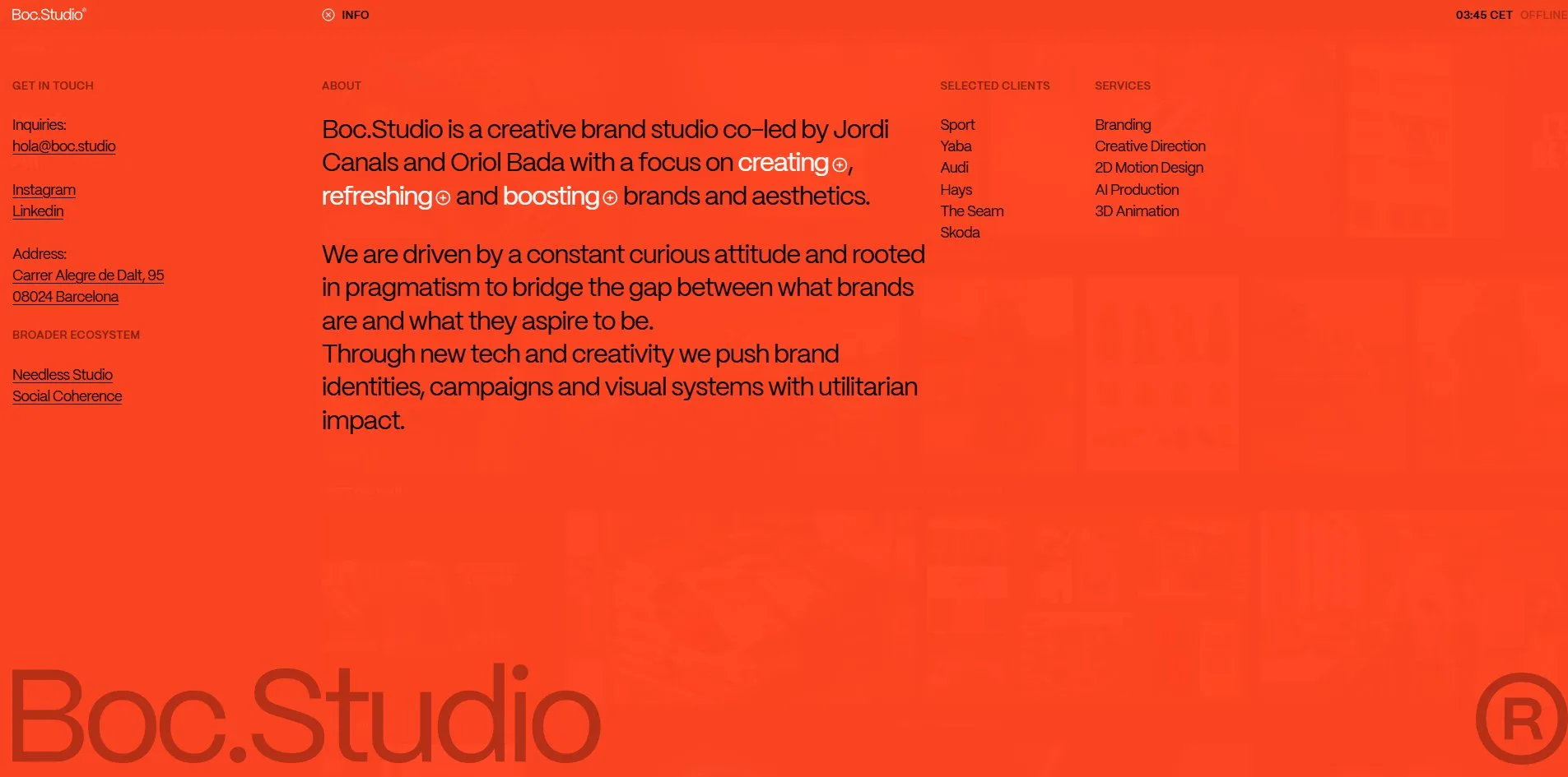
The INFO panel is the other face of that palette. Press INFO in the middle of the header and a sheet of orange-red glass, 98 percent opaque with an 8-pixel blur, comes down over the whole page. It has four columns, contact, About, clients and services, and in the About paragraph the words creating, refreshing and boosting are white, each followed by a circled plus. Along the bottom lies a Boc.Studio wordmark more than 200 pixels tall in a darker orange, as if printed on the glass. With the panel open the wheel still moves the list underneath, faintly visible through the glass.
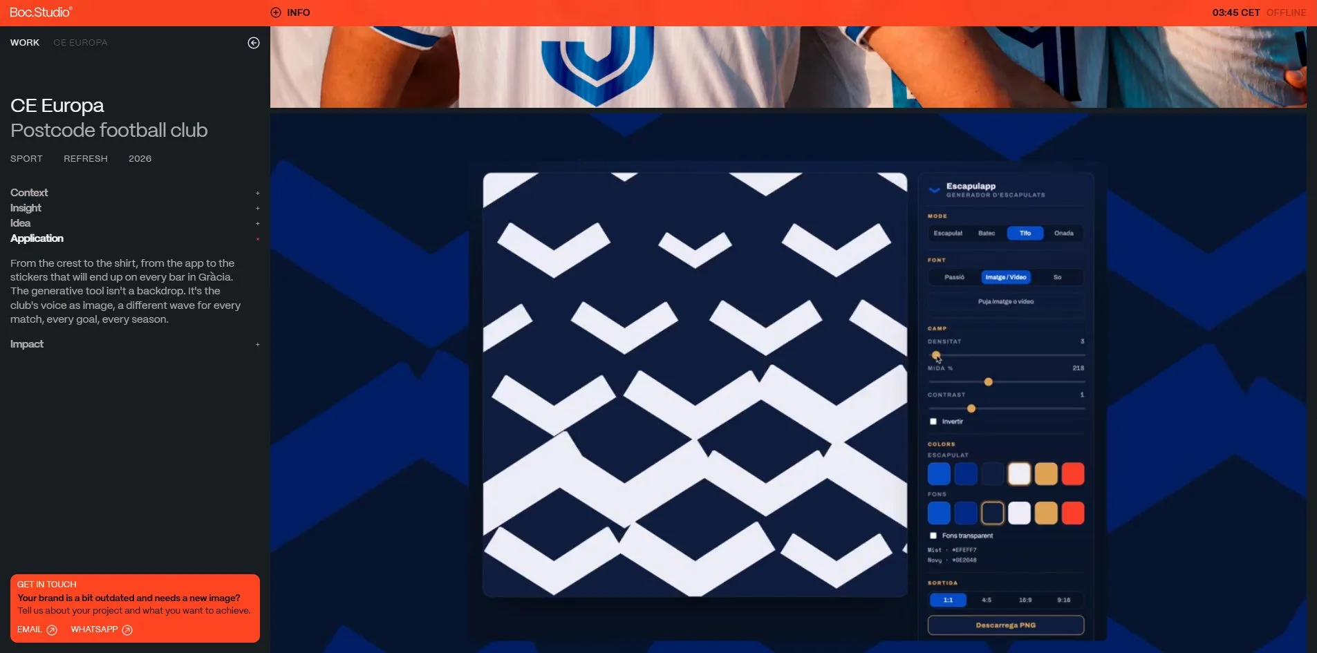
The case page changes face. In the sidebar the project title is 28 pixels with the tagline the same size in grey, and beneath them three 13-pixel capital tags, SPORT, REFRESH and 2026, give the sector, the task and the year. The images on the right come in two widths, full at 1,499 pixels and half at 746 side by side, 8 pixels apart. One screenshot in the CE Europa case deserves its own mention. It shows Escapulapp, the generator built for the club, white chevron stripes on a deep blue canvas, sliders for density, size and contrast, the club's six colours and four export ratios from 1:1 to 9:16. The brand is not a fixed set of marks but a tool the club can keep using, and this one picture says so.
The jury gave Design 7.4, second of the four dimensions behind Content at 7.56. The visual language is borrowed, a dark ground, a single sans, grey captions, the standard grammar of portfolio sites. What the studio added is the band, the film strips and the orange glass, and Creativity at 7.29, a little under Design, agrees with that reading.
Motion
The real work went into the opening band. It is not drawn with CSS. A WebGL canvas of 1,920 by 174 pixels lies over the band and runs a spring grid, 260 cells across, each holding a displacement. When the cursor passes, the cells within a radius of 14 percent of the grid are pushed, 9 units of force per pixel of travel, neighbouring cells pull on each other with a coupling of 0.3, everything decays to 92 percent each frame with an elasticity of 0.13, and the band can be pulled up to 130 pixels. Every frame the displacement table is written into a data texture, the fragment shader reads how far each pixel should shift, samples the band's texture at that offset and discards anything outside, which is why the band's edge bends too. The code keeps four presets, shipped, bouncy, fabric and dust, and a debug panel that opens by adding ?distort to the address. Dragging holds 60 frames per second.
The handover from band to header comes in three steps. After a wheel turn or a click, scrolling locks. Within a second the text on the band collapses into the wordmark and slides 15 pixels from the left edge. The band then rises from mid-screen to the top in 0.7 seconds, shrinking from 62 pixels tall to 38. Finally the opening layer is removed and the list fades in. About 1.8 seconds in all.
The strips are pure CSS marquees, one keyframe animation from 0 to -50 percent, with the track content duplicated and joined. Each row's duration is computed from its own length, 154 seconds for the longest and 43 for the shortest, so all nine rows travel at 69 pixels per second. On hover the row height scales to 1.2 over 0.4 seconds, one to six frames switch to silent 480p clips from Mux, and the marquee keeps going. Scrolling runs on Lenis with a lerp of 0.1.
On the case page the sidebar chapters follow the scroll. Context holds from 0 to 1,000 pixels, Insight from 1,500, Idea from 3,500, Application from 6,000 all the way to 17,000, and Impact from 17,500. Clicking a chapter name opens it directly. At 9,500 pixels an orange-red GET IN TOUCH card surfaces in the bottom left, asking whether your brand is a bit outdated, with EMAIL and WHATSAPP buttons. The brand film on the page is 73 seconds long. A Play video label follows the cursor over it, and one click plays it with sound.
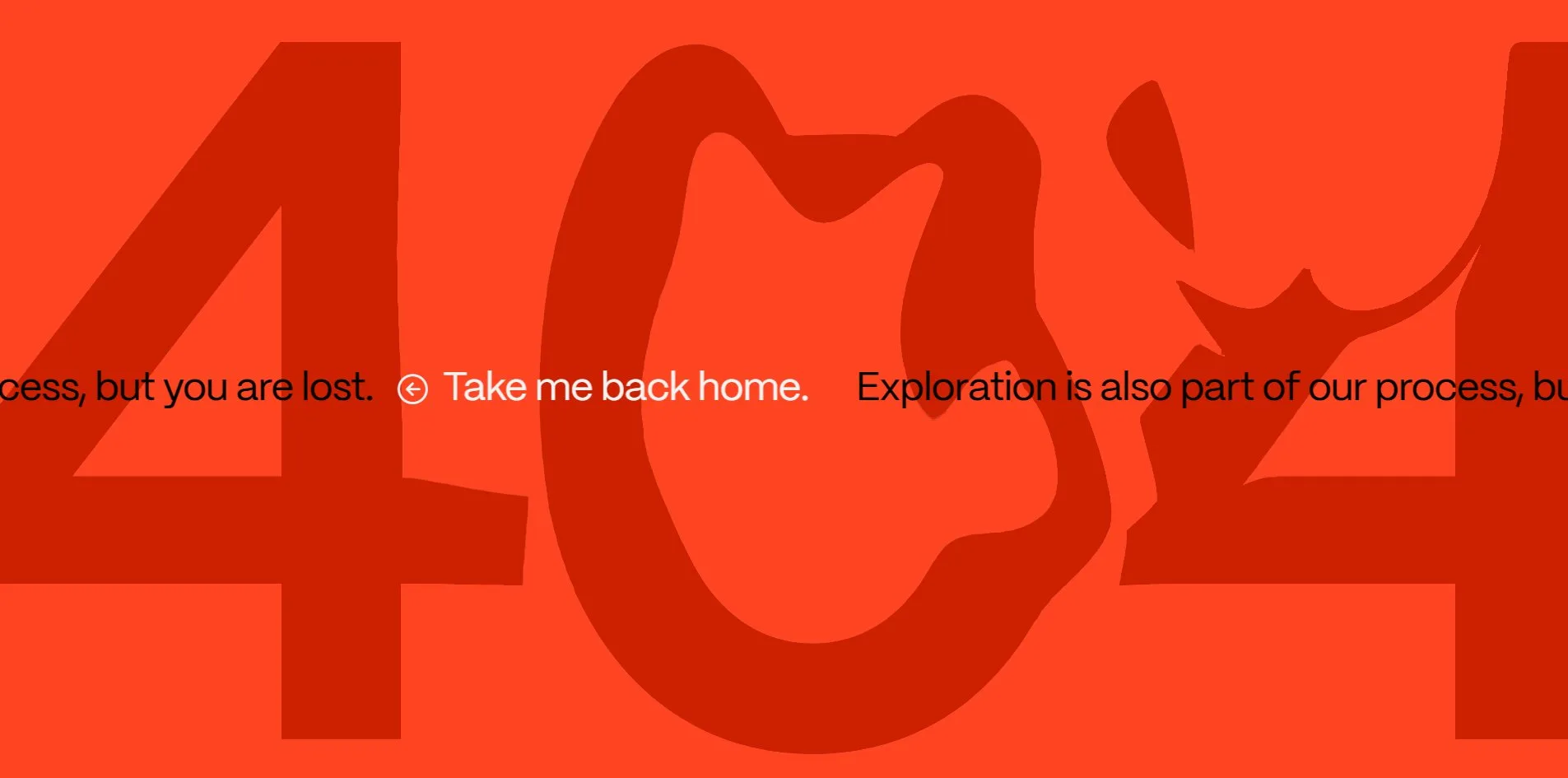
On the 404 page the digits 404 sit at 1,210 pixels in dark red on orange, and a full-screen WebGL canvas uses the same springs to warp them, so wherever the cursor passes the strokes are dragged along. A scrolling line underneath reads that exploration is also part of our process, but you are lost, Take me back home.
Engineering
Under the hood is Next.js, bundled by Turbopack, styled with Tailwind, with content from Sanity, video through Mux and hosting on Vercel. The script list includes Lenis, GSAP and framer-motion.
A first visit downloads 4.0 MB in 307 requests. The opening film in webm accounts for 2.5 MB of that, scripts are 328 KB across 20 files, fonts 73 KB, and the images of the list 0.8 to 0.9 MB. The images are generated on demand by Sanity. The request asks for a 2,560-wide webp and receives AVIF, 20 to 45 KB each. The first byte arrives in 250 to 375ms, first contentful paint at 780 to 844ms, largest contentful paint lands on the first row's image at 880 to 1,108ms, and layout shift is 0.0001. Continuous scrolling on the work page holds 59 to 60 frames per second without a single frame over 32ms.
The case page is a different order of magnitude. Scrolling CE Europa to the bottom costs 40 MB, of which 38 MB is Mux HLS segments in 168 requests, and images only 1.9 MB. At most five players are mounted at once, two at open and the rest created as they come near. The brand film is set to preload metadata and waits for a click, the other clips autoplay muted and looped. Continuous scrolling averages 58 frames per second with a p95 frame time of 35ms and a worst frame of 69ms, and the slow stretch is the first third where the film and players sit.
Accessibility has no gaps. The page declares English and has header, main and aside landmarks with a skip link. The 427 links in the strips look like duplicates, but only 204 are real, each named with an aria-label of Open case study plus the project, and the duplicated set is aria-hidden and removed from the tab order. The focus ring is a 2-pixel solid orange-red. Escape closes the INFO panel. The opening layer cannot be dismissed from the keyboard, but Tab passes through it to the WORK link underneath and Enter goes in. The reduced-motion setting covers the marquees, the arrows and the scrolling line on the 404.
Scores and Team
| Award | Source | Date | Score |
|---|---|---|---|
| Site of the Day | Awwwards | 2026-09-19 | 7.23 / 10 |
| Developer Award | Awwwards | 2026-09-19 | 7.30 / 10 |
| Dimension | Score |
|---|---|
| Design | 7.4 |
| Usability | 6.84 |
| Creativity | 7.29 |
| Content | 7.56 |
Content is highest and Usability lowest, 0.72 apart. Of the 19 published jury notes the lowest gives 6 across the board, the highest gives 9.4, 9.4, 9.6 and 9, and one more reaches 8.8. Usability is pulled down by two jurors who both gave it 5 while giving Design 7. An opening that needs a click to get through and a list of work that relies entirely on sideways marquees is where the jury disagreed most.
The Developer Award is 7.30. WPO is highest at 7.6, Animations and Accessibility 7.4 each, Semantics and Markup 7.0 each. Of the five developer jurors Johannes Auffermann gave 8.7 with a full 10 for Markup, and Balerein gave 6.45.
| Credit | Identity | Awwwards record |
|---|---|---|
| Boc.Studio | Barcelona creative brand studio co-led by Jordi Canals and Oriol Bada | WORKS 1, SOTD 1, DEV 1, HM 1 |
The credit on Awwwards stops at the studio, with Spain as its country. This is their first submission, and it took Site of the Day, the Developer Award and an Honorable Mention at once. The studio's own line on the award page is structure first, delight throughout, a straight-to-the-point portfolio brought alive by motion and small interactions. The INFO panel lists Needless Studio and Social Coherence as a broader ecosystem, and both partners link to their LinkedIn profiles. The site has not won on the FWA.
Archive
- Award date
- 2026-09-19
- Awards
- Awwwards SOTD 2026-09-19, Awwwards DEV 2026-09-19
- Site
- https://boc.studio/
- Credits
- Boc.Studio
- Design
- graphic
- Build
- realtime
- Awwwards
- 7.23 / 10. Design 7.4 / Usability 6.84 / Creativity 7.29 / Content 7.56. Developer Award 7.30. https://www.awwwards.com/sites/boc-studio
- Stack
- Next.js, Turbopack, Tailwind, Sanity, Mux, Lenis, GSAP, framer-motion, WebGL, Vercel
- Total assets
- First load 4.0 MB, of which the opening film is 2.5 MB. Case page fully scrolled 40 MB, of which Mux video segments are 38 MB
- Speed
- FCP 780 to 844ms, LCP 880 to 1,108ms, CLS 0.0001. Continuous scroll 59 to 60 fps, case page 58 fps