Pensatori Irrazionali
Pensatori Irrazionali, a creative house in Dubai, built its own site like a Renaissance folio. Chapter titles are set in a handwritten script, two white angels rise off the page in relief, and those angels are pre-rendered animation frames playing inside two WebGPU canvases. The bundle of flags on the first screen, printed with Uber, LEGO and Star Wars, is not an ordinary video either. It is fed to the GPU as a texture and multiplied back onto the grey paper. 
Visit site ↗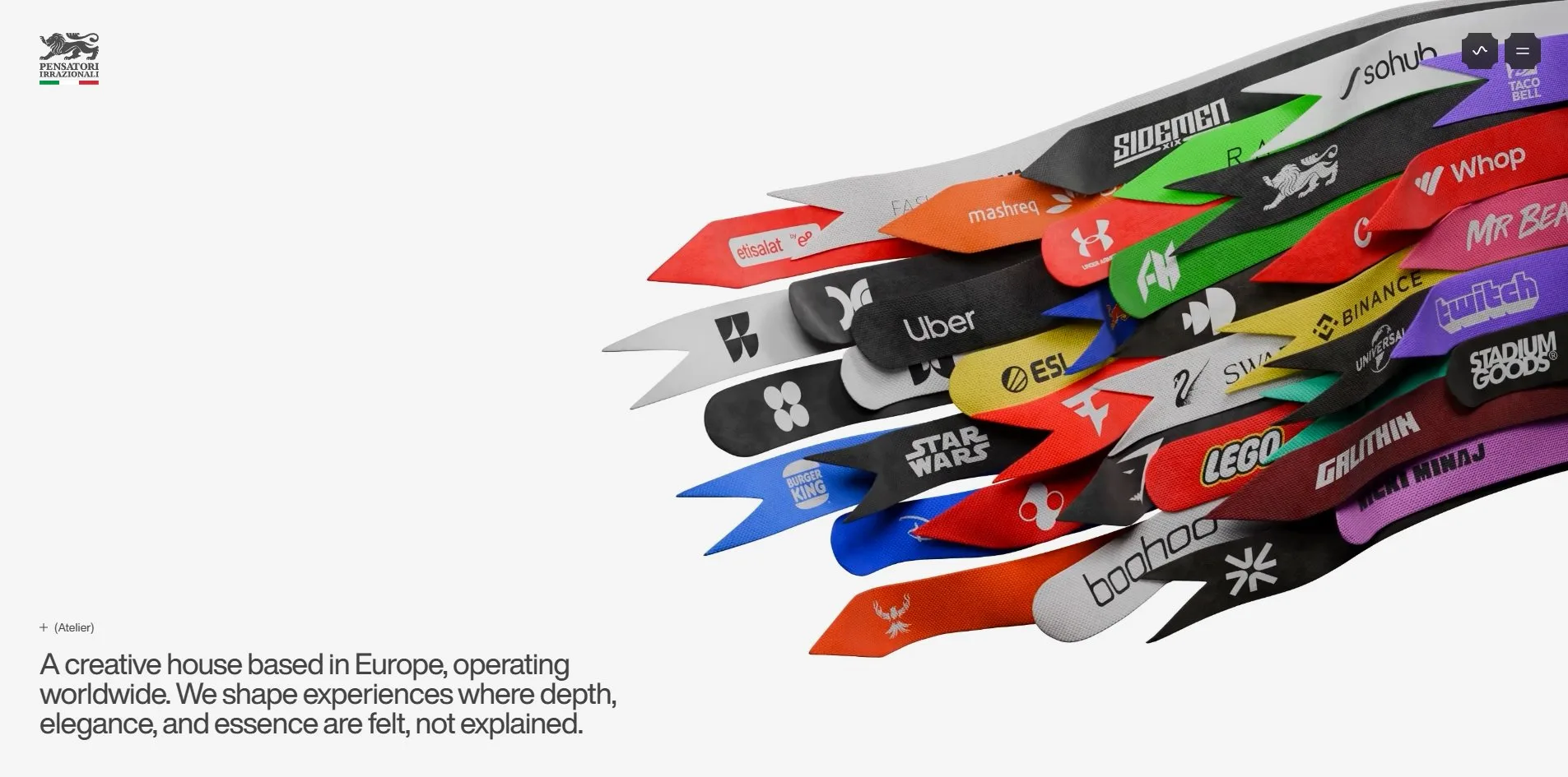
Concept
This is the site of a studio that does branding, websites, games and film, with Mayweather, Neymar, MrBeast and Cadillac on the client list. The usual treatment for a list like that is a black hero and a slogan. This site gives it engravings.
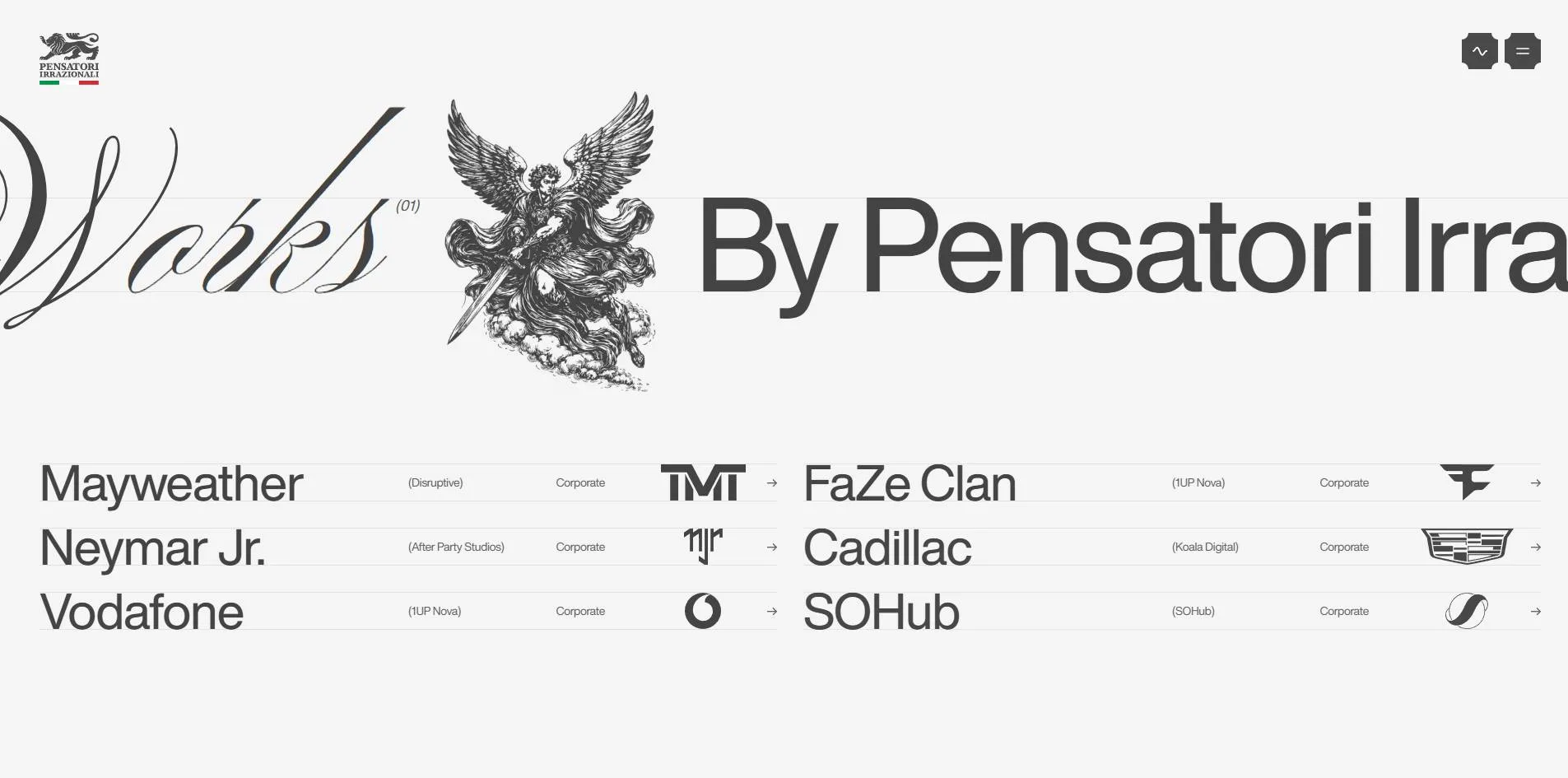
The name is Italian for irrational thinkers, and the crest is a lion over the Italian tricolour. Everything follows from that identity. The two chapter titles, Works and Disciplines, are handwritten script at 256px, each with a copperplate-style illustration beside it, an angel with a sword for one and a Pegasus for the other. Halfway down, a manifesto mixes three faces in one sentence. THE IDEA and TO CREATE are heavy grotesk, IS NOT is a serif italic, to live forever drops back into script, and two trumpeting putti fly in from either side. The footer is a heavy serif wordmark reading PENSATORI with a green rule and a red rule under it, while a grey Irrazionali in script runs behind the letters.
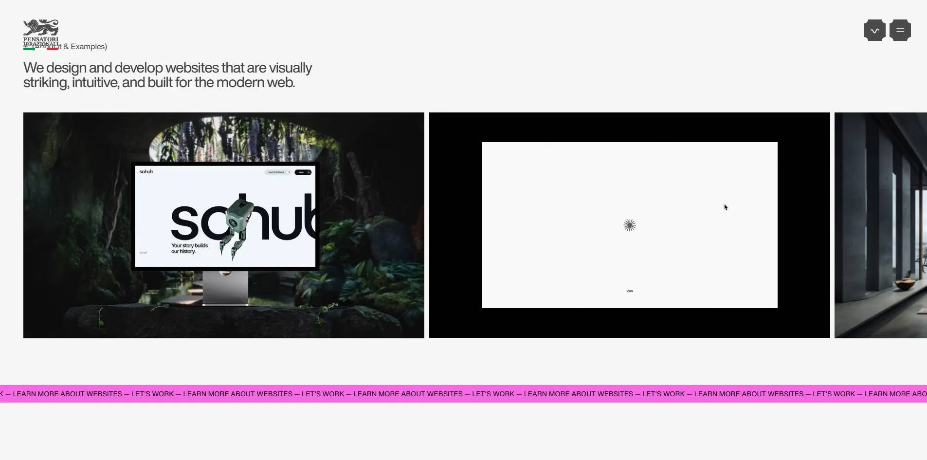
It does not stop at the antique. Each of the four disciplines gets one fluorescent colour, green for branding, pink for websites, hot pink for games, lime for film, and each colour appears in exactly two places, the dot in front of the discipline title and a full-width marquee band. Grey paper, copperplate and fluorescent tape on the same page is what separates this from other agency sites.
Three standalone pages carry the idea further. Universe is a black starfield with project images floating in it. You drag to wander through it, and clicking an image enlarges it into a preview with CLOSE and VIEW buttons. Contact is a pair of Michelangelo-style white relief hands around the question What brings you here today, and choosing Start a project opens a six-step form that asks one question at a time. The 404 page is a pixel game where the brand lion runs along the ground, eating pizza and wine and dodging Roman columns.
Design
The craft is in how the typefaces are cast. Of 6,632 characters on the page, 6,334 are set in Helvetica Now at weight 400, from 12px to 216px, so hierarchy rides almost entirely on size. The script face, Ballet, accounts for only 111 characters but nearly a third as much rendered area as those six thousand, because it is reserved for the 256px chapter titles, the four large discipline numerals, Error 404 and case-study titles. The serif, PP Editorial, is used for exactly 11 characters, all inside the manifesto. The monospace, Sometype Mono, appears only on the three buttons of the contact page. One face talks, one signs, one emphasises, one labels buttons, and none of them crosses over.
Colour is kept on an equally short leash. The page is rgb(245, 245, 245), the text is black and a few dark greys, and there is no other colour anywhere except the four bands. Their values are rgb(43, 255, 0), rgb(246, 105, 228), rgb(255, 0, 102) and rgb(173, 248, 0), and a full-page count finds each one on just the dot and the band. Colour is not decoration here. It is numbering.
The layout is tabular. Each discipline explains five services in a two-column table, Number on the left and Service on the right, separated by hairlines. The Trusted by section is ten empty boxes with thin borders, one client logo in each, followed by a map from Los Angeles to Tokyo with the coastline silhouettes of both cities pinned in opposite corners and their coordinates printed underneath. It reads like the contents page of a printed book, which is the same era as the script titles and the engravings.
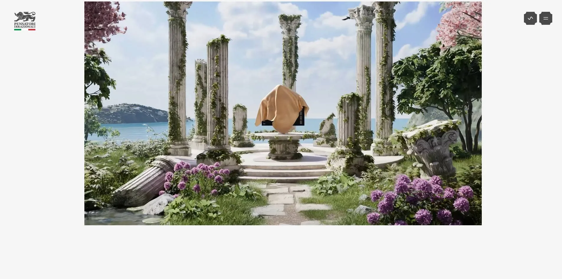
The imagery works in three layers. The copperplate illustrations are PNGs, the sword angel, the Pegasus, the two putti and the angel beside the quote. The white reliefs are frame sequences baked from a 3D render. They have no lines, only light and shadow, and look pressed into the paper. The third layer is client work, video and photography in full colour, Neymar, Vodafone's man in the red coat, FaZe's lemonade, and it appears only in the horizontal discipline galleries and in Universe. The first two layers belong to the studio, the third to its clients, and the separation is clean.
Take away the script and the engravings and what remains is a tidy grey agency site with tables, bands and galleries. The whole depth of the site is in that one layer. Its vocabulary is borrowed from classical book design, and the fluorescent bands are the studio's own addition. The four jury dimensions sit almost level, with Creativity at 7.33 a little above Design at 7.2, which is consistent with that reading.
Motion
The page scrolls on Lenis. One turn of the wheel moves the scroll position in shrinking steps of 170, 156, 141 and 126 pixels, and after thirty frames it has covered 1,700 pixels and is still settling.
The menu is a whole-page move. Click the icon at the top right and the current page shrinks to a card on a dark ground while a panel slides in from the right holding four news cards, the Awwwards SOTD, Forbes, Billboard and a Stüssy concept feature. Page changes use the same device. The whole page scales down into a dark frame and the next page scales back up out of it, all of it DOM scaling. The canvas count never changes.
Each row in the Works list carries four copies of the same name stacked up. On hover the letters roll and scramble before settling, and mid-animation the DOM reads something like Maywentatb. The effect has a sound, scramble-hover-2.mp3 at volume 0.2. Opening and closing the menu plays menu-open-4.wav, hovering a nav item plays hover.wav at volume 0.05. Sound is on by default, with a mute button in the header.
In the Contact section the word BUILD trails seven ghosts. Those are seven copies of the same SVG stacked on top of each other, five paths each. The four marquee bands each loop LEARN MORE ABOUT, the discipline name and LET'S WORK. The gallery videos play when they enter the viewport and stop when they leave. With three of them playing at once in the games section the frame rate drops from 60 to 30, and it returns to 60 as soon as you scroll away.
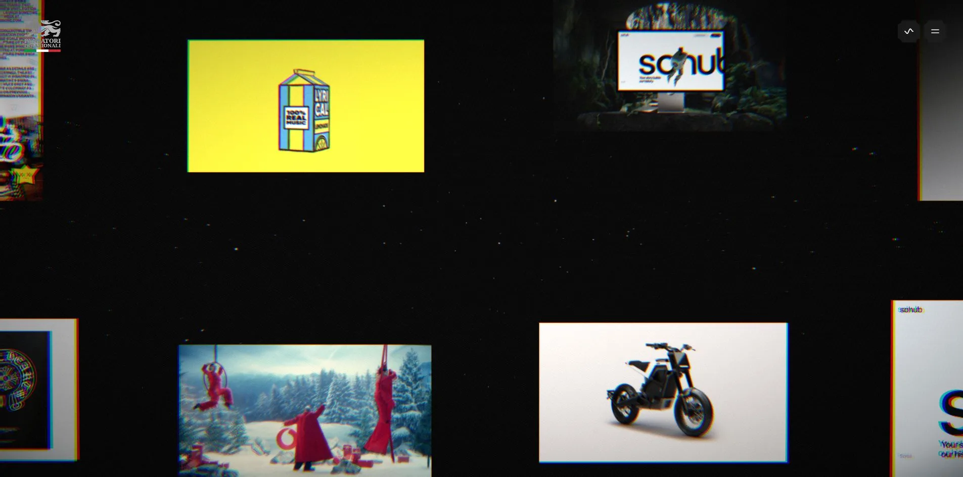
On Universe the cursor is a grab hand. Hold and drag and the whole starfield moves with you, holding 60 fps throughout. Click a project image and it grows to the centre of the screen with CLOSE and VIEW above it. On the contact page the two hands follow the pointer, changing pose and sharpness as the cursor moves. At the end of a case study the words NEXT WORK sit over a purple progress bar. It fills from 8% to 40% as you keep scrolling, and then the page swaps itself for the next project. In testing SOHub landed directly on David Beckham.
The 404 game jumps on the space bar. The lion is a GIF, the obstacles are three PNGs, six presses took the score from 21 to 80, a collision restarts the run, and the best score stays in HI 0080.
Engineering
The site runs on Next.js, bundled with Turbopack, and the 3D is three.js r182 through WebGPURenderer with a WebGL backend shipped in the bundle as a fallback. Content comes from Sanity, the galleries are Swiper, and the bundle also carries GSAP, ScrollTrigger, SplitText and Matter.js.
The flags on the first screen are a 2,560 by 1,440 mp4 looping every 5 seconds. The video element itself is at opacity 0. The picture is drawn frame by frame by a WebGPU canvas in the same container through a VideoTexture, and the container is set to mix-blend-multiply, which is why the white ground of the video melts into the grey paper. Video and canvas each carry a 300ms opacity transition, so the video can stand in if the canvas fails. The video even ships a VTT caption track whose only line is Decorative motion.
The two relief angels and the contact hands are baked frame sequences. A function called getBakeFrameUrls gives each object two ways in, either a single sequence.ktx2 texture array or six files numbered 1 to 6, decoded by basis_transcoder.wasm into compressed array textures. The angels are 16.2 MB each, the hands are six files of 10.7 MB, 64 MB in all. These are issued as high-priority link preloads from the HTML, downloading 222ms after parsing begins, while the angels are not visible until two and a half screens down and the hands are not on the home page at all.
So the first load of the home page is 41 MB, of which 32 MB is texture, 6.8 MB images, 830 KB script and 582 KB fonts. Scrolling all 15.6 screens brings it to between 125 and 132 MB. The Universe page pulls a further mp4 of close to 200 MB.
The first screen still arrives fast. The server answers in 139 to 192ms, first contentful paint lands at 516 to 596ms, largest contentful paint at 696 to 832ms on the flag video, layout shift is 0.004 and the longest of two long tasks is 173ms. What the visitor sees is a dark loading screen for roughly two seconds and then the flags.
Continuous scrolling averages 59 fps. The worst stretch is the games gallery at 52 fps with a p95 frame time of 35ms, and the cause is the three videos decoding at once. Universe renders through WebGL2 rather than WebGPU, on a 2,880 by 1,417 canvas that is 1.5 times the 1,920 viewport, a deliberate supersample.
On accessibility the page declares English, has header, nav, main and footer landmarks, and none of its 67 images is missing an alt attribute. The problems are headings and keyboard. There is a single H1 and no H2 at all, and the developer jury gave Semantics 6.60. The first Tab lands on the sound button, then the six Works rows, and the menu button does not come up until the thirties. Four Learn More buttons and one Contact us set outline to none, so focus vanishes when it reaches them. The reduced-motion preference is honoured in two places only, the Universe lion and the 404 game. Everything else keeps moving.
Scores and Team
| Award | Source | Date | Score |
|---|---|---|---|
| Site of the Day | Awwwards | 2026-09-20 | 7.23 / 10 |
| Developer Award | Awwwards | 2026-09-20 | 7.24 / 10 |
| Dimension | Score |
|---|---|
| Design | 7.2 |
| Usability | 7.19 |
| Creativity | 7.33 |
| Content | 7.31 |
The four dimensions fall within 0.14 of each other, nearly a flat line. Of the five jurors shown on the page, four scored a straight 7 across the board, and only Denys Koloskov gave 7, 8, 8 and 9, lifting Creativity and Content slightly.
The developer award spreads much wider. Animations at 8.20 is the highest of the seven categories, Semantics at 6.60 the lowest, with Accessibility 7.00, WPO 7.20 and Markup 7.40 between them. The 8.20 is the menu scaling, the script titles and the WebGPU flags. The 6.60 is the document with one H1.
| Credit | Identity | Awwwards record |
|---|---|---|
| Pensatori Irrazionali | Creative house, profile country United Arab Emirates | WORKS 2, SOTD 2, HM 2 |
The credit stops at the studio. Its other SOTD on Awwwards is SOHub from 7 June 2026, which is the first news card in the site's own menu. The SOHub case page names Socrates and Themis as project directors, and Billboard has covered Themis "Reit" Chrysafidis. The footer address is Building A1, Dubai Digital Park, the copyright belongs to Aeva, and the opening line of the site says based in Europe. The site has not won at the FWA.
Archive
- Award date
- 2026-09-20
- Awards
- Awwwards SOTD 2026-09-20, Awwwards DEV 2026-09-20
- Site
- https://pensatori-irrazionali.com/
- Credits
- Pensatori Irrazionali
- Design
- graphic
- Build
- realtime
- Awwwards
- 7.23 / 10. Design 7.2 / Usability 7.19 / Creativity 7.33 / Content 7.31. Developer Award 7.24. https://www.awwwards.com/sites/pensatori-irrazionali
- Stack
- Next.js, Turbopack, three.js r182 WebGPURenderer, KTX2 + Basis, Lenis, GSAP, Swiper, Matter.js, Sanity, Cloudflare
- Total assets
- 41 MB on first load, 32 MB of it KTX2 textures. 125 to 132 MB after a full scroll
- Speed
- FCP 516 to 596ms, LCP 696 to 832ms, CLS 0.004. Continuous scroll 59 fps