The Design Society
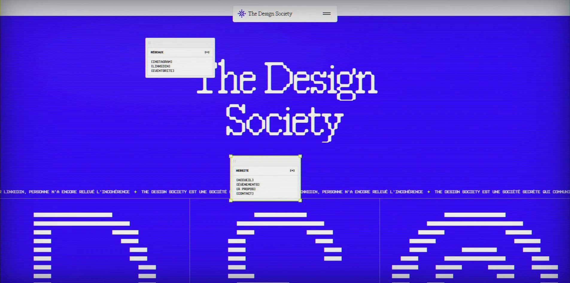
A marquee in the footer keeps repeating one line, The Design Society is a secret society that posts on LinkedIn, and nobody has pointed out the contradiction yet. The whole site sits inside an old cathode ray television, five layers of scanlines, grain, vignette, glass glare and bezel over every page, the cursor flings event photos across the first screen, and hovering the five members turns their portraits into pixel figures. It is the site of a club five designers run in Lyon, talks and drinks, built alone by Benjamin Nespoulous in Webflow, FWA of the Day with 82 points. 
Visit site ↗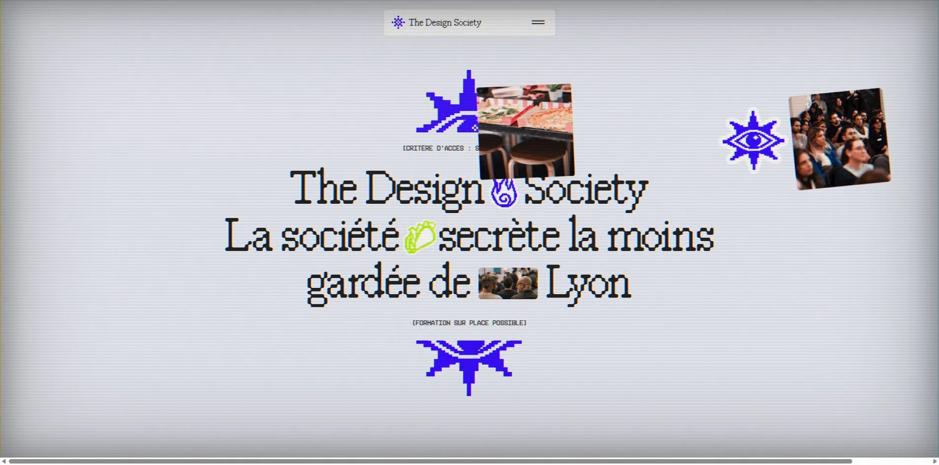
Concept
The Design Society is a designers' club founded in Lyon in 2025 by five people, and it runs two kinds of event, talks and drinks. A talk has a local designer on one subject, Hugo Douchet on how tools bias creative work, Salomé Millet on art direction, Julien Combaz on user research. The drinks have no programme. Tickets are on Eventbrite, the site holds only the introductions and the links. It is in French, with no second language.
A club site usually writes itself up seriously, mission, vision, join us. This one goes the other way, casts itself as a secret society and then undercuts the act at every turn. The first screen calls it the least well guarded secret society in Lyon, and the small bracketed lines above and below say that the entry requirement is knowing how to breathe, and that training on site is possible. The events heading says we hold secret events in secret places, the address is on Eventbrite. The members section says here are our faces, but avoid recognising us in the street. The about page tags itself doubtful classification, password 1234, high leak risk, anonymity failed. The marquee on the contact page promises that they really read their mail, even on Sundays, with a reply within 48 hours, sometimes 49. Switch to another tab and the browser tab title changes to a French oh come back.
The joke has a visual counterpart, the television. The site is not drawn straight onto the screen but seen through tube glass, like a tape from the nineties. Secret society, old television and pixel art add up to one tone, a group of designers pretending to be mysterious while knowing you can see through it.
There are only four pages. Home has the title, a manifesto, the next talk, the five members and the footer. Events has the next drinks and a four row table of past events. About has a group photo and an introduction. Contact is one screen, an email address and a marquee. The whole site has under a thousand words, and what carries it is that every interaction keeps the joke going.
Design
The five layers of television are where the craft lies, and they turn an ordinary Webflow layout into a picture with a surface. Five fixed layers sit above all content and take no clicks. The first is scanlines, a one pixel black line every three pixels at 18 percent. The second is grain, an SVG turbulence noise spread at 5 percent and shifted every 0.4 seconds, so the picture keeps quietly hissing. The third is glare, a 5 percent white radial highlight in the top left. The fourth is a vignette darkening the corners by 35 percent. The fifth is the case, two inset shadows of 60 and 160 pixels pulling the edges of the screen inward. All five values are CSS variables, so one change ages or renews the television across the whole site.
There are four colours. The ground is a very pale grey violet, rgb(235, 237, 245), the ink is a near black rgb(30, 30, 30), and the two brand colours are an electric blue rgb(53, 10, 255) and an acid green rgb(188, 240, 21). Blue fills whole sections, the manifesto, the footer and the entire contact page. Green only takes small areas, tags, the round arrow on buttons, the eye card in the menu and the background of selected text. The page switches between grey violet and blue, first screen violet, manifesto blue, events and members violet, footer blue, and every switch punctuates a chapter.
Four typefaces each do one job. FK Raster Roman Compact is a pixelated serif and sets only the largest words, the first screen title and the talk titles at 125 to 132 pixels and the Pssst on the contact page at 115, and its jagged edges are the shape the site is remembered by. KH Teka is a clean sans for section headings and the manifesto at 57 to 71 pixels, up to 140 on the about page. KH Interference sets all the small text, 14 pixel body and 11 to 12 pixel uppercase labels, most of them wrapped in square brackets like prompts in a terminal. The fourth, Geist Pixel Line, appears once, three letters at 768 pixels at the bottom of the footer, D, S and the copyright sign, so large that only a few bars remain and they read like a barcode.
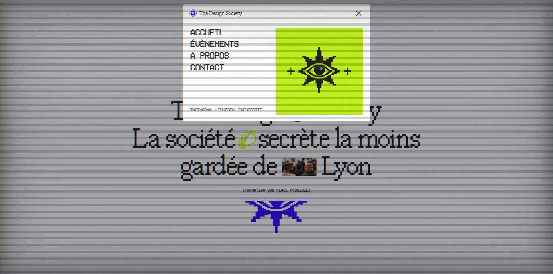
Every interface element is drawn like an old operating system. The navigation is a small window at the top of the screen with the logo, and it opens into a centred dialog with a close button while the page dims behind it. The two groups of links in the footer each live in a small draggable window with a plus sign at the right of its title bar. The eye in the logo turns to follow the cursor by up to 15 pixels. Pixel stickers are scattered everywhere, a flame, a taco and a small crowd photo inside the first screen title, a heart, a beer mug and a ticket over the members' portraits, and the stickers swap between green and blue every 12 seconds.
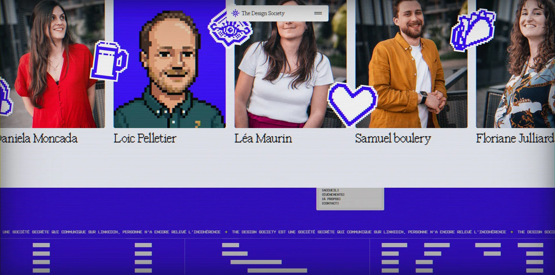
All the photographs come from the events themselves, an audience at a talk, a speaker holding a microphone, a crowd at the drinks, unretouched. The five members' portraits exist in two versions, a photograph and a matching pixel figure, and the pixel version appears only on hover.
Take away the television and the pixel type and what is left is a tidily arranged club site, headings, paragraphs, cards and buttons, all present. Its idea is not in the layout. It is in the glass and in the jokes.
Motion
The first screen moves with the cursor. Every 240 pixels of cursor travel takes one of the event photos or stickers and pops it in at the cursor, scaling up elastically over 0.6 seconds, then slides it out along the cursor's direction by four times the distance the cursor moved, with a little random rotation, and after 1.5 seconds it shrinks and disappears. One quick sweep throws four or five at once, scattering in every direction like a stack of photos swept off a table.
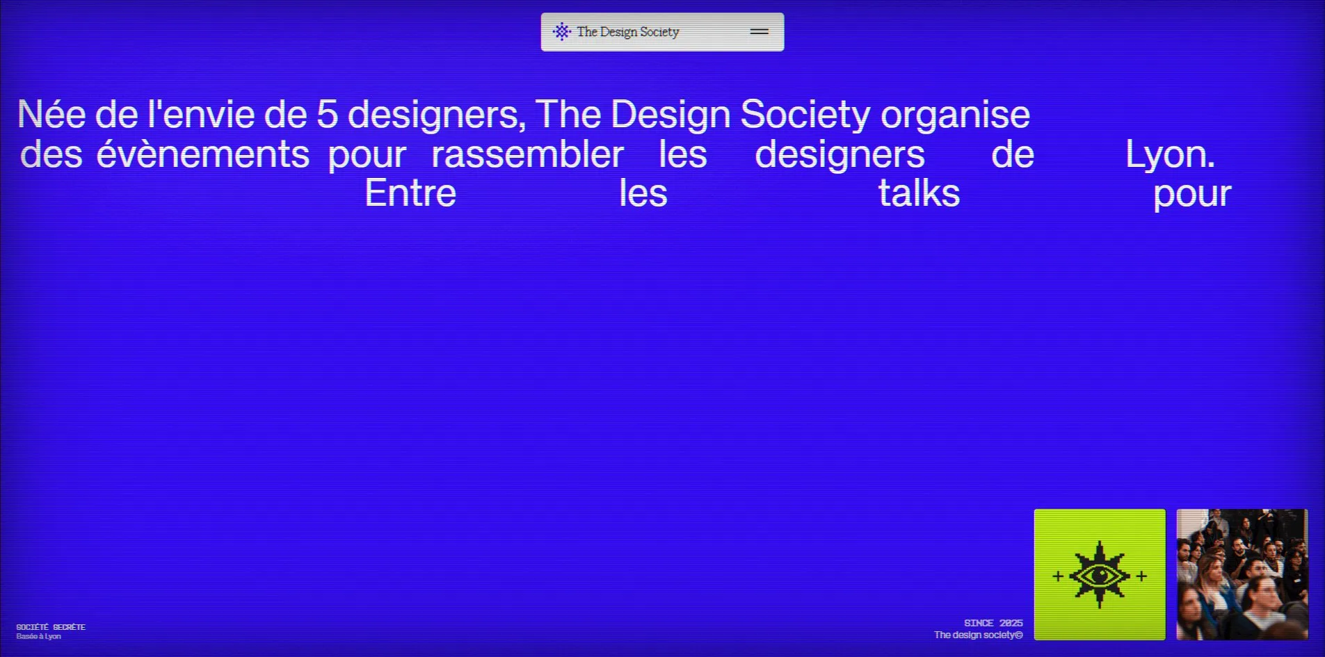
The manifesto is the one pinned picture in the site. A blue screen holds in place for 3,780 pixels of scrolling while 51 words fly in one after another from the right edge, 0.02 seconds apart on a power4.inOut ease, driven directly by scroll progress, so scrolling back sends them out again. Halfway through, the first half of the sentence is set and the rest is still scattered in mid air with long gaps between the words.
The event photos are a three slot carousel, the current slot 1,283 pixels wide and the other two 275 each, advancing every 6 seconds when a progress line beneath fills, and a click on any slot switches too. Images entering the viewport do not fade in but arrive through a grid of squares that vanish one by one in random order, like changing channels on an old set. Section headings push up line by line out of a mask.
The members are a strip that drifts on its own, five cards duplicated to ten and joined end to end. Rest the cursor on one and the pixel figure version of that person appears over the photo, and it returns to the photo when the cursor leaves.
Page changes are pixelated. Click a link in the menu and 72 blue squares in 12 columns and 6 rows cover the screen in random order over 0.3 seconds, the page swaps underneath, and the squares vanish in random order again, 1.6 seconds in all, while a green loading line runs across the navigation window.
The two footer windows can be dragged. On press they scale up 5 percent, tilt a random degree and pick up a shadow, and on release they stay where they are dropped, never leaving the footer. The marquee is a pure CSS translation taking 52 seconds a loop. The three 768 pixel letters skew slightly as you scroll. Every bracketed link scrambles its letters on hover and settles back, using GSAP's ScrambleText.
Engineering
This is a site without a canvas. The television, the pixel page change, the flung photos and the draggable windows are all DOM, CSS and SVG, and there is not one canvas element. Webflow produces the layout, and the motion is a 38 KB custom script injected through Slater, thirty initialisation functions each handling one thing, the loader, the navigation, the cursor trail, the manifesto, the carousel, the members strip, the pixel transition, the draggable stickers, the scrambled text. The libraries are the full GSAP 3.15 family, ScrollTrigger, SplitText, ScrambleText, Draggable, InertiaPlugin, Observer and CustomEase, scrolling is Lenis 1.3.17 with a lerp of 0.05, page changes are barba 2.10.3, and Webflow's own jQuery comes along.
With no canvas, scrolling is light. Of the 29 scroll triggers on the home page only the manifesto pins, the page holds 60 frames per second from top to bottom, and the slowest frame is 27 milliseconds. The first byte arrives in 84 to 177 milliseconds, first contentful paint at 350 to 480 milliseconds, largest contentful paint at 650 to 880 milliseconds, with a layout shift of 0.0066. A logo animation holds the page for about 4 seconds before letting you in.
The weight is in the images. The home page is 15 MB, 14.5 MB of it PNG, the five members' portraits at 1.8 to 2.1 MB each and their pixel versions at 0.3 to 0.4 MB, and there is not one WebP or AVIF on the site, the talk photos are PNG too. The about page adds another 15 MB and the events page carries one 2.7 MB hero image. The four font files total 173 KB, and KH Interference and KH Teka are loaded from files whose names carry the word TRIAL.
Accessibility has several gaps. The page declares no language, so a screen reader reads the French in its default voice. The home, about and contact pages contain no heading element at all, every title is a div. All 47 images have empty alt text, including the five portraits and the talk photographs. The navigation button has no name. What works is that Escape closes the menu, and with reduced motion on the page change becomes a fade, the grain stops shifting and the pixel reveals are dropped, though the cursor trail and the manifesto words still move.
Scores and Team
| Award | Source | Date | Score |
|---|---|---|---|
| FWA of the Day | The FWA | 2026-09-21 | 82 POINTS, DAYS 14 |
The FWA gave 82 points and took 14 days. The team's description on the award page is a single paragraph, five designers, talks to share knowledge and drinks to forget it, and a goal of creating the chances to meet that were missing and uniting the profession. It reads in exactly the site's voice, and is the same kind of self mockery.
| Credit | Identity | Record |
|---|---|---|
| Benjamin Nespoulous | Designer and developer, France | FWA 1, Awwwards WORKS 2, HM 2 |
Benjamin Nespoulous made the whole site alone, and this is his first FWA. On Awwwards he has two submissions, the event creation tool Shotai and his own portfolio, each with an Honorable Mention. The five members of the club are all designers and the site lists their roles, Samuel Boulery as president and lead on AI design, Floriane Julliard as treasurer and lead designer, Daniela Moncada and Léa Maurin on communication, Loïc Pelletier on partnerships, but they are not in the credits, and the design and build of the site are Nespoulous's own.
Archive
- Award date
- 2026-09-21
- Awards
- The FWA FOTD 2026-09-21
- Site
- https://www.thedesignsociety.fr/
- Credits
- Benjamin Nespoulous
- Design
- graphic
- Build
- dom
- The FWA
- 82 POINTS, DAYS 14. https://thefwa.com/cases/the-design-society
- Stack
- Webflow, GSAP 3.15, ScrollTrigger, SplitText, ScrambleText, Draggable, Lenis 1.3.17, barba 2.10.3, Slater
- Total assets
- 15 MB on the home page, of which PNG 14.5 MB. The about page adds another 15 MB
- Speed
- FCP 350 to 480 ms, LCP 650 to 880 ms, CLS 0.0066. Continuous scroll 60 fps