Elespacio
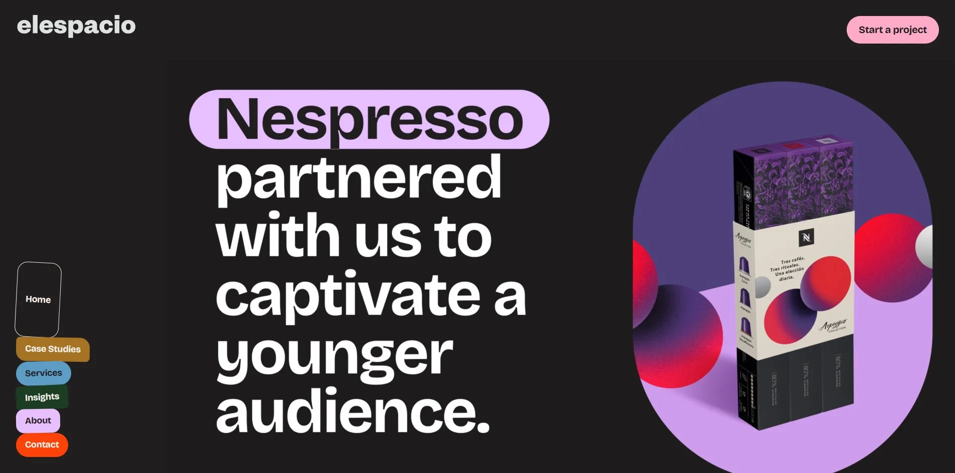
Elespacio's new website turns its navigation into a pile of stickers. Six small labels, each leading to a page, lean against the left edge of the screen at a tilt of a degree or two: a tall black card, an ochre card with two round corners and two square, a blue capsule and an orange one, a dark green square and a lilac card with soft corners. When the cursor rests on one of them, that sticker puffs up. When a visitor opens a page, the sticker for that page swells into a square or a strip, as if someone had just pressed a fresh one on.
Elespacio is a marketing agency in Barcelona and Berlin, and it built this site for itself. The site was FWA of the Day with 81 points.
01Concept
Elespacio is an agency with more than twenty years behind it, offices in Barcelona and Berlin and a client list that includes Nespresso, Victorinox, Google, Zalando and Desigual. This version of the site sells a word the agency coined, Brandformance, made from brand and performance. Performance marketing means advertising paid for and judged by clicks and conversions, and it is usually run by a different team from the one that builds the brand. The first sentence on the home page says so outright, Most agencies split the space between brand and performance. Elespacio closes it. In other words, other agencies run the two as separate shops, while Elespacio puts one team on one brief for both. The site also introduces two more things, a working method the agency calls REEAL, run in five week sprints, and a position on AI in which AI does the heavy lifting of research, audits, first drafts and optimisation while the thinking stays human.
What the site holds is the agency describing itself rather than a portfolio. Of the seven passages on the home page only one is about client work, and it arrives in the clients' own words, Nespresso's media manager saying a project with Elespacio is never a worry, Victorinox's head of UX saying conversion and revenue both rose. The full case studies sit on a page of their own, seven projects, each titled by its result, Victorinox's online sales up twenty percent, Cricut's return on ad spend in Germany at 521 percent, Ismax's social interactions up fivefold. Each case study, once a visitor opens it, turns out to be one long column of images. The Nespresso case is more than ten thousand pixels tall, with 35 pictures and around eighty words of text.
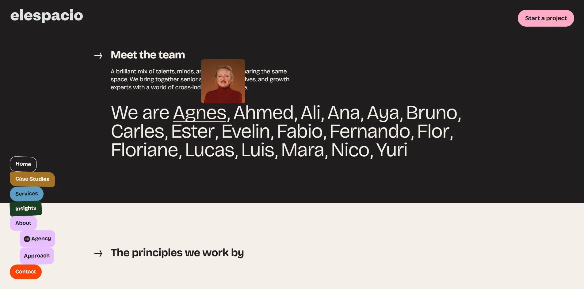
The Agency page introduces the team by running all eighteen first names into a sentence, We are Agnes, Ahmed, Ali, all the way to Yuri. Resting the cursor on a name pops that person's photograph up above it. Beneath the names come five working principles, each paired with a photo of a cut-out object, a tennis racket catching a ball, a roller skate filled with poppies, a bundle of salami taped up like dynamite. After that comes a list of awards, 16 in all, Awwwards five times, CSS Awards three times, and a Webby, a Lovie, an FWA and a Laus once each. The contact page has no form, only four buttons, start a project, join the team, email and phone, and press. The real form lives on the Start a project page, a Mailchimp form on a pink ground with thirteen fields, the budget in four bands from not sure yet to over fifteen thousand euros.
02Design
Just two background colours appear, a near black rgb(32, 30, 31) and an off white rgb(244, 239, 232), and the text uses only those two. Every other colour lives on the stickers and cards, six of them, pink rgb(255, 171, 200), orange red rgb(252, 65, 9), ochre rgb(166, 115, 37), blue rgb(93, 157, 197), lilac rgb(231, 191, 255) and dark green rgb(28, 61, 36). Each one is a flat, solid block of colour, with no gradient and no transparency. Pink belongs to the footer and the main button, orange red to the opening card and the email button, and the other four rotate between the stickers, the service cards and the client quote cards.
Each of the six stickers has its own shape. Home is a black card of 96 by 154 pixels with a hairline border, tilted three degrees to the right. Case Studies is ochre, with an 8 pixel corner radius on the left and 20 pixels on the right, tilted one degree. Services is a blue capsule with fully round ends, leaning one degree left. Insights is dark green with small 8 pixel corners, tilted three degrees. The About sticker is lilac, with a 16 pixel radius on all four corners. Contact is an orange capsule, and the only one of the six set straight. Under the cursor any sticker grows 12 pixels taller, which reads as a puff. The sticker for the current page swells further. On the case studies page Case Studies becomes a 150 pixel ochre square, on the contact page Contact stretches into an orange strip 148 pixels tall, and on the Agency page About unfolds two small stickers beneath it, Agency and Approach. Inside a single case study the whole pile folds away, leaving only a close cross at the top right.
One typeface, Bricolage Grotesque, covers the whole site, and the hierarchy comes entirely from two weights. The light weight carries all the big claims, the opening statement at 72 pixels with the letter spacing tightened to minus 2.16 pixels, the client list at 64 pixels, and the line The space for Brandformance in the footer. The bold weight carries card titles, section titles and the words on the stickers, at 44, 36 and 16 pixels. Each weight is a single 48 KB TTF file. There is no second typeface, no all-caps heading and no italic.

Pictures follow one recipe, a single object photographed on a solid colour, with no close-up portraits and no scenes. An arm in a red latex glove flexing its muscle, a wax-sealed salami bound up as dynamite, a set of gears, a lizard, a stack of toast printed with REEAL, and a man in blue pyjamas with a horse's head, running. Every object is cut out along its outline, saturated and surrounded by space, so the pictures read as stickers too, like the navigation. The corner radii across the site come from one scale as well, 8, 16, 24 and 48 pixels plus the fully round capsule, shared by buttons, cards, image frames and form fields.
The layout runs as a single column from top to bottom. The left edge is kept for the sticker navigation and the content runs in one column to its right. Every section title starts with an arrow, What we can do for you, We partnered with, Trusted by the finest, Industry insights, set small and bold above the large type. The client list has no logos at all. Instead the fourteen client names are joined by commas into one paragraph of 64 pixel light type. The footer is a solid pink block in which the city names, addresses, email and phone are each a capsule button, and the social links are two black circles.
03Motion
When the home page opens, the first thing on screen is an orange red card. The card, with a pink tab on top, slides in from the left carrying four bold lines, We built Elespacio for what brands need next. It holds for a couple of seconds, gives way to a pink card reading An agency for braver ideas and accelerated growth, and then both cards withdraw to reveal the video on the first screen. That video is hosted on Vimeo and plays muted on a loop, 1574 by 886 pixels. In it a deck of coloured cards turns over one after another, Nespresso on purple with coffee capsules, Victorinox on off white with a Swiss Army knife, and last the red-gloved arm with the line Elespacio. The space for Brandformance. The turning of the cards is filmed into the video, and the page's own code plays no part in it.
Once the wheel stops, the page glides on a little further before it settles, because Lenis, a smooth scrolling library, handles the scrolling. The services chapter on the home page is built as a stack of cards. The left column stays fixed while you scroll, with the horse-headed man running inside his oval. On the right, four cards rise one after another from below and cover the one before, each leaving a strip of its colour showing at the top, so that once all four are up the top edge reads as four coloured tabs, blue, orange, pink and ochre, and the whole stack takes 2,607 pixels of scrolling. The cards hold their place through CSS sticky positioning, position: sticky, with no script working out where they sit.
Apart from the opening cards and the stacked services, the moves on the page are small. The client quotes are a carousel built with the Swiper library, fourteen cards with an arrow button on either side. Each click advances three cards, and the carousel cannot be dragged with the mouse. In the insights passage there are three cards, and resting the cursor on one turns its image frame from square corners into a large oval with an 80 pixel radius, so the flexed arm inside looks packed into a sticker of its own. The cursor itself is swapped for three SVG icons, an arrow by default, a hand over links and a text bar over text, all set directly through the CSS cursor property. There is no extra dot trailing the cursor, and the cursor never grows or changes colour.
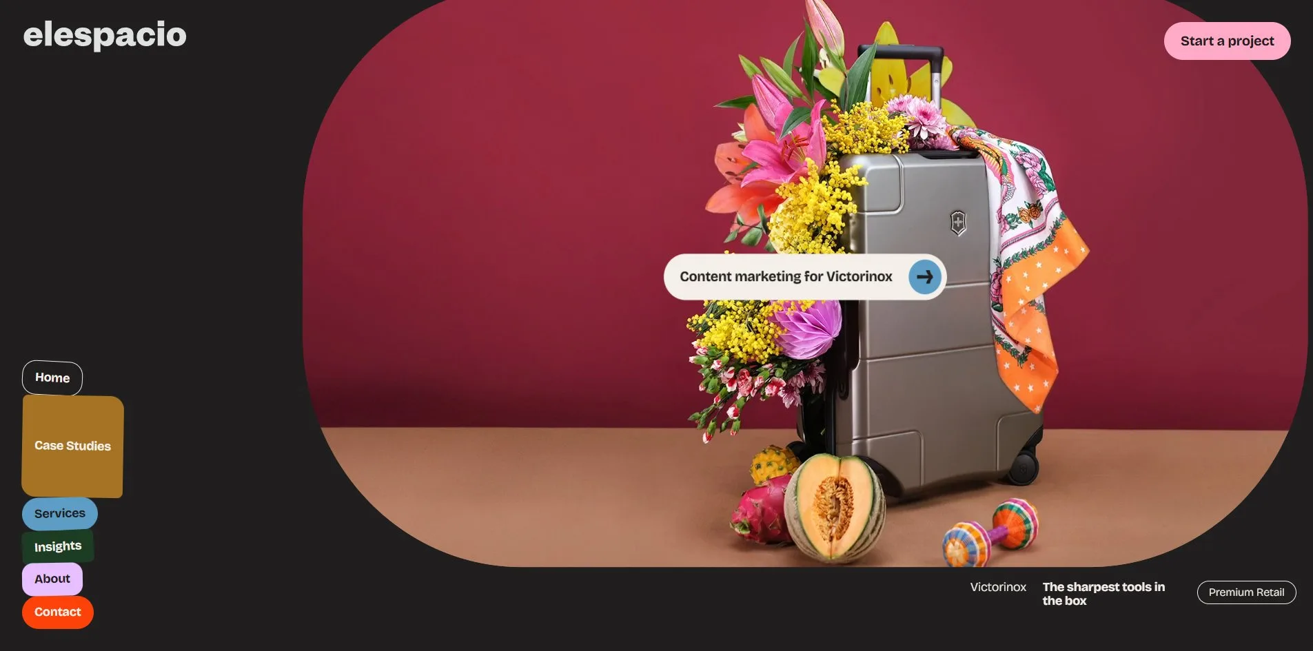
Clicking a sticker to change page reloads the whole page, with no transition in between. On the case studies list, resting the cursor on a card rounds off its corners and floats a capsule with the project name up at its centre.
04Engineering
Webflow hosts the site, but the motion code is not something Webflow generated. An inline script at the bottom of the home page downloads a file with a .txt extension from Webflow's file storage, 285 KB, reads it in as plain text, wraps it in a temporary in-memory file (a Blob) and then runs it as a JavaScript module. That file is really a complete script bundled with the build tool Vite, with the date 10-09-26 in its name, and it carries the animation and interaction libraries GSAP, ScrollTrigger, SplitText, Flip, Lenis 1.3.21, Swiper and Lottie. Webflow's asset library does not accept JavaScript files, so renaming the bundle to .txt and restoring it in the browser is one way of getting a build of your own into Webflow.
Loading the home page for the first time takes 3.3 MB in 39 requests. 2.5 MB of that is the WebM video of the horse-headed man, 720 by 720 pixels on an 11 second loop, so one video makes up three quarters of the whole. The agency's own script is 96 KB compressed, Webflow's own script 57 KB and jQuery 3.5 another 31 KB, while the two font files together also come to 96 KB. Google Tag Manager, meanwhile, arrives in two files totalling 339 KB, and with the LinkedIn tracking pixel and the Google Ads conversion script on top, the analytics and ad tracking code weighs more than three times the agency's own script. A visitor who scrolls to the bottom brings the total to 4.0 MB, most of the addition a 544 KB image for a REEAL article. The case and Agency pages each run between 1.1 and 3.1 MB.
Timing-wise, the server needs 107 to 231 milliseconds to send its first byte, the first content appears on screen (first contentful paint, FCP) at 556 to 720 milliseconds, and the page finishes loading in 1.7 to 2.1 seconds. Nothing on the home page jumps around while it loads, so its layout shift score (CLS) is zero. The inner pages are quicker, with the first byte in 35 to 64 milliseconds and the first paint at 224 to 288. Only the case studies list shifts, with a CLS of 0.41, far above the 0.1 ceiling Google recommends, because its seven cards change places as the images arrive. Scrolling the whole page holds 60 frames a second, with no frame taking longer than 18 milliseconds.
Several problems here fall on screen reader and keyboard users. The page marks only two landmark regions, main and footer, and the sticker navigation is not inside a nav element, so a screen reader user cannot jump straight to it. The page does declare its language correctly as English, so screen readers pronounce the text properly. Two of the 37 controls have no name a screen reader can announce, the two arrows of the quote carousel. All 31 images on the home page have empty alt text, so screen readers skip them as decoration. The keyboard focus ring is a 2 pixel solid line and easy to see, but the first press of Tab sends focus into the Vimeo player on the first screen, with nothing on screen to show where it went. The headings jump from H1 straight to H3, skipping a level. The stylesheet has no rule for the system's reduced motion setting. The script does read that setting, but uses it only to stop the horse-headed man's video, and the opening cards and the gliding scroll carry on as before.
05Scores and Team
| Award | Source | Date | Score |
|---|---|---|---|
| FWA of the Day | The FWA | 2026-09-23 | 81 POINTS, DAYS 9 |
| Credit | Identity | Record |
|---|---|---|
| Elespacio | Creative and marketing agency, Barcelona and Berlin | FWA 2, SOTD 5, HM 8 |
On its FWA profile Elespacio describes itself as a digital creative agency focused on web experiences and advertising campaigns, and this site is its second FWA. On Awwwards it has 10 works, with 5 Sites of the Day and 8 honourable mentions. Three of those Sites of the Day went to the previous three versions of its own site, in 2014, 2016 and 2021, and the 2021 version scored 7.34. This version is credited to the company alone, with no individual names. The Agency page does list all eighteen people by first name, but gives no job titles.
06Archive
- Award date
- 2026-09-23
- Awards
- The FWA FOTD 2026-09-23
- Site
- https://www.elespacio.net/
- Credits
- Elespacio
- Design
- graphic
- Build
- dom
- The FWA
- 81 POINTS, DAYS 9. https://thefwa.com/cases/elespacio-the-space-for-brandformance-p4
- Stack
- Webflow, jQuery 3.5, GSAP, ScrollTrigger, SplitText, Flip, Lenis 1.3.21, Swiper, Lottie, Vimeo, Mailchimp, ConsentPro, Google Tag Manager
- Total assets
- 3.3 MB on a first load, of which WebM video 2.5 MB. 4.0 MB after a full scroll
- Speed
- FCP 556 to 720 ms, LCP 556 to 720 ms, CLS 0. 60 fps scrolling the whole page