Lusion v3
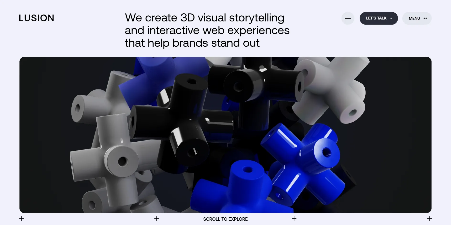
Lusion v3 is the third version of the portfolio site of Lusion, a British 3D and interactive studio, and it shows what the studio can do with 3D storytelling and interactive web work. A 3D picture runs through the whole home page, and as visitors scroll down, the picture moves forward one stretch at a time. The home page starts with a pile of white and dark grey cross-shaped blocks, a few of them in a bright accent colour. The cursor pushes them away as it comes near, and a click changes the accent colour. At the end of the home page, an astronaut flies through a glowing tunnel to a closing screen reading Let's work together.
Lusion designed and built the site itself, and in 2023 both the Awwwards Site of the Year and the FWA of the Year went to it, along with that year's Awwwards Developer Site of the Year. It also won Site of the Day and Site of the Month on both platforms.
01Concept
The FWA description calls this the third version of Lusion's portfolio, featuring the studio's latest work, experiments and thought process. A portfolio has to make potential clients trust the studio, so the site itself is the biggest sample on show, and nearly every part of the home page demonstrates in 3D what the studio can do.
Lusion v3's home page runs in several parts from top to bottom, opening on the pile of crosses. The line Bold Ideas, Brought to Life and a paragraph on how the studio works follow, then the studio's showreel and a dozen featured projects. A section headed Where Creative Ideas Become Immersive Experiences follows, with a tablet whose screen shows an astronaut floating above the Earth. The camera then dives into that screen, the astronaut flies through a series of tunnels and lands on the closing Let's work together, with the studio's Bristol address, social links and a newsletter field below. The astronaut's journey takes up three quarters of the home page, about 45 screens.
The order reads like the steps of persuading a potential client. Visitors first get their hands on the crosses and see that the studio can make playful real-time 3D, and only then read how the studio works. The showreel runs quickly through the range of projects, and the featured work lets visitors pick the ones they want to open. The longest and most ambitious part, the astronaut tunnel, comes last and lands exactly on Let's work together and the contact details. By the time visitors reach the contact details, they have already seen and played with the studio's craft. The page does not let visitors leave at the end either, since scrolling on switches the site straight to the About page and keeps visitors on the site.
Lusion v3's headline and projects have both been updated since the award. In the screenshot from the FWA award, the headline read We build epic realtime interactive experience to blow people's minds, and it now reads We create 3D visual storytelling and interactive web experiences that help brands stand out. The featured work also includes projects from 2024, while the overall layout and the opening crosses are still as they were at the award.
02Design
Lusion v3's layout uses only three colours: an off-white with a touch of purple (#F0F1FA), black text and a saturated electric blue (#1A2FFB). The palette Awwwards lists for the site is the blue and the off-white, with the same values. The blue appears almost entirely on things that move or can be clicked, namely the arc across the page, the hover states of the buttons and the menu on phones. Visitors therefore soon link the blue with the parts they can interact with. Small cross marks sit at the page corners and where the column lines meet, like the guides used while laying out a page, which puts the grid behind the layout on show. Only the astronaut sections switch to full black.
Behind the layout is a 12-column grid with gaps of 2 percent of the screen width and side margins of 5 percent of the screen width, at least 40 pixels. Headlines, gaps and margins are all set in proportion to the screen width, so from a laptop to a large desktop screen the whole layout simply scales up and down, with its proportions and white space unchanged. The first line of the home page headline is 48 pixels on a 1920-pixel screen and shrinks to 34 pixels on a 1366-pixel screen, exactly in step with the screen width. The cards, the 3D window and the menu all share the same 20-pixel corner radius, so the whole site looks assembled from one set of parts.
Lusion v3's home page uses a single typeface, Aeonik, a sans serif, the kind of typeface whose strokes end without small feet, and only in its regular and medium weights. Hierarchy comes almost entirely from size, and large headlines such as Bold Ideas, Brought to Life are set at regular weight and so large that the two lines almost fill the width of the screen. Project types, buttons and navigation use small capitals in the same face. Nothing on the page is heavier than medium, so even the large type looks light against the solid 3D picture below it.
Lusion treats the 3D picture as an object placed on the page. The opening crosses sit in a near-black box with rounded corners, set into the light page like a screen, and the contrast between the light page and the dark box draws the eye straight to the crosses. The crosses look like plastic toys, and only six of them carry the accent colour while the rest are white or a near-black grey. The accent colour is picked at random on each visit and blue is only one of the options, so the first crosses a visitor sees do not always match the layout's blue. The white ones come in a matte and a glossy finish, so the blocks still read as different materials even though the picture uses only three colours. The closing Let's work together screen speaks in a completely different voice, with the astronaut surrounded by floating cartoon stickers of pills, mushrooms, bananas and lips and by sparkling diamonds, the liveliest picture on the site.
The buttons on Lusion v3's pages share one set of states, and the top right of the header holds three pill-shaped buttons. A grey round button is the sound switch, whose icon is a flat line while there is no sound and turns into a waveform once the sound starts, and the dark LET'S TALK and the light MENU sit beside it. On hover, the round sound button fills with blue, and LET'S TALK also turns blue as its small dot is replaced by an arrow. MENU turns pure white and its two dots turn upright, so all three hovers follow the same rule, in which the button gets brighter or turns blue and swaps a small icon. When MENU opens, three rounded cards stack up on the right and the button label changes to CLOSE. The first card holds links to the home page, About, Projects and Contact, with a small dot after the current page, the second holds the newsletter field and the third is a black LABS link.
The project cards and the video player keep to the same restraint. Project cards sit two to a row with no text laid over the pictures, the project types in small capitals below each picture and the project name in large type at the bottom. When visitors open the showreel, the film fills the screen, and its progress bar and mute button are the studio's own design.
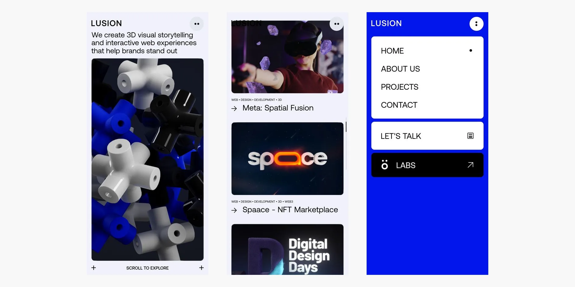
On phones, the site lays the page out again by the same rules, and the whole home page becomes a single column and the 3D box stretches into a tall rounded block. The gaps widen to 4 percent of the screen width, the corner radius shrinks to 10 pixels and the side margins are fixed at 25 pixels. The header keeps only the logo and a round menu button, while LET'S TALK and the sound switch are removed, and LET'S TALK moves into the menu. The phone menu fills the whole screen in the electric blue, with white cards stacked on top and no newsletter field. Parts that only appear on hover on a desktop are shown all the time on phones, such as the arrows before the project names and the PLAY REEL strips above and below the showreel. The site also counts tablets as mobile devices, so they get the phone interactions while keeping LET'S TALK in the header.
03Motion
Almost all of Lusion v3's animation is calculated frame by frame by the site's own program, and very little is handed to the browser's built-in transitions, so a single feel carries across the whole site. The site's favourite timing curve starts very slowly, speeds up sharply in the middle and then settles for a long time. Headlines, buttons and project names all enter on this curve, so each one looks as if it had been given a light push and then came firmly to rest.
Once the loading screen on the home page ends, the opening plays out in order. The home page headline rises from below one word at a time, and each word starts tilted about 15 degrees and straightens as it lands. Neighbouring words start only about 0.05 seconds apart and each takes one second, so the three lines stand up one word after another. At the same time the camera moves in on the crosses while narrowing its view, so the picture enlarges quickly. The camera settles after about three seconds, overshooting slightly and drawing back before it stops. The row of small crosses below the 3D picture then appears one by one, each turning half a circle as it grows, and the words SCROLL TO EXPLORE fade in one after another.
The pile of crosses keeps tumbling once the opening is over. An invisible force pulls the blocks toward the centre of the picture, and they collide, bounce apart and get pulled back. The blocks are also split by number into two groups that spin in opposite directions around a diagonal axis, so the pile never settles. The blocks keep only a fifth of their speed each second, so they slow down soon after being pushed, which gives their movement a sense of weight. The visitor's cursor acts like a stick reaching into the picture from the camera, sweeping aside any block it touches, and the faster the cursor moves, the further the blocks are flung.
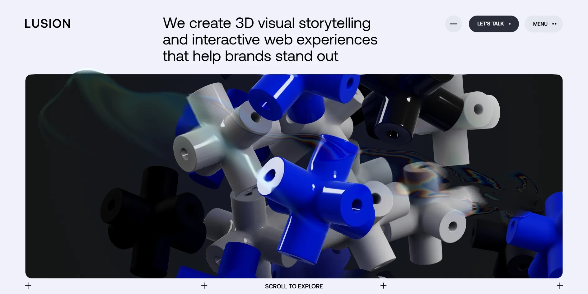
When visitors click the picture, every block reverses its direction and gets a random extra push, so the whole pile bursts outward before being pulled slowly back to the centre. At the same moment the accent colour switches to the next of five, in the order blue, lime, red, purple and amber, and the first colour is chosen at random on each visit. As the cursor moves over the 3D picture, it also leaves a smoky trail behind it. The trail warps the picture it passes over and splits its edges into red, green and blue fringes, and it takes a second or two to fade.
Lusion v3 also handles scrolling itself, and when visitors turn the wheel, the page does not jump straight to its new position but covers part of the remaining distance in each frame, so it slows down as it nears the end. Five quick turns of the wheel move the page 500 pixels, more than 90 percent of that in the first half of the time, and the page comes fully to rest after about 0.9 seconds. When visitors drag with a trackpad or a finger, the page keeps gliding with some momentum after they let go. While the page is scrolling, a thin progress bar appears at the right edge of the screen and fades half a second after visitors stop, and the small cross marks that divide the layout turn into diagonal crosses.
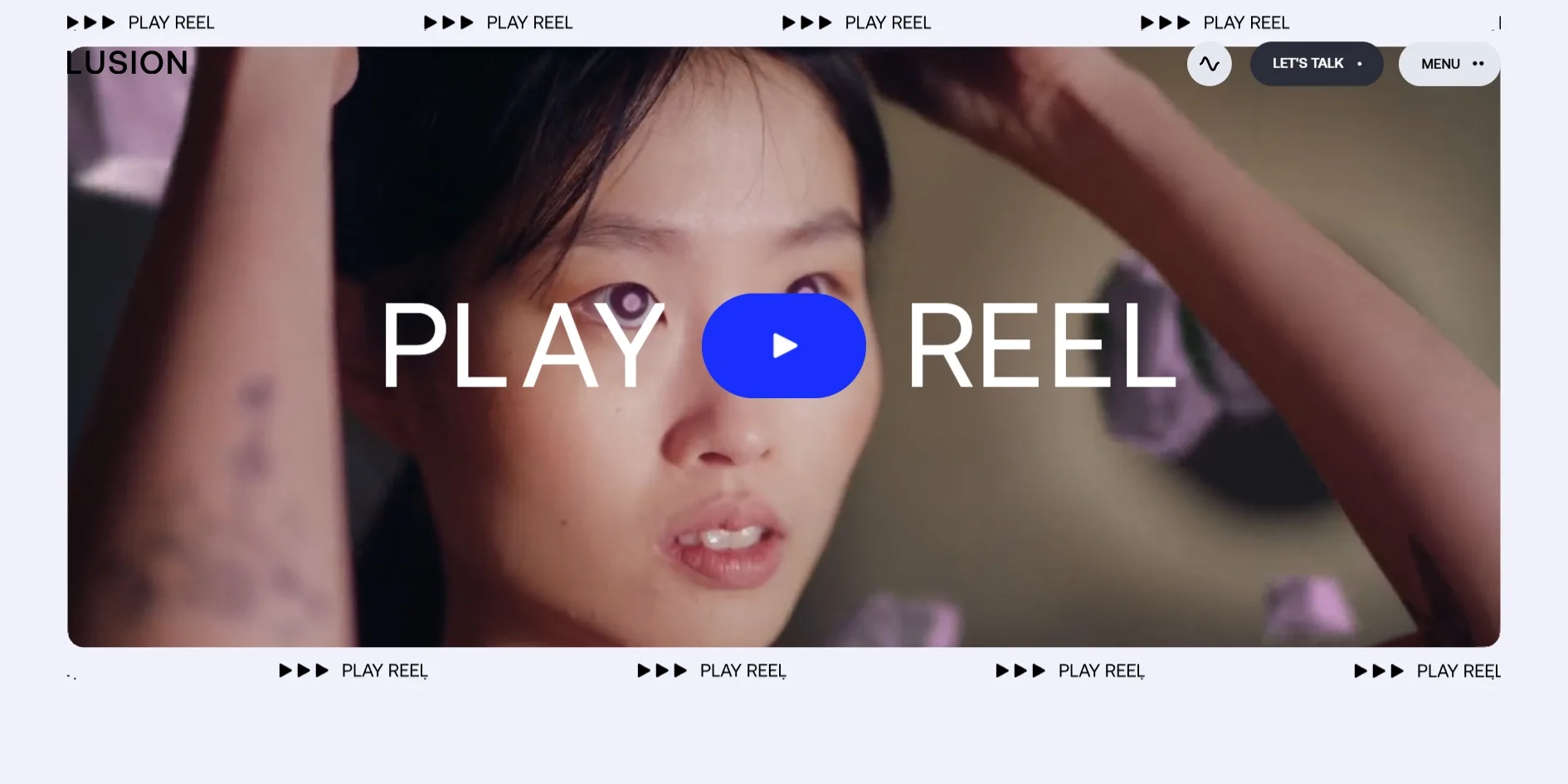
The showreel section turns a small card into a film. As visitors scroll down, the small blue preview card at the lower left grows until it becomes a film that nearly fills the content width, with the large words PLAY and REEL and a play button laid over it. When the cursor reaches the play button, the two rows of small crosses above and below the film drop out one after another from left to right. Each takes about 0.45 seconds and starts only a few hundredths of a second after its neighbour, so the rows fall away like a wave. Two strips reading PLAY REEL with three play arrows then slide into the empty space, the upper one running left and the lower one running right in an endless loop. The play button turns blue at the same time and grows by a tenth within 0.2 seconds.
The featured project cards respond to the cursor as well. When the cursor moves onto a card, an arrow slides in before the project name, and the picture shifts slightly toward the cursor, which gives it a little depth. The picture follows the cursor with a slight delay and overshoots a little as it stops, as if it hung on a soft spring.
The astronaut tunnel at the end of the home page is the longest animation on the site. It starts from the tablet, and once the camera has dived into its screen, only the astronaut and the line STEP INTO A NEW WORLD AND LET YOUR IMAGINATION RUN WILD remain in the dark. The astronaut then flies into a tunnel of metal frames whose lights change from cyan and red to green. The tunnel turns into a glowing pink lattice and then into a blue and white corridor of arches. That corridor sits inside a screen, and as the astronaut walks toward the visitor, the screen's glass shatters into hundreds of pieces and the astronaut steps through the shards and drops to the ground. Cartoon stickers then pop up around the astronaut one by one, and Let's work together! appears last.
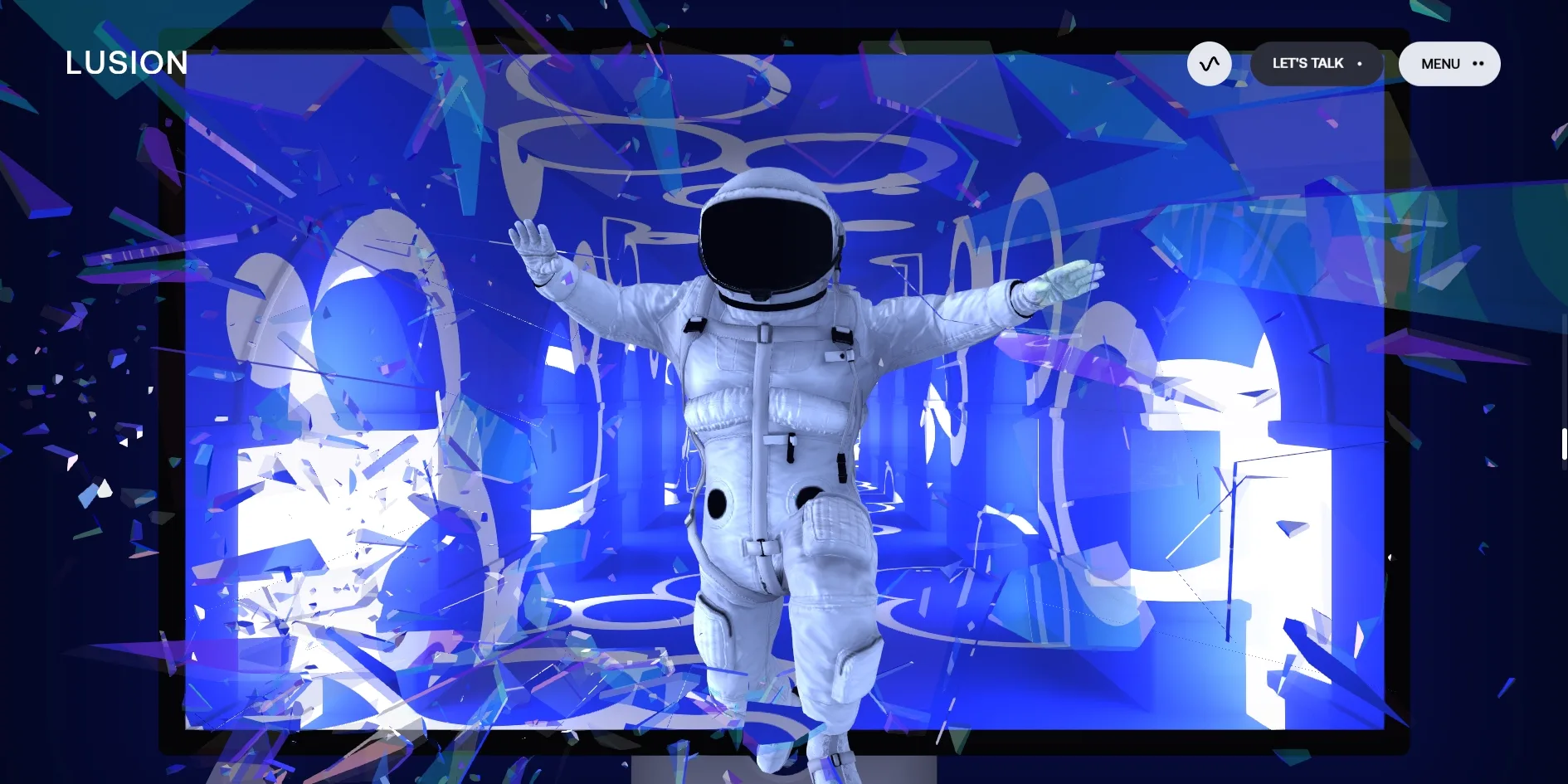
The tunnel moves forward differently from the rest of the page. The whole sequence follows the scroll position, so when visitors scroll back, the broken glass reassembles into the screen and the astronaut flies backward. Once visitors enter the tunnel, though, the page starts moving on its own at about two and a half screens per second, in the direction of the visitor's last scroll, so one scroll upward sends the tunnel flying in reverse. While visitors hold the mouse button down, the automatic movement stops, the animation inside the tunnel slows to about a third of its speed and the background music goes muffled. When visitors let go, the page takes about a second to speed up again and then slows gently to a stop at the Let's work together screen. Phones work the same way, as a finger held on the screen almost stops the tunnel and letting go sends it flying on.
The sound follows these stages too, although the site only starts making sound after the visitor's first click on the page. Buttons and project cards make a short sound when the cursor passes over them, each stage of the tunnel switches to a different piece of background music, and the breaking glass has a crash of its own. Phones get none of these sounds, because the site does not download a single sound file on a phone.
Lusion v3 holds the picture at about 60 frames per second for most of the home page, drops to 57 or 58 around the tunnel near the end with the odd frame stalling for 0.1 to 0.2 seconds, and leaves no room for visitors who want less motion. When visitors turn on the system setting for reduced motion, all of this animation plays exactly as before, because the site does nothing with that setting.
04Engineering
Lusion v3 is generated with Astro, and all of its effects live in a single script of about 1.25 MB that bundles three.js r158 with the studio's own framework. The home page has a single full-screen WebGL2 canvas fixed behind the DOM, and every section's 3D scene, the project pictures and the showreel are drawn on it. Layout stays with the DOM and CSS, and every frame the script reads the position and size of each matching DOM element and draws a plane at the same place on the canvas, then uses shaders to give that plane depth of field, parallax and distortion. The rounded 3D window on the home page works the same way. The canvas itself covers the whole screen, and a mask in the page's background colour is drawn over it with a rounded rectangle cut out of the middle. The opening lines up exactly with the box in the DOM, and the camera's centre and field of view follow that box's position and aspect ratio.
This approach works because the site takes over scrolling itself. Native scrolling is switched off, and the whole page sits in a container about 56,000 pixels tall. The wheel, dragging, the arrow keys, Page Up and Page Down all go to the site's own scroll module, which moves the container with translate3d every frame. For wheel scrolling, the position closes in on its target by a factor of 1 - exp(-12 * dt) each frame, which does not depend on the frame rate, so the feel is the same on fast and slow computers. For dragging, the module takes the velocity over the last 0.1 seconds before release and lets friction wear it down. The DOM and WebGL read the same scroll value, so the planes on the canvas and the text in the DOM never drift apart.
The 22 crosses on the home page use no physics engine, only about 2.6 KB of hand-written simulation, which treats each block as a sphere for collisions. Every sphere is pulled toward the centre, each pair bounces apart with a restitution of 0.8 and some friction, and velocity is multiplied by 0.2 every second. Odd and even spheres also get a tangential velocity around a diagonal axis in opposite directions, which is what keeps the pile tumbling. The simulation turns the cursor into a ray from the camera, pushes any sphere that comes too close to the ray out sideways and adds the cursor's own speed. Rotation is derived from the cross product of position and velocity, so each block rolls in the direction it is pushed. A click reverses every sphere's velocity, adds a random impulse and moves the accent colour on to the next one.
The crosses are lit without lights or shadow maps, and each block's sheen comes from an HDR matcap texture stored as EXR, and the matte and glossy blocks differ only in a roughness value. Shadows and ambient occlusion are computed directly in the fragment shader. Every frame, the script sorts the other 21 blocks by distance and passes their positions and rotations into the shader. The shader approximates each block as three perpendicular cylinders and solves occlusion, soft shadows and reflection hits against each of them in turn. That is where the soft shadows between the blocks and the colours they reflect onto each other come from, and the picture needs no shadow map at all. The code also keeps a method for translucent blocks, which blurs the already rendered picture into four levels and lets each block sample it by thickness for a frosted glass look, though none of the current blocks uses it.
The script calculates the animation on Lusion v3's pages every frame, and none of it is written as CSS transitions, with headlines first split into words by SplitType. Each word's offset and rotation come from feeding the elapsed time into the custom easing cubic-bezier(0.35, 0, 0, 1), the curve the Motion chapter describes as slow to start and long to settle. Parts that follow the cursor or a target, such as the focus and zoom of the project cards and the astronaut's movements, use a SecondOrderDynamics class. This class treats motion as a second-order system controlled by three parameters, frequency, damping and initial response. The card focus is set to 1 Hz with a damping of 0.6, which is why it overshoots a little and comes back. Each project picture also has a depth map, and the shader uses depth and the focus position to produce depth of field and a parallax shift, which gives the cards their sense of depth.
Lusion v3's picture goes through a chain of post-processing before it reaches the screen, starting with SMAA in post in place of WebGL's built-in antialiasing, which the site turns off. After SMAA come bloom, the distortion from the cursor trail and a pass that adjusts vignette and saturation, and each of them is switched on or off by the current scene, which also sets how strong the bloom is. The cursor trail is a velocity field at a quarter of the screen resolution, and as the cursor moves, the script writes its velocity into a buffer, two buffers take turns, and the field fades a little every frame. The distortion pass then offsets pixels along this field and separates the red, green and blue channels. To keep the cost down, the site caps the pixel ratio at 1.5 and the total pixel count at 2560 × 1440, and the code also includes AMD's FSR upscaling, which is off by default. During the opening, each frame bounces between offscreen buffers twenty to thirty times, and inside the tunnel close to sixty times, which is why the frame rate dips to 57 or 58 there.
The site splits the tunnel's 45 screens into nine named stages, such as the black tunnel, the white tunnel and the frame break. The middle seven stages share out the available scroll distance by weight, with 12 for the black tunnel, 2 for the white tunnel, 1.5 for the frame break and 1 to 5 for the rest. Each stage has its own progress from 0 to 1, and the camera, materials and music all read these values, so the whole sequence can be reversed at any moment. The tunnel's automatic movement sits on the scroll module, which adds 2.5 viewport heights per second in the direction of the last scroll whenever there is no input. While the mouse is held down, a freeze factor rises to 1, pushes that speed down to 0 and makes the tunnel's animation time run at 0.3 times its normal speed.
The tunnel's frames and particles are drawn with instancing, and the frames carry metal textures with fine surface detail. The astronaut's animation is baked into textures in advance, and the shader reads positions and orientations from them by time every frame, while the material combines base colour, normal and ARM textures with a matcap and an environment map. The broken glass has 946 shards, and every shard's position and orientation in every frame is simulated in advance and stored in two float textures. The textures are as wide as the number of shards and as tall as the number of frames, and the scroll progress decides which two frames to read and interpolates between them. The shards are laid out to match the size of the DOM frame on screen, and each refracts the already rendered page behind it. The tunnel also has a motion blur pass that uses depth and the previous frame's camera matrix to work out how each pixel moves, and this pass produces the streaks of the flight.
The music is driven by the same progress values. Each piece of background music runs through a low-pass filter, and the tunnel's stage decides which piece plays and how far the filter opens. Holding the mouse lets the freeze factor pull the filter frequency down, which is what makes the music sound muffled. Each hover sound comes in several versions that play in turn, so the sounds never repeat exactly.
All of these assets download when the home page opens. A first visit pulls down about 11.8 MB, including the models and textures for the closing tunnel. The largest group is about 5.2 MB of webp textures, and each of the astronaut's normal and base colour textures runs to three or four hundred KB. The models are stored in the studio's own binary format, .buf, about 2 MB in all. The sound is 16 ogg files of about 1.3 MB, loaded only in desktop browsers that support ogg, and the audio is only created after the visitor first presses the mouse button.
The site checks the device while loading and then decides what to download and how finely to draw. It decides the device type from the browser's UA string, counts both phones and tablets as mobile devices and adds an is-mobile class to the page's root element. Mobile devices get simplified models and matcap for the crosses, simplified grid models for the tunnel and a phone version of the showreel, and no sound files at all. The pixel ratio cap described above matters most on phones, where a phone with a pixel ratio of 3 renders at half its resolution and draws a quarter of the pixels. Opening the home page on a phone and swiping down a few screens downloads about 8.8 MB in all. The layout switches separately by width, becoming a single column below 812 pixels, where the grid, corner radius and margins change to another set of values, so a wide tablet still gets the desktop layout with the touch interactions.
Even with all these assets, visitors do not wait long. The server starts sending the page within 0.03 to 0.09 seconds, and the loading screen, a black background with a constantly changing number, appears at 0.2 to 0.32 seconds. The opening crosses are fully in place between 4.5 and 6.5 seconds. The page freezes for at most about 0.1 seconds during loading, and the picture barely shifts.
Lusion v3 does little for keyboard and screen reader users. The arrow keys, Page Up and Page Down scroll the page, but when visitors press Tab, the focus has no visible style and jumps straight to project links several screens down while the page stays where it is. The 37 project images and two buttons have no names for screen readers.
05Scores and Team
| Award | Source | Date | Score |
|---|---|---|---|
| FWA of the Day | The FWA | 2023-09-21 | 89 POINTS, DAYS 2 |
| FWA of the Month | The FWA | September 2023 | Monthly award, no separate score |
| FWA of the Year | The FWA | 2023 | Yearly award, no separate score |
| Site of the Day | Awwwards | 2023-10-02 | 8.25. Design 8.26 / Usability 7.95 / Creativity 8.65 / Content 8.26 |
| Developer Award | Awwwards | 2023-10-02 | 8.41 |
| Site of the Month | Awwwards | October 2023 | Monthly award, no separate score |
| Site of the Year | Awwwards | 2023 | Yearly award, no separate score |
| Developer Site of the Year | Awwwards | 2023 | Yearly developer award, no separate score |
Lusion v3 is the site of the year for 2023 on both Awwwards and FWA, and Awwwards also gave it that year's Developer Site of the Year. FWA gave its FWA of the Day 89 points and filed it under animation, personal portfolio and promotional.
The site's Creativity score on Awwwards was 8.65, the highest of the four, most likely thanks to the crosses that visitors can push and click and the closing flight through the tunnel. Usability was the lowest at 7.95, and the invisible keyboard focus and a tunnel that moves on its own may both have pulled it down. The five developer jurors gave 8.41, with a perfect 10 for Animations and 9.00 for WPO, the web performance score, and 8.40 for Responsive, which matches the lighter assets and the rearranged menu and layout on phones. Accessibility was lowest at 7.40, which matches the invisible keyboard focus and the unnamed images in the Engineering chapter.
| Credit | Who they are | Track record |
|---|---|---|
| Lusion | A 3D and interactive studio in Bristol, England, which designed and built the site itself | Awwwards works 20, SOTY 1, SOTM 3, SOTD 14, HM 20. FWA 25 |
Lusion's record also counts up to the time of writing, with 14 Awwwards Sites of the Day, the single Site of the Year in the table being this site, and 25 FWA awards in all.
06Archive
- Award date
- 2023-10-02
- Awards
- Awwwards SOTD 2023-10-02, Awwwards DEV 2023-10-02, Awwwards SOTM 2023-10, Awwwards SOTY 2023, The FWA FOTD 2023-09-21, The FWA FOTM 2023-09, The FWA FOTY 2023
- Site
- https://lusion.co/
- Credits
- Lusion
- Design
- spatial
- Build
- realtime
- Awwwards
- 8.25 / 10. Design 8.26 / Usability 7.95 / Creativity 8.65 / Content 8.26. Developer Award 8.41. https://www.awwwards.com/sites/lusion-v3
- The FWA
- 89 POINTS, DAYS 2. https://thefwa.com/cases/lusion-v3
- Stack
- Astro, three.js r158, SplitType, custom scroll, physics simulation and post-processing, Vimeo
- Total assets
- About 11.8 MB, of which webp textures about 5.2 MB, model data about 2 MB and sound about 1.3 MB
- Speed
- FCP 196 to 320 ms (loading screen), opening crosses fully in place at 4.5 to 6.5 s, CLS 0.0005. 60 fps for most of the page, 57 to 58 fps around the tunnel