La Revoltosa
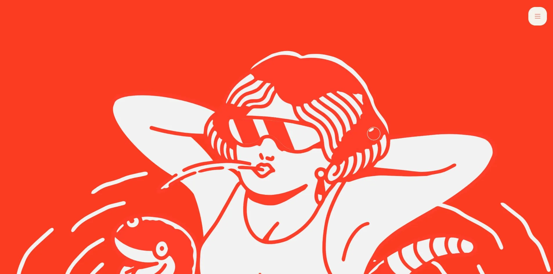
La Revoltosa's website lets the soda speak for itself, in the first person, on every page. I have been in Spanish bars for seventy years, I am not the homely type, I prefer after-dinner talk on a terrace, tell me what you need, darling. The speaker is drawn in tattoo style, a bob and sunglasses, a straw between her lips, a snake wound around her arms. When a visitor scrolls down, bubbles rise up the page, more of them the faster they go.
The Madrid studio Waka made this site for La Revoltosa, a soda brand founded in 1953, and it was Awwwards Site of the Day at 7.45 and FWA of the Day at 82 points.
01Concept
La Revoltosa is a soda from Madrid, and the site's history page tells its story. In 1953 three soda makers, Manuel, Félix and Bonifacio, tired of fighting the big brands alone, made it together. They named it after Mari-Pepa, the heroine of a zarzuela, a Spanish light opera that mixes spoken scenes with song, and a girl who would not shut up and stirred up trouble everywhere. It became a cooperative in 1955, spread across the country as a franchise from 1964, went on radio and television in the seventies, and in 1998 joined Refrescos del Atlántico, a family firm with a century behind it. The range now runs to nine drinks, a plain soda, a siphon, lemon, orange, lime and lemon, cola, two zero colas and a tonic.
The site folds that history into one line on the opening screen. Seventy years in the same glasses, on the same bars. Some things never go out of fashion because they were never a fashion. Everything the site says after that is spoken by the tattoo-style character. On the products page every bottle has a personality, and the siphon's line is aim and fire. The lemon calls itself a little needle on the tongue, I am sour by nature but I choose when to be sweet. The orange's line is a good mood that spreads, and the cola's is wherever I go, things get good. The tonic's line is bitter but with grace, the elegance of nocturnal animals. The contact form is headed What brings you here.
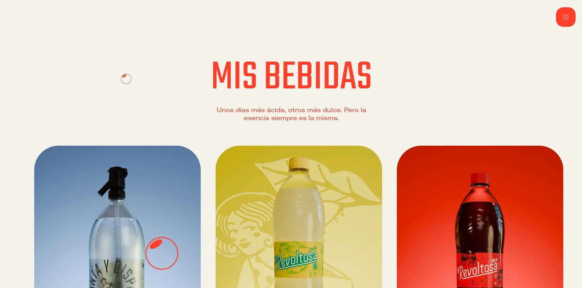
She is drawn by the illustrator GL6RIA in the style of tattoo flash, the sample designs that hang on a tattoo parlour wall, in thick lines and a single colour. On the home page she fills two whole screens, first at full length, then pushed in until only the sunglasses and the straw are left. On the history page she becomes a crocodile with a woman's face and a dancing girl, and on the products page she takes a different pose beside every bottle. Photographs appear in only three places on the site, four bar snapshots sliding across the screen of a phone she holds, a short brand film, and three product cards.
Beyond the home page, La Revoltosa's site also carries a good deal of content. Each of the nine drinks has a page, the history runs in four chapters by decade, and a page called Revoltosos carries events, news and a row of merchandise, a tote bag at ten euros, a T-shirt at fifteen, with the glass bottle and the toy truck sold out. One of the news items is written by the character herself, we made quite a scene, Site of the Day at the Awwwards.
02Design
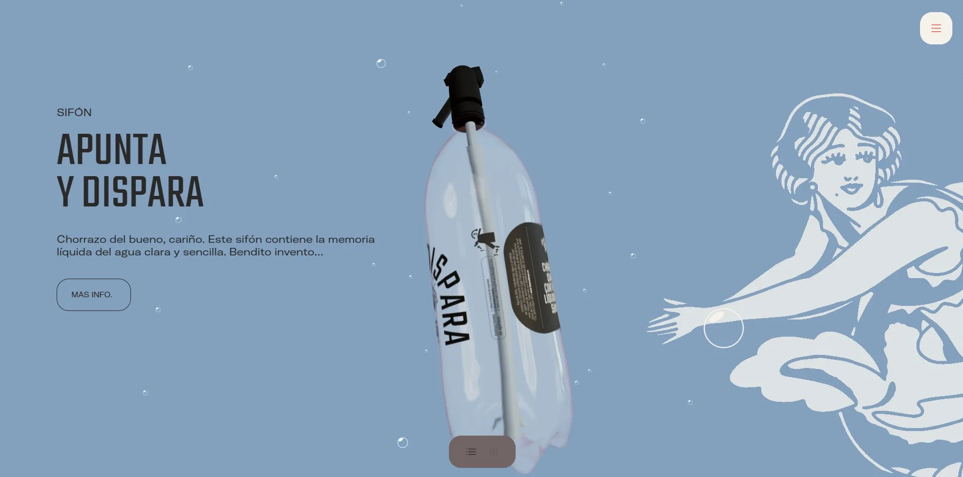
The home page uses two colours, a hot red rgb(254, 62, 41) and a cream rgb(244, 242, 234). The first fourteen screens are cream words and cream lines on red, the product cards flip to red on cream, the contact form stays on cream, and the footer turns red again. The products page loosens the two-colour rule, giving each drink a screen in its own colour, grey blue for the siphon, pale yellow for lemon, orange for orange, grass green for lime and lemon, deep red for cola and gold for tonic. The 3D bottle stands in the middle, with her drawing on the right in a lighter tint of the same colour.
La Revoltosa's site uses three typefaces, and each holds one job. Teko is a tightly condensed sans-serif, always in capitals, and every heading is set in it, from 96 pixels in the menu to 400 in the marquee, a strip of text that scrolls sideways on its own. Of the six hundred characters visible on the home page it sets only two hundred, yet it covers almost all the area. Vulf Mono is a heavy slab serif in which every letter is the same width, and it appears only on the second line of a heading, IBÉRICA, BUENO, MI VIDA, AL LORO, and the line MUUUUCHO gas at 384 pixels. GT America Extended handles the small text from 12 to 20 pixels, the navigation, buttons and body copy. The connecting words inside the headlines, EN, QUE, UNA, MUY, MÁS, shrink to half height and rise to the top of the line, the way old posters set them.
Almost every screen on this site is one big centred line of type and one object. The opening screen is two lines and a bottle, the claim screen is four lines and the bottle, the two illustration screens hold only her, and the phone screen is four lines, a phone and her hand. The product cards are three large cards of 545 by 727 pixels with an 80 pixel corner radius, one colour and one bottle each, with the name in small type at the bottom left. The footer is the brand mark set on a slant and wider than the screen, so only the lower half of La Revoltosa shows, with a circled R at the bottom right.
Once a visitor opens the menu, the screen fills with cream and four red lines of Teko in the centre, and the menu button at the top right turns into a red cross. When the cursor rests on a line, that line switches to the heavy slab serif of Vulf Mono, while the other three fade to 30 percent opacity. The site's buttons are pill shapes drawn with a thin outline, holding small capitals, and a 12 pixel SCROLL stays in the bottom right corner throughout. The site keeps the ordinary mouse cursor, and the bubbles do not follow the mouse, only the scroll. A cookie bar sits along the bottom, black type on white with Accept, Reject and Customise buttons, the only black anywhere on the site.
03Motion
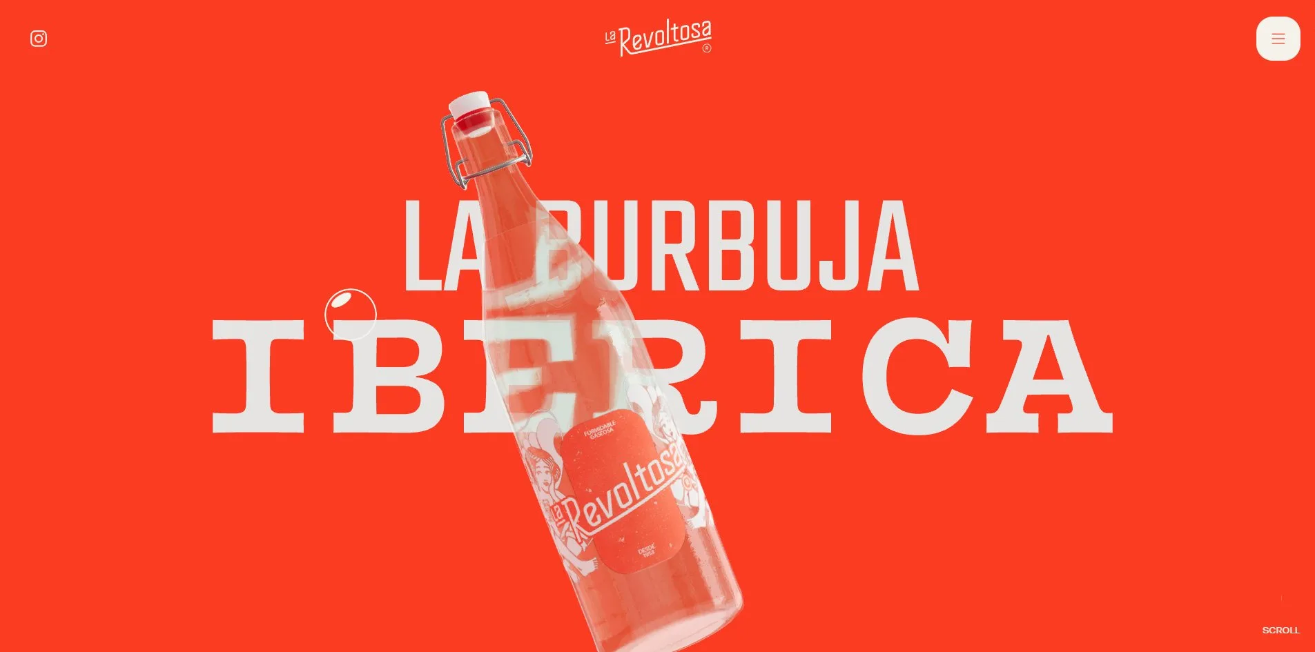
The site opens with six to ten seconds of intro animation, the length depending on how fast it loads. The intro first shows a screen of solid red, then after two seconds a few bubbles in the corners. Next the letters of LA BURBUJA IBÉRICA fly in from every direction and settle into two lines, and the glass bottle drops from the top and comes to rest at a slant across the words, bending the letters seen through it. Until the bottle lands, a visitor cannot scroll the page.
Waka built La Revoltosa's whole home page as one long camera shot. The frame stays fixed on screen while the scrollbar travels thirteen thousand pixels and the things in it change one after another. The words move up, the bottle turns and leaves, the claim arrives, her drawing pushes in from a distance until it fills the screen, the phone is raised and its four photographs slide out one over the next, and the film fills a screen. Then comes ESO SÍ, QUE SEA CON GAS, then the MUUUUCHO gas screen, where more than three hundred bubbles burst at once, and the bottle crosses the frame one last time.
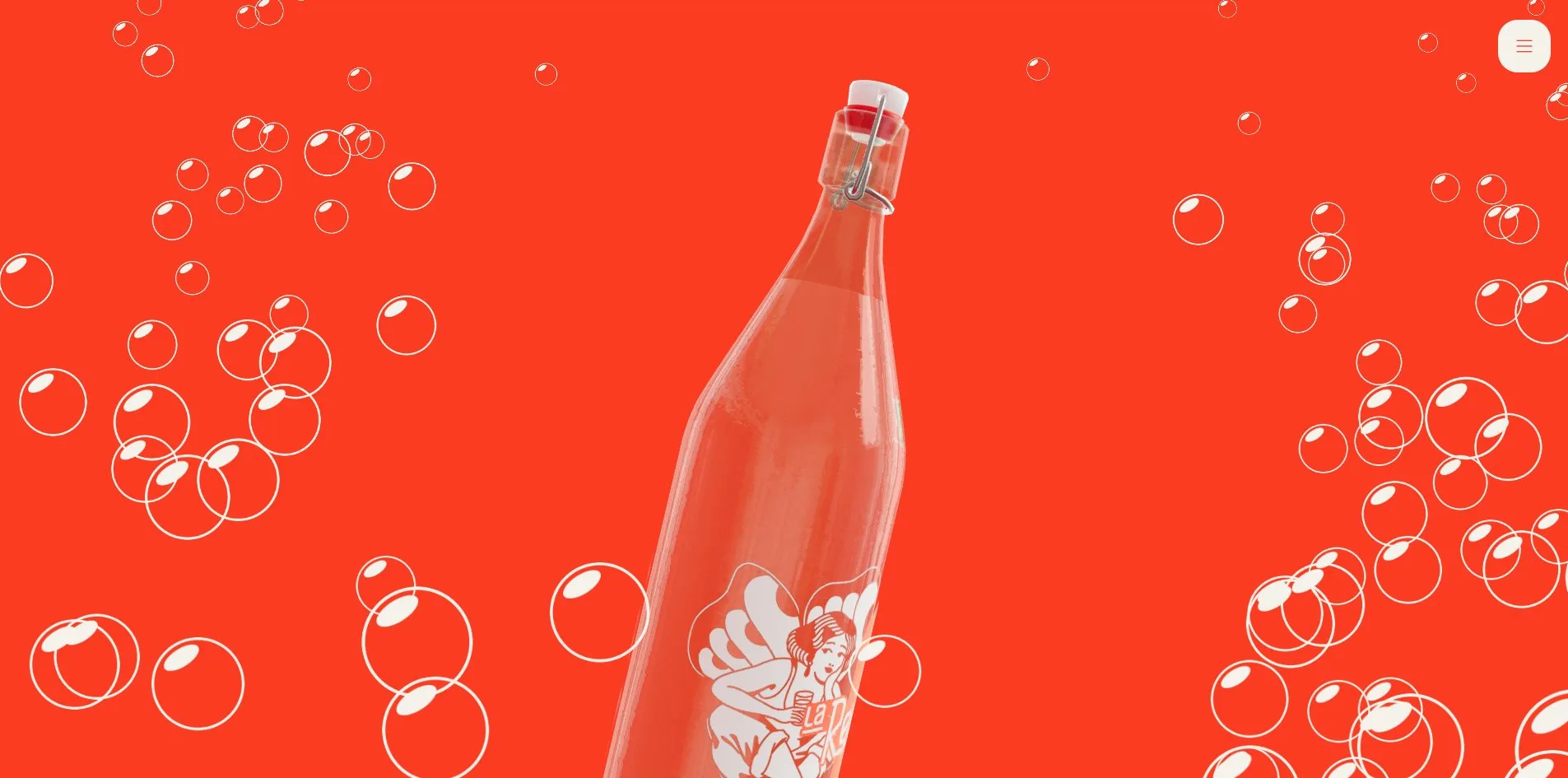
The bubbles are the fizz of the site, and the page releases one for every 300 pixels scrolled and another every 0.8 seconds while the visitor stands still. Each bubble rises from the bottom of the screen to the top with a slight wobble in its shape, between 25 and 115 pixels across, and the code keeps a ready supply of 400 that it reuses in turn. When a visitor scrolls fast, the letters of a headline shift up and down individually, like bubbles in a glass nudging the type. When the cursor rests on one of the three product photographs, her drawing surfaces behind it at 40 percent opacity while the photograph grows by 5 percent. The marquee A TODO, GAS moves by itself at 150 pixels a second, and faster while the page scrolls.
The footer mark rises on its slant from below with bubbles floating over it, and the top edge of the red block is a wave. When a visitor opens the menu, a full cream screen covers the page with the four lines held in the middle. When the visitor chooses one, the site loads a new page outright, with no transition between pages. The film screen uses a player the site built itself, with a round play button, two small play and mute buttons at the bottom left, and a progress bar that can be dragged. On the products page the bottle is a 3D model that changes with every screen scrolled. A pair of icons under it switches the whole page to a grid of photographs, nine bottles in three columns, and the page shrinks from twelve thousand pixels to six thousand.
04Engineering
The site runs on WordPress 7.1.2 with a theme Waka wrote itself. All the interaction lives in one app.js, 1.1 MB before compression and 292 KB as it travels over the network. It bundles three.js r182, the animation library GSAP 3.14 with its scroll plugin ScrollTrigger, the smooth scrolling library Lenis 1.3.17 and the carousel library Swiper. The two big lines on the opening screen are 3D text, made by first converting Teko and Vulf Mono into JSON glyph files that record the outline of each letter, 526 KB for the pair, and then turning those outlines into solid letters. The bottle is a low-poly model compressed with Google's Draco format. Its glass material has a transmission of 0.99, so it lets almost all light through, a refractive index of 1.2 and a thickness of 0.6. A 512 pixel HDR environment map supplies its reflections, and a normal map adds fine scratches to the surface. Finally the site uses ACES tone mapping, a standard from the film industry, to bring the brightness into the range a screen can show, with the exposure at 1.2.
La Revoltosa's home page downloads 4.1 MB in 56 requests on a first visit. The largest items are the bottle's 477 KB texture, the 380 KB Vulf Mono glyph file, 346 KB of reCAPTCHA, Google's check for telling people from bots, the 337 KB HDR map, three photographs of around 300 KB each and the 292 KB script. The three web fonts were uploaded as the TTF and OTF files they came as, not converted to a smaller web font format, and come to 513 KB. Google's tag manager and analytics load as soon as a visitor arrives, and with reCAPTCHA they add up to 645 KB. When a visitor scrolls to the bottom, the total comes to 4.9 MB. The products page has a canvas of its own carrying the plastic bottle and siphon models, and a visitor who enters it downloads another 3.7 to 4.0 MB.
The server takes 518 to 602 milliseconds to send its first byte, and the first content appears on screen at 828 to 856 milliseconds. The largest piece of content is the two big lines of type, drawn in that same window, well inside the 2.5 seconds Google recommends, while the full load takes 2.4 to 3.1 seconds. Layout shift, how much things jump around while the page loads, is 0.06 to 0.07, within Google's 0.1 limit, and comes from the menu links and the opening screen. During the intro there is one long task of 454 to 765 milliseconds, a stretch in which the main thread is fully busy and the page does not respond. At rest the canvas asks the graphics card for 49 draw calls a frame covering 69,000 triangles, and it stops rendering once it has scrolled off screen. Scrolling the whole page holds 60 frames a second, which leaves about 16.7 milliseconds per frame, and the slowest frame took 39 milliseconds, a hitch of a frame or two.
The page declares Spanish and marks two landmark regions, navigation (nav) and main content (main), so screen reader users can jump straight to them. The home page has no first-level heading (H1), three of its five second-level headings (H2) are the drink names on the product cards, and the inner pages have one H1 each. Seventeen of the 21 images have empty alt text. Of the 72 interactive controls, 25 have no name a screen reader can announce, among them the logo link, the menu button and the form fields. The site sets the focus outline to 0 pixels, so a keyboard user can reach every button without ever seeing where the focus is. The system's reduced motion setting affects only the form's loading spinner, and the intro and bubbles carry on regardless. On the home page 262 elements carry aria-hidden, which tells screen readers to skip them, and these elements are the headings, split into single letters for animation.
05Scores and Team
| Award | Source | Date | Score |
|---|---|---|---|
| Site of the Day | Awwwards | 2026-05-21 | 7.45 / 10 |
| Developer Award | Awwwards | 2026-05-21 | 7.08 / 10 |
| FWA of the Day | The FWA | 2026-09-18 | 82 POINTS, DAYS 8 |
La Revoltosa's Awwwards site score peaks at Creativity, 7.81, and bottoms out at Usability, 7.09, with Design at 7.53 and Content at 7.48. Of the five Developer Award categories listed, Animations is the highest at 7.80 and Accessibility the lowest at 6.40, with Semantics at 7.40, WPO at 6.60 and Markup at 6.60. Four months later The FWA gave it 82 points, with 8 in the DAYS column.
| Credit | Identity | Record |
|---|---|---|
| Waka | Creative branding studio, Madrid | SOTD 1, HM 8, FWA 1 |
| GL6RIA | Illustration | No profile |
Waka describes itself on Awwwards as a creative branding studio in Madrid that loves brands, good design, UX, data and challenges. Its profile holds 11 works and 8 honourable mentions, and this site is its first Site of the Day and its first FWA. The description on the FWA case page credits Three.js for the 3D renders, GL6RIA for the tattoo-style illustrations and GSAP for the motion, while the site's footer signs off with Design by waka.
06Archive
- Award date
- 2026-09-18
- Awards
- Awwwards SOTD 2026-05-21, Awwwards DEV 2026-05-21, The FWA FOTD 2026-09-18
- Site
- https://larevoltosa.es/
- Credits
- Waka, GL6RIA
- Design
- cinematic
- Build
- scroll
- Awwwards
- 7.45 / 10, Design 7.53, Usability 7.09, Creativity 7.81, Content 7.48. Developer Award 7.08. https://www.awwwards.com/sites/la-revoltosa
- The FWA
- 82 POINTS, DAYS 8. https://thefwa.com/cases/la-revoltosa-p2
- Stack
- WordPress 7.1.2, three.js r182, Draco, GSAP 3.14, ScrollTrigger, Lenis 1.3.17, Swiper, Contact Form 7, reCAPTCHA, Vimeo
- Total assets
- 4.1 MB on a first load, of which 3D glyph files 526 KB and fonts 513 KB. 4.9 MB after a full scroll, and the products page adds 3.7 to 4.0 MB
- Speed
- FCP 828 to 856 ms, LCP 828 to 856 ms, CLS 0.06 to 0.07. 60 fps scrolling the whole page