Noho
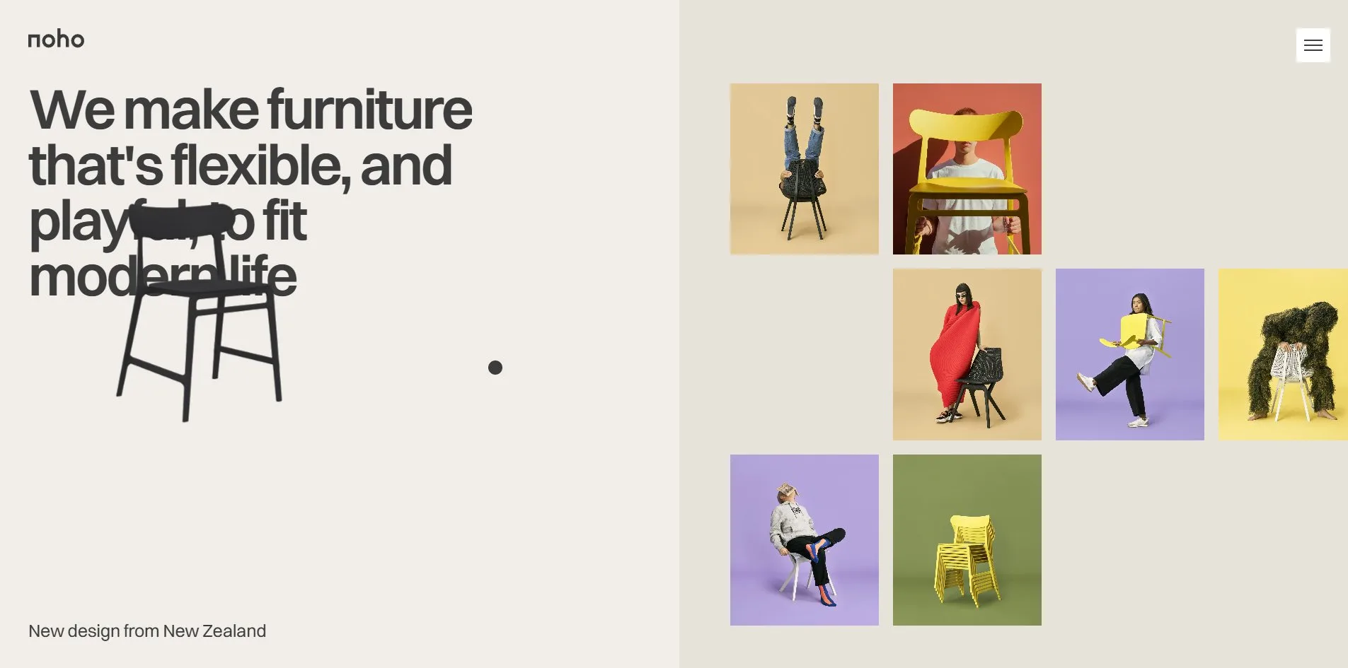
When the mouse stays still for a minute, Noho's furniture website goes into a screensaver, like a computer. The screen darkens to a deep brown and a chair drifts across it, bouncing off the edges and changing colour with every bounce, like the DVD logo that bounced around the screen of an idle DVD player. When a visitor moves the mouse, the page comes back, but the chair stays, drifting over headlines and photographs until the next time the visitor stops.
This is a non-commercial redesign of the New Zealand furniture brand Noho by Evgeny Morev and Alex Ivanov. It was FWA of the Day at 83 points and Awwwards Site of the Day at 7.34.
01Concept
Noho is a New Zealand furniture brand that sells straight to customers rather than through shops. It launched in March 2020 with just two chairs. Lightly costs 329 dollars, was designed by Formway, weighs 6 pounds, is made of a plant-based polymer, stacks ten to a metre and won Furniture Design of the Year at the Dezeen Awards in 2023. The Move chair costs 450 dollars and has a breathable woven back. The site says the materials come from castor beans, old carpets and recycled fishing nets. In March 2025 the brand posted A Good-Goodbye on its blog, announcing that its US online store would close on 15 May.
This site was made after that, and every word and photograph on it comes from the brand itself, from the opening slogan We make furniture that's flexible, and playful, to fit modern life, to five blog posts, the two founders' statements and seven furniture awards. Yet when a visitor presses any Buy or Make an order button, what opens is not a cart but a card. The card is headed A good goodbuy, with the line This website is design concept builded in memory of the playful and sustainable brand below it and a photograph of a man carrying a chair down a country road. The card's one button leads to the brand's real website. The whole site is a memorial to a brand that has just closed its online shop.
The two words on that card, playful and sustainable, each get their own set of features. Playful covers the small moving parts, a gallery that follows the cursor, footer letters that light up one by one and a chair that wanders across the page. Sustainable is the energy panel in the menu, which opens to two switches, one for a dark mode and one that turns the animation off, with a note that turning both on saves about 35 percent of the device's battery. A tag beside them reads High in orange with both off, Med in yellow with one on, and Low in green with both on. The dark mode is not black but the same deep brown the screensaver uses.
Noho's redesign carries a good deal of content. Each of the two product cards opens into a half-screen page of its own, with a quote, three selling points and seven photographs. The site also has a four-step quiz about how you sit, which ends by opening the chair it recommends. The blog section holds five real blog posts, the longest over 1,300 words. Next to the FAQ stands a 3D chair whose colours and lighting can be changed at random.
02Design
Everything on this site sits on a paper off-white, rgb(241, 238, 233), with two deeper sands, rgb(231, 226, 218) and rgb(205, 192, 176), laid over it to mark out blocks. The text is one dark grey, rgb(60, 60, 60), and there is no other text colour on the site. The only variation is the same grey at 60 and 40 percent opacity. Dark mode swaps the three background layers for rgb(46, 36, 28), rgb(70, 54, 42) and rgb(113, 89, 70), turns the type cream, and leaves every photograph untouched.
Switzer is the only typeface, in two weights, Regular for the 18 pixel body text and Semibold for headings. Heading sizes jump a long way, with section titles at 80 pixels and the letter spacing tightened to minus 3.2 pixels, card titles at 40 pixels, small headings at 25 and captions at 14. Of the site's 9,700 characters, eight in ten are 18 pixel body text. The footer line happy modern is 300 pixels, a single line across the full width of the screen, and the only place the site uses type as a picture.
The hero is split down the middle, with the slogan on the left. On the right are seven photographs of 210 by 242 pixels on a sand ground, in three rows that are deliberately out of step, with the second row shifted one cell to the right and a gap left at the bottom right. The photographs all show people playing with chairs, legs upside down on a seat, a chair held over someone's head, a person wrapped in a red blanket, a chair grown over with grass. Each photograph sits on a flat colour, beige, orange-red, lilac, yellow or green. Those colours appear nowhere else in the layout except in two places, the footer letters as the cursor sweeps across them and the drifting chair each time it bounces and changes colour.
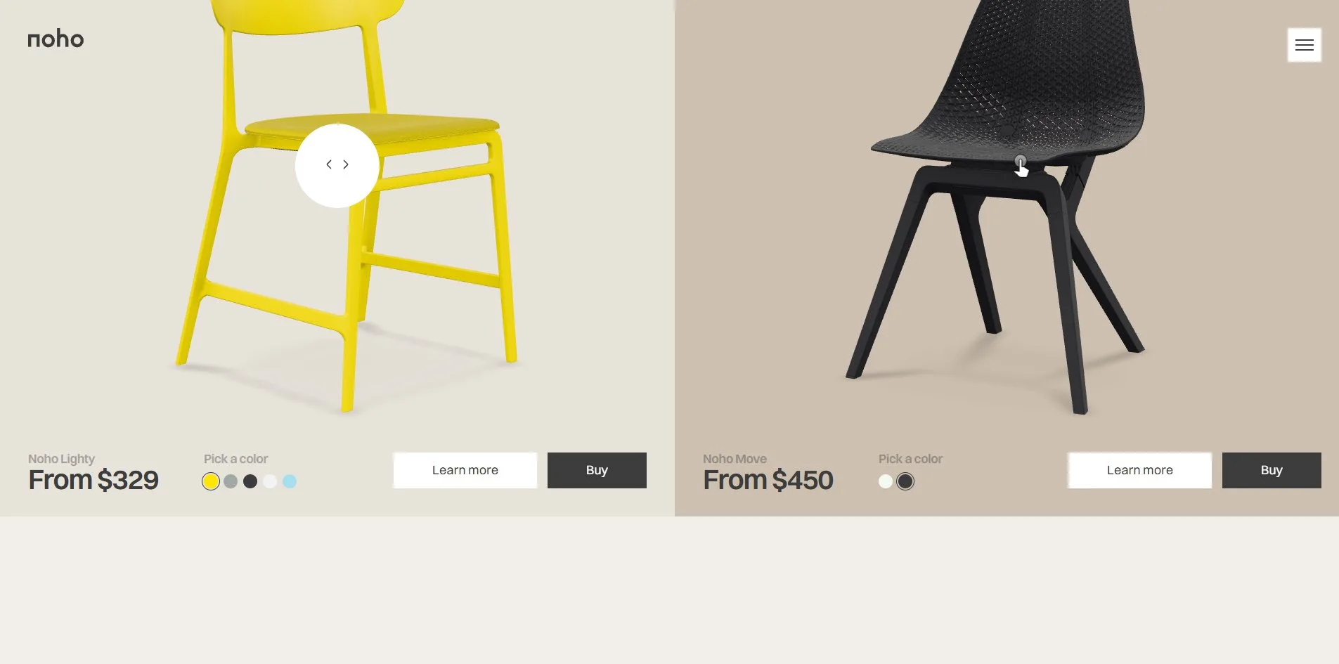
The product section is two half-screen cards side by side, a yellow chair on the light ground and a black one on the dark. The chairs are 3D models that a visitor can turn by dragging. Along the bottom edge of each card runs a line of small type, giving the model, the starting price, five colour dots and two buttons. The sustainability passage is three cards numbered 01 to 03, reading 99% recycled nylon, 82% renewable electricity and 5-year warranty, with the figure centred and nothing else.
The blog section lays its five articles out as a row of cards, each with a title and a summary and no image. When a visitor opens one, the article slides in from the right, 880 pixels wide, with a landscape photograph, the title, a date and a category, the body, and at the foot the image for the next piece.
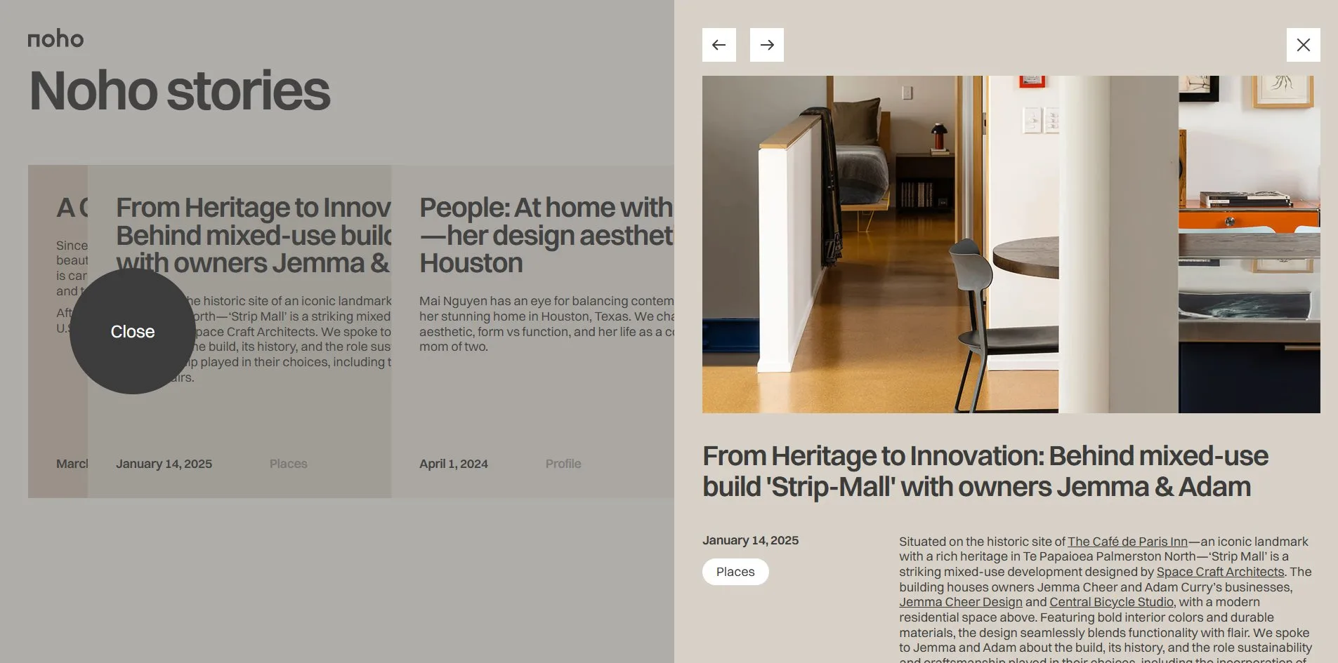
A 20 pixel dark grey dot replaces the cursor, and it grows and takes on a word when it meets certain things. Over a 3D chair the cursor becomes a 120 pixel white circle holding a pair of left and right arrows. Over the gallery it is a 170 pixel white circle reading Scale. Over a blog card it is a 170 pixel black circle reading Open, and once the panel is open it reads Close when it rests outside the panel. When the cursor rests on the Instagram photographs, it reads Follow. The word on the cursor tells the visitor what a click will do, so the buttons themselves never have to.
03Motion
The site opens behind a dark grey curtain that rises from the bottom, and the page is uncovered after two and a half seconds. The site hands scrolling to the smooth scrolling library Lenis, with the easing set to three seconds, so the page keeps sliding long after the wheel stops, and the whole site moves at that slow pace.
When a product card comes into view, it first shows a still poster image of the chair. Rings ripple outward from behind the chair, and as they fade the poster is replaced by the real 3D model. When a visitor drags the model, it only turns horizontally. The viewer allows no zoom and no panning, and holds the viewing angle from above between 22.5 and 90.5 degrees, so the chair can never be flipped over.
The gallery is thirteen photographs in a single row, more than nine hundred pixels wider than the screen. The gallery needs no dragging, since the row slides left as the cursor moves to the right. When a visitor clicks a photograph, it grows to three times its size over its neighbours, and the word on the cursor changes from Scale to Close. The row of blog cards stays fixed on screen for four screen heights of scrolling, and as the visitor scrolls, the cards take turns expanding while the others shrink to narrow strips.
The chair beside the FAQ has two buttons. Random gives the frame and the seat pad new colours and swings the camera through a full turn around the chair. Mood changes the card's background, running through sand, coral, lilac, pale yellow and olive. With each new background, Mood loads an environment map of the same tint, the panoramic image the model takes its reflections from, so the reflections on the chair follow the colour behind it.
Each letter of happy modern in the footer is a separate piece, and as the line comes into view the letters rise from below one after another, 0.04 seconds apart. When the cursor sweeps across, the letters turn coral, pale yellow, olive, lilac and sand in sequence. The last three letters swept keep their colour and the rest fade back to grey. The footer itself hides behind the last section and is revealed from underneath as the visitor scrolls.
The screensaver starts after sixty seconds without any cursor movement. The page darkens to the deep brown, and a chair of 371 by 397 pixels flies in from an edge at about 170 pixels a second. Every time it meets one of the four edges it bounces and changes colour, cycling through white, pale blue, black and grey. When a visitor moves the mouse, the brown lifts, but the chair stays where it is and keeps drifting, over the headline and over the photographs, until the next time the visitor stops. The switch in the energy panel that turns animation off removes nearly all of this. The ripples no longer appear and the letters no longer rise. Of the page's twenty-five scroll triggers, settings that start an animation when the page reaches a certain point, only one is left.
04Engineering
Evgeny Morev and Alex Ivanov built the site in Webflow, then exported it and hosted it themselves at noho.ink. The scripts are three hand-written bundles, including a main one of 84 KB and a heavier one of 239 KB that loads later. The libraries on the site are jQuery 3.5, the animation library GSAP 3.15 with its ScrollTrigger, CustomEase and SplitText plugins, the smooth scrolling library Lenis, the carousel library Embla, and model-viewer, Google's component for showing 3D models on a web page, along with the three.js 0.149 and Draco decoder built into it. Then there are ogl and html2canvas, which exist only for the ripple on the product cards. html2canvas can draw a part of a web page into an image, and here it captures the poster and hands it to ogl, a small WebGL library, as a texture for the ripple.
Both chairs live in one GLB file, a format that packs a 3D model together with its textures. It is 2.2 MB after Draco compression, and all three model-viewers on the page share it. A first visit downloads 4.0 to 4.4 MB in 59 requests, more than half of it the GLB, followed by model-viewer at 274 KB, photographs at 1.1 to 1.4 MB and two woff2 fonts at 36 KB. When a visitor reaches the product section, the page starts downloading in the background the seven HDR environment maps the Mood button uses, 760 KB each. When the visitor scrolls to the end of the page, the total comes to 11.3 MB.
Within 96 to 126 milliseconds the server sends its first byte, the first content appears on screen at 252 to 348 milliseconds, and nothing jumps around while the page loads, so layout shift is zero. The browser records the largest piece of content as a hero photograph of 184 by 242 pixels with an opacity of only 0.001, so it is all but invisible. That photograph counts as drawn at almost the same moment as the first content, while the curtain still covers the page, so that figure does not reflect when a visitor actually sees anything. Decoding the GLB is one long task of 760 to 840 milliseconds with the main thread fully busy, a little over three seconds after arrival. Scrolling the whole page holds 60 frames a second, and at rest the 3D models are not redrawn.
The page declares English and marks only two landmark regions, header and footer. There is no main, so screen reader users cannot jump straight to the content. The only first-level heading (H1) on the site is the title of the hidden privacy policy panel, and the hero slogan is a plain paragraph, not marked as a heading. All seventy images have empty alt text, and the three 3D models have no alternative text either. The menu button is a graphic with no name, so a screen reader cannot say what it is. The keyboard reaches the product models and the buttons, with the browser's default thin outline as the focus ring. The site never reads the system's reduced motion setting, so the switch on the site is the only way to turn the animation off.
05Scores and Team
| Award | Source | Date | Score |
|---|---|---|---|
| FWA of the Day | The FWA | 2026-07-25 | 83 POINTS, DAYS 8 |
| Site of the Day | Awwwards | 2026-09-18 | 7.34 / 10 |
| Developer Award | Awwwards | 2026-09-18 | 7.00 / 10 |
The FWA came first, with 83 points and 8 in the DAYS column. Two months later Awwwards made it Site of the Day too, and in its site score Design is the highest of the four categories at 7.64 and Usability the lowest at 7.00, with Creativity at 7.25 and Content at 7.35. Of the five Developer Award categories listed, Accessibility is the highest at 7.40 and Animations the lowest at 6.80, with Semantics at 7.20, WPO at 7.00 and Markup at 7.20.
| Credit | Identity | Record |
|---|---|---|
| Evgeny Morev | Freelance digital and interactive designer | FWA 1, SOTD 1, HM 1 |
| Alex Ivanov | Freelance creative front-end developer | FWA 1, SOTD 1, HM 1 |
Both of their Awwwards profiles give Serbia, while both FWA profiles give an address in Montenegro, and on both platforms this is the only work either of them has. On The FWA Evgeny Morev describes himself as a freelance digital and interactive designer at 60 FPS and Outpost, and on Awwwards says he is looking for freelance or full-time work at a good agency. The footer credit on the site, Designed by Eugene More, links to his LinkedIn. Alex Ivanov describes himself as a freelance creative front-end developer, and both awards credit him alongside Evgeny Morev.
06Archive
- Award date
- 2026-09-18
- Awards
- The FWA FOTD 2026-07-25, Awwwards SOTD 2026-09-18, Awwwards DEV 2026-09-18
- Site
- https://noho.ink/
- Credits
- Evgeny Morev, Alex Ivanov
- Design
- interface
- Build
- realtime
- Awwwards
- 7.34 / 10, Design 7.64, Usability 7.00, Creativity 7.25, Content 7.35. Developer Award 7.00. https://www.awwwards.com/sites/noho
- The FWA
- 83 POINTS, DAYS 8. https://thefwa.com/cases/noho
- Stack
- Webflow, jQuery 3.5, GSAP 3.15, ScrollTrigger, SplitText, CustomEase, Lenis, Embla, model-viewer, three.js 0.149, Draco, ogl, html2canvas
- Total assets
- 4.0 to 4.4 MB on a first load, of which the GLB 2.2 MB. 11.3 MB after a full scroll, of which seven HDR maps 5.3 MB
- Speed
- FCP 252 to 348 ms, LCP 268 to 348 ms, CLS 0. 60 fps scrolling the whole page