bleibtgleich'26
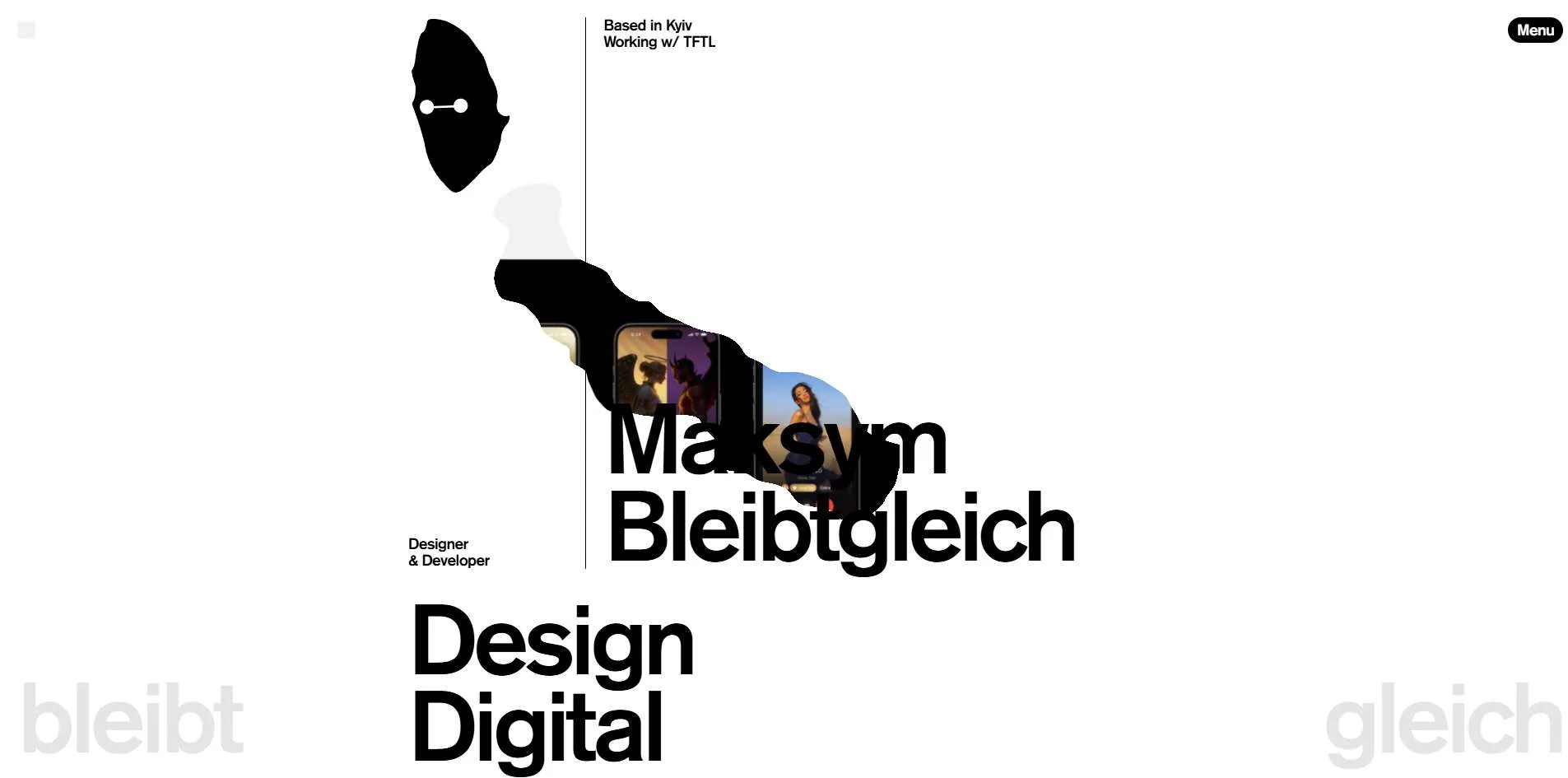
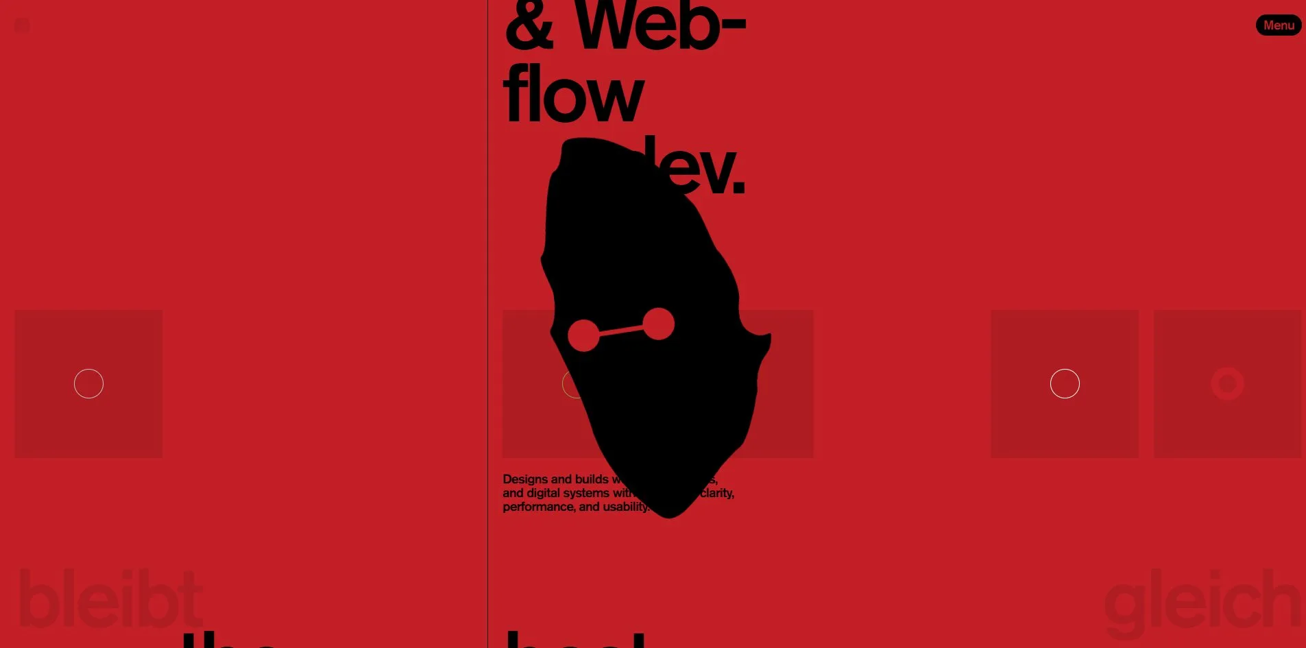
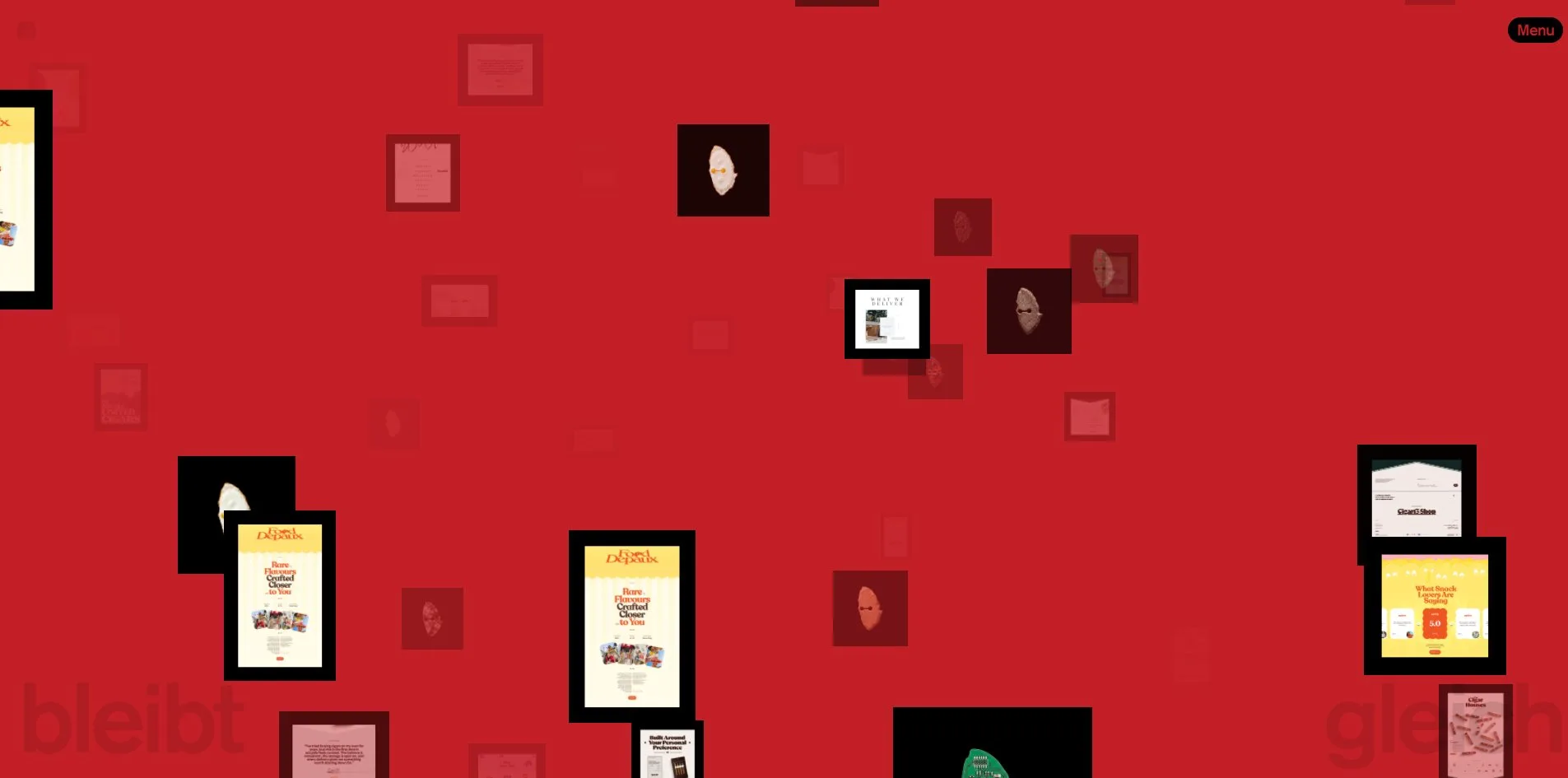
The logo of bleibtgleich'26 is an irregular black shape with a dumbbell shaped slit across it, like a mask, and it turns up all over the site. When the cursor moves, the mask becomes a pool of liquid trailing behind it, with screenshots of the work showing through. When a visitor clicks any of the theme swatches lower on the page, the mask grows to half the screen height and spins twice, and the whole site turns grey, orange, olive or red. The mask is also the middle cell of the footer clock, changing material every few seconds.
The site is the 2026 edition of the personal site of Maksym Bleibtgleich, a designer in Kyiv. It was Site of the Day on Awwwards with 7.46.
01Concept
Maksym Bleibtgleich is a UX/UI designer and developer in Kyiv who works with The First The Last, an agency in Miami and Dubai. The site describes his work as designing and building websites, products and digital systems with a focus on clarity, performance and usability. He releases a new edition of his own site every year. The awards list on the page names bleibtgleich'23 and bleibtgleich'25, and this one is '26.
A personal portfolio usually makes the work the star, but this site makes the logo the star instead. The black mask hangs at the top left as the logo, and it is also the liquid that follows the cursor, the shape that spins in the centre of the screen when a theme swatch is pressed, the cell in the middle of the footer clock and the centre of the rotary telephone on the contact page. On this site the work steps back behind the logo. The home page holds only four project covers, and even those hide inside the liquid until a visitor wipes them into view with the cursor.
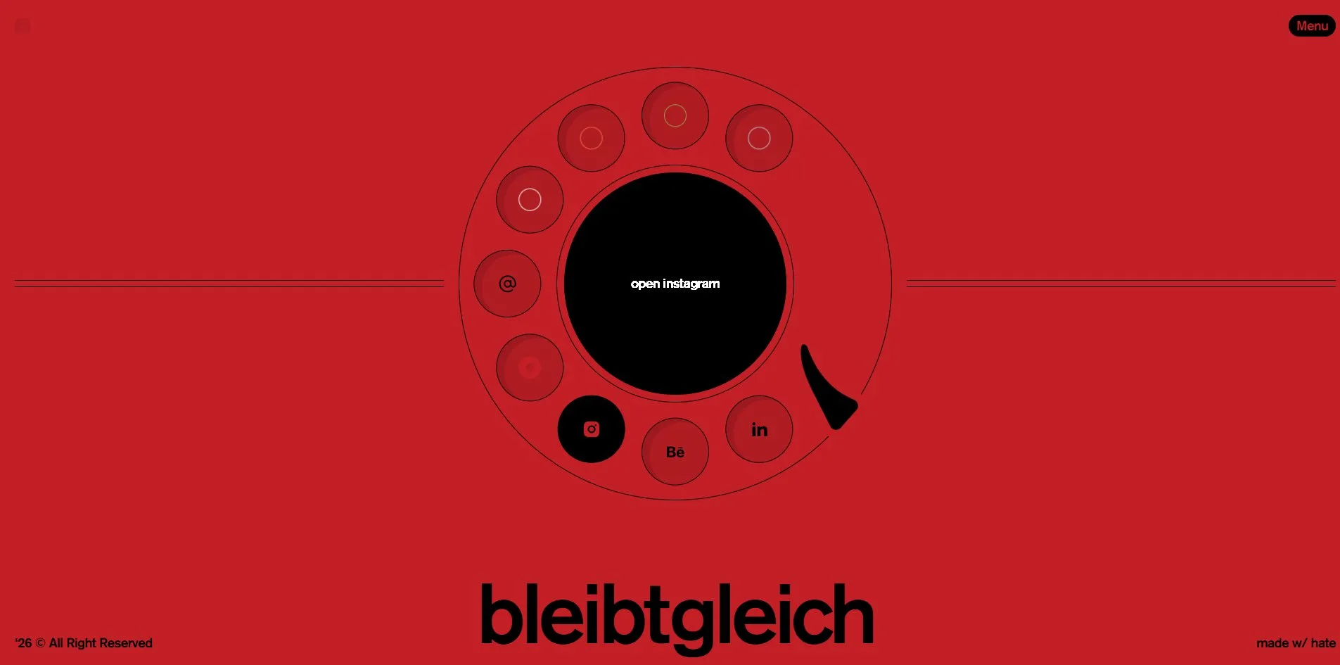
The site has four pages, and the home page runs through the name, a line of introduction, the four hidden covers, the sentence the best ideas deserve execution, an awards table and the footer. The Work page shows 15 projects on black cards tagged Case or Shot, and the page can be switched into a sphere that visitors drag around with the mouse. Experiments is a three dimensional space with 34 screenshots of experiments floating in it, which visitors fly through with the keyboard and mouse. Contact is drawn as an old rotary telephone, with nine holes in the dial, five of them for changing the theme colour and four of them email and social links.
The copy on the site has the same spirit as these tricks. The site cuts the footer sentence Everything that exists had first existed as nothing more than a sentence in half and inserts a clock showing the visitor's local time, so the sentence reads everything that exists had first existed as ( 01 : mask : 59 ) nothing more than a sentence. The part in brackets is the clock, with the mask in its middle cell. The end of the Work page says these things were crafted through irritation, perfectionism and the constant feeling that it still could be better, and the sign off at the bottom right is made w/ hate, a twist on the usual made with love.
A black speech bubble opens beside the cursor whenever a visitor presses the slash key anywhere on the page. Whatever the visitor types is sent, together with that visitor's cursor position, to everyone else looking at the site at that moment, and their cursors are drawn on the visitor's page. The site is a portfolio, and it is also a room with people in it.
02Design
One typeface does everything, Akzidenz Grotesk Pro, and only in its Medium weight. The seven hundred or so characters on the home page come in just two sizes, small text at 19 pixels and display type at 120, with nothing in between. The page's root font size is set to one percent of the browser window's width, and every size is written in rem, a unit equal to that root size, as a number of rem divided by 14.4. The display type is 90 of those units and the small text 14, so all the type scales in proportion with the window. Whatever the background colour, the text on this site is always black.
The page comes in five background colours, white, grey rgb(190, 193, 202), orange rgb(255, 99, 61), olive rgb(145, 158, 68) and red rgb(195, 31, 38), and the visitor picks one. Once the visitor picks a colour, the small icon in the browser tab changes to a mask in the same colour, and the choice holds for the rest of the visit, across page changes. The pill shaped menu button at the top right stays black, with its label in the current background colour. The menu opens as three columns hanging from the top of the screen, one each for Home, Work and Contact, 480, 373 and 288 pixels tall in turn, each a step darker than the current background. In the menu, Experiments sits on its own strip at the bottom.
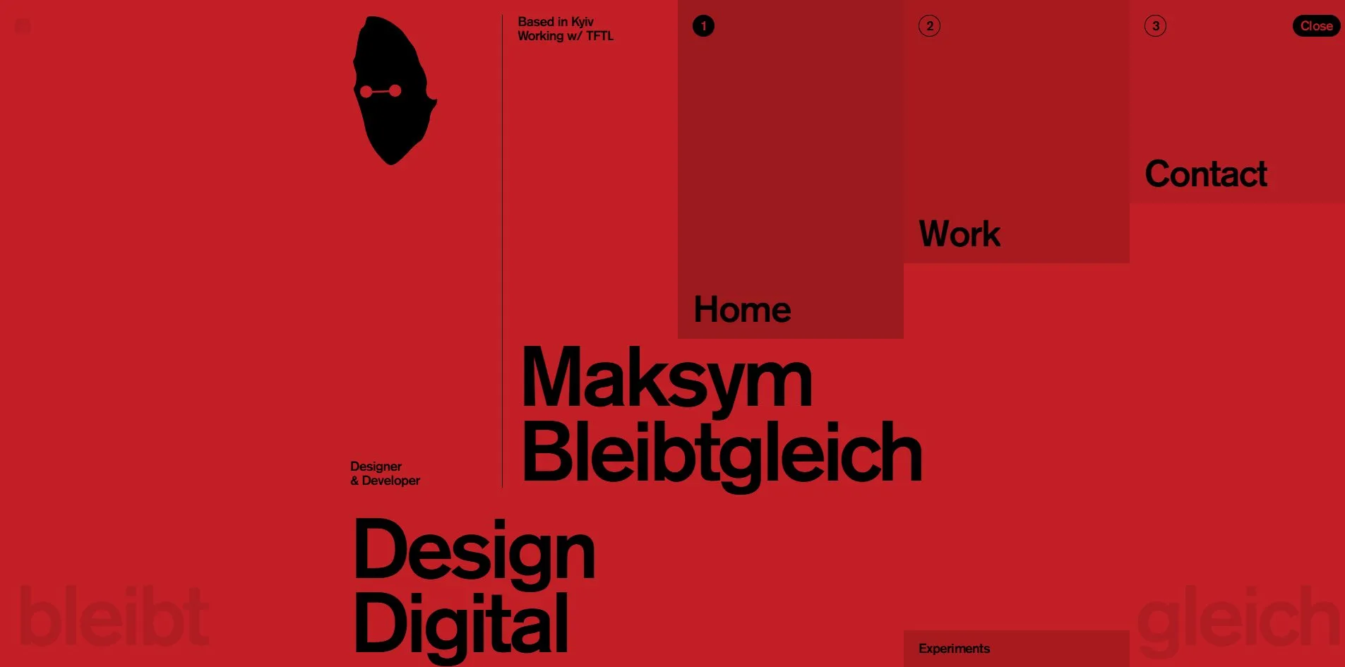
The layout sits on a grid of 8 columns, each 216 pixels wide with 16 pixel gaps between them, and the visitor can bring the grid into view. The small square at the top left of the page is the grid switch. When a visitor clicks it, eight pale columns of 5 percent black cover the page, and a second click folds them away. On the first screen a thin vertical rule stands 712 pixels across and cuts the picture in two. The left half holds only the two small lines Designer & Developer and the mask. The right half holds Based in Kyiv, the name and the display lines Design Digital Products. Each display line has a different indent, the at the far left, best just right of the rule, ideas deserve execution back in the middle, as if someone had pushed the line starts around on purpose. At the bottom corners of every page sit two 120 pixel words, bleibt on the left and gleich on the right, one shade darker than the background. These two words stay pinned to the bottom edge, holding the two halves of the name at either side.
The Work page puts each project on a black card. An outlined, rounded tag at the bottom left reads Case or Shot, with the project name beside it. When the cursor rests on a card, an Explore button slides up at the bottom right, and the card itself tilts slightly with the cursor. The awards table on the home page has four columns, year, project, awarding body and award, with a hairline between rows, and when the cursor rests on a body's name, a thumbnail of the certificate floats up.
The most finely drawn screen among the site's four pages is the contact page. In the centre is a 616 pixel dial with nine 96 pixel holes around the rim, a 339 pixel black disc in the middle holding the mask in white, and a black finger stop at the lower right, the hook on a rotary phone that stops the finger and the dial. The five holes at the top each carry a small ring in one of the five theme colours, the hole on the left reads @, and the three at the bottom are Instagram, Behance and LinkedIn. When the cursor rests on a hole, the hole fills solid black, and the mask in the centre gives way to a line of white text saying what a click will do, such as send email, open instagram or change theme.
The images on the site are of two kinds only, screenshots of work and screenshots of experiments, all set in black frames, with not one photograph and not one portrait. The single exception is the middle cell of the footer clock, where the mask takes on materials in turn, such as raw beef, brushed metal and a green circuit board. The materials number nine in all, and they change every three or four seconds or whenever a visitor clicks.
03Motion
A loading counter is the first thing a visitor sees on arriving at the site. A 120 pixel percentage at the bottom left runs from 0% to 100% in two seconds, and the page becomes usable after about three. Then the logo at the top left starts as a rectangle and morphs into the mask over about two seconds, using MorphSVG, GSAP's shape morphing plugin. Every line of text arrives through an SVG Gaussian blur filter whose radius closes from 42 pixels to 0. A second filter, a colour matrix, pulls the blurred edges tight again, so the letters do not simply fade from soft to sharp but seem to set out of a puddle of ink. Each of the 54 lines on the home page has a filter of its own.
The liquid that follows the cursor is a fluid simulation running on the graphics card through WebGL2. Which way and how fast each point of the liquid flows (the velocity field) and how dense its colour is (the dye field) are held in 16 bit floating point buffers on the graphics card and advanced one step per frame. The outline of the liquid is the mask, and its colour is taken from the current text colour. Four project covers are hidden around the first screen, invisible wherever the liquid has not flowed. As the cursor passes, they show through gaps in the liquid, then vanish again a few seconds later as the liquid disperses.
The site stages a theme change as a small ritual. When a visitor clicks any swatch, the mask grows to half the screen height in the centre, turns two full circles around its vertical axis with a slight wobble, and disappears after two seconds. The background has already changed the instant the click lands. Moving between pages is handled by barba, a library that swaps pages without a full reload so that a transition can play in between. The old page blurs to 24 pixels as it fades out, and the new one fades in from the same blur.
When a visitor switches the Work page to Sphere at the top right, the cards give way to a three dimensional view in which the project images form a ball. The images are placed on a Fibonacci sphere, a method for spreading many points evenly over a sphere's surface. A visitor can turn the ball by dragging it, and the images on the far side are mirrored so they still read the right way round from behind. The Experiments page is a space a visitor can fly into, with 34 screenshots scattered at different depths. The mouse position sets the drift and the wheel pushes the view deeper. A visitor can pan by holding and dragging, fly with W A S D or the arrow keys, and rise and sink with Q and E.
The bubble that the slash key opens is black, with text in the background colour, and only three of its four corners are rounded. The bubble follows the cursor, and when the visitor presses Enter to send, it disappears from that visitor's own screen. Other visitors' cursors are drawn as an arrow icon, with their words hanging beside it.
04Engineering
Webflow builds the pages, and all of the motion lives in one 98 KB custom script, 30 KB compressed, added to the pages through Slater, a tool for attaching custom code to Webflow sites. The script has fifty odd functions, each with one job, such as the loading counter, the custom scrollbar, the themes, the mask animation, the footer clock, the dial, the cursor tracker, the text blur, the sphere and the infinite canvas of the Experiments page. The animation library is GSAP 3.15 with its plugins MorphSVG, ScrollTrigger, SplitText, CustomEase, Draggable and InertiaPlugin. The smooth scrolling library Lenis 1.3.21 handles the scrolling and eases each scroll to a stop along a custom 1.2 second curve. The site uses barba for page changes and three.js 0.128 for the 3D. The chat uses socket.io 4.5.4, a library that keeps a connection open between the browser and the server so either side can send messages at any moment. On top of these, the page also loads Webflow's own jQuery library. Draggable and InertiaPlugin, the plugins for dragging and momentum, are loaded, yet not one element on the home page uses them.
Page weight on the site is low throughout, and a first visit to the home page downloads 774 to 803 KB in 36 to 40 requests. The single largest file is the Google Analytics tracking script at 172 KB, ahead of three.js at 145 KB. All the project covers use AVIF, a compact modern image format, and total 189 KB, and the font is a single 33 KB woff2 file. When a visitor scrolls to the bottom of the home page, the total reaches 1.1 MB. Opening the Work page adds another 0.8 MB, a project page 1.2 to 2.3 MB, and the Experiments page 1.5 to 2.1 MB. The server sends its first byte after 98 to 112 milliseconds. The first content appears on screen (first contentful paint, FCP) at 840 to 864 milliseconds, and the largest piece of content is drawn (largest contentful paint, LCP) at 840, far inside the 2.5 seconds Google recommends. The layout shift score (CLS), which measures how much things jump around while the page loads, is 0.0007, close to zero. Only one long task of 82 milliseconds shows up on the page, a stretch in which script keeps the browser too busy to respond to clicks. The server is occasionally slow, and once the first byte took 2.9 seconds, which pushed the first paint to 6.5.
The fluid canvas covers the whole window, and when the cursor is still it sends only 2 draw calls to the graphics card each frame, a very light load. The frame rate stays at 60 per second even while the cursor sweeps fast. Continuous scrolling also holds 60 frames per second across the page, with the slowest frame at 18 milliseconds, only a little over the budget of about 16.7 milliseconds per frame at 60 frames a second. The sphere on the Work page and the infinite canvas on Experiments hold 60 as well.
On bleibtgleich'26 the accessibility basics are in place. The page declares English, marks three landmark regions, navigation, main content and footer, and shows a 1 pixel outline around the keyboard focus. The site's real problems lie in the structure of its pages. All 31 headings on the home page are H1s, the top level, because every line of display type is its own H1, and the Work page has 15 of them. Screen reader users rely on heading levels to understand how a page is organised, and here they hear thirty headings of equal rank. 40 of the 49 images have empty alt text, including every project cover, so screen readers skip them as decoration. The three social links in the footer have no name a screen reader can announce. When a visitor turns on the system's reduced motion setting, only one thing changes, the page transition going from a blurred fade to a plain fade, while the fluid, the sphere, the flying canvas and the spinning mask all keep going. The slash key, the grid switch and W A S D flight have not a word of hint on the page. What a visitor types in the chat, along with that visitor's cursor coordinates, is sent to a server on the cloud platform Railway, and the site does not say so anywhere.
05Scores and Team
| Award | Source | Date | Score |
|---|---|---|---|
| Site of the Day | Awwwards | 2026-09-22 | 7.46 / 10 |
| Developer Award | Awwwards | 2026-09-22 | 7.22 / 10 |
| Dimension | Score |
|---|---|
| Design | 7.73 |
| Usability | 7.15 |
| Creativity | 7.42 |
| Content | 7.4 |
Design is highest of the four scores and Usability lowest, 0.58 apart. The page shows the scores of five jurors, each scoring all four categories. Two of them gave a straight 7, Eugene Sokolovski gave 8, 8, 7 and 7, Joffrey Spitzer 8, 7, 7 and 7, and Ilya Kostin 7, 7, 7 and 8, so the Design column collected the most 8s. The Developer Award is a separate Awwwards score for the quality of the build, and this site got 7.22. Animations scored highest at 8.00, where Nik Roytman gave a 9. Accessibility scored lowest at 6.40 and Markup, the quality of the code structure, 6.80, which fits the thirty H1s and the empty alt text described above.
| Credit | Identity | Awwwards record |
|---|---|---|
| The First The Last | Creative agency in Miami and Dubai | WORKS 50, SOTY 2, SOTM 2, SOTD 25, HM 48 |
| Maksym Bleibtgleich | UX/UI designer and developer, Ukraine | WORKS 4, SOTD 1, HM 3 |
The site carries two credits, the agency The First The Last first and Maksym Bleibtgleich second. The site itself is his own portfolio, and the header reads Working w/ TFTL, TFTL being short for The First The Last. The First The Last has 25 Sites of the Day and two Sites of the Year on Awwwards. It describes itself as thirty plus people, all in house with no outsourcing, and counts itself among the 30 most awarded digital studios on Awwwards. Maksym's own Awwwards profile has four submissions, of which bleibtgleich'25 took a Site of the Day, and InstaGallery and Bleibtgleich took Honorable Mentions. The awards table on the site is fuller than the profile, and the '25 edition also took a Website of the Day at CSS Design Awards, a Site of the Day from GSAP, and Awwwards' Portfolio Honors and Developer Award. This edition's description on Awwwards is a single line, the best ideas deserve execution.
06Archive
- Award date
- 2026-09-22
- Awards
- Awwwards SOTD 2026-09-22, Awwwards DEV 2026-09-22
- Site
- https://bleibtgleich.dev/
- Credits
- The First The Last, Maksym Bleibtgleich
- Design
- graphic
- Build
- realtime
- Awwwards
- 7.46 / 10. Design 7.73 / Usability 7.15 / Creativity 7.42 / Content 7.4. Developer Award 7.22. https://www.awwwards.com/sites/bleibtgleich26
- Stack
- Webflow, Slater, GSAP 3.15, MorphSVG, ScrollTrigger, SplitText, Lenis 1.3.21, barba, three.js 0.128, socket.io 4.5.4, WebGL2
- Total assets
- 774 to 803 KB on a cold load of the home page, of which scripts 507 to 538 KB. 1.1 MB after a full scroll
- Speed
- FCP 840 to 864 ms, LCP 840 ms, CLS 0.0007. Continuous scroll 60 fps