Agrumea Farm
Every jam jar on the Agrumea Farm website gets its label stuck on by the browser. The jar is a photograph of an empty jar and the label is a flat artwork. Behind the scenes the site wraps that artwork around an invisible cylinder, lights it from the left, and paints the result back onto the jar. When a visitor turns the wheel, ten jars slide across the screen in an arc, and the label on each one turns with the direction of travel, the way a real jar rolls across a table. When the visitor rests the pointer on a jar for less than half a second, it turns a full circle on its own and brings the ingredients on the back round to the front.
A family farm near Syracuse in Sicily that makes jams, spreads and pestos owns the site. Studio K95 in Catania designed and built it, and it won FWA of the Day.
01Concept
Agrumea Farm wants a visitor to meet its products the way a shopper picks a jar off a shelf and looks at it. The farm started growing citrus in 1968, switched to organic farming in 2018 and opened its own processing kitchen. It now sells ten jarred foods, among them orange marmalade, strawberry and goji jam, pistachio cream, almond spread, Sicilian caponata, Iblean red pesto and sweet and sour onions, all in the same glass jar with a silver lid. The whole site is built around those ten jars. The home page shows nothing but them, and the other pages explain where they come from, how they are made and how to buy them.
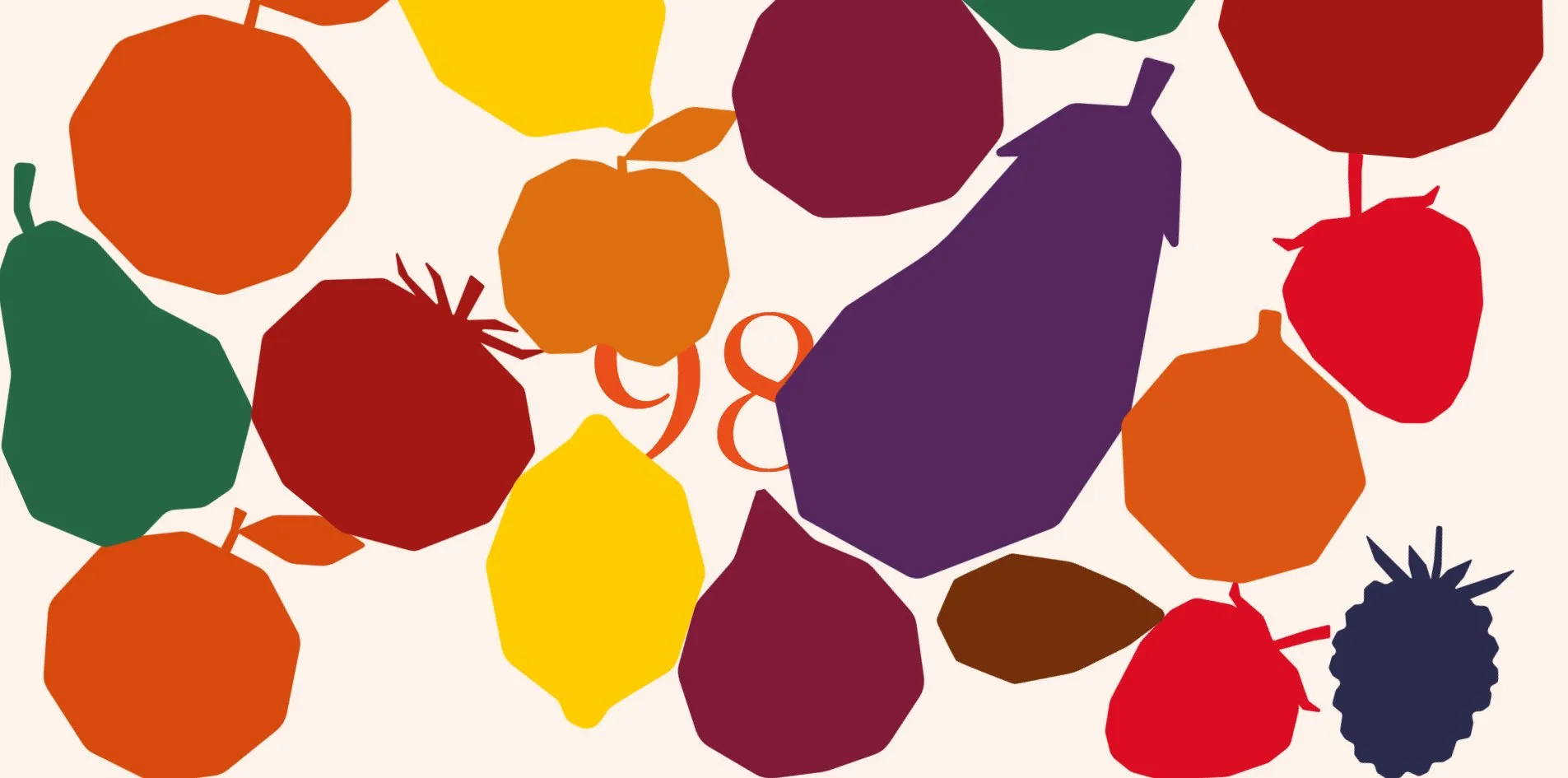
The first thing through the door is a rain of fruit. On a cream screen, 22 paper-cut fruit silhouettes fall from the top, an orange, a lemon, a strawberry, a fig, an aubergine, a blackberry, a pear and a tomato each in its own colour. They land at the bottom, bump into each other and pile up, while a percentage in the middle of the screen counts from 0 to 100. Once it reaches 100 an orange curtain rises from below to cover the screen, and when it falls back the ten jars are already in place. The two seconds of fruit rain plus the changeover take four seconds in all.
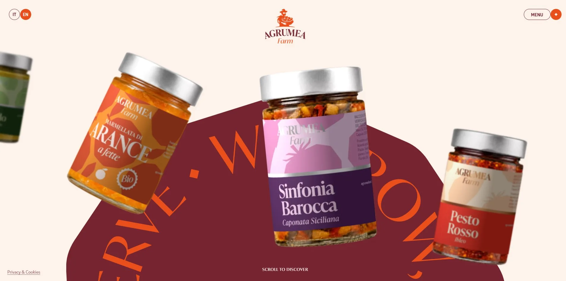
The home page after the opening is one horizontal row of jars. A dark burgundy blob covers the lower half of the screen, and a ring of orange text reading WE GROW, WE PRESERVE, WE SERVE runs in an arc along its upper edge. The ten jars stand along that arc, the middle one largest and the ones towards the edges smaller and blurrier. Turning the wheel or holding and dragging moves the whole row sideways, and the ring of text turns with it. Over a jar, a white pill reading Discover the product appears beside the pointer, the jar grows slightly, and after a moment it turns a full circle. On a click the other jars fade, this one rises to the top of the page, and the product title rolls in letter by letter.
Further down a product page come a description, the ingredients, serving suggestions, the available sizes and the shelf life. Below that is a band of photographs the visitor can drag, and the page ends with a row headed The other products listing the rest of the jars. The Pantry page lays out the ten products in four groups, Marmelade & Jams, Spreadable creams, Savoury and Mono Pack, each with a paragraph, a lifestyle photo and a row of jars. A set of pill buttons in the lower right follows the scroll so the visitor can jump between groups. The Production page covers the citrus and nut varieties and their months of availability, and the Experience page sells three farm visits. The About page tells three generations of family history, and the Contact page holds an address, an email and an Instagram handle. Buying happens on a separate shop site under another domain.
02Design
The whole site uses four colours, cream, burgundy, orange and yellow. Cream is the background of every page, and burgundy is the body text and the blob on the home page. Orange is every large heading, the full-screen background of the menu and the buttons, and yellow appears only behind one block on the Experience page and on a few of the fruit. When the menu opens the whole screen flips to orange with burgundy giant words on top, and the line under the pointer turns cream. The footer is cream text on burgundy, and every page ends with it.
The two typefaces divide the work cleanly. ivymode is a high-contrast serif used only for headings, always in capitals, with page names set at 258 pixels and the word Vision on the About page at 493. The letters of a heading appear one at a time. ivystyle-sans is a humanist sans serif that sets all body text and labels. Body copy is 32 pixels, notes are 14 to 16, and navigation and small headings use capitals with wide spacing. Both come from Adobe Fonts and weigh 73 KB together.
A table top covered in jars is the composition of the home page. The dark burgundy blob spreads like a cloth from the lower left to the lower right of the screen, with the arc of orange text hugging its upper edge. The jars stand in front of the blob, the largest dead centre, the ones on either side leaning inwards by 16 degrees, growing smaller and softer with distance until the farthest is half the size of the middle one. The AGRUMEA farm wordmark sits at the top, a pill button reading MENU in the upper right, two round IT and EN language switches in the upper left, and a small line reading SCROLL TO DISCOVER at the bottom centre.
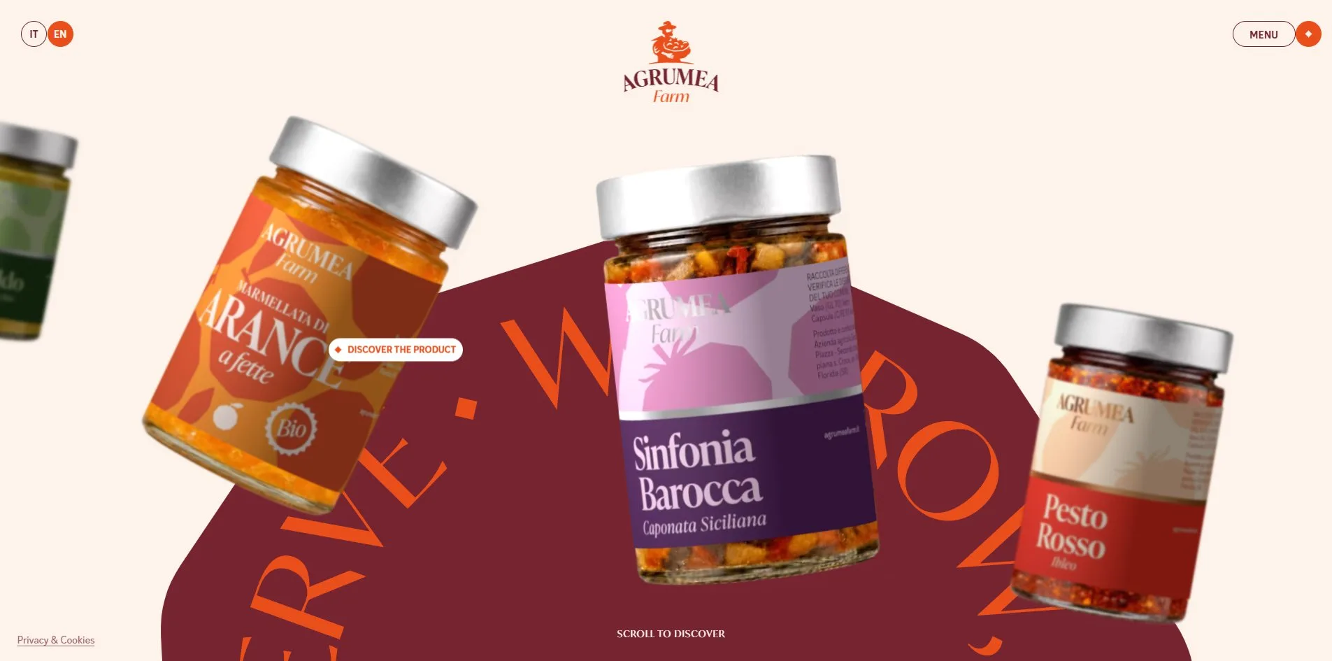
The inner pages are laid out like a food catalogue, each opening with an orange heading the full width of the screen, a full-width photo under it, and a line of white serif text over the photo. The paragraphs below the heading sit centred in a narrow column, separated by a small diamond. Jars always come in rows, four or five standing side by side on cream with their labels facing the reader. The Experience page turns its three visits into three white cards stacked at an angle on an orange ground, each with a photo, a number and a description. The About page scatters a few enlarged fruit silhouettes between its paragraphs, the same set that fell in the opening.
The photographs are all food and land in warm light, heaps of oranges, pistachios, a tomato field, jam and bread on a breakfast table. Product shots come in two kinds, the front-on jar used in the row and the lists, and the lifestyle photo used at the head of each group. Across the six pages there is not one cold-toned photograph.
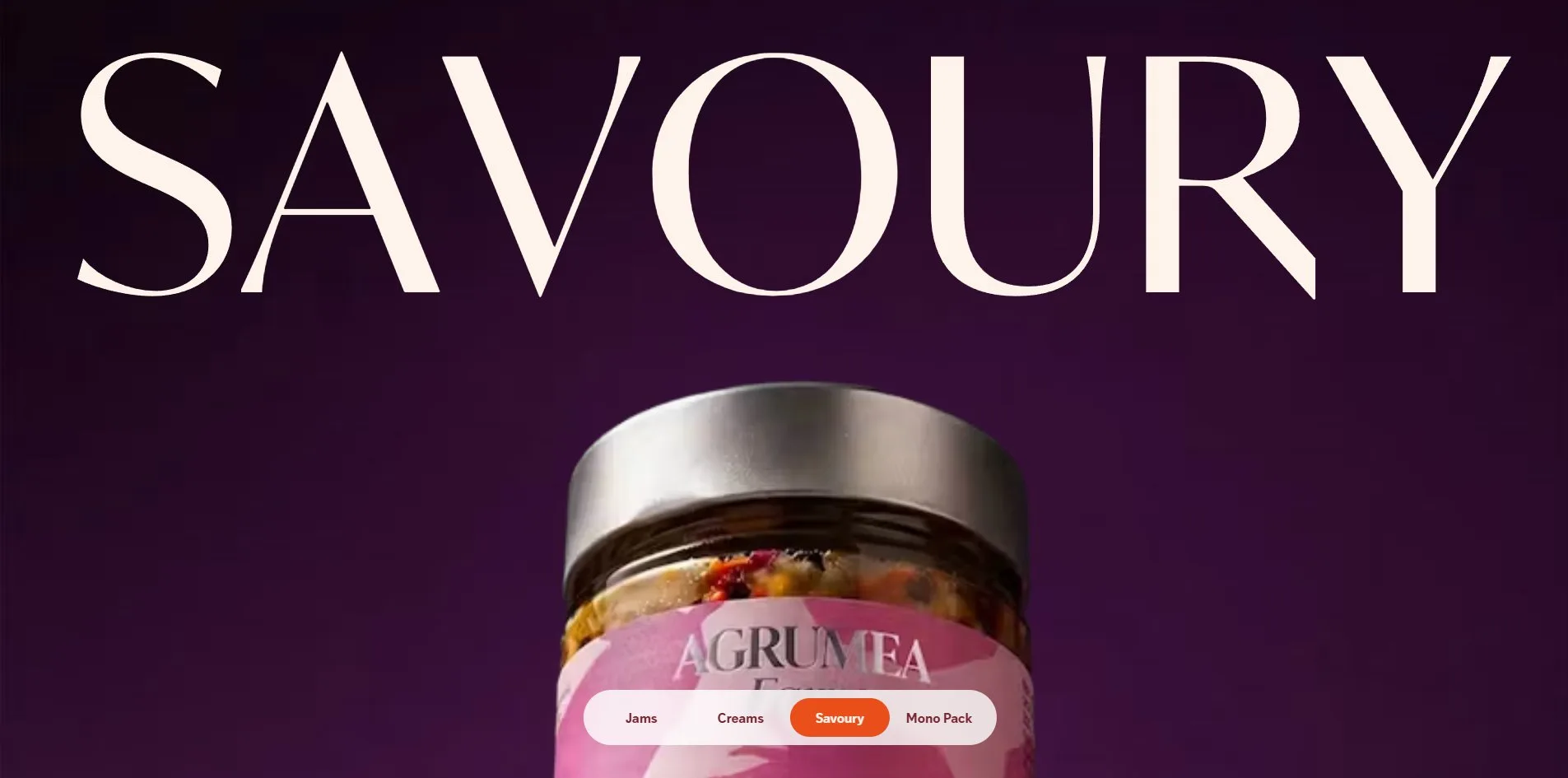
03Motion
The opening fruit rain is a genuine physics simulation. The 22 fruit silhouettes are spawned above the top of the page and fall under 3.35 times normal gravity, colliding, tumbling and stacking as they land, and the opening ends once eight tenths of them have come to rest. The percentage reaches 100 in 1.7 seconds, after which the orange curtain rises over the screen and falls back. The visitor sees it on every visit to the home page, the second time included.
The row of jars on the home page is driven by the wheel and by dragging. The site converts each notch of the wheel into a sideways step that the row completes along an easing curve in about a second, roughly 700 pixels per notch. When the visitor holds and drags, the row follows the hand one to one, and after release it coasts a little further at the speed of the drag. Every move recalculates each jar's position, size, tilt and blur, the middle jar enlarged to 1.3 times, the outer ones shrunk to half and blurred by 4 pixels. The ring of text turns as well, 8 degrees per notch.
The labels are put on the jars by 3D rendering. The site builds a lathe-turned cylinder of 128 segments in three.js with a slight 3 degree curve and wraps the 630 by 1013 pixel label artwork around it. The material has a roughness of 0.72, one spotlight lights it from the upper left, and ambient light fills the shadows. The whole site opens a single renderer, which renders the jars on screen one after another and copies each result into that jar's own canvas. Jars off screen are not rendered, and jars whose position has not changed are not redrawn. As the row slides, the texture turns around the cylinder and the jar appears to roll. 260 milliseconds after the pointer enters a jar, it begins one full turn, and a new turn cannot start until that one has finished.
The change from jar to product page takes 1.5 seconds, and the jar itself is the star of it. On the click the other nine jars fade, the page locks its scroll, and the chosen jar rises into its place on the product page as a 576 by 926 pixel hero image. Each letter of the product name rolls in from below, and the category and origin appear on either side. This runs at 59 frames per second with the slowest frame at 47 milliseconds.
The hero jar on the product page gets its label from the same renderer. As the visitor scrolls, the jar tilts 14 degrees to the left and shrinks, leaving the viewport together with the title. The band of photographs halfway down uses a grabbing-hand cursor and a pill reading Drag as its invitation, and it also responds to the left and right arrow keys. On the menu button the letters of MENU and CLOSE roll up and down to swap. When the menu opens the four large links step diagonally from upper left to lower right, and the line under the pointer turns from burgundy to cream.
The inner pages hand scrolling to the smooth scroll library Lenis, so the page glides a little further after the wheel stops. The 13 screens of the Pantry page scroll from top to bottom at a steady 59 to 60 frames per second with no frame over 32 milliseconds.
04Engineering
Nuxt carries the site on top of a Prismic content backend, and every page's text and images come from that backend. The scripts loaded on the home page total 546 KB, of which the site's own code is 210 KB, three.js 112 KB and Google's analytics tag 173 KB. three.js serves only the labels on the jars. Its rendering canvas never enters the page, and every canvas visible on the page is an ordinary 2D one.
Images make up 1.17 MB of the 1.9 MB that a first visit to the home page downloads. Those images are two per jar, one photo of the jar body and one flat label artwork, around 50 KB each, all WebP. Opening a product page directly costs 1.17 MB. The server sends its first byte in 0.15 to 0.22 seconds, and first contentful paint (FCP), the moment something first appears, lands between 0.22 and 0.29 seconds, that something being the opening percentage. Largest contentful paint (LCP) waits until 3.5 seconds, because the jars are held behind the opening animation until then, against Google's guideline of 2.5 seconds. Cumulative layout shift (CLS) is 0, nothing jumps while loading. During the opening there are one or two long tasks over 50 milliseconds, the longest 89, which is the physics simulation running.
On accessibility, keyboard and screen reader users get what they need. The page declares its language, offers header, navigation, main and footer landmarks, and hides a skip link to the content at the start of the page. The keyboard focus ring is 2 pixels of burgundy with a 5 pixel cream halo, and it stays visible on any background. The ten jars on the home page are links with the product names as alternative text. The photo band on the product page can be turned with the arrow keys, and a line of text under the band says so. The operating system's reduced motion setting exists for people who are made uncomfortable by movement on screen. The site writes more than twenty rules for it, collapsing the opening, the rolling letters and the turning ring of text into instant changes while the row of jars still moves.
Screen reader users lose out in two places. On the Production page, 9 of the 15 images carry empty alternative text, so the whole citrus grove is skipped. The cookie dialog on entry comes from a third-party component whose 7 toggles have no readable names. Buying means leaving for a shop on another domain, and no price is shown on the site.
05Scores and Team
| Award | Source | Date | Score |
|---|---|---|---|
| FWA of the Day | The FWA | 2026-09-27 | 82 POINTS |
Agrumea Farm took 82 points from The FWA. The team's line on the award page calls it an immersive journey blending Sicilian heritage with three.js, Nuxt, GSAP and smooth Lenis interactions. All four names in that line can be found on the site. three.js puts the labels on the jars and Nuxt is the site's frame. Lenis handles the scrolling on the inner pages, and GSAP runs the opening and the page changes.
| Credit | Who | Record |
|---|---|---|
| Studio K95 | Catania, Italy, brand and digital design studio | FWA FOTD 3. Awwwards SOTD 1 |
Studio K95's FWA profile describes a studio that makes identities, visuals and web experiences, with an office in Catania. This is their third FWA of the Day, after wins in November 2020 and November 2025. Their own portfolio site won Site of the Day on Awwwards in August 2026 with 7.32, tagged with the same three.js and Nuxt.
06Archive
- Award date
- 2026-09-27
- Awards
- FWA FOTD 2026-09-27
- Site
- https://agrumeafarm.it/en
- Credits
- Studio K95
- Design
- graphic
- Build
- realtime
- The FWA
- 82 POINTS, DAYS 5. https://thefwa.com/cases/agrumea-farm
- Stack
- Nuxt, Vue, Prismic, three.js, Matter.js, GSAP 3.11, Lenis, Adobe Fonts, Cloudflare
- Assets
- First visit to the home page 1.9 MB, of which images 1.17 MB. A product page opened directly 1.17 MB
- Timing and frame rate
- FCP 0.22 to 0.29 s, LCP 3.5 s, CLS 0. Continuous scroll 59 to 60 fps