Realevate
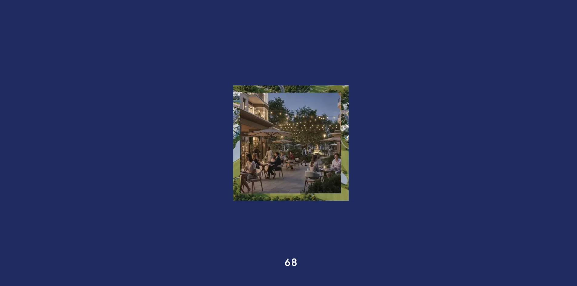
Realevate turns every page change into a trip taken by one photograph. When a visitor presses the Our Selection button in the bottom corner, the whole home page shrinks to less than half its size and sinks to the bottom of the screen. Four cards with vertical titles stand up on top of it. The visitor picks one, the photo on that card first fills the entire screen, then shrinks into a small square, and the giant title of the next page slides out from both sides of the square. At the bottom of that page the visitor clicks Next and the same move plays again. The opening animation follows the same idea, a small square in the middle of a dark blue screen cycles through four photos and finally lands where the home page photo sits.
The site belongs to a real estate marketing agency that sells property in Cyprus, Montenegro and Georgia to buyers abroad. Or Halevi, a freelance designer in Tel Aviv, designed and built it alone, and it won Site of the Day on Awwwards.
01Concept
Realevate does not sell a building, it sells a way of living. The agency sorts its listings into four kinds of life. By The Sea covers homes by the water and the marina, Evergreen covers golf resorts and homes in the woods, Urban Living covers apartments in city centres and old towns, and Rare Gems covers landmark buildings and branded residences. The home page lists no property at all, it offers one slogan, one starting price and one door. The whole site exists to walk the visitor to the form on the contact page.
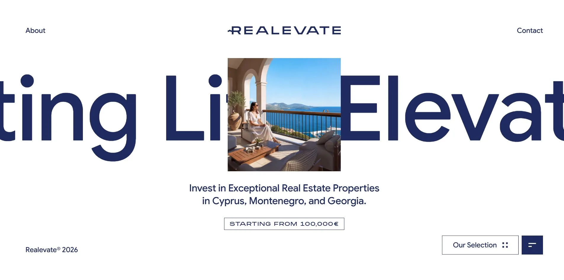
A visitor who opens the home page first watches a 4.5 second opening. Two white digits at the bottom of a dark blue screen count from 0 to 99, and a small square in the centre changes photo every half second, running through the four category covers. White rises from the bottom of the screen and covers the blue, the square moves to where the home page photo belongs, and the giant words Elevating Life slide out from behind it. The home page consists of this one screen and nothing more. A line of marquee letters runs across the middle, a 382 pixel square photo sits over the letters, and in the photo a woman in a white dress sits on a stone balcony looking at the Montenegrin sea. Under the photo comes one sentence, Invest in Exceptional Real Estate Properties in Cyprus, Montenegro, and Georgia. Under that sits a pill label reading STARTING FROM 100,000€. This screen does not scroll, the home page ends here.
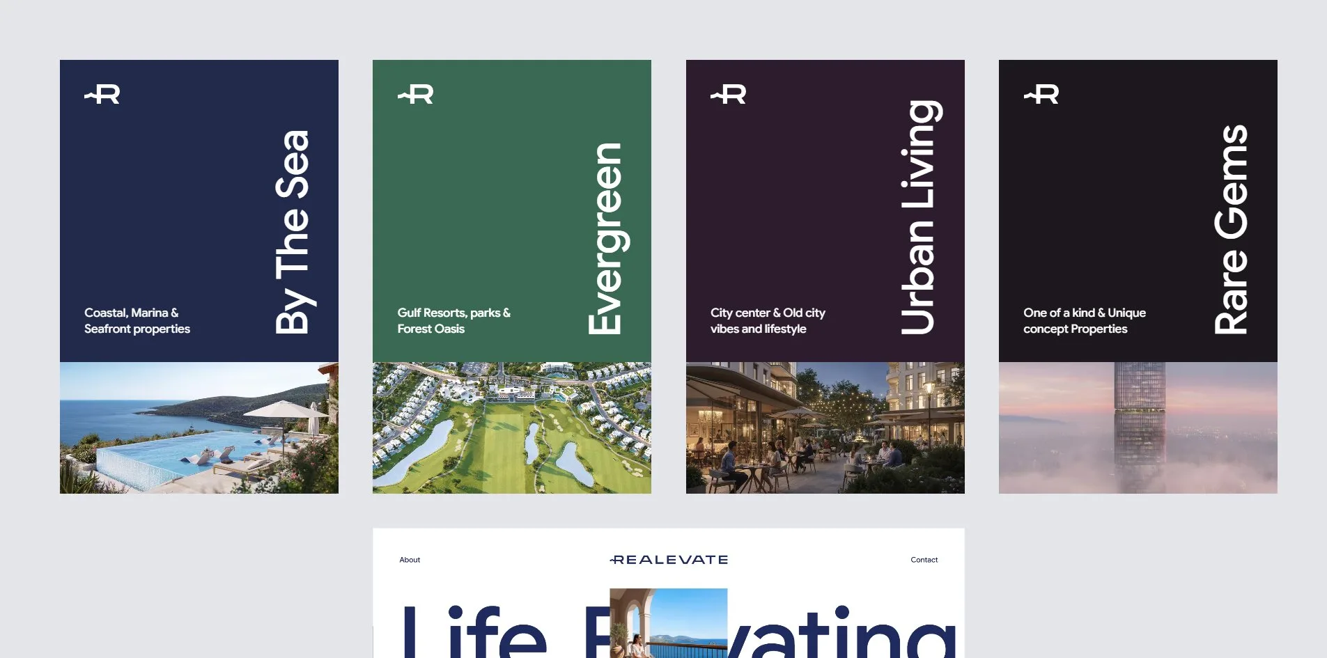
The Our Selection button is the second exit from the home page, the first being About and Contact in the header. When the visitor presses it, the whole home page shrinks to 44% of its size and sinks to the bottom of the screen, and four cards of 400 by 623 pixels rise on a pale grey background. Each card has its own colour, a title set vertically like the spine of a book, a line of subtitle in the lower left, and a photo of that category in the bottom third. When the visitor rests the pointer on a photo, a soft glow spreads over it from the centre. Esc, or a click on the shrunken home page, sends the cards away and the home page back up.
The four category pages share one structure and change only colour and content. The page is filled with the colour of that category, a marquee title runs across the screen, a small square photo sits in the middle, and a sentence and the starting price sit below. As the visitor scrolls, the square grows into a full-screen photograph, and then white content slides up over it. The white part begins with a serif chapter title and a paragraph, then a horizontal slider of 10 to 14 renderings. Below the slider come a quotation from an industry report with its source, three selling points each with a small image, one full-screen photo, and a second quotation. The page ends with a dark call to action reading Speak With Us and a Next block that leads to the following category. Each page carries between 200 and 240 words. The four starting prices are 100,000, 150,000, 350,000 and 100,000 euros.
The About and Contact pages close the site. About is a long white page with seven passages, each under a small label in brackets, (About Us), (Philosophy), (01) to (04) for four criteria the agency uses to pick a project, and (The process). A 37 second film is embedded in the middle, and a dark blue block reading Building wealth through better living closes the page. Contact puts a vertical Contact marquee and three ways of getting in touch on the left, and a form on the right with two tabs. Investors asks for budget, purpose, destination and timeline, Partnership asks for a company name and a type of partnership.
02Design
One dark blue plus white is the only colour pairing the site allows itself, and every other colour is left to the photographs and the four category backgrounds. Home, About and Contact are dark blue text on white. Each category page swaps in its own background, a deep navy for By The Sea, a dark green for Evergreen, a dark plum for Urban Living, and a near black for Rare Gems. When a visitor enters a category page, the wordmark, the buttons and the footer flip to white, and once the visitor has scrolled past the cover into the white content, the buttons flip back to dark blue. The pale grey behind the selection cards is the third neutral on the site, and it appears only in that layer.
Three typefaces each do one job and stay out of each other's way. Google Sans, a rounded sans serif at weight 500, sets everything from the 306 pixel marquee to the 23 pixel body text, and every word on the home page is in it. Roslindale Display, a thin serif at weights 200 to 300, appears in three places only. The chapter titles and the two quotations on the category pages use it at 99 pixels. The three links Home, About and Contact inside the menu use it at 54 pixels, and the quotations and the closing title of the About page use it too. Monument Extended, a very wide face, is written exactly once on the home page and once on each category page, on the starting price label, 18 pixels, capitals, letters spaced apart. The three font files together weigh 97 KB, one weight each.
A photograph cutting a line of giant letters in two is the whole composition of the first screen. The marquee occupies one full band across the middle of the screen, the photo is a 382 pixel square placed dead centre over it, and the letters show on either side. The slogan sits below the photo in two centred lines, the price label below that, the copyright in the bottom left, and the Our Selection and menu buttons in the bottom right. The first screen of each category page repeats this composition with a new set of colours, the letters turn white and the photo becomes that category's cover.
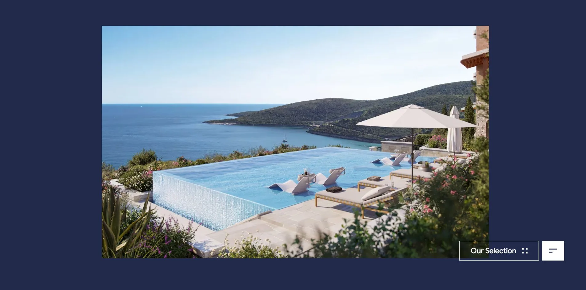
The selection cards set their titles like book spines. A card measures 400 by 623 pixels. The title runs vertically along the right edge in 62 pixel white Google Sans read from bottom to top, a two-line subtitle sits in the lower left, and an R-shaped mark sits in the upper left. The bottom third of each card is a photo. The four photos show an infinity pool on a cliff, a resort inside a golf course, an open-air restaurant in an old town, and a tower rising out of cloud. The four cards stand side by side and darken step by step from deep navy to near black.
Scenes of living fill every image on the category pages, and not one of them is a floor plan. Renderings and photographs mix, a pool over the sea, a golf fairway, a long restaurant table, a white piano in a bar. The white content area is laid out like a magazine, the serif quotation is centred across four or five lines with a line of small text under it giving the source, Knight Frank / Global Waterfront Report / 2019. The three selling points carry 70 pixel Google Sans headings, each with a small image, and the three groups step down the page alternating left and right.
03Motion
The opening spends 4.5 seconds delivering one square to its place. The two digits at the bottom of the screen roll independently and count from 0 to 99 in 2.3 seconds. The small square in the centre changes to a new category cover every half second and stops on the home page photo after the fourth. At 2.3 seconds white wipes up from the bottom over the whole screen in 1.2 seconds, while the square moves from the centre to the photo's position. The slogan, the price and the buttons rise line by line from below, and the page settles at 4.5 seconds. On a second visit the opening plays again in full.
Our Selection treats the whole page as one more card. When the visitor presses the button, the home page shrinks to 44% around the midpoint of its bottom edge and sinks to the bottom of the screen while the four cards drop in from above, all within 0.8 seconds. When the visitor clicks a card, the card expands into the full page, and the new page settles 1.8 seconds later at 58 frames per second, with the slowest frame taking 63 milliseconds.
Scrolling on a category page is taken over by a smooth scroll written for this site. It multiplies each wheel step by 0.8 and lets the page close in on the target with a very small catch-up factor. One notch of the wheel therefore moves the page 480 pixels and takes about a second to come to rest. The cover photo grows with the scroll, from a 382 pixel square to a 1920 by 1040 full screen over 2,300 pixels of travel, and then the white content slides up over it. The two full-screen photos further down are enlarged by 1.2 and shift up and down with the scroll for a parallax effect.
The horizontal slider is the one part of a category page that asks for a hand. Photos of 995 by 644 pixels stand in a row 40 pixels apart, and the pointer turns into a grabbing hand over them. When the visitor holds and drags to the left, the photos follow one to one, and after release they slide a further 600 pixels and stop after 1.2 seconds. Two round arrows in the lower right move one photo at a time. When the visitor leaves the slider alone and just scrolls the page, the whole track drifts sideways as well, 200 pixels of scroll moving it 200 pixels. The list of photos is copied three times, so reaching the end joins seamlessly onto the start.
The Next block carries the largest move on the site. The visitor scrolls to the foot of a category page and sees the photo of the next category, and resting the pointer on it enlarges the photo by 1.1. On a click the page locks for 1.3 seconds, then the photo fills the whole screen. It then shrinks in 0.7 seconds into a 397 by 387 pixel square that lands where the next page's photo belongs, while the next marquee appears from both sides. From the click to a settled page takes 2.5 seconds, at 58 frames per second with the slowest frame at 94 milliseconds.
Continuous scrolling down a whole page holds 59 to 60 frames per second with no frame over 32 milliseconds. The film on the About page starts as a still frame 550 pixels wide, the pointer over it becomes a dark blue circle reading Play, and a click starts the film with sound. As the visitor keeps scrolling the film expands to fill the 1920 by 945 screen, and it keeps playing after the visitor has scrolled past it.
04Engineering
Realevate is built on no framework at all, its seven pages are seven static HTML files. One 278 KB script runs everything, including a router written for the site. When the visitor clicks a link, this router fetches the target page's HTML, parses out its main body and swaps it into the current page's stage. The animation library GSAP with its ScrollTrigger and SplitText plugins is hosted on the site itself, and the smooth scroll is written by hand. There is no canvas anywhere, every effect runs on ordinary page elements.
The home page costs a first-time visitor 8.6 MB, and 7.8 MB of that is images. Within 0.7 seconds of the opening finishing, the site fetches all 45 slider renderings and every cover for all four categories, so that no later page change waits for a picture. The HTML of all seven pages is fetched once before the opening and once again after it. Opening a category page directly costs 3.4 MB. Scripts account for 470 KB, of which 188 KB is Google's analytics tag and 109 KB the Facebook pixel, leaving 240 KB for the site's own compressed code. The 37 second film on the About page weighs 45.5 MB, lives on a separate domain, and downloads only when clicked.
The server sends its first byte in 0.16 to 0.20 seconds, against Google's guideline of 0.8. First contentful paint (FCP), the moment something first appears, lands between 0.44 and 0.57 seconds, and what appears is the first digit of the opening counter. Largest contentful paint (LCP) waits until 4.2 seconds, because the home page photo is held behind the opening animation until then, against a guideline of 2.5 seconds. Cumulative layout shift (CLS) is 0.01, nothing jumps while the page loads. There is not a single long task, meaning no stretch where a script held the browser for more than 50 milliseconds.
Keyboard and screen reader users find the basics in place. The page declares its language, offers header, navigation, main and footer landmarks, names every button and link, and leaves no image without alternative text, with arrows and duplicate covers marked as decorative. A keyboard user can Tab through the navigation, the cards and the form, and the About and Contact links show an underline when focused. The wordmark link, the Our Selection button and the menu button, however, show nothing at all when focused. The stylesheet explicitly switches off the focus ring on those three controls, so a keyboard user landing on them cannot tell where they are. The renderings in the slider carry alternative text like By The Sea property 1, so a screen reader hears only a serial number.
The operating system's reduced motion setting exists for people who are made uncomfortable by movement on screen. The site writes five rules for it, the opening and the page transitions are switched off, and the category and About pages fall back to native scrolling with all their content. The home page, however, breaks under this setting. With the opening removed, the title, the slogan, the price and the Our Selection button all stay hidden, and the page shows only About, Contact and a line of copyright. Pressing where Our Selection should be does nothing, and only the menu button still works. The console fills with five warnings from the animation library about targets it cannot find.
The contact form has what a form needs. The Investors form has ten fields, six of them required, with a country list of 221 entries, and the Partnership form has nine. When a required field is missing, the form relies on the browser's built-in prompt. The email line is a button that copies the address and confirms with Copied.
05Scores and Team
| Award | Source | Date | Score |
|---|---|---|---|
| Site of the Day | Awwwards | 2026-09-27 | 7.22 / 10 |
Realevate took 7.22 from the Awwwards jury. Of the four categories Design scored highest at 7.41, Content at 7.34 and Creativity at 7.28 sat in the middle, and Usability came last at 6.88. Seven of the nineteen jurors gave an overall of exactly 7.0, three went below 7, and three went to 8 or above, the highest a 9.25. The low usability mark lines up with several decisions on the site, a home page that does not scroll, a 4.5 second opening on every visit, and an 8.6 MB first download. The developer jury added 7.27, with Animations highest at 7.60 and Accessibility lowest at 6.60, and the award page shows no developer award badge.
| Credit | Who | Record |
|---|---|---|
| Or Halevi | Tel Aviv, Israel, freelance designer, art director and creative developer, founder of MAKETHECUT | Awwwards SOTD 2, DEV 2, HM 11, WORKS 11 |
| MAKETHECUT | Or Halevi's one-person studio | Awwwards SOTD 2, HM 9, WORKS 9 |
Two names appear in the credits, and they belong to one person. Or Halevi's Awwwards profile lists Tel Aviv, English and Hebrew, a budget range of 5,000 to 30,000 dollars, and a note that he is looking for freelance work inside an agency. MAKETHECUT is his own studio, and all nine works in its profile are credited to him. His previous Site of the Day was the website of the coffee equipment company CoffeeTech.
06Archive
- Award date
- 2026-09-27
- Awards
- Awwwards SOTD 2026-09-27
- Site
- https://realevate.agency/
- Credits
- Or Halevi, MAKETHECUT
- Design
- graphic
- Build
- dom
- Awwwards
- 7.22 / 10. Design 7.41 / Usability 6.88 / Creativity 7.28 / Content 7.34. Developer jury 7.27. https://www.awwwards.com/sites/realevate
- Stack
- Hand-written single-page app, static HTML, GSAP 3.12, ScrollTrigger, SplitText, custom smooth scroll, Cloudflare
- Assets
- First visit to the home page 8.6 MB, of which images 7.8 MB. A category page opened directly 3.4 MB. About page film 45.5 MB on demand
- Timing and frame rate
- FCP 0.44 to 0.57 s, LCP 4.2 s, CLS 0.01. Continuous scroll 59 to 60 fps