CoMinVi
CoMinVi's website turns the five metals it mines into a single turning rock. When a visitor reaches the minerals section, a pale grey lump of gold ore stands in the middle of the page. As the visitor keeps scrolling, the rock slowly rotates and its surface becomes silver ore, lead ore, greenish copper ore and finally zinc, while the list of names on the left lights up from Gold to Zinc. Instead of a product table explaining what it digs, an underground mining contractor lets the visitor turn all five ores by hand.
CoMinVi is an underground mining contractor based in Guanajuato, Mexico. Its website was designed and built by the Croatian studio HOLOGRAPHIK and won Site of the Day on Awwwards.
01Concept
CoMinVi has spent more than twenty years digging tunnels for companies that mine gold and silver in Mexico, and the partner list near the bottom of the page names fourteen of them, including Trafigura, Agnico Eagle and First Majestic. The website has to answer two audiences at once. One is a mining company wondering whether this contractor can be trusted, and the other is a miner or engineer looking for work. So the home page shows the setting and the scale first, then the services, the ores, safety, equipment and people, and only at the end the partner list and the way into the jobs page.
Every visit begins with an opening animation of about 4.5 seconds. The company's miner's-head logo appears on black and unfolds into the COMINVI wordmark. A small white-framed window then opens in the middle of the screen with the first screen inside it, and the window grows until it fills the display, at which point the first screen is fully in view.
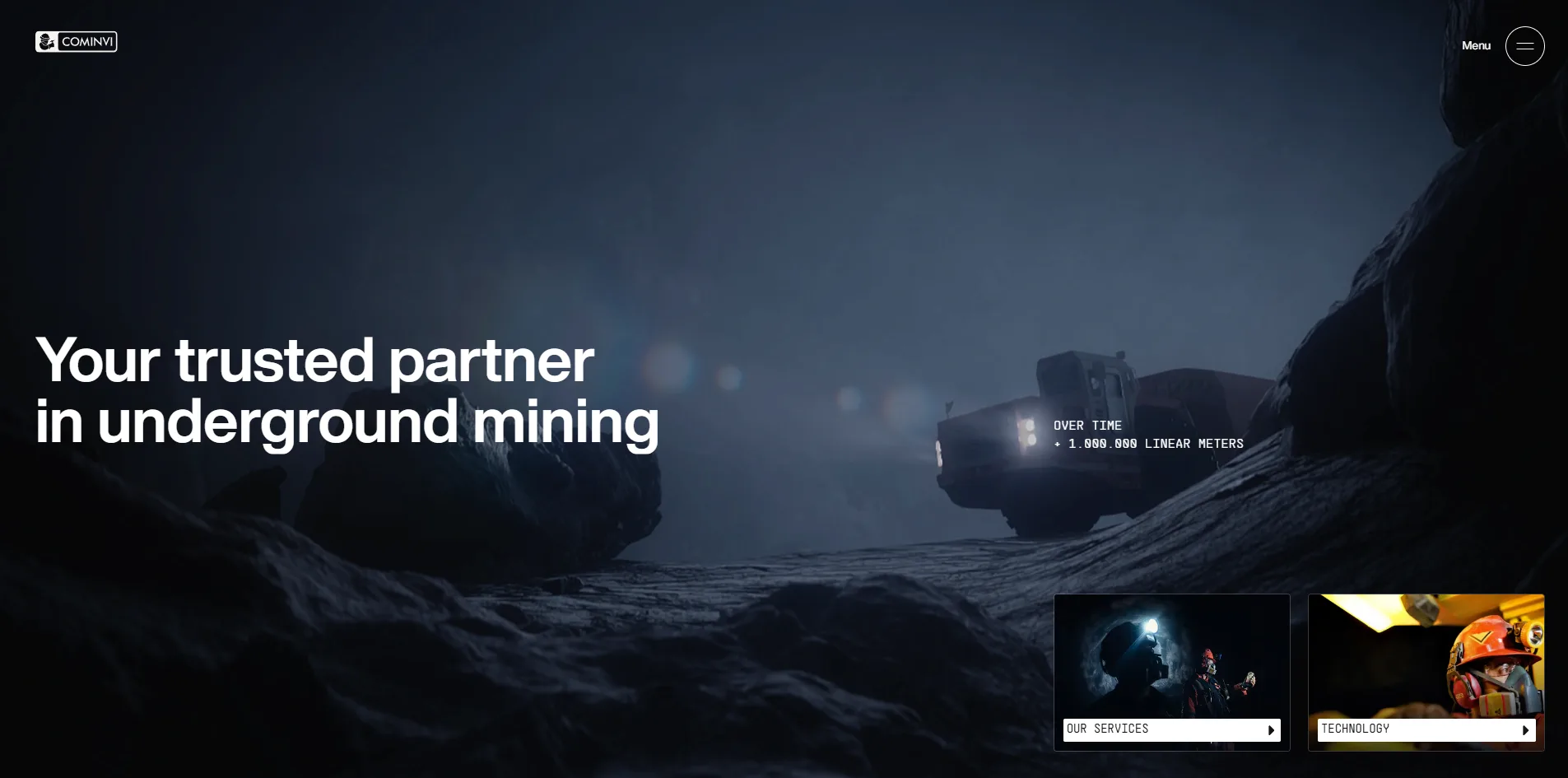
The opening view is a dim underground tunnel. A mining truck with its headlights on drives toward the viewer between walls of rock. The large words Your trusted partner in underground mining sit on the left, and a line of small monospaced text beside the truck says the company has driven more than a million linear meters of tunnel. Two small cards at the lower right lead to the services and technology pages.
Below the first screen the page turns white. It opens with a short company introduction and six figures, a million linear meters, twenty million tons of ore, 5,100 indirect jobs, 1,700 direct jobs, seven active projects and thirty-six delivered. Five services follow, engineering, ground support, development, production and hauling, each on its own large card. Further down come the turning rock, the safety policy, a fleet of more than 360 machines, employee testimonials and the partner list. The home page runs about 22 screens, and the site adds seven inner pages for services, technology, safety, about, careers, blog and contact, along with a full Spanish version.
02Design
CoMinVi's site keeps darkness for the opening and the close, with white paper in between. The first screen is the only dark computer-rendered scene on the home page. Once the body begins, the background switches to pure white and a very pale grey-green, and the two take turns. Just before the footer the page goes dark again, with a full-screen photograph of a miner lit by a headlamp. The white body sits between two dark passages and reads like a carefully bound company handbook.
Most of the images in the body are real photographs taken underground. Miners wear lit headlamps, orange work suits and respirators, and most of these photographs are dark, with only the lamps and the suits catching light. The technology section shows six machines against pure black, the motor grader, the telehandler and the compactor all in yellow. Set into the white layout, each dark photograph reads like a window cut into the mine.
CoMinVi's home page sets everything in two typefaces, one sans-serif and one monospaced. Headlines and body text are set in the heavy sans-serif Helvetica Now Display, and several sections open with a whole paragraph in bold, as if reading out a company statement. Labels and figures use the monospaced PP Supply Mono, small and all in capitals. Each section carries a small black tag at its upper left reading S.01 ABOUT US, S.02 OUR SERVICES and so on up to S.08, which makes the whole page feel like a technical document divided into chapters.
The brand orange barely appears on the page at rest. It shows up only when the visitor does something. The menu button turns into an orange dot when the menu is open, the active language En is orange, and a service card turns entirely orange when the mouse moves over it. The rest of the time the layout holds only black, white, grey and the colours inside the photographs, so orange becomes the signal that the visitor is acting.
The minerals section is laid out like a specimen label in a museum. A ring of fine tick marks circles the rock like the face of a gauge. The element symbol and atomic number sit on the right, AU 79 for gold, AG 47 for silver and CU 29 for copper. The five names run down the left, the current one in black and the rest in light grey. In this section the business of a mining company becomes five squares of the periodic table.
03Motion
The truck on the first screen is stitched together from two kinds of footage. When the opening ends, a 3.6-second film plays once and the truck drives in from the distance. Once the visitor starts scrolling, the picture switches to 150 pre-rendered images, one replacing the next with every bit of scroll. The truck keeps driving, the tunnel slowly darkens, and the sequence finishes after a little more than half a screen of scrolling. Each of those 150 images is a full 1920×1080 frame, downloaded in five batches and drawn onto a canvas.
The introduction text darkens word by word as the page scrolls. The bold company introduction starts out light grey. As the visitor scrolls, its words turn black one after another from left to right, and the safety statement gets the same treatment. The reader's eye follows the darkening edge, so wherever the reader has reached is the part in black.
Everything on the service cards happens under the visitor's mouse. At rest the five cards are white, with only a title and a line icon. When the mouse moves over one, the card turns orange and a short description slides up from the bottom. The photo tile on the right changes at the same moment, a worker in a workshop for engineering and a miner standing in an enormous crystal cave for hauling. One photo tile serves all five services in turn, so the five services do not each need their own block of layout.
The minerals section holds the page in place for a while. When the visitor reaches it, the rock stops in the middle of the screen. Over roughly a screen and a half of further scrolling it turns and changes into each of the other four ores in turn, with the names on the left following along. The rock is actually a 600-frame film that HOLOGRAPHIK stored in a form that can jump straight to any frame, and wherever the visitor scrolls to, the browser decodes that frame and draws it. An ordinary video can only play forward, but this one can be scrolled backwards and stopped on any frame, so the speed of the rotation is entirely in the visitor's hand.
HOLOGRAPHIK made the partner list into a drum that turns vertically. The names of the fourteen companies sit in a column, and as the visitor scrolls they roll upward like letters on a wheel, with the one in the middle in black and those above and below fading away.
When a visitor opens an inner page, the photograph they clicked grows until it becomes the first screen of the next page. Clicking About us beside the company introduction, for example, first shows the words About Us above the photograph of a miner in a respirator. The photograph then fills the screen as the cover of the about page, all in about a second. Page changes are handled by Barba, a library that lets a site switch pages without a full reload so it can animate the transition.
Scrolling stays smooth over the whole page from top to bottom. From the first screen to the footer it averages 59 to 60 frames per second, with the slowest frame taking only 30 milliseconds. Only the first screen dips to between 50 and 55 frames per second, which is exactly where the 150 large images are being swapped.
04Engineering
HOLOGRAPHIK built the layout in Webflow and put the motion in a separately hosted script. The script uses the animation library GSAP with its scroll-trigger plugin, the smooth scrolling library Lenis, the page transition library Barba and Lottie, a player for vector animations, which drives the twenty-odd small line icons on the page. The map on the contact page is drawn with the open-source map library MapLibre, using OpenStreetMap data.
In total the home page downloads about 24.5 MB, and almost all of it arrives the moment the page opens. The 150 images of the first screen account for about 15 MB, the minerals film for 4.8 MB and the opening film for 3.7 MB. Scrolling from top to bottom afterwards adds only about 0.1 MB. So by the time the page has opened, before the visitor has scrolled at all, the browser has already fetched the three heaviest assets on the page.
The format of the minerals film is the most economical choice on the site. Its 600 frames take only 4.8 MB, under 8 KB per frame on average, because they are stored as compressed video and the browser's built-in video decoding interface, WebCodecs, decodes single frames on demand. Browsers that lack this interface fall back to loading 600 separate images one by one.
Visitors see the first screen much later than the loading metrics suggest. The server returns its first byte in 20 milliseconds and the first contentful paint (FCP) comes at 0.23 seconds. What the browser draws at that moment, however, is the menu text hidden behind the first screen, and the visitor has to wait about 4.5 seconds for the opening to finish before seeing the whole first screen. Cumulative layout shift (CLS) reaches 0.27, above Google's recommended limit of 0.1. Part of it comes from the first screen's video box jumping 0.3 seconds after opening, and the rest from the animation that unfolds the COMINVI wordmark. The opening also plays again every time the home page is reopened.
Visitors using only a keyboard get lost at the top of the page. After Tab selects the logo and the menu button, focus moves into the menu that has not been opened and walks through twelve invisible links. The screen still shows only the first screen, the focus ring is hidden behind it, and the visitor cannot tell what is selected. Once the menu is open, Escape does not close it, and the button keeps reporting itself as collapsed, so a screen reader user cannot hear that the menu has opened. The 01 and 02 switch above the employee testimonials is a plain block element rather than a button, so a keyboard user most likely cannot reach it. The three social icon links in the footer have no names, so a screen reader announces only that there is a link. On the positive side, the other links and buttons keep the browser's default focus ring, every image carries an alt attribute, and the Spanish version correctly declares its page language as Spanish.
The site also makes no allowance for the system's reduce motion setting. Its style sheets contain no rule for that setting, and with reduce motion turned on, the opening, the first screen's film and the 150 images all play as usual.
05Scores and Team
| Award | Source | Date | Score |
|---|---|---|---|
| Site of the Day | Awwwards | 2026-09-30 | 7.44. Design 7.65 / Usability 7.04 / Creativity 7.42 / Content 7.41 |
| Developer Award | Awwwards | 2026-09-30 | 7.32. Semantics 7.00 / Animations 8.00 / Accessibility 6.80 / WPO 7.20 / Markup 7.20 |
Across the four categories from nineteen jurors, Design scored highest at 7.65 and Usability lowest at 7.04. The high Design score fits the tidy visual rules of white layout, underground photography and numbered sections. The low Usability score may relate to the 4.5-second opening and to keyboard focus falling into the hidden menu. Among the five Developer Award categories, Animations is highest at 8.00 and Accessibility lowest at 6.80, pointing the same way as the previous chapter.
| Credit | Who | Record |
|---|---|---|
| HOLOGRAPHIK | Croatian design studio that describes itself as focused on digital and brand projects, with project budgets of $30,000 to $50,000 | Awwwards works 23, SOTD 20, HM 22 |
HOLOGRAPHIK has submitted 23 works to Awwwards, and 20 of them won Site of the Day. Its clients over the past two years include the blockchain project Sui, the startup conference Slush, the electronic musician Paul Kalkbrenner and the footballer David Alaba. On Awwwards this site is credited to the studio alone, with no individuals named.
06Archive
- Award date
- 2026-09-30
- Awards
- Awwwards SOTD 2026-09-30, Awwwards DEV 2026-09-30
- Site
- https://www.cominvi.com.mx/
- Credits
- HOLOGRAPHIK
- Design
- cinematic
- Build
- scroll
- Awwwards
- 7.44 / 10. Design 7.65 / Usability 7.04 / Creativity 7.42 / Content 7.41. Developer Award 7.32. https://www.awwwards.com/sites/cominvi
- Stack
- Webflow, GSAP, ScrollTrigger, Lenis, Barba, Lottie, WebCodecs, MapLibre
- Total assets
- About 24.5 MB for the home page, almost all fetched on opening, about 15 MB of it the first screen's frame sequence
- Speed
- FCP 228 to 236 ms (hidden menu text), first screen visible after about 4.5 s, CLS 0.27. Continuous scroll 59 to 60 fps