1917 Into the Trenches
The film 1917 plays as a single unbroken shot, and its promotional site, 1917 - Into the Trenches, tries just as hard never to cut. As a visitor turns the scroll wheel, they walk down the trench the crew built for the film, rebuilt in 3D from a scan of the real set. At the end of each stretch the site plays a clip from the film that picks up exactly where the trench leaves off. When the clip ends, the visitor is standing at the mouth of the next stretch, and the whole walk feels like one long take.
The London studio Powster made it for Universal Pictures, and it won FWA of the Day, FWA of the Month for February 2020 and Awwwards Site of the Day.
01Concept
Instead of opening on a trailer, the site sends visitors onto the set itself. 1917 follows two young British soldiers in the First World War who must cross enemy territory to deliver a message that will save 1,600 men, and the director Sam Mendes filmed it to look like one continuous shot. To make that possible, the crew built more than a mile of trenches. In an interview with the FWA, Powster explains that they took high-resolution 3D scans of these sets because they wanted people to walk through them first hand and learn how the film was made along the way.
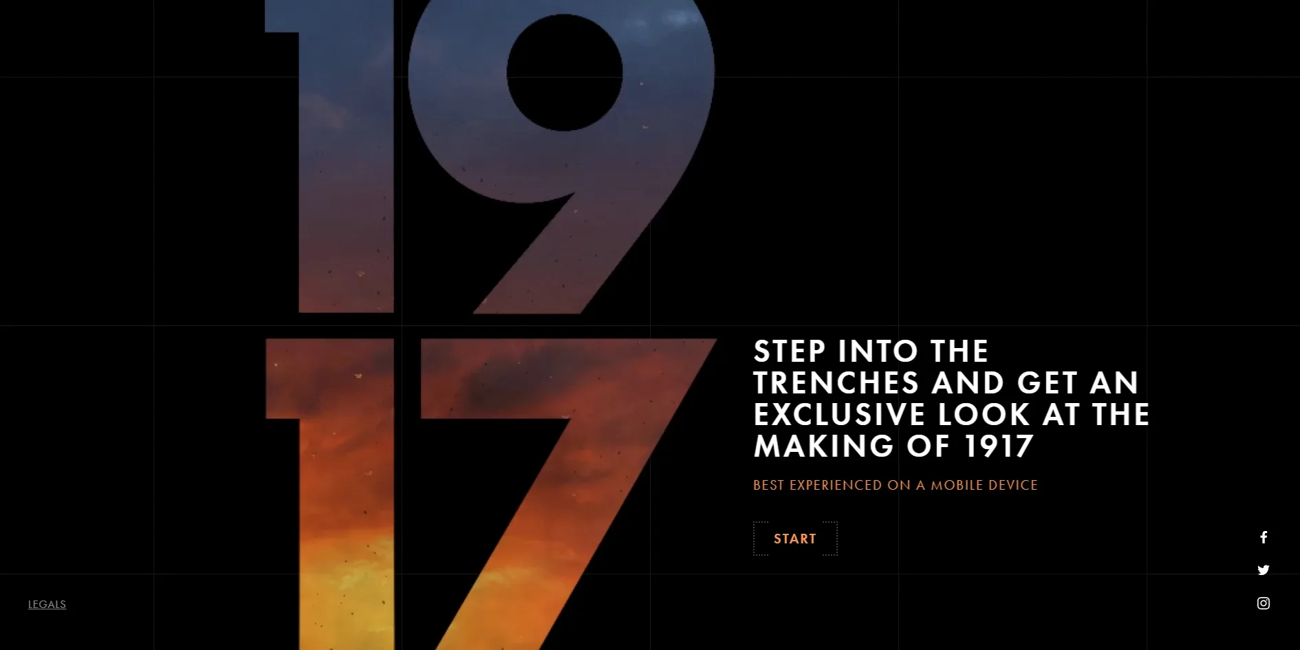
The landing page is a black screen holding only the title numerals, one line of invitation and a START button. The invitation reads STEP INTO THE TRENCHES AND GET AN EXCLUSIVE LOOK AT THE MAKING OF 1917, and a smaller line above the button, BEST EXPERIENCED ON A MOBILE DEVICE, tells visitors the site works best on a phone. After START, the site plays a six-second opening and then fades into the first trench. A prompt in the middle of the screen reads SCROLL TO MOVE. PAN TO LOOK AROUND., meaning the wheel moves the visitor forward and the cursor turns their head.
The trench comes in three stretches, and each takes roughly 130 turns of the wheel to walk. Visitors can only move forwards or backwards along a fixed route, and the cursor decides only where they look. At certain points huge chapter titles such as ONE SHOT, SETTING THE SHOT and A HISTORIC CONSTRUCTION appear in the trench, five in all across the three stretches. If a visitor stops for more than 20 seconds, the line YOU HAVE TO KEEP MOVING... appears near the bottom of the screen to push them on.
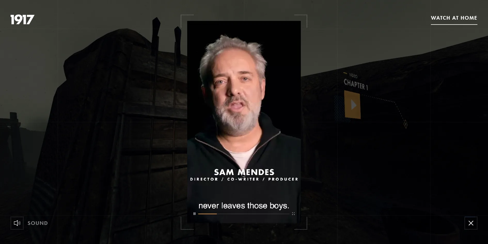
Ten hotspots sit along the route, and almost all of them open material about the making of the film. Six of the hotspots play short videos shot in a vertical format. Among them are Sam Mendes explaining how the camera never leaves the two soldiers, the scene in which General Erinmore hands over the mission, and footage of a digger on site while the trenches were going up. Three more are marked STORYBOARD TO SCREEN and set the storyboard sketches beside the finished shots. The last one, DECODE THE MESSAGE, opens a behind-the-scenes featurette from Universal on YouTube in a new tab. Apart from that link, the videos behind the other nine hotspots add up to about six minutes.
The MAP button in the bottom right opens a map of the whole trench with the three stretches labelled PART 1, PART 2 and PART 3, and clicking one takes the visitor to the start of that stretch. After the third stretch comes a 13-second closing film and then a black end page that reads IN THEATERS DECEMBER 25, with two buttons below it, BACK TO THE TRENCH and VISIT OFFICIAL SITE. That date refers to the film's limited release at Christmas 2019. The button in the top right has since been changed to WATCH AT HOME, for watching the film at home, but the line on the end page was never updated to match.
02Design
Nearly every image on the site comes from the film itself, either the scanned trench or clips cut from the movie, and the designers added only a thin layer of interface on top. That interface uses little more than black, white and one orange. Its type is the geometric sans serif Futura, with headings and buttons set in capitals, and a small control sits in each corner. The 1917 logo is at top left, WATCH AT HOME at top right, the SOUND toggle at bottom left and MAP at bottom right. These controls take up very little room, so the trench and the film fill almost the entire screen.
The landing page turns the title 1917 into a window onto the film. The four numerals run from the top of the screen to the bottom and take up about a third of its width. Inside their strokes is a sky that shades from grey blue into fiery red, everything outside the strokes is black, and the invitation and START button to the right are set very small. The sky is not cut out by a mask in the page. The numerals and the fire inside them are drawn into the video that loops on the landing page. The end page after the closing film uses the same picture, so visitors leave through the same window they came in by.
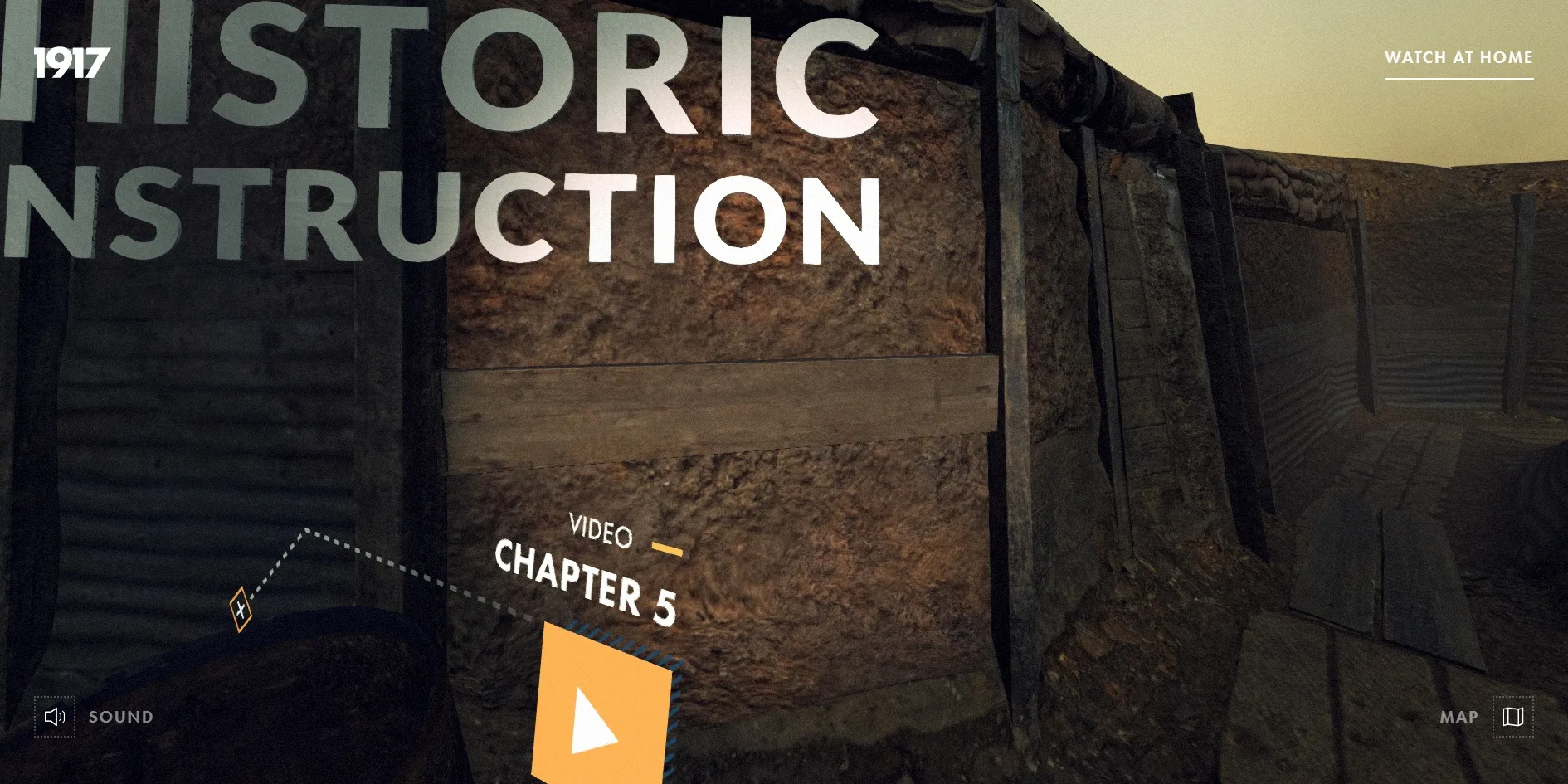
The chapter titles in the trench are not text pinned to the screen but models placed in the 3D scene. They are pale grey-white capitals, some standing against the trench walls and some lying flat on the ground. As a visitor approaches, a title grows and tilts with the perspective, and once they pass it, it stays behind them. Their letterforms are the same geometric sans serif capitals as the interface, so the titles in the scene and the buttons in the corners read as one family.
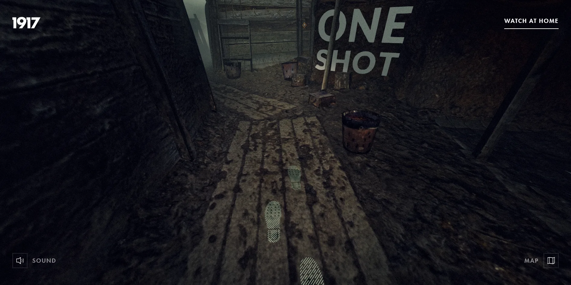
Orange is the accent colour of the interface, and it appears on the outline of the START button, the loading bar, the hotspot squares and the marker for the current stretch on the map. The scanned trench is mud, sandbags and timber in shades of grey brown, so the orange stands out clearly against it. The sky also changes from stretch to stretch, from a heavy grey in the first to a dusky yellow glow on the horizon by the third.
The hotspots also stand inside the 3D scene rather than floating on the surface of the screen. Each one is made of an orange square, a small VIDEO label with a chapter number, and a dashed line running down to a diamond-shaped cross marker on the ground, with a band of blue diagonal hatching behind the square. The set of marks looks like annotation drawn on a military map or a storyboard, and when a visitor sees a hotspot from the side, the square and its label lean with the perspective.
Every video a hotspot opens is vertical, shaped like a phone screen, which fits the landing page's note that the site is best on a phone. The video appears in a tall frame in the middle of the screen with a thin bracket at each corner, like the focus corners in a camera viewfinder. Behind it the trench dims, and a faint grid of lines covers the darkened picture. The map uses the same black grid, with a top-down render of the whole trench laid diagonally across it, each stretch marked with a horizontal line, and the line and dot for the current stretch in orange.
03Motion
Each turn of the wheel moves the camera a small step along the route, and it never jumps straight there, because on every frame the camera closes only part of the remaining distance. Continuous scrolling therefore feels like walking steadily forward, the camera drifts on a little after the wheel stops, and scrolling the other way walks the visitor backwards. As the visitor walks, footprints with diagonal hatching appear one after another on the boards and mud underfoot, as if the visitor had just made them.
Where the cursor sits decides where the visitor looks, without any need to hold down a button and drag. With the cursor at the far left edge of the screen, the view turns about 65 degrees to the left, and the far right edge turns it just as far the other way. The vertical range is much smaller, about 27 degrees up or down, and the view always turns towards its new direction gradually. At certain points along the route the camera also turns by itself to steer the visitor's eye towards the path ahead or a nearby hotspot.
Letting the cursor steer the view becomes a problem when a visitor tries to click a hotspot. When a hotspot sits near the edge of the screen and the visitor moves the cursor towards it, the view turns that way and the hotspot slides towards the centre, slipping out from under the cursor. If the visitor jumps the cursor straight onto the hotspot's position, the hotspot swings back and forth between two places, and it only settles under the cursor after three to five smaller moves, each covering part of the way.
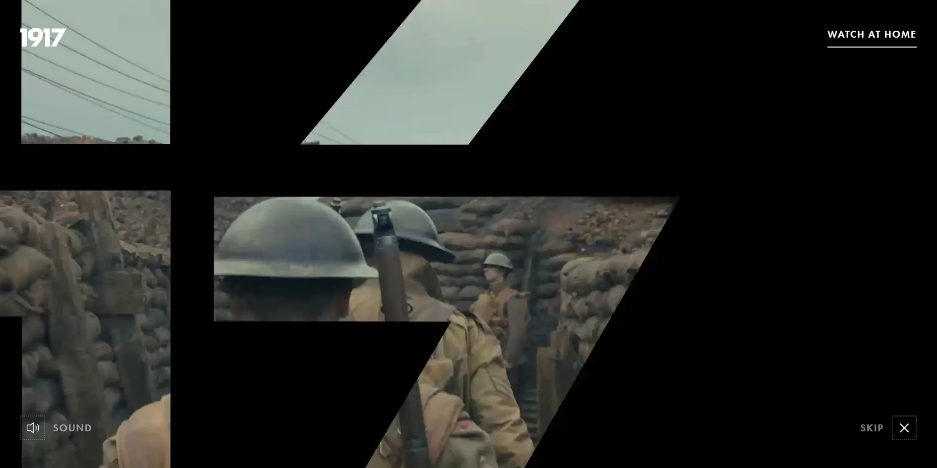
The six-second opening that follows START continues the window idea from the landing page. The four numerals first become four windows, and the picture inside them changes to soldiers moving down a trench. The diagonal of the 7 then pushes the frame open at an angle, the slanted pieces of picture grow and join, and by the end of the opening the whole screen is film. A SKIP button in the bottom right lets visitors jump straight past it.
The join between one stretch and the next is the main piece of motion on the site. When the visitor reaches the end of a stretch, the site plays a clip from the film, 7.6 seconds long the first time and 9 seconds the second. Powster says in the interview that these clips were chosen because they begin exactly where the scanned set ends, to stay as true as possible to the film's one-take style. As soon as a clip starts, the site begins loading the next stretch in the background, and when the clip ends and the picture fades back in, the visitor is already standing at the start of that stretch. Each stretch needs twenty to thirty megabytes of textures, and that whole wait is hidden inside a piece of the film.
Each hotspot opens its video in a frame in the middle of the screen, while the trench behind it dims and the camera holds still. While the video plays the wheel does nothing, so the visitor cannot walk on. When the video ends or the visitor clicks the cross in the bottom right, the frame closes and the visitor carries on from where they were standing.
A continuous walk through all three stretches runs at about 58 frames a second on average, with fewer than 0.5% of frames taking longer than 32 milliseconds, which is very close to a steady 60 frames a second. For each frame the graphics card handles only about 18 to 26 batches of geometry, so walking costs very little, because the detail of the scanned trench lives mostly in its textures rather than in a heavy count of polygons.
04Engineering
The site renders the trench with three.js, builds its interface with Preact, a lightweight alternative to React, animates with GSAP and plays its background sound through the audio library Howler, all packed into a single script of 266 KB compressed. That script still carries two developer tools, a frame-rate panel and a panel for tuning parameters, neither of which is switched on in the live version.
Before the visitor even presses START, the landing page downloads about 6.5 MB, of which 3.4 MB is the sunset video with the numerals and 1.3 MB is the stylesheet. The stylesheet is that large because the map's base image and its shadow are encoded directly inside it, so visitors download the map, which only appears much later, before they have decided whether to go in at all.
Walking all three stretches downloads about 114 MB, including the one hotspot video that was opened, and 81 MB of that is textures. In every stretch the walls, floor, sandbags and props each have a colour texture 4,096 pixels square and a normal map of the same size. A normal map records the bumps and grooves of a surface so that a flat model looks textured. Each of these images is about 2 to 4 MB, which adds up to twenty or thirty megabytes per stretch. The models themselves are light by comparison, with the geometry for all three stretches coming to under 5 MB and each stretch showing only about thirty to fifty-odd thousand triangles. Powster says the raw scans were over 3 GB per section with millions of polygons. The team rebuilt each one as a much simpler model and baked the scanned detail into its textures, which explains why the textures outweigh the models so heavily. Watching all nine hotspot videos adds roughly another 44 MB.
The landing page's first contentful paint arrives after 0.5 to 1.1 seconds, comfortably inside Google's recommended 1.8 seconds, but what it draws is only a loading icon. Visitors have to wait about four to six seconds to see the 1917 numerals themselves, because the page first has to download enough of the sunset video to play it. The layout shift score is 0, so nothing jumps once the page has appeared. The first stretch's textures start loading during the six-second opening, and the other two load behind the film clips between stretches.
Stretches the visitor has already walked are never released from graphics memory. Once the second stretch arrives, the first one's models and textures are only hidden. By the third stretch the scene holds the models for all three, three sets of 15,000 floating dust particles and every texture, and the number of models has grown from 44 to 135. The graphics card therefore keeps tens of megabytes of textures from the earlier stretches loaded, although the frame rate does not suffer for it.
The site answers only to the mouse, which leaves keyboard and screen reader users almost nowhere to go. None of its buttons are marked up as buttons, so none of them can receive focus with the Tab key. After 25 presses of Tab the focus is still on the page itself, and it never reaches START, the map, the sound toggle or a hotspot. The page has no headings either, which leaves a screen reader with no structure to announce, and the video frame can only be closed by clicking its cross, since the Escape key does nothing. With the system setting to reduce motion switched on, the opening and the clips between stretches still play automatically, although the camera in the trench only ever moves when the visitor scrolls. One thing the site does get right for accessibility is that the subtitles are burned into the videos, so visitors who cannot hear the sound can still follow them.
Powster's interview and the live site disagree on one point. The team says they hid a Morse code minigame at the very end of the experience, but the DECODE THE MESSAGE hotspot in the live version opens a featurette on YouTube instead. Nothing in this version of the site deals with Morse code, so the game appears to have been replaced after launch.
05Scores and Team
| Award | Source | Date | Score |
|---|---|---|---|
| FWA of the Day | The FWA | 2020-02-11 | 84 POINTS, DAYS 4 |
| FWA of the Month | The FWA | February 2020 | Monthly winner, no separate score |
| Site of the Day | Awwwards | 2020-03-01 | 7.68. Design 7.63 / Usability 7.05 / Creativity 8.53 / Content 8.09 |
The FWA was the first to recognise the site, naming it FWA of the Day on 11 February 2020 with 84 points from 57 judges' votes, in the film category. On 1 March the FWA made it FWA of the Month for February, and on the same day it won Awwwards Site of the Day. Powster's entry on the FWA describes it as an immersive behind-the-scenes site built from 3D scans of the mile-long trench constructed for the film, with Web AR on phones that lets visitors explore the trenches at full scale around them.
Walking through scans of a real film set, stitched into one long take by clips from the film, earned the site 8.53 for Creativity, its highest score on Awwwards. The other three Awwwards categories are design, usability and content, each scored out of 10. Content came second at 8.09, which fits the six minutes of behind-the-scenes videos along the route. The lowest was Usability at 7.05, which the hotspots slipping out from under the cursor and the mouse-only controls may well have pulled down.
The separate panel of front-end developers gave the site 7.12. Leaving responsive design aside, Animations was the highest of the five categories at 8.40, matching the opening that pushes open from the title numerals and the joins between stretches. Accessibility was the lowest at only 6.20, in line with the buttons the keyboard cannot reach that are described in the engineering chapter.
| Credit | Who they are | Record |
|---|---|---|
| Powster | A creative studio in London and Los Angeles that works for the entertainment industry, responsible for the site's idea, design and development | Awwwards works 8, SOTD 1, HM 7. FWA 18 |
| John Iacoviello | A Canadian programmer who appears to have handled development | Awwwards works 3, SOTD 3, HM 3 |
| Rob Baughan | Based in the United Kingdom, with this as his only work on Awwwards | Awwwards works 1, SOTD 1, HM 1 |
| Universal Pictures | The studio that distributed 1917 and commissioned the project | FWA 6 |
Powster developed the site together with the digital marketing team at Universal. In the interview, the studio says that ten years after it was founded, this project brought its tally to twelve FWA awards and a Site of the Month. The table shows totals up to the present, which is why Powster's FWA count now stands at 18. John Iacoviello describes himself on Awwwards as a programmer, and all three works under his name have won Site of the Day.
06Archive
- Award date
- 2020-03-01
- Awards
- Awwwards SOTD 2020-03-01, The FWA FOTD 2020-02-11, The FWA FOTM 2020-02
- Site
- https://intothetrenches.1917.movie
- Credits
- Powster, John Iacoviello, Rob Baughan, Universal Pictures
- Design
- spatial
- Build
- scroll
- Awwwards
- 7.68 / 10. Design 7.63 / Usability 7.05 / Creativity 8.53 / Content 8.09. Developer Award 7.12. https://www.awwwards.com/sites/1917-into-the-trenches
- The FWA
- 84 POINTS, DAYS 4. https://thefwa.com/cases/1917-into-the-trenches
- Stack
- three.js r109, Preact, GSAP 2, Howler, Amazon S3, CloudFront
- Total assets
- Landing page about 6.5 MB. All three stretches about 114 MB, 81 MB of it textures. The nine hotspot videos about 44 MB more
- Speed
- FCP 504 to 1,108 ms (loading icon), landing picture after about 4 to 6 seconds, CLS 0. Continuous scroll 58 fps