Powerhouse Company
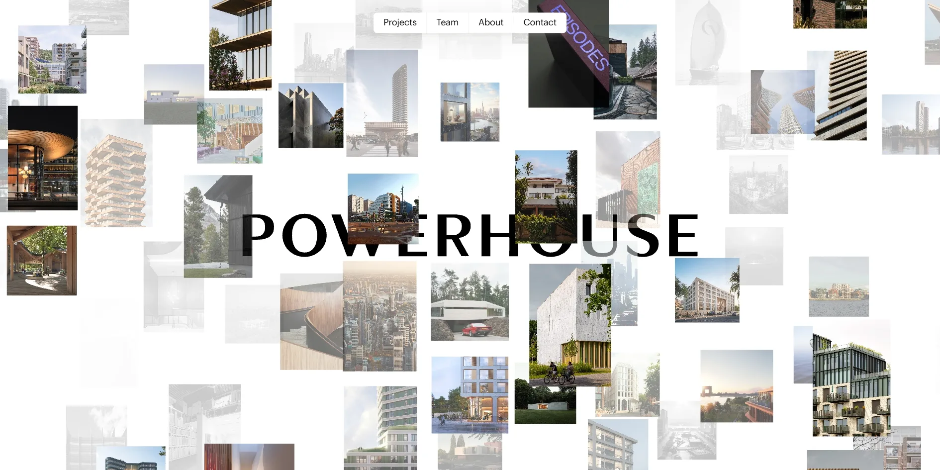
On the home page of the architecture firm Powerhouse Company, a photograph that a visitor clicks does not lead to a new page. The photograph itself grows until it becomes the cover of that project's page. The home page is a single wall of photographs, one for each of the firm's 75 projects, set in a 3D space that visitors can drag around and push away or pull closer. The newest project sits in the middle and the rest spiral outwards.
The Amsterdam studio Build in Amsterdam made the brand and website for this Rotterdam firm, and in April 2020 it won Awwwards Site of the Day, FWA of the Day and Awwwards Site of the Month.
01Concept
Powerhouse Company's home page offers no manifesto and no introduction, only photographs of projects. On the FWA, Build in Amsterdam writes that they repositioned the firm from top to bottom, from brand strategy to visual identity to the website. The claim they wrote, We give meaning to space, went on to lead both the identity and the site. The website makes that claim through the work itself, so the first thing a visitor sees is the buildings the firm has built or is building.
Visitors first watch an opening animation of about six seconds in which the photographs settle into a wall around the POWERHOUSE wordmark. They can then drag the whole wall around with the mouse, push it away or pull it closer with the scroll wheel, and click whichever photograph catches their eye. Hovering over a photograph only turns the cursor into a hand, and the wall shows no project names, so a visitor has to click to find out what a project is.
Every project page is a long article, about twenty screens for Sluisbuurt 1B and more than forty for Céline & Lolo. A page opens on a full-screen cover photograph, followed by a short introduction, a set of tabs that switch between Key info, Team and Collaborators, and a run of titled sections of pictures and text. Along the way come quotes from clients and architects, floor plans and sections, and image carousels numbered like 1 of 9. At the very end an Ask us anything button opens a Join the conversation comment form, whose comments the firm reviews and then adds to the project page, and below that sit three related projects.
The white pill at the top of the home page holds four links, Projects, Team, About and Contact, leading to the project list, the team, an introduction to the firm and its contact details. These four pages use a conventional editorial layout. The project list can be filtered and searched, and the team page shows each architect's portrait, role and city. The firm now has offices in Rotterdam, Munich, Oslo and Nairobi, and the About page opens with the line We give meaning to space through profound form and function.
The site has stayed in use since it won its awards and its content keeps changing, so the project in the middle of the wall is now Sluisbuurt 1B, which is still under construction. The structure has changed in a few places. In 2020 the white pill at the top held the underlined claim We give meaning to | Space, and it now holds the four links instead. The comment form and the related projects at the end of each project page were also added later. The wall of photographs, the opening animation and the way a photograph grows into its project page are all as they were when the site won.
02Design
The site has almost no colour of its own, because every colour on screen comes from the project photographs. The layout is only a white background, black type and the white pill at the top with a soft shadow, and the photographs are separated by even white gaps with no frames or shadows. The site uses just two typefaces, and the large headings and quotes are set in Optima, a humanist sans serif whose strokes flare slightly at the ends so that it reads almost like a serif. Graphik, a plain sans serif, sets the interface and the body text. On a project page Optima sets only about a seventh as many characters as Graphik but covers roughly the same area, because it only ever appears at very large sizes.
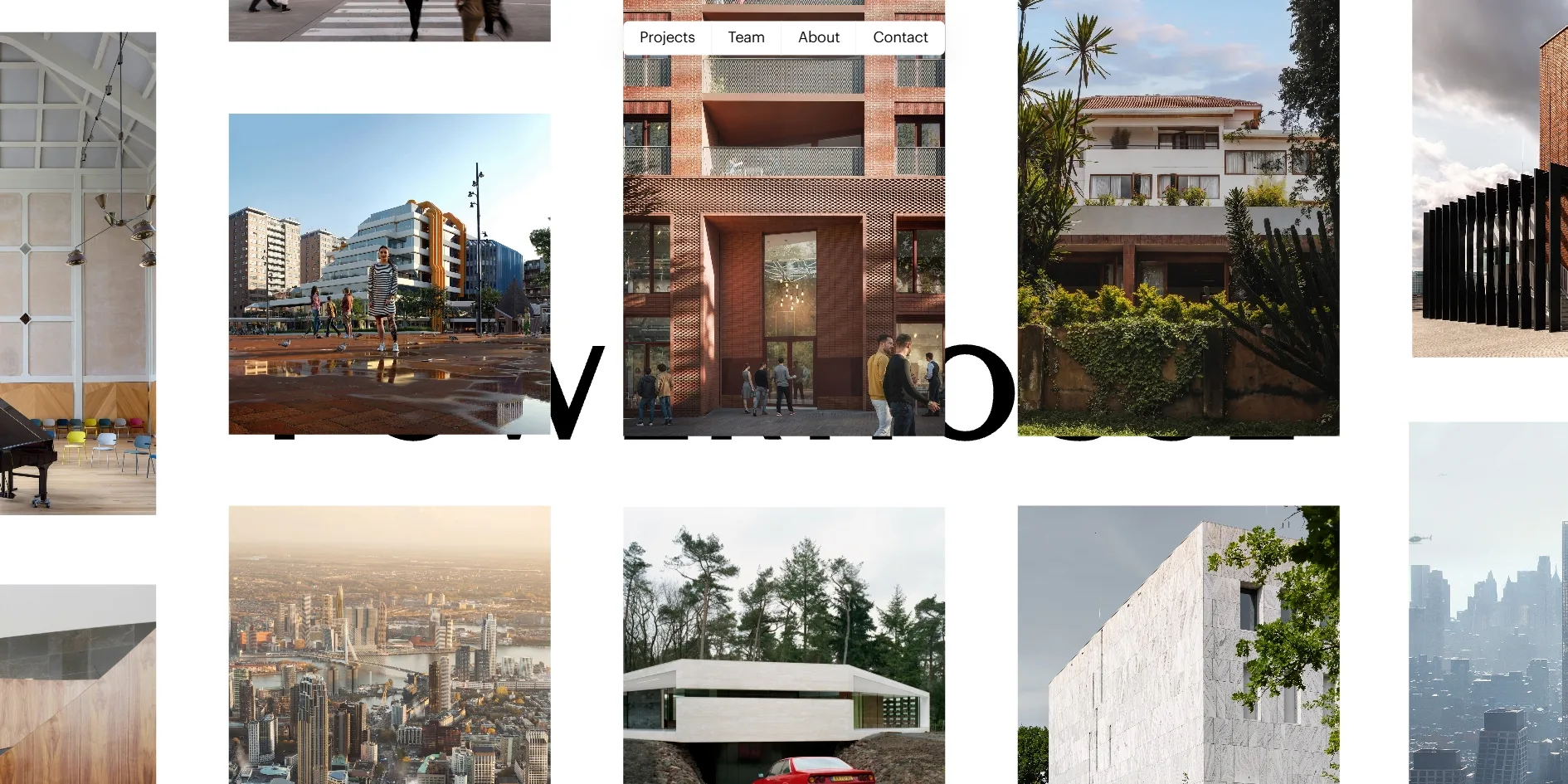
The wall is not a flat grid but a 3D space with layers at different depths. The photographs are portrait, landscape and square, arranged in columns, and neighbouring columns are offset vertically, so the wall looks like a set of staggered shelves. Build in Amsterdam set the POWERHOUSE wordmark in Optima capitals and placed it on a layer between the photographs. Some photographs sit in front of it and hide a few letters, while others sit behind it and are covered by them. At the default view most of the wordmark is hidden and only one or two letters show, so a visitor has to push the wall further away to read the whole name.
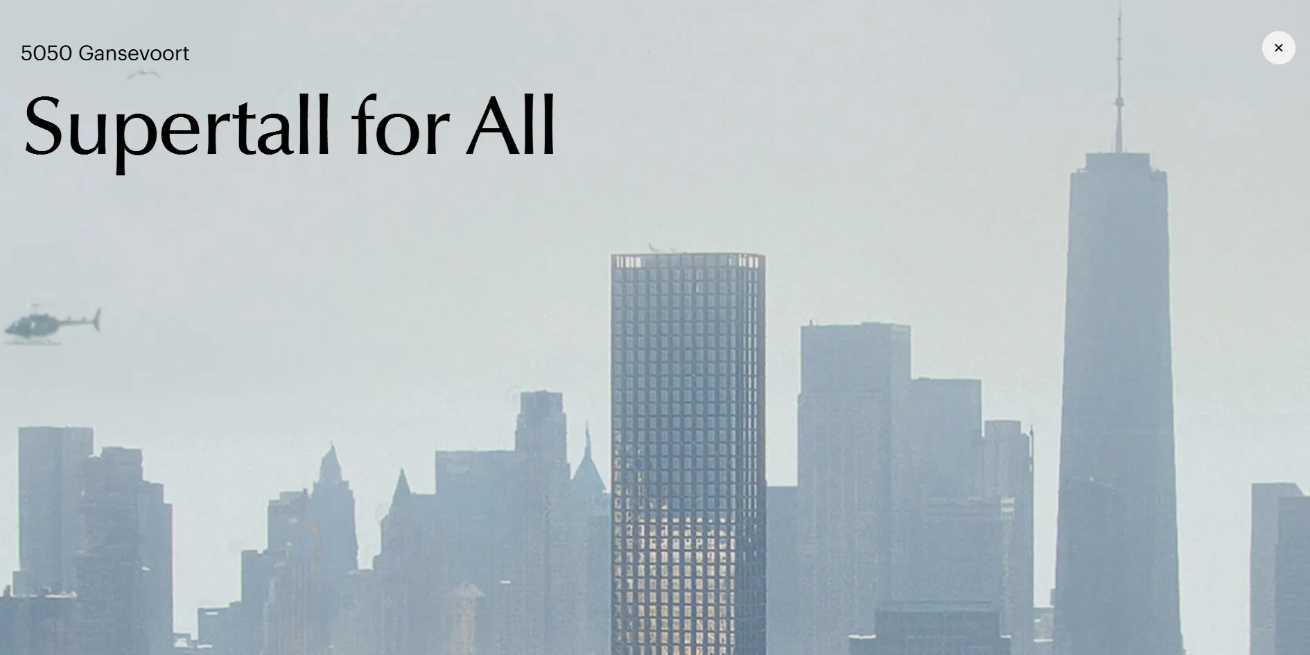
The cover of a project page follows the same rule as the wall and gives the whole frame to the photograph. The project name sits in small Graphik type at the top left, with a large Optima title below it about four times its size, such as Supertall for All under 5050 Gansevoort. A pale grey round close button sits at the top right, and there is no other interface on the screen.
After the cover, the layout reads like the spreads of an architecture magazine. Pictures and text sit in two columns, with the heading often at the top of the right column, a large photograph on the left and a small caption running vertically up the photograph's edge. Words from clients or architects are set as whole paragraphs of large Optima type with a small portrait and a name beneath them. There are no dividing lines anywhere, and each section is separated from the next by generous white space.
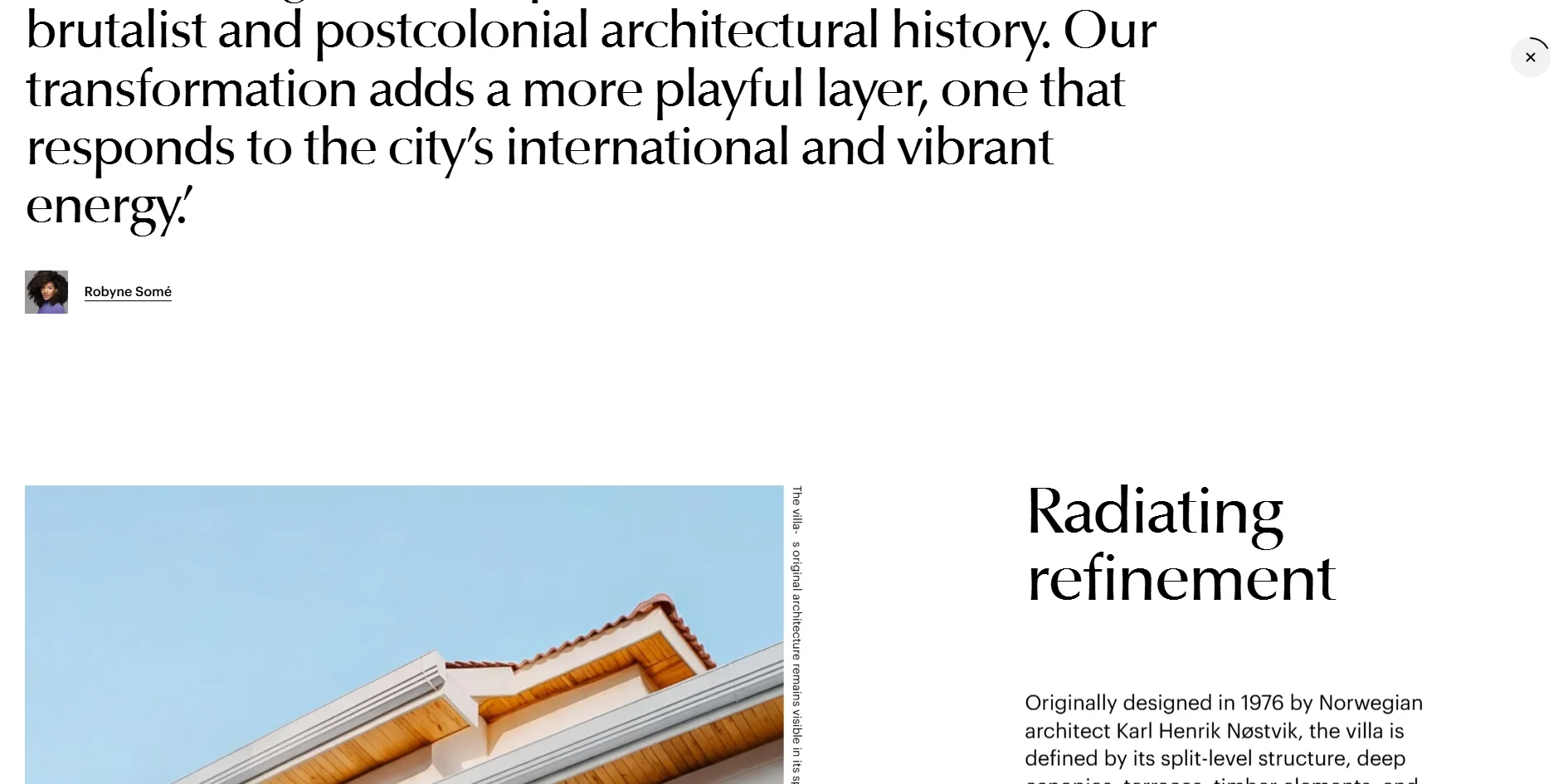
The close button at the top right of a project page doubles as a reading progress indicator. A thin arc runs around its outside edge, and as the visitor reads on, the arc grows clockwise, closing further around the button the more of the page they have read.
03Motion
The opening animation builds the wall one photograph at a time. The wordmark appears first in the middle of the white screen, and then dozens of photographs fly towards the viewer from the distance. The distant ones are faded almost to white and gain colour as they come closer, so this white haze is what separates near from far. The photographs finally land in their places on the wall with their colour fully restored, and the whole sequence takes about six seconds.
The wall on the home page responds to both dragging and the scroll wheel. While a visitor drags, the whole wall follows the hand, and after release it glides on for about half a second before it stops. Turning the wheel moves the camera forwards or backwards through the depth of the wall, so the photographs grow or shrink, from about three columns on screen at the closest to about six at the furthest. The way the layers overlap changes as the camera moves. When the visitor stops moving, the wall stays still.
The move from the wall into a project page is the main piece of motion on the site. When a visitor clicks a photograph, the wordmark and the other photographs quickly fade to white. The clicked photograph travels from its place on the wall to the middle of the screen and grows until it fills the whole screen. The project name and title then fade in, turning it into the cover of the project page. The whole move takes anywhere from under a second to a second and a half, depending on which photograph was clicked.
This join is possible because every photograph on the site is drawn on the same full-screen WebGL canvas, both on the home wall and inside the project pages. The clicked photograph never has to be swapped for another image, because the canvas only has to move and enlarge the same picture for the project page to follow on. Going back from a project page to the wall works differently. When the visitor clicks the close button, the project page fades completely to white and the wall fades back in out of the white, taking a little over a second in all, rather than playing the enlargement in reverse.
Scrolling on a project page is taken over by the site's own script. When a visitor turns the wheel, the browser page itself does not move, and the site instead slides the whole content layer upwards. On every frame the content layer closes only part of the remaining distance, so the page keeps gliding a little after the wheel stops, and the photographs on the canvas move in step with it. A forty-screen project page scrolls from top to bottom at a steady 60 frames a second, with only 0.1% of frames taking longer than 32 milliseconds.
04Engineering
Powerhouse Company's site runs on React 16 and is rendered on the server first, while three.js draws the photographs on a WebGL canvas both on the wall and on the project pages. The gesture library react-use-gesture handles dragging and zooming, the carousels on the project pages use the carousel library Flickity, the content is managed in WordPress, and the cookie banner comes from Cookiebot.
A single visit to the home page downloads about 38.3 MB, and 37.1 MB of that is photographs. Four of those photographs weigh about 4.7 MB each, at a little over 2,000 pixels wide by about 2,500 pixels tall. Together they come to about 19 MB, half of the home page, even though each one appears on the wall as a tile only a few hundred pixels wide. They appear to be original images that editors uploaded to WordPress and that went straight onto the home page without being compressed. The firm's logo at the top left is a similar case, an image 8,216 pixels wide shown at only 127 pixels.
The home page's first contentful paint arrives after 0.53 to 0.69 seconds, well inside Google's recommended 1.8 seconds. What it draws, however, is only the menu text at the top, and the wall is not built until about six seconds in. During loading, the browser's main thread is blocked six times, the longest for 1.1 to 1.2 seconds at a stretch, while Google counts any task over 50 milliseconds as a long one. Clicks and drags get no response for as long as the thread is blocked. The layout shift score is only 0.003, so the page barely jumps as it loads.
The home page leaves people using a keyboard or a screen reader with very little they can do. The wall is a canvas, so none of the 75 projects can be reached with the Tab key. Tab only passes through the cookie banner at the bottom, the logo at the top left and the four links at the top before returning to the page itself. The stylesheet removes the browser's default focus outline, so when keyboard focus lands on the menu, the menu looks exactly the same as when it has no focus. The project pages are better structured, with a correct heading hierarchy and tabs such as Key info that are real buttons. Every photograph on them, however, is drawn on the canvas without alternative text, so a screen reader cannot announce a single one. The stylesheet has no setting for reduced motion either, so the opening animation and the enlarging transition play the same way for every visitor.
05Scores and Team
| Award | Source | Date | Score |
|---|---|---|---|
| Site of the Day | Awwwards | 2020-04-15 | 7.95. Design 7.98 / Usability 7.68 / Creativity 8.29 / Content 7.93 |
| FWA of the Day | The FWA | 2020-04-18 | 81 POINTS, DAYS 2 |
| Site of the Month | Awwwards | April 2020 | Monthly winner, no separate score |
The wall of photographs and the way a photograph grows into its project page earned the site 8.29 for Creativity, its highest score of the four Awwwards categories. The other three are design, usability and content, each scored out of 10, and Design came second at 7.98. Usability was the lowest at 7.68, which the missing project names on the wall and the photographs the keyboard cannot reach may well have pulled down. The separate panel of front-end developers gave the site 7.28, and leaving responsive design aside, Animations was the highest of the five categories at 8.33. Semantics and Markup were the lowest at 6.67 each, with Accessibility at 7.00.
The FWA named it FWA of the Day three days later with 81 points from 28 judges' votes, in the Architecture & Design and Personal/Portfolio categories. Awwwards then made it Site of the Month for April 2020.
| Credit | Who they are | Record |
|---|---|---|
| Build in Amsterdam | An Amsterdam digital studio that describes itself as building digital flagship stores, responsible for the brand positioning, visual identity and website | Awwwards works 54, SOTY 4, SOTM 2, SOTD 41, HM 51. FWA 9 |
Build in Amsterdam is the only credit on both platforms, so everything from the brand claim to the site's code came from one team. The studio introduces itself with the line We build digital flagship stores, meaning online flagship stores for brands. The table shows Build in Amsterdam's totals up to the present.
06Archive
- Award date
- 2020-04-18
- Awards
- Awwwards SOTD 2020-04-15, Awwwards SOTM 2020-04, The FWA FOTD 2020-04-18
- Site
- https://www.powerhouse-company.com
- Credits
- Build in Amsterdam
- Design
- spatial
- Build
- canvas
- Awwwards
- 7.95 / 10. Design 7.98 / Usability 7.68 / Creativity 8.29 / Content 7.93. Developer Award 7.28. https://www.awwwards.com/sites/powerhouse-company
- The FWA
- 81 POINTS, DAYS 2. https://thefwa.com/cases/powerhouse-company
- Stack
- React 16.12, three.js r102, react-use-gesture, Flickity, WordPress, Cookiebot
- Total assets
- Home page about 38.3 MB, 37.1 MB of it photographs, including four original images of about 19 MB in all
- Speed
- FCP 528 to 692 ms (menu text), wall built after about 6 seconds, CLS 0.003. Project page continuous scroll 60 fps