Dropbox Brand
Dropbox Brand is the brand guidelines site of the cloud storage company Dropbox, and it turns a rulebook into a box of toys people can play with. As visitors scroll, eight coloured tiles fly in from around the screen and lock into a table of contents, each leading to a chapter. Inside the chapters, sliders stretch and thicken the typeface, and dragging an easing curve sends a paper plane across the screen at that rhythm. Whenever visitors reach a rule, they can try it for themselves.
Dropbox's Brand Studio made the site with Daybreak Studio, and it launched in January 2025. It won FWA of the Day and FWA of the Month for January, then Awwwards Site of the Day on 12 February and Awwwards Site of the Month for February.
01Concept
Dropbox had just refreshed its brand, and the old guidelines site could no longer keep up. Theresa Ma, Associate Creative Director for brand at Dropbox, says in Webflow's customer story that the old site was rigid, hard to update and rarely referenced. Kiran Patel, a design engineer at Daybreak, puts it more bluntly in Communication Arts, saying the old site was no longer used or maintained and felt dense and outdated. Content changes on the old site depended on developers, so designers and writers could not edit it themselves.
The team gave the new site two jobs, to tell the story of the brand and what goes into it, and to serve as a resource for real work. On the Rive blog, Theresa Ma explains the shift, saying past guideline sites were more functional, while this one had to tell a story so people experience the brand and not just read about it. The site is written mainly for people outside Dropbox, such as partners and agencies, so it has to win their attention before it can serve as a reference. Kiran Patel calls it an interactive visual playground and says the navigation should feel like a toy box, with each tile a piece of that playground. Mike Chiu, a brand designer at Dropbox, says the company did not have the skills in-house to take the site as far as it could go, so it brought in Daybreak, a Webflow partner. Webflow's story reports an average of ten interactive elements per page, up from three.
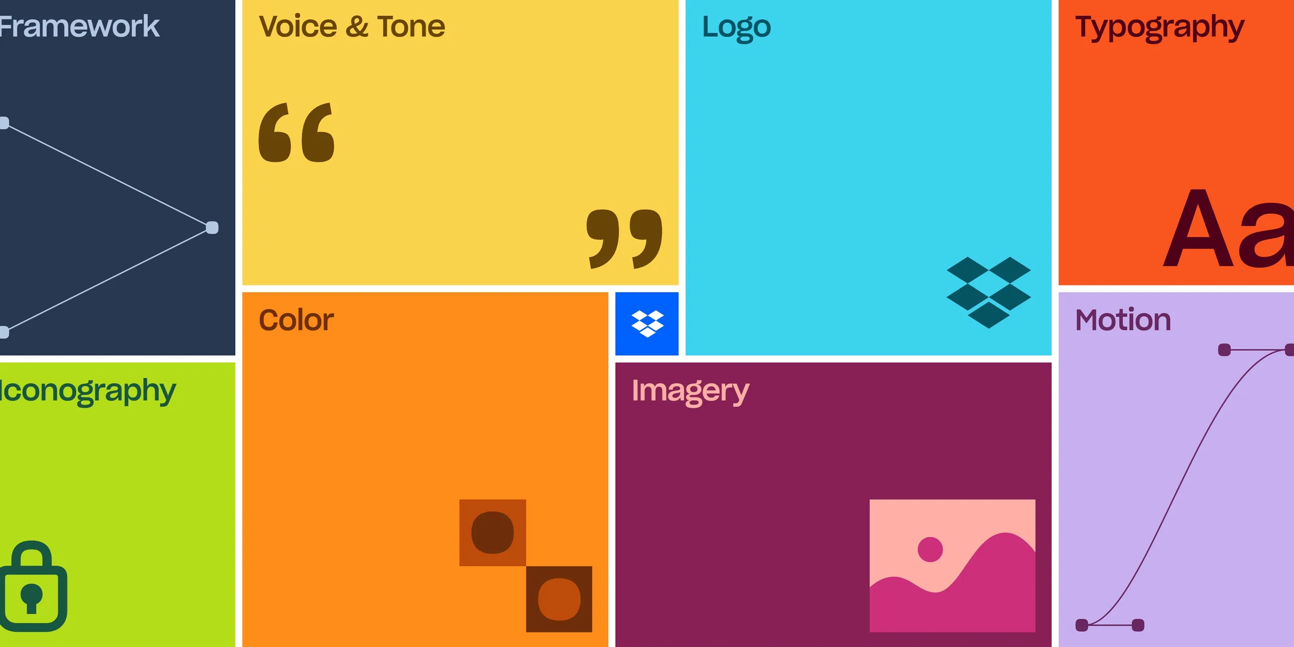
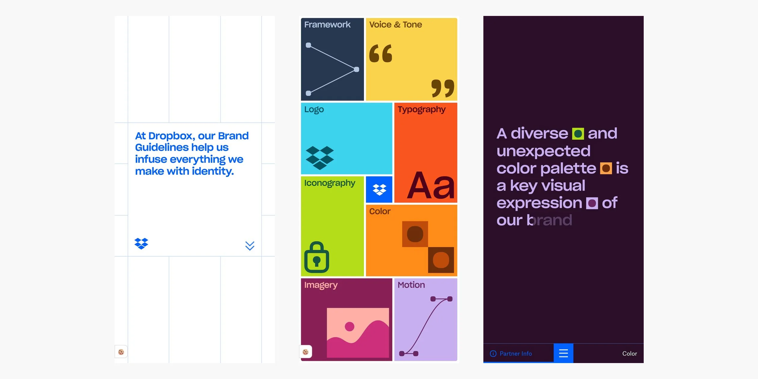
The home page opens on a large white square, with the blue Dropbox logo drawing itself stroke by stroke beside a line about what the guidelines are for. Over three screens of scrolling, the white square turns blue and shrinks to a small tile while eight coloured tiles close in to form the contents. The eight chapters are Framework, Voice & Tone, Logo, Typography, Iconography, Color, Imagery and Motion, and each tile carries a picture of its subject, such as a large Aa for Typography and an easing curve for Motion.
Each chapter is a separate long page of about four to ten screens in a similar order. A sentence states the idea, the specifications follow, and real product and advertising examples show it in use. The site can therefore be read from start to finish or consulted one page at a time. Small tools hide among the rules, and Kiran Patel says most of them are not needed for the story and were left for visitors to discover. The first screen of Framework can be scribbled on with a marker, a button on Voice & Tone writes out an on-brand line word by word, and the start of Iconography lets visitors create folders one at a time. A Partner Info button at the bottom left of chapter pages opens partner resources and the site's credits.
02Design
The site's visual rule is a thin line grid laid across every page. Pale blue lines appear on the home page, the chapters and the 404 page, and content always sits in the cells. Kiran Patel says this scaffolded feeling represents Dropbox's tidy brand system. The grid makes the content feel ordered, and it lets a tool, an image and a piece of text occupy cells of the same size and stand in for one another.
The colour rule alternates white and near-black backgrounds, with bright colour held inside blocks. Dropbox Blue #0061FE runs through every page, on the left navigation button and the blue home tile. The Color page sorts the brand colours into three groups, with the core colours Dropbox Blue, Coconut #F7F5F2 and Graphite #1E1919, sixteen accent colours and twenty steps of grey. The accents carry names such as Crimson, Tangerine, Lime and Orchid. The palette is very bright, but block corners stay square and everything sits on the grid, so the picture holds together.
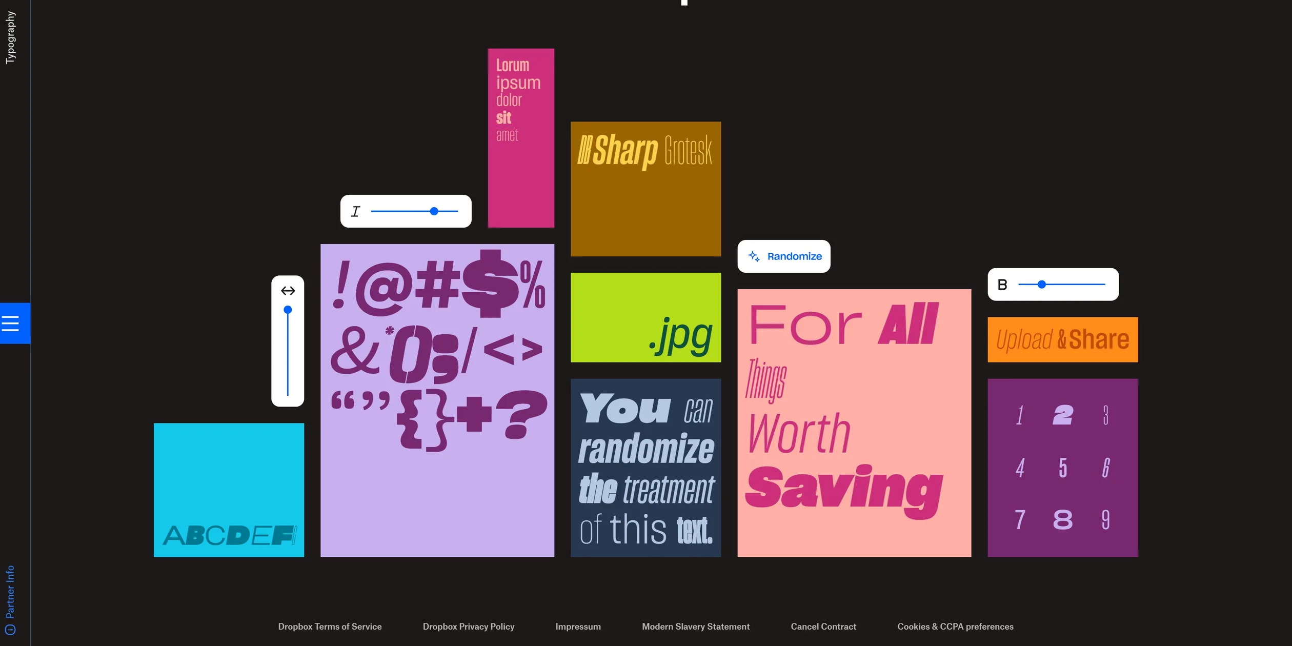
Type is the star of the site. Headlines use DB Sharp Grotesk, a variable typeface that Sharp Type made for Dropbox, with weight, width and italic all continuously adjustable. Body text uses Atlas Grotesk, and small labels use Noto Sans Mono, a monospaced face that reads like notes on an engineering drawing. The Typography page turns this variable type into nine coloured blocks, where the same family can squeeze like a condensed poster face or stretch like a shop sign.
The site's interface parts stay quiet and leave attention for the content. On chapter pages, a small blue square sits fixed at the middle of the left edge, and clicking it spreads the whole contents back across the screen. A tile turns solid black under the cursor with its graphic reduced to a thin outline, which tells visitors which one is selected. Buttons and controls are small white rounded cards that look like parts of Dropbox's own product.
On phones, the contents rearrange into two columns with taller tiles, the navigation button moves to the bottom of the screen, and the grid and colour rules stay the same. The type tools switch to their own font sizes on phones, and the Iconography and Imagery animations come in separate phone versions.
03Motion
The scroll on the home page is the main move on the site. As soon as visitors start scrolling, the white square changes to blue in a 0.6-second step that plays by itself. Everything after that follows the scroll position. The blue square shrinks all the way down to a small button while eight tiles at twice their size fly in from all sides, shrink to normal and lock together. Their curve is very slow at first and very fast at the end, so visitors mostly watch the blue square during the first half and see the tiles snap together near the bottom. Close to the end, the page also pulls itself to the bottom, and only then can the tiles be clicked.
The tiles answer quickly and consistently. When the cursor moves onto one, its colour turns black in about 0.35 seconds and the graphic switches to a thin line version, fast at first and then settling. Each tile also has its own small move, such as the sun and moon on Imagery turning half a circle to take the picture from day to night. Clicking a tile enlarges it to fill the screen, and the new page only loads 0.6 seconds later, so visitors feel they have stepped into the tile. The site skips this enlargement on screens of 991 pixels or narrower, or when visitors have turned on reduced motion.
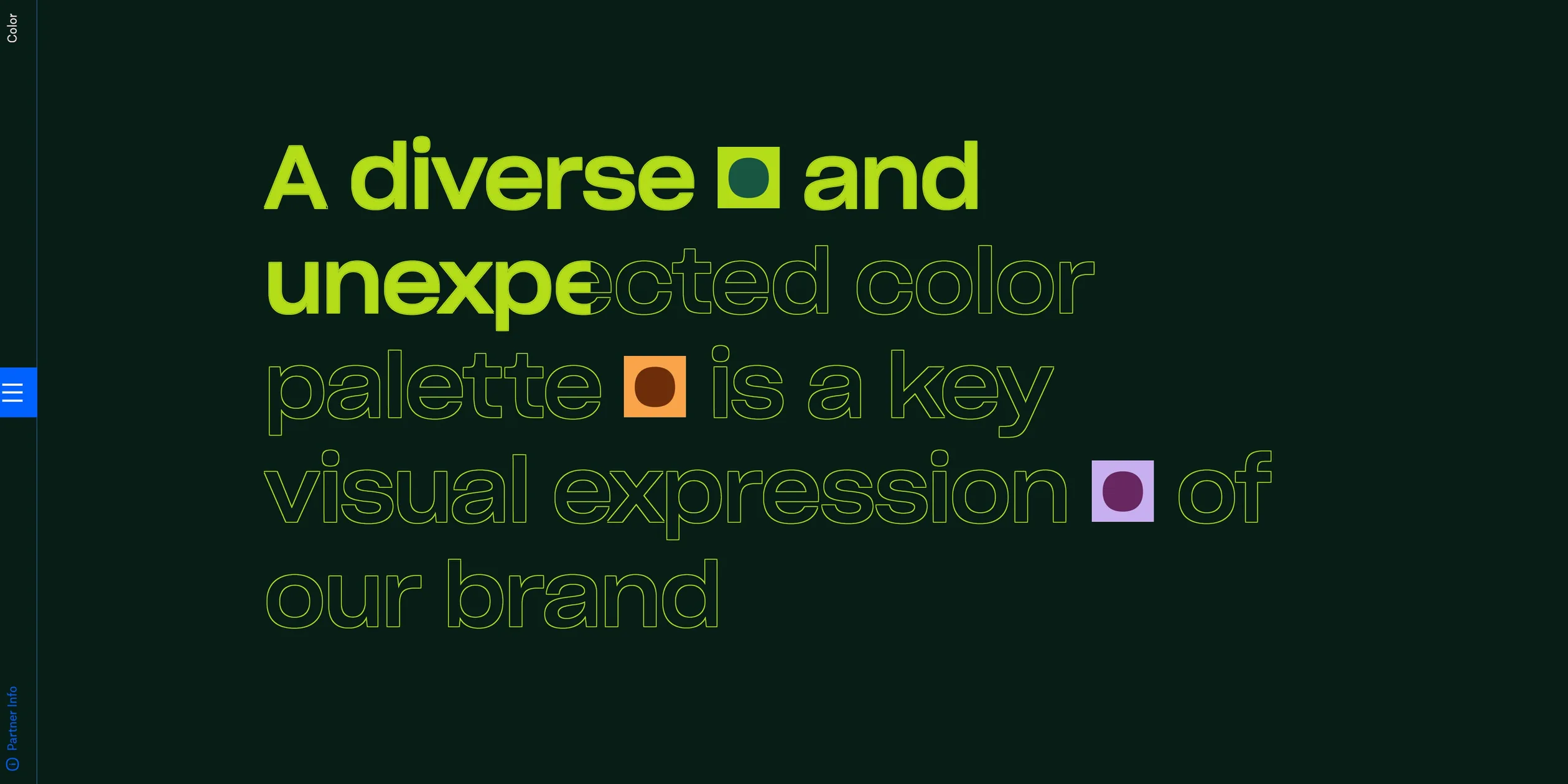
Most animation inside the chapters demonstrates the chapter's own subject. Large text on the Color page starts as outlines and fills in letter by letter with the scroll, while the background moves through dark green, dark brown and dark purple, so the sentence itself shows off the palette. Motion's headline also appears letter by letter, and a timeline below moves with the scroll, so visitors watch an animation timeline taken apart, with a slider beside it to zoom in.
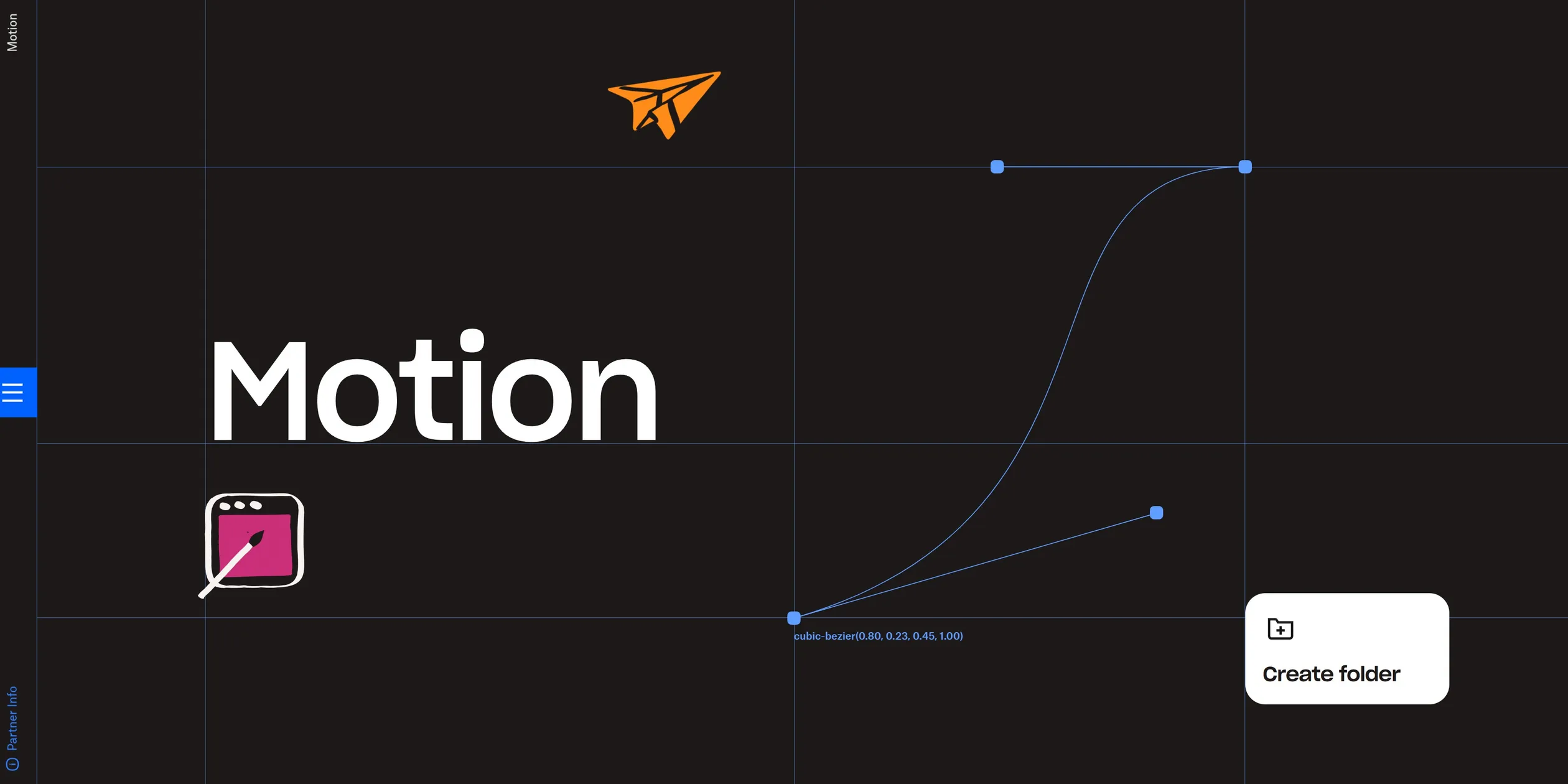
The hands-on tools each turn a rule into an action. The curve on Motion's first screen has two control points. When visitors drag one, the cubic-bezier value beside it updates at once, and an orange paper plane then flies across the screen on the new curve, which makes the difference between easing in and easing out plain to see. Iconography has three rows of icons that spin fast like a slot machine when they come into view, slowing to normal over four seconds, with each row at a slightly different speed. The Generate options button on Voice & Tone types a new line word by word, with random gaps that make it look like someone typing.
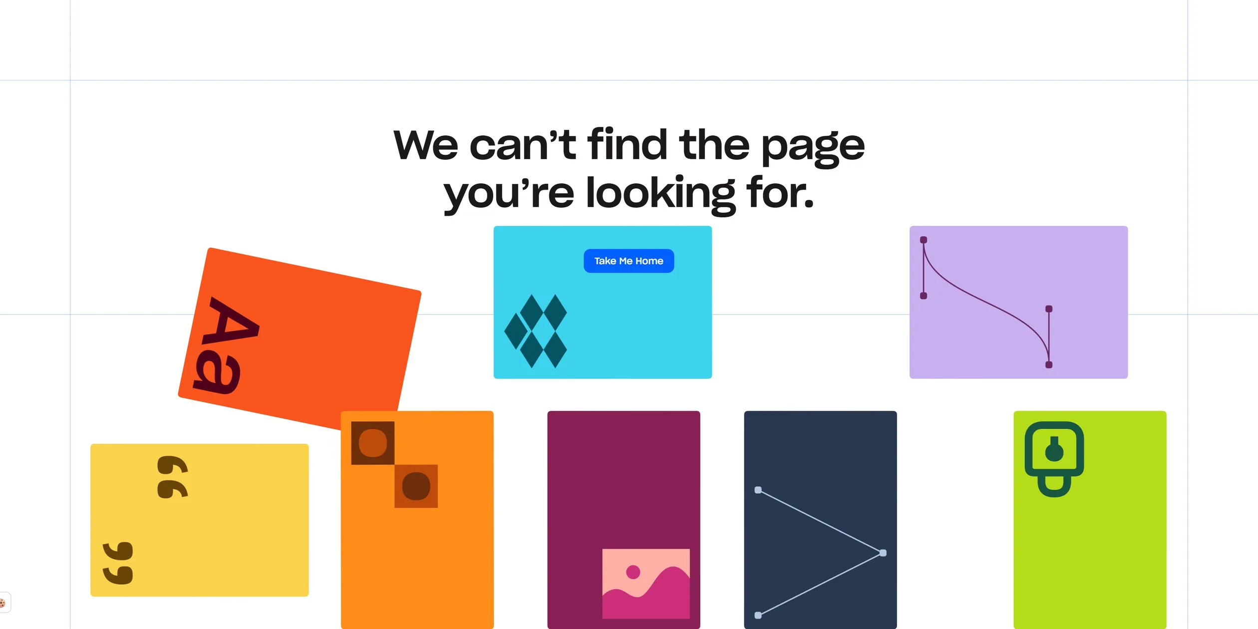
A small move at the end of each page returns visitors to the contents. When visitors keep scrolling at the bottom of a page, the contents pull out, so they do not need to go back up to find the way on. The credits in the Partner Info panel have a small move too. When the cursor reaches them, ten cursor labels carrying team members' names appear at random positions with up to 0.25 seconds of random delay, like many people working in one shared file. The 404 page keeps the same humour, with the contents tiles scattered across the bottom of the screen under a message that the page cannot be found, and a button on one tile to go home.
04Engineering
The site is built on Webflow, yet most effects are hand-written CSS and JavaScript. In Communication Arts, Kiran Patel says there is no CMS and no framework, just vanilla code, with Rive used for the slot machine and the closing pieces on several pages. The pages load no GSAP or smooth scrolling library, and each chapter carries its own script inline in the HTML. Each page therefore brings only the code it needs.
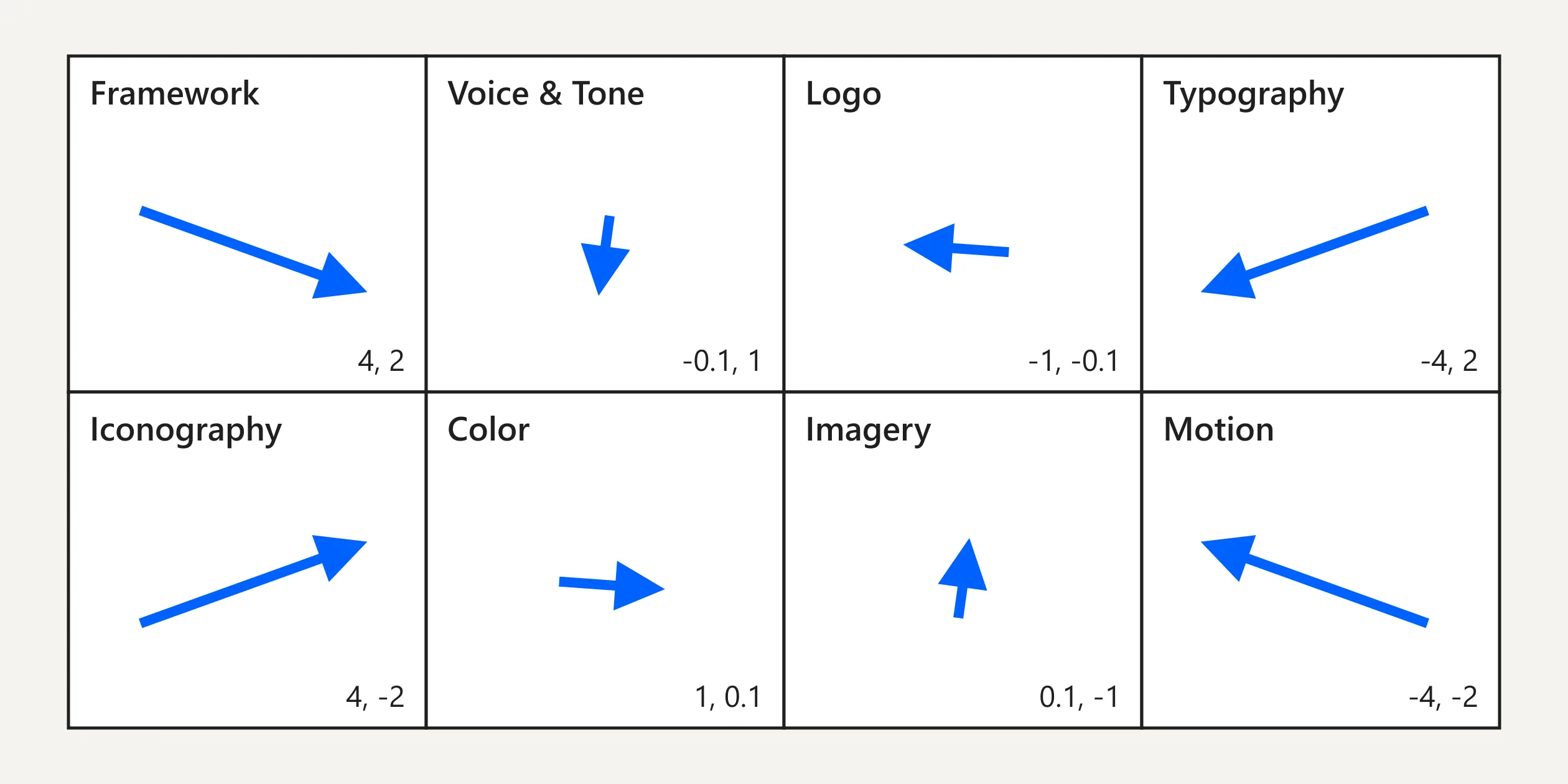
The home scroll animation needs only one table and one easing curve. Each of the eight tiles has a pair of factors, such as 4 and 2 for Framework and -1 and -0.1 for Logo, which set the direction and distance it flies in from. The script passes scroll progress through cubic-bezier(1, 0.25, 0.85, 1), then works out each tile's offset and its scale from 2 to 1. The curve barely moves at the start, which is why the tiles close in so late.
The blue square is a three-state machine, where the first two states switch with CSS transitions and the third takes its size directly from scroll progress. Because the grid lines scale with the tiles, the script applies 1 divided by the scale in reverse, which keeps the lines at a constant thickness. Phones use a second table of factors.
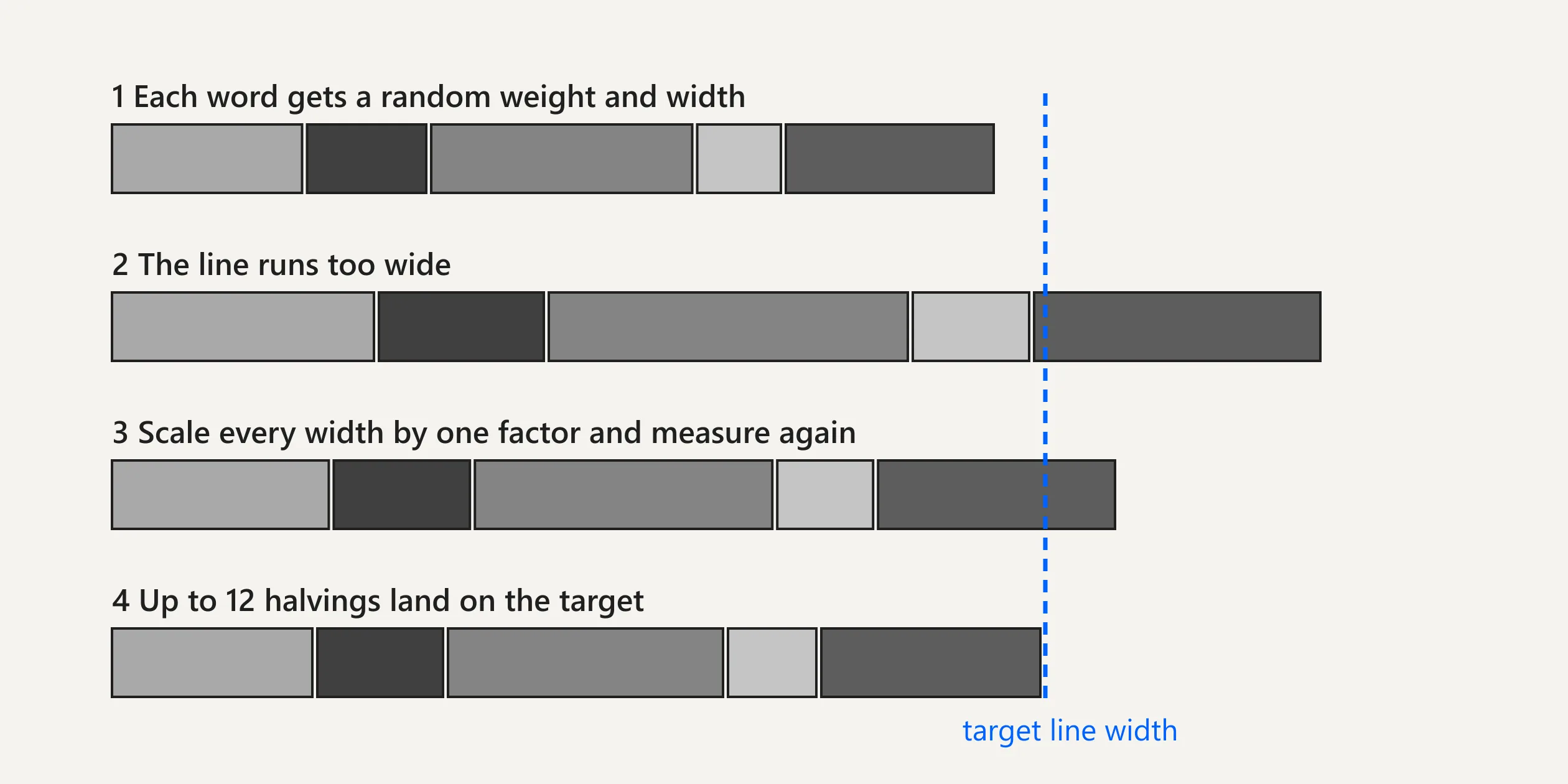
The randomise button in the type tools holds the most involved code on the site. It has to give every word a random weight, width and italic while keeping each line exactly the width of its block. The script picks random values, multiplies all the widths by one factor, measures the line in a hidden span, and binary-searches that factor for up to 12 steps, stopping within 2 pixels. Paired brackets and quotation marks are forced to share one italic setting. All three axes go straight into font-variation-settings, so everything on screen stays live text.
Rive handles vector animation that needs state. The Logo page shows how. Between half a screen and five screens, the page turns on CSS mandatory scroll snapping, so each scroll lands on a section. The script then clicks a hidden trigger element to move the Rive animation to that section's state, walking through the full logo and then the symbol alone. This uses Webflow's triggers as a remote control for Rive's state machine, so the page script only needs to know which section it has reached.
Page weight varies widely from one chapter to the next. The home page is about 3.8 MB, led by a 1.8 MB variable font in TTF that was not compressed to WOFF2, the easiest saving on the site. Imagery is the heaviest page at about 27.8 MB, with two Rive files taking 16 MB, one of 9.5 MB for computers and one of 6.8 MB for phones. Computers download both, so visitors fetch the phone version for nothing.
The home page opens fast, with first paint at about 0.2 seconds, though the tiles jump during loading and the shift is noticeable. At the start, the page locks scrolling for about 1.8 seconds while the grid lines and logo draw. The tile enlargement ends in a real page load, because the site is not a single-page app, so each chapter loads its scripts again.
The site takes real care of visitors sensitive to animation. Several animations read the reduced motion setting, the slot machine icons stop moving entirely under it, and the page change enlargement is skipped. Keyboard visitors can close the contents with Esc, and links inside leave the focus order once it closes. The home page's structure is weaker, with no top-level heading, and the first Tab press lands in the cookie box.
05Scores and Team
| Award | Source | Date | Score |
|---|---|---|---|
| Site of the Day | Awwwards | 2025-02-12 | 7.67. Design 7.67 / Usability 7.56 / Creativity 7.75 / Content 7.88 |
| Site of the Month | Awwwards | 2025-02 | The monthly award has no separate score |
| FWA of the Day | The FWA | 2025-01-22 | 83 POINTS, DAYS 2 |
| FWA of the Month | The FWA | 2025-01 | The monthly award has no separate score |
Dropbox Brand's four categories sit close together, with Content highest and Usability lowest. High Content fits the site, which is a real reference with substance in both its rules and its tools. The slightly lower Usability may relate to the single small navigation entry at the side, since visitors must reach the bottom or find the button to change chapters. The developer jury gave 7.8. Responsive scored highest at 8.6, and the contents and animations were made separately for phones. Semantics and Accessibility scored lowest, both at 7, which matches the missing top-level heading.
| Credit | Role | Record |
|---|---|---|
| Daybreak Studio | The account lists Toronto, Canada, describes making opinionated products and brands, and the studio's website title reads 2020 to 2025 | Awwwards works 6, SOTM 1, SOTD 3, HM 6. FWA 3 |
| Taha Hossain | Founder and creative director of Daybreak Studio | Awwwards works 1, SOTM 1, SOTD 1, HM 1 |
| Kiran Patel | Senior design engineer at Daybreak Studio | Awwwards works 1, SOTM 1, SOTD 1, HM 1 |
| Jenny Rudziensky | Named on the award page and in the site's closing credits | Awwwards works 1, SOTM 1, SOTD 1, HM 1 |
| Jessica Lai | Named on the award page and in the site's closing credits. The account lists the United States | Awwwards works 1, SOTM 1, SOTD 1, HM 1 |
| Ben Giannis | The account lists product designer and developer at Metalab | Awwwards works 1, SOTM 1, SOTD 1, HM 1 |
| Dennis Ish | Named on the award page and in the site's closing credits. The account lists Portugal | Awwwards works 1, SOTM 1, SOTD 1, HM 1 |
Records are cumulative as of 7 November 2026. This was a partnership between an in-house team and an outside studio. Dropbox's Brand Studio led the brand direction and content, and Webflow's customer story says Daybreak managed the technical side and built the interactions. The Dropbox credits include Theresa Ma, Bijan Rafie-Tari, Mike Chiu and Otis Rubottom, and these names appear only in the site's closing credits.
06Archive
- Award date
- 2025-02-12
- Awards
- Awwwards SOTD 2025-02-12, Awwwards SOTM 2025-02, The FWA FOTD 2025-01-22, The FWA FOTM 2025-01
- Site
- https://brand.dropbox.com/
- Credits
- Daybreak Studio, Taha Hossain, Jenny Rudziensky, Kiran Patel, Jessica Lai, Ben Giannis, Dennis Ish
- Design
- interface
- Build
- scroll
- Awwwards
- 7.67 / 10. Design 7.67 / Usability 7.56 / Creativity 7.75 / Content 7.88. Developer Award 7.8. https://www.awwwards.com/sites/dropbox-brand
- The FWA
- 83 POINTS, DAYS 2. https://legacy.thefwa.com/cases/dropbox-brand-guidelines-p2
- Stack
- Webflow, vanilla JavaScript and CSS, Rive, DB Sharp Grotesk, Atlas Grotesk, Noto Sans Mono
- Total assets
- About 3.8 MB on the home page, including a 1.8 MB variable font, and about 27.8 MB on the Imagery page
- Speed
- FCP 244 ms, CLS 0.26. Continuous scroll on the home page 60 fps