Anime.js
This is the official site of Anime.js, a JavaScript animation library, designed and built by the library's author, Julian Garnier. The library is free and open source and lives on sponsorship. In April 2025 the author released version 4, five years in the making, together with this site. The site had to show developers what the new version can do. The author's answer was to hand the whole site to Anime.js, which runs the intro, the 3D engine, the demos and the scroll. The 3D engine at the centre of the homepage has parts named after the library's modules that come apart and back together as the visitor scrolls, so each chapter demonstrates a feature by using it.
Julian Garnier is the only name in the credits, and the site was Awwwards Site of the Month for May 2025.
01Concept
Anime.js is an animation library written in JavaScript that web developers use to change text, shapes and other values on a page over time. Julian Garnier released the first version of Anime.js in 2016. The library now has more than 70,000 stars on GitHub. It costs nothing to use, and the author maintains it with sponsorship from people and companies on GitHub Sponsors, who got the version 4 beta back in 2023. On 3 April 2025 the author announced on X that version 4 was out, calling it a dream animation library five years in the making, and the same thread linked to the new website and the new docs.
The new site therefore had two jobs: prove to developers what version 4 can do, and make people want to sponsor it. The author's approach was to let the site be the demo. Apart from a few short hover transitions on buttons, everything that moves on the page is driven by Anime.js. On launch day someone on Hacker News, a discussion site many programmers read, asked whether the page hijacked scrolling. The author replied that the page scroll is not taken over. The scroll only controls the animations in the background, while the body content still scrolls normally with the page.
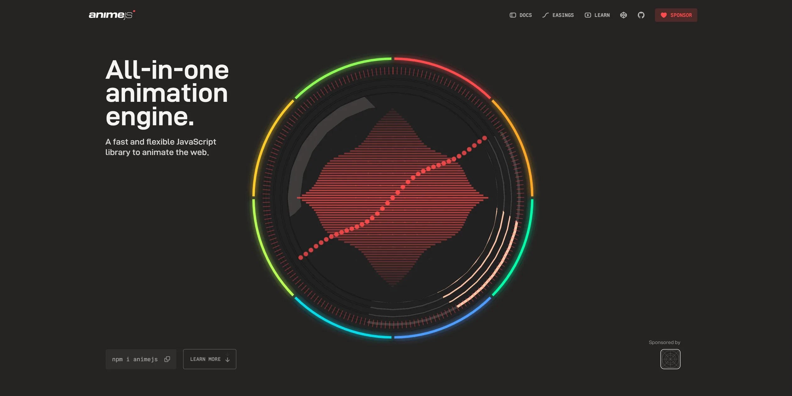
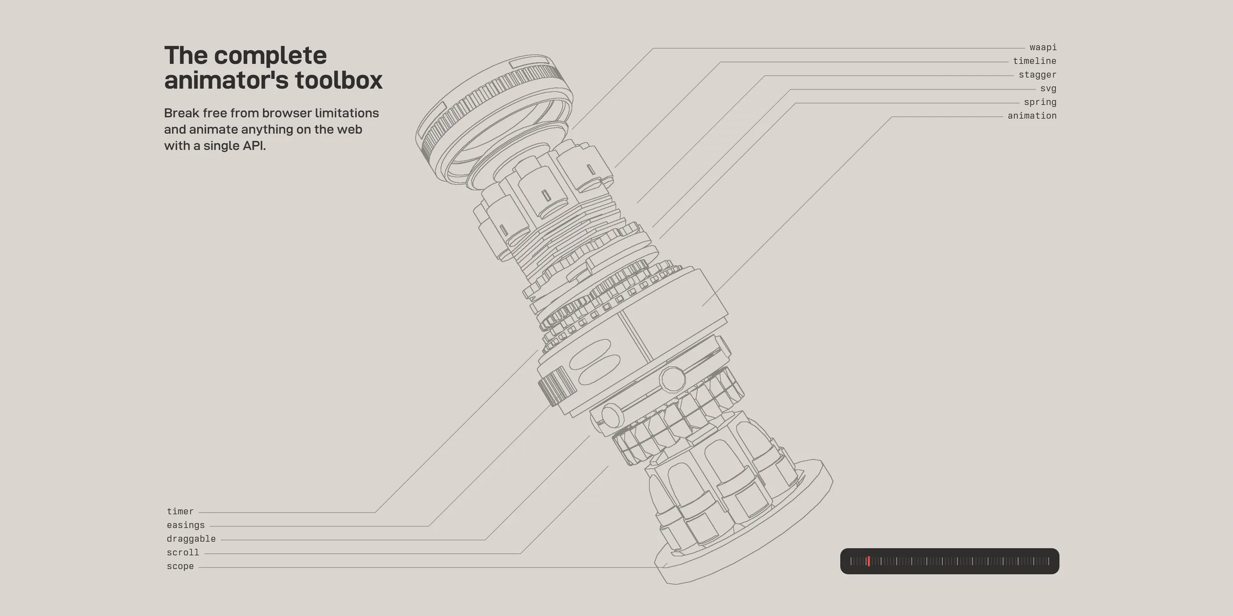
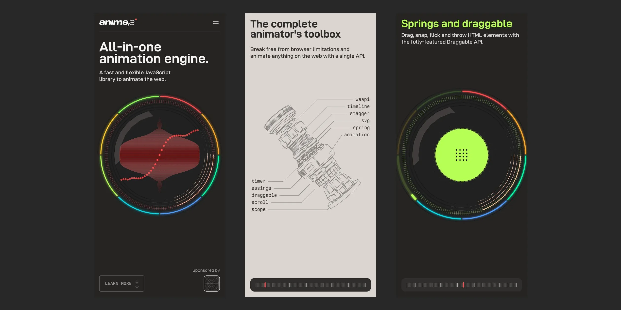
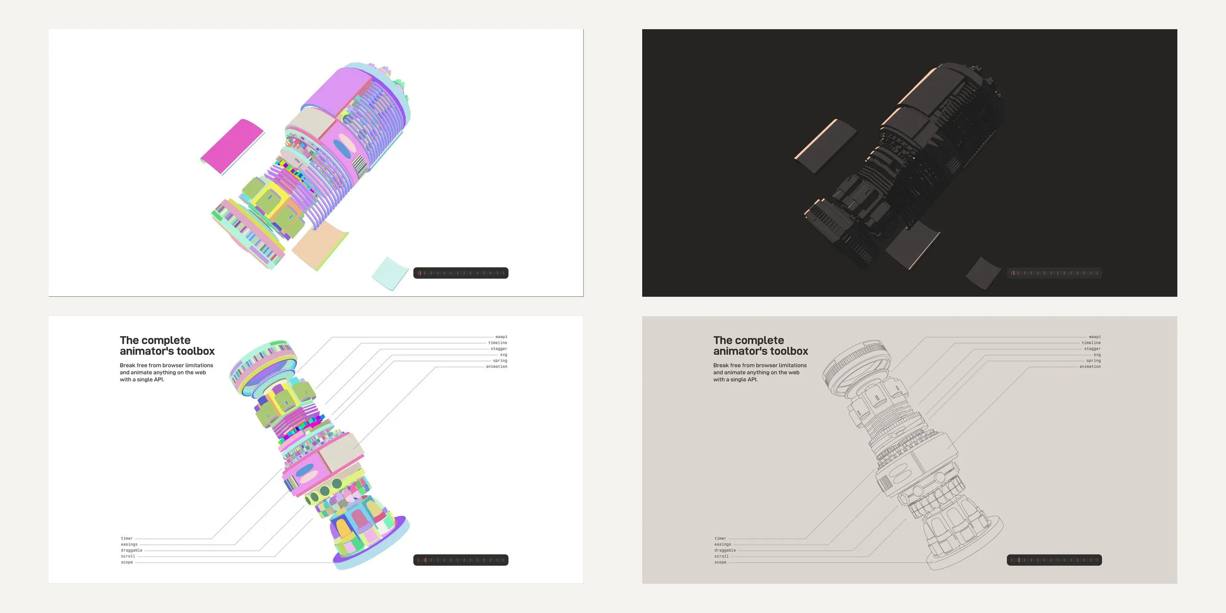
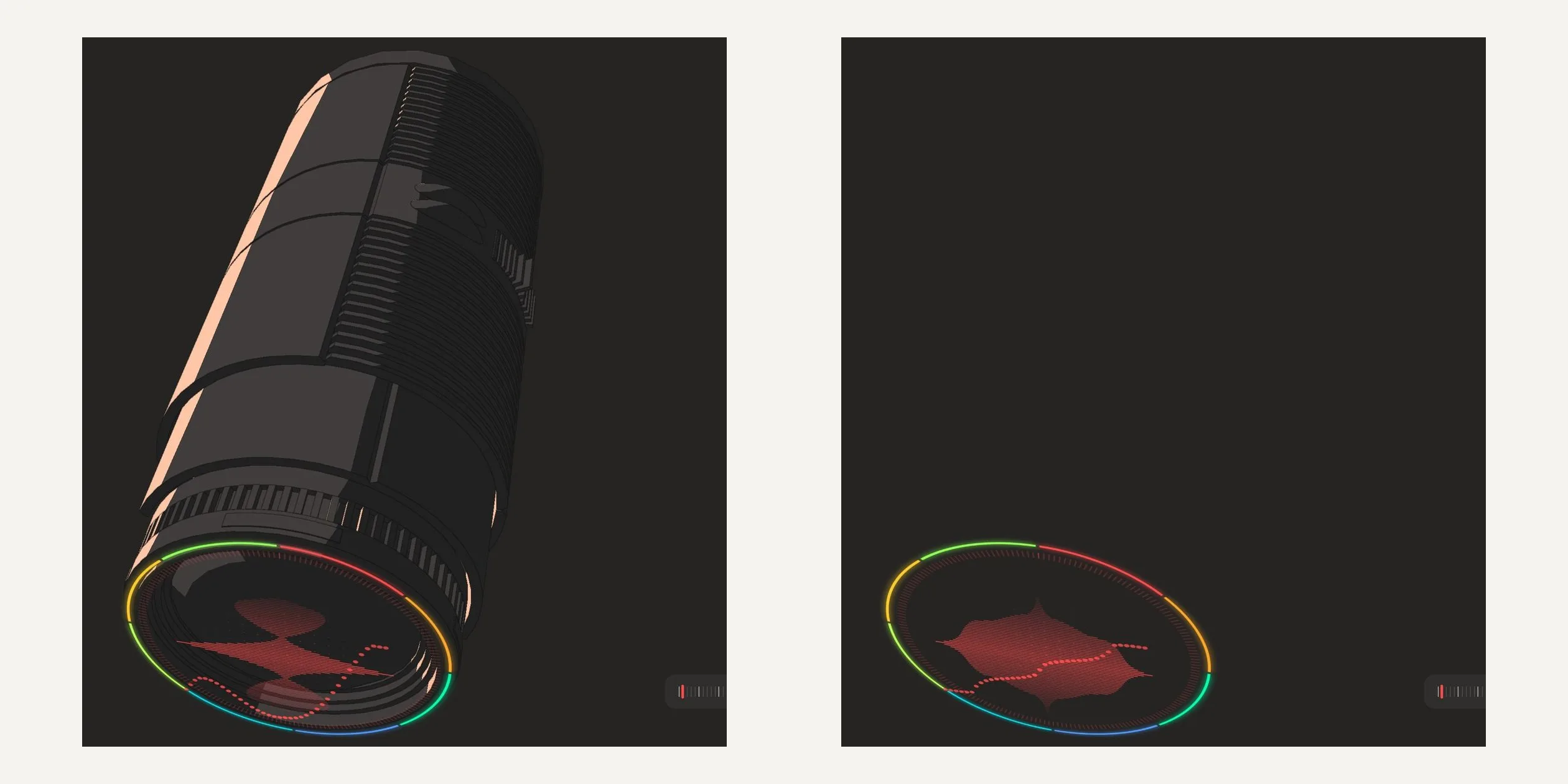
A visitor first sees a round dial like an instrument gauge, with All-in-one animation engine. written on the left. Inside it, a few dozen red lines and a row of red dots draw an easing curve (the rule for how an animation's speed changes over time). When the visitor scrolls down, it turns out the dial is the front lens of a long cylindrical 3D engine, which then comes apart. The light chapter that follows, The complete animator's toolbox, works like an annotated exploded view, with leader lines tying each part to its module.
Further down, the page moves into eight feature chapters of one screen each, from Intuitive API to Responsive animations. In each one the dial holds a small demo of the feature, and the card at the bottom right shows the code that drives it. After the eight feature chapters comes another light chapter, A lightweight and modular API, about keeping files small by importing only the modules you need. The page ends with a sponsors chapter and a Start animating chapter, which lists links into each part of the docs. The whole homepage is about 23 screens long.
The order states a claim first, then takes the engine apart to show what it is made of, then demonstrates each feature, and only then covers size, sponsorship and where to go next. The two light chapters that explain the build take four screens each, while each of the eight feature chapters gets one screen, so the visitor is slowed down where the principles are explained and moves faster through the demonstrations. The homepage has two exits. One is the set of docs links in Start animating, and the other is the red SPONSOR button in the header together with the funding bar in the sponsors chapter, which match the two jobs above.
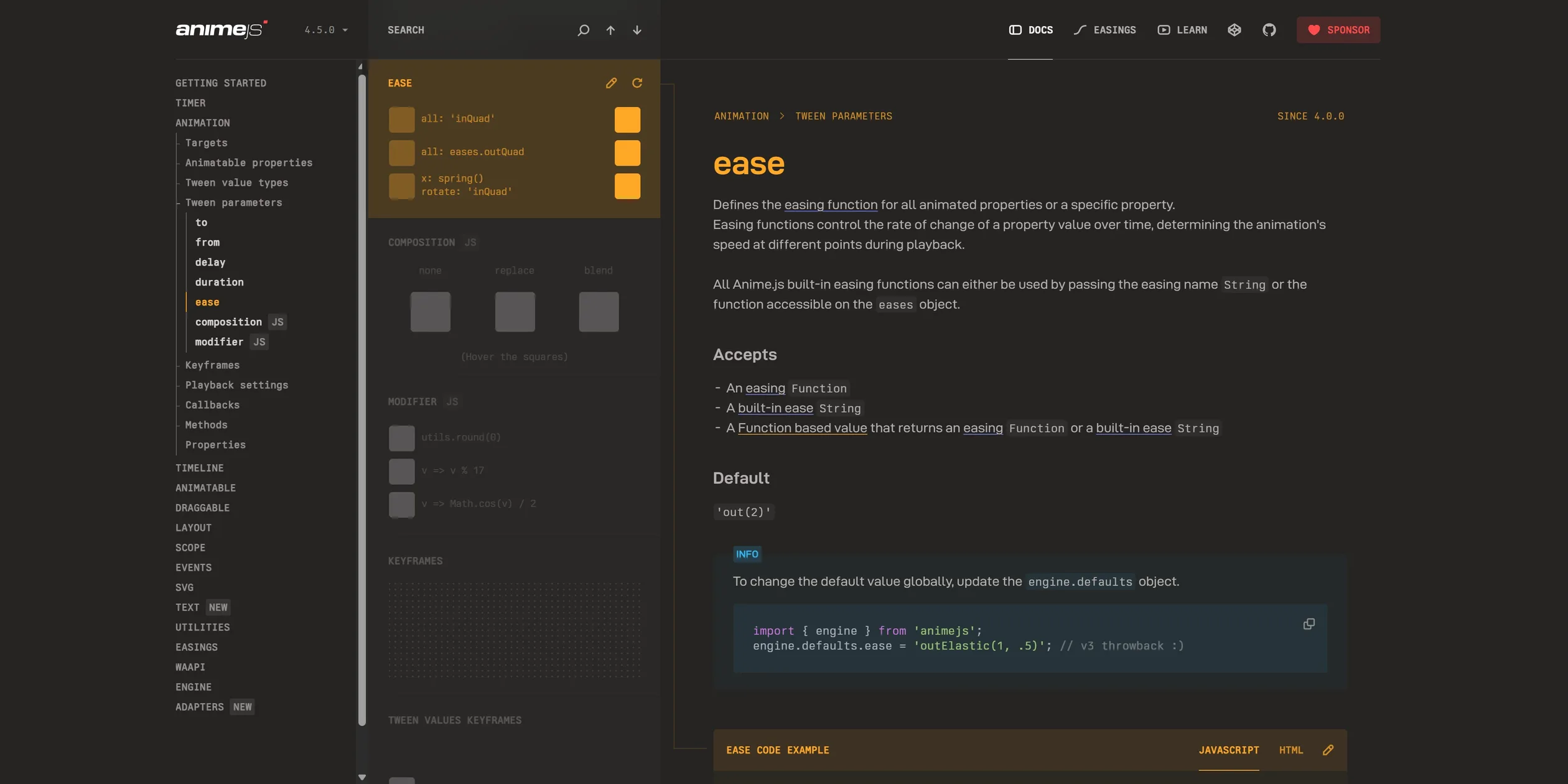
Beyond the homepage, the Anime.js site has the docs, an easing editor and a course page. Every docs page has three columns, with the table of contents on the left and the article and code on the right. Between them runs a long reel of small demos, where the demo for the current page lights up in its module's colour. The easing editor lets a visitor shape an easing curve and export the code. It arrived with version 4.2 in September 2025, and the EASINGS link in the header and the reorganised footer were also added after the award. The course page, LEARN in the header, is a waitlist for a course. A few days after launch the author announced the course, which rebuilds this homepage from scratch to explain how it was made, and the course has still not started.
02Design
The main visual rule is to make the page an instrument working in the dark. On a dark warm grey background (#252423) there is only the 3D engine, the dial's rainbow ring and a little light text (#f6f4f2), and most of the text sits at the left edge and in the corners. The rule has two exceptions, the two light chapters that explain the build. When the visitor reaches them, the whole page turns light grey (#DAD5D0) and the 3D engine is reduced to thin grey lines, like a mechanical drawing printed on paper. Both light chapters label parts and explain ideas, while the dark chapters run demos, so the change of background marks the boundary between the two kinds of content.
For colour, the site treats a full hue wheel as the table of contents of the docs. The site defines eighteen colours that run from red (#ff4b4b) through orange, yellow, green, cyan and blue round to purple and pink. Each colour belongs to one module of the library, in the same order as the docs, so the Timer module is coral, the Animation module orange and the SVG module sky blue. Each colour also comes in eight steps that mix from the pure hue down into the background, and the darker steps are used for outlines, fills and shadows. The rainbow round the dial is this hue wheel. The heading, demo and ticks of each feature chapter switch to that module's colour, and links to a module in the docs pick up its colour automatically, so colour also works as an index across the site.
The site uses two typefaces. Headings and body text are set in DINish, an open source variable font modelled on DIN, which the site sets to a width of 125 by default, so the letters are wider than common DIN. On a 1920-pixel layout, chapter headings are 64 pixels at weight 700 and body text is 20 pixels at weight 600, so headings are about three times the body size. Navigation, buttons, module names and code use the monospaced Berkeley Mono, mostly in capitals at 12 to 14 pixels. The wide large type next to small monospaced labels reads like the nameplates and scale markings on an instrument panel.
On wide screens the layout keeps three fixed positions. Text sits on the left, starting at the left edge of a 1500-pixel content area, and the dial and engine take the centre. At the bottom right sit two stacked dark rounded cards, the upper one showing the chapter's code and the lower one holding a notched progress bar. The header navigation is set in monospaced capitals with small icons, and SPONSOR is a red button. Each feature chapter's three docs links have a small arrow in front, and the code card has a copy button at its top right. The progress bar gives every chapter an equal slot, a red mark shows the current position, and when the cursor is over the bar a grey mark follows it to show where a click would jump.
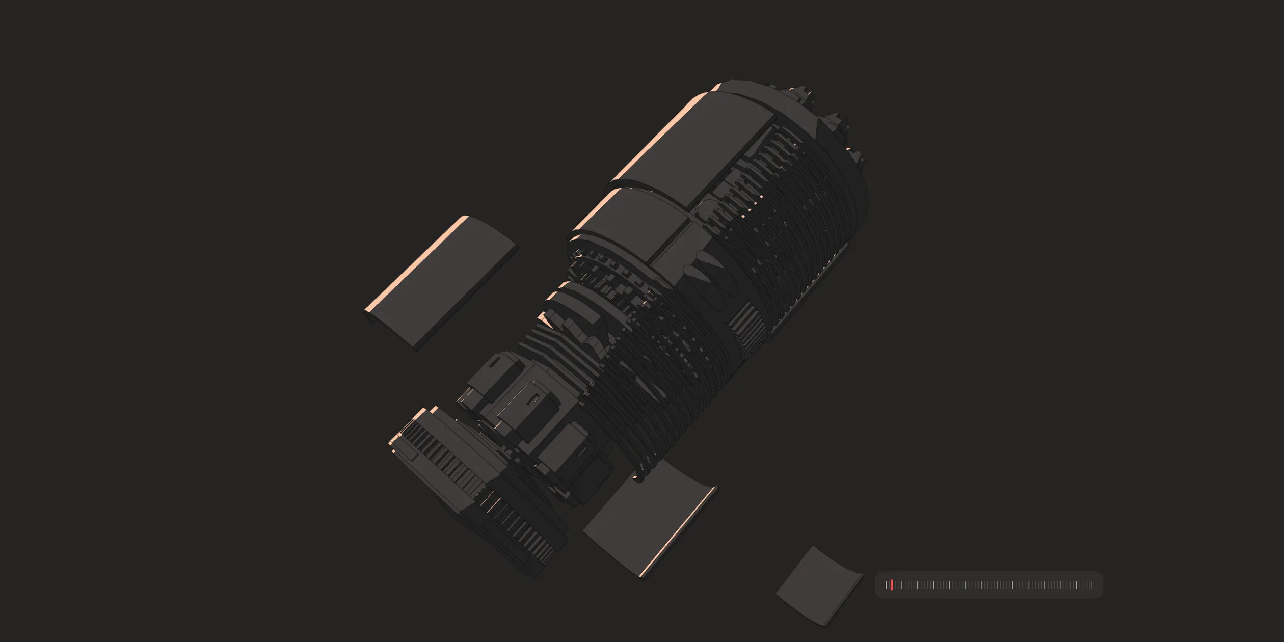
The way the 3D engine is drawn is the most distinctive part of the design. It has no textures (images wrapped onto a model's surface) and no realistic metal reflections, and every part is painted with just three flat colours. Lit edges get a peach highlight (#ffc7a8), most surfaces are a dark brown grey (#423d3d), the shadowed side is close to black, and every part is outlined in a dark line. This keeps a machine with many parts readable against the dark background and lets it sit comfortably next to the flat dial and the monospaced type. In the light chapters all three colours switch to the background colour and only the lines remain, so the engine turns from an object into a drawing.
On phones and tablets the same layout is stacked vertically. Below 900 pixels wide, the heading and one line of copy sit at the top, the dial fills almost the full width, and the engine is further from the camera, so it looks smaller. The code cards and the three docs links per chapter are removed, and only the progress bar at the bottom stays. The header shrinks to the logo and a menu button, which opens a dark panel on the right with the navigation set in large monospaced capitals, and SPONSOR is still red.
03Motion
Motion on the site runs at two tempos. The 3D engine and the big moves around it are tied to the scroll position. The engine turns and comes apart as far as the visitor scrolls, and scrolling back puts it together in reverse, on phones as well. The engine does not snap into place, though. It catches up with a trailing lag and keeps turning for about half a second after the wheel stops, which gives the assembly some weight. The other tempo belongs to the small moves at chapter changes, such as the background switching, a demo changing or a card swapping. These fire the moment the visitor crosses a chapter boundary and then play out on their own clock, usually between a quarter and a third of a second, no matter how fast the visitor scrolls. The body text itself scrolls normally with the page and is never held or snapped. Most moves on the site share one curve that starts slow, speeds up in the middle and slows down again at the end.
The intro does not depend on scrolling and plays on a clock for about four seconds. The screen starts black. The nearly two hundred ticks round the dial light up from one end to the other, and the rainbow ring flickers a few times as if an instrument were powering on. The dot grid in the centre pops out ring by ring. At about two seconds the letters of the heading slide in from the right one by one, each starting a little after the one before, and the header and buttons appear last. The dial then starts cycling through the library's easing curves. The lengths of seventy-odd horizontal lines and the heights of thirty-odd dots are offset by the current curve, so together they draw its shape, and the curve changes every half second. The words the web at the end of the line under the heading also cycle. Their letters fold away from right to left, and the full stop stretches into a short red dash and slides to the start of the word. Once a new word such as HTML, WebGL or CSS is in place, its letters grow back, and the full stop stretches back to the end and shrinks to normal.
When the visitor starts scrolling, the whole scene first tilts round and the dial tips over, revealing the long engine hidden behind it. The engine then turns side on, and the plates of its casing fly off along the diagonals one after another, shrinking away as they go, each only slightly behind the last. The dozen or so fins at the back spin first and then disappear one at a time starting from the last, and the modules then spread out along the engine's long axis. In the light chapter that follows, the module names on both sides light up one by one and a leader line draws from each name to its part.
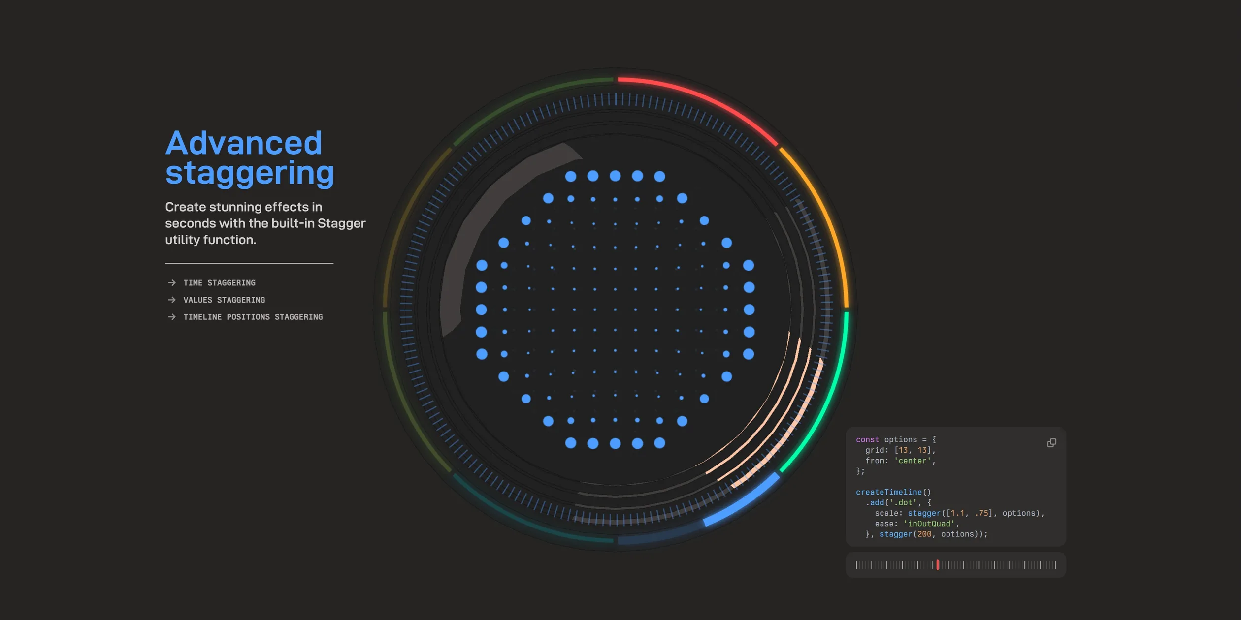
The eight feature chapters change over with the same set of moves. As the visitor crosses into the next chapter, the previous code card sinks and fades while the new card rises from below. The old demo in the dial fades out as the new one fades in, and the heading goes from half transparent to full brightness. The ticks round the dial and the dot grid in the middle switch to the new module's colour at the same moment, with the grid changing colour ring by ring from the centre outward. All of these start together and finish within a third of a second, so although the page underneath is one long scroll, it reads like a set of slides turning over. The arc of the outer ring that belongs to the current chapter fills in as the visitor scrolls, which shows how much of the chapter is left.
Each chapter's demo is the feature itself. In Advanced staggering the dot grid grows and shrinks in order of distance from the centre. In Runs like clockwork a hand turns as the visitor scrolls, and the ticks round the dial jump outward one after another as it passes. In Springs and draggable the green ball can be dragged with the cursor. When the cursor pulls the ball away, the ball only follows half the distance. On release it snaps back to the centre as if tied to a rubber band, overshooting and then wobbling for two to three seconds before it settles. On phones the ball can be dragged with a finger without the page scrolling along, and it springs back to the centre on release as well.
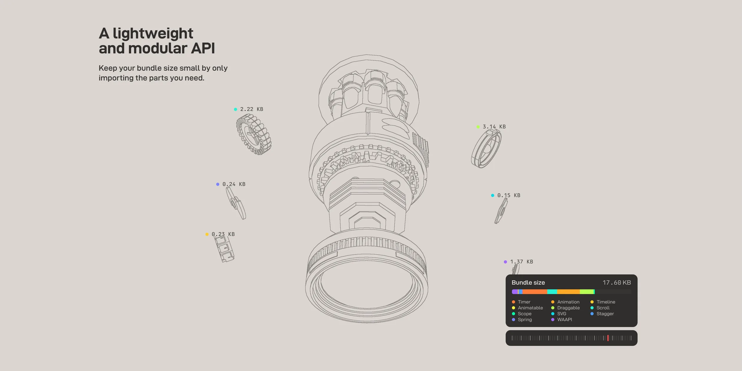
The light chapter about file size animates importing only what you need. Six optional modules first slide out from either side of the engine in turn, each with a label showing its size. As the visitor keeps scrolling, they turn and shrink away while the numbers on their labels count down to zero. The total size on the card at the bottom right counts down with them, from about 27 KB to about 11.5 KB, the size of the core modules alone. The engine then spins round twice and the casing closes again, now only half as long as before. In the final Start animating chapter the engine tips backward and sinks out of the bottom of the frame.
The parts of the engine also keep moving when scrolling is not pushing them, and each part moves in the way its name describes. The gear named timer ticks forward one notch at a time like the escapement of a watch, with a little bounce at each step. The ring named spring turns a quarter of a turn at a time and settles on a spring curve. The part named svg is a colourful cylinder that changes to a new wavy outline every three quarters of a second.
The progress bar at the bottom works on desktop and on phones. When the visitor clicks anywhere on the bar, or holds the red mark and drags it, the page jumps straight to that position with no transition. On phones, a tap on the bar jumps the page there in the same way.
04Engineering
The core technique of the site is to use Anime.js to drive DOM elements, 2D canvases, the three.js scene, shader parameters and the page scroll at the same time. The library's animate and createTimeline can change any number on any JavaScript object, not only CSS properties. That makes the positions and rotations of the engine's parts, the colours of the outline shader and the size of every dot on the dial's canvases targets of the same kind of tween. Even the three.js render loop is an Anime.js timer set to 60 frames per second, which asks the composer for a frame and then updates the CSS3D layer on top. The version that won the award wrapped three.js objects in its own small class that translated properties such as x, rotateZ and scale into position, rotation and scale. Version 4.5, released in June 2026, turned the same idea into a three.js adapter that ships with the library, and the live site now uses it.
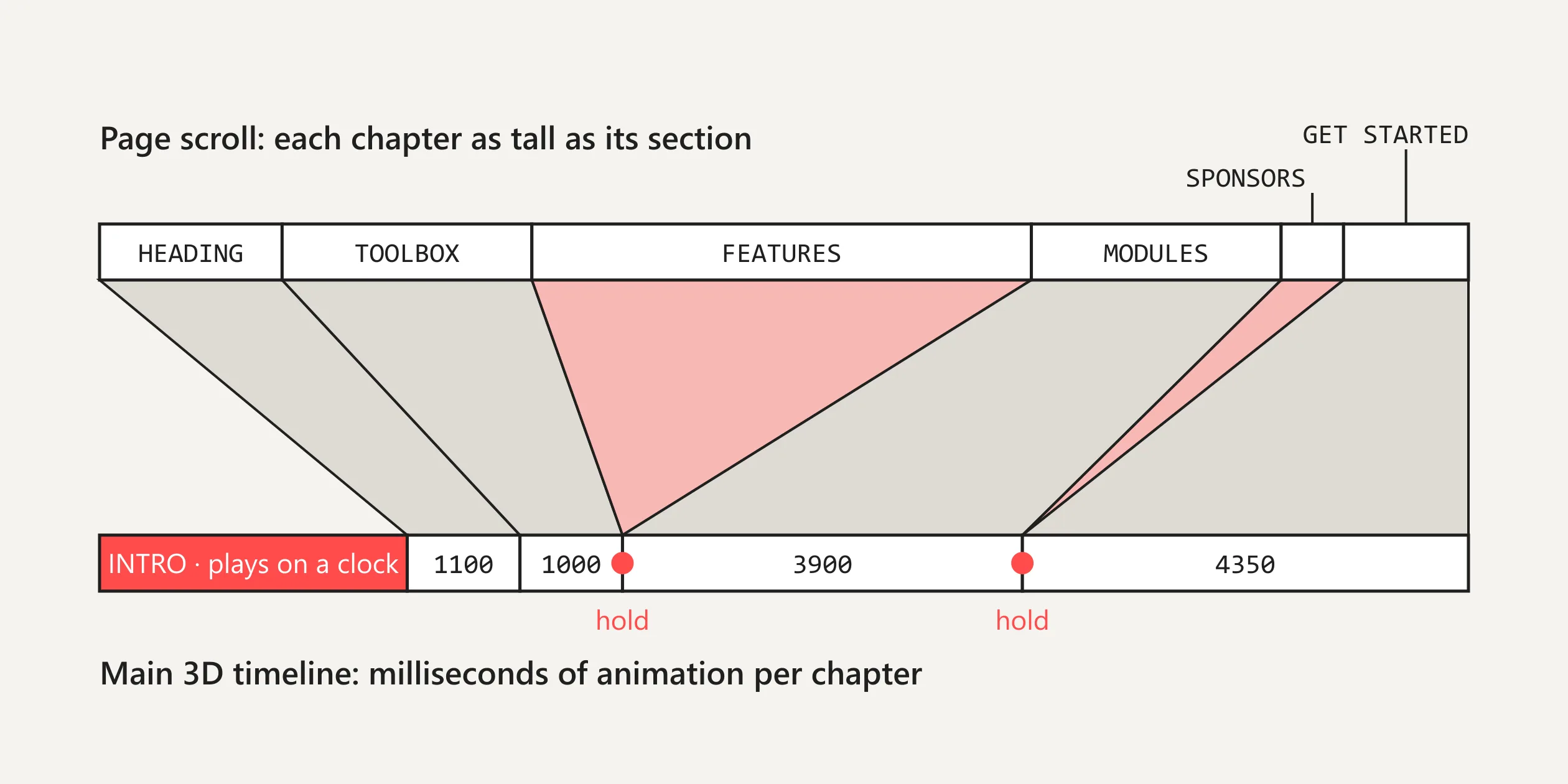
A conversion layer sits between scrolling and the 3D animation. All of the 3D scene's moves live on one main timeline with a label per chapter, such as INTRO, HEADING, TOOLBOX and MODULES. Each chapter gets as much time as its animation needs, and each section of the page carries a matching label. A second timeline, used only for the conversion, treats each section's height as a duration. It lines up tweens on a proxy object so that the proxy's currentTime moves from one chapter's label to the next. This conversion timeline is driven by Anime.js's onScroll from the scroll progress of the whole page, and every time the proxy updates, the main timeline is seeked to the same point.
This conversion lets scroll distance and animation time be tuned separately. The HEADING section at the top of the page is almost three screens tall but drives only 1.1 seconds of animation. By contrast, GET STARTED, the final Start animating chapter, is only two screens tall but has to play the whole 4.35-second backward tilt. The eight feature chapters and the sponsors chapter have zero length on the main timeline, so the engine holds still through them while the dial is handed over to another timeline tied to the scroll of the feature area. The trailing lag described earlier comes from setting onScroll's sync to 0.9, which makes the timeline's progress chase the scroll position smoothly. The intro is a separate tween that pushes the proxy from INTRO to HEADING on a clock, and that tween is paused as soon as the visitor starts scrolling so that the scroll can take over.
The flat colours and ink outlines of the engine come from a two-step render. In the first step every part shares one material modified in onBeforeCompile. This material does not output real lit colour. Instead it writes each part's vertex colour, mixed with a little of the view-space normal colour, into the RGB channels, and writes whether each pixel is lit or in shadow into the alpha channel. The models were given a distinct light colour per part when they were made, and these colours exist only for the next shader, so visitors never see them. The second step is a full-screen shader that samples each pixel in four diagonal directions and draws a line wherever the colours differ enough, so an outline appears wherever two parts meet. Where there is no outline, the shader fills in one of three colours, the highlight, the main colour or the shadow colour, according to the light value in the alpha channel.
The light chapters use the same render. When the page background switches, the site simply uses Anime.js to tween the outline shader's highlight, main, shadow and background colours to the same light grey and turn the outlines black, which leaves only the lines. The code also builds bloom and chromatic aberration effects, but they are never added to the composer, so each frame goes through only three steps: the scene, the outline pass and the output. The directional light has shadow casting turned on, but the shadow map is never enabled, so all the shading on screen comes from the outline shader's three tone bands.
The dial, by contrast, is a piece of web page, not part of the WebGL canvas. A CSS3DRenderer is layered on top of the three.js scene and places a whole block of HTML into the same scene as a 3D object. That block holds two SVG rings, nearly two hundred ticks (each one a div), most of the feature demos and several 2D canvases. The dial and the engine hang from the same parent, so when the scene tilts round, the dial is distorted by the same perspective and fits exactly into the engine's front end. The module names and leader lines are a third layer, where a CSS2DRenderer projects a point on each part onto the screen and SVG polylines connect it to the names on either side. The dot grids and the easing curve inside the dial are drawn on 2D canvases by a tiny renderer the site wrote itself. The dots and lines are plain objects, Anime.js tweens their position, size and opacity, and the canvas is cleared and redrawn on every timeline update. The glow on the rings comes from a CSS drop-shadow filter.
The whole engine is assembled from twenty-odd Draco-compressed glb models totalling about 460 KB, plus a Draco decoder of about 280 KB. The models carry no textures, and all colour is stored in the vertices. The colourful cylinder named svg has no model file at all and is generated in code, and its wavy outline comes from rewriting vertex positions on each tween.
A first visit to the homepage downloads about 5.1 MB, of which the site's own files are only about 1.2 MB, and the largest share is about 3.6 MB of sponsor avatars. The homepage pulls dozens of sponsor avatars from GitHub as soon as it opens, the largest over 600 KB, even though they only appear in the sponsors chapter near the end of the page. What visitors see while waiting is the intro described earlier, and the heading and buttons are all in place after about three seconds.
The site barely tells devices apart. Every device gets the same assets, and the script makes only one distinction, at a width of 900 pixels, which decides the pulled-back camera and hidden code cards described earlier. For image quality, the site turns off WebGL's built-in antialiasing and instead renders the whole composite at twice the layout size before the browser scales it down. The outline samples are only half a pixel apart, so the lines come out thin and clean. On phones with a pixel ratio above 2 the site renders at three times the size, which means nine times as many pixels as the layout. At launch, visitors on Hacker News said the page felt heavy on older computers and on mobile Safari, and this supersampling is very likely part of the reason. The site also has no fallback for browsers that cannot get WebGL. In that case the whole page stays a black screen without even the header or the text, and visitors reported exactly that in the launch-day discussion.
A keyboard can reach the homepage's main content. When focus lands on a chapter's docs links, the browser scrolls the page to that chapter, and the engine and demo change with it. Screen reader users will meet several unnamed controls, since the per-chapter jump buttons on the progress bar and the npm copy button have no readable name, and the newsletter field has only placeholder text. The site ignores the system's reduced motion setting, so with it turned on the intro, the assembly and all the looping animations play as usual.
05Scores and Team
| Award | Source | Date | Score |
|---|---|---|---|
| Site of the Day | Awwwards | 2025-05-06 | 7.62. Design 7.63 / Usability 7.51 / Creativity 7.75 / Content 7.63 |
| Site of the Month | Awwwards | May 2025 | Site of the Month, no separate score |
Of the four Awwwards categories, Creativity scored highest and Usability lowest. The developer jury gave 7.84, with Animations highest at 9 and Semantics, Accessibility and Markup lowest at 7.4 each.
| Credit | Role | Record (as of 16 November 2026) |
|---|---|---|
| Julian Garnier | Author and maintainer of Anime.js. The Awwwards account lists France, and the GitHub profile lists Paris | Awwwards works 1, SOTM 1, SOTD 1, HM 1 |
This is the site Julian Garnier made for their own library, designed and built by the author alone.
06Archive
- Award date
- 2025-05-06
- Awards
- Awwwards SOTD 2025-05-06, Awwwards SOTM 2025-05
- Site
- https://animejs.com/
- Credits
- Julian Garnier
- Design
- spatial
- Build
- scroll
- Awwwards
- 7.62 / 10. Design 7.63 / Usability 7.51 / Creativity 7.75 / Content 7.63. Developer 7.84. https://www.awwwards.com/sites/anime-js
- Stack
- Anime.js 4.5.0 (with the three.js adapter), three.js r172, postprocessing 6.36.6, Draco, highlight.js
- Total assets
- About 5.1 MB on a first visit to the homepage, about 1.2 MB of it the site's own files, most of the rest about 3.6 MB of GitHub sponsor avatars
- Speed
- FCP 0.54–0.58 s, picture complete at about 3.2 s, CLS 0. Continuous scroll 60 fps