MindMarket
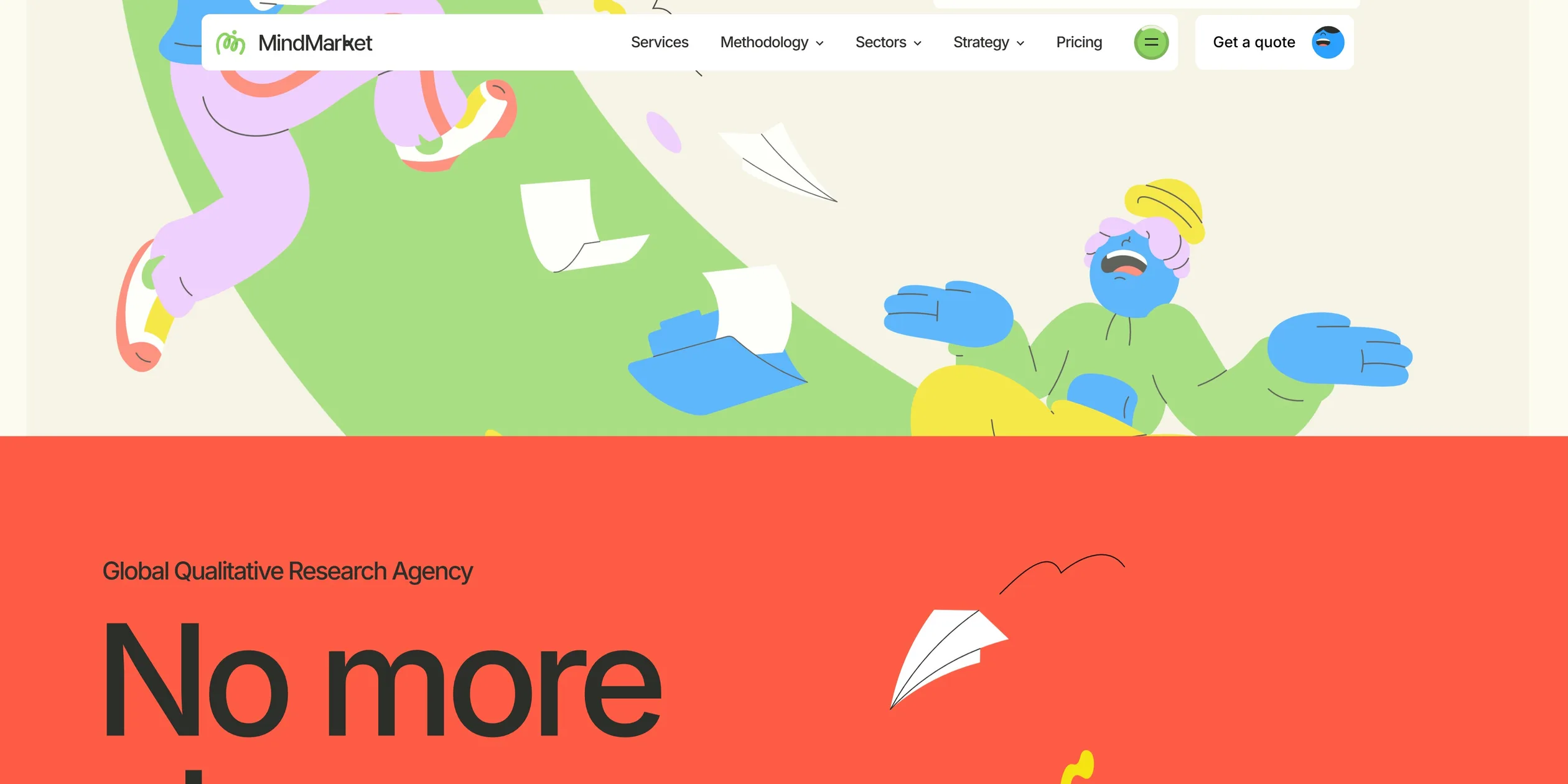
MindMarket is the website of an international qualitative research company, and it draws that company's work as a thread connecting businesses to real people. As a visitor scrolls the home page, a very thick green ribbon grows section by section, bends across the page and passes over itself. Along the way it meets more than a dozen hand-drawn animated characters and four cards that introduce the business. Those cards lead to red, yellow, blue and pink pages, and the characters follow into the first screen of each one. A company that talks about research methods ends up reading like a picture book you scroll.
The site was made by Louis Paquet, the studio KOKI-KIKO and the development studio Domaine Public. It won Awwwards Site of the Day and the Developer Award on December 29, 2025, then became the Awwwards Site of the Month for December.
01Concept
MindMarket was founded by Sina Salah and Kais B.H. Salah, and it has offices in Dubai and London. The company does qualitative research, which means learning through interviews, focus groups and field observation why people think and act as they do. Its About page says the founders started it because they were tired of how global research was being done, with too many layers, too much chaos and not enough meaning. Its main selling point is therefore one project lead from start to finish, and the company reports more than 60 countries and more than 400 projects.
A service like this is hard to show, because there is no product to photograph. In its case study on Awwwards, KOKI-KIKO says most research websites speak the language of data, while MindMarket chose to speak the language of people, so the challenge was to make qualitative research felt rather than to explain it. The idea the team found was a thread. The thread stands for MindMarket's role as a connector between companies and consumers, between cultures, and between raw conversation and usable conclusions. The team says the thread shaped the brand expression, the page structure and the technical approach from the start. The company's logo is also a single looping line.
The site also has a business to run. Deven Caron of Domaine Public writes on deven.ca that the team built a custom platform to capture leads and manage enquiries in one place. So the site has two jobs. The home page makes the company memorable, and the inner pages explain the methods, sectors and regions before leading visitors to the enquiry form.
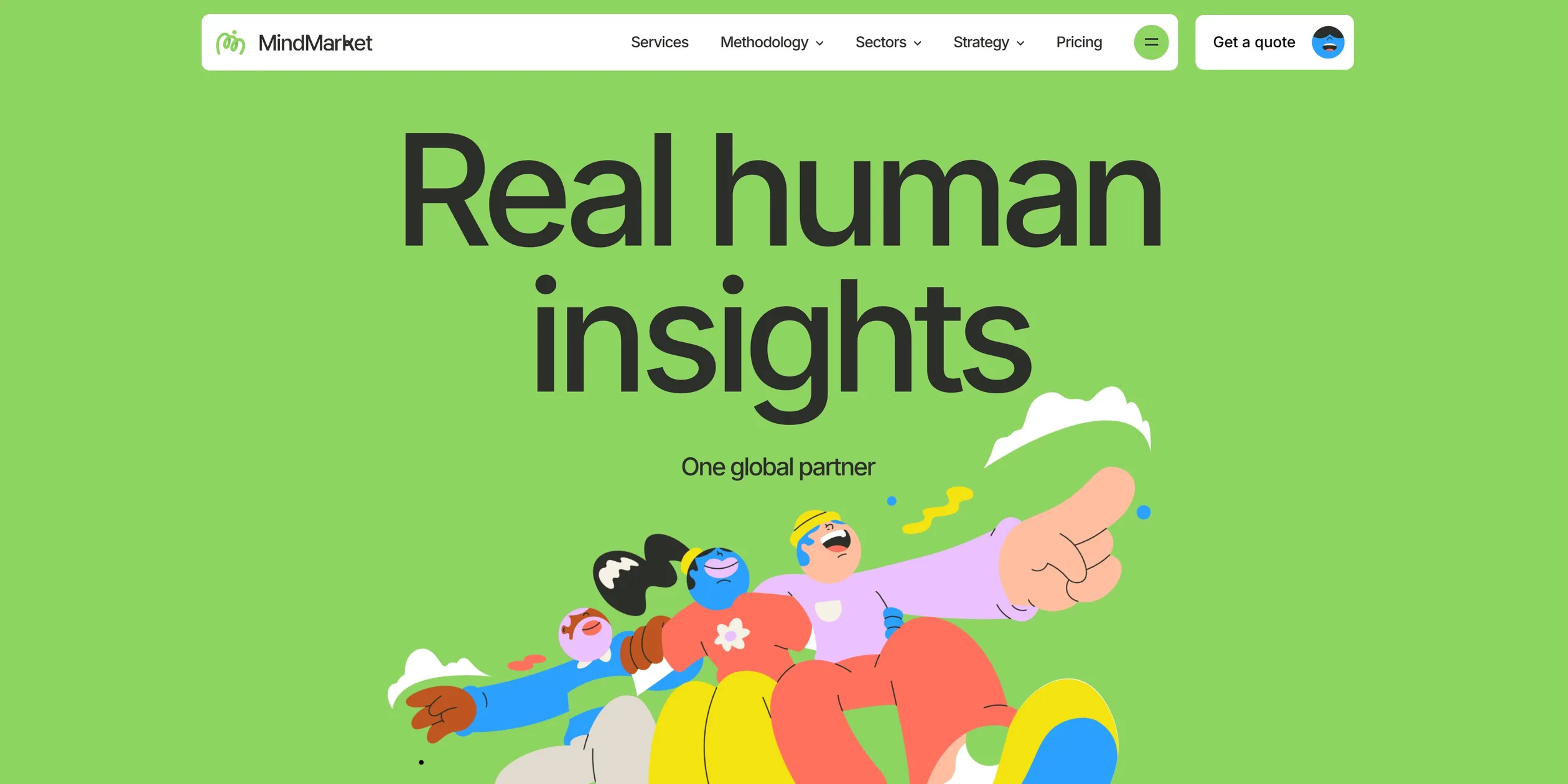
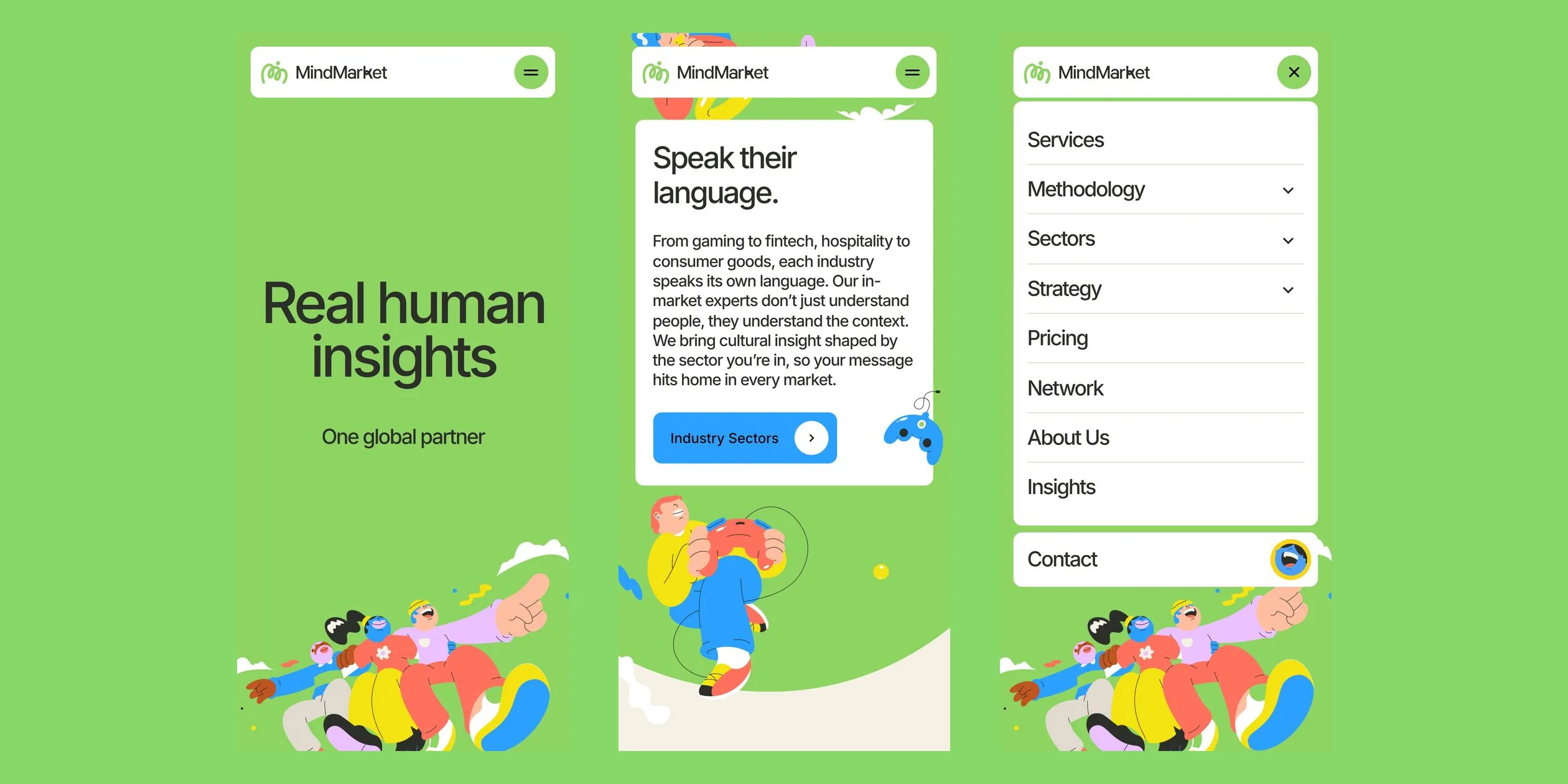
When a visitor opens the home page, the green logo first draws itself on a beige curtain. The curtain lifts to reveal a green first screen that reads Real human insights, with a crowd of characters pushing up from the bottom edge and the one in front pointing ahead.
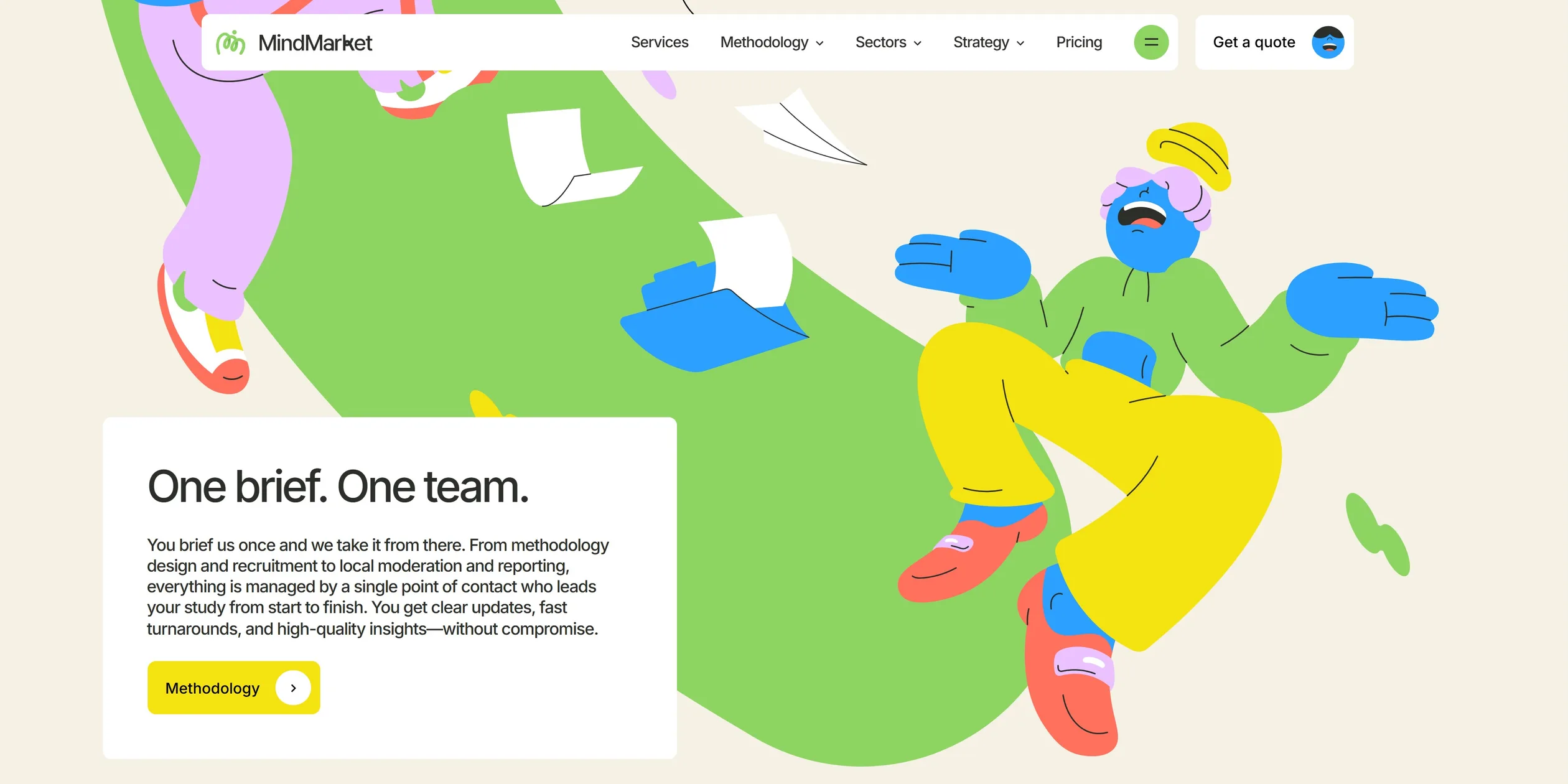
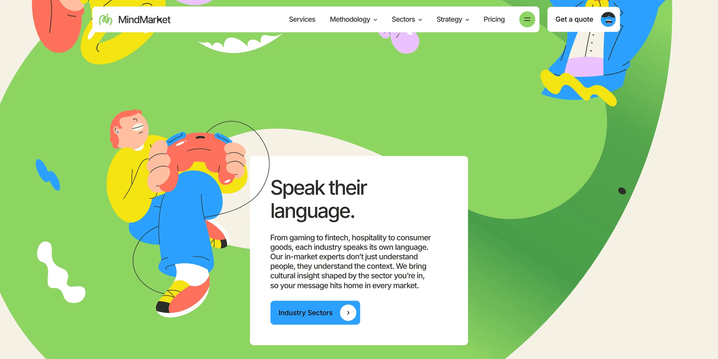
A beige panel slides up to introduce the company, and then the green ribbon starts to grow. The ribbon passes four stops, each a white card with one line about a client's pain, namely No more chaos., One brief. One team., Speak their language. and Global, for real.. These four stops match the Services, Methodology, Sectors and Network sections of the navigation, so the ribbon also works as a contents page. By the end of it, a visitor knows what the company sells.
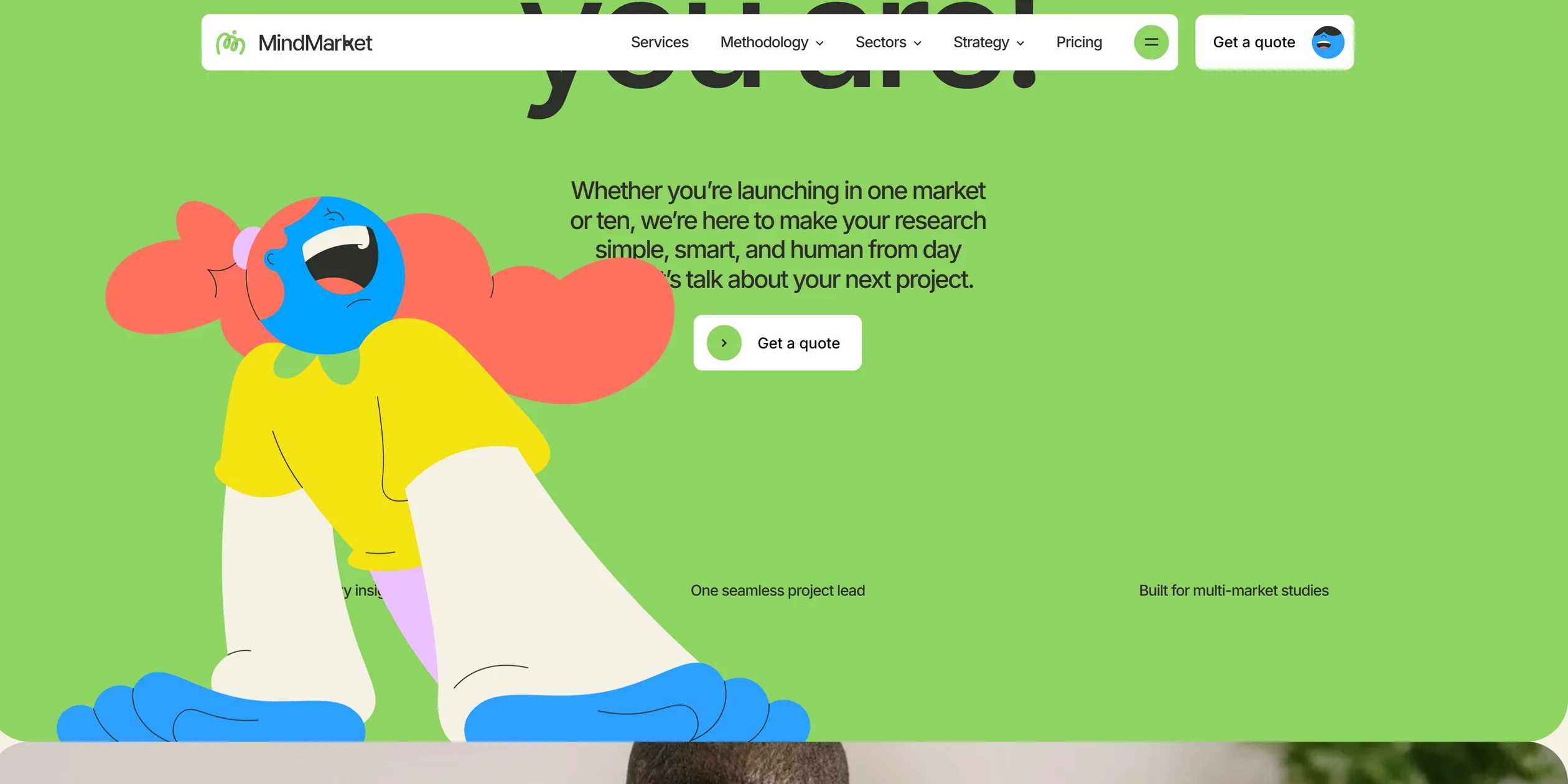
The home page gives feeling first and evidence second. After about eight screens the ribbon lands in a bed of flowers, with characters riding past on a unicycle, and a green panel says Ready when you are! with the quote button in the centre of the page. The content then switches to photographs and numbers, running through more than 60 countries, more than 400 projects and more than 50 clients, then articles and a wall of brand logos, and finally the yellow closing panel, Let's Connect. Visitors are drawn in by the pictures first and only then reach the material that can persuade a buyer.
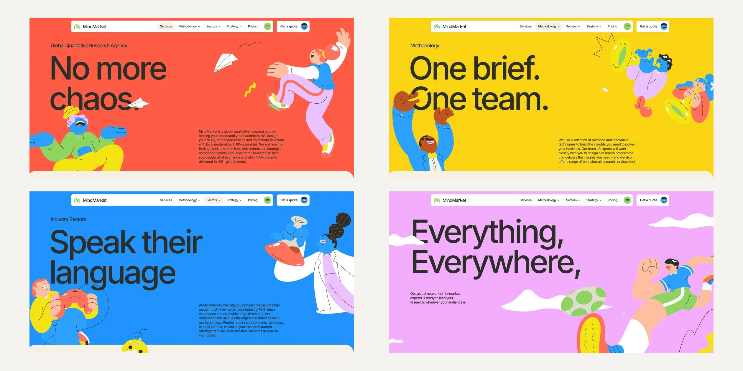
The buttons at the four stops lead to four coloured inner pages, and the first screen of each reuses characters from the ribbon. Visitors who leave the home page are therefore still inside the same picture book. Further down, these pages turn into regular content layouts. The whole site has about 77 URLs, including twelve research methods, twelve sectors and a set of articles, and this long content mainly serves search and clients who are comparing agencies carefully.
This report measures the live site in November 2026. A web crawl from December 15, 2025 shows that the home page ribbon, the 13 character animations and the page components were the same then. The pricing page and the Customer-Led Strategy section were not in the navigation at that time, so they were added after the award.
02Design
The visual rule of this site is to give all the colour to the illustrations and keep the type and interface quiet. Characters and props are flat areas of colour, with thin black lines only for folds and expressions, and there is no volume or realistic light. The illustrations are hand-drawn, and the team says they use no stock or AI-generated imagery. The type stays dark charcoal, and most interface parts are small white cards. This clear division lets visitors find the words at a glance even on a very colourful page.
The thickness of the ribbon is the most unusual decision in this design. On a screen 1920 pixels wide it is about 500 pixels across, thicker than any character's body, so it reads less like a line and more like a road or a meadow. Cards, folders and characters can sit on top of it, and it divides the page without any borders or labels. This turns an abstract idea into the main subject of the picture. It also makes the home page long, since a visitor has to scroll about eight screens to reach the end of the ribbon.
The place where the ribbon crosses itself is the high point of the picture. The ribbon loops around here and its second half lies over its first half, with a dark green gradient shadow where they overlap. Everything else on the page is flat, so this gradient stands out, and a visitor sees at once that the ribbon has a front and a back. The ribbon appears on other pages as well. The About page strings its process together with a blue ribbon, and the blue ribbon on the 404 page is covered in the number 404.
The palette has seven colours. Brand green #8ED462 fills the ribbon and the first screen, beige #F5F1E4 is the page background and charcoal #2C2E2A is the text. Red #FF705D, yellow #F5E211, blue #2BA0FF and pink #EBC1FF each own one part of the business. These four colours appear on the characters' clothes and on the card buttons, so the Services button is red and the Services page it opens is red too. Visitors learn from the colour where they are going before they click.
The site uses a single typeface, Inter, in only two weights, 400 and 500. The first-screen title is 9.7% of the screen width, about 186 pixels at 1920, with line height pressed to 0.95 and letter spacing tightened to -0.06em. Body text is only 17 to 19 pixels, with letter spacing of -0.04em. Type size changes continuously with the screen width through a formula. Inter is neutral on its own, and the tight large setting gives it a little poster character. The nearly tenfold gap between titles and body text creates hierarchy without any extra typefaces.
The interface parts reuse a very small set of shapes. The top navigation is a white card floating over the page, with a separate Get a quote card to its right, so the enquiry link stays available at every scroll position. Cards and buttons have a 10-pixel radius and large content panels have a 50-pixel radius, which makes panels look soft when they overlap. Key words in titles sit on a slowly flowing wavy underline, a small version of the ribbon that also becomes the divider between sections on article pages. Buttons inside the cards have a coloured background and a white arrow dot, and when the cursor arrives the dot moves to the left of the label while the label shifts right to make room.
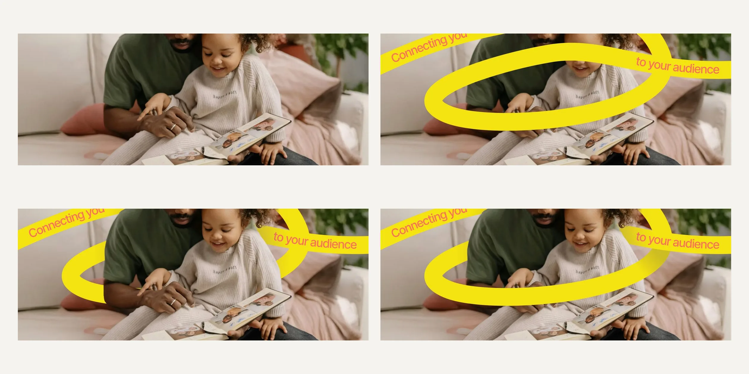
Photography is the second language of this design. Illustration carries personality and photographs carry real people, so from Ready when you are! onward the home page uses warm portraits, and the inner pages use the same kind of photo in their body content. The two languages meet in one photograph on the home page, where a yellow ribbon reading Connecting you to your audience loops around an adult and a child. Part of the ribbon passes behind them and part passes in front, which carries the thread idea into the real world.
On phones the ribbon becomes a narrow route that was redrawn specifically for that size, and the characters and cards are rearranged, so the layout is not a shrunken desktop page. Cards fill the width of the screen, characters sit between them, and each screen covers one thing. The top navigation keeps only the logo and a green round button, which opens an expandable menu. The enquiry link sits at the bottom of the menu, with the same small face.
03Motion
The opening shows visitors the thread at once. On a computer, the green logo draws itself in 1 second, its shadow segments fade in around 0.4 and 0.6 seconds, and the small dot on the logo springs into place. At 1.25 seconds the beige curtain starts to close upward over 1 second, with large round corners on its lower edge. The crowd of characters then springs in on the first screen and the top navigation slides down from above. Touch devices and narrow screens skip this opening.
The first screen leaves in step with the scroll. As a visitor scrolls down, the title and tagline shrink to 80% of their size while a dark layer slowly deepens over the background. The beige panel slides up from below and covers the first screen. This is one continuous action, so scrolling back plays it in reverse.
The ribbon is the signature motion of the site, and it follows the scroll position completely. It stops when the wheel stops and retracts when the visitor scrolls back, so visitors feel they are pulling the thread out by hand. The first half of the ribbon follows an unusual curve that starts very slowly and suddenly speeds up in the middle. In the first big bend the tip rises from below the screen to the upper middle, and in the large returning loop it briefly drops below the screen before coming back to the crossing. The second half then grows at a steady rate, with the tip staying near the middle of the screen. The shadow fades in only after the second half has started to cover the first, so visitors see the ribbon land first and the depth arrive after it.
The cards and characters at the four stops play a short action by themselves when they enter the screen, which contrasts with the hand-driven ribbon. Each card pops out in layers. A backing in that stop's colour scales up from 0, overshoots to 1.09 and settles, and 0.2 seconds later a white backing covers it with the same bounce, so a flash of colour passes as the card appears. The title, body text and button then start to fade in at 0.3, 0.35 and 0.45 seconds, and the whole group is in place after about 0.9 seconds. Characters spring up from 75% of their size and 100 pixels lower, with an elastic action lasting 1.75 seconds, like a toy pressed down and released.
Once they have appeared, the characters keep performing in loops, such as playing the trumpet, kicking a ball or riding a unicycle. Rive plays these actions. Rive is a vector animation tool in which an animator builds the loop, and the page only plays it, so character movement has nothing to do with the scroll. Small props such as sheets of paper, musical notes and paper planes do follow the scroll, sliding at different speeds relative to the page to create depth.
Transitions between pages also work with a front layer and a back layer. When a visitor clicks a link, the current page shrinks to 90%, sinks slightly and fades to half opacity. The new page rises from the bottom of the screen and covers it. Both actions run together for 0.75 seconds, starting a little slowly, moving fast in the middle and settling gently at the end. The old page shrinks from the visitor's current view, so even deep in a long page the picture never jumps back to the top first.
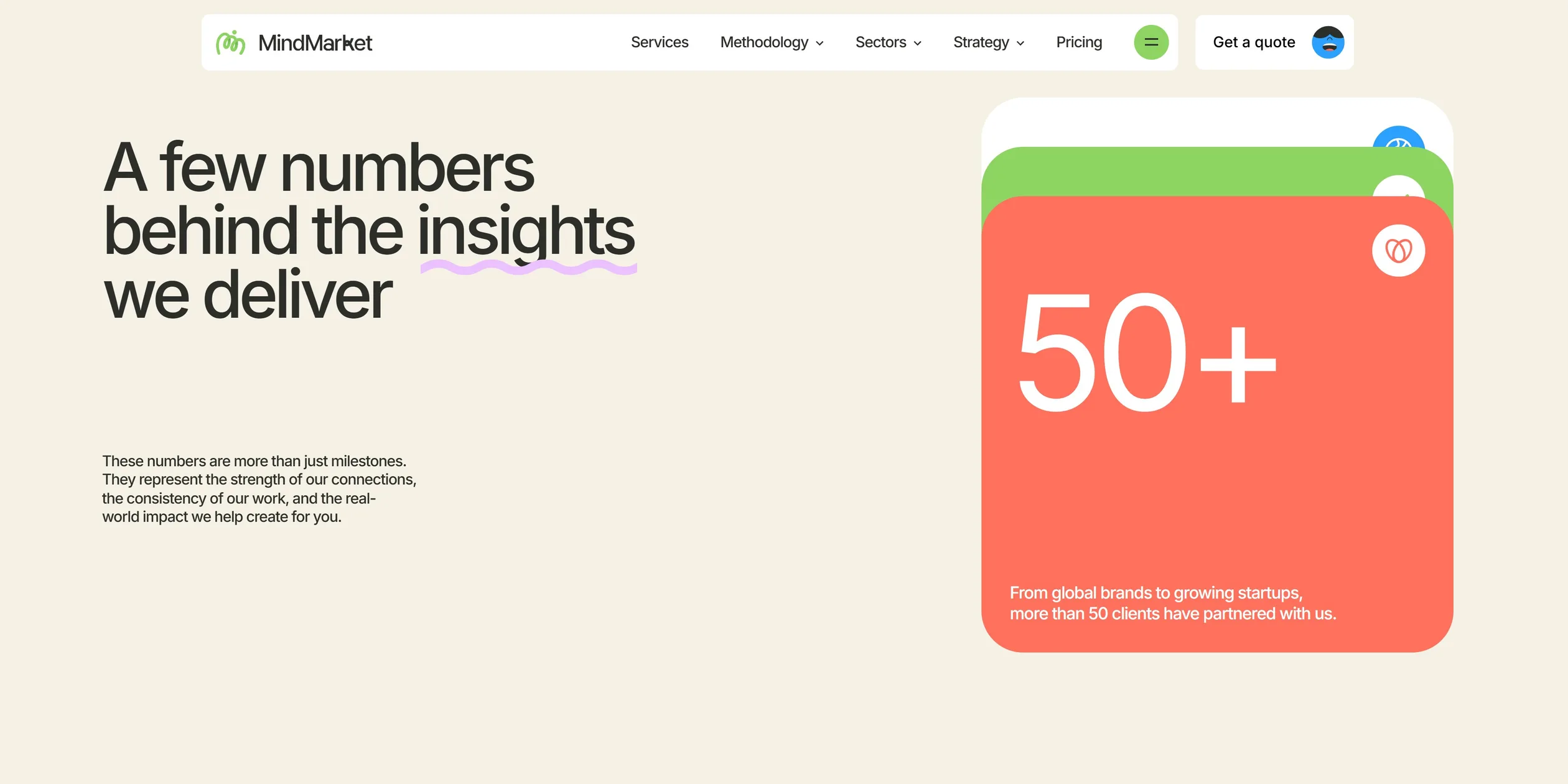
The numbers section uses stacked cards for its rhythm. The title on the left stays fixed while three large cards scroll up one after another on the right. Each starts tilted by 10 degrees, alternating left and right, straightens as it arrives and lies over the previous card, leaving only the top edge of that card visible. This action follows the scroll, so by the third card the three numbers have become a neat pile.
The wall of brand logos further down uses three horizontally moving bands, which have a looser link to the scroll. When a visitor is still, the bands drift slowly, and the third moves at about 40 pixels per second. As soon as the visitor scrolls, the band speeds up to more than 200 pixels per second and turns to follow the scroll direction.
Small parts all respond with a little spring, sharing one slightly overshooting curve and usually lasting 0.4 seconds. The most playful small actions on this site are saved for the enquiry links. The Get a quote button holds a small blue face whose features lean toward the cursor. When the cursor reaches the button, the button turns yellow and the face opens its mouth in a wide laugh. On the Ready when you are! screen, moving the cursor onto the button makes a character pop up from the lower left corner in 0.3 seconds, and it drops away when the cursor leaves. Both actions appear only on enquiry buttons, so they reward visitors with a small surprise for reaching the last step.
All these actions stay steady together. Two continuous scrolls down the home page both ran at 60 frames per second, with no slow section.
04Engineering
The site uses Astro to generate static pages and Swup to move between those pages without a full reload. Each interactive part is a very small custom element, such as c-rive, c-rail and c-homepage-timeline, and a page loads a script only when it uses that part. Content lives in DatoCMS, styling uses Tailwind 4, and the site is deployed on Netlify. This structure keeps content pages as ordinary web pages and adds the experience layer only where it is needed, so one site can hold more than seventy URLs of content and also run full-page animation.
The ribbon is three SVG paths with a stroke-width of 500, drawn inside a container with a fixed aspect ratio. main-path is the first half and secondary-path is the second half. shadow-path sits between them, covers only the crossing and uses a linear gradient for its stroke. The team says the only purpose of a separate second path is to render above the shadow, which is a simple way to get depth from drawing order.
GSAP's DrawSVG plugin places the three actions on one paused timeline. The first half runs for 0.9, the second half follows for 1, and the shadow fades in over 0.15 starting at 0.95. Locomotive Scroll watches the container and sends out a progress value from 0 to 1 in a pathProgress event, and the component passes it straight into the timeline's progress(). The container's entry offset is -27%, so the ribbon starts to grow while the top of the container is still below the screen. In a 1920×945 window this progress runs from a scroll position of 532 pixels to 7057 pixels.
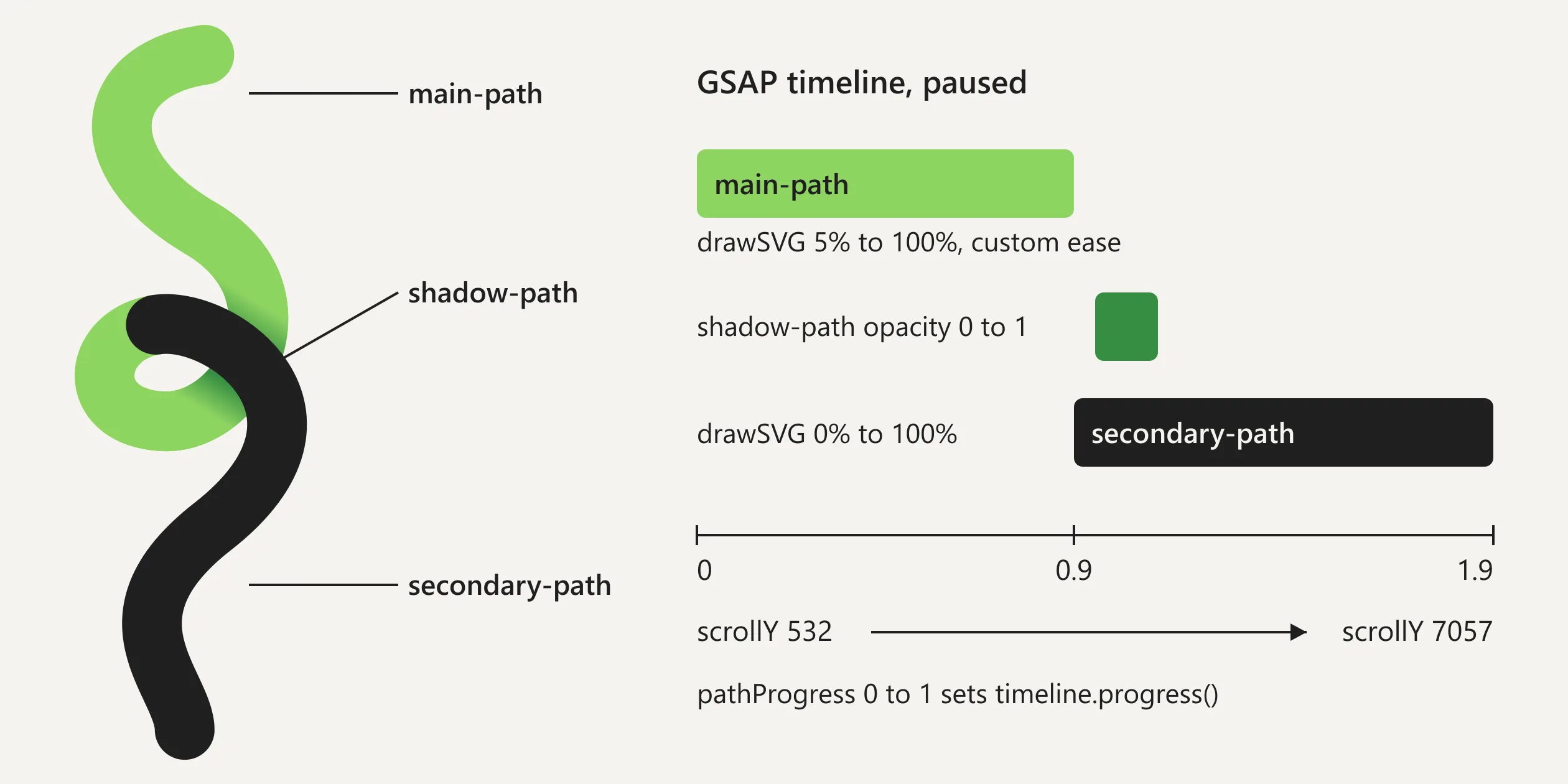
The custom easing on the first half is the key to this effect, because it corrects the mismatch between the path and the scroll. Path length is not proportional to page height, and a long stretch of path in a bend covers very little vertical distance. With linear drawing, the tip would drift away from where the visitor is looking. The team wrote M0,0 C0.952,0.017 0.744,0.69 1,1 with CustomEase, which barely moves early and then rushes to finish.
At a scroll position of 2120 pixels, only about 900 units of the path are drawn, and the tip sits 386 pixels down the screen. Over the next 1500 pixels of scrolling the remaining 4800 units are drawn, and only the large returning loop sends the tip briefly below the screen. The second half runs downward without doubling back, so linear easing is enough, and its tip stays between 316 and 657 pixels down the screen. The team lists this tuned easing among the reasons the effect works.
Everything along the ribbon sits in the same container and is positioned with percentages. The team says the home page has 85 animated and static elements, placed one by one at each breakpoint. Percentage positioning means these elements share a coordinate system with the path, so they scale together when the screen widens and never drift off the ribbon. Below a window width of 1000 pixels the component switches to another set of paths with a stroke of 250 and another timeline, the elements use another set of percentages, and max-md:transform-none! turns off the parallax on the props. The blue ribbon on the About page reuses the same pathProgress event, but splits its paths across a lower and an upper SVG, so the ribbon passes behind the content and then over it.
The character animations are organised very economically. Each of the 13 animations on the home page is a separate .riv file of 12 to 44 KB, about 300 KB in total, and Rive's canvas-lite runtime draws each one to its own 2D canvas. Each file has one looping timeline and a state machine with no inputs, so the page and the animations need no complex communication. The c-rive element uses Intersection Observer to call startRendering() when its canvas enters the viewport and stopRendering() when it leaves, so usually only one to four animations run at a time during scrolling. The elastic entrance is not in the Rive files. GSAP applies it to the canvas wrapper, which lets the team tune the entrance of every character in one place.
Firefox is the exception to this approach. With the browser identifier changed to Firefox, the 11 characters along the ribbon stop playing and hold a single frame. These elements all carry data-disable-firefox-renderer, which suggests the team was avoiding a rendering problem in Firefox.
The small face on the quote button is the Rive file on the home page that really talks to the page. Its state machine has two inputs, isIdle and isSmiling, and its view model exposes two numbers, posx and posy. The component listens for mousemove on the whole window, maps the cursor's position relative to the canvas into a range from -90 to 20 and writes it to these two numbers. When the cursor leaves the window, the script returns the face to its starting position with a linear interpolation factor of 0.1.
The scroll layer is Locomotive Scroll 5, which uses Lenis for smooth scrolling with default settings. Many animations have no script of their own and rely on attributes on the element. data-scroll-speed creates parallax, and data-scroll-css-progress writes progress to the CSS variable --progress, from which calc() works out position, rotation and scale. The straightening number cards and the shrinking first screen both work this way, with each element's start and end values in the stylesheet. This turns scroll animation into a styling task, so tuning it does not touch the scripts.
The ribbon photo uses four layers to pass the ribbon through the people. The bottom layer is the full photograph, the next is the rear part of the ribbon, above that is a cut-out PNG of the people, and the top layer is the front part of the ribbon. The lettering on the ribbon is vector outlines, which is how it can follow the curve. Both photo layers share one parallax speed and both ribbon layers share another, so the ribbon slides slightly against the people during scrolling and adds to the sense of space.
Page transitions combine Swup and CSS. On leaving, the script stores the current scroll position in --scroll-y and sets the scale centre --transform-origin to the middle of the viewport. clip-path trims the old page down to the current screen. The new page is positioned absolutely at the same height and slides from 110svh to 0. The old page therefore seems to shrink in place, with no need to scroll back to the top.
Swup preloads the target page on hover, so the animation can start right after a click. The script waits 850 milliseconds after the page content is replaced before it starts Locomotive again, which avoids position calculations during the transition. Filters on the article list use a Swup fragment update that replaces only the list.
Download size is well controlled on the home page, while the About page has an obvious leak. The site's own files on the home page come to about 1.2 MB, and the largest is the 236 KB Rive runtime loaded from unpkg. Vector animation and a typeface with only two weights make this size possible on a page full of motion. The About page reaches about 6 MB, and traditional.riv alone is 3.5 MB, although it is only a small round avatar in a comparison table. Its counterpart on the other side of the table, new_approach.riv, is 5 KB, so this file very likely carries an export mistake, and it is more than ten times the size of all the home page animations together.
Visitors mostly wait for the opening animation. First paint on the three pages measured falls between 0.24 and 0.34 seconds, but the full first screen of the home page appears after about 2 seconds, once the logo has drawn. This wait is the length of the opening animation and not a download delay. Touch devices have no opening, so the text appears directly.
Keyboard visitors can get through the site, but they have a long navigation to cross first. Focus keeps the browser's default outline, dropdown menus open on focus, and Esc closes them. There is no skip link, however, and the dropdown links all stay in the focus order, so it takes more than 45 presses of Tab to get past the first screen. The site reads the reduced motion setting only for video and the estimate tool. The ribbon, characters and page transitions on the home page ignore it, which is the biggest problem on this site for visitors sensitive to motion.
05Scores and Team
| Award | Source | Date | Score |
|---|---|---|---|
| Site of the Day | Awwwards | 2025-12-29 | 7.85. Design 8.09 / Usability 7.48 / Creativity 7.95 / Content 7.75 |
| Developer Award | Awwwards | 2025-12-29 | 7.55 |
| Site of the Month | Awwwards | 2025-12 | Monthly awards have no separate score |
Design is MindMarket's highest score, which fits the finish of the hand-drawn illustrations and the ribbon. Creativity is close to 8 as well, since a research company's website is rarely built as a picture book. Usability is lowest, and the long home page and the small body text next to very large titles may both play a part. The developer jury gave Animations its highest score of 8 and Accessibility its lowest of 6.8, which fits the site's lack of support for the reduced motion setting. Domaine Public's website also lists an Idéa 2026 Gold award for this project.
| Credit | Role | Record |
|---|---|---|
| Louis Paquet | Digital creative director and designer in Montreal | Awwwards works 52, SOTY 1, SOTM 2, SOTD 41, HM 51. FWA 3 |
| KOKI-KIKO | Creative studio in Montreal that calls itself the smallest of agencies, and the named author of this project's Awwwards case study | Awwwards works 9, SOTM 2, SOTD 9, HM 9. FWA 2 |
| Kim Levan | The account describes a freelance strategist | Awwwards works 10, SOTM 2, SOTD 10, HM 10. FWA 1 |
| Deven Caron | Co-founder and technical director of Domaine Public, with an account based in Montreal | Awwwards works 22, SOTM 1, SOTD 18, HM 22 |
| Pier-Luc Cossette | Co-founder of Domaine Public, with an account based in Montreal | Awwwards works 30, SOTM 1, SOTD 14, HM 30. FWA 1 |
| Marie-Christine Dion | The account lists mindmarket.com as its website | Awwwards works 1, SOTM 1, SOTD 1, HM 1 |
| Domaine Public | Digital studio in Montreal and the project's developer | Awwwards works 9, SOTM 1, SOTD 6, HM 9 |
Records are cumulative as of November 7, 2026. This is a client project made by a group of Awwwards regulars from Montreal. Going by the roles on each account, Louis Paquet, KOKI-KIKO and Kim Levan cover design and strategy, while Deven Caron and Pier-Luc Cossette of Domaine Public handle development. The accounts of KOKI-KIKO, Kim Levan, Deven Caron and Pier-Luc Cossette also all list a project called Cerebrium, so this is a group that works together repeatedly.
06Archive
- Award date
- 2025-12-29
- Awards
- Awwwards SOTD 2025-12-29, Awwwards DEV 2025-12-29, Awwwards SOTM 2025-12
- Site
- https://mindmarket.com/
- Credits
- Louis Paquet, KOKI-KIKO, Kim Levan, Deven Caron, Pier-Luc Cossette, Marie-Christine Dion, Domaine Public
- Design
- graphic
- Build
- scroll
- Awwwards
- 7.85 / 10. Design 8.09 / Usability 7.48 / Creativity 7.95 / Content 7.75. Developer Award 7.55. https://www.awwwards.com/sites/mindmarket
- Stack
- Astro, Swup, Locomotive Scroll, Lenis, GSAP, Rive, Tailwind CSS, DatoCMS, Netlify, Inter
- Total assets
- Home page about 1.2 MB, including the 236 KB Rive runtime, About page about 6 MB
- Speed
- FCP 268 ms, CLS 0.0025. Home page continuous scroll 60 fps