Son Daven
Son Daven is the website for a resort hotel that the Ukrainian developer blago is building in the Carpathians, and it turns an investment pitch into a mountain dream drawn as a moving line print. The site slices footage of mountains, trees, sheep and birds into vertical bars of varying width in real time, using only a sand colour and a dark brown. As visitors scroll, sheep graze on a hillside made of bars and birds cross the page, while renders and photos of the hotel sit inside this print in full colour. The return figures and floor plans stay in the same world.
The First The Last designed and built the site, with Ivan Chopei on design and development and Maksym Stepenko as producer. It won Awwwards Site of the Day and the Developer Award on 5 June 2026, then Site of the Month for June.
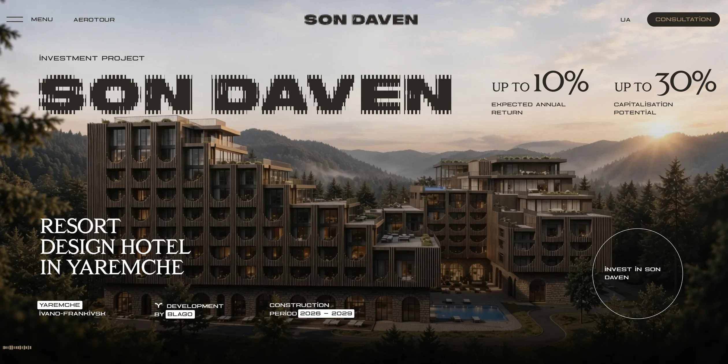
01Concept
blago is the largest residential developer in Ivano-Frankivsk, Ukraine, and Forbes reports it placed second in the 2024 national ranking. Son Daven is the company's first hotel, in the small town of Yaremche, about 35 km from Bukovel, the country's largest ski resort. The project is two nine-storey buildings holding 304 apartments of 37 to 105 square metres, with the first phase planned to open at the end of 2027. The apartments are sold to private investors, who hand them to a management company and collect dividends, so the real job of this website is to persuade investors to buy into a building that does not exist yet. Yuriy Hladkyi, founder of Grape, the agency behind the brand, told Forbes that most hotels in Yaremche are budget or outdated, and that the project gives blago a chance to show itself after years of building mainly housing.
On its case page, The First The Last describes the brief as two jobs, telling a story and generating leads. The team had to balance narrative flow against conversion while staying true to the brand Grape had already set and expanding its visual language. The site's tagline is Once upon a time, the Carpathians dreamed, which makes the mountains a dreaming main character. On its Webflow gallery page, the team says the story is built on Hutsul culture, the traditions of the local highlanders, and on Carpathian nature. While the building exists only as renders, this story gives the site something more memorable than a render.
On a first visit, people see a walking sheep and the line I am a valley of peace, see you in the dreams. When loading ends, a render of the hotel fills the screen with two figures side by side, an expected annual return of up to 10% and capitalisation potential of up to 30%. The site does not hide the numbers until the end. It tells investors what is on offer first and only then begins the story.
About 42 screens follow, ordered from feeling to facts to money. A prologue opens with a monologue from the mountains, then come the project concept and a promotional film, then a map marking waterfalls and markets beside walking times. Eight benefit cards cover food, spa, yoga and children's activities, followed by a construction timeline from 2026 to 2029 and six apartment types. Financial indicators come after the apartments, once visitors know what they would be buying. After the finances, a summer and winter switch shows what this mountain town offers in each season. The developer's record, a gallery, news and nine frequently asked questions come last, there to settle an investor's remaining doubts.
Almost every chapter on this path carries a CONSULTATION button, and the form behind it asks only for a name and a phone number. Beyond the home page, the site has a news list, monthly construction reports and a complete Ukrainian version, and those reports give an unfinished building progress that people can follow.
02Design
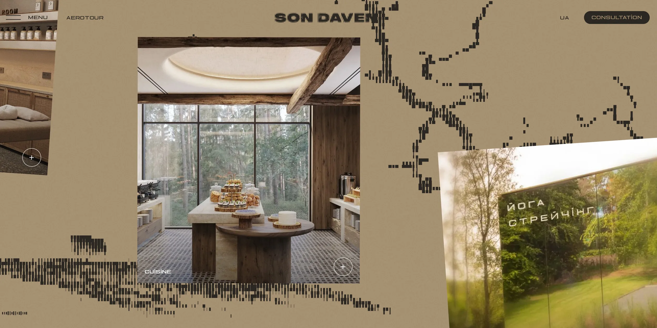
Son Daven's visual rule splits the world into two layers. One layer holds the mountains, sheep and birds drawn in bars, and it uses only sand #A89474 and dark brown #2C2824, the same two colours as the page backgrounds and text. The other layer holds renders and photos of the hotel, which keep their full colour. Visitors can tell at a glance what is legend and what is the building on sale, and the colour images always catch the eye first.
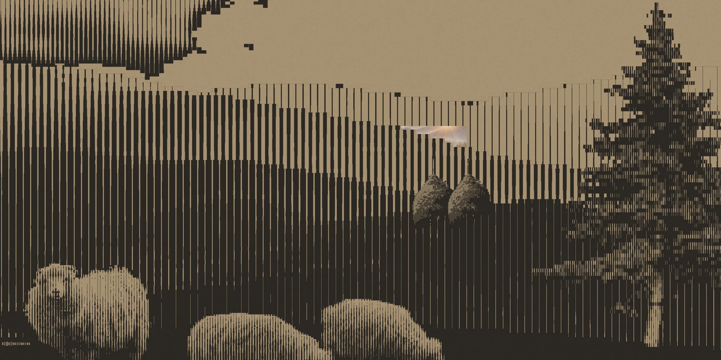
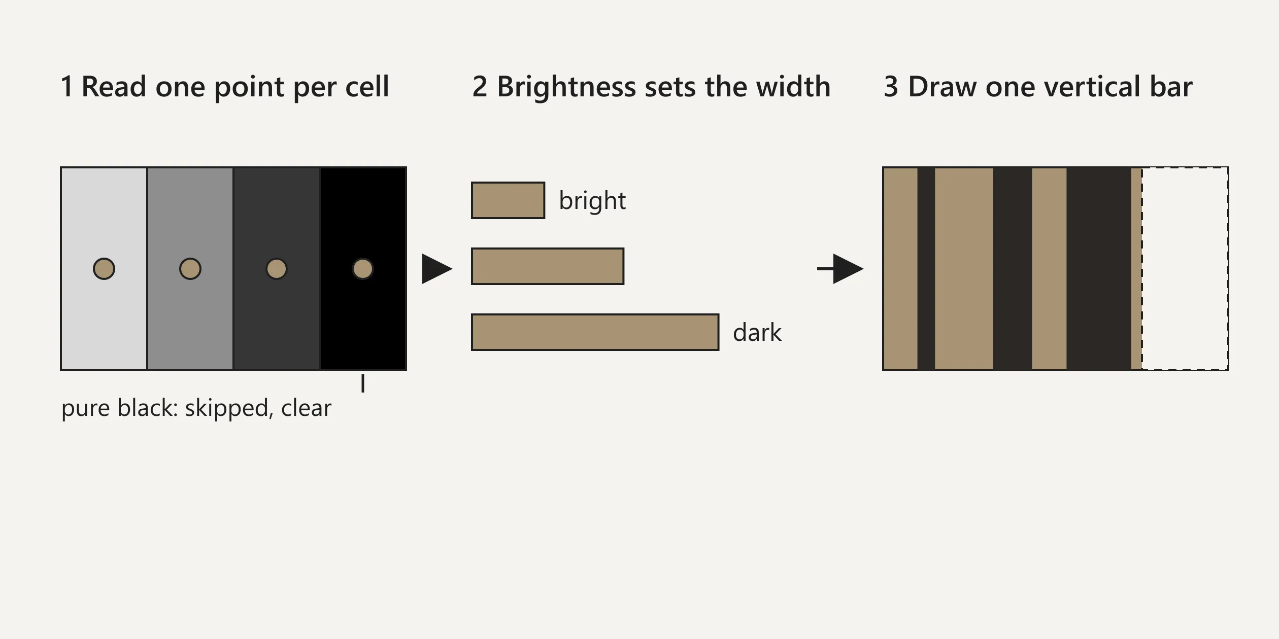
The art direction of the bars comes from one algorithm. The picture is divided into small cells and each cell holds one bar, and darker footage makes a wider bar, so hillsides become thick bars and skies become thin ones. Sheep and birds use a denser grid than the distant mountains, which keeps the layers of the fleece readable while the edges stay stepped, like weaving or an old print. On Webflow the team calls this pixel-art WebGL and video patterns. A very faint grain covers the whole site so that the two flat colours do not look too clean.
The type comes from one family, KTF Metro, by the Ukrainian foundry Kyiv Type Foundry. Headlines use KTF Metro Roman, a wide serif, meaning its strokes end in small finishing details. It is set with tight letter spacing and line height at or below the font size, so a large headline reads like a carved block. Body text uses KTF Metro Blueline, a wide, flat geometric sans with letter spacing opened by 8%. Almost all the text on the site is in capitals, which suits the print, though long passages at small sizes take effort to read. Sizes are based on a 1440-wide layout, with headlines stepping down through 144, 96, 72, 56 and 40.
The layout uses a twelve-column grid with 32-pixel gutters and 16-pixel page margins on that 1440-wide layout. The site sets the root font size to 1% of the screen width and derives every size from it, so the layout scales proportionally on computer screens and keeps its composition like a poster. The interface parts stay restrained. Buttons are capsules, the close button is an X in square brackets, and a small group of bouncing bars at the bottom left switches the sound. Header text flips between light and dark to match the chapter underneath.
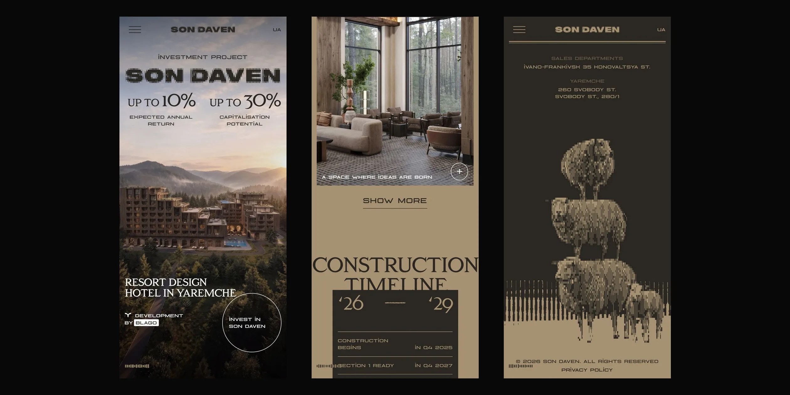
On phones, the same rules collapse into one column. The first screen becomes a portrait render, and the eight benefit cards change from a horizontal gallery into a vertical stack with a SHOW MORE button. The header keeps only the menu, the logo and the language switch. The bar pictures remain, but each scene has fewer layers and the animated scene in the summer and winter section is gone. When a phone turns sideways, the site covers the page with a layer that asks for portrait orientation.
03Motion
All the motion on the site shares one rhythm. Most durations come in three lengths, 0.4, 0.8 and 1.2 seconds, entrances start fast and slow down, and exits start slow and speed up. Large headlines split into words, each word scales up from a different height, and the order is random, so a line gathers as if blown together. Paragraphs rise and fade in line by line, and a group of lines settles within about a second with only a small gap between lines.
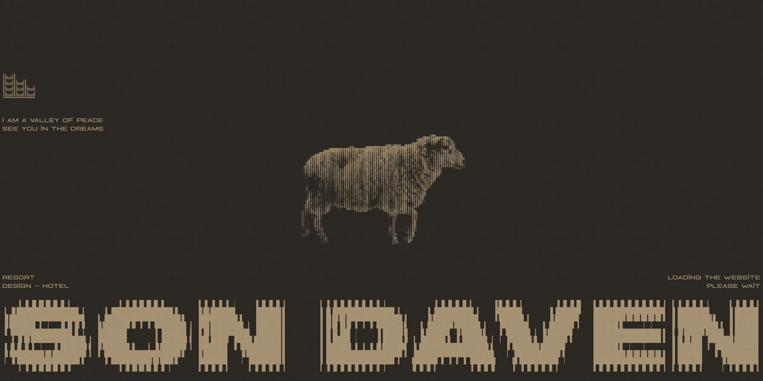
On a first visit, the loading screen opens with this rhythm. A sheep drawn in bars walks on the spot against dark brown, above a large logo running across the screen, while a percentage climbs in the corner. When everything is ready, the logo flies up to its place in the first screen and shrinks, the render behind it settles from one and a half times its size, and the words appear one at a time. This takes several seconds, though the sheep and the logo give visitors something to watch. Returning to the home page in the same visit skips this animation.
The four screens after the opening hold the main scroll move on the site. As visitors scroll, the hotel render becomes a flight around the building, with the camera rising from the front to above the roof. This footage follows the scroll position exactly, so it stops when the wheel stops and reverses when visitors scroll back. The text lifts away and shrinks during the first half. In the final three tenths, the whole picture shrinks to three tenths of its size and settles as a photo inside a sand page, while clouds and mountains drawn in bars close in around it. Visitors move from the real building into the print without a single cut.
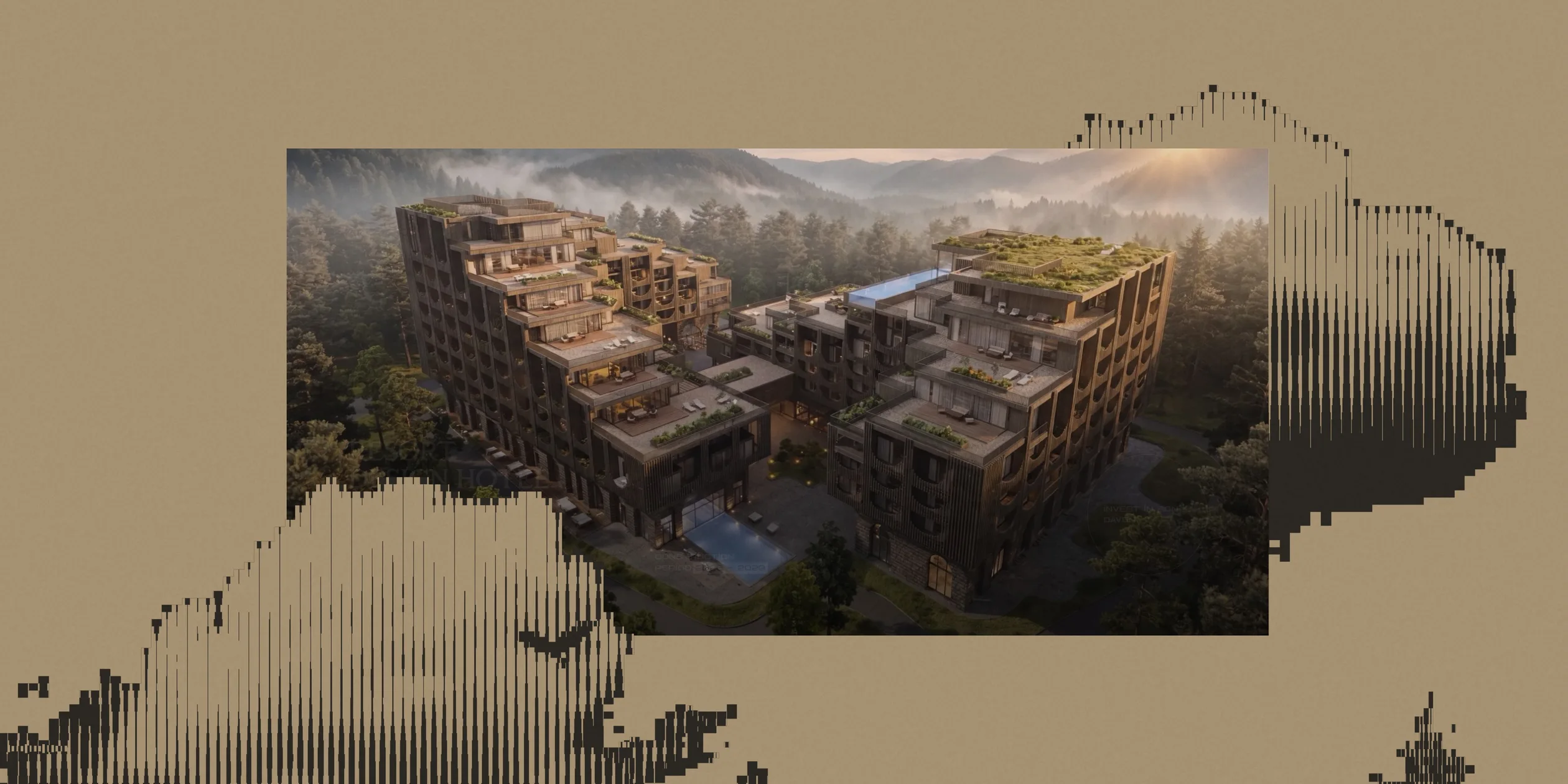
Inside the print, pictures move in two ways. Sheep, trees and clouds are looping clips that keep moving whether or not visitors do anything. Birds cross the whole page at a steady speed in five seconds, then wait five seconds before the next pass. The other kind of motion follows the scroll. Before the benefits chapter, for example, a hole in the middle of the picture keeps growing, so visitors pass through it into the next chapter as if through a cave. The figures and birds inside grow to about four times their size. At the same time the headline WHY SON DAVEN CAPTIVATE scales up from a point to its normal size.
The eight benefit cards make up the longest stop on the page. Scrolling turns into horizontal movement here, and the cards enter one by one from the right. Each card has a random tilt and height, and its tilt slowly reverses as it travels from right to left, so the arrangement differs on every visit. When visitors click a card, a dark brown panel unrolls from its top edge, and a second click rolls it back.
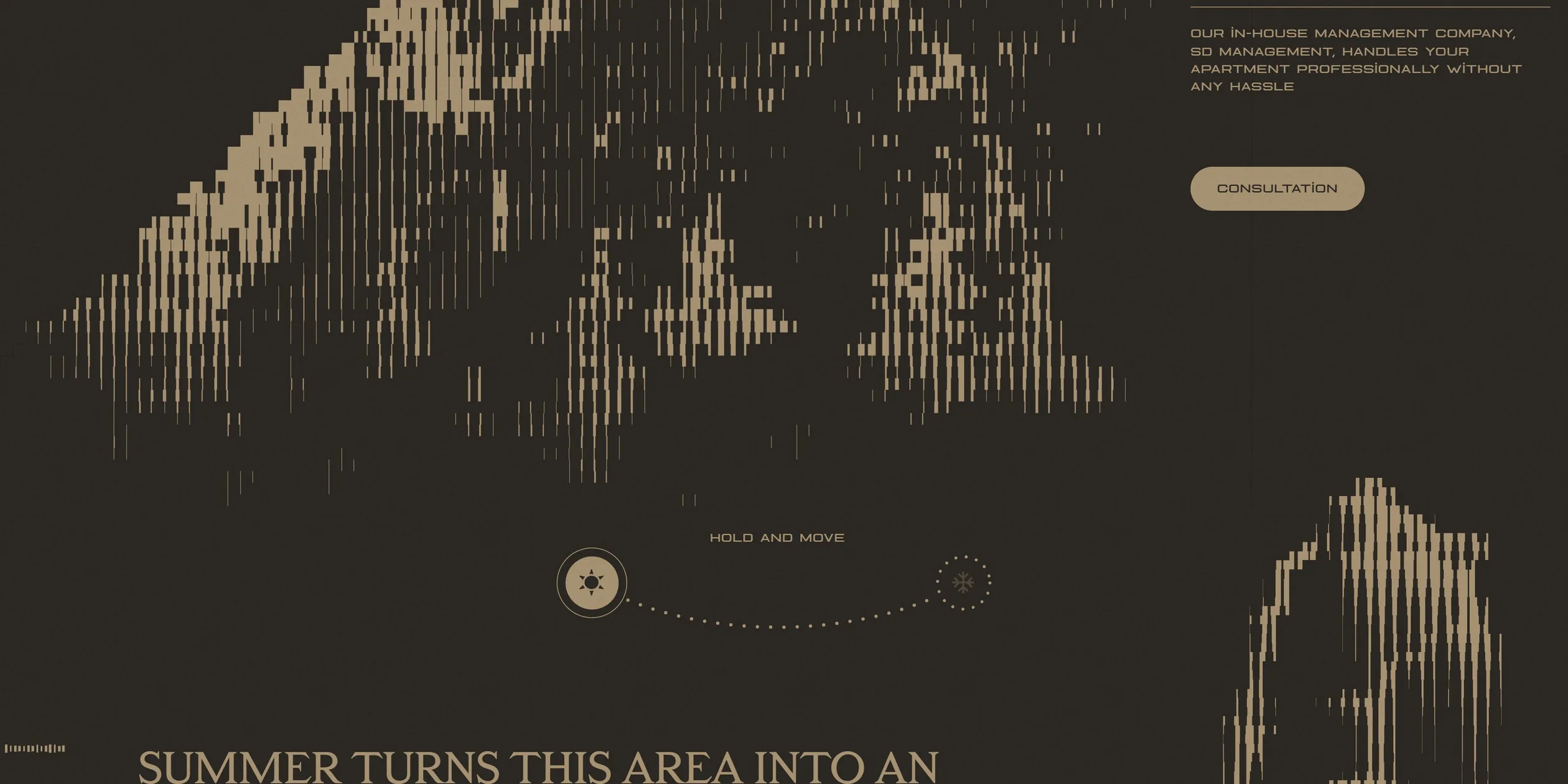
The summer and winter section is the most hands-on moment on the site. An arc crosses the middle of the screen with a small icon at each end, beside the words HOLD AND MOVE. When visitors hold the round handle and drag, it sticks to the arc, and on release it slides to the nearer end. Past the midpoint, the picture changes from the summer mountain to the winter mountain over 1.2 seconds, and the text changes word by word. Visitors can also click the icon at either end.
Responses to clicks mostly share a flipping feel. The consultation window grows from nothing while swinging down around its horizontal axis, and on closing it keeps swinging away downwards. When visitors switch between the six apartment types, the old card spins away to the left and the new one rotates upright from the right. The seven markers on the map grow as the cursor nears them, and the closer the cursor, the larger they get. Button and navigation labels also swap in small, randomly staggered animations on hover. These hover moves exist only on computers, and phones keep the clicks.
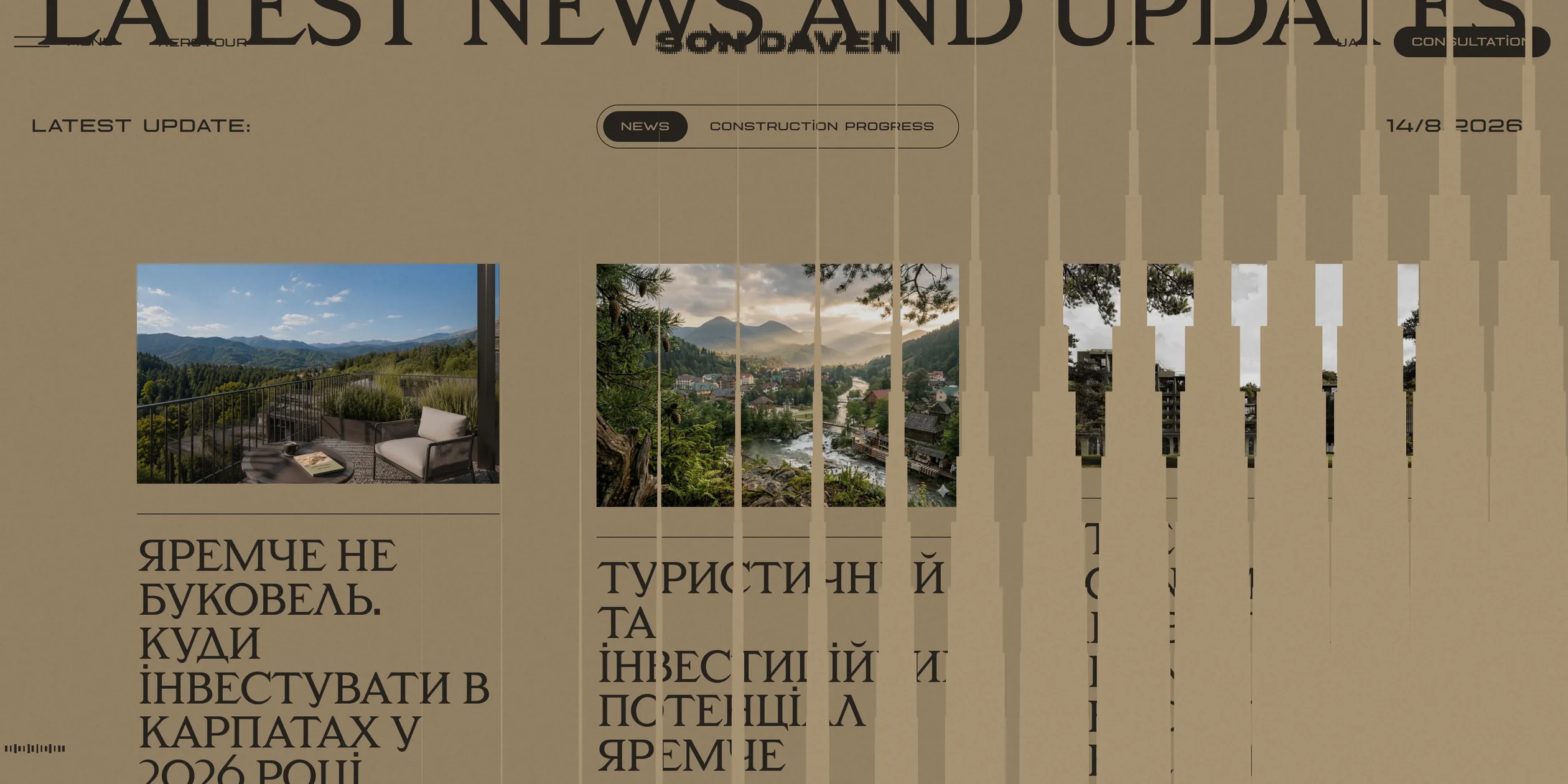
Pages on the site change behind a ragged curtain of bars. After a visitor clicks a news item, 240 small cells open in turn from the right side of the screen towards the left and cover it in about 0.7 seconds. Their edge forms a row of pointed bars that reads as the same material as the home page pictures. When the new page is ready, the cells draw back in half a second. The whole change takes about 2.5 seconds, slower than most, but it carries the site's theme into every jump.
The end of the home page brings the motion back to the sheep. The footer shrinks from twice its size as visitors scroll, and sheep stacked into a tower stand in the middle. Sound is off by default. When visitors click the small bars at the bottom left, a looping ambient track fades in within a second and the bars start to bounce.
04Engineering
Son Daven is built on Webflow, yet the team wrote the signature bar pictures entirely by hand. There is no three.js. Each scene is a raw WebGL canvas holding one full-screen quad and one fragment shader. The shader divides a layer's area into a grid (100 columns by 100 rows by default), reads the footage once at the centre of each cell, works out the brightness and decides how wide that cell's bar should be.
The bar width runs from -2% to 102% of the cell, so the brightest cells hold no bar at all and the darkest cells merge into solid colour. Each pixel only checks whether it sits close enough to the cell's centre line, and paints the foreground colour if it does and the background colour if it does not. The canvas turns antialiasing off, which keeps the bar edges very hard and gives the picture its print quality. The foreground and background colours come from CSS variables at startup, so the pictures and the layout always share the same two colours.
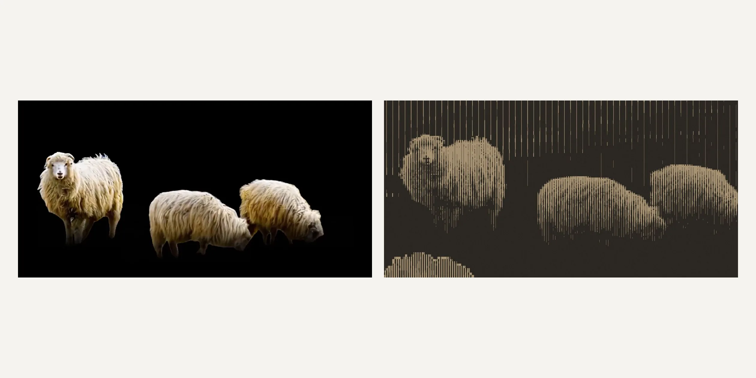
The same shader also takes care of keying. The source material is short colour clips on black, with the sheep and birds already cut out onto pure black. When the shader finds a near-black colour at a cell's centre or anywhere in the 5 by 5 texels around it, it discards the cell, so the black background becomes transparent. Plain H.264 is enough, with no need for a video format that carries an alpha channel. Checking the surrounding texels stops half-lit fringes from appearing around the subject.
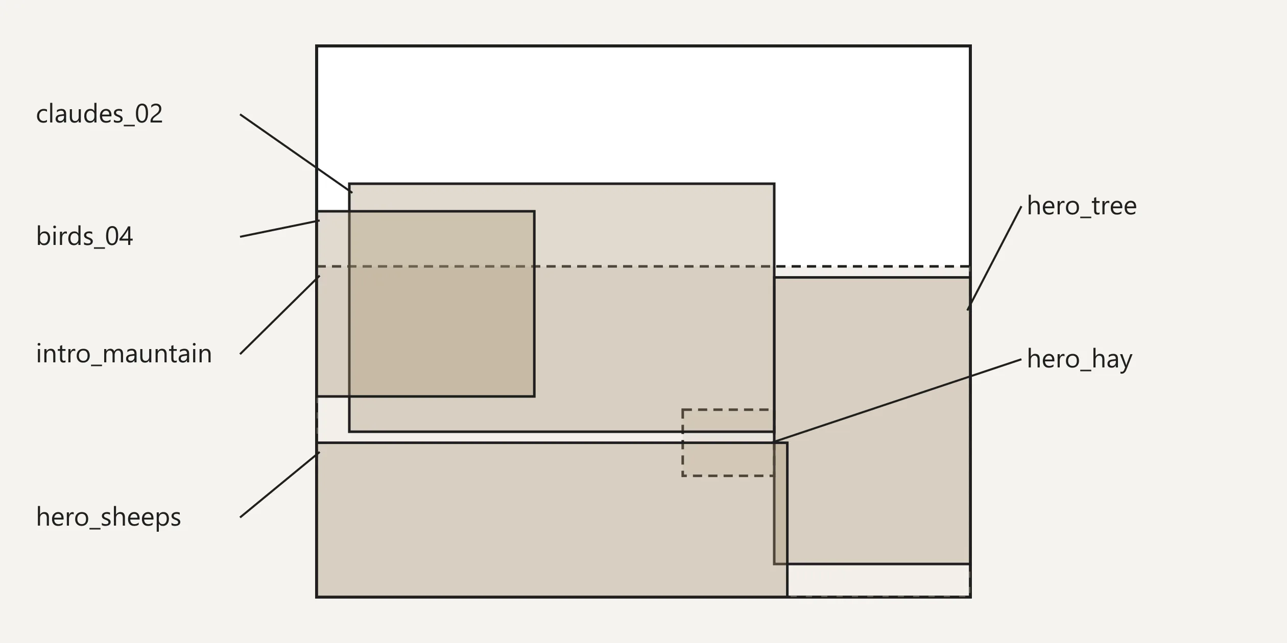
A scene is simply a list of layers. Each layer names a source and a set of parameters, including its position and size on the canvas as percentages, its grid density, and its black and white points. The render loop draws every layer in order on each frame, one draw call per layer, and stacks them with alpha blending. The most complex scene on the home page has six layers, two still images of mountains and hay plus four clips of a tree, sheep, clouds and birds.
Animation never touches the canvas either. GSAP only changes the numbers in these parameter objects, so a bird crossing the page is x tweening from a negative value to 100%, and the shader reads the new value on the next frame. The site's 15 canvases all share this code.
The black and white points are the cleverest parameters in this system. Setting the black point above the white point inverts the picture, so the same clip turns into light bars in dark chapters. Pushing both values to one end turns a layer completely black or white, and with the foreground or background opacity at 0, that layer disappears. The summer and winter switch works this way. The site spends 1.2 seconds pushing one layer's levels to the end and pulling the other back, so the bars thin out one by one until they vanish. The growing hole works the same way, with ScrollTrigger tying position, size and levels to the scroll together.
The flight around the building takes a different route. The site preloads 120 WebP frames at 1920×1080 and draws them on a 2D canvas according to scroll progress, with GSAP's scrub set to 0.25 to add a little damping between scroll and picture. Lenis handles smooth scrolling and runs from GSAP's clock, so the scroll, the frames and the scene parameters share one beat. Barba handles page changes, and every exit destroys all the scenes and ScrollTriggers before the next page rebuilds them.
The two methods differ greatly in weight. The 120 frames total about 22 MB, two thirds of the 34 MB first download. The site's 23 line clips add up to only 2.3 MB and the six still layers to 213 KB, so the entire print world takes about 2.5 MB. The clips can be this small because a 100-column grid has no use for high-definition detail, and each one is a loop of only 1 to 12 seconds.
These clips stay out of the page structure. The script creates 31 video elements in memory, and a canvas only starts playing and rendering when it comes within 20% of the viewport, pausing again when it leaves. Textures update only when a video's time has changed. During scrolling, up to eight clips play at once, mostly in the stretch after the opening and in the benefit cards.
The wait for all this sits in the loading screen. First paint takes about 0.3 seconds, but what appears then is the loading screen. The site holds visitors back until the 120 frames, all the scenes and the fonts are ready. On a first visit the percentage reaches 100% in about 4 seconds, and more than three seconds of opening animation follow, so scrolling becomes possible after about 7.8 seconds. Content barely jumps during loading.
Different devices download very different amounts. Below a screen width of 992 pixels, the site downloads none of the frames, replaces the first screen with one still image, and skips some layers and the whole seasons scene. A visit then needs only about 8.4 MB, a quarter of the desktop figure. The canvas pixel ratio is capped at 1.5, so 2x and 3x screens do not multiply the shader's work. Devices are told apart by screen width, so a narrow window on a computer gets this version too.
A few pieces of text on the pages were missed in proofreading. The apartment cards in the English version show a price of 0 UAH per m², news headlines and the 404 page are in Ukrainian, and the cookie box's confirm button reads Ок in Cyrillic. With the price at 0, investors cannot see a real unit price in the English version.
Keyboard visitors can Tab to the menu, buttons and apartment tabs with a visible focus outline, though the seasons handle does not respond to the keyboard. The site ignores the reduced motion setting entirely, so visitors sensitive to movement still face a page full of animation. Screen reader users meet a messy heading structure, where numbers such as 31min. are marked as top-level headings.
05Scores and Team
| Award | Source | Date | Score |
|---|---|---|---|
| Site of the Day | Awwwards | 2026-06-05 | 7.62. Design 7.7 / Usability 7.16 / Creativity 8.15 / Content 7.59 |
| Developer Award | Awwwards | 2026-06-05 | 8.09 / 10 |
| Site of the Month | Awwwards | 2026-06 | The monthly award has no separate score |
| Business & Services Honors | Awwwards | 2026-05 | The page lists no separate score |
Among the four categories, Creativity scored highest and Usability lowest, which fits the site. The bar print is a language the team invented, and the jury is unlikely to have seen it elsewhere. Small capitals, 42 screens of length and a long first wait all ask more of visitors. The developer jury gave 8.09. Responsive scored highest at 8.4, and the phone version does rearrange its layout and assets. Accessibility scored lowest at 7.4, in line with the keyboard and screen reader problems above.
| Credit | Role | Record |
|---|---|---|
| The First The Last | Creative digital agency founded in 2018. Its website says it is based in Miami and Dubai, and its Awwwards account lists Miami, United States | Awwwards works 50, SOTY 2, SOTM 2, SOTD 25, HM 50. FWA 3 |
| Maksym Stepenko | Producer of this site. The account lists Miami, United States | Awwwards works 14, SOTM 2, SOTD 8, HM 14 |
| Ivan Chopei | Art director at The First The Last and self-described digital design creator and creative developer. The account lists Ukraine | Awwwards works 4, SOTM 2, SOTD 2, HM 4 |
Records are cumulative as of 7 November 2026. The First The Last is a regular at Awwwards, and this was a client project. A credit left in the browser console says Ivan Chopei designed, developed and delivered the site with Maks Stepenko as producer, so the shader and the layout came from the same person. On Webflow the team says the site drew more than 4 million views on Instagram, a figure the team reports itself.
06Archive
- Award date
- 2026-06-05
- Awards
- Awwwards SOTD 2026-06-05, Awwwards DEV 2026-06-05, Awwwards SOTM 2026-06
- Site
- https://sondaven.com/en
- Credits
- The First The Last, Maksym Stepenko, Ivan Chopei
- Design
- graphic
- Build
- scroll
- Awwwards
- 7.62 / 10. Design 7.7 / Usability 7.16 / Creativity 8.15 / Content 7.59. Developer Award 8.09. https://www.awwwards.com/sites/son-daven
- Stack
- Webflow, GSAP 3.13 (ScrollTrigger, SplitText, CustomEase, Flip), Lenis 1.3, Barba, Swiper 11, raw WebGL, KTF Metro Roman, KTF Metro Blueline
- Total assets
- About 34 MB on a first desktop visit, including about 22 MB of 120 frames, and about 8.4 MB on phones
- Speed
- FCP 296 to 352 ms (under the loading screen), scrolling possible after about 7.8 seconds on a first visit, CLS 0.02 to 0.03