Gil Huybrecht
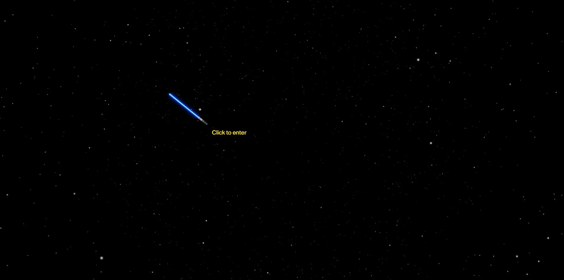
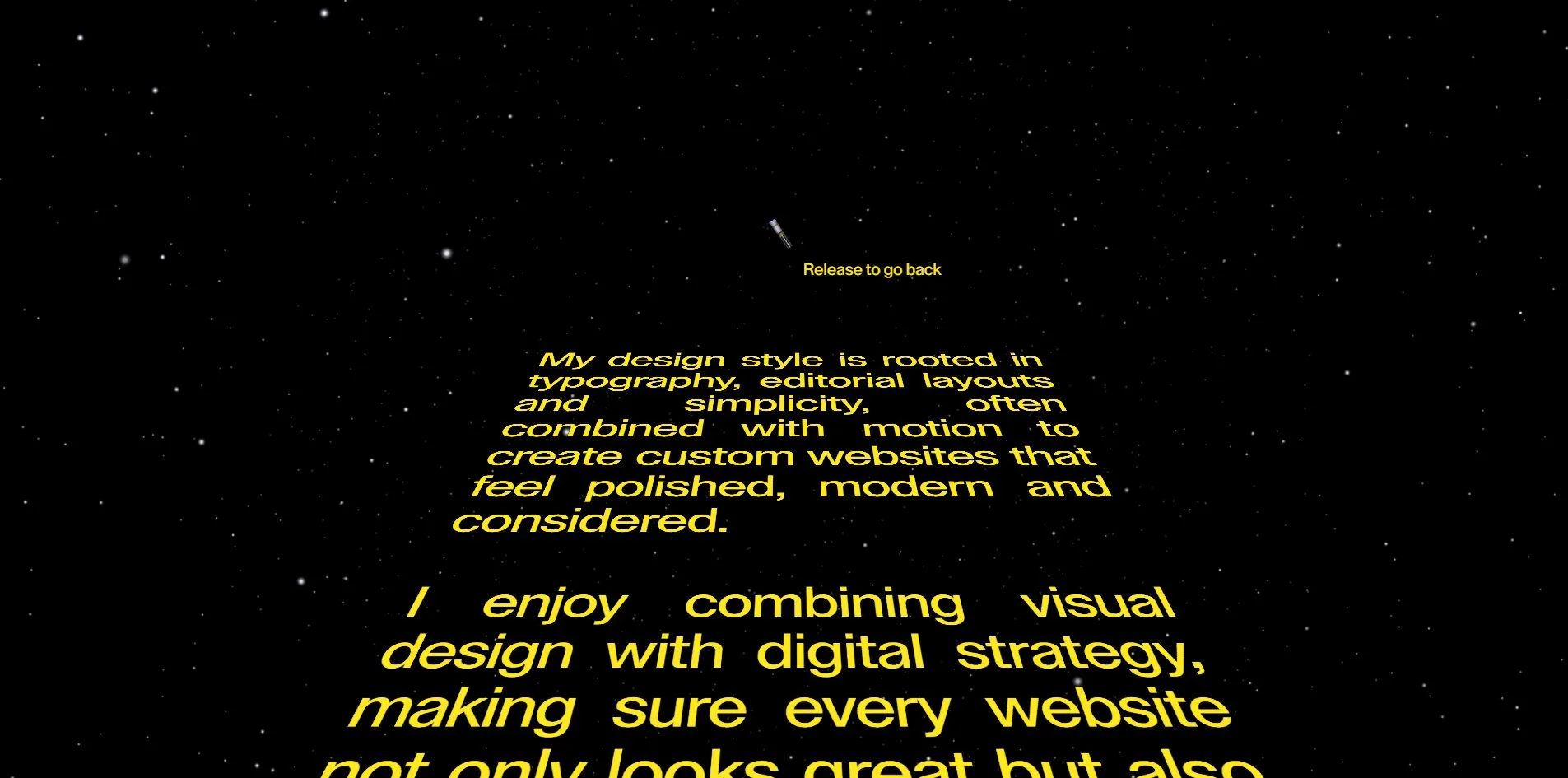
Move the cursor to the bottom right corner, click Star Wars, and this black and white portfolio reloads itself. The loading counter turns yellow, the background fills with stars, the cursor becomes a blue lightsaber, a theme plays as you enter, and if you hold F on the profile page, the paragraphs he wrote about himself become a yellow opening crawl receding into the distance. In normal mode it is a 14 column grid, 84 screenshots from 19 projects in order, one typeface and one size across the whole site. 
Visit site ↗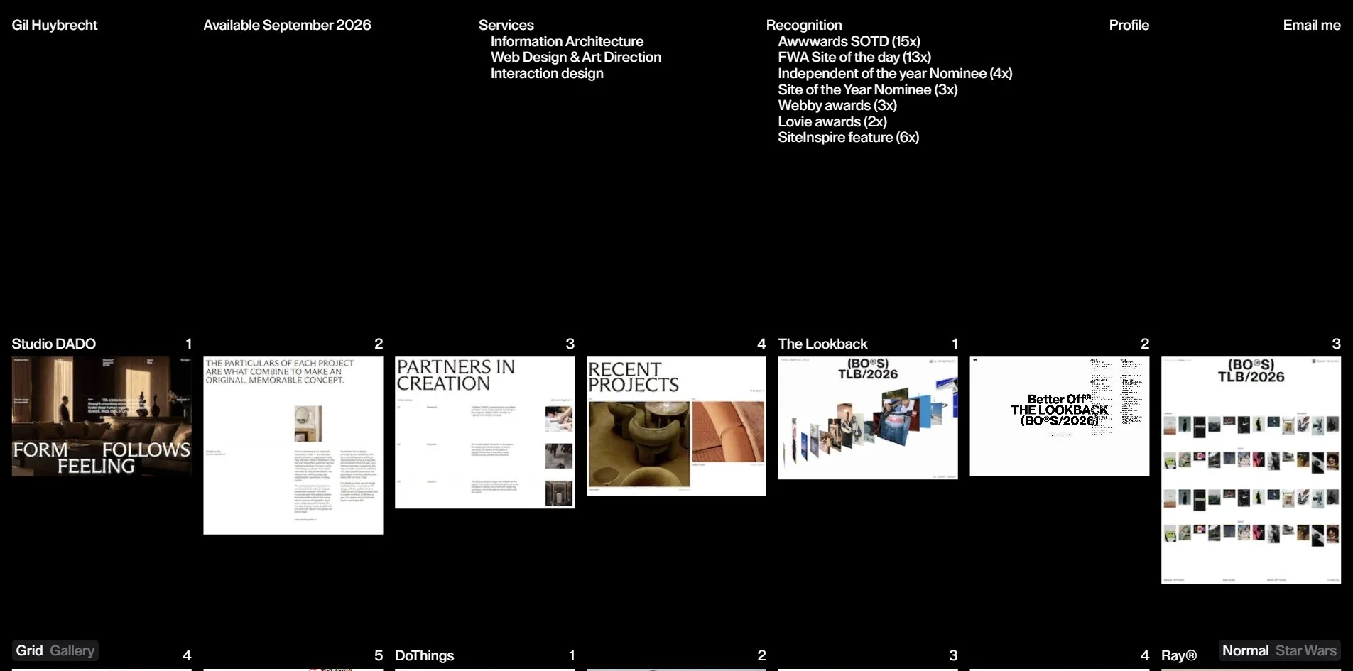
Concept
Gil Huybrecht is a freelance designer and art director in Bornem, Belgium, working on editorial websites, ecommerce and immersive experiences. This version of his site holds 19 projects from 2018 to 2026, for clients such as Sotheby's, Loop Earplugs, the Manhattan towers 53 West 53 and 111 West 57th Street for Douglas Elliman, the Belgian skincare brand Ray, the New York branding agency Motto and the creative agency DoThings. He only designs. Every project was built by someone else, and each project page names that person on a line marked Dev.
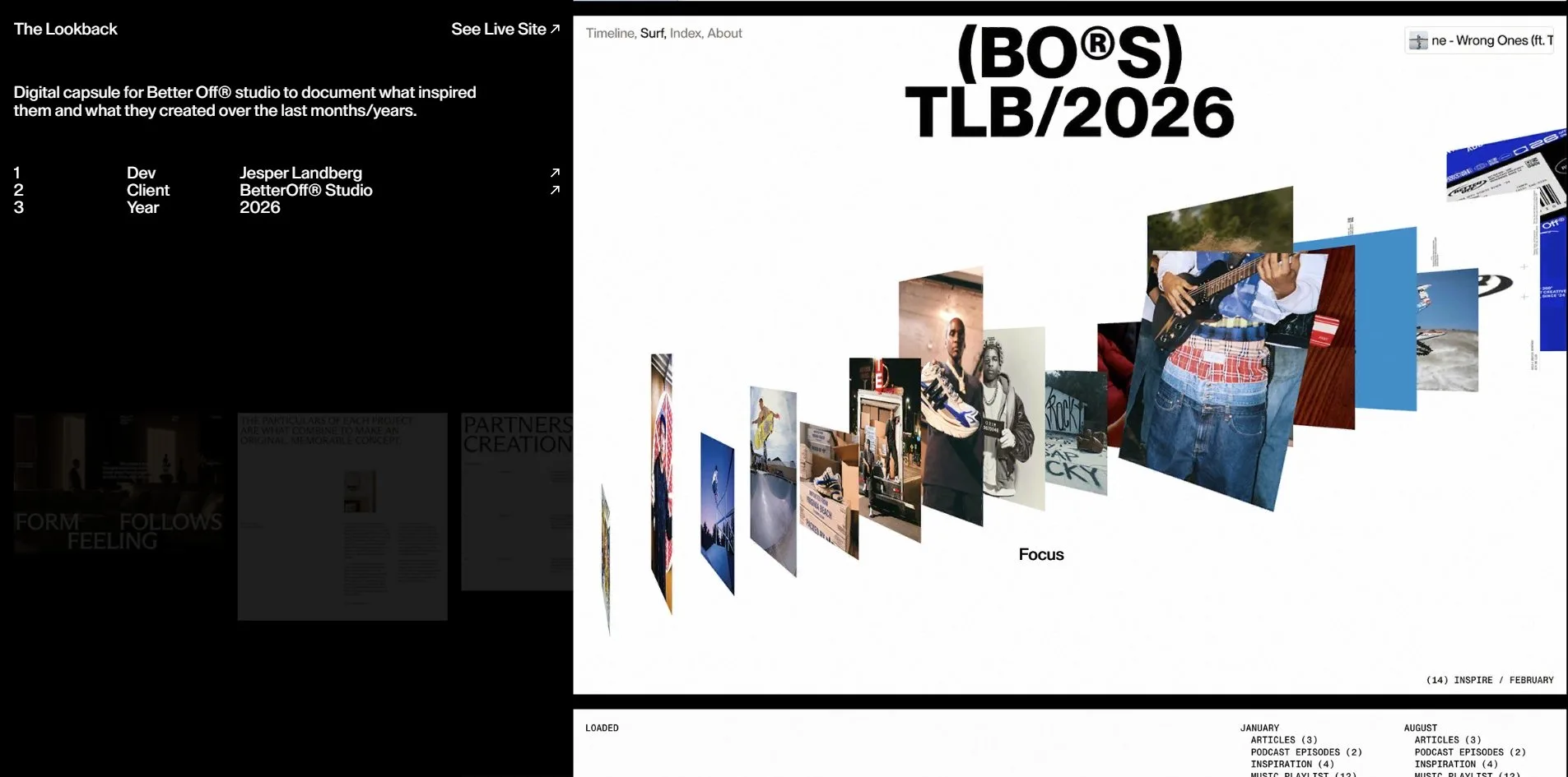
A portfolio usually has to choose between two things, a story page per case or a wall of thumbnails people click through. This site does both with the same set of images. The home page is a grid in which each project's screenshots run on as a strip, taking as many cells as it has images, four for Studio DADO, six for Vucko, and each cell carries a running number at its top right. Click any cell and that image flies out of the grid to fill the nine columns on the right, leaving four columns of black on the left for a sentence of description, the developer, the client, the year and a link to the live site. The column on the right holds all of that project's images and videos, eight to twenty five of them stacked one under another, and when you reach the end it starts again.
A second view, called Gallery and switched at the bottom left, shows the same 19 projects once each, at sizes from three to eight columns, scattered down the page. The third entry is Profile, five paragraphs of introduction set at 84 pixels filling the screen, with tilted project screenshots floating beside them.
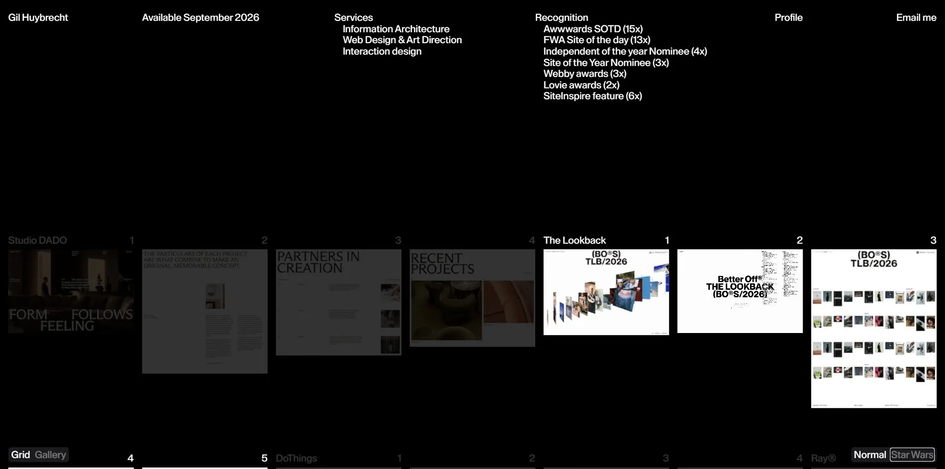
At the bottom right there is one more switch, Normal and Star Wars. Flip it and the whole site reloads as a Star Wars edition, every line of text turns yellow, the background becomes a starfield, the cursor becomes a lightsaber, a theme plays as you enter, and tiles glow blue when the saber comes near. Nothing new is added. It is the same work with a different mood, a designer making a joke at his own site's expense.
Design
Restraint is where the craft shows. One typeface, Lay Grotesk, in one weight, Medium, and on the normal pages every character is 20 pixels, the header, the project names, the numbers, the footer, the project descriptions, the developers' names. Nothing is set larger or smaller. Hierarchy comes from position and space rather than size or weight. The header is four columns, name, availability, services and recognition, each in its own column, and more than 200 pixels of black separate it from the first row of images.
The layout has 14 columns of 118 pixels with 16.8 pixel gutters. Every tile spans two columns, 253 pixels wide, with its height following the proportions of the screenshot, seven tiles to a row and 75 pixels between rows, so the bottom edge of each row is ragged, like a row of proofs pinned to a wall. A project's name appears only on its first tile. The tiles that follow carry only a number, and the number is how you know you are still inside the same project. The 19 projects run to 12 rows and the home page ends in under six screens.
Colour is black ground and white type, with two whites, full white for the main text and 40 percent for secondary switches and links. There is no third colour anywhere, except in the Star Wars edition, where all text becomes one yellow, rgb(255, 232, 31), and the lightsaber is blue, and those are the only two colours on the starfield.
Every image is a screenshot of a site he designed, first screens, inner pages and long captures, placed as they are with no frame, no shadow and no colour treatment. Each tile is what that site looks like in a browser window, so the whole grid reads like 84 browser windows tiled on a black wall. The videos are screen recordings too, muted and looping, and 9 of the 84 tiles move.
The Profile page runs at another scale. Each of its five sections opens with a small label, 1. Profile, 2. Approach, 3. Info, and the body is 84 pixels with a line height of 0.9, tracking pulled in by 1.68 pixels and a first line indent of five columns. The same typeface that labels the grid at 20 pixels becomes a full screen statement here, with no size in between the two pages. A tilted project screenshot floats to the left or right of the paragraphs and turns slowly as you scroll, the only perspective in the site.
Take the Star Wars switch away and what remains is a careful grid, uniform format, uniform size, generous space, the portfolio a person who teaches editorial layout would make. Its idea is not in the layout. It is in that switch.
Motion
The main effect is a tile flying out to become the large image. Click a tile and the image leaves its 253 pixel slot, lifts along an arc with a perspective tilt, and flies to the frame on the right, landing at 1,207 pixels wide in a little over half a second on a power3.inOut ease. The grid fades at the same time and the text of the left column pushes up from below. Going back runs in reverse, the large image shrinking into its original cell. It is a transition from one position to another, the image is the same texture throughout, only its rectangle changes.
Inside a project the wheel does not move the page but the column of images on the right. The page is locked, the column moves up inside a clipping frame one screen tall, and images that leave the top edge are attached to the end of the queue, so scrolling down never reaches an end. Over the black of the left column a Back label follows the cursor, and one click returns to the grid.
Hovering on the grid dims everyone else. Wherever the cursor lands, the tiles of the other 18 projects, together with their names and numbers, drop to 20 percent opacity within 0.2 seconds, while the current project stays full white.
Hovering a card in the Gallery view lifts the images out of the card and lays them out as the tiles they occupy in the grid view, at the top of the page, leaving a one pixel white outline where the card was and the project name at the cursor. Move away and they fly back into the card.
Star Wars mode is a second set of motion. Switching reloads the whole site, the loading counter is yellow, and what loads is a starfield with the cursor as a lightsaber and a yellow Click to enter beside it. The click plays the sound of a saber igniting and the theme, the header and grid fade in, and the tile textures glow blue according to the saber's position, brighter the closer it comes. Every click sounds a saber strike.
This mode hides one action with no hint anywhere. Hold F on the Profile page and the page fades out, the five paragraphs he wrote about himself become a yellow italic opening crawl that narrows into the distance from bottom to top, with its own sound, and a small line beside the cursor reads Release to go back. Let go and it comes back.
Engineering
Not one img element exists on the page. The 84 screenshots and 9 videos are all drawn on one WebGL canvas covering the viewport, driven by three.js r185, and the DOM holds only 84 empty article placeholders carrying a project name, a number and an aspect ratio. The canvas maps its textures to the positions and sizes of those placeholders. So the hover dimming, the fly out, the starfield and the saber glow are all changes to a texture's parameters, and the layout never moves.
The textures are KTX2, Basis ETC1S compressed, 1,500 by 1,000 each with 11 mip levels built in, 110 of them on the home page for 19 MB in total, decoded in the browser by a 226 KB wasm transcoder into the format the graphics card takes directly, so what sits in video memory is compressed texture. What this buys is 14 draw calls and 14 thousand triangles while scrolling, a steady 60 frames per second from top to bottom, with the slowest frame at 23 milliseconds.
The first screen pays for it in weight. A cold load is 46 MB, 19 MB of textures and 24 MB for the 9 videos hosted on Mux, the counter takes 1.5 to 3 seconds to run from 0 to 100, and the page unlocks between 2.6 and 4.2 seconds. The numbers before that unlock are good, first byte at 230 to 290 milliseconds, first contentful paint at 280 to 340 milliseconds, largest contentful paint at 1.7 to 1.8 seconds and a layout shift of 0.005. Switching to Star Wars downloads another 4 MB of audio.
The framework is Nuxt with Tailwind, content comes from DatoCMS, scrolling is Lenis with a lerp of 0.15 and a wheel multiplier of 1.25, driven by the ticker of GSAP 3.11. Project pages can be opened by address, and the server renders an ordinary long page version.
Accessibility has one real problem. The 84 tiles are articles without links, so a keyboard user pressing Tab reaches only the three header controls and the seven footer links, never the view switches at the bottom right and never a single project, which means someone using only a keyboard cannot open any piece of work on this site. The page declares its language, the landmarks are complete, every control is named and the focus ring is white, but there is not one rule for the reduced motion setting, and the starfield and the saber run regardless.
Scores and Team
| Award | Source | Date | Score |
|---|---|---|---|
| Site of the Day | Awwwards | 2026-09-21 | 7.66 / 10 |
| Developer Award | Awwwards | 2026-09-21 | 7.4 / 10 |
| FWA of the Day | The FWA | 2026-08-01 | 83 POINTS, DAYS 3 |
The four Awwwards dimensions are Design 7.93, Usability 7.33, Creativity 7.46 and Content 7.92. Design and Content are high and Usability is the lowest, most of the 19 jury votes are 7s and 8s, and one juror gave 9.9, 9.3, 9.3 and 9.7. Usability trailing the other three matches the projects that cannot be opened from the keyboard and the seconds of waiting on the first screen. In the Developer Award of 7.4, Animations scores 8.4 with one of the five developer jurors giving a 10, and Semantics is the lowest at 6.6. The FWA gave 83 points and the Day award came in three days.
| Credit | Identity | Record |
|---|---|---|
| Gil Huybrecht | Freelance designer and art director, Bornem, Belgium | Awwwards WORKS 21, SOTD 15, HM 20, FWA 13 |
| Jesper Landberg | Creative developer, Sweden | Awwwards WORKS 52, SOTD 30, HM 49, FWA 40 |
The division of labour is clear. Gil Huybrecht designs, his Awwwards profile lists 15 Sites of the Day that are all editorial layouts, and the grid, the single type size and the 84 pixel statement on this site are the way he always works. Jesper Landberg develops, with 40 FWA awards and 30 Awwwards Sites of the Day, his profile describing a creative developer focused on motion and refined digital experiences, and inside this site he is also the developer credited on The Lookback, 53 West 53 and DoThings. The WebGL texture grid, the fly out and the entire Star Wars mode are his craft. On the Profile page Gil writes that he runs a course on editorial web design called TIWD with more than 400 students, and this site is the course's own specimen.
Archive
- Award date
- 2026-09-21
- Awards
- Awwwards SOTD 2026-09-21, Awwwards DEV 2026-09-21, The FWA FOTD 2026-08-01
- Site
- https://gilhuybrecht.com/
- Credits
- Gil Huybrecht, Jesper Landberg
- Design
- graphic
- Build
- canvas
- Awwwards
- 7.66 / 10. Design 7.93 / Usability 7.33 / Creativity 7.46 / Content 7.92. Developer Award 7.4. https://www.awwwards.com/sites/gil-huybrecht
- The FWA
- 83 POINTS, DAYS 3. https://thefwa.com/cases/gil-huybrecht
- Stack
- Nuxt, Tailwind, DatoCMS, three.js r185, KTX2 / Basis, GSAP 3.11, Lenis, Mux, Web Audio
- Total assets
- 46 MB on a cold load of the home page, of which KTX2 textures 19 MB and Mux video 24 MB. Star Wars mode adds 4 MB of audio
- Speed
- FCP 280 to 340 ms, LCP 1.7 to 1.8 s, CLS 0.005. Continuous scroll 60 fps