The Tuscan Journey Begins
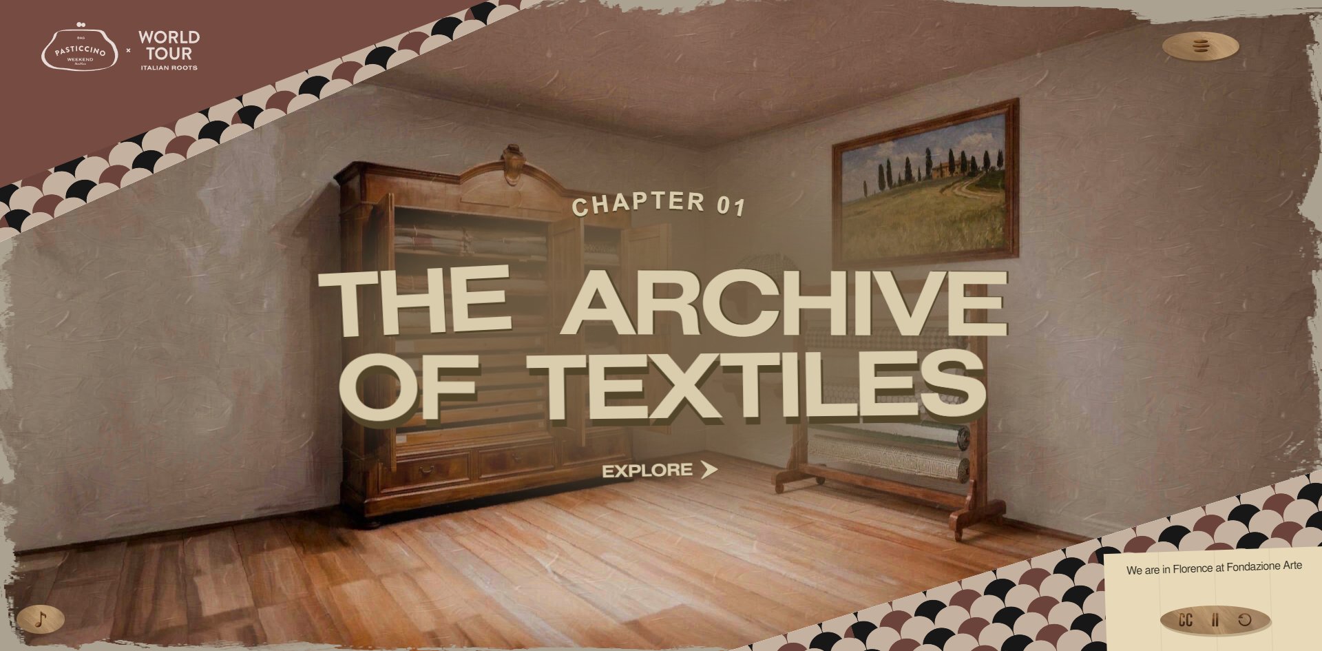
The one chapter you can open is given over entirely to the historic fabrics of a Florence silk foundation, credited to that foundation by name, with the handbag itself sitting nearby like a fellow passenger. This is a handbag campaign built as a hand-painted train journey, one chapter per stop. It runs on WebGPU, which is rare, and its Awwwards developer score of 6.67 fell short of the 7.0 that wins that award.
Visit site ↗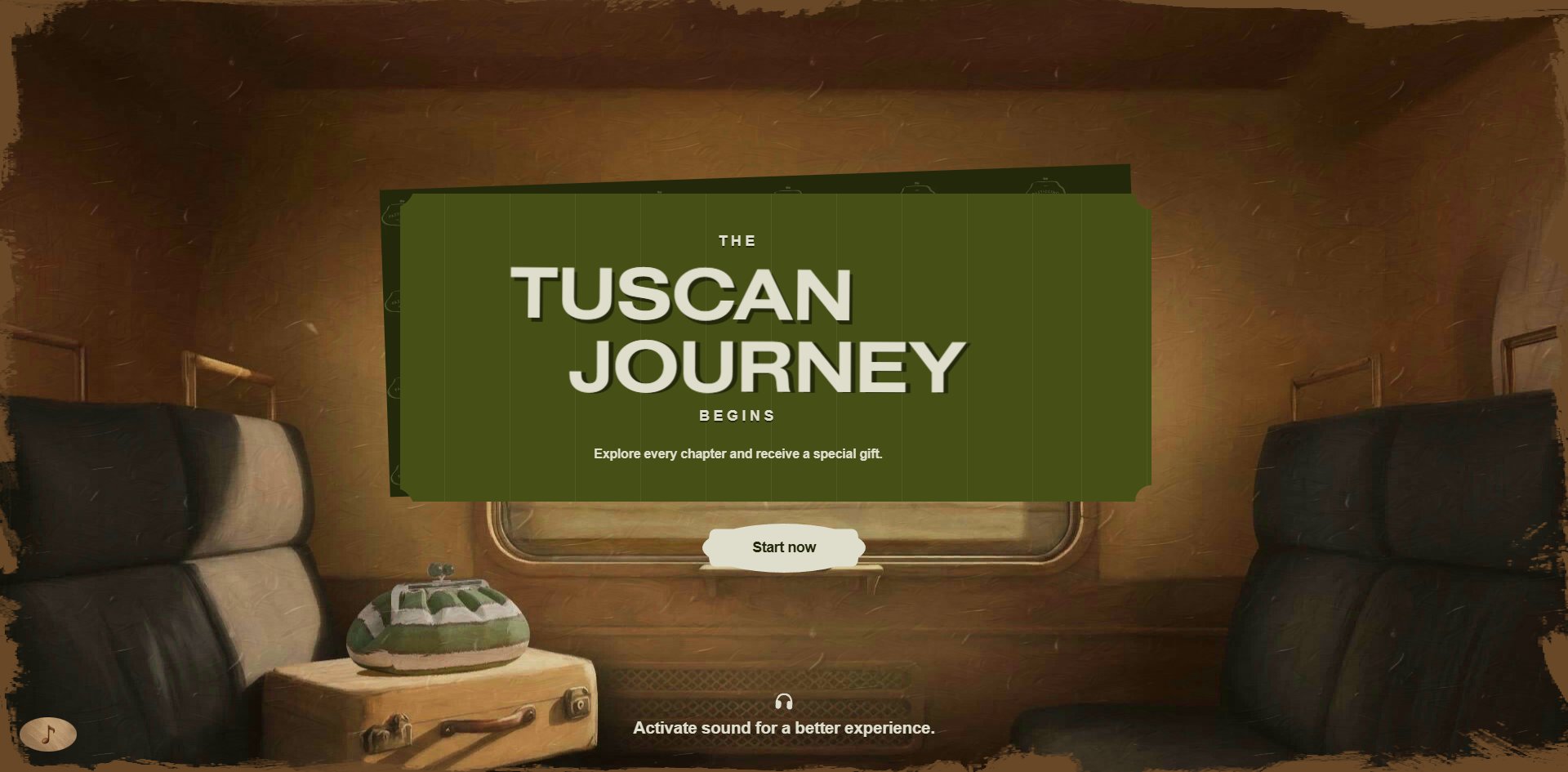
Concept
A brand pays for advertising so that people will look at its own thing. This campaign hands the stage to somebody else's craft instead, and it hands it over completely.
It opens on a painted Italian train compartment: leather seats, a luggage rack, a window, with the brushwork and canvas grain fully visible and the frame torn at every edge. An olive-green ticket hangs at the centre saying the Tuscan journey begins, with a smaller line underneath promising a gift if you see every chapter. On the suitcase beside the seat sits the handbag itself.
It is not merchandise on display. It is a fellow passenger.
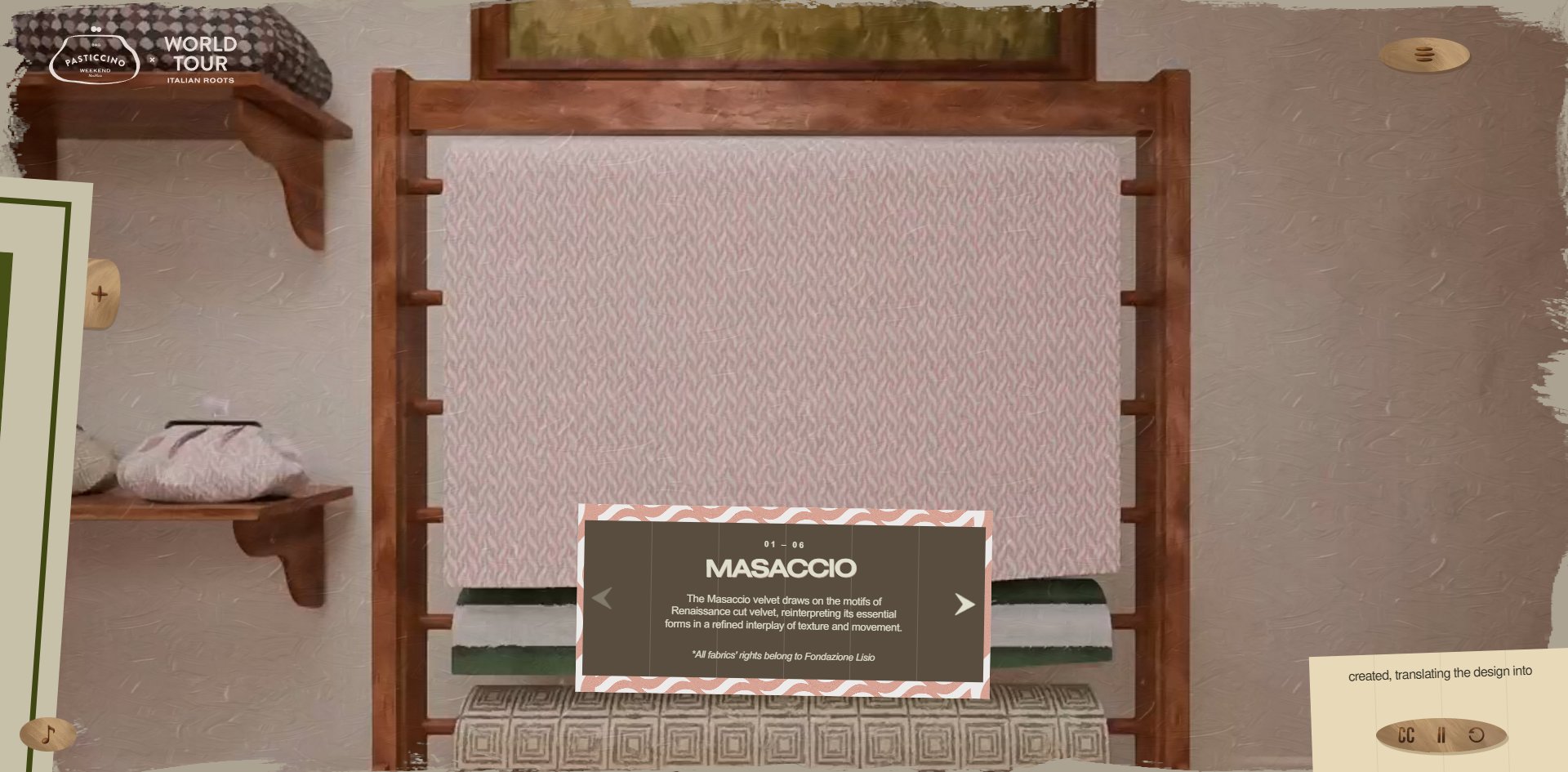
What makes it unusual only shows once you are inside the first chapter. The content is not how good the bag is, it is the historic fabrics held by a real silk-weaving foundation in Florence. They are brought out one at a time, six to a set, each with a name and a history, and every caption card carries an italic line underneath saying the rights to all fabrics belong to that foundation.
The brand steps behind the camera and what appears is somebody else's craft, credited to somebody else. An advertisement willing to do that has worked something out: nobody believes you when you say how good you are, but they will believe you once you show them what you care about.
Two things get given up for it, and neither is small.
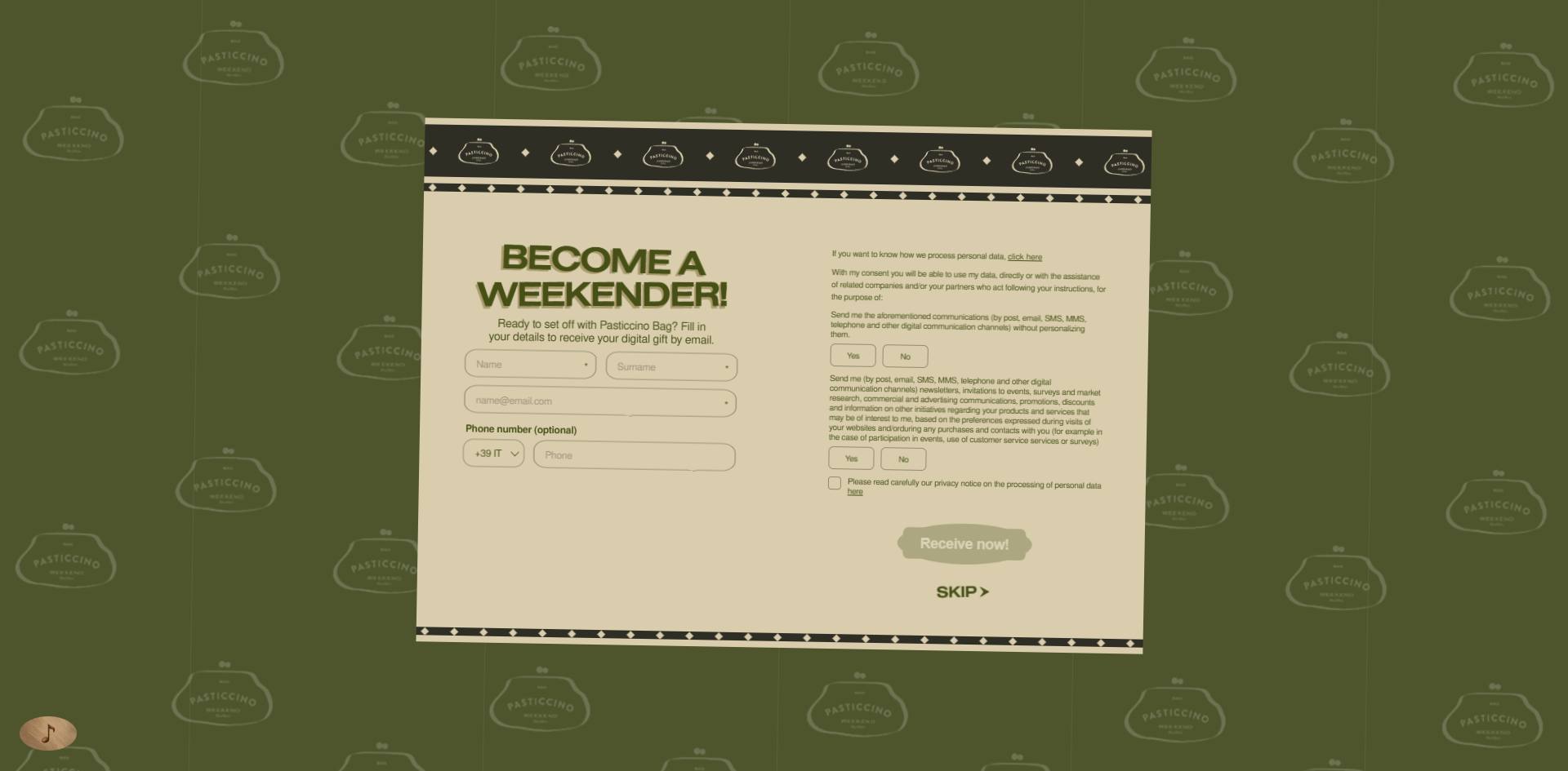
The first is at the door. Pressing start runs a short intro, and when the intro ends the chapters still do not begin: a lead capture form comes first. Become a weekender, with name, surname and email all required, phone optional, two yes-or-no consent choices and a privacy tick box, and then you get that digital gift. It does offer a skip, but claim it now is a filled button while skip is a line of small type underneath it. A story that earns its standing from somebody else's craft puts customer capture in front of the thing itself.
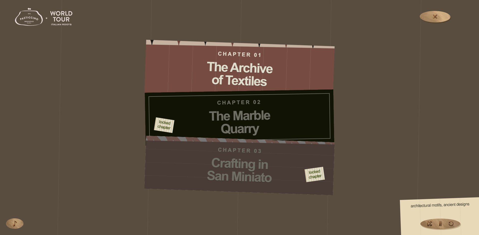
The second is that the chapters are locked. Only the first of three is open, and the other two each carry a small paper tag reading locked chapter.
The look is not original, and comes out of painted travel posters and mid-century railway publicity. What is new is how the lock is drawn: not a padlock icon but a slip of paper pinned to a cloth banner, made of the same material as the torn edges, the ticket and the handwritten labels. That is worth copying. A locked state should be drawn in your own design language rather than reaching for a generic icon.
Design
The entire site uses one way of making pictures: digital oil painting. Walls, timber, fabric and metal all carry brushwork and canvas grain. There is not one photograph and not one clean vector shape anywhere. Every screen is torn at the edges so it reads as a printed sheet pasted down.
One colour carries the whole site. The Awwwards page says this site uses one colour, that olive green, and counting them up it appears in 53 places, used for the ticket, the caption cards and the locked-chapter background.
Every other colour, the ochre, maroon, dusty pink, cream and timber, comes from the painting rather than from CSS. That division is clean: interface colour belongs to CSS and picture colour belongs to the canvas, with neither reaching into the other. Anybody building an illustrated site can follow that thinking and save a great deal of palette maintenance.
Type is one family, Nimbus Sans, in three weights totalling 99 KB. It is a Helvetica revival that carries the plain look of public signage, which is a counterintuitive choice inside a luxury campaign and exactly right next to that ticket and those museum labels.
The division of labour is clear too: the heavier extended weight does large type only, writing 27 characters inside a chapter but covering 270,000 square pixels, while the text weight writes 1,269 characters. Two percent of the words cover two thirds of the area.
There are two decorative systems and neither enters the body copy. One is a scallop pattern filling opposite corners of the frame in maroon, cream, black and dusty pink. The other is a wave pattern used only on caption card borders. Both come out of textile ornament, which is what the chapter is about, so neither is arbitrary trim.
Corners are effectively square: 177 right-angled elements inside a chapter against two rounded ones, both belonging to the sound toggle.
The finest work is how the logo is handled. A solid maroon triangle sits in the top left carrying the brand and campaign lockup, and the triangle's hypotenuse meets the edge of the scallop pattern exactly. The logo does not float above the picture. It is part of the composition.
Motion
There is no scrollbar anywhere in the experience. You click your way from screen to screen instead.
The structure is a straight line: the opening, a skippable intro, a skippable lead form, a chapter title screen, press explore, then a six-step fabric tour advanced with left and right arrows.
The narration is where unusual care shows. A caption box sits permanently in the bottom right revealing the script line by line, with three buttons for subtitles, pause and replay, and the subtitles are on by default. A fashion campaign that captions its own narration and leaves it switched on is a rare thing.
The sound handling is right too. Before you click anything, five audio tracks are loaded and none is playing, with the audio context suspended. A static line at the foot of the opening screen tells you that you can turn sound on, and the toggle sits permanently in the bottom left. Nothing autoplays.
Where it slips is in how far the reduce-motion support actually reaches, and the way it slips is subtle. The stylesheet carries 13 rules responding to that preference, which is a lot of rules, and every one of them governs the transitions on buttons and controls. Turn the setting on or off and the canvas keeps rendering at 60 fps either way.
The rules cover the interface chrome while the picture keeps moving. Writing the most rules is not the same as covering the most ground. That is a trap worth watching: how many rules you wrote says nothing about how much you covered, and what matters is which layer those selectors reach.
Engineering
The page is written in Vue with Modernizr doing capability detection.
The picture layer runs three.js on WebGPU, which is still rare on the web. Materials are seven compressed textures totalling 1.7 MB, given as a proper set of diffuse, normal and bump maps, with a 241 KB decoder alongside.
The largest single cost is video. Two files come to 11.7 MB, one of them 9.7 MB on its own with the letters ionly at the end of the filename. That means all-intra encoding: much larger than ordinary encoding, and what it buys is instant seeking to any frame without decoding a whole preceding group of pictures. Letting a visitor drag to any frame they like costs exactly this much file size. The other file, 2 MB, is the train loop.
One visit downloads 15.4 MB in total. Past the video and textures the heaviest remaining item is script, 43 files at 1.1 MB, and a good share of that does not belong to the work at all: an enterprise tag manager with six vendor tags plus a cookie consent system. Those tracking and compliance layers sit on top of a creative piece and contribute more files than the piece itself.
There is one clear gap in the speed. The layout and text appear in six hundred milliseconds, which is fast, but the painting takes 3.7 seconds. For those three seconds the page is stable, just empty.
Accessibility needs reading in two layers, and the two are far apart.
The control layer is genuinely good: the page declares its language, all eight keyboard-selectable elements have names, proper role markers are used, all 18 images carry empty alt text with none missed, and the focus outline is left as the browser drew it. Even the fact that a chapter is locked is written into what a screen reader hears, which is more careful than most sites manage.
The document structure layer barely exists: there is no main content landmark, an entire chapter page carries one third-level heading, that 139px chapter title is not a heading element at all, there is no first or second level heading anywhere, and there is no skip-to-content link. That is where the two lowest scores come from.
There is one further specific gap: the caption box is not marked as a live region, and there is not one such marker on the page. The subtitles update line by line and a screen reader never announces them. Captioning the narration and then not marking it as live is doing half the job, and anybody adding captions should watch for this, because otherwise the work does nothing for screen reader users.
The last problem is usability. Typing a chapter address directly bounces you back to the opening screen, so a chapter cannot be shared on its own. For a campaign that encourages you to see every chapter, that is awkward.
Scores and Team
| Award | Source | Date | Score |
|---|---|---|---|
| Site of the Day | Awwwards | 2026-09-13 | 7.27. Design 7.17 / Usability 7.06 / Creativity 7.71 / Content 7.36 |
| Developer score (no award) | Awwwards | 2026-09-13 | 6.67. Semantics 6.40 / Animations 7.80 / Accessibility 6.40 / WPO 6.60 / Markup 6.00 |
Of the four, Creativity is highest and Usability lowest. Five jurors returned 7.00, 6.40, 7.00, 7.00 and 7.10, with one Ukrainian experience designer at 6.40 and the rest clustered around 7.
The developer side won nothing, with 6.67 falling below the seven-point line and markup quality lowest of the six at 6.00. The clearest single scorecard comes from the Georgian front-end juror, who gave animation a perfect ten and gave semantics, accessibility and markup a four each, for 5.50 overall.
That scorecard matches the site almost point for point, though marking accessibility a flat four is rough, because the control layer really is well made and the problem lies in the document structure.
| Credit | Who | Awwwards record |
|---|---|---|
| MONOGRID | Florence and Milan, creative studio | 43 works, SOTD 19, HM 40 |
There is one credit and it belongs to a studio with nineteen Sites of the Day behind it. The client is Weekend Max Mara and the project is the Italian Roots tour for the Pasticcino bag.
There is an uncommon coincidence here: the studio telling this Tuscan craft story is itself in Florence. The silk foundation in chapter one is a Florentine institution, and the marble quarry and San Miniato in chapters two and three are both in Tuscany. This is not an outside team writing somebody else's local history.
One more thing worth recording: the address submitted for the award is the studio's own hosting rather than the client's proper domain.
Archive
- Award date
- 2026-09-13
- Awards
- Awwwards SOTD 2026-09-13
- Site
- https://weekend-mm-2026-pasticcino-bag-master.monogrid.io/en/
- Credits
- MONOGRID
- Type
- campaign
- Awwwards
- 7.27 / 10. Design 7.17 / Usability 7.06 / Creativity 7.71 / Content 7.36. Developer score 6.67, no award. https://www.awwwards.com/sites/the-tuscan-journey-begins
- Stack
- Vue, Modernizr, three.js WebGPU, Howler.js, KTX2 compressed textures
- Total assets
- 15.4 MB, of which a single all-intra video is 9.7 MB and compressed textures 1.7 MB
- Speed
- Layout at 590 to 730ms, largest picture at 3.7 seconds, no layout shift. 60.2 fps, and the site does not scroll