Milledollars
The video production company MilleDollars has built a website where the films themselves are the interface. Every screen of the home page is one film, and when a visitor nudges the scroll wheel, that film shrinks into a rounded card and slides away upward while the next one rises from below. The works page is normally just a neat list of text, but wherever the cursor rests, the whole page fills with that project's film, and even the divider above it turns into a hand-drawn scribble.
The Paris advertising agency Magnetism built the site with a freelance designer and a freelance developer, and it has won FWA of the Day and then Awwwards Site of the Day.
01Concept
MilleDollars makes high-end advertising films, and its works page lists 31 of them from 2019 to 2026. Twenty-six were made for the Swiss luxury watchmaker Richard Mille, and the rest were made for Danone, the perfume house Parfums de Marly, the skincare brand EviDenS de Beauté and the perfume house Henry Jacques. A film company's portfolio is usually a grid of thumbnails that a visitor clicks to watch. This site works the other way round and lets the films fill the screen directly.
A visitor who arrives first sees a loading screen. On a pale grey ground the words MILLE. and .DOLLARS sit one above the other, joined by a few scribbled lines that keep changing shape. About two seconds in, a column of rounded film thumbnails races upward like the reel of a slot machine and stops on one of the films. That card then grows to fill the screen and the interface text fades in, and the whole opening takes about four and a half seconds.
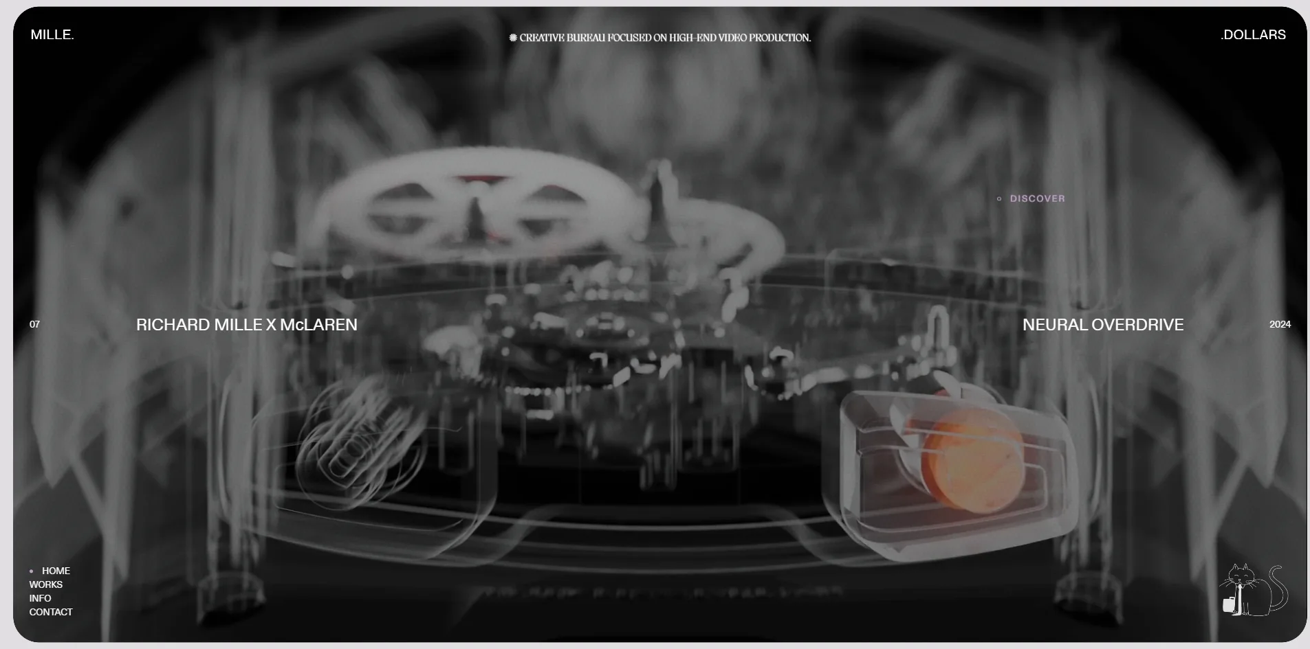
The home page holds seven selected films, one per screen. The number and the client sit on the left, the title and the year on the right, and a thin progress bar split into seven segments runs along the bottom. One notch of the wheel down moves to the next film and one notch up goes back, and scrolling past the seventh film returns to the first. A visitor can also click a segment of the progress bar to jump straight to that film. When the cursor is over a film, a DISCOVER label appears beside it, and a click opens that film's project page. The film that is playing carries on without a break and becomes the large picture at the top of the project page.
Each project page is a long behind-the-scenes article. The Dazzling Division, for example, is an advertising film for a Richard Mille high jewellery watch starring Michelle Yeoh, and its project page runs to about sixteen and a half screens. The article first tells the story of the film, then explains how the colours were chosen, what each of the four sets contributes and what it was like to work with Michelle Yeoh. Stills, a horizontal carousel of Polaroid photographs, a switchable set of 21 images and several looping clips sit between the paragraphs, and some project pages add a set of behind-the-scenes photographs. The article ends with the full cast and crew list, followed by a dark band titled A GLIMPSE INTO OUR WORLD THROUGH OTHER PROJECTS that shows several other films.
Besides the home page and the project pages, the site has three more pages. The Works page lists all 31 films, each entry giving only the year, the title and the client. The Info page describes the company as a full-service production agency and lists its services as production, storyboard, sound design and shooting, with a last entry reading E tutti quanti, Italian for and all the rest. The Contact page has no form, only an email address and links to three social networks.
02Design
Milledollars leaves only a ring of small text around the edges of the screen and gives the whole middle to the film. On the home page MILLE. sits in the top left corner and .DOLLARS in the top right, so the site splits the company's name in two across the full width of the screen. A short line of small type between the two words reads creative bureau focused on high-end video production. The four navigation words are stacked in the bottom left corner, and a cat sits in the bottom right. On the home page all of this text is set in small white capitals over the film. To keep that white text readable on any of them, the site darkens every film by the same amount and adds a darker band along the bottom.
Almost all of the text on the site uses one sans serif, ABCDiatype, for the labels, the navigation and the body copy, mostly small, loosely spaced and in capitals. The large headlines on the Info and Contact pages use the same face at about five times the body size. A second, serif face, Migra, appears only in the tagline at the top and the star symbol in front of it, which are on every page but come to only a few dozen characters.
Like the type, the colour makes room for the films. The home page and the works page sit on a pale grey with a touch of lilac, the text is near black, and the interface carries almost no colour of its own. The accent is a soft lilac, and apart from the cookie notice at the bottom it is used only on the PLAY, PAUSE and DISCOVER labels that follow the cursor. The Info and Contact pages each switch to their own background, lilac for Info and pale yellow for Contact, so the colour of the whole page changes as a visitor moves between them.
Alongside the polished films, the site keeps a deliberately casual hand-drawn layer. The scribbled lines in the loading screen, the divider above every entry on the works page and the small wave after the subheadings on the Info and Contact pages are all set in a typeface called Redacted Script. This typeface draws any letter as a loose handwritten stroke, so the site simply types a string of arbitrary letters to produce these lines. The cat in the bottom right corner is also a line drawing. It wears a necktie and has a briefcase at its feet like an office worker, and clicking it opens the company's Instagram.
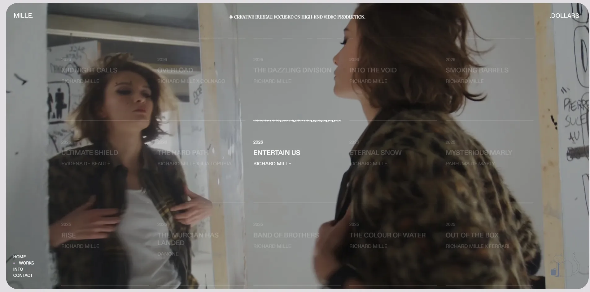
The works page pushes the contrast between the films and the hand-drawn layer furthest. The page is five neat columns of text entries, each under a thin line, without a single image. When the cursor rests on an entry, that film immediately spreads across the whole page behind the text, framed by a rounded border. The other entries fade back, only this one stays sharp, and the thin line above it turns into a scribble.
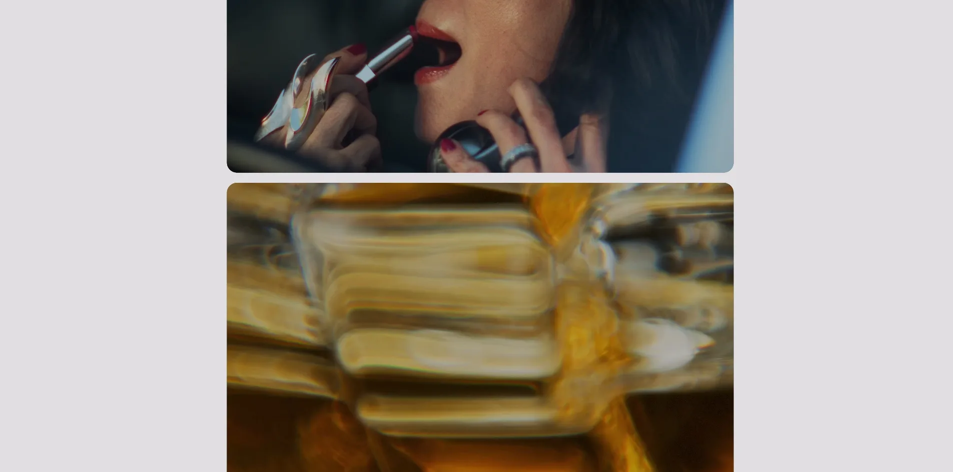
The project pages switch to a long article layout on a pale grey ground. The body copy is small grey type set to one side of the page, and the images and videos are rounded cards of different sizes staggered from left to right down the page. The Polaroid set keeps the white border of the instant film, and some of the photographs are cropped into circles.
03Motion
The change of film on the home page is the main movement on the site. When a visitor nudges the wheel, the current film shrinks slightly, its corners round off, and it becomes a card that slides up off the screen. At the same moment the next card slides up from below the screen and grows back to full size. The text on both sides slides away as well, with the number, client, title and year each setting off a little later than the one before, so they read like a row of words being pushed aside one after another.
The films on the home page are all drawn on a single full-screen canvas with the lightweight WebGL library OGL. Each film is a flat panel in that canvas, which first shows a still frame and fades it out within a fifth of a second once the film actually starts playing. The site loads only the film that is on screen and unloads it after the visitor moves on, so even after all seven films have been viewed, only one film is ever playing at a time. The opening reel, the change of film on the home page, the hover on the works page and the uninterrupted film on the way into a project page all use this one canvas. That is why the picture stays continuous as a film moves from one page to another.
The line that turns into a scribble on the works page is made of two layers. The lower layer is a one-pixel straight line, and the upper layer is the string of scribble letters, which the site normally squashes flat so that it cannot be seen. When the cursor arrives, the straight line flattens away and the scribble unrolls from left to right, so the line seems to bend itself into handwriting.
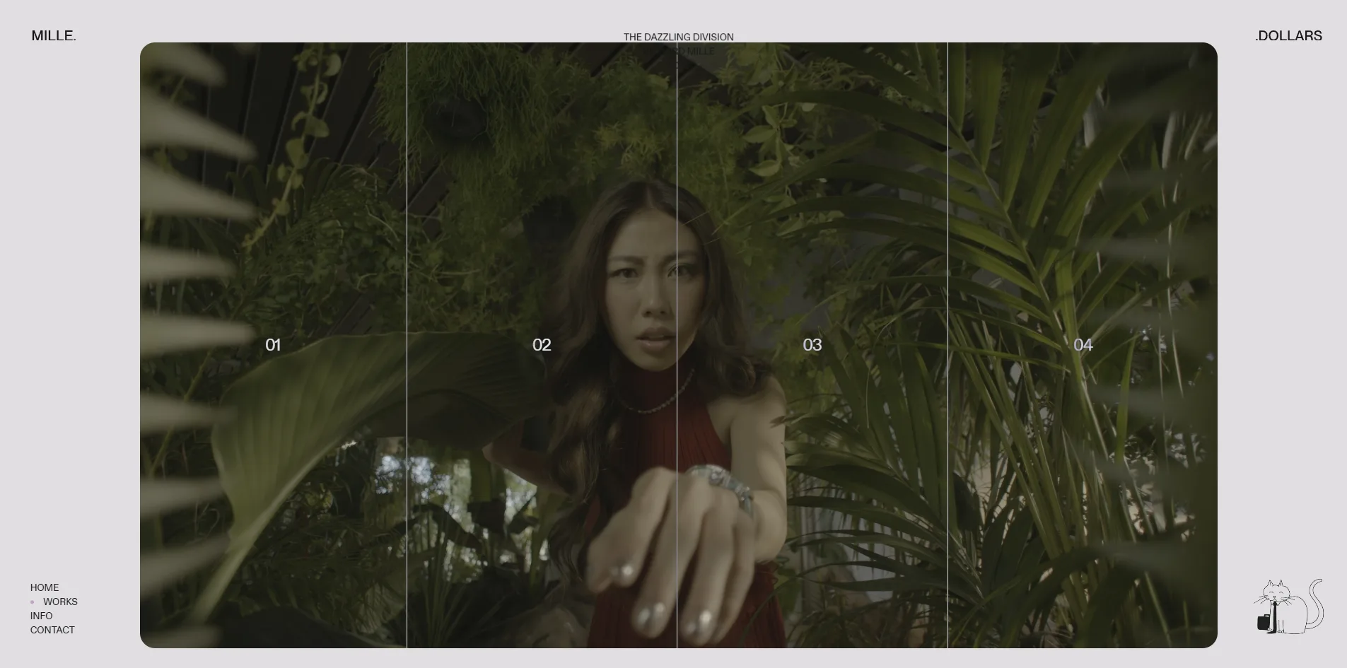
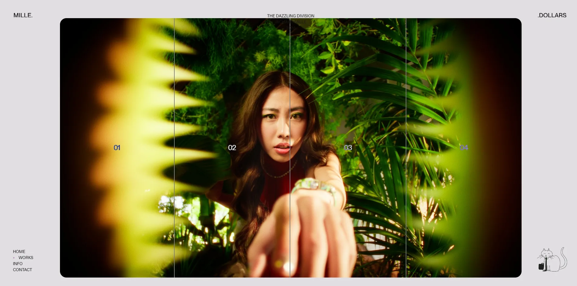
The project pages include a comparison labelled WE SHOOT, WE GRADE and WE FLAME that lets a visitor see for themselves how a shot is built up step by step. The site turns each production stage of the same shot into its own short clip, plays them in sync on a loop stacked in the same place, and divides the picture into zones with a few thin vertical lines. With the cursor in the first zone, the visitor sees the dull grey footage straight from the camera, and in the later zones the colour-graded version and finally the finished shot with its effects. Flame is compositing software widely used in film post-production, and WE FLAME refers to that final step of compositing the effects. The same kind of comparison on The Dazzling Division page has four zones, moving from a dark raw image to a saturated finished shot with a glow around the edges of the lens.
The other components on the page each move in their own way. The Polaroid strip can be held and dragged left and right. The set of 21 images is a row of narrow strips beside one large image, and whichever strip a visitor clicks opens up into the large image. The cat in the bottom right corner has four animations, two of which show it adjusting its tie. It normally plays an idle animation, switches to another when the cursor comes near, and returns to the idle one when the cursor leaves. Scrolling across the site is handled by the smooth scrolling library Lenis, so the page glides on a little after the wheel stops.
All of this movement runs smoothly, with no visible stutter. Changing through five films in a row on the home page averages 60 frames per second, and frames slower than 32 milliseconds make up only a tenth of a percent. The works, Info and Contact pages also hold 60 frames per second from top to bottom.
A visitor who has turned on the reduced motion setting in the operating system sees exactly the same site as everyone else. That setting exists for people who feel unwell when things move on screen, and a site is expected to cut back its animation when it is on. On Milledollars, however, the opening reel and the slide between films on the home page play as usual.
04Engineering
Milledollars is built with Nuxt, a web framework based on Vue. The content lives in the Prismic content management platform, and the animation runs on the GSAP animation library. The wheel-driven change of film on the home page uses GSAP's Observer plugin, which reads only the direction the wheel is pushed and keeps the page itself from scrolling. The technology tags on the Awwwards page name a different content platform, Contentful, but the site actually loads Prismic.
Milledollars downloads about 12.7 MB when its home page first opens, and 8.5 MB of that is the one film that is playing. The films are hosted on the video platform Vimeo and downloaded as the original files, at resolutions from 1080p to 2160p, so each new film a visitor turns to means downloading that film as well. Apart from the films, the largest download on the home page is the cat. Each of its four animations is one large image packed with frames, and together they come to about 1 MB, nearly four times as much as all of the site's scripts combined.
Something appears on screen quickly, but the real content takes longer. The server returns its first byte in about 0.3 seconds, inside the 0.8 seconds Google recommends. The browser draws its first content (first contentful paint, FCP) at 0.57 seconds, far faster than Google's suggested 1.8 seconds. What it draws then is only the loading screen, though, and the first film does not fill the screen until about four and a half seconds. Loading includes four long tasks, pieces of script that each hold the browser for more than 50 milliseconds so the page cannot respond, adding up to about 0.9 seconds with the longest at about half a second. Layout shift (CLS) is 0.044, below Google's ceiling of 0.1, so a visitor hardly sees anything jump.
Screen reader users first get a well-made table of contents on the home page. The page declares its language, marks out its header, navigation and main content as landmarks, and adds an overview that is invisible on screen and written only for screen readers. That overview introduces the company in one sentence and then lists all seven films with their full titles and clients.
The real trouble for keyboard and screen reader users starts with the first press of Tab. Focus lands first on the cat, which is a link without a name, so a screen reader announces only that it is a link. Focus then moves to a logo link with no size at all, and after that to seven stacked, full-screen film links that have no names either. The 31 entries on the works page are also links without names, with the titles written outside the links. All 46 images on a project page have alternative text, but every one of them carries the same film title, so a screen reader user cannot tell the images apart.
Two pieces of text on the site were left unfinished. The whole site is in English, yet the cookie notice that pops up at the bottom is in French, although it does offer a single button to refuse everything. At the bottom of the Info and Contact pages, the Location heading is followed only by a scribble, with no address.
05Scores and Team
| Award | Source | Date | Score |
|---|---|---|---|
| Site of the Day | Awwwards | 2026-10-02 | 7.23. Design 7.25 / Usability 7.15 / Creativity 7.23 / Content 7.39 |
| FWA of the Day | The FWA | 2026-07-14 | 83 POINTS, DAYS 4 |
The four Awwwards categories are design, usability, creativity and content, each scored out of 10. Milledollars scored highest on Content at 7.39, which fits a site with 31 films that each come with a behind-the-scenes article more than ten screens long. It scored lowest on Usability at 7.15, and the fact that the home page changes films only through the wheel and a very thin progress bar may be part of the reason. Most of the 19 jurors gave around 7, with the lowest vote at 6.0 and the two highest at 8.2 and 8.7.
The separate Awwwards panel of front-end developers gave the site 7.01, with Animations highest of the five categories at 7.40. Accessibility was lowest at only 6.00, which matches the unnamed links described in the engineering chapter.
The FWA had already given the site 83 points on July 14, from 26 votes, filing it under design and production studios and film. The team's description on the FWA is a single sentence calling MilleDollars a creative bureau focused on high-end video production.
| Credit | Role | Record |
|---|---|---|
| Magnetism | Paris advertising agency that describes creativity as its driving force, with project budgets of $30,000 to $50,000 | Awwwards works 10, SOTD 7, HM 10. FWA 9 |
| Elisa Dubois | French UX/UI designer from the Franche-Comté region, freelance | Awwwards works 9, SOTD 6, HM 9. FWA 9 |
| Ludovic Boiteux | French freelance creative front-end developer | Awwwards works 6, SOTD 3, HM 6. FWA 6 |
The three people credited on this site work together as a regular team. Magnetism's other Awwwards projects, Le Mans Classic, Redot, Bataclan and Cipher, all carry Elisa Dubois's name just like this site, and three of them, Le Mans Classic, Redot and Bataclan, also credit Ludovic Boiteux. Elisa Dubois has the same number of FWA awards as Magnetism, nine, so she appears to have worked on almost every award-winning project the agency has made.
06Archive
- Award date
- 2026-10-02
- Awards
- Awwwards SOTD 2026-10-02, The FWA FOTD 2026-07-14
- Site
- https://milledollars.fr/
- Credits
- Magnetism, Elisa Dubois, Ludovic Boiteux
- Design
- cinematic
- Build
- canvas
- Awwwards
- 7.23 / 10. Design 7.25 / Usability 7.15 / Creativity 7.23 / Content 7.39. Developer Award 7.01. https://www.awwwards.com/sites/milledollars
- The FWA
- 83 POINTS, DAYS 4. https://thefwa.com/cases/milledollars
- Stack
- Nuxt, Prismic, OGL, GSAP, Observer, Lenis, Vimeo
- Total assets
- About 12.7 MB / 89 files on a first visit to the home page, 8.5 MB of it one home film and about 1 MB the cat's four animation sheets
- Speed
- FCP 568 ms (loading screen), first film fills the screen after about 4.5 s, CLS 0.044. Home film changes and works page 60 fps