INHERITED
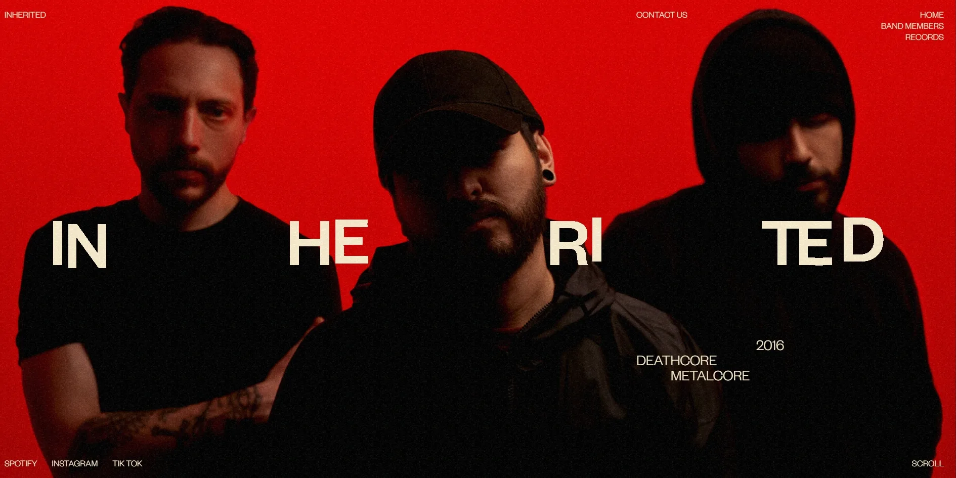
On its website, the deathcore band INHERITED splits its own name into four pieces and wedges them between the bodies of its three members, as if the three of them were holding the name apart. Every large headline on the page keeps trembling slightly, and now and then its edges tear open in a thin line, like a videotape with a bad signal. The site barely relies on words, since a red wall, black clothes and a series of faces shot very close up are all the introduction the band gives its visitors.
The band's vocalist Eder Anaya, an animator and designer based in Mexico City, designed the site, and the Colombian creative developer Jorge Toloza built it. Their work won FWA of the Day in October 2026.
01Concept
INHERITED is a deathcore and metalcore band formed in 2016, and two of its three members are from Mexico while one is from Colombia. This site leaves out tour dates, a shop and news. It answers only two questions, who these three people are and what their latest song is. All the web text on the page adds up to a few hundred characters, and photographs and short clips carry the rest.
The first thing visitors see is a black and white clip so blurred that the figure in it is barely recognisable, and this clip is the loading screen. Once loading finishes, the opening screen rises into place, showing the three members in front of a red wall with the four pieces of the band's name laid across them and the founding year and genres at the lower right. A thin navigation bar runs along the top, with Contact us just right of centre and Home, Band Members and Records stacked at the top right, and links to Spotify, Instagram and TikTok stay fixed along the bottom.
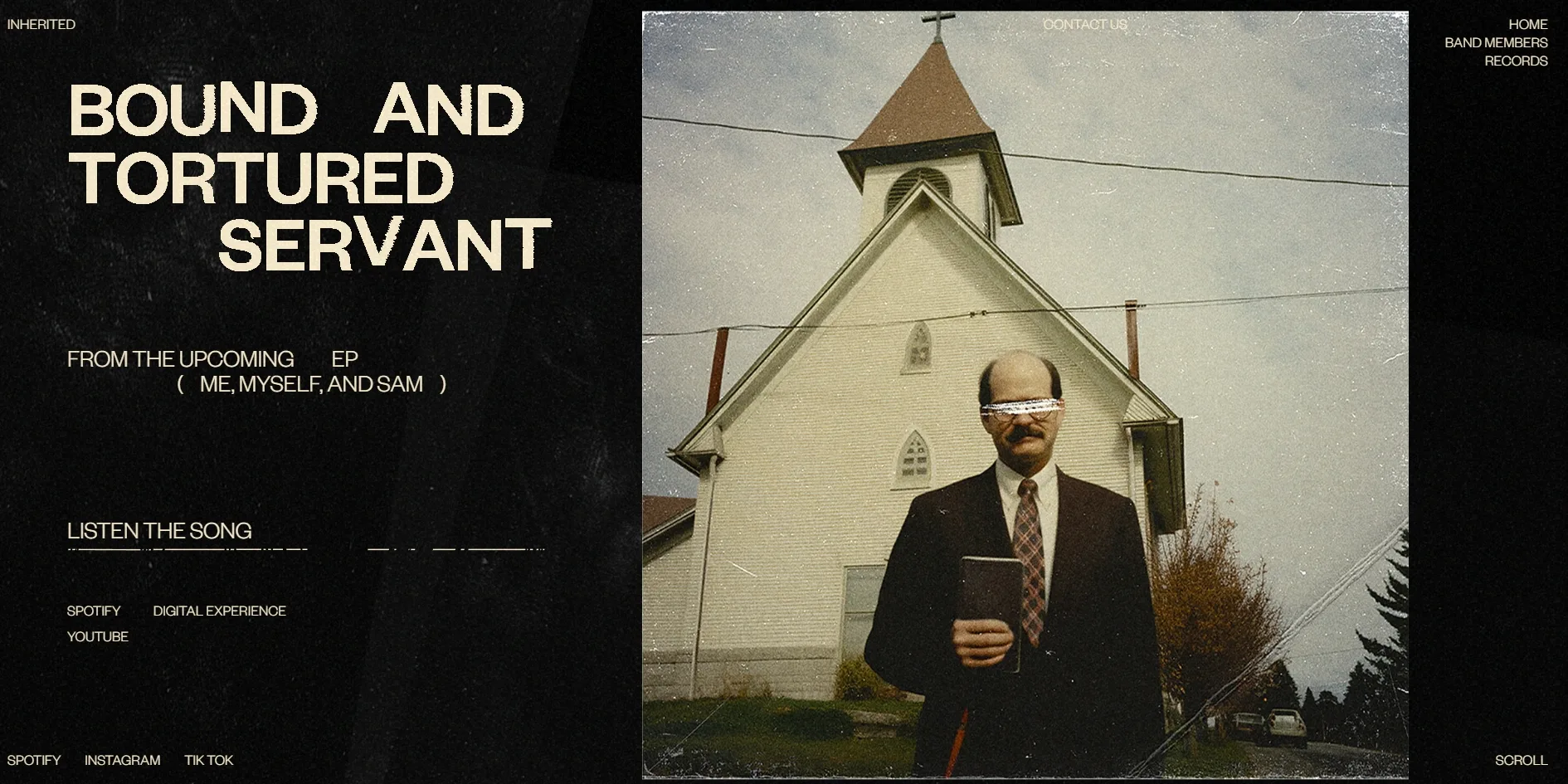
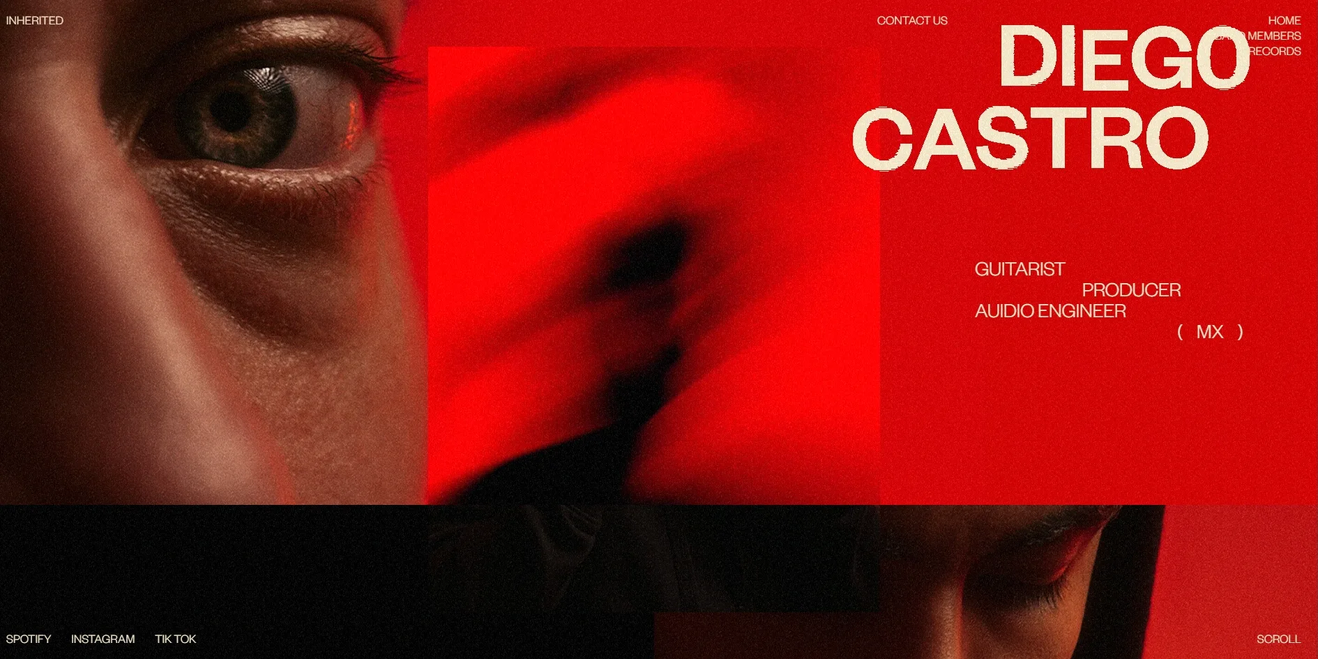
As visitors scroll, each member gets a screen of their own, first the vocalist Eder Anaya, then the guitarist and producer Diego Castro and then the guitarist and film director Manuel Lenis. Each screen is a collage of one large, very close photo showing only half a face or a single eye, a smaller half-length portrait, and the member's name, roles and country code. The last screen presents the new single Bound and Tortured Servant, from the upcoming EP Me, Myself, and Sam, with links to listen on Spotify and YouTube and a Digital Experience link. That link leads to a separate page, a word-guessing game that can only be played on a phone, so desktop visitors who click it see nothing but a QR code.
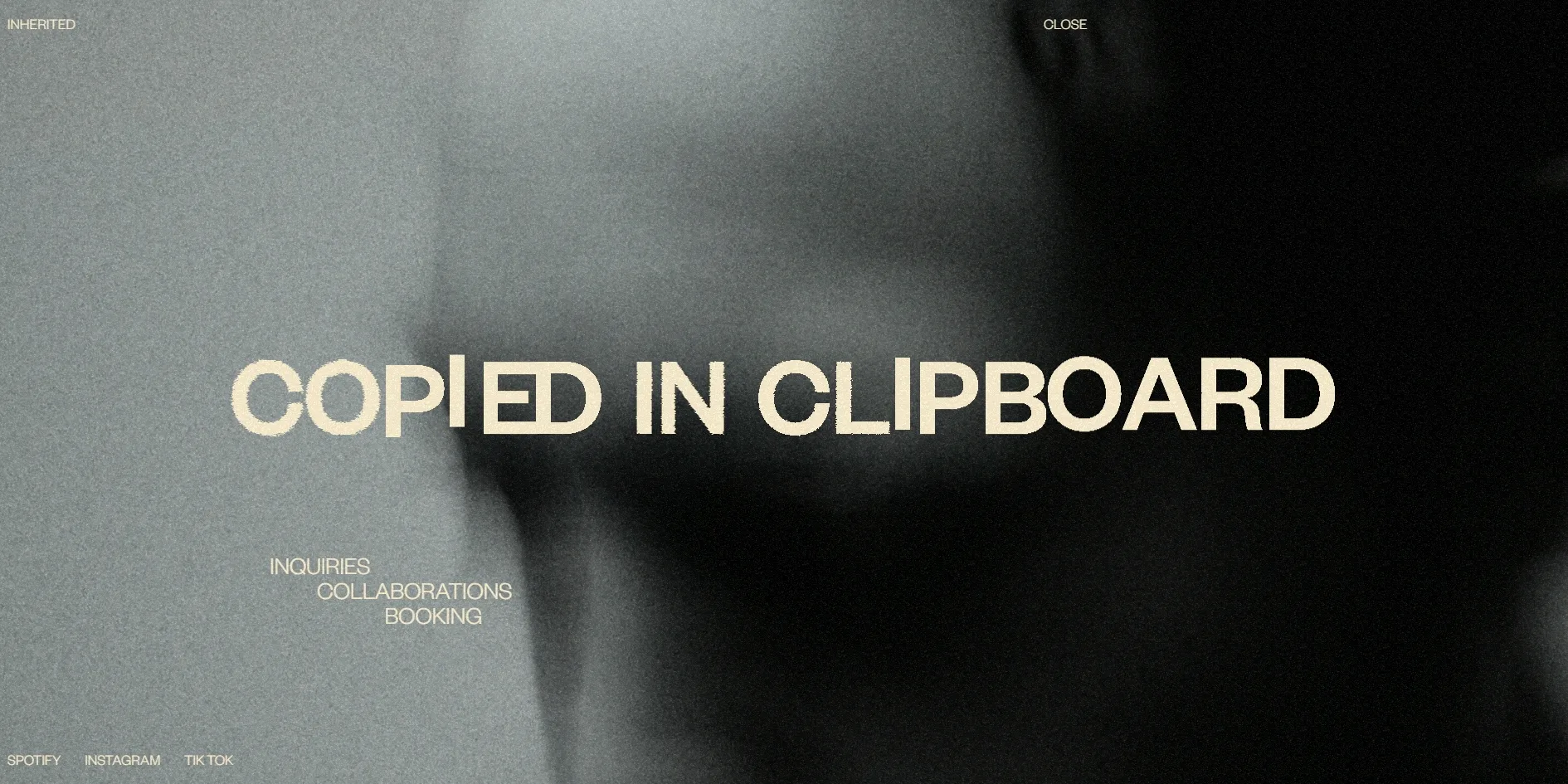
There are few places on the page where visitors can act, and the contact window is the most complete of them. When a visitor clicks Contact us, the whole screen turns into a contact window, with a very large email address in the middle and three reasons to get in touch below it, Inquiries, Collaborations and Booking. When the visitor clicks the email address, it is copied, and an equally large COPIED IN CLIPBOARD takes its place for a few seconds before the address returns.
02Design
Apart from the photographs themselves, the layout uses only three colours, a red close to pure red, black and a yellowish cream. The red is the colour of the wall in the member photos, the black is their clothes and the empty space between the photos, and the cream is used only for text. On the last screen, about the single, the red drops away and leaves a scratched black background with a faded old photograph. The contact window turns black and white, so the colour of each screen also tells visitors what that screen is about. A fine layer of grain covers the whole site and shows on both the red wall and the black background, which makes the page look more like developed film than a screen.
All the text is set in one sans serif, Founders Grotesk, in just two weights, regular and bold. Headlines are always bold capitals, and their layout follows a recurring habit. Lines are not aligned on the left but step further to the right one after another, and wide gaps are left between words on purpose. DEATHCORE and METALCORE on the opening screen are set this way, as are the members' names and roles and the single's title BOUND AND TORTURED SERVANT. The stepped setting makes every block of text look as if it had been pasted on by hand, which belongs to the same language as the collaged photographs.
Photography is the lead on this site, and the FWA files it under photography as well. Every member photo is shot under red light with the faces kept very dark. Some show only a mouth and a beard, and some show only one wide-open eye. What visitors see is a series of faces pressed very close to the camera rather than a neat band photo. The image for the single switches to a different tone. In an old, yellowed photograph, a man in a suit holding a book stands in front of a white church, with his eyes covered by a white scratch.
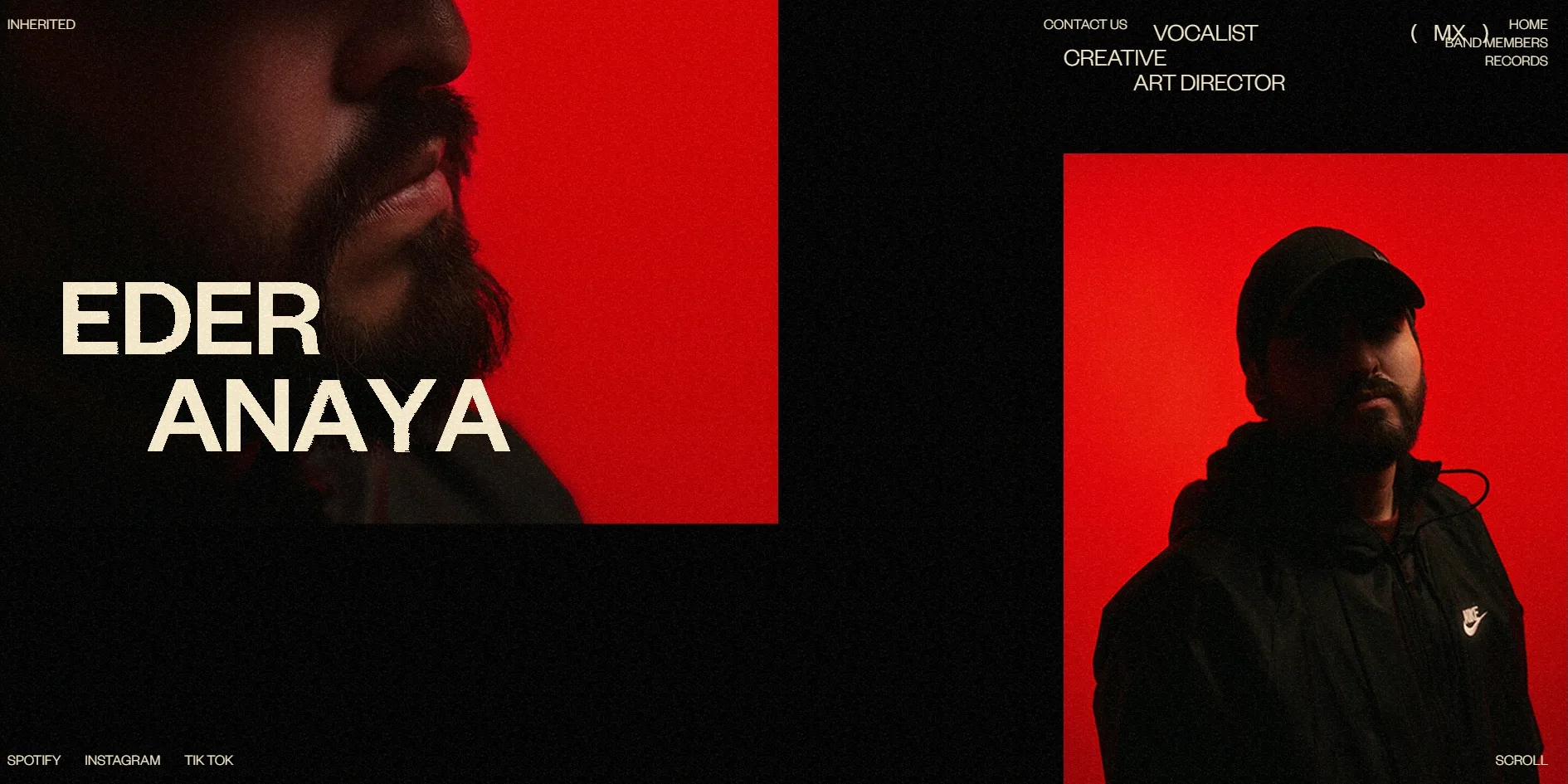
The navigation fixed to the top and bottom does not make room for the content. On the vocalist's screen, the roles and country code at the top right sit directly on top of Band Members, and on Diego Castro's screen the large letters of his name also cover the navigation on the right. These spots read as collisions rather than deliberate overprinting, because the navigation is small regular type and forms no contrast at all with the large letters laid over it.
03Motion
The most noticeable motion on the site is that every large headline keeps trembling. Each letter of a large headline carries a set of noise and displacement filters whose strength keeps rising and falling. The edges of the letters therefore ripple slightly all the time and now and then tear open in a thin horizontal crack, like a skipped frame on a videotape. Right after the page loads, the headlines start as a smeared tangle of shapes and settle into clean letters within about two seconds, then stay in this slight tremble. The email address and COPIED IN CLIPBOARD in the contact window use the same filters, so when a visitor copies the address, the line trembles as it changes.
Scrolling on the page is handled by the smooth scrolling library Lenis, so the page keeps gliding a little after the wheel stops, and the anchor links in the navigation also glide smoothly down to each member. When a member's screen comes into view, each letter of the name flies in from its own direction to form the full name, while the lines of roles slide in alternately from the left and the right. As visitors scroll down, the group photo on the opening screen is smeared sideways and slowly darkens, and the further they scroll, the stronger the smear, as if the camera were whipping to one side.
If the cursor stops on a member's half-length portrait, the still photo is replaced by a looping clip of about a second and a half in which the member moves under red light with heavy motion blur. When the cursor leaves, the clip stops and the photo returns.
The motion runs smoothly, but it makes no allowance for visitors who want less of it. A continuous scroll from top to bottom holds 60 frames per second throughout. With the system setting for reduced motion turned on, the trembling headlines, the flying letters and the smeared group photo all happen just the same, because the site does nothing with that setting.
04Engineering
Everything on INHERITED lives on a single page, and all of its effects come from one script of about 100 KB. Animation is handled by the animation library GSAP, scrolling by Lenis, and the trembling headlines use the SVG filters built into the browser, with no 3D canvas anywhere on the page. The filters only update frame by frame while a headline is in view and stop once it scrolls out, so even with this many letters trembling at once, scrolling does not slow down.
The first visit pulls down about 22 MB, more than half of it video at about 12 MB, with photographs making up about 10 MB. The largest single file is an 8 MB portrait-format video for the opening screen, which is meant for phones. On screens narrower than 1024 pixels, the site hides the opening photo and shows this video instead. On a desktop both the photo and the video are on the page, and the photo sits exactly on top of the video, so desktop visitors download and play this 8 MB video without ever seeing it. The remaining 4 MB of video is the black and white clip from the loading screen, which also serves as the background of the contact window. The four large background images for the members and the single are about 1.5 to 2 MB each, which makes up most of the photo weight.
Loading is quick, with first contentful paint between 0.37 and 0.48 seconds, under Google's suggested 1.8 seconds, and what it paints is the loading screen. The group photo on the opening screen appears at around 2.3 seconds, also under Google's suggested 2.5 seconds. Layout shift is only 0.011, far below the suggested limit of 0.1, and no long task blocks the page for more than 50 milliseconds at any point during loading.
The site lays some groundwork for screen readers, but keyboard users get lost and several large headlines are hard to read aloud. The page declares English as its language, marks out a header, navigation, main content and footer, offers a link to skip to the content and gives every photo a text alternative. Keyboard users see no focus ring on any link, so when they press Tab they cannot tell where they are. Focus also passes first through the hidden contact window, stopping on its close button, the email address and three social links while nothing changes on screen. On the screen reader side, several large headlines are written in the page with a space after every letter, as in I N H E R I T E D. A screen reader is therefore likely to read them out as a string of separate letters rather than the band's name.
A few things on the page were not cleaned up before launch. Diego Castro's role is spelled Auidio Engineer, with an extra letter i. The listening prompt on the single's screen reads Listen the song, missing a to. In the page's text, the last letter of the name Diego is the digit 0, which is hard to spot on screen but which a screen reader will read out as a number. In addition, when visitors press Shift and G together, a coloured six-column layout grid appears over the page until they press it again, a design alignment tool that was never removed at launch.
05Scores and Team
| Award | Source | Date | Score |
|---|---|---|---|
| FWA of the Day | The FWA | 2026-10-05 | 81 POINTS, DAYS 13 |
| Nominee | Awwwards | 2026-09-21 | The page shows no jury score |
INHERITED won FWA of the Day with 81 points, and the team's description on the FWA calls it a deathcore project reimagined as a digital world that blends music, storytelling, identity and interactive experiences. The storytelling appears to live in the phone-only word-guessing game, whose page opens with a monologue asking the visitor to play along. The desktop page reads more like a band calling card, strong on identity and light on story and interaction. The FWA files it under two categories, personal and portfolio and photography, and the second one matches the way the site puts its photographs in the lead. Before that, Awwwards listed it as a nominee on 21 September, with only community members' votes on the page and no jury score.
| Credit | Who they are | Track record |
|---|---|---|
| Eder Anaya | An animator and designer in Mexico City, and also the vocalist and art director of INHERITED | Awwwards works 9, SOTD 2, HM 8. FWA 5 |
| Jorge Toloza | A creative developer in Santa Marta, Colombia, co-founder of DDS Studio, whose FWA introduction describes him as an Awwwards judge | Awwwards works 19, SOTD 3, HM 17. FWA 2 |
Track records are cumulative as of the time of writing. The most unusual credit here is Eder Anaya, who is the band's vocalist on the page and the site's designer on the award page, so the band built its own website instead of handing it to an outside studio. Neither credit is new to awards, with two Sites of the Day on Awwwards for Eder Anaya and three for Jorge Toloza.
06Archive
- Award date
- 2026-10-05
- Awards
- The FWA FOTD 2026-10-05, Awwwards NOMINEE 2026-09-21
- Site
- https://inherited.band/
- Credits
- Eder Anaya, Jorge Toloza
- Design
- graphic
- Build
- dom
- The FWA
- 81 POINTS, DAYS 13. https://thefwa.com/cases/inherited
- Stack
- Vite, GSAP, Lenis, SVG filters
- Total assets
- About 22 MB on a first visit, including about 12 MB of video, 8 MB of which is the phone-only opening video that desktop visitors never see
- Speed
- FCP 368–484 ms (loading screen), LCP 2.25–2.35 s, CLS 0.011. Continuous scroll 60 fps