twks
The twks website strips its own interface down to little more than black, white and a single typeface, hands the colour over to its clients' work, and says nothing of its own on the opening screen apart from the navigation. Where twks really spends its effort is the moment a visitor gets in touch. Opening the contact entry shows whether the Geneva office is open right now, what time it is there and how warm it is outside. One more click, and a project director called Marie starts asking about the visitor's project one message at a time, as if in a chat.
twks is an independent creative agency in Geneva, and it designed and built this site itself. The site won Awwwards Site of the Day.
01Concept
twks has worked on brands, campaigns and digital projects in Geneva since 2011, for local and international brands and institutions. Its website has two jobs, to show the work and to get the right people to make contact. twks lets the work speak first and keeps its own words for later. From top to bottom the homepage is a full-screen slideshow of work, a short self-introduction, four large case studies, four articles and finally a black footer full of contact details.
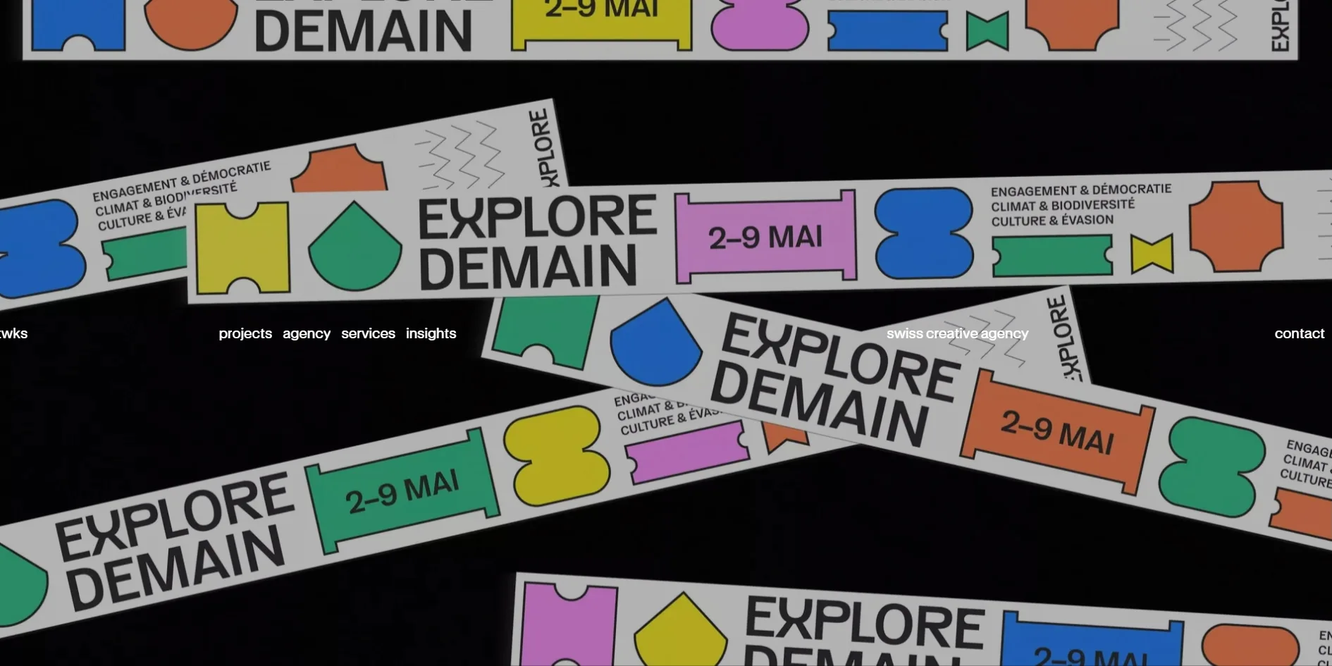
The first time someone opens the homepage, the screen starts out black, the letters of the navigation are typed out one at a time, and only then does the first piece of work appear. The opening slideshow has fifteen slides, eleven photos and four short videos. They show things such as festival posters in the street, a loyalty card in a shop and a laptop on a desk, all of it work twks made for clients. Each photo stays for a little over three seconds, each video plays to its end, and the change is a straight cut with no fade. The order of the fifteen slides is shuffled again on every visit.
Below the slideshow comes a large self-introduction, and a small animated head icon sits in its sentence right after the word creative, as big as the letters and set in the line like another word. Further down come the four large case studies, and each one opens into a long page. The page for a mental health project at EPFL, the Swiss federal institute of technology in Lausanne, runs to about fifteen screens, mostly pictures with little text. Beyond the homepage, the projects page lists 38 selected projects and 283 archived ones that can be filtered by service and by industry, although the English filter still shows a few French labels such as Horlogerie & Joaillerie. The agency page explains the team's method in four steps, research and strategy, creation and testing, preparation and launch, and feedback and optimisation.
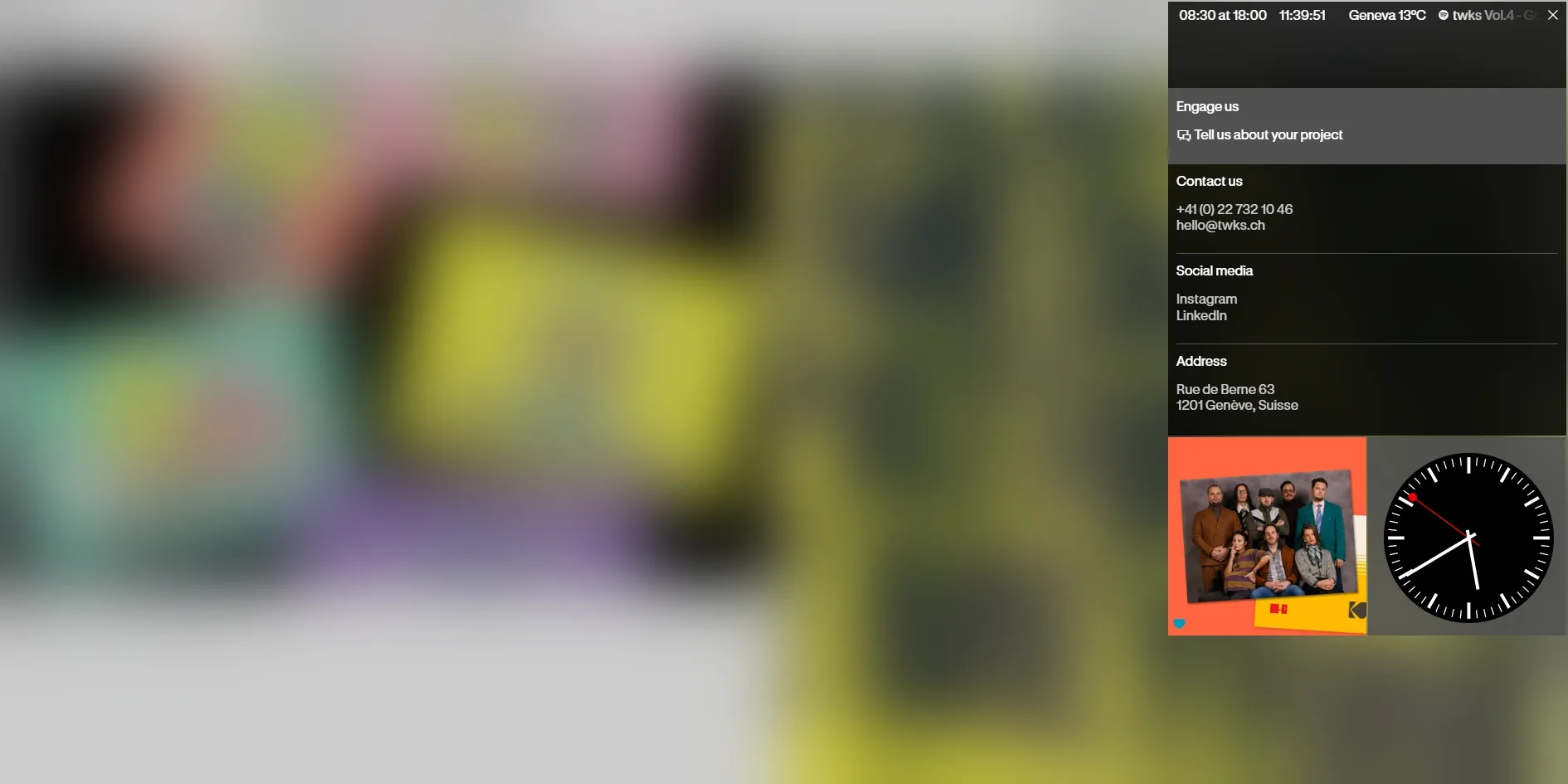
Clicking contact at the top right of the navigation blurs the page and slides a panel in from the right. A ticker runs along the top of the panel and says the office is open from 08:30 to 18:00, with a dot in front that is green during opening hours and red after them. The current time in Geneva, the local temperature and one of the team's Spotify playlists follow in the same ticker. Below the ticker come the phone number, email, social accounts and office address. Two tiles sit side by side at the bottom of the panel, and the left one is a picture, which showed a blurred photo of a running animal on one visit and a team photo on another. The right tile is a ticking station-style clock with a red second hand.
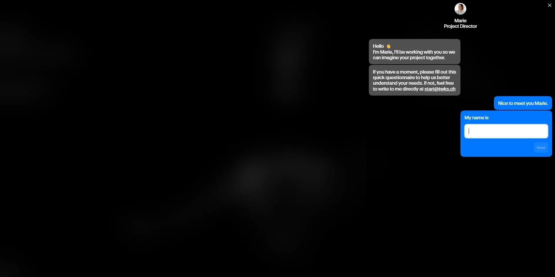
Tell us about your project in the panel opens a conversational questionnaire, which twks has made into a chat window with Marie's photo and the title Project Director at the top. Marie opens with two grey messages, saying hello and adding that a visitor without time for the questions can write directly to start@twks.ch. A blue reply, Nice to meet you Marie., then appears on the visitor's side by itself, followed by a blue bubble that reads My name is with a blank to fill in. The questionnaire runs to about ten questions about the company, the kind of service needed, how urgent the project is and how much creative freedom twks would get. The urgency scale runs from In the flow, no rush all the way to Full alert, every second counts. The creative freedom scale runs from Highly defined framework, tightly directed. to Complete trust, let your creativity shine. Only at the end does it ask for an email address and a phone number.
02Design
The rule twks set itself is that the interface uses black, white and one typeface, and the colour on the site comes from the clients' work. All the text is set in GT Standard, a sans serif from the Swiss type foundry Grilli Type, in just regular and semibold, and the navigation is all lower case. A thin layer of black sits over the photos on the opening screen, which dims the work a little and keeps the white navigation readable on every slide. The content below is black on white and the footer returns to solid black, so the large areas of bright colour all come from the pictures of work. The contact panel is the one exception, with its green or red dot, the red second hand of the clock and the blue chat bubbles on the visitor's side of the questionnaire, the familiar blue of messaging apps.
twks uses only two type sizes, one for the large self-introduction on the homepage and one for all the other text. The self-introduction is about two and a half times the size of the navigation and the body text. Headings, case study names and article titles are all the same size as the body, and grey subtitles and weight do the work of hierarchy. The page's real main heading is hidden from view and is there only for screen readers.
The navigation is a single line of text that runs through the whole site, and it sits in a different place on the opening screen than everywhere else. On the opening screen the line crosses the middle of the photo, with twks on the left and contact on the right. In between come projects, agency, services and insights, followed by swiss creative agency, and the whole line stretches from one edge of the screen to the other. Once the visitor leaves the opening screen, the line settles at the top of the page and its colour flips against whatever lies underneath. Over white it is black text, and over a photo it turns into the photo's inverted colours, so no background strip is needed behind it.
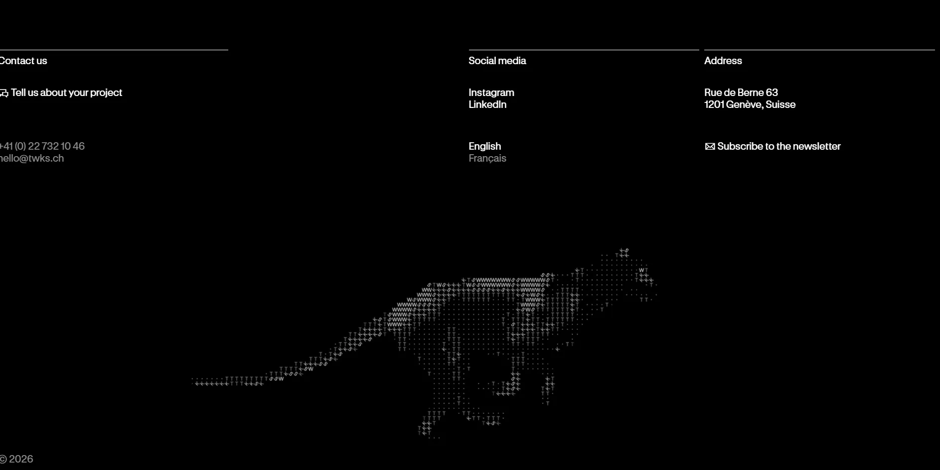
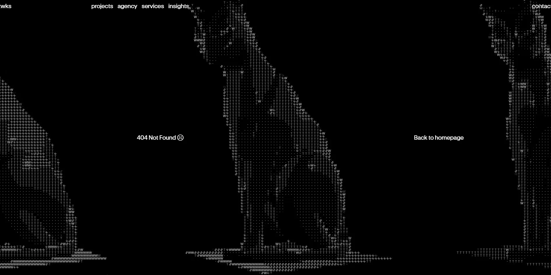
twks's own illustrations keep to black and white as well, and they are drawn with the agency's name. The running panther in the footer and the cats on the 404 page are both made of the letters t, w, k and s plus small dots. Bright areas use the dense W and dark areas use dots, so from a distance the picture is an animal and up close it is all twks.
03Motion
The handover from the opening screen to the content below is the main piece of motion on the twks homepage. As the visitor scrolls down, the photo on the opening screen slowly grows and fades at the same time. By the time the opening screen has scrolled away, the photo is about twice its size and barely visible, and the white self-introduction has pushed up from below and covered it. Scrolling across the page is handled by the smooth scrolling library Lenis, so the page glides on a little after the wheel stops. With the system setting for reduced motion turned on, this growing photo and the typed opening still play as usual, and the site makes no adjustment for the setting.
At the other end of the page sits the footer, which does not scroll up with the page but waits underneath the white page all along. At the bottom of the page the white page lifts away like a curtain, and the black footer is uncovered from below bit by bit. As soon as the first edge of the footer shows, the panther makes its entrance, a cloud of scattered letters gathering into a panther in about two seconds, and after that the panther keeps running in place. Because the entrance starts the moment the footer begins to show, a visitor who scrolls slowly will see the first half of it play out behind the white page.
Apart from these two, the rest of the motion on the site is small and mostly follows the cursor and clicks. When the cursor moves over a case study image, a See the project label follows it, in colours inverted against the image underneath. Navigation links draw a line underneath on hover, the page behind blurs as the contact panel slides in from the right, and the messages in the questionnaire pop up one after another as in a chat app.
Scrolling the whole homepage from top to bottom twice held a steady 60 frames per second with no stalls. The growing photo on the opening screen and the panther in the footer are video and styling rather than live drawing, and the page has no canvas, so the browser has little extra work to do while scrolling.
04Engineering
The twks site hands interactions such as opening panels and changing slides to Alpine.js, a small lightweight framework, and scroll-driven animation such as the growing opening screen and the footer's entrance to the animation library GSAP. Visitor statistics come from Fathom, which sets no cookies, so the site shows no cookie notice.
About ten seconds after opening, the homepage has downloaded around 6 MB, mainly the opening photos, a few short videos and an animated GIF. After that the slideshow downloads each video as it reaches it, and a visitor who stays on the homepage for a minute or so ends up with 16 to 24 MB in total. The largest slideshow video lasts only about ten seconds yet weighs about 11 MB. Two smaller files are out of proportion to what they do, starting with an article thumbnail that is a 1.3 MB animated GIF. The small head icon in the self-introduction needs an animation player of about 0.5 MB from a public server before it can move. The site asks for the latest version of that player, so whenever the library updates, the version on the site changes with it.
The twks homepage loads at a broadly normal speed. The server starts sending the page within 0.64 to 0.83 seconds, close to Google's suggested 0.8 seconds, and the first content appears on screen at 0.92 to 0.98 seconds, under the suggested 1.8 seconds. The first piece of work waits until the navigation has finished typing out, at around four to five seconds. The page barely jumps while it loads, with measuring tools reading 0.02 against a suggested limit of 0.1.
Keyboard users can mostly get around the site and only stumble at the contact panel. Each link a visitor reaches with the Tab key shows a clear focus outline, and the three items under services can be reached too. Pressing Enter on contact opens the panel and moves focus inside it. Once the panel is open, though, pressing Esc does not close it.
A screen reader will get two things wrong on this site. The cross on the contact panel has no name, so a screen reader announces it only as a button. The English pages are labelled as French throughout, so a screen reader will read English text with French pronunciation.
05Scores and Team
| Award | Source | Date | Score |
|---|---|---|---|
| Site of the Day | Awwwards | 2026-10-07 | 7.35 / 10 |
Content was the highest of twks's four Awwwards scores at 7.64, and Creativity the lowest at 7.09. The high content score fits a site that puts so much real work, long case studies and writing on show. The low creativity score probably reflects how deliberately plain twks keeps its own interface, since the most striking colour and imagery on the homepage come from the clients' work rather than from the site itself. A separate developer jury gave 7.24, and leaving responsiveness aside, web performance scored highest at 7.4 and accessibility lowest at 6.8. The low accessibility score may be linked to the wrong page language and the unnamed close button described above.
| Credit | Who they are | Track record |
|---|---|---|
| twks | An independent creative agency in Geneva that says it has worked on brand, digital and campaign projects for local and international brands and institutions since 2011 | Awwwards works 1, SOTD 1, HM 1 |
Awwwards credits only the agency itself, and the track record counts up to the time of writing. The credit names no individuals and does not say who did what. This is twks's first Site of the Day on Awwwards, and the award went to its own website rather than to a client project.
06Archive
- Award date
- 2026-10-07
- Awards
- Awwwards SOTD 2026-10-07
- Site
- https://twks.ch/en
- Credits
- twks
- Design
- graphic
- Build
- dom
- Awwwards
- 7.35 / 10. Design 7.45 / Usability 7.28 / Creativity 7.09 / Content 7.64. Developer Award 7.24. https://www.awwwards.com/sites/twks-1
- Stack
- Alpine.js, GSAP (ScrollTrigger), Lenis, dotLottie, Fathom
- Total assets
- About 6 MB ten seconds after opening, about 16 to 24 MB after a minute or more on the homepage, including about 11 MB for the largest slideshow video
- Speed
- FCP 920–984 ms, first piece of work at about 4 to 5 s, CLS 0.02. Continuous scroll 60 fps