1minus1
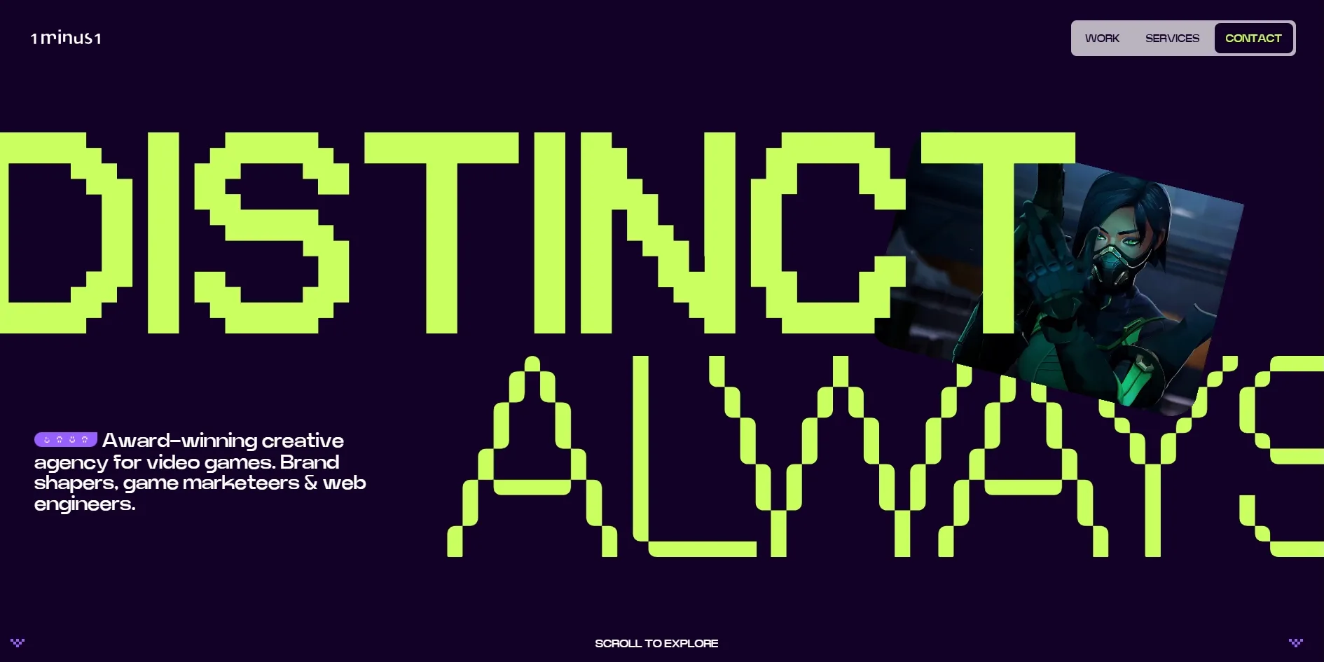
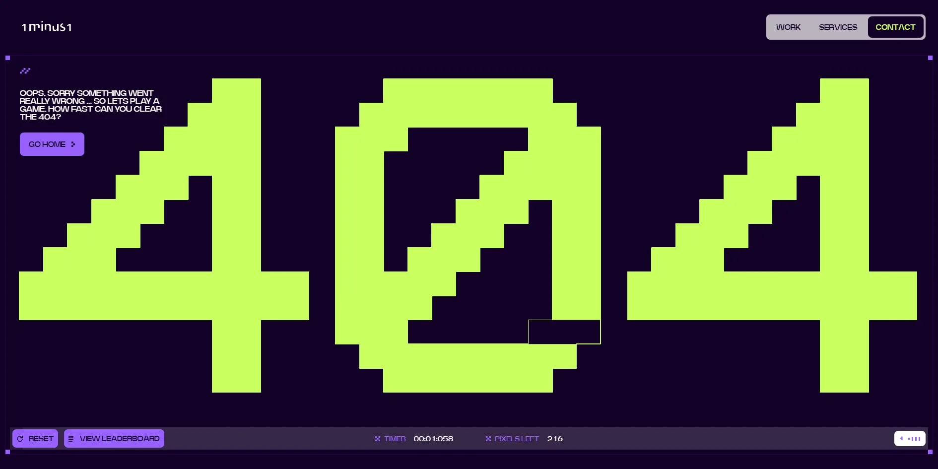
1minus1 is an agency that makes websites, brands and marketing for the games industry, and it has built its own new website to look like a game. Every large word on the page is pixel type made of blocks, acid green on deep purple, like the start-up screen of an old console. 1minus1 even turned its error page into a small game, in which visitors rub out a 404 made of over two hundred blocks one square at a time with the cursor, against a timer and a leaderboard.
1minus1's own team designed and built the site, and it won FWA of the Day.
01Concept
1minus1 made this site so that game companies would recognise it at once as one of their own. The opening screen calls it an award-winning creative agency for video games, made up of brand shapers, game marketeers and web engineers. The team's FWA description says this is the agency's rebranded site, designed and built in-house to show its brand, web and marketing work for studios and publishers, with touches borrowed from games. The site's clients are game companies, so the whole site looks like a game too.
When visitors arrive, small blocks assemble the 1minus1 logo on the deep purple screen, and a few seconds later two huge words fill the width of the opening screen, DISTINCT and ALWAYS. A small card is wedged at an angle between the two words, looping game footage that moves from a masked character to a burst of fire and on to other games, and the card shifts position as the cursor moves.
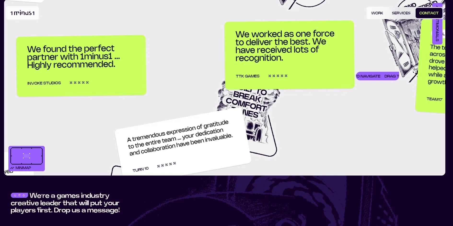
As visitors scroll, the page covers four things, one section each. The first section is a full-screen showreel, and clicking PLAY SHOWREEL plays the full version in place. The second section is services, split into three cards for websites and platforms, branding and creative, and marketing and campaigns. The third section is the work, eight case studies in a carousel that can be dragged left and right and filtered by brand, web and marketing. Clicking any case study opens a full case study page, and the Adhoc Studio page runs to about fifteen screens. The last section holds a few client testimonials and a contact form titled BEGIN YOUR STORY.
A button in the footer reads PLAY OUR 404 GAME and leads to that game of clearing the 404. A huge pixel 404 made of 219 blocks fills the screen, and the corner text admits that something went really wrong and asks how fast visitors can clear the 404. When the cursor passes over a block, that block is rubbed out and only a thin outline is left. The timer starts when the visitor touches the first block, and buttons at the bottom reset the game or show the leaderboard.
02Design
The whole site uses three loud colours, deep purple, acid green and a bright lavender, with a little white. The opening screen and footer are deep purple with acid green, the services section rotates the three colours across its three cards, and the work and testimonial sections switch to white so that the game screenshots and character art supply their own colour.
Pixel type is the site's signature, and every one of the largest words is set in it. The largest lines use the pixel face OffBit, and words such as DISTINCT, SERVICES, OUR WORK and BEGIN YOUR STORY are set about as wide as the screen, some running off its edge, with every block clearly visible. The face comes in two versions, one of solid blocks and one drawn only in outline. On the opening screen DISTINCT is solid and ALWAYS is hollow, like the two kinds of lettering on a game's title screen. Card titles use a bold sans serif and body text and testimonials use a rounder one, so pixels are kept for the largest lines only.
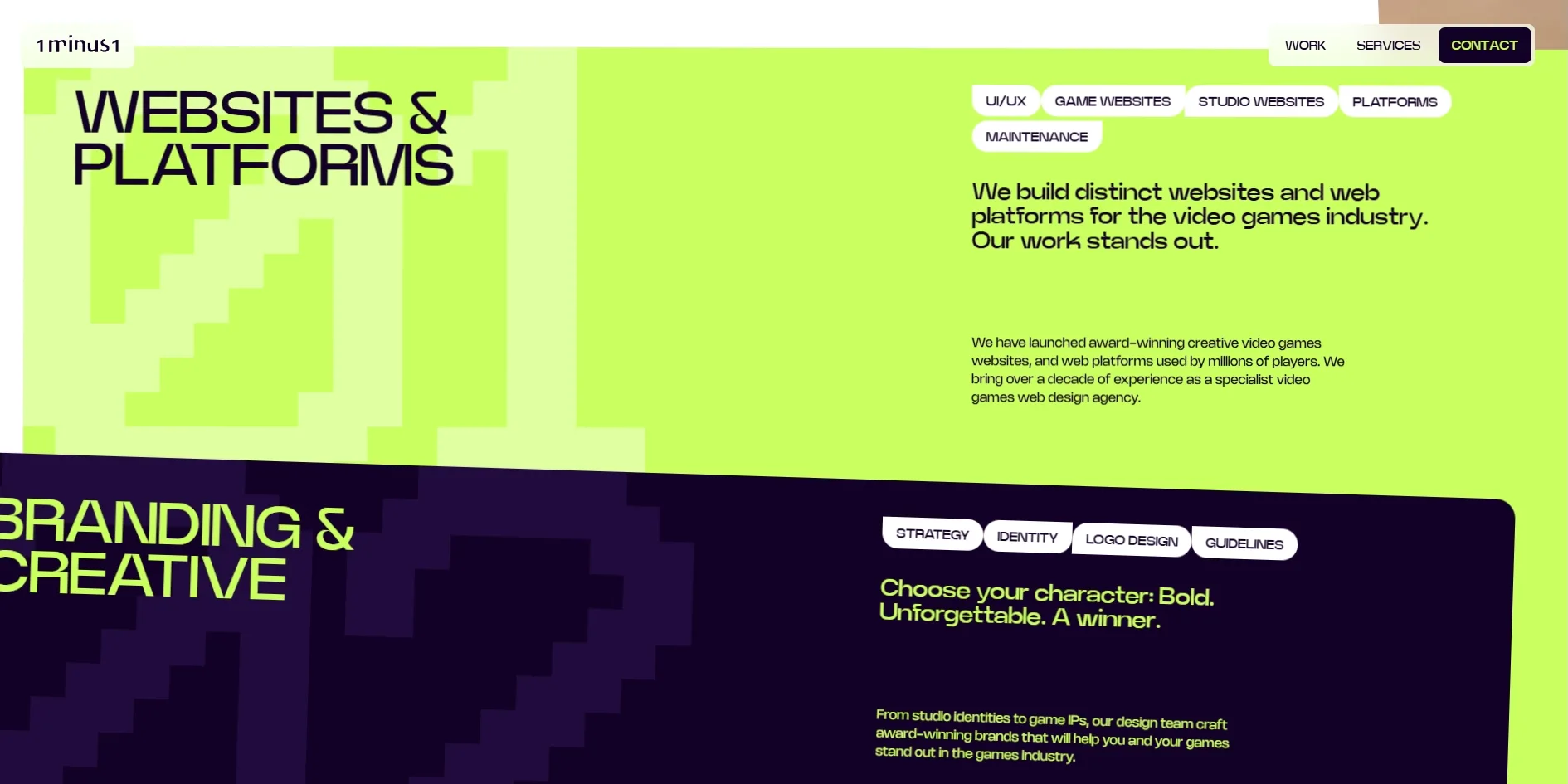
Almost nothing on the layout sits straight on the page. The service cards overlap at angles, the white services panel arrives tilted, and the testimonials are acid green and white notes stuck on crookedly, with black and white sticker illustrations between them carrying slogans such as BREAK COMFORT ZONES. A small frame labelled MINIMAP sits at the lower left of the testimonial area, with a tag reading DRAG TO NAVIGATE next to it, like the minimap in a game's interface. The tilts and stickers make the page look like a wall covered in things rather than a tidy list of services.
03Motion
The card on the opening screen is the site's main piece of motion. As visitors scroll, the small tilted card grows larger and slowly straightens until it fills the whole screen. It becomes the background video of the showreel screen that way, and the PLAY SHOWREEL button then appears in the middle of the footage. The opening screen and the next one are therefore joined by the same footage, with no page change in between.
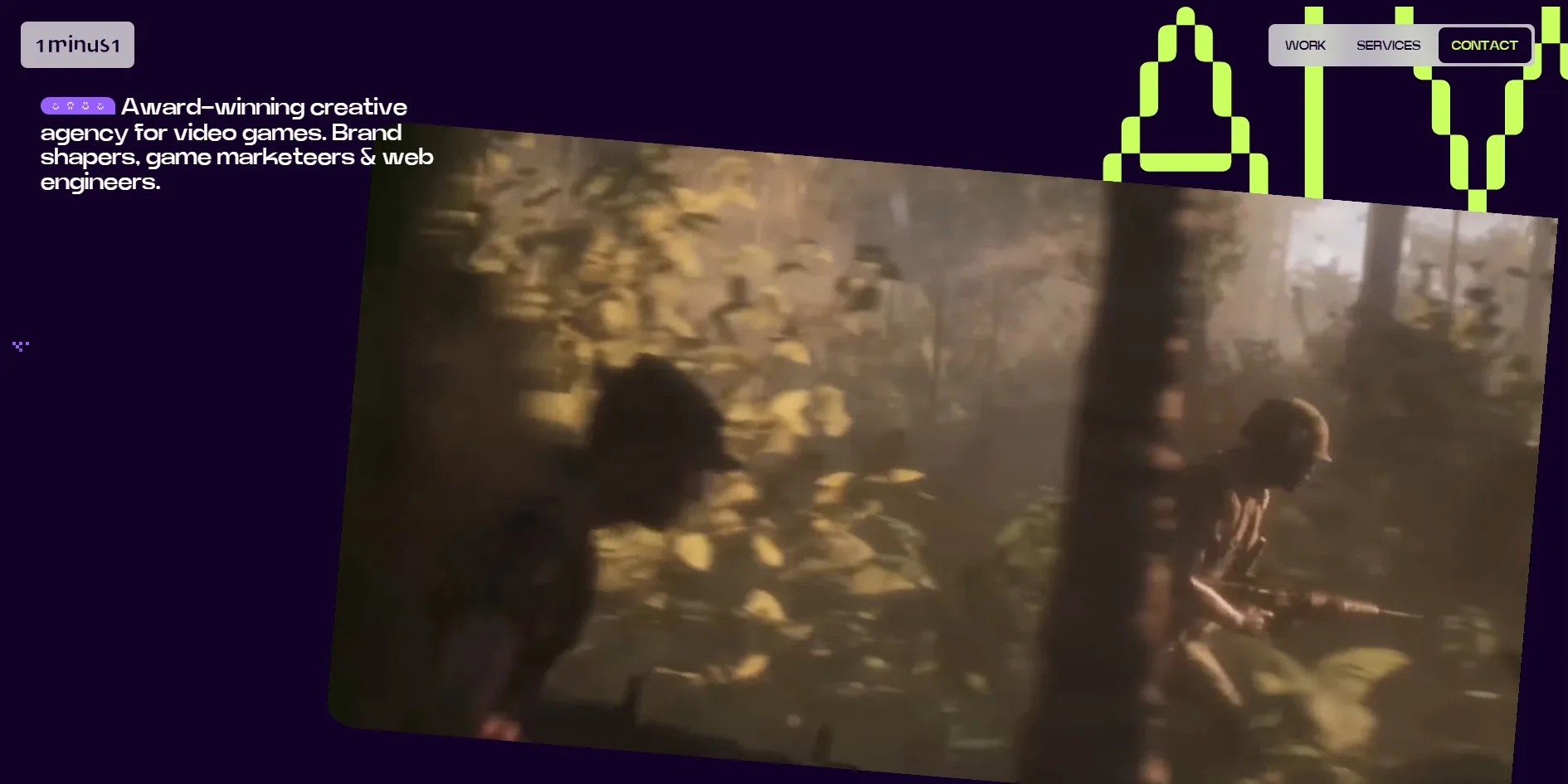
After the card, most of the other motion comes from scrolling. The white services panel pushes up from below at an angle and covers the showreel, and the three service cards stack on one after another. The work carousel can be dragged with the mouse and comes to rest on a card when released. The row of pixel words in the footer, DISTINCT, BRAVE, CREATIVE and so on, keeps scrolling sideways. Scrolling is handled by the smooth scrolling library Lenis, so the page glides a little further after the wheel stops.
Two continuous scrolls both averaged 60 frames per second, with a single frame that stalled for less than a tenth of a second. With the system setting for reduced motion turned on, the site switches some animation off, so the card that follows the cursor no longer appears on the opening screen and the showreel appears as a plain full-screen video, with no growth from the small card.
04Engineering
1minus1 built the site with Nuxt, a framework for Vue, and scroll-driven animation is handled by the animation library GSAP. Opening the home page downloads about 10 MB, more than four fifths of it a single video at about 8.3 MB. The video is only 6 seconds long but larger than the screen, and it is the game footage looping in the small card on the opening screen as well as the background of the showreel screen. When the home page opens, the card covers only about an eighth of the screen, yet the site has already downloaded the largest file on the page for it. Scrolling to the end adds the testimonial stickers and case study screenshots, for about 13 MB in all.
First contentful paint lands between 0.37 and 0.43 seconds, under Google's suggested 1.8 seconds. The pixel logo finishes assembling and all the large words on the opening screen appear at about the fourth or fifth second. Layout shift is only 0.006 to 0.016, far below the suggested limit of 0.1, and the page never freezes for more than about 0.2 seconds while loading.
On privacy, the site does things in the wrong order. A cookie notice appears at the bottom right, offering to accept everything or to open a panel and keep only the necessary category, with analytics switched off by default. Before the visitor has made any choice, though, the site has already loaded Google Analytics, two pieces of Google tracking code and LinkedIn's analytics script, and has already sent requests to LinkedIn's and Google's analytics servers.
Keyboard and screen reader users can use the site, but they lose out in a few places. The work carousel is carefully done, with a description written into the page for screen readers that tells visitors they can switch between case studies with the arrow keys and states which case study is showing. Keyboard focus is visible too, since WORK at the top turns white when it receives focus. The fields in the contact form have no labels, though, only placeholder text inside the boxes. Once a visitor starts typing, the placeholder disappears and a screen reader can no longer say what the field is for. Many images on the page have the layer names from the design file as their text alternatives, such as Group 50891 and Slide 16_9 - 428, and a screen reader will read these labels out as they are.
05Scores and Team
| Award | Source | Date | Score |
|---|---|---|---|
| FWA of the Day | The FWA | 2026-10-08 | 81 POINTS |
1minus1's site won FWA of the Day with 81 points. The FWA files it under two categories, design and production studios, and game. The two categories match the site's two sides, since it is a studio's website that borrows the look of games throughout. Of the touches from games mentioned in the team's description, the ones visible on the site include the logo assembling like a start-up screen, the minimap in the testimonials and the 404 game.
| Credit | Who they are | Track record |
|---|---|---|
| Jonathan Hill | — | FWA 1 |
| Robin Pillar | — | FWA 1 |
| Alfie Renton | — | FWA 1 |
| Grace Aiken | — | FWA 1 |
| Sarah Newton | — | FWA 1 |
The FWA credits these five people, and the records count up to the time of writing. None of their profiles gives a role or an introduction, and this is the first FWA award for each of them. The team's description says the site was designed and built in-house, so all five are most likely members of 1minus1, though the award page does not say who did what. On the site, 1minus1 says it has been working in games for over a decade.
06Archive
- Award date
- 2026-10-08
- Awards
- The FWA FOTD 2026-10-08
- Site
- https://1minus1.com/
- Credits
- Jonathan Hill, Robin Pillar, Alfie Renton, Grace Aiken, Sarah Newton
- Design
- graphic
- Build
- scroll
- The FWA
- 81 POINTS, DAYS 7. https://thefwa.com/cases/1minus1-p3
- Stack
- Nuxt, GSAP, Lenis, three.js r179, DigitalOcean Spaces
- Total assets
- About 10 MB on a first visit, including about 8.3 MB for the looping video in the opening card, about 13 MB after scrolling to the end
- Speed
- FCP 368–432 ms, opening screen complete at about 4 to 5 s, CLS 0.006–0.016. Continuous scroll 60 fps