Odyssée
Odyssée is the website of an aesthetic medicine clinic in Sydney, and it keeps its words small and its skin enormous. The largest line of type on the home page is only a little over three times the size of the body text, and the opening screen carries a single small tagline. Lips, eyes and cheeks, meanwhile, fill the whole screen or half of it again and again, close enough to show the direction of an eyebrow and the texture of the skin. There are no prices on the site and no before and after photos, so the clinic leaves almost everything it has to say to the skin itself.
Nightjar, a studio in Sydney, designed and built the site, which won Awwwards Site of the Day and the Developer Award.
01Concept
Odyssée is a clinic for medical aesthetics in Hunters Hill, Sydney. The website has a simple job, which is to get the people who read it to book a consultation. Every BOOK CONSULTATION button on the home page, the booking item in the menu and the whole footer film open the same external booking system in a new tab. The clinic keeps insisting that its treatments rest on medical evidence, and one chapter of the home page is even titled Method, not myth. It does not try to persuade visitors with prices or before and after comparisons, and talks only about how it assesses people and plans their treatment.
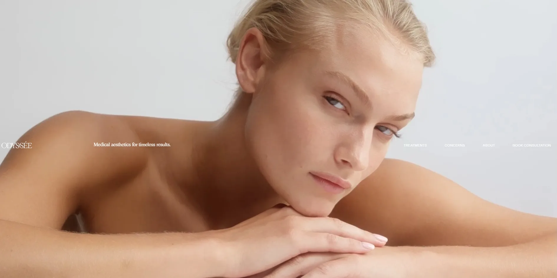
A mauve grey opening screen is what a visitor sees first on the home page, with the clinic's logo and the line Medical aesthetics for timeless results sitting on one line across the middle of the screen. Once that screen fades away, a 27 second film plays behind it, with models resting their hands on their chin and shoulders and the camera very close. The logo, the tagline and the navigation stay on that same line. When the visitor scrolls one screen down, the film gives way to a full screen close-up of lips, and the line is still sitting in the middle of the screen.
After the line leaves, the home page runs chapter by chapter for about ten screens. First come a short introduction and the first booking link, followed by a chapter called WHY ODYSSÉE?, where four cards each carry a clip of about five seconds and take turns giving the clinic's four reasons. Further down, the home page sets out two large pictures side by side with the clinic's philosophy, then a link to the treatments page and the Method, not myth chapter. It ends with two cards leading to the Treatments and About pages.
Behind the home page are three more pages. The first of them, Treatments, sorts the treatments into five groups, from facial structure and skin restoration through to a range for men, and gives each group a paragraph on the approach and a list of procedures. The Concerns page works the other way round and starts from three concerns, skin health, facial contouring and hair restoration. The About page sets out the clinic's philosophy and introduces two people, Dr Jean-Paul Chung and the registered nurse Mary Chigwidden. None of the three pages is long, and all of them keep making the same point, that the clinic assesses first and then plans around each person.
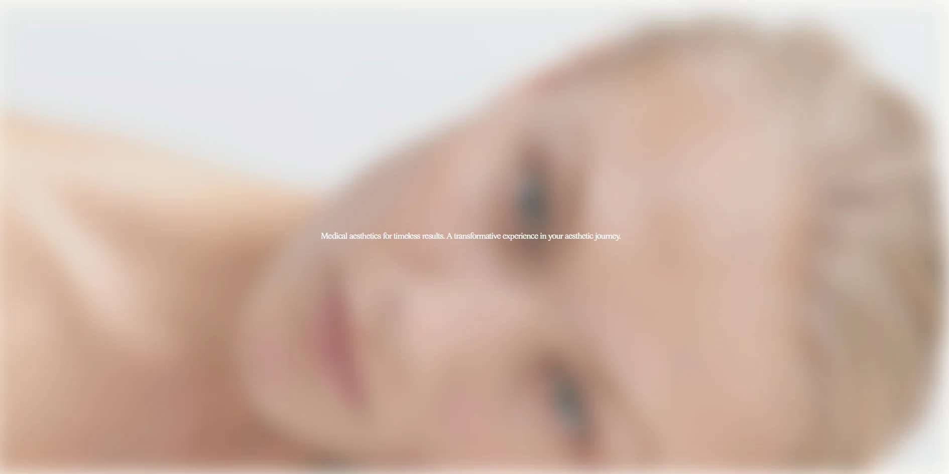
The site also keeps two unusual details for visitors who stay a while. Next to the opening hours in the footer is a live clock showing the current time in New South Wales, the state Sydney is in. The small dot in front of it is green while the clinic is open and red once it has closed, and after closing time the words Currently closed appear when the cursor rests on it. If a visitor leaves the mouse, keyboard and scroll wheel alone for ten minutes, the home page slowly covers itself with a blurred portrait, with one line of white text in the middle repeating the clinic's tagline. A single click makes the portrait go away and leaves the page where it was.
02Design
The whole Odyssée layout uses two colours and two typefaces, and it builds its hierarchy from position and picture size rather than from type size. The text on the home page comes in only two colours, a deep navy and white, laid over a slightly warm off-white background, and the navy text reads very clearly against it. Full-sentence headings and the longer passages are set in a serif, and even the largest of them on the home page is only a little over three times the body size. The navigation, labels and body text use a small sans serif, and the labels are always in capitals. The opening screen holds just one tagline about the size of the navigation, leaving the clinic's case to the pictures.
The most distinctive layout move is a single line stretched across the full width of the screen. On the opening of the home page it holds the logo at the far left, the tagline a third of the way in and the four navigation items on the right. Together they are pinned to the exact middle of the screen, like a horizon running across the film and the close-up of lips. The same spread appears twice more, first across a pair of large pictures on the home page, where the words BESPOKE, MEDICAL and AESTHETIC sit at the left edge, the centre and the right edge. The inner page titles are split in two as well. On the Treatments page Guided by science sits on the left and refined through care on the right. Only after the visitor scrolls down does the sentence join up into one line, in the header bar at the top.
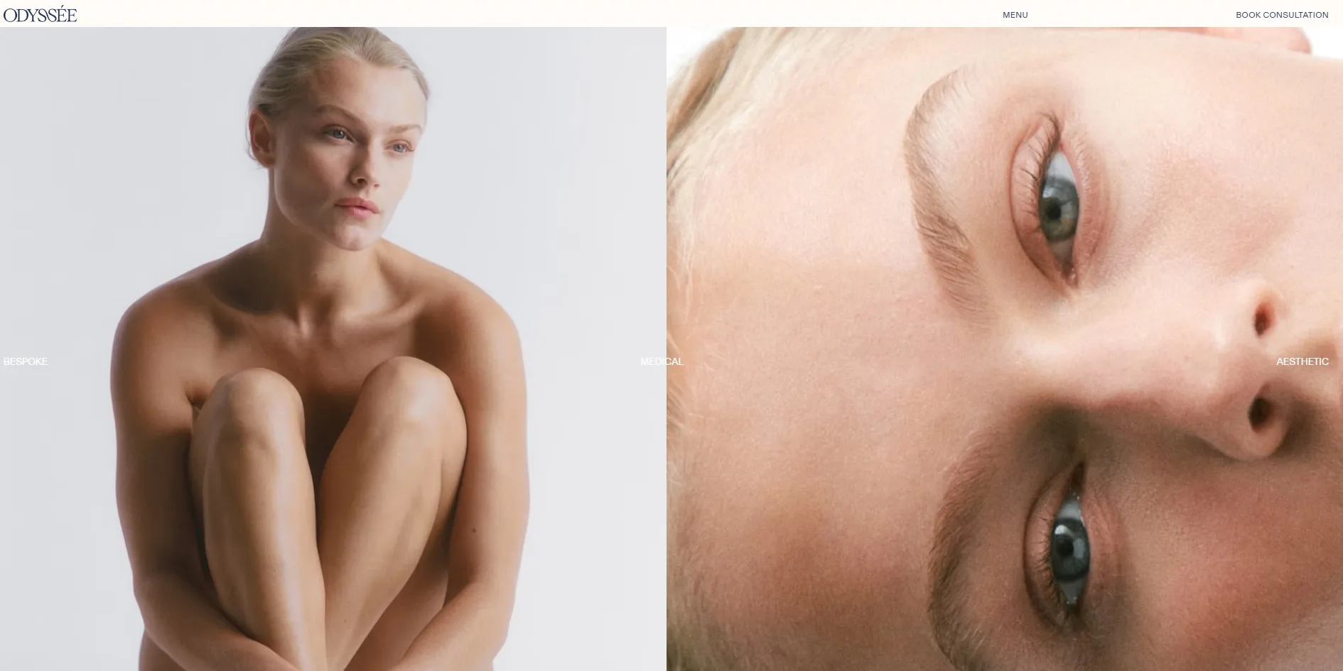
Almost every photo and film on the site shows skin, always against pale grey. Some are so close that only part of a face is left, with lips, eyes or the side of a nose filling the frame, and the rest show models with bare shoulders. The home page rarely shows the clinic itself, apart from one clip of a room with a sofa and a few photos of a consultation, and the formal portraits of the staff appear only on the About page. The other kind of picture is product texture, a drop of gel, a heap of bubbles and, in the footer, a pearl coloured ball engraved with ODYSSÉE. Nearly all the living colour on the site comes from that skin, while the interface itself stays navy and off-white.
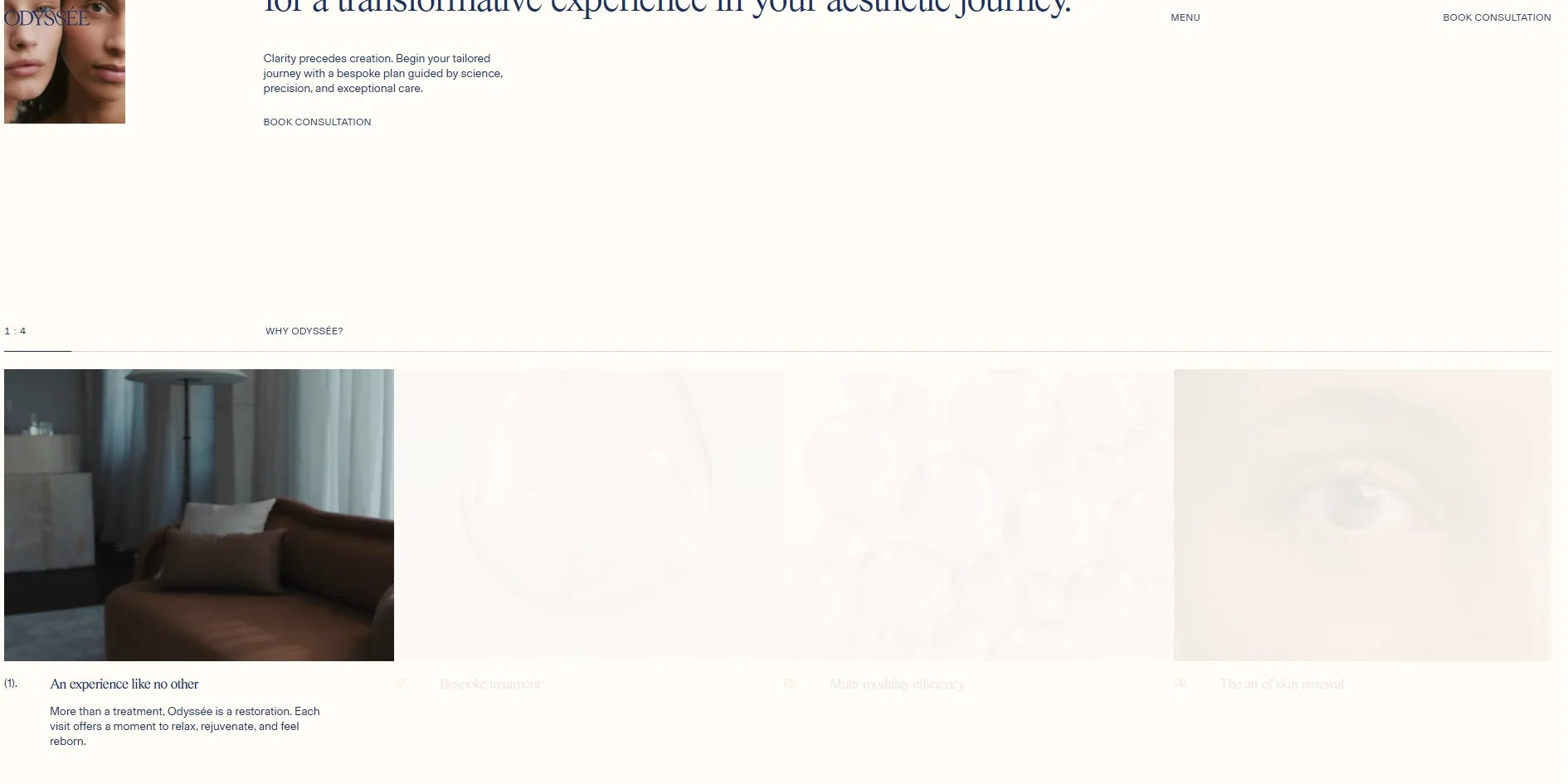
The layout uses fading to show that something is not the focus right now. In the WHY ODYSSÉE? chapter, the card that is playing is in full colour with its title and caption showing, while the other three sit under an off-white veil and their titles almost disappear. The five treatment groups on the left of the Treatments page behave the same way. Whichever group the visitor has scrolled to opens into a paragraph and a list, the other four stay as a single pale title, and the photos on the right change to match that group. The two cards that close the home page turn the rule around, showing black and white photos under a navy wash until the cursor rests on one and brings back its colour.
A few details show that someone looked after this layout point by point. Each long serif passage opens with a blank space, like a first line indent in a book, only wider. The cards and treatment groups are numbered in brackets, as in (1)., and the footer marks the address, the contact details and the social links with the letters A., C. and S. A small dot also keeps coming back, half the size of a letter and always in the colour of the text beside it. It is the status light in front of the footer clock, and it also sits in front of CLOSE in the menu.
03Motion
Everything in Odyssée moves slowly and gently, and almost nothing jumps onto the screen. Scrolling is handled by the smooth scrolling library Lenis, which smears each turn of the wheel into a gentle glide. When long serif passages scroll into view, they rise word by word, the work of the text splitting plugin in the animation library GSAP. As the visitor scrolls down, the footer film of the ball shrinks slowly from one and a half times its size back to normal. Continuous scrolling holds a steady 60 frames per second on the home page and all three inner pages, with almost no stutter.
The line across the middle of the opening screen carries the first piece of motion on the home page. On the mauve grey opening screen, the logo and tagline already sit where that line will be, so they stay put while the screen fades and the navigation items appear a moment later. The visitor sees no seam between the opening screen and the home page. For the first two screens of scrolling the line stays in the middle. Once the film and the close-up of lips have scrolled past, it leaves with them, and a narrow header bar takes over at the top with only the logo, MENU and BOOK CONSULTATION.
The four cards in WHY ODYSSÉE? work as a small player. When the clip in one card finishes, the next card lights up and starts playing. The counter at the top left moves on from 1 : 4 to 4 : 4, and the thin line beneath it stretches further to the right. Whichever card the visitor rests the cursor on lights up and plays at once, while the others fall back under the off-white veil.
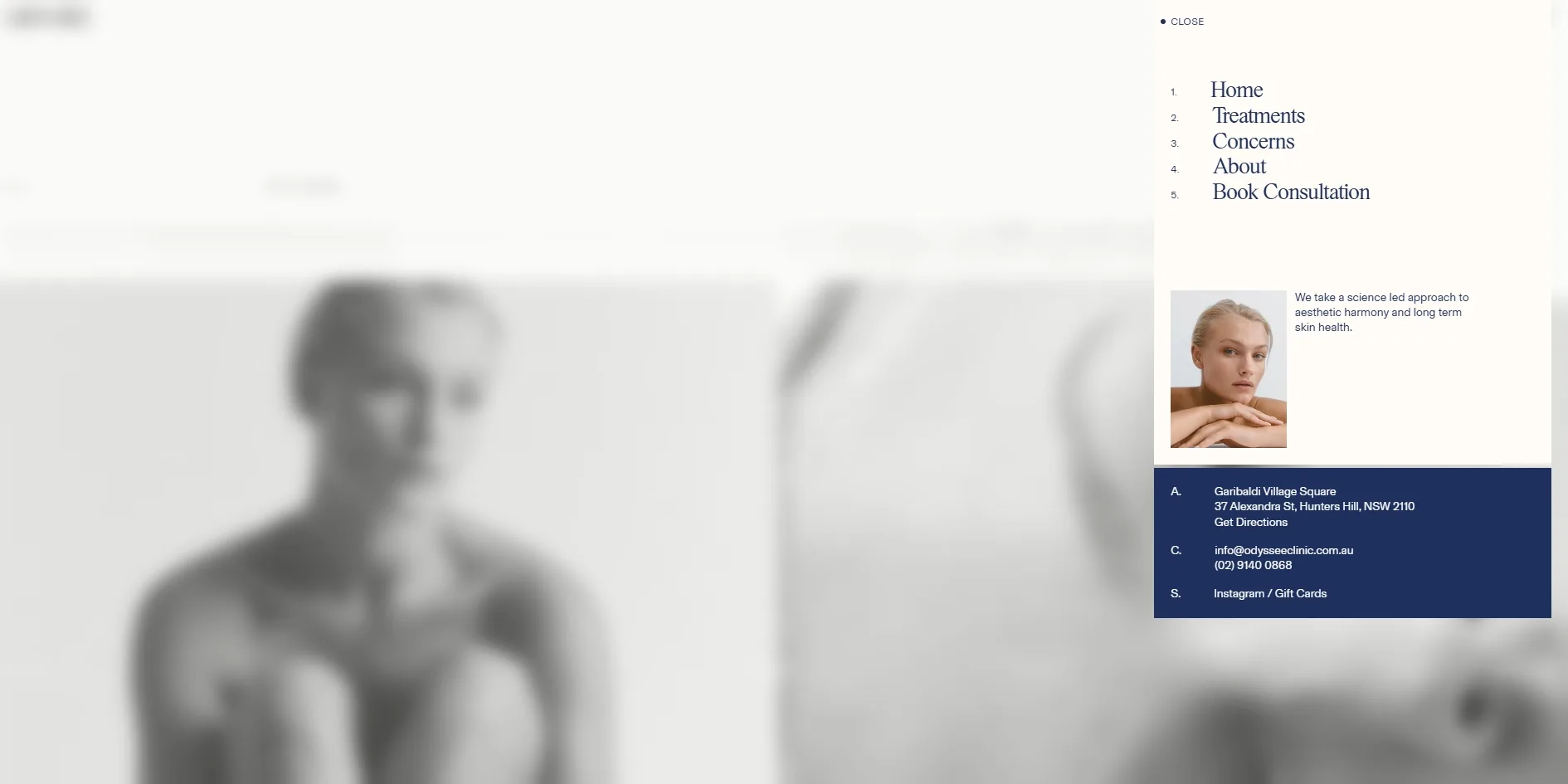
To change scene, the site usually blurs what lies behind instead of darkening it. When the visitor opens MENU, a narrow card drops in at the top right with five numbered links, a portrait and a navy block of contact details. The whole page behind it turns into a blurred black and white image, and the links rise one after another. On the opening pictures of the inner pages, a transparent text panel rises as the visitor scrolls and turns the photo behind it into frosted glass. The top edge of the frosting blurs in gradually instead of stopping at a hard line. The portrait that appears after ten minutes without input, mentioned earlier, is also a blurred photo, and it fades in over a second.
Links, the logo and the footer film all react a little to the cursor. When the cursor rests on a navigation item, the small dot grows in front of it from nothing. The thin line under ordinary links draws itself from left to right, and the joined pair of letters S in the logo flips upside down. The whole footer film of the ball is itself a booking link. When the cursor moves onto it, the pointer is hidden and replaced by a small dot with the label Begin your tailored journey, which follows the cursor around.
With reduced motion turned on in the system settings, the site leaves out only two animations, skipping the opening screen and no longer raising the menu links one by one. The opening film on the home page and the four clips in WHY ODYSSÉE? still play and take turns on their own.
04Engineering
Odyssée runs on Next.js and takes its text and pictures from the content management system Sanity, while every film is hosted on the video service Mux, which sends it in small pieces at a quality that suits the connection. GSAP handles the animation on the page and Lenis handles the scrolling, and there is no canvas anywhere on the site, so everything on screen is made of page elements, photos and films.
Most of what the home page downloads is film, about 29 MB of the roughly 31 MB on a first visit, spread over eight films. All eight have finished downloading before the visitor has scrolled at all. The 27 second opening film is close to full HD. The 9 second footer film of the ball is full HD too, yet it sits at the very bottom of the page, where the visitor only sees it after scrolling all the way down. The site does set a rule for each film to start loading only when it is about to come on screen. The component that plays the segmented video appears to start downloading as soon as it is attached, though, because the film tags still say to load only basic information while their buffers are already full. The Treatments page does the same, and its footer film has finished buffering within a dozen or so seconds of opening.
Odyssée's home page opens very quickly, and its speed figures are all well ahead of the usual benchmarks. The server starts sending the page within a little over 20 milliseconds, far below the common benchmark of 0.8 seconds, and something first appears on screen after about 0.2 seconds, against a usual benchmark of 1.8 seconds. What the visitor sees at that moment is the logo and tagline on the opening screen, and once that screen has faded, the film is fully visible at about 2.3 seconds. The picture barely jumps at all along the way, and the layout shift score is 0.0006, far under Google's recommended limit of 0.1.
Visitors who use the keyboard on the home page run into trouble in two places. When the visitor presses Tab from the top of the page, the first three stops land on the logo, MENU and the booking link in the narrow header bar. At the opening that bar is covered by the film, so the visitor cannot see where the focus is. The focus then runs through the navigation on the opening line and jumps straight to the two cards at the end of the page. The booking link in the introduction and the link to the treatments page are skipped, because those two links can only be selected once the visitor has scrolled up to them and their reveal animation has played. The menu gets it right, closing with Esc and sending the focus back to the MENU button, although the scroll wheel can still move the page behind it while it is open.
A few pieces of text on the home page are too faint to read comfortably, and most of its photos have no description. The navigation on the opening line is small white text on the pale grey of the film, and it almost melts into the background. The three footer links for the privacy policy, the terms of use and Site by Nightjar are shown at 30 percent opacity, which gives a contrast of about 1.8 to 1 against the off-white background. The web accessibility guidelines ask for at least 4.5 to 1 for body text. Among the photos on the home page, only the close-up of lips on the second opening screen has a text alternative, so screen reader users hear nothing about the rest.
There is also one piece of code nobody proofread, in a visitor tracking script from a customer management system. Its address was pasted with typographic curly quotes at both ends, so the browser requests an address that does not exist and gets a 404 page back, which means the tracking script has never run.
05Scores and Team
| Award | Source | Date | Score |
|---|---|---|---|
| Site of the Day | Awwwards | 2026-10-08 | 7.38 / 10 |
| Developer Award | Awwwards | 2026-10-08 | 7.36 / 10 |
Content was the strongest of Odyssée's four Awwwards categories, at 7.63, and Creativity the weakest, at 7.17. The high content score probably reflects how clearly the site explains the clinic's philosophy, its five treatment groups and its team. Creativity likely came last because an off-white background, navy serif type and close-ups shot right against the skin are a language that skincare and beauty brands have used for years. The site carries that language out thoroughly without adding a new move of its own. The developer jury gave 7.36, and leaving out the responsive category, web performance scored highest with 7.6. Semantics and SEO came lowest in the Developer Award, with 6.8.
| Credit | Who they are | Track record |
|---|---|---|
| Nightjar | An experience design company in Surry Hills, Sydney, which describes itself as creating digital products and services for ambitious businesses at speed | Awwwards works 20, SOTD 13, HM 20. FWA 4 |
The Awwwards credit goes only as far as the company Nightjar, the record in the table counts up to the time of writing, and no individual roles are listed. Nightjar is a regular on Awwwards, with thirteen of its twenty works winning Site of the Day, and its previous Site of the Day before this one was ALNF in March 2025. This time the client and the studio are both based in Sydney.
06Archive
- Award date
- 2026-10-08
- Awards
- Awwwards SOTD 2026-10-08, Awwwards DEV 2026-10-08
- Site
- https://www.odysseeclinic.com.au/
- Credits
- Nightjar
- Design
- cinematic
- Build
- dom
- Awwwards
- 7.38 / 10. Design 7.56 / Usability 7.21 / Creativity 7.17 / Content 7.63. Developer Award 7.36. https://www.awwwards.com/sites/odyssee
- Stack
- Next.js, React, Sanity, Mux (hls.js), GSAP (ScrollTrigger, SplitText), Lenis
- Total assets
- About 31 MB on the first visit to the home page, of which about 29 MB is eight films
- Speed
- FCP 204–212 ms, opening film fully visible at about 2.3 s, CLS 0.0006. Continuous scrolling 60 fps