Immersive Garden
Immersive Garden is a Paris studio that builds experiential websites for brands such as Cartier and Louis Vuitton. Its new website, launched in December 2024, gathers a decade of client projects in one place and shows how each of them was made. The idea is to hang that work on a plaster wall that answers the visitor: wherever the cursor passes, reliefs of flowers, birds and leaves rise out of the wall, then sink back.
Immersive Garden designed and built the site itself, and it was named Site of the Month on both platforms, by The FWA for December 2024 and by Awwwards for January 2025.
01Concept
Immersive Garden was founded by the art director Dilshan Arukatti, and the awards chapter of the site says the studio has been making award-winning digital experiences for global brands and agencies since 2014. In a case study the team published on Awwwards in March 2025, it describes the new site as a showcase of all its projects. Visitors can read a full case study for each one and open a Backstage section that shows the tools, sketches and problems behind it. The team also writes that it had to balance minimalism with atmosphere, and that it spent more time removing elements than adding them. The reliefs come from the same idea, and the team says they give the site a tactile, handmade dimension and show the studio's taste for organic forms.
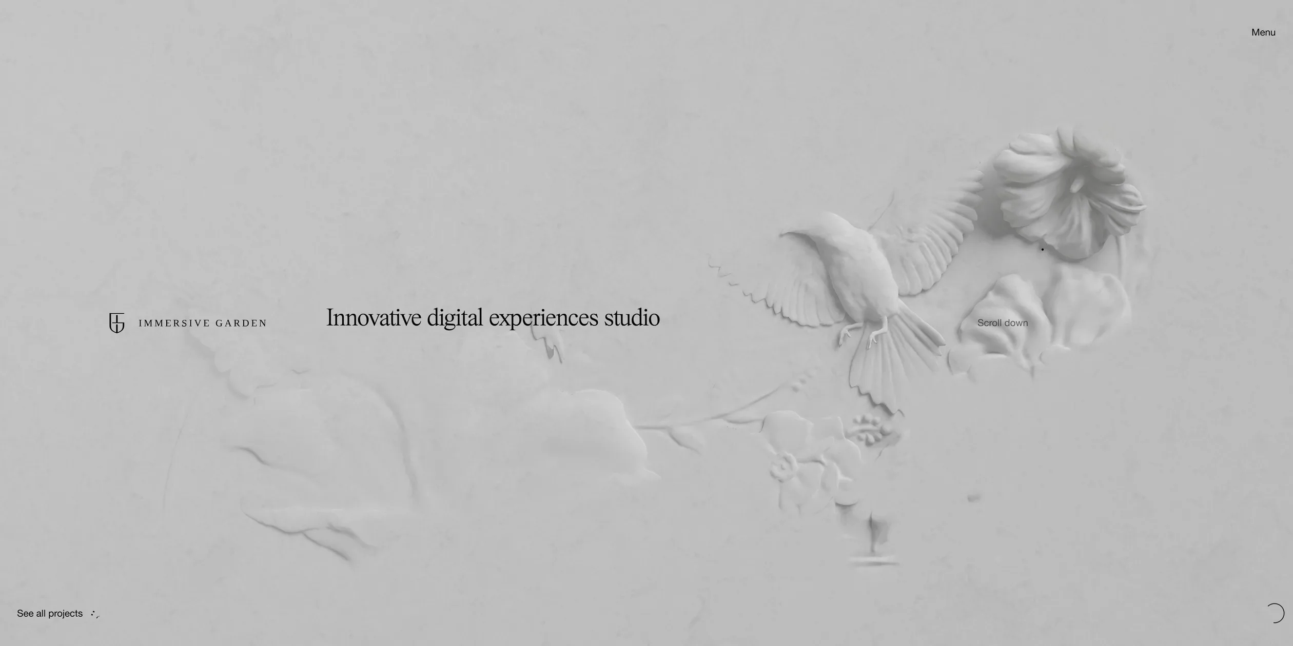
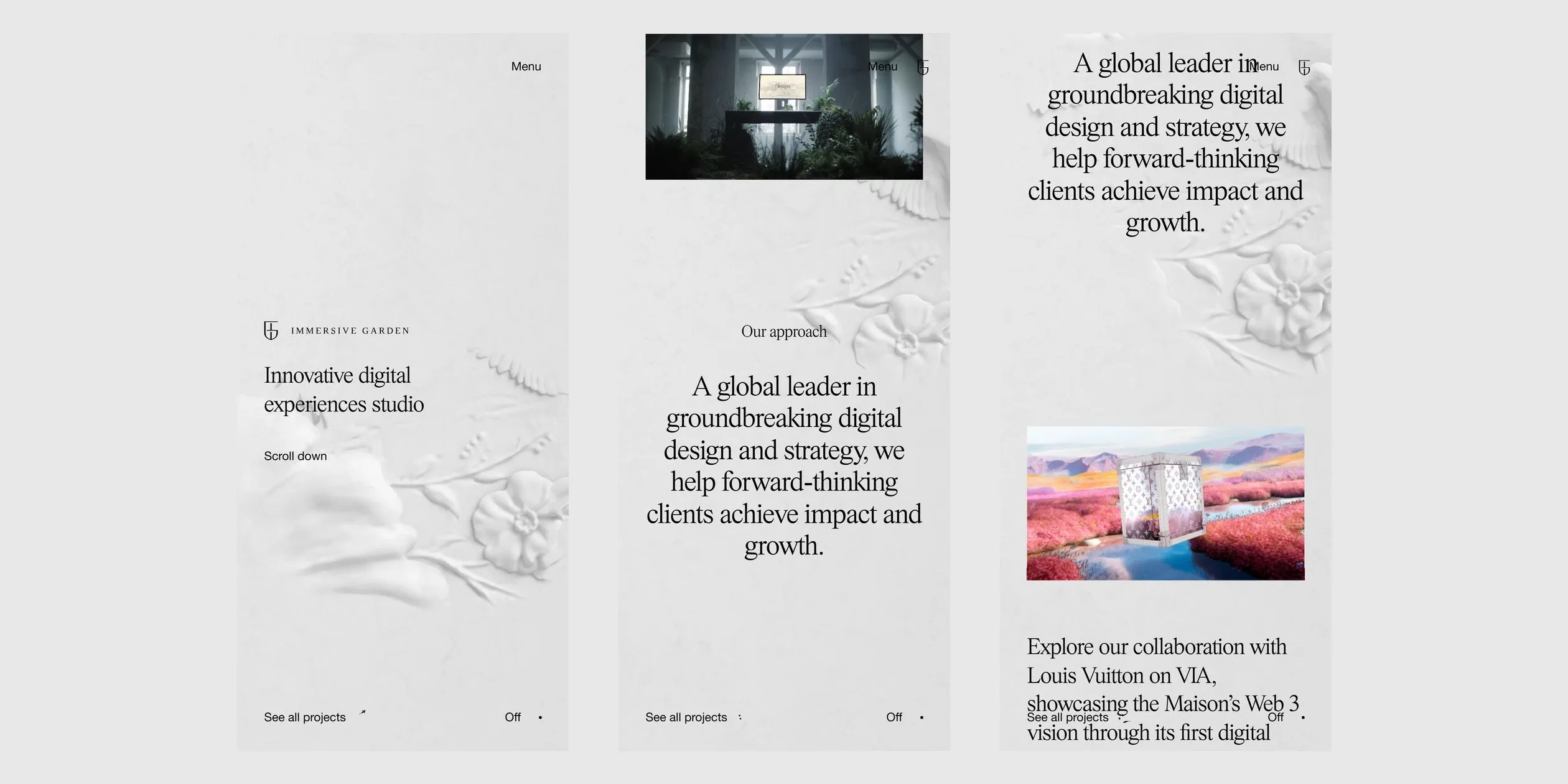
Where a studio site usually opens on a grid of project thumbnails, this one turns its home page into one long wall. A visitor first sees a pale grey screen with the studio's logo and the line Innovative digital experiences studio on the left, while a number on the right counts from 0 to 100. After about nine seconds, the plaster wall fades in under that text. Scrolling down, the visitor reaches a large statement, then a short Our approach passage about how the studio works, and then 18 featured projects, from Louis Vuitton's VIA to three Cartier campaigns. Each project is a video or an image with a one-sentence description, the two set apart on the wall, left and right, and a statement headed Our mission sits after the third project. The whole home page is about 53 screens long, and its last screen is a See all projects link on black that leads to the full project list.
Because 53 screens take a long time to scroll, the site adds a fast scroll mode. When the visitor keeps scrolling hard, the page pulls back into an index, with project names lined up one after another in the middle of the screen and only small thumbnails beside them. When the visitor stops, the page settles back on the project it stopped at. The same long page can therefore be read two ways, one project at a time or as a quick search for one particular project.
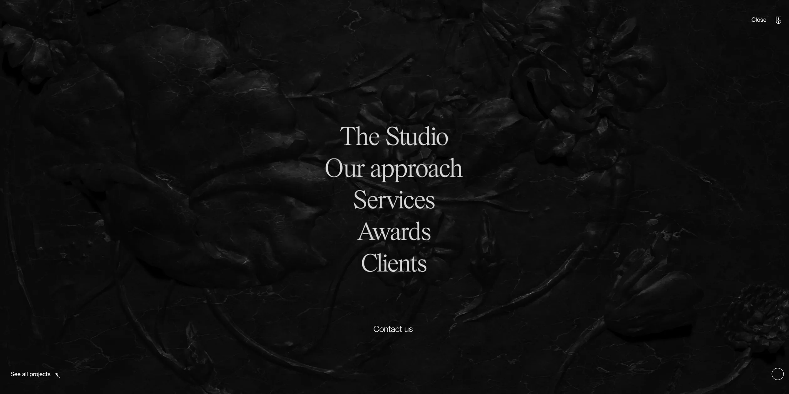
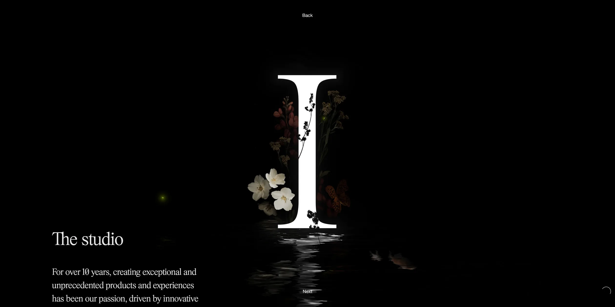
Beyond the home page, the site has four kinds of pages. The Menu at the top right opens a black marble relief wall listing five entries, The Studio, Our approach, Services, Awards and Clients, plus a Contact us link. Each entry leads to a chapter about the studio, and the six chapters are numbered I to VI. When the visitor scrolls to the end of a chapter, the next one follows directly, and chapter VI leads back to chapter I. The project list holds about 60 projects, and a click on an empty area filters them by type. Each project page has a title, a Launch website link that opens the original site, and a See backstage entry on the right.
The way to contact the studio sits at the end of every page. When a visitor scrolls to the bottom of the home page or the project list, a black closing screen shows the studio's email, inquiries@immersive-g.com, beside a Newsletter button. Chapter VI, Contact us, opens with the line Interaction begins with dialogue and lists two email addresses, one for projects and one for jobs, along with the studio's address in Paris.
02Design
The main rule of the home page is a single ground, a pale plaster wall. The project videos and the text all sit on this wall, and the only things on it besides the work are reliefs, which appear only where the visitor has just passed. The wall itself therefore stays quiet, nearly all the colour on the page comes from the project videos, and the eye goes straight to the work. The rule has two exceptions. The menu and the six studio chapters turn the ground to black, and the project list and project pages switch to a plain light page with no wall.
The interface uses only two colours. The pale grey is #E8E8E8, the text is a near black #030303, and the plaster wall renders as a slightly darker mid grey. Almost all of the text is set in one serif, PS Times from the foundry Parker Studio, and in a single weight, from the opening line and the statement to the project descriptions and the menu links. The second typeface, Helvetica Neue, appears only in the small labels at the corners of the screen, such as Menu, See all projects, Scroll down and the sound switch. On a 1920 pixel wide screen, a project description is about 48 pixels, the opening statement about 74 pixels and a corner label only 14 pixels. The long passages therefore read like lettering on the wall, while the labels step aside. Type sizes are set against a 1440 pixel layout and scale with the screen width, stopping once the screen is wider than about 1915 pixels. Line spacing is tight, mostly 1.1 times the type size.
The layout uses a 12-column grid with 16 pixel gutters and a maximum content width of 2,088 pixels. How many columns each project video spans, and which column it starts from, is set project by project. Some videos therefore sit on the left, some on the right and some in the middle, with the description on the other side. Large stretches of empty wall are left between the projects, and that is where the reliefs appear, so the page reads like an exhibition wall with work hung freely across it.
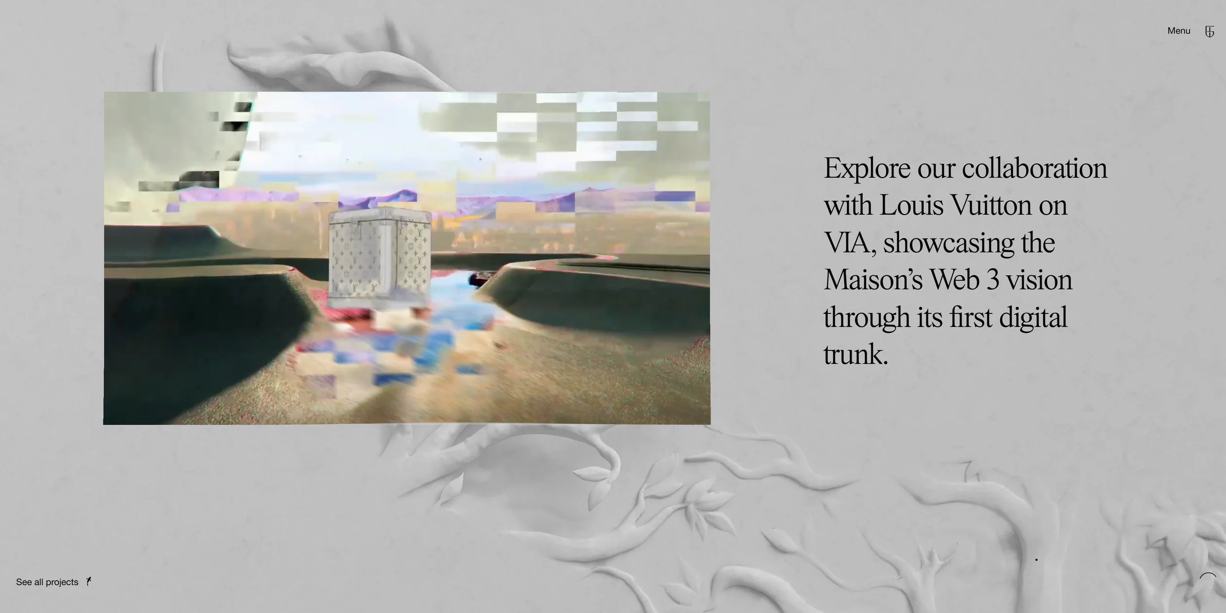
The reliefs set the character of the wall. Six relief panels are hidden in it, each built around an animal (a bird, a deer, dragonflies, a frog, a peacock and a squirrel) and wrapped in flowers, vines and leaves. The team says they were made in ZBrush, Houdini and Blender. The reliefs are the same pure white plaster as the wall, lit from the upper left so that soft shadows fall under the petals and feathers, and their surface keeps the rough grain of plaster. The menu turns the same kind of relief into black marble, with fine white veins running along the flowers and leaves. The six studio chapters have no reliefs. Instead, a huge white Roman numeral stands in the middle of each one, with real flowers and dry stems around it, a reflection in the water below and a few fireflies drifting in the dark.
The cursor is a small black dot, and when the site has something to say, a line of small text appears beside it. Before the visitor's first click, it reads Click to enable sound. Over a project video it reads Discover, over a menu link Click to explore, and over an empty area of the project list Click to filter. When the cursor moves onto The Studio in the menu, that link changes into a short description, Innovative Design Studio. The sound switch at the bottom right reads Off while the sound is off and turns into a circle once it is on. A project page puts its title in the centre, with Back above it, an underlined Launch website link below it and See backstage on the right.
On a phone, the same wall and the same reliefs stay in place. The opening line and the statement break over several lines, and a project description shrinks to about 28 pixels. The videos run almost the full width of the screen with their descriptions below them, while Menu, See all projects and the sound switch keep their corners.
03Motion
The loading screen is itself the first screen of the home page. After about a second of blank pale grey, the logo and the words Innovative digital experiences studio fade in one after another, and the number on the right counts up to 100 with the download. Once the download is done, the plaster wall takes nearly two seconds to fade in under that text, while the camera makes a slow zoom that starts quickly and eases to a stop. The number then becomes Scroll down, and the corner labels appear.
The reliefs follow the cursor. As the cursor crosses the wall, the reliefs along its path swell out of it, higher the closer they are to the cursor and higher again the faster it moves. Once the cursor has passed, the trail sinks back into the wall from its tail and is flat again within about a second, while the spot under a cursor that has stopped stays raised. When the visitor leaves the mouse alone, the wall does not go completely still. Every one to three seconds, the site draws one to three strokes of its own, each lasting less than a second along a slightly shaky path. It looks like an invisible hand passing over the wall, and new reliefs keep rising here and there. When the visitor scrolls, the plaster wall moves at only a quarter of the page's speed, so the work and the text seem to hang a little in front of it.
When the cursor moves onto a project video, the video grows slightly and then breathes very slowly, and the picture ripples gently as the cursor moves. The word Discover beside the cursor is made of separate letters that travel with it. When the visitor clicks the video, the home page fades out in under half a second, and the large title of the project page then grows into place. Its strokes start very thin and thicken, while the letters appear from one point with rough, noisy edges, and the title is essentially complete in about two seconds.
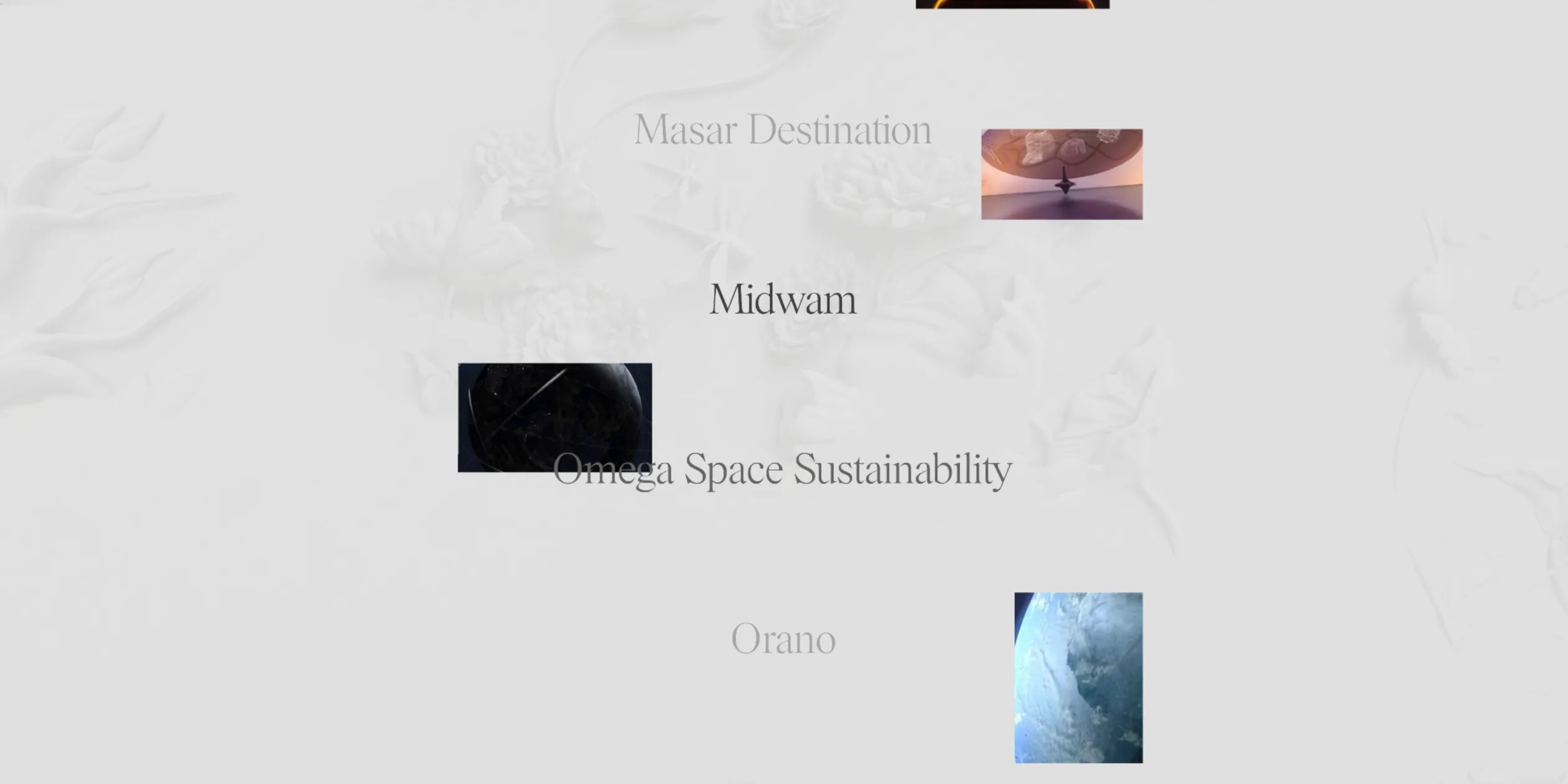
Fast mode is the largest change on the home page. After the visitor has scrolled quickly for a short while, the whole page pulls back over a second and a half. The project descriptions shrink by half and fade out within half a second, and the videos shrink to small thumbnails. The project names grow into a centred column of titles, with the one passing by in black and the rest in pale grey. At the same time the whole wall breaks into reliefs that keep flowing as the page scrolls, and the picture becomes brighter and more contrasted than usual. About two seconds after the visitor stops, the page returns to its normal layout over a little more than a second, starting quickly and easing out, and settles on the project it just passed. The mode only appears on desktop.
Opening the menu also starts on the wall. When the cursor moves onto Menu, a small blot of ink already seeps in at the top right corner. After the click, the ink spreads over the whole screen with a rough edge in about two seconds, revealing the black marble wall, and the menu links fade in after it. When the menu is closed, the screen dims first and then the home page returns. Once the visitor turns the sound on, the home page, the project pages and the menu each have their own background track. Opening the menu and entering a chapter each have a transition sound, and the cursor triggers a short sound over Menu, the menu links and See all projects.
A phone has no cursor, so the finger takes over its job. Wherever the finger swipes or taps, the reliefs swell and sink back in the same way, and the invisible hand keeps drawing on the wall. Fast mode never appears on phones and tablets, and the page keeps its normal layout however fast the visitor swipes.
04Engineering
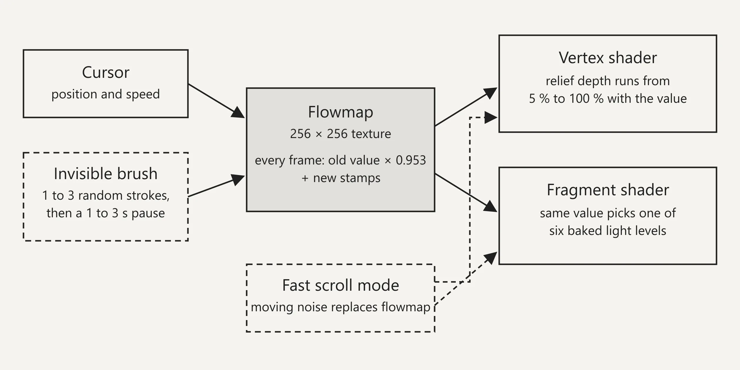
The relief wall is a real 3D model that stays complete in the scene at all times, and the site simply squashes it wherever nobody has passed. The vertex shader multiplies the depth of each vertex by a factor between 5% and 100%, and that factor comes from a 256 × 256 flowmap texture that records where the cursor has been recently. The flowmap is updated by ping-ponging between two render targets. Each frame it multiplies the previous values by 0.953, scaled by the frame interval so the fade keeps the same speed when the frame rate changes, and then stamps a new mark at the cursor. The mark is strongest in the middle and falls off outwards, with a radius of about a fifth of the screen height. A noise texture is laid over the mark, so the raised edge is mottled. The vertex shader works out where each vertex lands on screen and reads the flowmap at the same spot. When the page scrolls, the flowmap shifts up with it, so a trail moves with the wall as if it had been left on it. The cursor position is also eased, and the recorded position closes only four tenths of the remaining gap to the real cursor each frame, which gives the trail described earlier its slight drag.
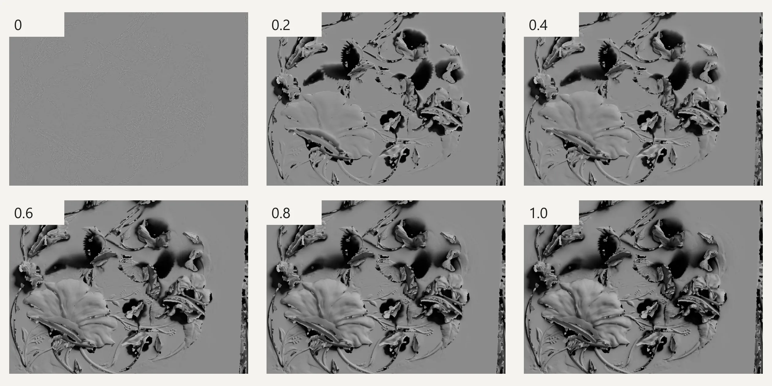
The shading of the reliefs is not computed at run time, and the model stores no normals, only a position and a texture coordinate for each vertex. For each relief panel, the team baked the lighting at six levels of extrusion into six greyscale images and packed them into the red, green and blue channels of two 2048 × 2048 WebP textures. This is the channel packing the team mentions in its case study. The fragment shader receives the same extrusion value as the vertex shader, switches level every 0.2 and blends smoothly between neighbouring levels, so the more a relief swells, the longer and deeper the shadows under its petals become. The flattest level is replaced in the shader by a fixed grey, so a squashed relief matches the colour of the wall and disappears. After the lighting, the shader multiplies in a plaster texture and adds a faint top-to-bottom gradient.
The invisible hand is a second stamp in the flowmap. A GSAP timeline drives its position, drawing one to three random strokes per round, each lasting 0.7 to 1 second, and then pausing one to three seconds before the next round. Each stroke tweens its horizontal and vertical positions separately with RoughEase, an ease with random jitter. This stamp is three times as strong as the cursor's and adds only extrusion, with no direction of movement.
Fast mode on the home page is controlled by a small state machine. Each smooth scroll update subtracts a threshold from the scroll speed and adds a fraction of the result to a progress value between 0 and 1. The mode starts when the progress reaches 0.99 and ends when it falls below 0.75. As a result the visitor has to keep scrolling fast for a while to trigger it, and a single quick flick does not. On entry, one 1.5 second GSAP timeline drives the scaling and fading of the page text, the parallax of the video planes, the reveal and 2.5 times enlargement of the project titles, and a switch on the relief. Once that switch is on, the extrusion comes from a noise texture that flows with the scroll, the picture is brightened and given more contrast, and the camera pulls back to 0.6 times its zoom.
Everything on screen is drawn in one full-screen WebGL canvas with three.js. The home page, the menu and each inner page are separate views, each rendered into its own render target, and a compositing shader blends the outgoing view with the incoming one. The ink of the menu transition is a noise mask in that shader, growing out from the top right corner over the marble wall that has already been rendered beneath it. The project videos are drawn in the same canvas, each as a plane with a video texture that follows an empty placeholder element in the page, so the 12-column grid described earlier still decides where each video sits. The page also contains a set of zero-size project links that visitors never see, delivered in the server-rendered HTML, so search engines can still read every project.
The large titles are drawn in the canvas from an MSDF font atlas of PS Times. Their thickness, fade and mask are three tweens of six seconds each, every one on a custom Bézier curve that is extremely fast at first and then barely moves for a long stretch. That is why the project title mentioned earlier is essentially in place after about two seconds. The whole frame then goes through a bloom pass and an FXAA anti-aliasing pass.
This approach makes visitors wait. The server answers quickly and the opening line appears within 0.2 to 0.3 seconds, but the loading screen only leaves once the whole first batch of assets has downloaded, after about nine seconds. On desktop, about 26 MB downloads before any scrolling, of which about 13 MB is 3D models, the largest being the home page relief model at 5.7 MB and the model for the black closing screen at 3.6 MB. The model and the two largest normal maps of the menu's marble wall are in the first batch too, so the site prepares everything the menu needs at the start. As the visitor scrolls on, the project videos stream in from the Strapi content library the team built on Node.js, with the files stored on DigitalOcean Spaces, and seeing the whole home page adds about 50 MB more. In its case study the team says project assets are converted to KTX compressed textures on the server and that the 3D exports are automated with gltf-transform and a set of custom JavaScript and Blender scripts. The downloaded files match this, with the models compressed with Draco and the menu wall's normal maps in KTX2.
Visitors on different devices also get different assets. The site sorts graphics hardware into tiers with detect-gpu. Phones, tablets and weaker GPUs get a lighter relief model that drops from 18 meshes and about 620,000 vertices to 6 meshes and about 330,000 vertices, at 4.6 MB, and the menu wall switches to a smaller set of textures. The canvas pixel ratio is capped at 2, and the weakest tier uses 1.
The site can only be browsed with a mouse, a trackpad or a finger. The smooth scrolling library Lenis scrolls the home page inside a container, and the arrow keys, Space, Page Down and End cannot move it. Tab stops only on Menu and the two See all projects links, and when it reaches the closing link the page jumps straight to the bottom, so the keyboard cannot reach a single project on the home page. None of the 39 images in the home page's markup has alternative text. With reduced motion turned on in the system settings, the reliefs, fast mode and the page transitions all play as usual.
05Scores and Team
| Award | Source | Date | Score |
|---|---|---|---|
| Site of the Day | Awwwards | 2025-01-07 | 8.00. Design 8.09 / Usability 7.51 / Creativity 8.4 / Content 8.34 |
| Developer Award | Awwwards | 2025-01-07 | 7.5 |
| Site of the Month | Awwwards | 2025-01 | No separate score for the monthly award |
| FWA of the Day | The FWA | 2024-12-18 | 85 POINTS |
| FWA of the Month | The FWA | 2024-12 | No separate score for the monthly award |
On Awwwards, Creativity came out on top of the four categories and Usability at the bottom, and among the Developer Award categories, Animations scored highest (8.8) and Accessibility lowest (6.6). The site also won the 2025 Webby Award for Best Visual Design, Aesthetic, in the websites category, an international award for work on the internet.
| Credit | Role | Record (as of 2026-11-14) |
|---|---|---|
| Immersive Garden | Paris digital experience studio, Awwwards account located in Paris, France, member of the FWA Hall of Fame | Awwwards works 94, SOTY 3, SOTM 13, SOTD 68, HM 89. FWA 89 |
This is the studio's own site, and both platforms credit only the studio. The chapter of the site that introduces the team lists its roles, from art directors, motion designers, 3D artists and creative developers to strategists, producers and account directors, but it does not say who did which part of this site.
06Archive
- Award date
- 2025-01-07
- Awards
- Awwwards SOTD 2025-01-07, Awwwards DEV 2025-01-07, Awwwards SOTM 2025-01, The FWA FOTD 2024-12-18, The FWA FOTM 2024-12
- Site
- https://immersive-g.com/
- Credits
- Immersive Garden
- Design
- graphic
- Build
- realtime
- Awwwards
- 8.00 / 10. Design 8.09 / Usability 7.51 / Creativity 8.4 / Content 8.34. Developer Award 7.5. https://www.awwwards.com/sites/immersive-garden-website
- The FWA
- 85 POINTS. https://legacy.thefwa.com/cases/immersive-garden-website
- Stack
- Nuxt (Vue), three.js r151, GSAP, Lenis, Howler.js, detect-gpu, Strapi, Vercel
- Total assets
- About 26 MB on desktop on first load without scrolling, of which 3D models about 13 MB. About 50 MB more of project video when scrolling through the home page
- Speed
- FCP 208 to 272 ms, loading screen leaves after about 9 s, CLS 0. Continuous scroll —