Maxima Therapy
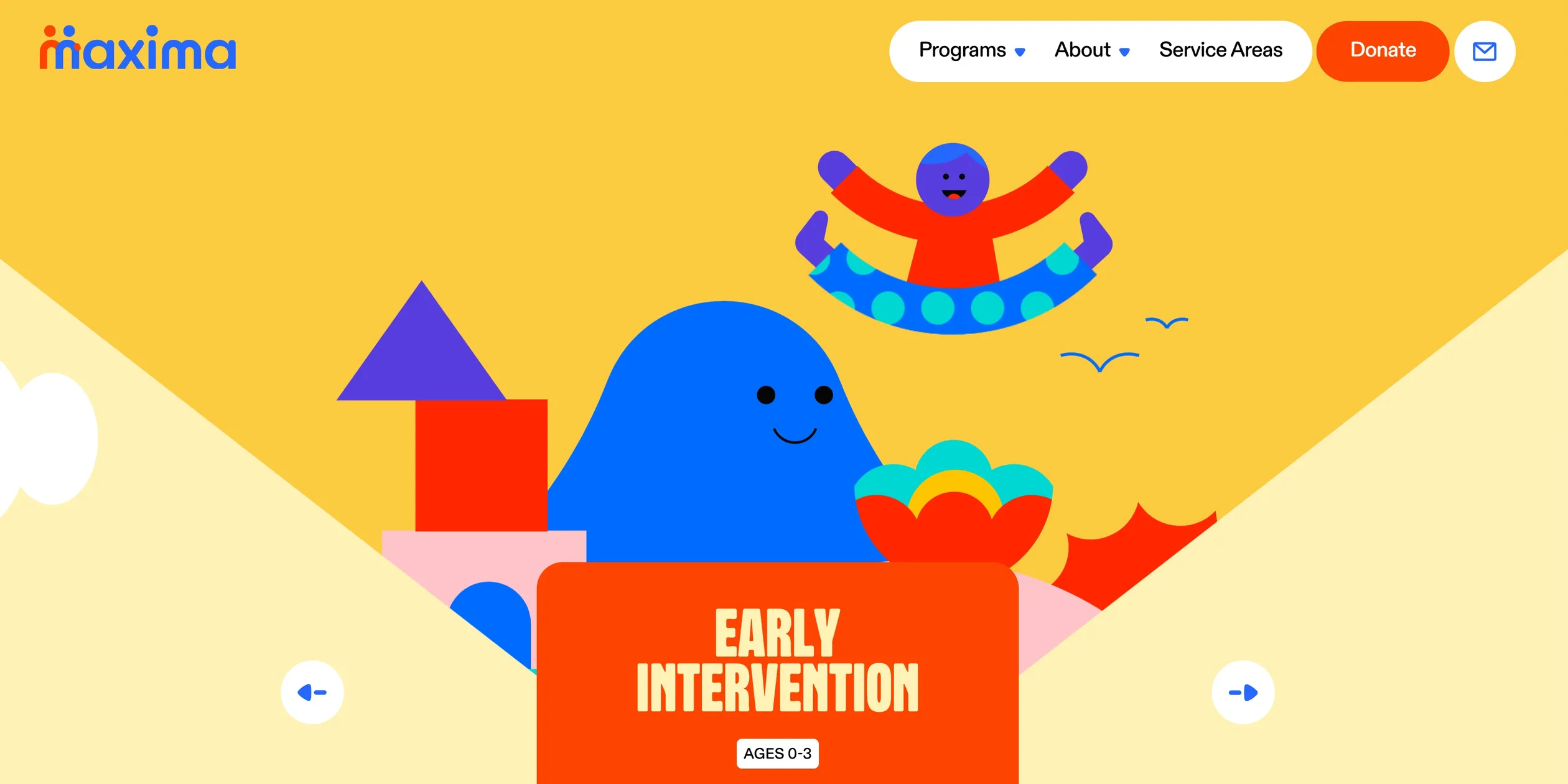
Maxima Therapy is a California organisation that provides therapy for neurodivergent people, those with autism, ADHD and similar differences, from babies to older adults. Families told it they felt lost in cold medical systems, so it set out to be a warm community instead, and its website had to drop the chilly tone of the therapy world. The site turns its opening line, See life from a different angle, into its whole method. A huge illustrated wheel sits at the centre of the home page, and turning it carries the visitor from one stage of life to the next.
The site was led by KOKI-KIKO, a small agency in Montreal, with art direction and design by Louis Paquet and development by Nicolas Garnier. It won Awwwards Site of the Day in April 2026.
01Concept
On the site's Our Story page, Maxima tells how it began. Families felt lost in systems that were cold, clinical or dismissive, so the founders built a warmer place where children, teenagers, adults and elders could be seen and understood at every stage of life. Neurodivergence describes brains that work differently from most, as with autism or ADHD, and the page says Maxima does not treat it as a problem to fix but as something to understand, support and celebrate. Kim Levan, cofounder of KOKI-KIKO, told Communication Arts that the goal was to move away from the cold, clinical tone often associated with therapy and make something alive, sensitive and human. Levan also said that neurodivergence is neither linear nor uniform, so the team kept questioning conventional structure and hierarchy and designed navigation as gentle exploration rather than a fixed path. In a making-of article on Codrops, developer Nicolas Garnier summed up the brief as a highly illustrated, interactive and playful website.
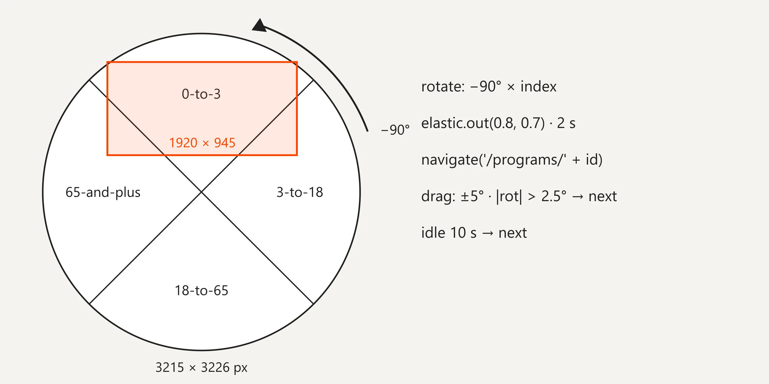
Maxima's services are paid for by California's Regional Centers, the state-funded agencies that arrange services for people with developmental disabilities. Its FAQ page says it currently offers only a programme for ages 0 to 3, with more coming soon. The site is nevertheless organised around a whole life, and the second half of its opening line promises support for differences from birth to golden age. The home page wheel is therefore split into four quarters, Early Intervention for ages 0 to 3, Adaptive Skills Training for 3 to 18, Workforce Development for 18 to 65 and Residential Support for 65 and over, and each quarter is a programme page of its own. When the visitor turns the wheel, the address bar changes to that programme's URL, so the wheel is both the home page's main picture and the navigation between the programme pages.
Every programme page follows the same order. The wheel sits at the top, followed by a stack of four cards describing the services, a statement about independence and growth, a band of giant words that take turns, a photo dressed with illustrated stickers, and a large heading with a paragraph about that age group. The page then explains how to start in three steps, first a referral from the Regional Center's service coordinator, then a plan made together, then growing together at home and in the community, next to a Get started button. The last screen says Next stop with the name of the next programme, and a click on it takes the page back to the top while the wheel turns to the next quarter. The four programmes join end to end, so a visitor who keeps reading walks from infancy to old age and back to the start.
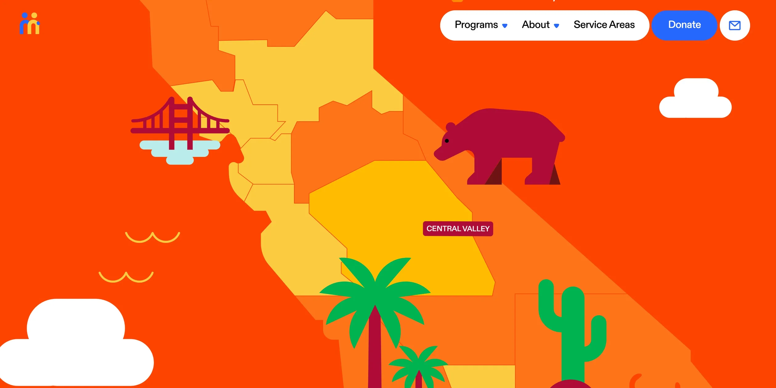
Beyond the programmes there are eight more pages, each with its own background colour and one small toy. Our Story tells the origin, Careers recruits therapists and assistants, and Shop sells tote bags, mugs and a cap printed with different angle, with the proceeds funding programmes. FAQ answers questions about eligibility and payment, Contact is a contact form, and Blog, added after the award, writes for parents and therapists. The Service Areas page draws a map of California whose 21 regions follow the service areas of the state's Regional Centers. The 8 regions already covered are yellow, hovering one shows its name, and a click opens a card describing the service there.
02Design
Flat, cut-paper illustration plus one saturated main colour carries every page of this site. The illustrations have almost no gradients, and people, hills, building blocks and clouds are all clean-edged blocks of colour. Each programme has its own colour set, Early Intervention yellow #FDCB40 with pale yellow #FFF2B7, Adaptive Skills Training green #00B351 with pale green #A7EB98, Workforce Development pink #F780D4 with pale violet #F5CBFF and Residential Support turquoise #2CD1D0 with pale turquoise #B9ECEA, and each set adds one dark colour. Two colours stay the same across all four programmes. Red #FD4401 is used for the title plates, the menu text and the opening title, and blue #2668FD for buttons, the giant words and the opening background. When the visitor turns from one programme to the next, the background colour of the whole page changes, so the colour itself tells the visitor which stage of life they are in, while red and blue tie the four worlds into one brand.
The type plays three roles. Headings use Robuck Rounded, a narrow, all-caps display face with rounded stroke ends, set with a line height of 80% so that lines nearly touch, and the largest heading is about 286 px tall on a 1920 px screen. Body text, buttons and cards use ABC Diatype Rounded Plus, a sans serif with the same rounded corners, in weights 500 and 700 with letter spacing tightened to minus 0.02 em. The giant words use the heaviest member of the family, ABC Diatype Rounded 900, with each letter about 767 px tall and scattered at designed angles and offsets like a handful of building blocks. Nearly every size on the site is written in rem, and the rem is converted from the screen width. Wide screens scale up a 1512 px wide design, short, wide laptop screens are converted as if 1728 px wide, tablets as if 500 px and phones as if 375 px, so within one class of screen the layout never jumps, it only grows or shrinks as a whole.
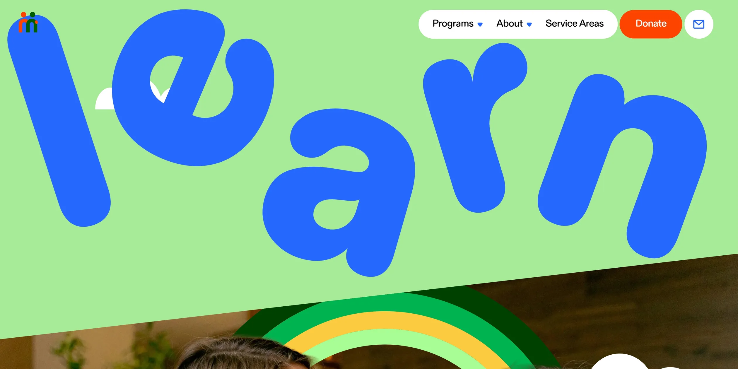
Tilting is the second rule of the design, and it turns the words different angle into visible shapes. The background at the top of each programme page is two pale slopes running in from the sides, leaving a V-shaped valley in the middle. The service cards each carry a slightly different angle, the menu panel lies askew over the page, the last word of the opening title, ANGLE, is pushed over, and even the card that opens on the map is turned a little. The photos are not set square either but are cut by slanted lines and dressed with the illustration's elephant, tree and little blue monster, which joins the real photos to the drawn world.
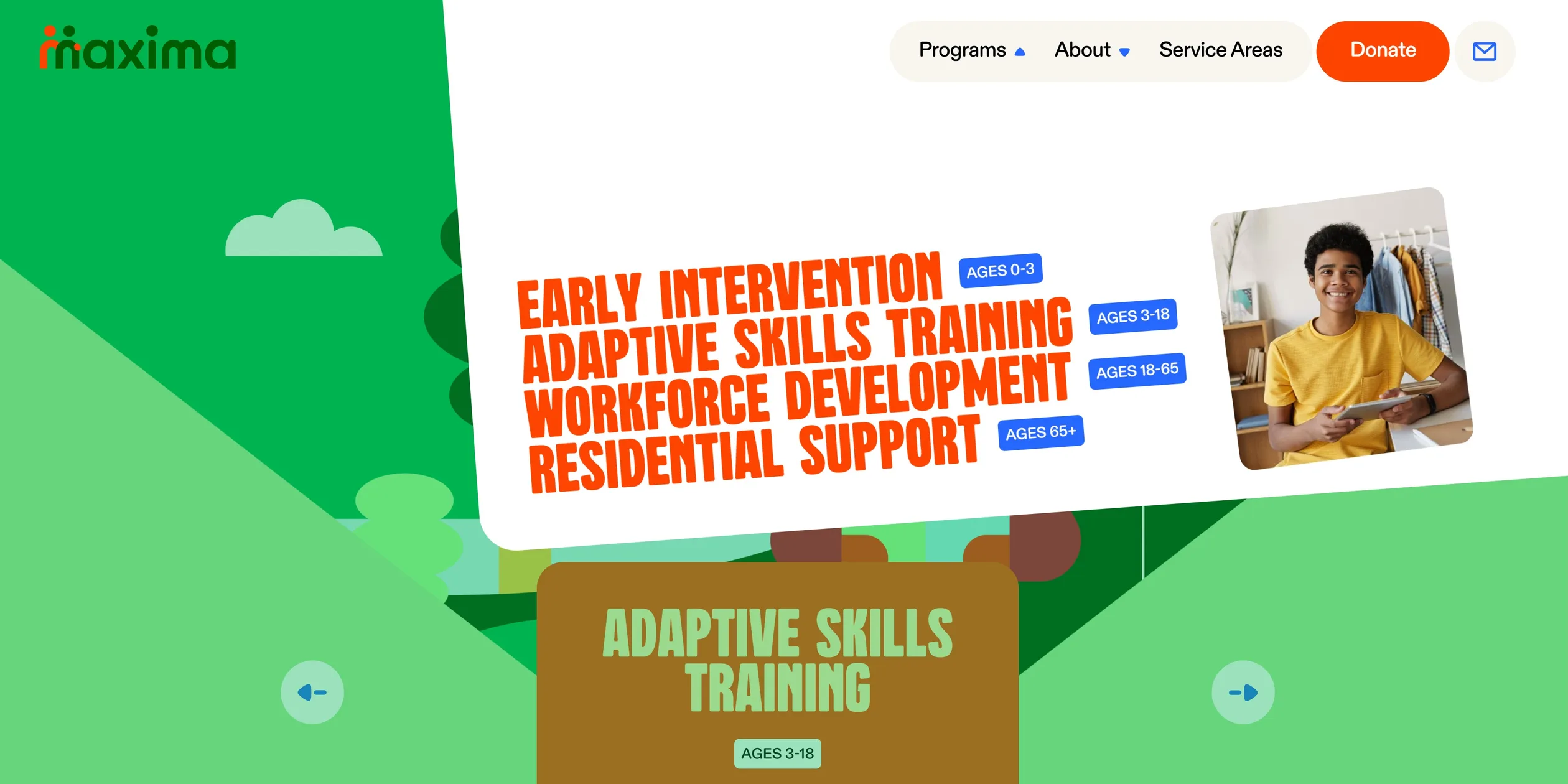
The interface pieces on this site are rounded pills and circles. A white pill on the right of the header holds Programs, About and Service Areas, followed by a red Donate pill and a round mail button. When the cursor moves onto Programs, a white panel with large rounded corners drops from above and lies askew over the page, with the four programme names stacked in narrow red capitals, each followed by a blue age tag. Whichever item the cursor rests on, a photo of that programme pops up beside it, and the page behind is covered with a translucent wash of the programme colour. Buttons on the page are blue or yellow pills that swell into circles under the cursor. The site also replaces the system cursor with a drawn arrow, an open hand on the wheel and a gripping hand while it is held.
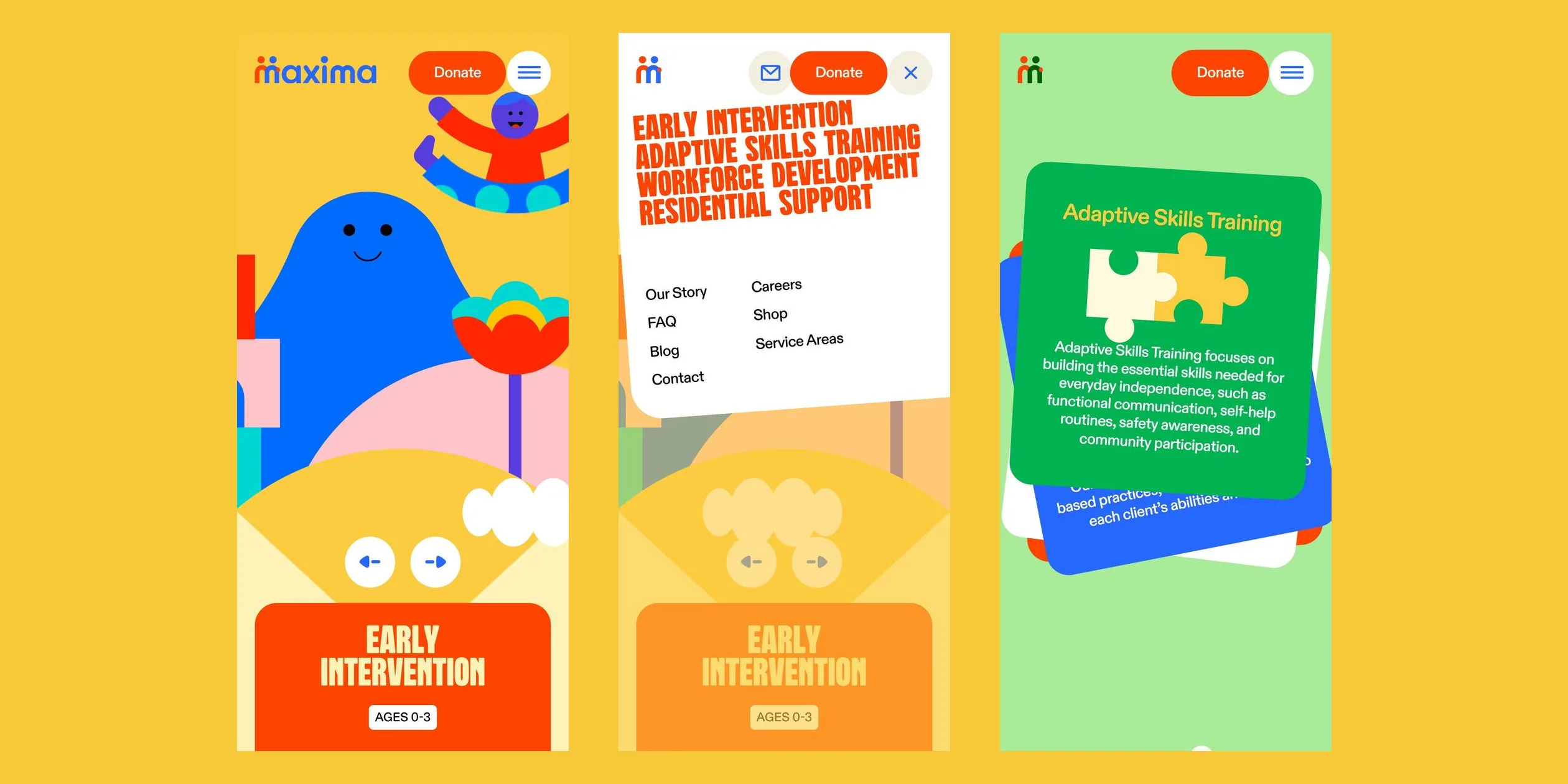
On phones the header keeps only the maxima logo, the Donate button and a hamburger menu button. The wheel's illustration fills the top half of the screen, the two arrow buttons move below it side by side in the centre, and the title plate becomes a full red panel with an extra line introducing the programme. The menu opens as a white, tilted card dropping from above, with the four programme names at the top and links to the other pages below.
03Motion
Almost every movement on this site shares one feel, the bounce. Buttons growing, stickers appearing, letters popping and the wheel stopping all overshoot a little and spring back, like a toy that has been flicked. The bounce keeps the site lively and unbuttoned, which matches its wish to leave the clinical feel behind.
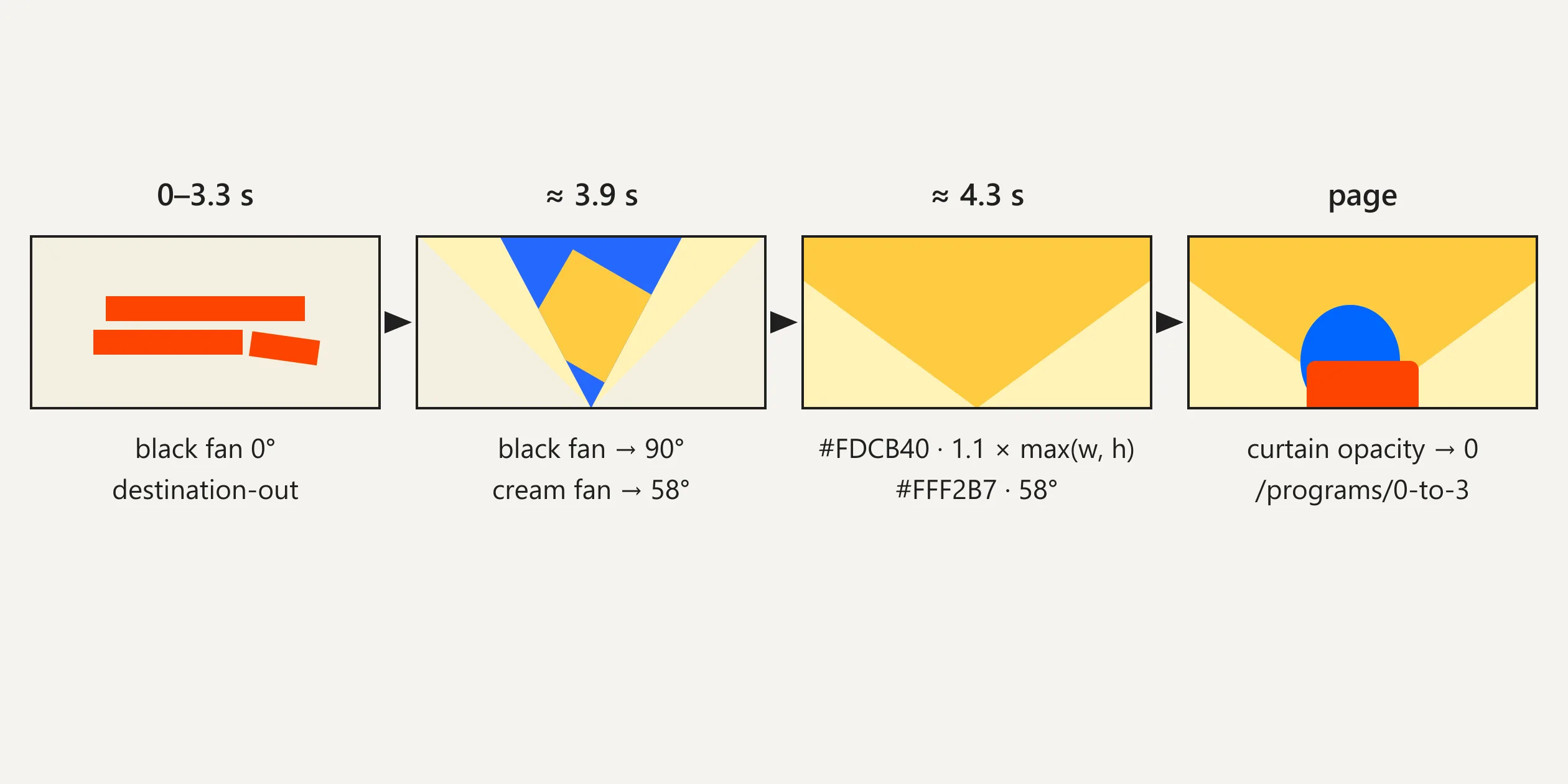
Every time a visitor opens the site, an opening of about 5 seconds plays first. On a beige ground the words of See life from a different angle drop in one by one, each 0.1 seconds after the last, and the letters of each word turn from lying on their side to upright, taking about 1.8 seconds to settle with a bounce. The two-figure logo above the title then draws itself, and a line of small text rises beneath. At about 2.5 seconds the last word, ANGLE, is pushed over, literally taking a different angle. From about 3.3 seconds a V-shaped opening splits from the bottom centre and widens, a yellow square spins and grows on a blue ground, and through the opening the wheel behind is still turning. The opening fades only when the wheel stops on Early Intervention.
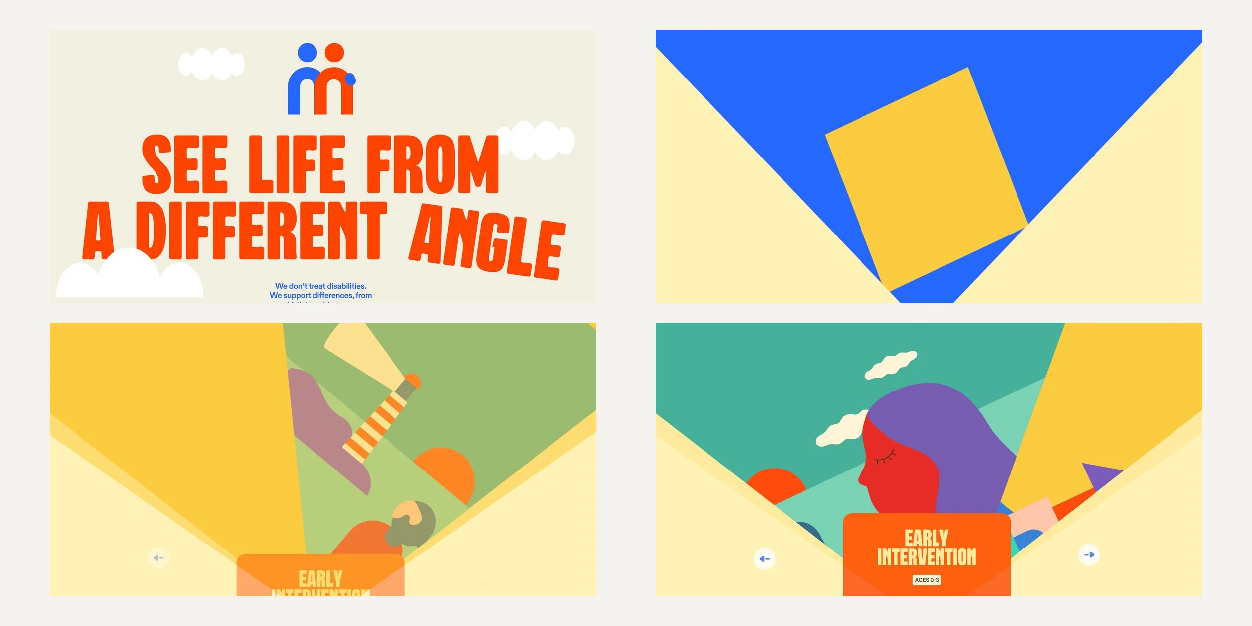
The visitor controls the wheel. A click on the right arrow first tips the whole illustration about 3 degrees in the direction of the turn, as if nudged, and about 0.25 seconds later the address changes to the next programme. The wheel then turns a full 90 degrees, overshoots by about 6 degrees, springs back and comes fully to rest after about 2 seconds. The visitor can also press and drag the illustration sideways, and the picture follows the hand by up to 5 degrees. Released past halfway, it turns to the next quarter, and otherwise it springs back. If the visitor stays on the wheel screen for 10 seconds without touching anything, the wheel turns to the next quarter on its own, once. The page content below changes with the programme without replaying the opening, and the programme name slides into the title plate from the side.
Each quarter's illustration also hides one small interaction. The blue hill in Early Intervention follows the cursor with its eyes, the balloon in Adaptive Skills Training is tied to a swinging string, the man with binoculars in Workforce Development tilts up and down with the height of the cursor, and in Residential Support a cursor crossing the sea sets off a ripple that slowly flattens out.
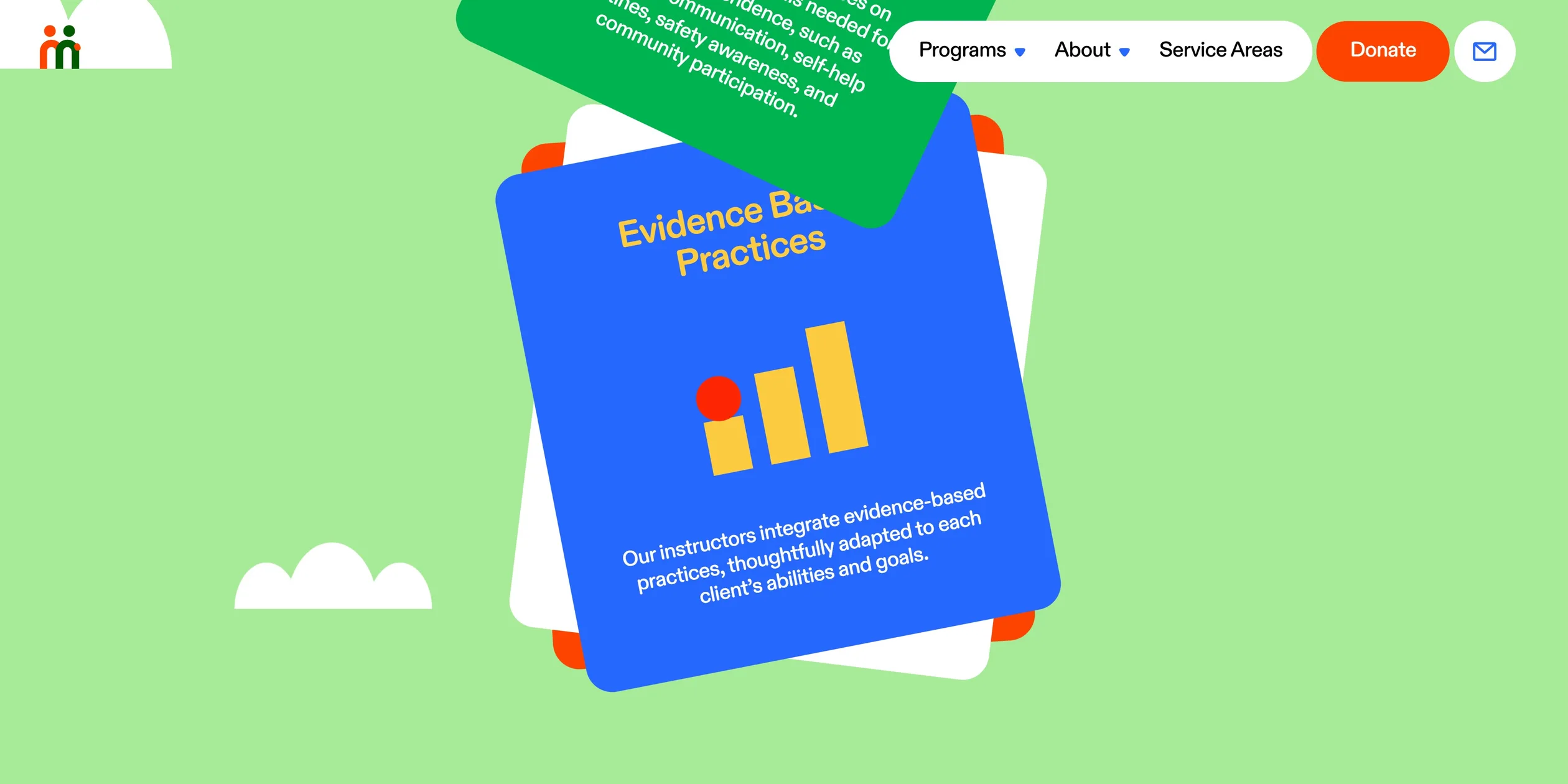
Further down, the service cards are peeled off one by one as the visitor scrolls. With the scroll, the top card slides upwards and turns away to one side, revealing the next one below. The cards follow the scroll but always lag half a beat behind, and when the wheel stops they wobble once more before settling, like paper on a rubber band.
The giant word band changes word every 3 seconds, on the Adaptive Skills Training page learn, play and talk in turn. The letters of the old word shrink away one by one, and the letters of the new word pop up in order, each 0.1 seconds after the last. As the visitor scrolls, the letters move at different speeds like layers of paper. When the cursor comes near a letter, the letter is gently drawn towards it, then drifts back when the cursor leaves. The large heading below the word band is a toy too. It already carries a stack of books, a pencil and an open book, and each click on the heading moves one of those stickers to the click point and pops it in again, the three taking turns.
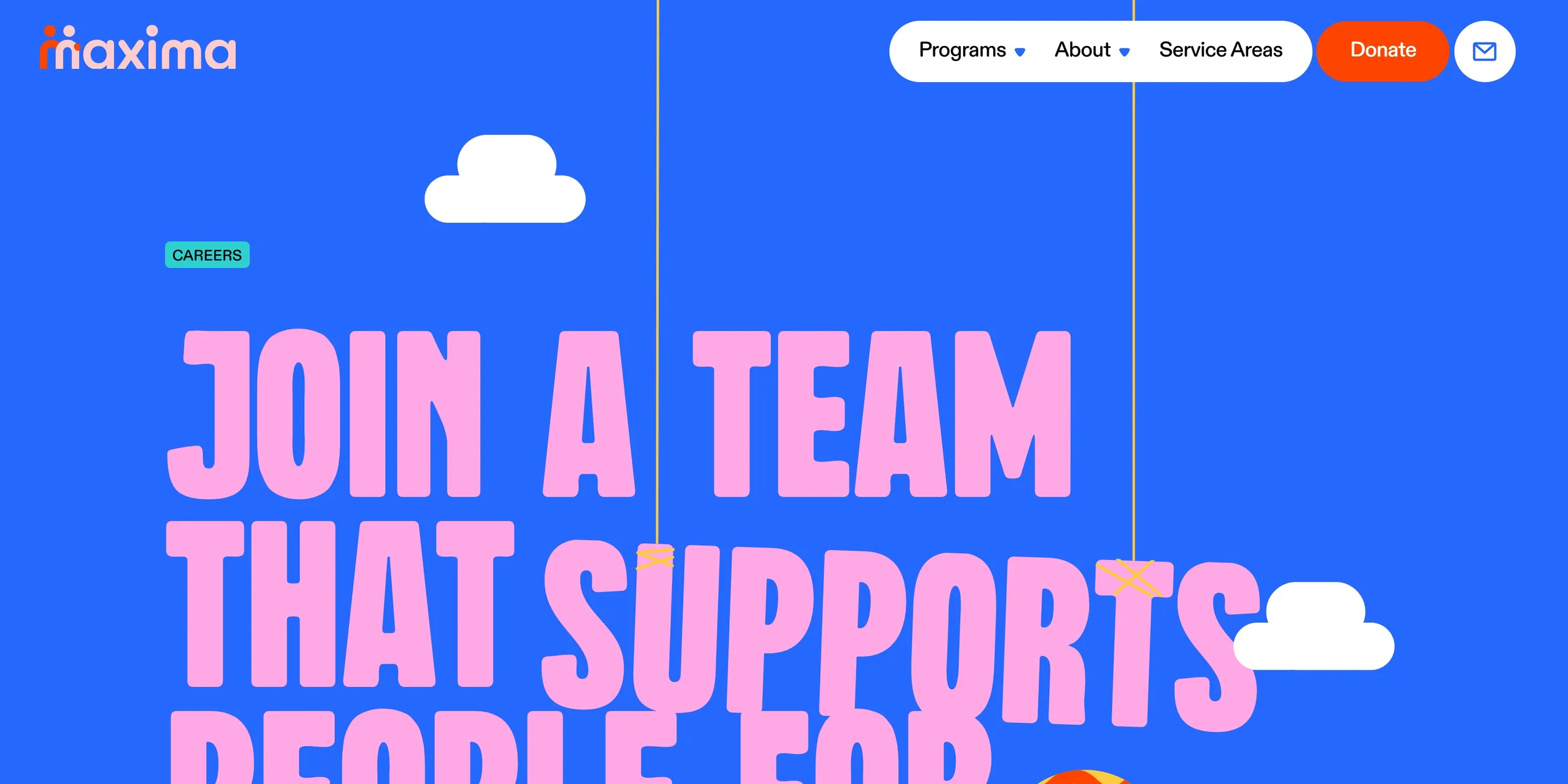
The site's menus and buttons move just as boldly. The white panel of the Programs menu swings down from an upright position like a door hinged on its bottom right corner, overshoots a little and comes to rest at a slight tilt, about 1.8 seconds in all, and swings back in about 1 second when it closes. As the cursor moves between menu items, the preview photos pop in from the direction of travel, each at a different angle. When the visitor moves between pages outside the programmes, the site reuses the curtain from the opening. A V-shaped opening splits the middle of the screen, a coloured curtain fills the screen through it, the page changes behind the curtain, and the curtain fades. On the Careers page, the word SUPPORTS hangs from the top of the page on two strings, and a fast cursor across it sets it swinging, back and forth for several seconds like a hanging sign before it slowly comes to rest.
On phones, tapping the arrows and swiping the illustration sideways both turn the wheel. The growing buttons and the pills swelling into circles are triggered by a finger pressing and lifting instead, while the cursor-following toys, such as the hill's eyes and the attracted letters, have no phone counterpart.
04Engineering
The site is a statically generated React Router site with its content in the Sanity CMS, hosted on Cloudflare Pages. The key to the wheel is the routing hierarchy. Nicolas Garnier writes on Codrops that the wheel lives in the layout shared by the programme pages, above the Outlet that renders the page content, so when the visitor turns to the next programme, the route and the page data below change while the wheel itself does not re-render. The wheel is a circle about 3215 px across, of which the desktop shows only the top, and the four programmes are four divs, each rotated by 90 degrees, inside one wrapper. To show a given programme the wrapper rotates to minus 90 degrees times its index, using GSAP's elastic.out(0.8, 0.7) over 2 seconds, and navigate is called with that programme's URL at the same time. In the three quarters that are not at the top, the Lottie animations are paused and ignore the mouse, and only the quarter that reaches the top starts playing and takes input, so four large illustrations can sit on the page without slowing it down.
The opening curtain is drawn on a full-screen 2D canvas, and its trick is that the last frame almost exactly matches the background of the programme page. The canvas is first filled blue, then a square in the programme's main colour is drawn, turning from 90 degrees upright and growing to 1.1 times the long side of the screen. Next come two fans that open outwards around the bottom centre of the screen in the programme's pale colour, pale yellow for Early Intervention. Finally a black fan on a second canvas is used with destination-out to cut part of the first canvas away.
The opening's timing follows from these layers. For the first 3.3 seconds the black fan is closed and the whole canvas is cut out, so the visitor sees the beige title panel underneath it. As the black fan opens to 90 degrees, the canvas appears bit by bit, the square ends up filling the screen and the pale fans stop at 58 degrees, or 50 on phones. Another canvas draws the same two slopes behind the top of each programme page, also at 58 degrees, or 55 on wide screens, in that programme's pale colour, so when the curtain fades almost nothing changes except that the illustration and title plate appear in place. Each page's curtain colours come from a colour table. Moves between programmes, or between the home page and a programme, skip the curtain and leave the wheel to do the work.
The half-beat lag of the cards and letters comes from a very simple combination. ScrollTrigger converts the scroll into progress from 0 to 1, but instead of writing that progress straight into a position, the site calls gsap.to on every update to push the element towards its new position, with elastic.out(1, 0.5) over 1 second. New targets keep arriving before the previous bounce has finished, so the element chases the scroll as if dragged on a spring. Each card moves only in its own stretch of the scroll range. Card number n starts at the nth share of the run and spans 1.5 shares, so the next card starts moving before the previous one has finished. Smooth scrolling comes from Lenis, which shares GSAP's ticker, and one notch of the wheel glides into place in about 1.1 seconds. The parallax of the giant letters is written the same way, each letter's offset being 20 times the scroll progress times its own weight, and different weights make the letters move at different speeds.
The site's toys each use a light technique. The SUPPORTS word on the Careers page uses the Matter.js physics engine, where the word is a rectangular rigid body and each of the two ropes is a chain of 8 thin rigid bodies. The ropes are drawn on a 2D canvas, the SVG word is placed every frame at the body's position and angle, and when the cursor enters, the site applies a horizontal force based on the cursor's horizontal speed. The balloon in Adaptive Skills Training uses the same rope with gravity reversed, so the balloon floats upwards.
Two other toys reshape what is on screen directly. The blue trousers with turquoise dots on the child in Early Intervention come from drawing a Lottie animation to a hidden canvas and using it with destination-in as a mask over a field of dots drawn in code. The pattern moves only with the scroll, at a quarter of its speed, so while the child moves, the dots on the fabric look as if they sit on another layer. The sea in Residential Support is an SVG path built from 50 points. When the cursor crosses the sea, the site takes the cursor's x position as the centre, works out the wave height from the cursor's vertical speed and pushes a sine-shaped ripple outwards over 3 seconds. Garnier writes that the control points for this ripple were generated with Claude Code, and that AI also helped them turn some SVG masks into clip paths for performance, but that it occasionally broke their data fetching patterns and even invented shapes, so the team kept it to small, tightly scoped tasks. The whole site uses about 70 Lottie animation files.
The cost of all this illustration and motion lies mostly in the download, and it is modest. A first visit to the home page downloads about 2.7 MB of site files, with about 0.35 MB more of analytics scripts. Images account for about 1.3 MB, as the home page downloads the illustrations' backgrounds and scenes straight away, the largest at about 260 KB. Fonts are the second largest item, with two variable fonts of 325 KB and 263 KB. The 52 scripts add up to about 0.9 MB, and the chunk of about 114 KB that holds the giant word band also carries the entire Tweakpane debug panel library, although the site's code never creates a panel. Phones, tablets and desktops download exactly the same files. The browser paints its first frame within 0.4 to 0.5 seconds, but every full page load plays the opening of about 5 seconds before the visitor can use the wheel.
The main interactions work only with a mouse or a finger. When the visitor presses Tab, focus first enters the two closed menu panels and lands on about ten invisible links, because the panels do not open on focus. The wheel's two arrows work with the keyboard, but the service cards, giant words and stickers have no keyboard access, and the focus outline is the browser default. The site ignores the reduced motion setting, so the opening, wheel, cards and menus animate as usual, and only the blog page turns off its parallax.
05Scores and Team
| Award | Source | Date | Score |
|---|---|---|---|
| Site of the Day | Awwwards | 2026-04-07 | 7.73. Design 7.8 / Usability 7.38 / Creativity 8.12 / Content 7.76 |
| Developer Award | Awwwards | 2026-04-07 | 7.98 |
Of the four Awwwards categories, Creativity scored highest (8.12) and Usability lowest (7.38), and among the Developer Award categories Animations and Responsive scored highest (8.2 each) and Accessibility lowest (7.4).
| Credit | Role | Record (as of 13 November 2026) |
|---|---|---|
| Louis Paquet | Digital creative director and designer, Awwwards account location Montreal, Canada | Awwwards works 52, SOTY 1, SOTM 2, SOTD 41, HM 51. FWA 3 |
| KOKI-KIKO | Creative studio in Montreal that calls itself the smallest of agencies | Awwwards works 9, SOTM 2, SOTD 9, HM 9. FWA 2 |
| Kim Levan | Freelance brand strategist, Awwwards account location Canada | Awwwards works 10, SOTM 2, SOTD 10, HM 10 |
| Nicolas Garnier | Design engineer, self-described as based in Seattle | Awwwards works 7, SOTD 7, HM 7 |
At the end of the Codrops article, Nicolas Garnier lists the roles, with KOKI-KIKO as the agency, Kim Levan on strategy and project management, Louis Paquet on art direction and design, Anthony Morell on branding and illustrations, and Garnier on technology and development. Anthony Morell does not appear in the Awwwards credits, but the site's cut-paper characters and scenes come from Anthony Morell.
06Archive
- Award date
- 2026-04-07
- Awards
- Awwwards SOTD 2026-04-07, Awwwards DEV 2026-04-07
- Site
- https://maximatherapy.com/
- Credits
- Louis Paquet, KOKI-KIKO, Kim Levan, Nicolas Garnier
- Design
- graphic
- Build
- scroll
- Awwwards
- 7.73 / 10. Design 7.8 / Usability 7.38 / Creativity 8.12 / Content 7.76. Developer Award 7.98. https://www.awwwards.com/sites/maxima-therapy
- Stack
- React Router 7.11 (static generation), React 19.2, Sanity, GSAP 3.13 (ScrollTrigger, SplitText, MorphSVG), Lenis 1.3.11, lottie-web 5.13, Matter.js 0.20, Tailwind CSS, Cloudflare Pages
- Total assets
- About 2.7 MB on a first visit to the home page, of which images about 1.3 MB. Phones and tablets the same as desktop
- Speed
- FCP 392 to 480 ms (the opening curtain), home page usable after about 5 s, CLS 0.0006. Programme pages 60 fps on continuous scroll