Steven.com
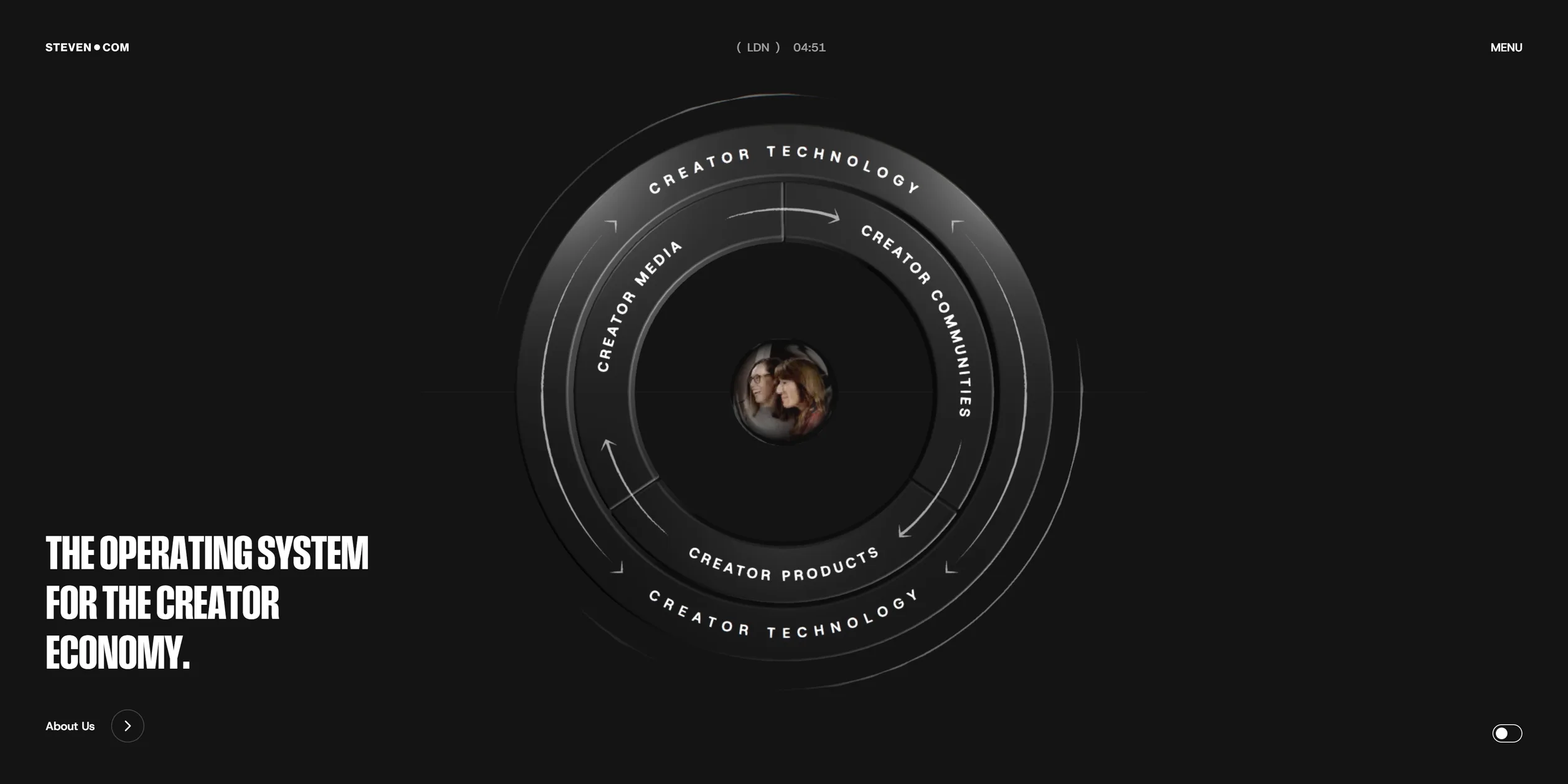
Steven.com is the website of a creator holding company owned by the British entrepreneur and podcast host Steven Bartlett. The company calls itself the operating system for the creator economy and runs four businesses, in media, events and communities, branded products and technology, so the site has to show first-time visitors at once how the four connect. The site's answer is a metal armillary dial in the middle of the home page, with one ring for each business. Whichever ring a visitor clicks, the camera passes through the glass sphere at its centre and flies into that business's room.
The site was designed and built by the London digital agency OFF+BRAND. It won Site of the Day on both FWA and Awwwards.
01Concept
Steven Bartlett bought a microphone in 2017 and started the podcast The Diary of a CEO, then set up the companies FlightStory, FlightFund and FlightCast, an AI-powered podcast hosting platform. According to reports from early November 2025, Steven.com is the holding company above these businesses, and it had just closed an eight-figure funding round at a valuation of US$425 million. Bartlett said in the company's press release that his ultimate ambition was to build the Disney of the creator economy. As late as February 2026, the steven.com domain still showed a single line of tagline, and the current site went live in early March.
OFF+BRAND. said in its studio feature on Codrops that the client described itself as the operating system for the creator economy, a completely new category, and the website had to make people understand it almost immediately. The team's first attempts at explaining the category were not visual enough, so it kept only the four essential businesses. The team could have given each business its own page, but the whole point of the company is that the businesses connect, so it decided to make the site something to explore rather than to read. The interactive 3D object at the centre of the home page was therefore built as the navigation itself, and its four rings are the entrances to the four businesses. The team calls it an armillary sphere, and Georgia Gibson on the client side liked the design so much that Gibson came to a call with a wooden model made by a carpenter friend.
The site has to win over several kinds of people at once. OFF+BRAND. wrote on its own case page that Steven.com is not a personal brand website but the front door to the ecosystem, and that its visitors range from creators the company might sign and investors to fans and founders. The Codrops feature adds that these visitors spend much of their lives online, so if the site felt slow or overbuilt, the team would lose them before it started.
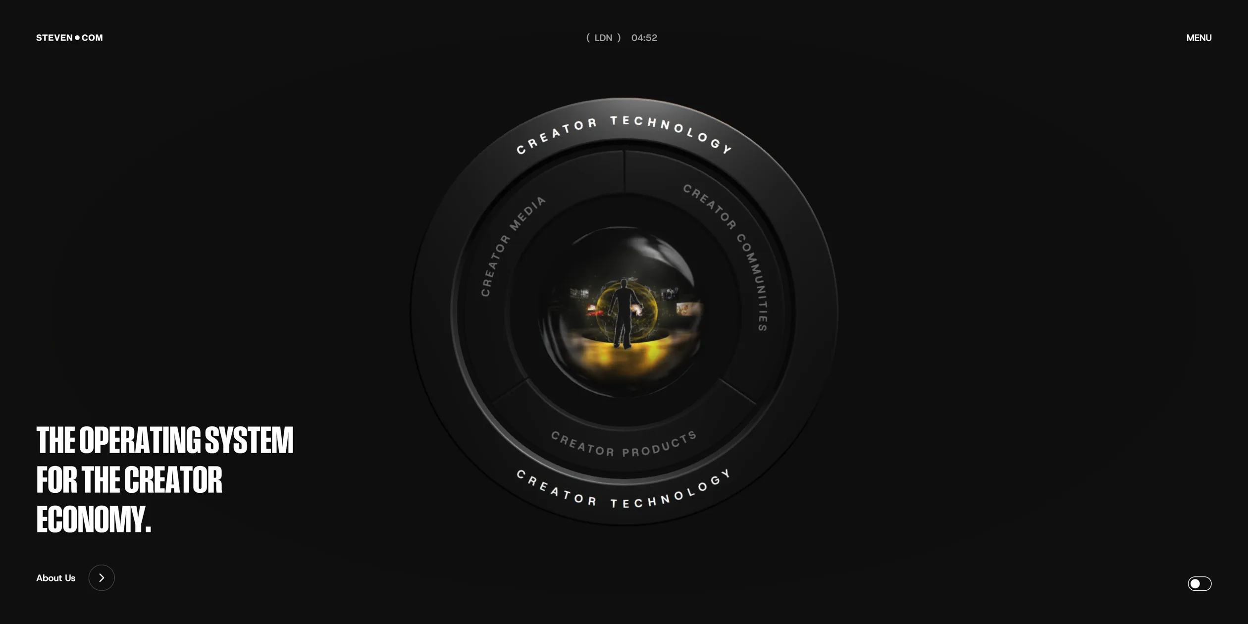
A visitor first sees a white loading screen, where a percentage and a red pen stroke count up to 100 together. The screen then turns dark, and the home page is a single screen with the dial in the middle and a tagline and an About Us button at the lower left. The dial has four rings, Creator Media, Creator Communities, Creator Products and Creator Technology. Whichever ring the cursor rests on, the glass sphere in the middle switches to a photo of that business at work, and a click enters that room.
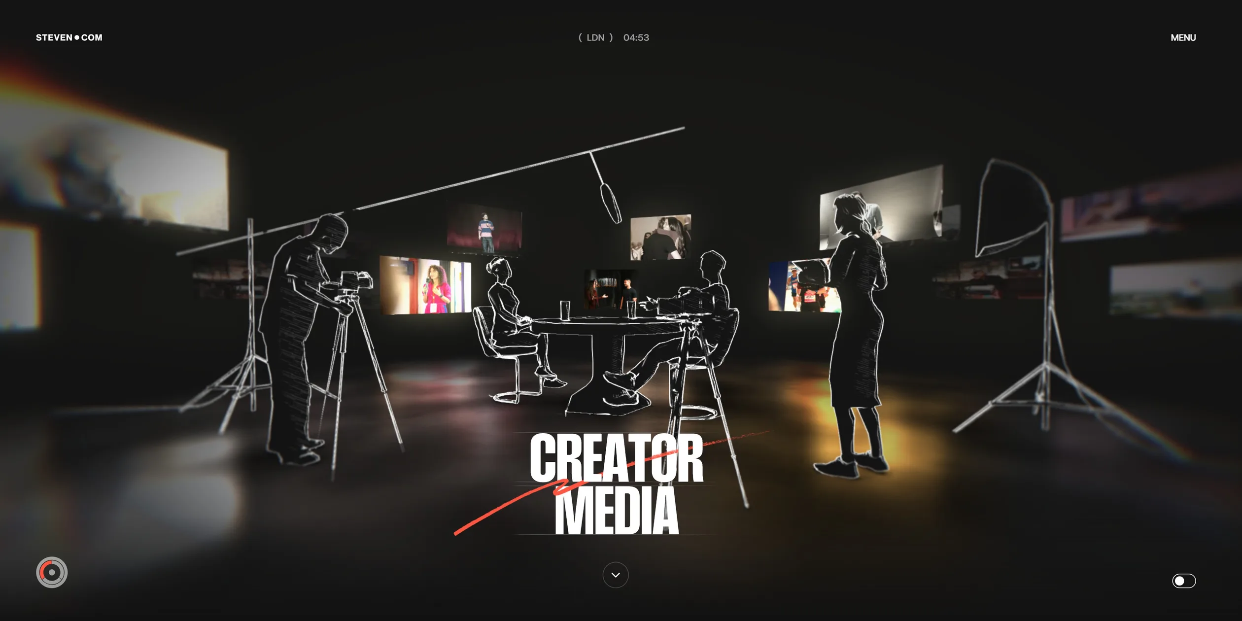
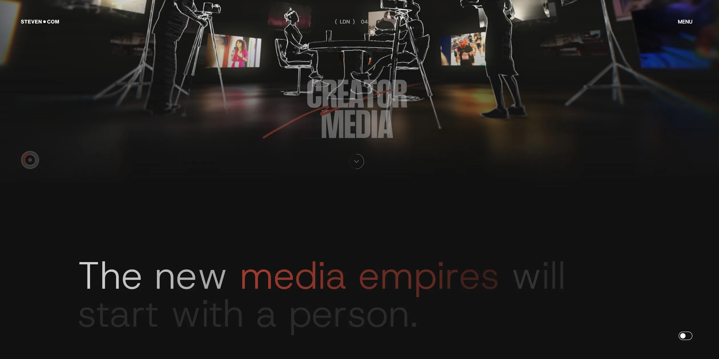
All four room pages follow the same order. At the top is a screen of the 3D room with the business name, followed by one large statement, such as The new media empires will start with a person in the media room. Below that come a set of photos and a list whose rows link to the real companies or events behind each business. The media room lists 20 creators, the communities room 4 events, the products room 8 brands and the technology room 5 tools. Each room page ends with NEXT and the name of the next room, and the four rooms join end to end, so a visitor who keeps reading walks through the whole ecosystem.
The site's menu adds three more destinations. About Us opens a white manifesto panel about the company's mission, ending in Steven Bartlett's handwritten signature. The Join Us page sorts visitors into five groups, creators, founders, businesses, people who want to join the team and job seekers, and gives each one an entry, which is where the site ultimately wants to take its visitors. The Press & News page gathers the company's coverage, and its styling and the entry in the home page footer were changed after the awards.
02Design
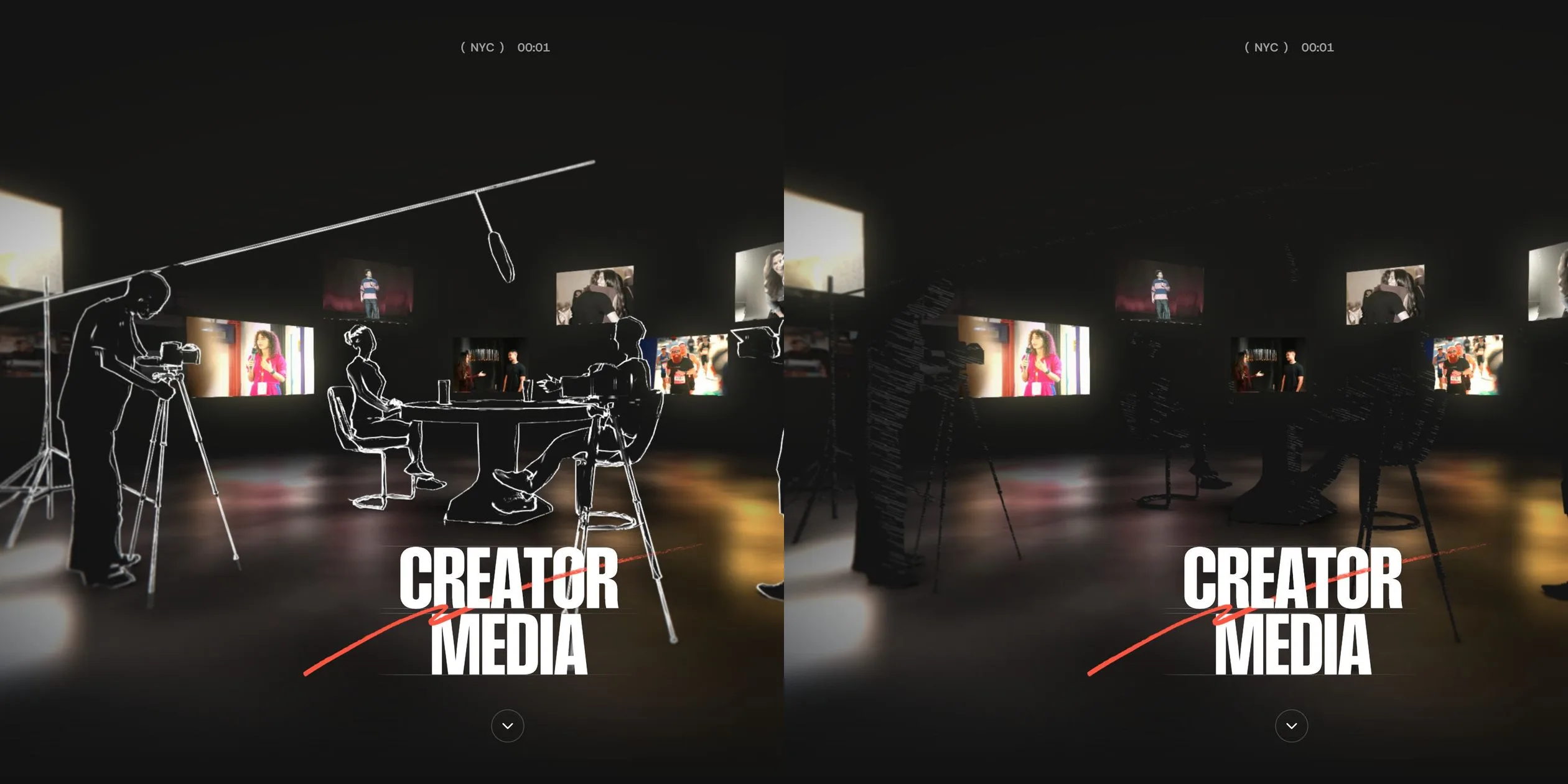
The site's main visual rule is to press everything onto a near-black ground (#121212), light only the 3D object or room, and shrink the text and buttons into small type at the edges. A polished metal armillary dial stands in the middle of the home page with a glass sphere set at its centre, and almost nothing on that page has a colour beyond black, white and grey. The rooms switch to another way of drawing, with people and props outlined in white hand-drawn lines in the dark, and only the photos on the screens on the walls keep their real colours. OFF+BRAND. says on its case page that setting the warmth of hand-crafted illustration against precise layout expresses the company's core thesis, that in a world accelerating towards AI and automation, the most valuable thing is still human. The creators and events on the site appear in real photos, while the people and props in the rooms are all drawn.
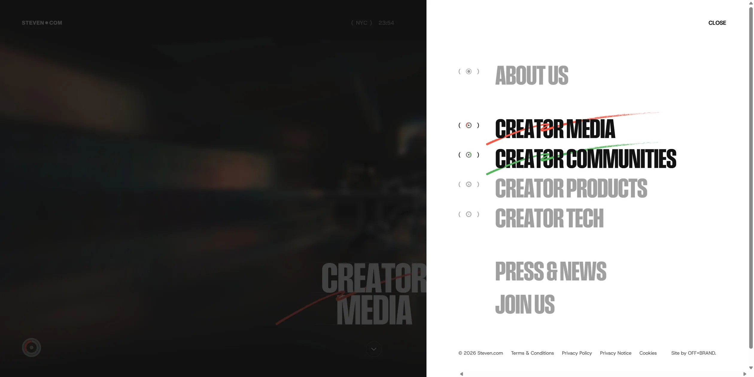
Colour is used only for the four businesses. Media is red #ff5541, communities green #51b75a, products blue #5595ff and technology yellow #ffdd4b. Each colour appears only in a few small places that belong to its business. These are the handwritten stroke under the title, the key phrase in the statement, the round badge at the lower left of the room, that item's stroke in the menu and the tint over the photo under the cursor in the photo grid. The rest of the site is black, white and a few greys, so as soon as visitors see a colour, they know which room they are in.
The type plays two roles. Titles use Field Gothic, a narrow sans serif set in capitals. On a 1920 px screen a room name is about 110 px tall with its line height pressed to 0.73 of the size, so the two lines nearly touch, like a printed label. Body text, buttons and the statements use Host Grotesk, the statements in a light weight, and the navigation is set in small capitals of about 14 px with letter spacing opened to 0.05 em. The sizes of titles, body text, navigation and buttons, and the page margins, all scale continuously with the screen width between 320 px and 1920 px. A room name, for instance, grows smoothly from 50 px to 110 px, so the layout never jumps between widths.
The hand-drawn elements are the other half of the design. Every room name has a stroke under it drawn in one go, in the room's colour. The arrows and fine lines on the home dial tremble slightly, as if traced by hand. The About Us panel ends with Steven Bartlett's own handwritten signature.
The site keeps its interface pieces restrained. The header carries the STEVEN●COM logo on the left, a clock in the middle that cycles through the local times in Los Angeles, London and New York, and MENU on the right. When the menu opens, a white panel slides in from the right and covers a little over four tenths of the screen, while the scene behind it dims and blurs. The menu items are stacked in large grey title type. The room the visitor is in turns black with a stroke in that room's colour, and any other item under the cursor also turns black with its own colour. Buttons are thin outlined pills with round ends. The photos in the grid keep their own colours until the cursor rests on one, which then gets a tint in the room's colour with a row of social media icons in the middle.
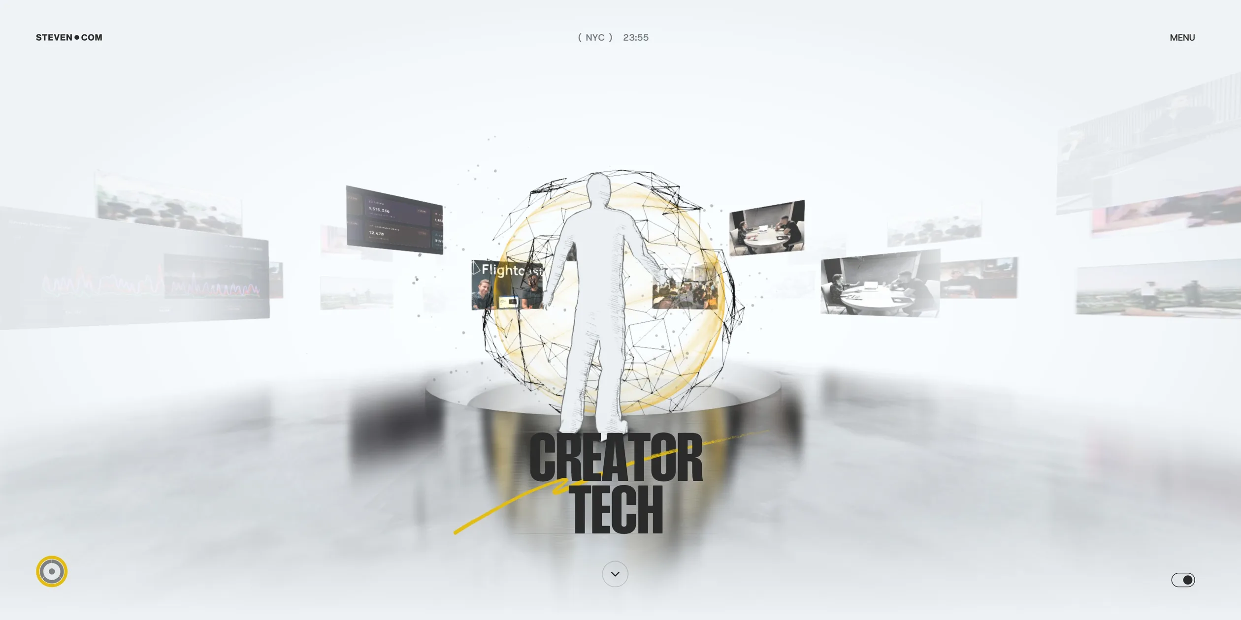
A switch at the lower right turns the whole site light. After the switch, the page turns white and the 3D scenes change too. The dial turns silver and white, the rooms get a white ground, and the people are drawn in grey lines. In the technology room in light mode, a grey human figure stands inside a sphere made of fine lines with a yellow ring of light, surrounded by floating screens of software.
On phones, the home tagline moves to the top centre with an Our Ecosystem link under it, and the dial grows to the full screen width. Phones have no hover, so a white pill button at the bottom names the business currently selected, with a left and a right arrow beside it. When a visitor taps an arrow, the name in the pill and the lit ring on the dial change together, the glass sphere switches to that business's photo, and only a tap on the pill itself enters the room. The first screen of each room gets a pencil button at the lower right, which turns on what the site calls Sketch Mode, stopping the page from scrolling so that the visitor can look at the room on its own.
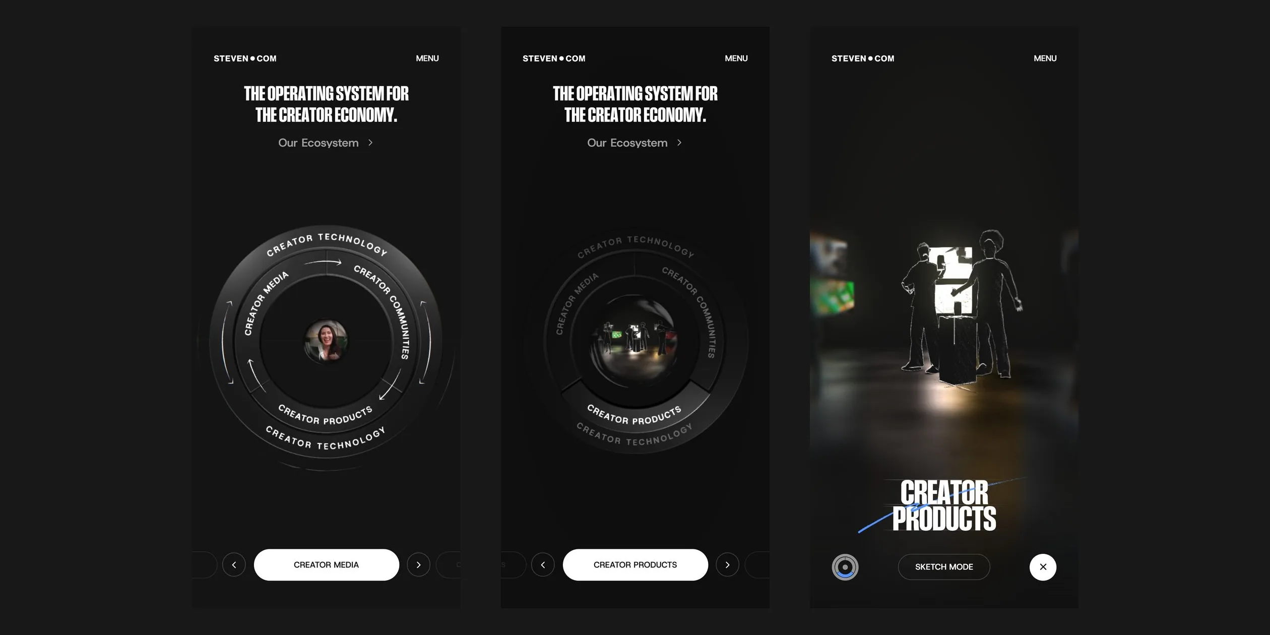
03Motion
The loading screen moves with the real download progress. A red pen stroke draws itself from left to right on the white ground, and the two-digit percentage below follows it. The stroke advances smoothly and does not jump ahead when a large file finishes. At 100 the red and grey strokes keep running forward, as if a pen were sliding off the paper. The STEVEN●COM logo then moves to the centre, the percentage rolls up and out, and the tagline rolls up into place word by word. Finally a burst of white light closes down into the dark home scene, and the dial emerges from the light.
The site's home page is not completely still when nobody touches it. The portrait in the glass sphere keeps changing as several creators take turns, each in a short moving clip. The two layers of rings turn slightly with the cursor, and the arrows and fine lines on the rings tremble.
When the cursor moves onto a ring, the site first waits 0.2 seconds to make sure the visitor has really stopped, so the dial does not flicker as the cursor passes over it. The response is several layers of movement at once. The ring the visitor chose stays in place at full brightness, while the other three sink a little in about 0.4 seconds and drop to a third of their brightness. The background darkens at the same time, a light falls on the chosen ring, and the arrows and fine lines on the rings fade out. The glass sphere in the middle grows to twice its size in about a second, and a photo of that business spreads outward from its centre. When the cursor leaves, these movements return the same way.
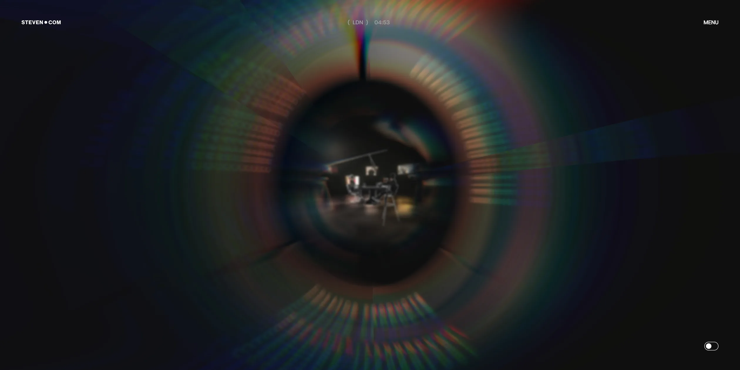
After a visitor clicks, the camera pushes into the glass sphere over about 2 seconds. In the first half the two layers of rings each turn half a circle and melt into a radial blur, while rainbow colour fringes appear at the edges, peak midway and then fade. As the camera pushes forward, the room behind the glass sphere moves forward as well, so the visitor feels they have travelled through the glass sphere into the room. Going back from a room to the home page, for instance through About Us in the menu, plays the same sequence in reverse. The camera backs out of the room trailing rainbow streaks until it is in front of the dial again.
Moving between rooms works another way. When a visitor clicks NEXT at the end of a page, the letters of the room name split apart and fade, the list fades row by row, and the screen goes black. The next room then sharpens out of a blur while the camera pushes in a little and settles back, all in about 2 seconds.
Inside a room the picture never stops moving. The people in the room go through their own actions, and every so often all the white lines jump at once, as if the frame had been redrawn, which gives the room the feel of hand-drawn animation. On desktop, the cursor leaves a thin white line like a pencil mark behind it as it moves across the room, and the line disappears less than half a second after the cursor stops. The camera also shifts slightly with the cursor.
As a visitor scrolls down, the room name on the first screen fades, and the statement lights up letter by letter. Each letter rises from a tenth of its brightness to full, one after another. The progress is tied entirely to the scroll position, so if the visitor stops, a half-lit sentence stays half lit, and if the visitor scrolls back, the letters dim again. The divider line below the statement grows from left to right at the same time, and the small label and description beside it brighten with the scroll as well.
The small interface movements on the site are quick. When MENU at the top right changes to CLOSE, each letter has two stacked layers, the old letter rolls up and away and the new one rolls up from below. The letters are staggered by about 0.035 seconds, and each change takes about 0.5 seconds. The letters of the menu items also appear one by one. The switch between dark and light finishes in under 0.3 seconds.
04Engineering
All the 3D work is drawn on one WebGL2 canvas behind the page with three.js, while Webflow still produces the page's text and buttons on top of it. The home dial and each room are separate scenes, each rendered first into an offscreen texture, and a compositing shader decides which texture to show in each frame and how two of them mix. A final full-screen pass after the composite handles distortion, barrel warping, chromatic aberration, bloom, vignette and the pencil line of the cursor. So the trip through the glass sphere and the moves between rooms are both made with GSAP timelines that change the cameras of several scenes and the parameters of these passes at the same time.
Taking the entry into a room as an example, its timeline is 3 seconds long and plays at 1.5 times speed. The dial scene's camera moves from 6.5 to 1.75, the two layers of rings each rotate 180 degrees, and the radial blur rises from 0 to 25. The chromatic aberration strength goes from 3.5 up to 50 and back to 3.5, while the room scene's camera moves from 8 to 3. A room scene is only created when it is needed and is destroyed when the visitor leaves it. The site's own debug panel shows that each frame of the media room goes through 12 render passes, drawing about 90,000 triangles in about 50 draw calls.
The dial's hover state comes from raycasting. Each ring has an invisible hit mesh beside it, and on every mouse move the site casts a ray from the camera towards the cursor, checks which mesh it hits and maps that to the ring's business. When the hovered ring changes, the site waits 200 ms, then uses GSAP to tween the background colour, the light intensities, the rings' positions and opacities and the size of the glass sphere. When a visitor clicks, the site only hands the target URL to taxi.js, which swaps the page. The WebGL side listens for the page-change event and, depending on which page the visitor comes from and goes to, picks one of three transitions, through the glass sphere, between rooms or straight into a room. The pill button on phones writes to the same hover state, so the dial responds on a phone just as it does on desktop.
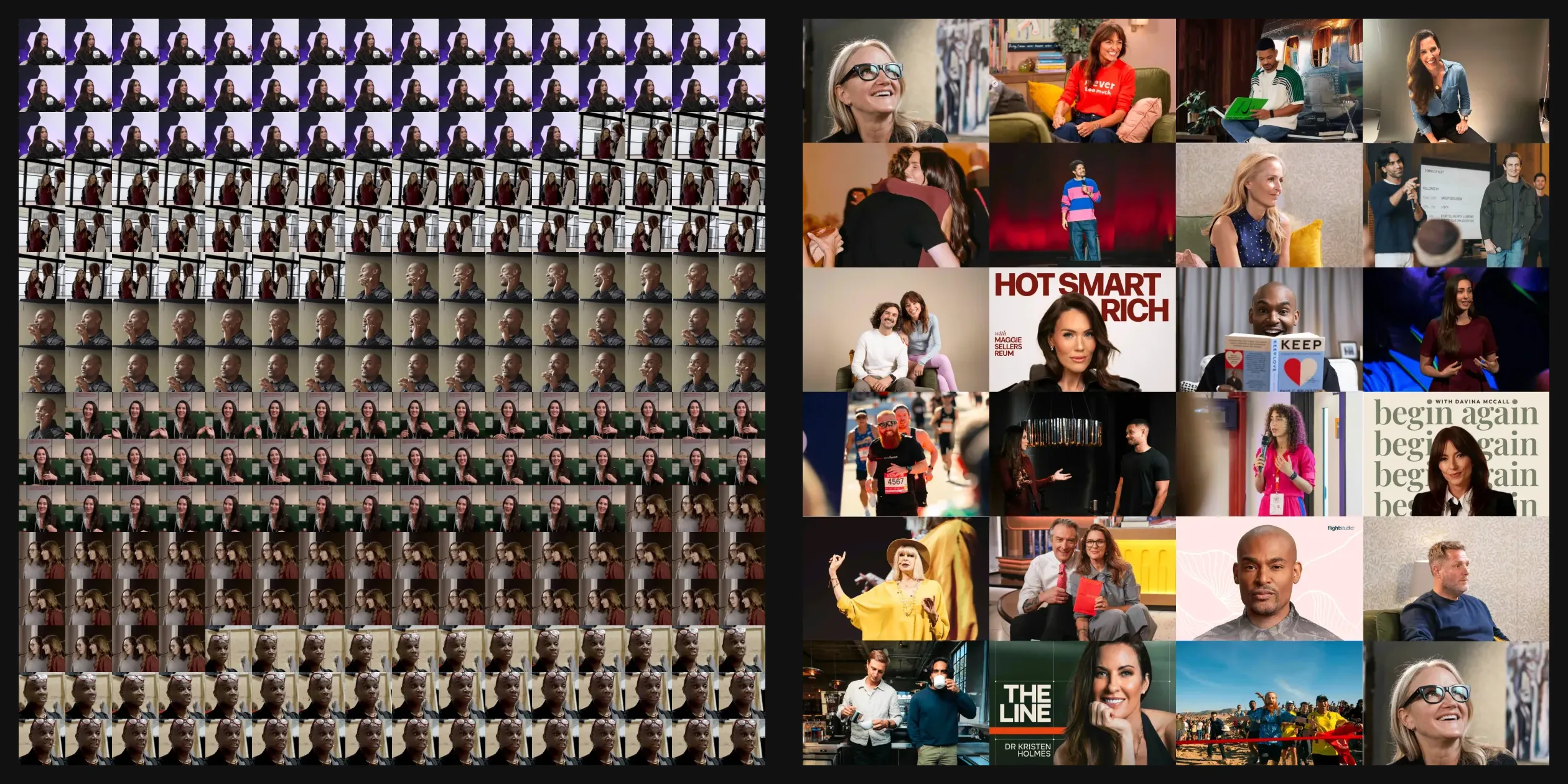
The glass sphere in the middle is a patched version of three.js's physical material shader. It puts no 3D objects inside the sphere. Instead it reads a flat texture using the normal at each point of the sphere, so the flat picture curves as if seen through a fisheye lens, with a glass highlight and darker edges on top. The portraits come from a 4096 px square sprite sheet holding 256 frames in 16 rows and 16 columns, short video clips of five creators. The shader steps through them at 24 frames per second, so one loop takes about 11 seconds. The photo that appears on hover is another texture, which the shader spreads outward with a mask that grows from the centre of the sphere. The site never has to play a video in the page, because the portraits and photos are just different areas of textures.
The hand-drawn look of the rooms is computed entirely in real time, and the models themselves carry no lines. The site first renders the room into an offscreen texture with a material that outputs only normal directions, where sudden changes in the normal colours mark the outlines and folds of objects. The line shader runs Sobel edge detection on that texture twice, once at the normal thickness and once at a third of it, with the sample position nudged by noise. The two lines overlap like a pencil going over the same stroke twice. Shading uses a hatching texture. The shader works out light and dark from the normal and a fixed light direction, compares that with the hatching texture and keeps the hatching where the surface is dark. The hatching texture's sample position jumps to a new place every so often, and the vertices are pushed by noise at the same rhythm, so the lines seem to be redrawn every little while. Light mode only inverts this shader's output to get grey lines on white.
The photos in the rooms also come from one 4096 px square atlas per room, about 24 photos each, drawn in one go as instanced planes. Every other photo is at half saturation, and a cylinder printed with photos wraps around behind the walls. The cursor's pencil line is a line mesh that follows the cursor position, rendered into a texture and multiplied by a pencil texture in the final full-screen pass, then revealed and faded through noise. The line is only switched on for screens wider than 768 px, and phones and tablets switch it on only in Sketch Mode. The strokes under the titles and the signature in About Us are Rive animations. The site does not keep one file per room, it uses Rive data binding to pass a colour name and a switch that starts the drawing into the same animation.
The cost of this approach is mostly in the download. OFF+BRAND. says in the feature that the site had to load quickly and respond instantly, and the trade this site makes is to have visitors do all their waiting when it opens, so that every later step responds at once. Whether a visitor opens the home page or a room, the loading screen waits until the assets for all four rooms and the dial have downloaded. A first visit to the home page downloads about 13.2 MB, of which about 10.5 MB is KTX2 textures. The largest are the four rooms' photo atlases at 1.2 to 2.2 MB each, followed by the 1.4 MB portrait sprite sheet, and the dark and light sets of dial thumbnails also download together. Opening a room page directly costs about 14.4 MB, the extra being the photo grid's photos and the Rive files. Phones and tablets download exactly the same files as desktop. The percentage on the loading screen keeps moving, and the home page takes about 10 seconds to appear in full.
The site keeps the running cost under control. The canvas stops rendering once it has scrolled off screen, and the pixel ratio is capped at 1.5 on screens wider than 768 px and at 2 on narrower ones.
The main navigation works only with a mouse or a finger. On the desktop home page, keyboard focus reaches only four places, the logo, the colour switch, the menu button and About Us. The four rooms on the dial are not in the focus order, so keyboard users can only reach the rooms through the menu, and About Us and the colour switch show no visible focus ring. The site largely ignores the reduced motion system setting, as only the clock digits and the phone carousel switch to direct changes, while the trip through the glass sphere and the scroll animations play as usual.
05Scores and Team
| Award | Source | Date | Score |
|---|---|---|---|
| FWA of the Day | The FWA | 2026-05-22 | 83 POINTS |
| Site of the Day | Awwwards | 2026-06-04 | 7.64. Design 7.69 / Usability 7.28 / Creativity 8.17 / Content 7.47 |
| Developer Award | Awwwards | 2026-06-04 | 7.44 |
Of the four Awwwards sub-scores, Creativity is highest (8.17) and Usability lowest (7.28), and in the Developer Award WPO, web performance, is highest (8.0) and Accessibility lowest (6.6).
| Credit | Who they are | Track record (as of November 12, 2026) |
|---|---|---|
| OFF+BRAND. | A digital agency whose Awwwards account gives London, United Kingdom, and whose FWA profile lists an office in Glasgow, describing itself on both platforms as a Scottish-born, global digital marketing, branding and web design agency | Awwwards works 24, SOTY 1, SOTM 1, SOTD 9, HM 23. FWA 8 |
Both platforms credit only OFF+BRAND. The agency's case page lists its services on the site as branding, Webflow development, web design, WebGL, 3D, Rive and motion.
06Archive
- Award date
- 2026-06-04
- Awards
- The FWA FOTD 2026-05-22, Awwwards SOTD 2026-06-04, Awwwards DEV 2026-06-04
- Site
- https://steven.com/
- Credits
- OFF+BRAND.
- Design
- spatial
- Build
- canvas
- Awwwards
- 7.64 / 10. Design 7.69 / Usability 7.28 / Creativity 8.17 / Content 7.47. Developer Award 7.44. https://www.awwwards.com/sites/steven-com
- The FWA
- 83 POINTS. https://legacy.thefwa.com/cases/stevencom
- Stack
- Webflow, three.js r182, GSAP (ScrollTrigger), Lenis, taxi.js, Rive (canvas-lite 2.32.2), KTX2 (Basis)
- Total assets
- About 13.2 MB on a first visit to the home page, about 14.4 MB opening a room page directly, about 10.5 MB of it KTX2 textures. The same on phone and tablet
- Speed
- FCP 176 to 228 ms (loading screen), home page complete in about 10 s, CLS 0. 60 fps scrolling the room pages