Shader Development Studio
Shader Development Studio is a creative development studio in Norrköping, Sweden, that builds real-time 3D and interactive work for the web. When the two founders started the company they found themselves surrounded by business acronyms and stock phrases, so they mocked it by naming the firm High Tech Business Solutions. They only switched to the current name after clients could not tell it was a joke. For their own website they brought the joke back, and the whole site plays an 80s tech company earnestly selling itself. Beige computers, brochures, a paper shredder and a golden tie all live in one 3D picture, and even the text carries the colour of old film.
The studio designed and built the site itself, and the credits also name Andreas Antonsson, a freelance interaction designer in Norrköping. The site won FWA of the Month for April 2026.
01Concept
Simon Hedlund and Filip Kantedal founded Shader in 2021 while they were both media technology students, setting it up to keep their consulting work apart from the product development they run at another company. In a making-of article on the design and development site Codrops in May 2026, Filip Kantedal writes that the company was first called High Tech Business Solutions. Its first company material was a business photoshoot they spoiled on purpose, with the photos watermarked, stretched sideways and saved as a JPEG at the lowest quality. After the rename the two still liked the ironic angle too much to drop it, so for the website they chose 80s business tech as their material. The article lists beige computers, glossy office ads, sales brochures, golden ties and stiff corporate handshakes. On the three.js forum, Filip Kantedal describes the site as playing this satire completely straight.
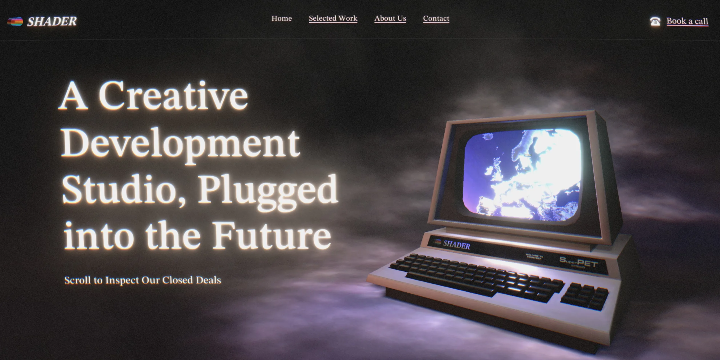
Studio sites are usually a grid of work and an about page, while this one keeps the work to the second screen and spends the rest of its length staging a sales pitch. A visitor first sees a blue boot screen, then the first screen, where an old computer cycles through the studio's project videos. One push of the scroll wheel carries the view into that screen, which becomes a ring of film holding the project carousel, with eleven projects in it. Further down come a whole floor of office cubicles and About Us. After that come several beige paper pages laid out like a brochure, holding in turn a team photo, an introduction to the studio, a wall of client logos, a computer whose screen shows a sales bar chart, and a booking coupon to cut out and post back. Once the pages have been read, the site feeds them into a shredder and closes with Still Not Convinced We're Serious About Business and a golden tie. Finally two hands shake, the picture turns to a few old telephones and the pun Good buy, and the contact details sit below that.
The route follows the order of a sales meeting: credentials first, then the samples, then the company and the brochure, and finally a handshake to close the deal and a phone number. In the site's own page configuration, the seven scenes differ greatly in length. The project carousel takes one screen, while the brochure pages take more than seven, and they are where the site actually informs. The golden tie section takes six screens, adds no new information and exists only to push the joke as far as it goes. The copy plays its part too, and each page usually opens with a plain paragraph about the studio and follows it with one stuffed with synergize, verticals and ROI. Book a call appears in three places, in the navigation, on the coupon and in the contact area, and all three open the same call booking page.
Each project in the carousel has its own page. When a visitor opens one, the project page lies on a sheet of beige paper, with the project name, type, two paragraphs and a website link on the left and screen recordings of the project on the right. The end of the page leads straight to the next project. The Close button at the top right takes the visitor back to the carousel, still turned to that project. Two other pages keep the same voice: the 404 page is a bank vault door under the heading 404: Line Busy, and the accessibility statement sits beside a photo of a desk covered in staplers and a calculator. The Met us in Singapore recently banner at the bottom of the page was added after the award, and the rest matches the web archive copy from April 2026.
02Design
The site's main visual rule is to treat everything visible as 80s corporate print or advertising and then pull it together with the colour of old film. The computer on the first screen, the office and the telephones are beige plastic, and the brochure pages have a letterhead, a dotted cut-out frame and a scissors icon. The footer carries a Worldwide Business Certified Company globe badge, and even the link to the accessibility statement is a laurel-wreath medal. The site never steps out to explain the joke, and the satire comes entirely from these props and the sales voice, so the more seriously a visitor takes it, the funnier it gets.
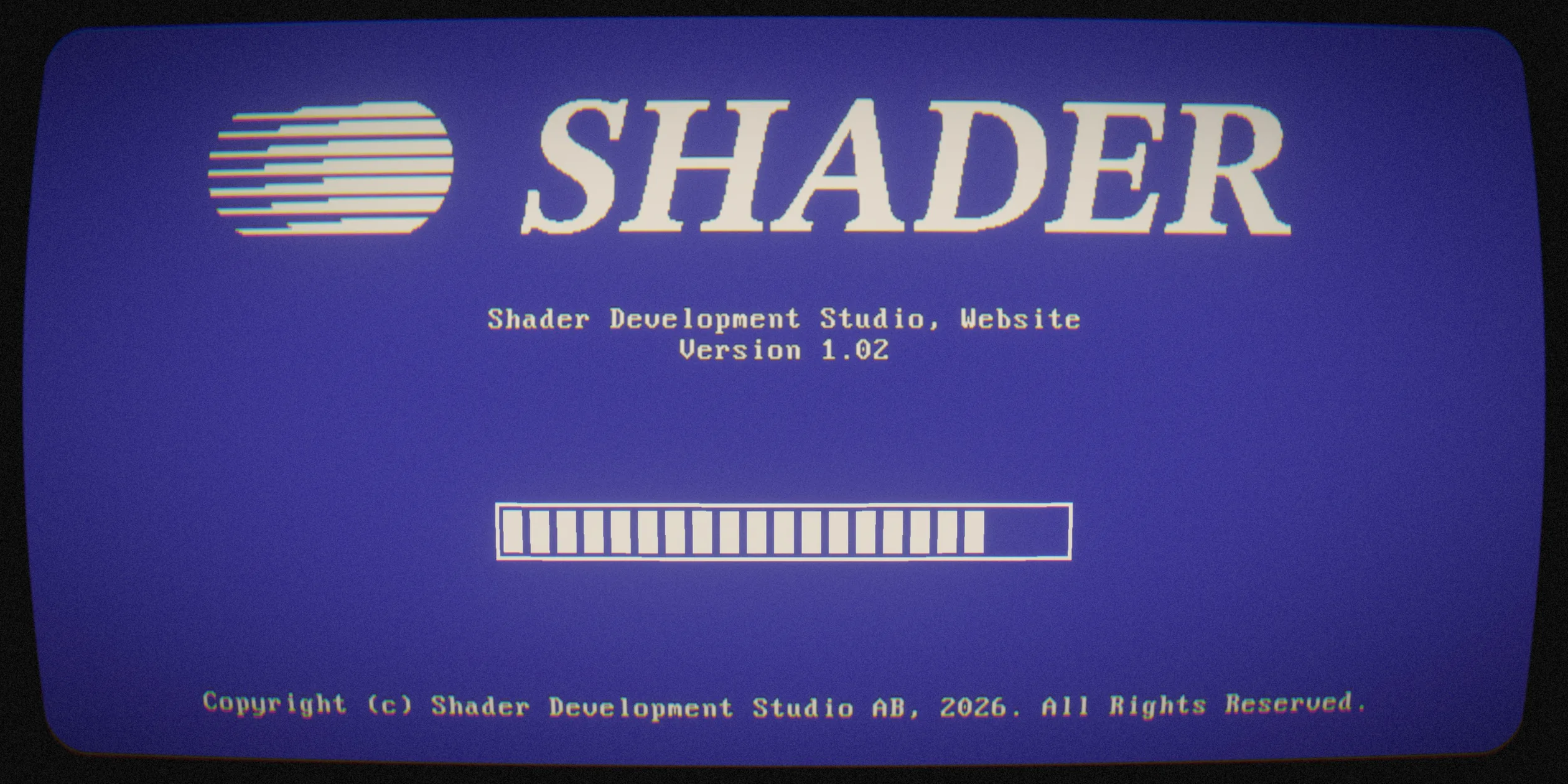
The site's interface text uses a single typeface, STIX Two Text, a serif designed for scientific publishing that carries the air of a textbook or an annual report. The monospaced type on the boot screen is part of an image and does not count. The site uses its regular, medium and bold weights, with medium for large headings and regular for body text and navigation. The site steps type sizes up with screen width, and the heading Had Enough Reading, for example, is 32 pixels on the narrowest phones and grows to 82.8 pixels on wide desktops, with steps at 46.8, 64.8 and 73.8 pixels in between. Single large words such as About Us and Good buy go bigger still, between 140 and 200 pixels, while body text and labels sit between 16 and 24 pixels. Headings in the dark scenes carry a warm yellow halo, like glowing letters on an old television.
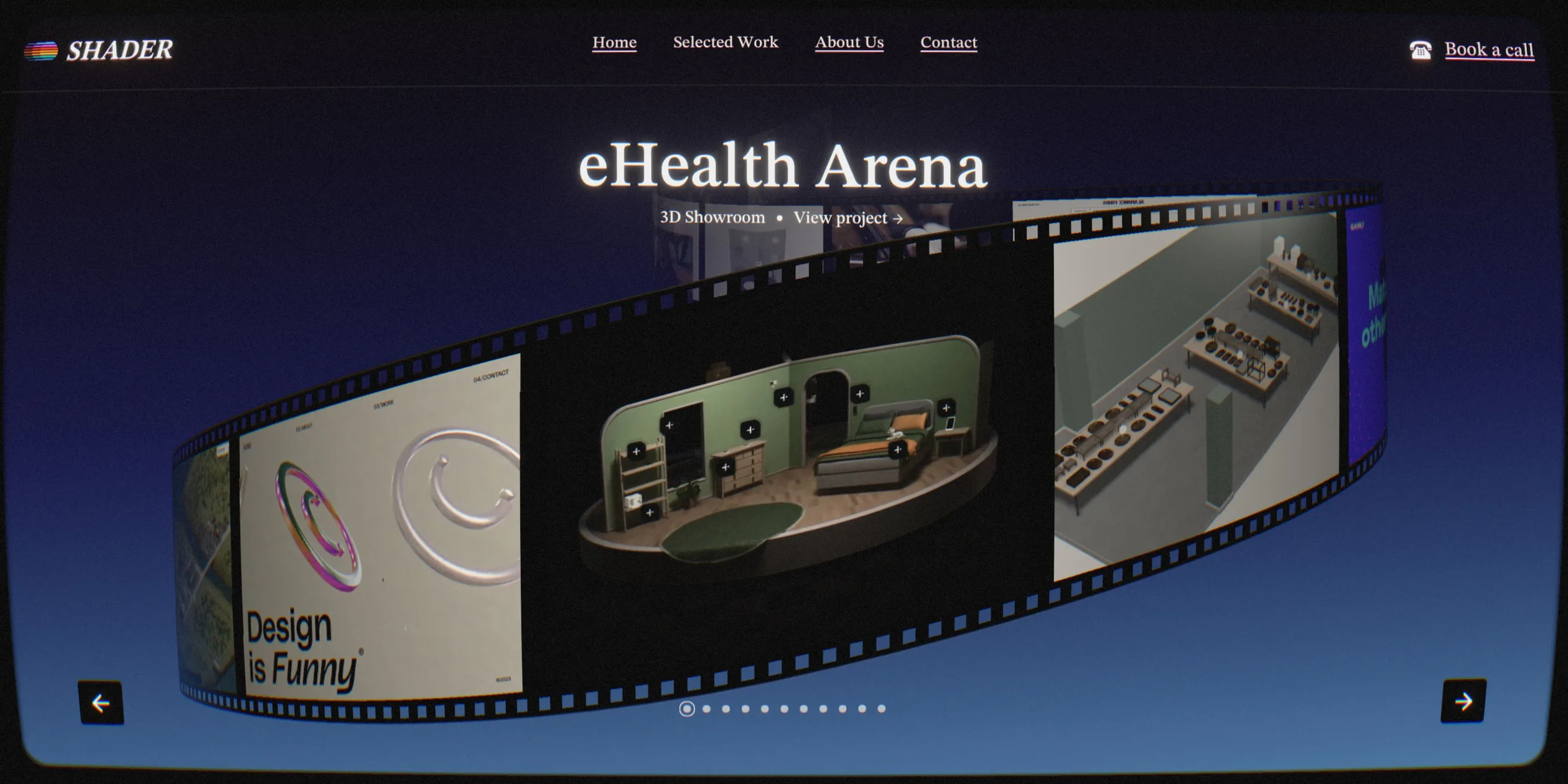
The colours fall onto two grounds. The 3D scenes use a near-black ground, which reads between #191918 and #242424 in the screenshots, and the brochure pages use beige paper at about #EEE7D3. The boot screen and the project carousel are old-monitor blue, about #413C99 in the middle of the boot screen, and the carousel background runs from #181621 at the top to #3C5C86 at the bottom. The navigation and text switch between a light and a dark version with the ground, turning dark on the beige paper. The gold of the tie is rare among the dark scenes, so it stands out when it arrives.
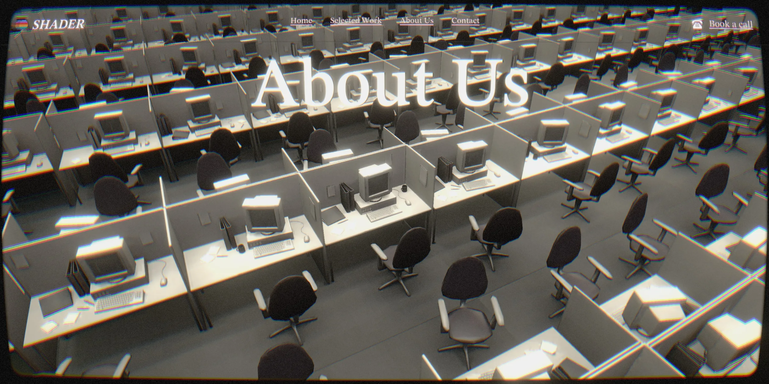
The grading of the 3D scenes and the photos plays the same old film. Each scene has its own set of grading values. The office scene has the strongest sepia and the lowest saturation, which leaves the cubicles almost grey-white, while the first screen and the golden tie have the strongest glow, so the computer screen, the headings and the tie shine. Most scenes add a little lens distortion that bulges the edges outward, and the carousel and the office also round off the corners, as if seen through the glass of a picture tube. The people in the photos have 80s hair and moustaches and stand in broad-shouldered suits behind beige computers, and the photos carry the same grain and warm tint.
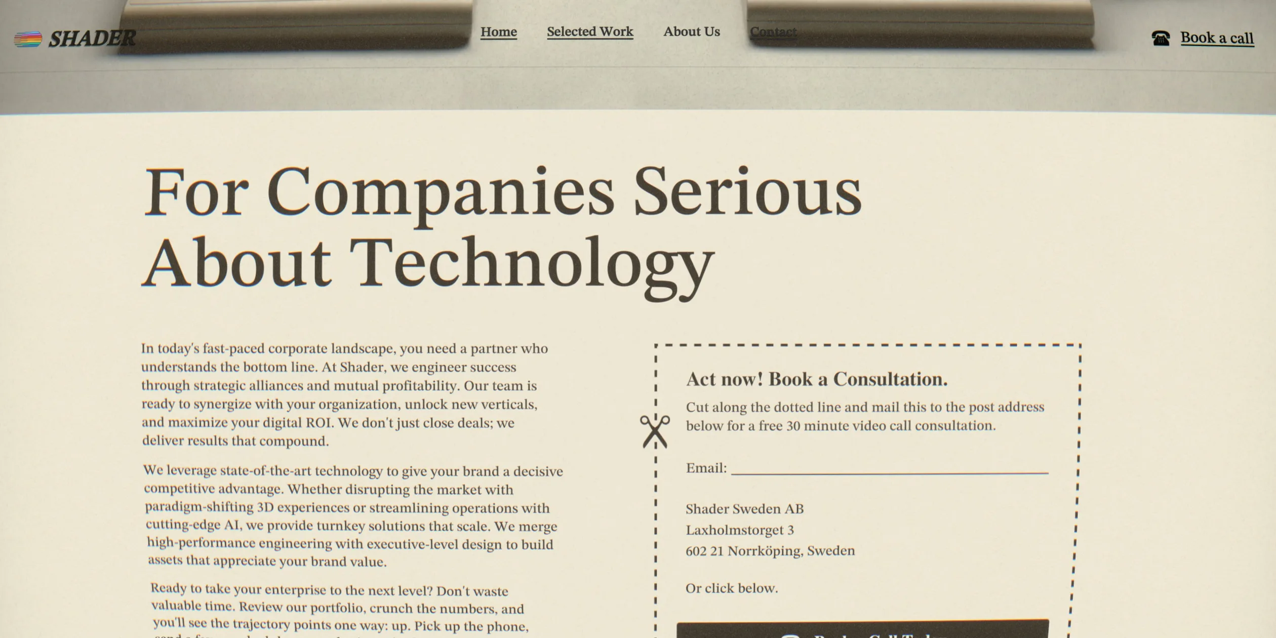
The navigation, buttons and other interface parts follow old print as well. The navigation is a row of small underlined serif links, and Book a call has an old telephone drawn in front of it. The carousel arrows are white arrows in black squares, project pages have a black Close button with white text at the top right, and the booking button on the coupon is a dark brown bar. When a visitor moves keyboard focus, the site draws a thin rectangle around the current link inside the 3D picture, and when a carousel project is selected the rectangle frames the whole block of project name and View project.
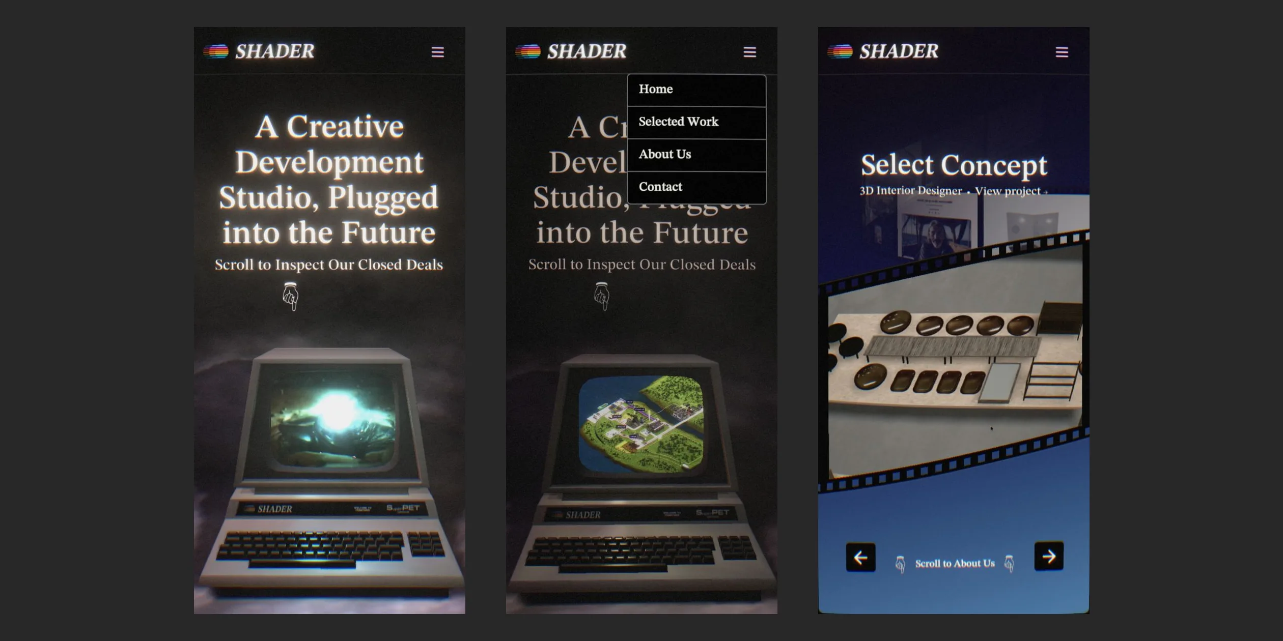
On a phone the navigation folds into a menu button at the top right, which opens a column of dark boxes reading Home, Selected Work, About Us and Contact. The first-screen heading sits centred in the upper half with the computer moved to the lower half, and the three columns of brochure text merge into one. The carousel arrows move to the bottom of the screen with the Scroll to About Us hint between them. In the layout code, several blocks set a separate height for each of more than twenty widths between 370 and 1600 pixels, which shows that the team tuned the layout width by width.
03Motion
Almost every movement on the site is tied to scrolling, and the picture follows the scroll position frame by frame, so scrolling back plays it in reverse. The scroll itself carries a long glide, and the page keeps sliding after the wheel stops. The first screen and the project carousel also pull like magnets: if a visitor stops near one of them, the page is drawn slowly onto the exact position, and a fast flick toward one lands squarely on that screen. The cursor tilts the scene slightly, and the tilt catches up with the cursor after a delay, so the picture seems to float in water. The grading, glow and grain of each scene fade into the next at the boundaries, and the film grain keeps jumping, so the picture never quite stands still.
The opening has two steps. The site stays black for about two seconds, then shows the blue boot screen, whose progress bar fills block by block with the real loading progress, and the first screen appears after about six seconds. The computer screen on the first screen loops project videos, and its colour falls on the keyboard and the smoke, so when a pink shot plays the whole cloud of smoke glows pink.
When a visitor scrolls once from the first screen, the camera pushes toward the monitor until the screen fills the whole picture, and the push takes about one screen of scrolling. During the push, the monitor already shows the live project carousel, so when the push ends the visitor is inside the carousel and never sees a cut.
The carousel's own turning is triggered by clicks. When a visitor clicks an arrow, the film ring turns a quarter of a circle to the next project. The segments of the ring do not turn together: the leading segment moves first and follows closely, and the trailing segments are looser and slower, so the whole strip bends slightly as it turns and wobbles once before it stops.
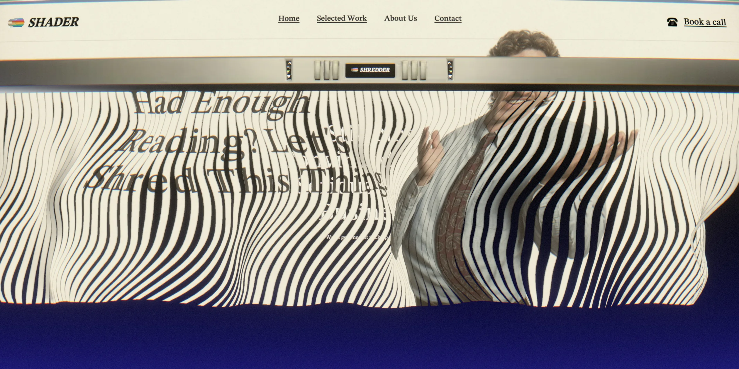
The brochure arrives and leaves as paper. When the office scene ends, a sheet of beige paper curls in from a corner, covers the cubicles and becomes the readable pages. When the visitor reaches the line “Had Enough Reading? Let's Shred This Thing.”, scrolling pushes the paper into the shredder at the top of the picture, and it comes out below as strips that ripple with the scroll like torn cloth. The dark blue between the strips is the next scene, so the shredding itself is the transition.
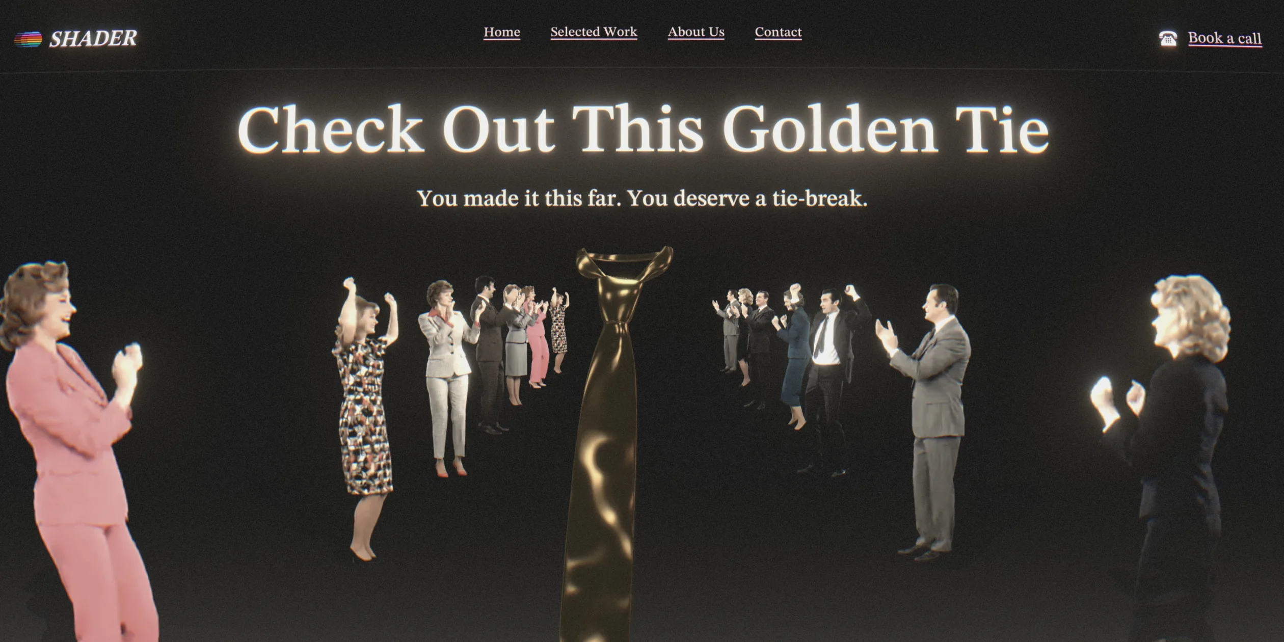
In the following Still Not Convinced We're Serious About Business section, a few gold stars tumble down, and then the golden tie flies in from far away, coming closer the further the visitor scrolls. It takes more than five screens of scrolling to arrive, at a constant speed. At Check Out This Golden Tie the tie stops in the middle of the picture, two rows of people in 80s suits stand on either side clapping and cheering, and the camera keeps pushing forward between the rows.
The final handshake follows the scroll as well. Two hands reach in from both sides and clasp in the middle, the whole handshake takes nearly three screens of scrolling, and the hands move in step with the scroll distance. If the visitor stops, the handshake freezes at that moment, and if the visitor scrolls back, the hands part again. A point of light stays on the spot where the palms meet and flares into a flash as the grip closes. The flash and the reveal after it take about two screens of scrolling, slow at both ends and fast in the middle, and when the flash fades the picture has already become Hello and a few old telephones.
On a phone, finger swipes replace the wheel, one swipe from the first screen lands on the project carousel, and the carousel arrows still work by tapping. There is no cursor on a phone, so the scene no longer tilts. The film ring has fewer segments and its trailing segments follow more tightly, so it bends less than on a desktop.
04Engineering
The whole site is one WebGPU canvas whose picture is built from seven scenes, each rendered first into its own offscreen texture. Every frame the site renders only the scenes visible at that moment and then composites them to the screen. The site's page configuration is an array in which each entry gives a scene type and a length in screens: hero 1, projects 1, office 1.8, about-us 7.34, golden-tie-reveal 1.7, golden-tie 6 and contact 3.32. Each scene starts at the sum of the lengths before it, so the scroll position Lenis reports each frame converts directly into the progress of any scene. The site skips a scene that is out of view entirely, together with all of its sub-passes, such as the cloth simulation and UI layer of the shredding section. Each scene can also extend its active range slightly before or after its position, so its texture is ready before it appears.
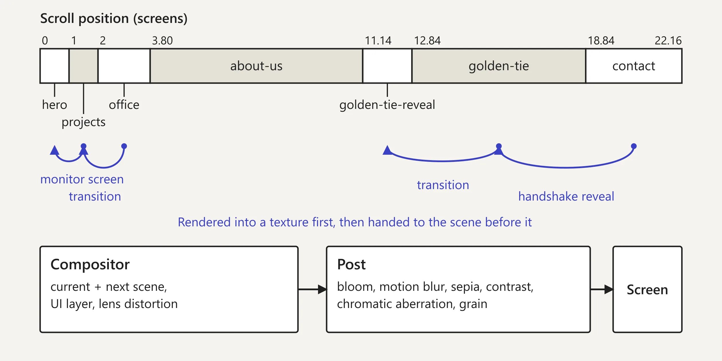
The scenes render in reverse order, last first and first last, because a scene often needs the picture of the scene after it. In the Codrops article the team explains that instead of giving each scene its own useFrame, they use React's useImperativeHandle so that each scene hands its render function to the parent. The parent calls these functions in order inside a single useFrame, passes the texture returned by each later scene to the scene before it, and skips any scene outside its range. The site makes four such hand-offs. The carousel's picture goes to the hero, where it is drawn on the computer screen. The office goes to the carousel, the golden tie goes to the reveal scene before it, and the contact page goes to the golden tie for the reveal after the handshake.
The camera's dive into the monitor uses what the team calls a frustum-matched plane. The site reads the world position, size and orientation of the screen mesh, then works out along the screen's normal how far the camera must be for its frustum to frame the screen exactly. That distance is half the screen's height divided by the tangent of half the field of view, and the width is used instead when the screen is narrower than the viewport. The result is multiplied by 0.9 so that no part of the monitor frame leaks into the picture.
The reveal of the contact page after the handshake moves no camera and uses a different method. The shape that does the revealing samples the next scene's texture at each fragment's screen coordinates, so whatever its shape and wherever it sits in 3D space, it always shows the matching part of the next scene. The remaining scene boundaries are handled by the final compositing shader, which has three blend modes. A fade runs a smoothstep over the scroll position. An overlay uses the next scene's own alpha to lay it over the current scene, which is how the brochure paper comes in. A below blend works the other way round and uses the current scene's alpha to reveal the scene underneath, which is where the dark blue between the shredded strips comes from. The shredded strips are a cloth simulation, which the team on the forum says runs on the GPU. The WebGPU records read screen by screen show no compute passes anywhere on the page. The render passes per frame rise from about 20 to about 33 during the shredding screens instead, so the simulation appears to be computed with extra render-to-texture passes.
Apart from the Singapore banner added later, every piece of text and every button on the page is also drawn inside this canvas. The team uses @pmndrs/uikit, a library that lays out interfaces in three.js with yoga flexbox, and forked it to run on WebGPU. The interface renders into one light and one dark texture, the compositor switches between them by scene, and they pass through the same lens distortion as the 3D picture, which is why the headings bend and glow with it. A separate invisible layer of text and buttons in the page holds the same content as the canvas, and screen readers and search engines read that layer. A transparent scroll container sits on top of the canvas and takes the wheel, touch and click input, while the canvas itself takes none.
Post-processing is a chain applied in a fixed order, with its own parameter set for each scene and smooth blending between sets at the boundaries by scroll position. First comes bloom: the site blurs the parts brighter than a threshold through seven successively smaller levels, adds them back with a screen blend and tints the glow slightly warm, which produces the halo around the headings. Next the site mixes a share of the previous frame into the current one for motion blur, then applies gamma, a sepia matrix, brightness and contrast. Chromatic aberration shifts red and blue vertically, more strongly toward the edges, and only half as much where text sits, so the type stays crisp. The UI layer is laid over once more after the aberration, and film grain comes last, stronger in dark areas than in bright ones.
The site scrolls with Lenis, which the team modified, adding its own snapping layer on top. This layer never yanks the page. Each frame it adds a small push to Lenis's target position based on the remaining distance to the snap point raised to the power 0.8. The push weakens when it runs against the scroll direction and is capped at a tenth of a screen per frame. When a visitor flicks quickly toward a snap point, the site pauses wheel input and carries the page straight to that screen. The arrow keys and the space bar are wired into the same system and jump to the next snap point. On desktop, the carousel's film ring is split by screen width into up to 24 segments, and each segment follows the target angle with its own spring. The stiffness runs from 120 at the leading end to 30 at the trailing end and the damping from 7 to 13, which produces the bend and wobble described earlier. Below 1024 pixels the trailing stiffness rises to 50 and the damping increases.
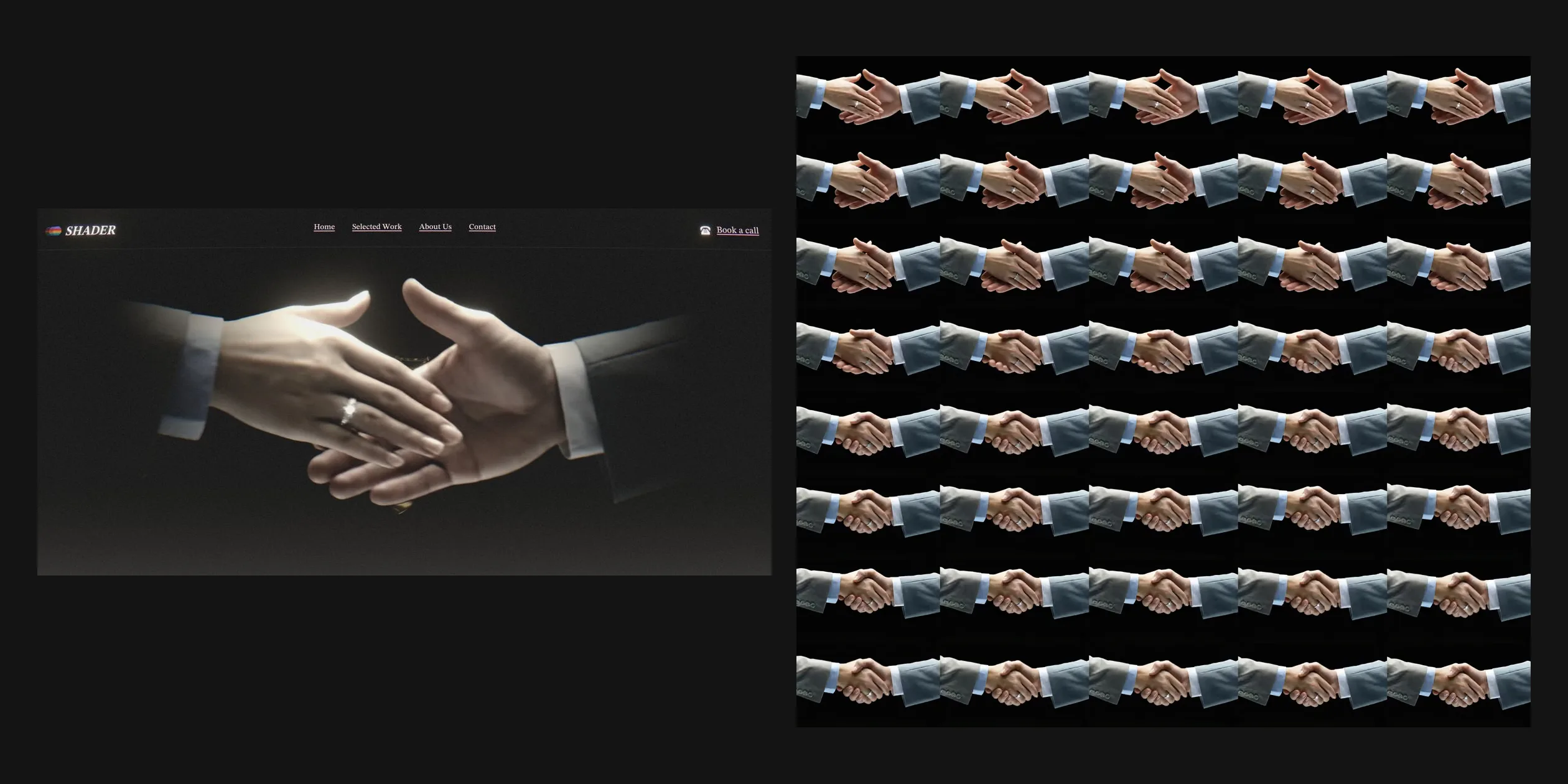
The crowd around the golden tie and the handshake both come from video, but they are used differently. The crowd comes from one video in which ten people's clips are arranged five across and two down, each person on a black background. The site draws them with a 32-instance mesh. Sixteen instances stand upright in two rows of eight on either side, and the other sixteen are the same people flattened onto the floor, filled black with blurred edges as their shadows. The shader keys out the black by brightness, so the people appear to stand in the scene. The handshake was originally a 3.5-second clip at 30 frames per second, and the team split its 106 frames into three AVIF atlases of five columns by eight rows. The site picks the current frame from the scroll progress and only uses the first 80% of the frames. Each frame also has a coordinate for the point of light, so the glow can follow the spot where the palms meet.
On a first visit without scrolling, the site downloads about 6.6 MB. The largest part is the project video on the first-screen computer and in the carousel, about 3 MB, streamed in segments over HLS from Mux. The rest is about 0.95 MB of script, about 0.85 MB of handshake atlases and about 0.35 MB of Draco-compressed models such as the computer, the desk and the telephones. The progress bar on the boot screen is real. The site takes over three.js's loading manager and advances the bar by loaded items over total items, then enters the first screen when the last item has loaded, or when no new item has arrived for four seconds. Until then the videos prefetch only a sliver of data, and their buffer grows to 30 seconds once the first screen can be drawn. WebGPU is enabled only in Chromium browsers on Windows and macOS and on iPhones and iPads whose GPU allows buffers of at least 2 GB, and every other device runs the same TSL shaders compiled to WebGL2. The canvas pixel ratio is capped at 1.5, phones get smaller handshake atlases with motion blur turned off, and a phone's first visit downloads about 6.4 MB, close to the desktop figure.
The site puts what screen reader and keyboard users need into that invisible layer of the page, so a keyboard user can reach every link and button. Each time focus moves to a link, the site draws a rectangle around it in the canvas and scrolls the page to its screen. The site does not read the system's reduced motion setting at all, however, so with the setting on, the camera dive, the shredding and the handshake still move. The long passages such as the brochure and the client list have only four section headings to jump between in that layer. The accessibility statement admits these limits in the same voice as the rest of the site and asks visitors who struggle to email secretary@shader.se for a plain-text dossier of the studio's services.
05Scores and Team
| Award | Source | Date | Score |
|---|---|---|---|
| Site of the Day | Awwwards | 2026-04-20 | 7.73. Design 7.65 / Usability 7.42 / Creativity 8.33 / Content 7.81 |
| Developer Award | Awwwards | 2026-04-20 | 8.12 |
| FWA of the Day | The FWA | 2026-04-02 | 89 POINTS |
| FWA of the Month | The FWA | April 2026 | Monthly award, no separate score |
Of the four Awwwards categories, Creativity is the highest (8.33) and Usability the lowest (7.42). Of the Developer Award categories, Animations is the highest (9.40) and Accessibility the lowest (7.40).
| Credit | Role | Record (as of 18 November 2026) |
|---|---|---|
| Shader | A creative development studio in Norrköping, Sweden, building real-time 3D, visualisation and AI interactions for the web, whose Awwwards account gives Norrköping as its location | Awwwards works 3, SOTD 2, HM 3. FWA 2 |
| Andreas Antonsson | A freelance interaction designer and creative developer whose Awwwards and FWA accounts both give Norrköping, and who is also credited on the Design is Funny and Gamily projects in the carousel | Awwwards works 10, SOTD 3, HM 10. FWA 6 |
Both platforms credit the studio and Andreas Antonsson, the making-of article carries the name of co-founder Filip Kantedal, and the public material does not say which part each side handled.
06Archive
- Award date
- 2026-04-20
- Awards
- Awwwards SOTD 2026-04-20, Awwwards DEV 2026-04-20, The FWA FOTD 2026-04-02, The FWA FOTM 2026-04
- Site
- https://www.shader.se/
- Credits
- Shader, Andreas Antonsson
- Design
- cinematic
- Build
- scroll
- Awwwards
- 7.73 / 10. Design 7.65 / Usability 7.42 / Creativity 8.33 / Content 7.81. Developer Award 8.12. https://www.awwwards.com/sites/shader-development-studio
- The FWA
- 89 POINTS. https://legacy.thefwa.com/cases/shader-development-studio
- Stack
- Next.js, React Three Fiber, three.js r186 (WebGPURenderer, TSL), @pmndrs/uikit, Lenis, Motion, Zustand, hls.js and Mux, Prismic
- Total assets
- About 6.6 MB on first visit, of which project video is about 3 MB, about 6.4 MB on a phone
- Speed
- FCP 1.95 to 2.12 s (boot screen after a black start), first screen at about 6 s, CLS 0. Continuous scroll —