L.I.S.A.
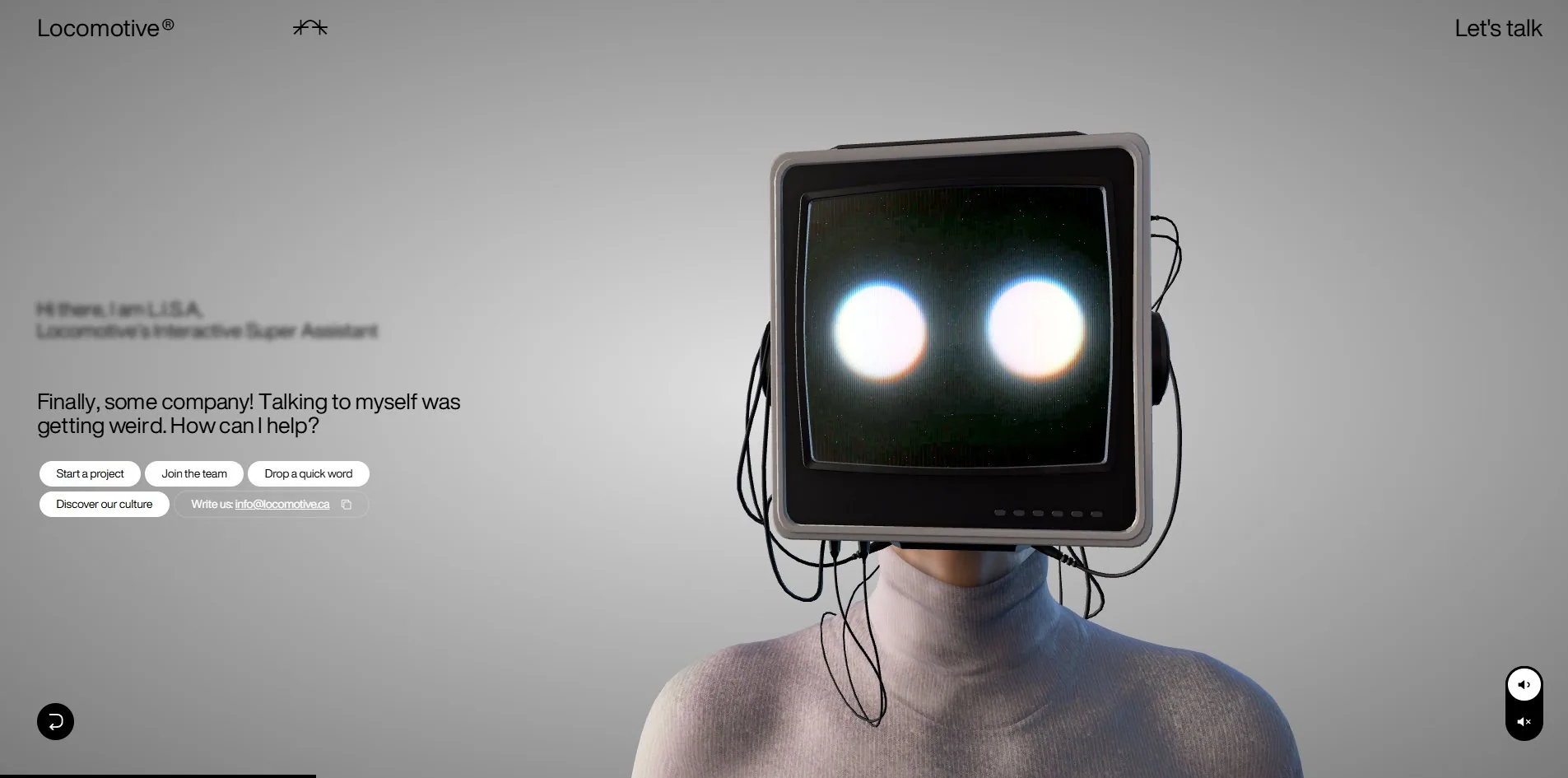
"Finally, some company. Talking to myself was getting weird. How can I help?" The line comes from a character with a CRT monitor for a head, whose job on this site is to be the contact form for the Canadian studio Locomotive. Each option a visitor picks reframes the shot, pushing from a mid-shot to close enough to read the cooling vents on the monitor. How far the conversation has come is legible from camera distance alone.
Visit site ↗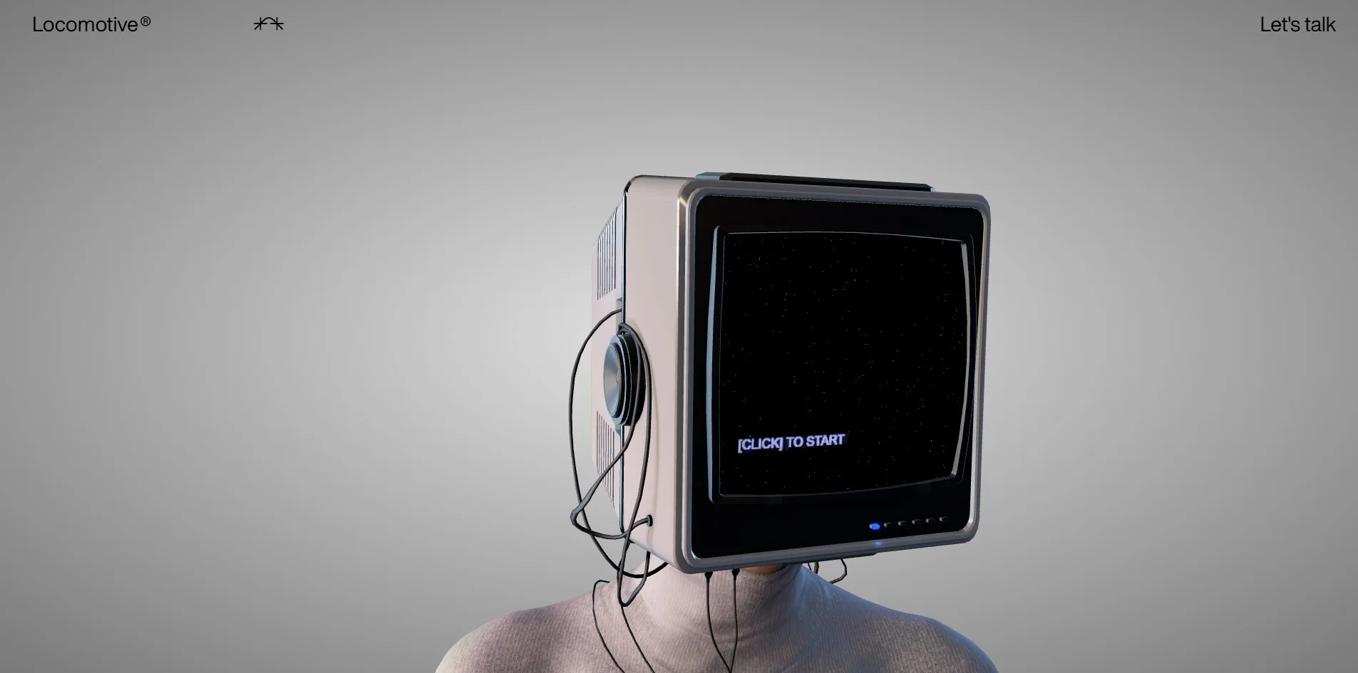
Concept
An agency site usually puts work on the front page and buries contact in the footer. Locomotive reversed that. This site does one thing, which is receive the person who arrived, and the work and everything else hang off a small row of navigation at the top.
The receiving is done as a scripted conversation. After the greeting, L.I.S.A. offers four directions: start a project, join the team, drop a quick word, discover our culture, with a plain exit beside them giving the email address outright as info@locomotive.ca.
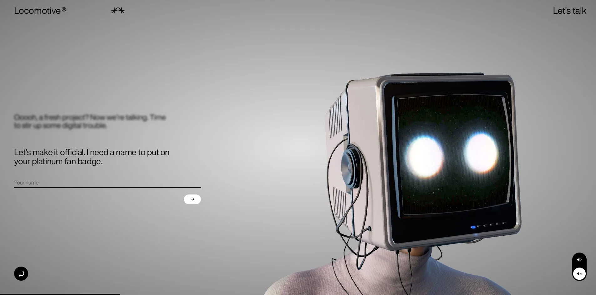
Take any branch and it answers first in character. Choosing to start a project gets a line with some performance in it, roughly that a fresh project means it is time to stir up some digital trouble. Only then does it start collecting anything: let us make it official, I need a name to put on your platinum fan badge, above a field with nothing but an underline and the placeholder your name.
One thing has to be said plainly here. It is called a Super Assistant, but there is no free text input at the top level at all. The four directions are hard-coded buttons and the replies are written in advance. This is not an assistant that understands an arbitrary question, it is a shallow decision tree. That is not a flaw, since a contact form has no need to parse natural language, but a visitor who came for the word assistant will find the first screen does not match the promise.
What the approach genuinely buys is willingness to fill the thing in. Breaking name, intent and message into steps, asking one thing at a time and putting a line of character between them, turns filling in a form into having a conversation. The cost is that it is slower than a form, so anyone who only wants to leave an email address has to click through more, which is exactly why that plain mail exit sits on the very first screen.
Design
There are two things in the layout. A column of text on the left and a character on the right. No divider between them, no speech bubbles, and no chat window frame.
The text column is run on very little. There are two typefaces on the site. The text face, HelveticaNowDisplay, carries 283 characters between 13 and 29px. The display face, LocomotiveNew, carries 69 characters and reaches 154px. Those two hold the entire interface, and across 108 elements there is not one rounded corner.
The sharpest decision is how already-spoken lines are treated. The previous line does not disappear. It stays exactly where it was, at the same size, faded to a pale grey, while the current line is solid black. A visitor can therefore see at a glance which line is live and which was said a moment ago, with no bubbles needed and none of the left-and-right column convention of instant messaging.
That one is worth stealing. Conversational interfaces default to copying iMessage, a bubble each side with timestamps, but that convention was designed for many participants, long histories and scrolling back. Here there are two speakers and only one line that matters at a time, so using lightness as the timeline is enough, and the borders and bubbles it saves go back into the picture.
On colour, only two text values are visible on screen, black across 72 elements and white across 36. The one other colour value in the whole system is an electric blue, attached to the collapsing menu element, and it does not appear in the default view.
The character is the most expensive asset on the site, a 2.8 MB model with a 341 KB environment map. The metal bezel of the CRT, the plastic buttons and the knit of the turtleneck are all lit by reflections off that map, with no separate lights in the scene. Once the monitor comes on, the picture inside it is a noisy green-black field with scan lines and two blown-out white discs for eyes, and that layer is drawn separately rather than being part of the model.
Motion
There is no scrolling here, so all the motion hangs off the conversation advancing.
Every answer reframes the camera. The opening is a straight mid-shot showing the whole monitor and the figure's shoulders. Inside a branch the character has turned three quarters and moved closer, near enough to show the cooling vents on the side of the CRT and one of its speakers. So it is not only the words that change between steps, the shot changes too, the way a scene would be blocked.
This is the best piece of craft on the site and the reason animation scored 7.80. Anyone building a conversational interface can take it. Moving the camera as the conversation advances does far more than animating the text in, because it gives the conversation a progress bar in space.
Audio amounts to one 3.9 MB ambient bed, with two circular buttons in the bottom right controlling it.
Reduced motion gets five rules, which is more serious than most sites manage. But like every site that puts its content inside a canvas, those rules reach the CSS transitions and cannot reach the render loop, so the character and the noise keep moving.
Engineering
Everything visual happens on one 1920 by 945 WebGL2 canvas driven by three.js r165, rendering at display size.
One visit transfers 9.4 MB across only 12 files, and the breakdown is clean: 2.8 MB of model, 341 KB of environment map, a 1.1 MB video, a 693 KB main script, 107 KB of fonts, and the largest remaining piece is that 3.9 MB ambient track.
First paint is fast, 179ms to first byte and 256ms to first contentful paint. Being able to use it comes much later. During loading there is a single long task of 1,611 milliseconds, nearly a second and two thirds with the main thread fully occupied, during which neither clicks nor the keyboard respond, and largest contentful paint does not settle until 2,604ms. The opening line is on screen while the thing cannot yet be pressed, and that gap is the first thing this site should fix. A long task like this usually comes from parsing the model and building the scene in one pass, and splitting it across frames breaks it up.
Layout stability is the other one. Loading produces 113 separate shifts totalling 0.0674. Each is small enough that nothing visibly jumps, but a count that high says every new line of conversation is pushing its neighbours rather than appearing in space already reserved for it. A conversational interface especially ought to reserve room for the lines to come, since adding content indefinitely is what it does by nature.
Plenty is right on accessibility: the page declares its language, the header, navigation and main landmarks are all present, the stylesheet carries 13 focus rules, the overlay uses a correct dialog role, and all 18 interactive controls have accessible names.
Two of those names are wrong, though, and wrong in a very specific way. The sound toggle in the bottom right and the back button in the bottom left announce themselves to a screen reader as lisa.toggle-sound and lisa.back, which are the raw translation keys, never substituted. Sighted visitors see two icons and screen reader users hear two strings of code. This is harder to catch than a missing name, because automated checks only test whether a name exists, not whether it is language. Any site using keys for localisation should search the rendered page for strings shaped like prefix.something before shipping.
The heading structure is also thin, with a single second-level heading and no first-level heading anywhere in the document.
Scores and Team
| Award | Source | Date | Score |
|---|---|---|---|
| Site of the Day | Awwwards | 2026-09-16 | 7.48. Design 7.45 / Usability 7.22 / Creativity 7.89 / Content 7.61 |
| Developer Award | Awwwards | 2026-09-16 | 7.52. Semantics 6.80 / Animations 7.80 / Accessibility 7.00 / WPO 7.60 / Markup 7.00 |
Creativity at 7.89 is the highest of the four design categories and Usability at 7.22 the lowest, 0.67 apart. Content at 7.61 is second highest, which is unusual, since content is normally the weakest link on an award-winning site, and here the content is those lines of dialogue, which genuinely sound like a person wrote them.
The five judges gave 7.00, 7.40, 7.00, 8.00 and 8.30, a wider spread than usual, with two above 8 and three settled around 7.
The developer score of 7.52 comes in slightly above the site total. Semantics at 6.80 is the lowest of the six, which matches a document holding a single second-level heading. Animations at 7.80 is the highest, and the Mexican judge gave that category a perfect 10 while marking accessibility a 5 on the same card. Both extremes landing on one site describes its strengths and weaknesses exactly.
| Credit | Who |
|---|---|
| Locomotive | Canadian design studio, and the owner of the site |
| 60fps | Collaborator |
Both credits are companies, with no individuals listed. This is their own site, with no client budget and no client content constraining it, which is how the front page can be given over entirely to a character and carry no work at all.
The FWA has no record of this site and it carries no award badges of its own.
Archive
- Award date
- 2026-09-16
- Awards
- Awwwards SOTD 2026-09-16, Awwwards DEV 2026-09-16
- Site
- https://lisa.locomotive.ca/en
- Credits
- Locomotive, 60fps
- Design
- spatial
- Build
- canvas
- Awwwards
- 7.48 / 10. Design 7.45 / Usability 7.22 / Creativity 7.89 / Content 7.61. Developer Award 7.52. https://www.awwwards.com/sites/l-i-s-a
- Stack
- three.js r165, WebGL2, glTF model, EXR environment map
- Total assets
- 9.4 MB, of which the ambient track is 3.9 MB and the character model 2.8 MB
- Speed
- 179ms to first byte, 256ms first paint, longest task 1,611ms, layout shift 0.0674