Léo Parpeix - Portfolio 2026
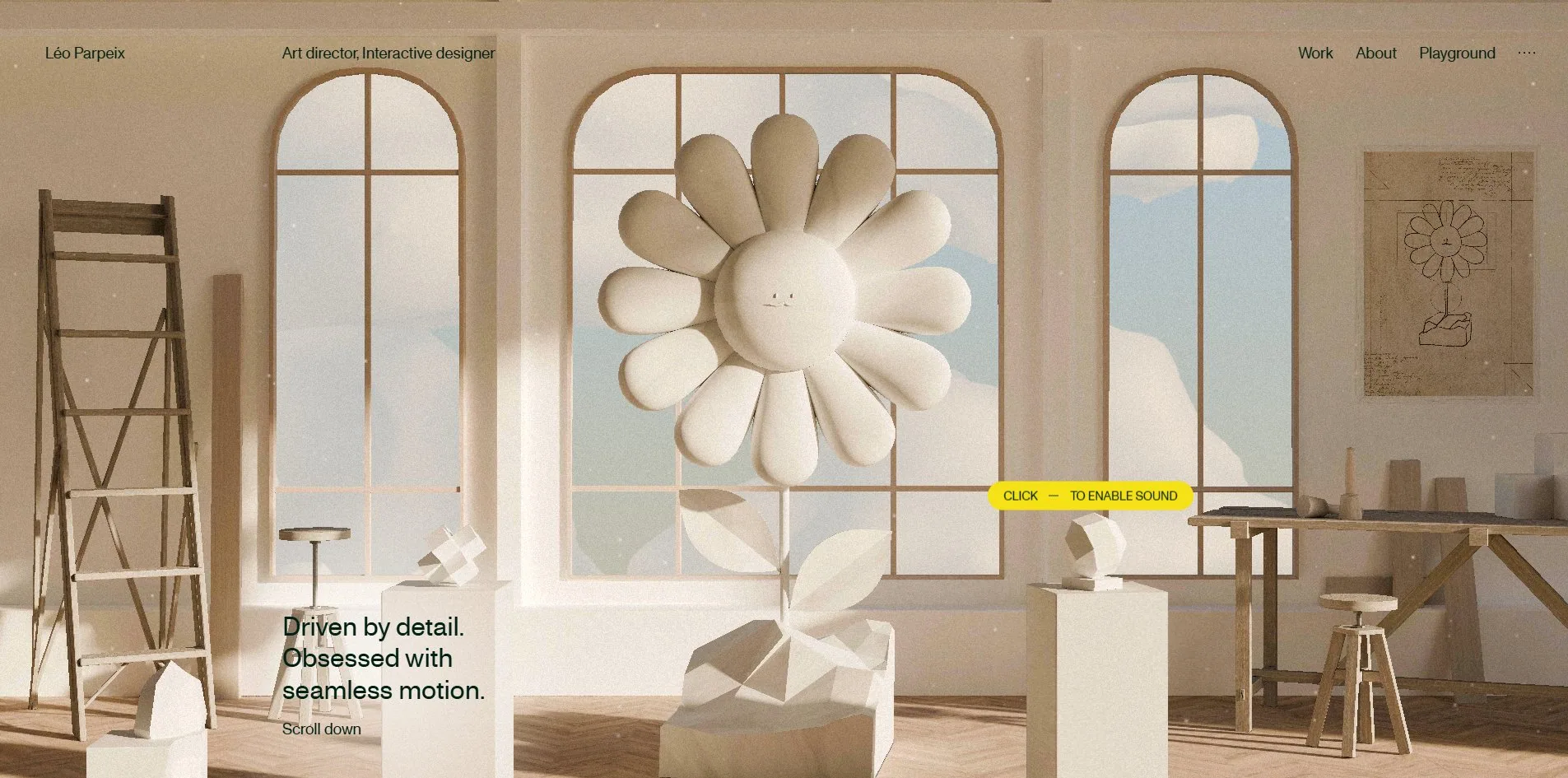
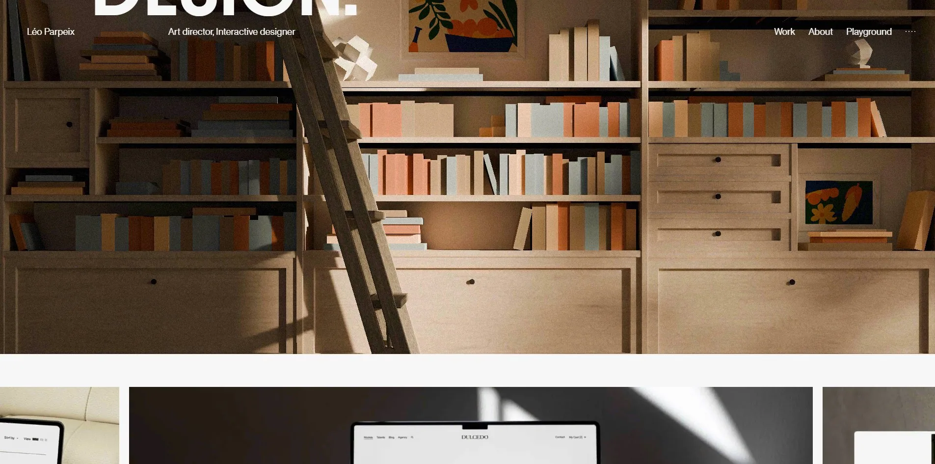
Léo Parpeix's portfolio is not a wall of thumbnails but a sculpture studio a visitor can walk into. A plaster daisy with a face stands on the plinth in the middle of the room, and the design drawing for the same flower hangs on the wall to its right. With the finished piece and its drawing in one frame, a visitor sees both the result and the process behind it the moment they arrive. As the visitor scrolls down, the camera moves on into other rooms, such as a library lined with books.
Léo Parpeix is a French interaction designer who uses this portfolio to look for work, and it won an Awwwards Site of the Day and a Developer Award, then an FWA of the Day two weeks later.
01Concept
A portfolio usually opens straight onto projects, but Léo Parpeix's portfolio opens onto a 3D-rendered sculpture studio. The room has cream plaster walls, three arched windows, a herringbone wood floor and a wooden ladder leaning against the wall, with small geometric studies set out on a few plinths. The central plinth holds the plaster daisy with a face, and its drawing hangs on the wall to the right. Beside them the page sets only one line of text, which says he is driven by detail and obsessed with seamless motion. By placing the finished piece next to its drawing, the frame puts the obsession with detail that the line claims right in front of the visitor.
The site tells visitors outright where they can play. A yellow 3D bee flies around the middle of the page, and a line of small type on the page reads click to feed the bee. Whenever the visitor moves the mouse, a small yellow capsule appears beside the cursor as well, reading click to enable sound. Léo Parpeix does not hide these easter eggs and wait for someone to find them. The instructions sit right beside them, so a visitor knows where to click without having to explore.
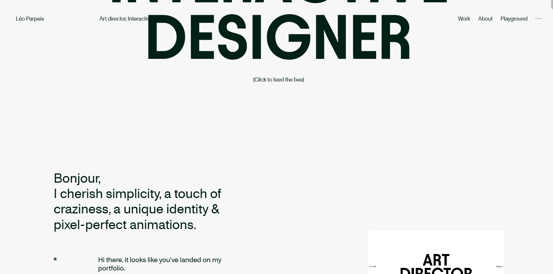
After the studio, the camera moves into other rooms as the visitor scrolls down, and one of them is a library. These rooms are the stars of the site and take the most prominent places on the page.
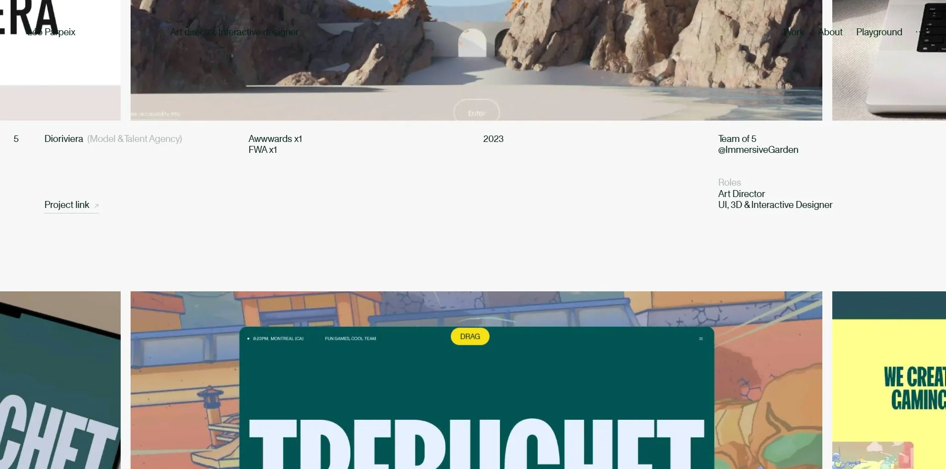
The projects he has worked on come after the rooms and are packed in tightly. Thumbnails and videos for twenty-odd projects run in horizontal strips that a visitor can drag with the mouse. The full list of projects sits on the Archives page as a table, and that table is the most down-to-earth content on the site. Instead of the usual portfolio format of a big image and a title, Léo Parpeix gives each project one row. Each row lists the year, the number of awards, the size of the team, the company it was made at and what he personally did. The Dioriviera row, for example, records a team of five at ImmersiveGarden, with his role given as art director plus interface, 3D and interaction design. A portfolio meant to get him hired volunteers that he was one of five people, and that makes it easier for a reader to judge what he can actually do.
02Design
A series of 3D-rendered rooms carries the look of this site. The library has warm wooden shelves, pastel book spines, a leaning ladder and a few cut-paper illustrations. Every room shares the same style of soft light, matte plaster, a shallow depth of field that blurs the background and bare unvarnished wood. That style turns up often in 3D renderings of recent years, and Léo Parpeix did not invent it. The image on the site that truly belongs to him is the plaster daisy with the small face, which he uses as his emblem and repeats across the site. The bee, by contrast, belongs to none of the rooms and floats directly over the layout, following the page as it moves.
Only two typefaces set the text on the page, and almost all of its weight rests on a handful of enormous words. The display face sets only 247 characters, at sizes up to 216px, while the text face sets 9,712. By character count the large type is only 2.5% of the text, but by the area it covers on screen it takes sixty percent.
One of those enormous words also contains a spelling mistake. A 216px heading spells Passionate as Passionnate, with an extra n. A portfolio that opens by saying it is driven by detail misspells a word in the largest type on the site.
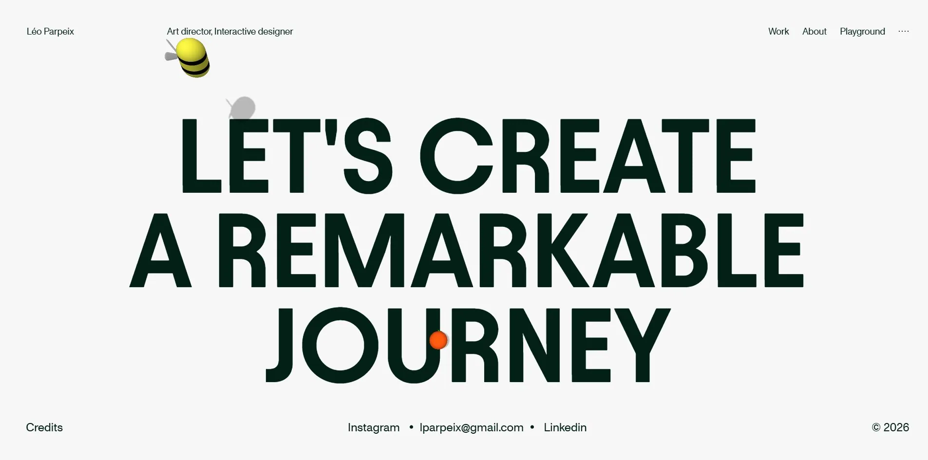
The interface uses very little colour, and the large type that looks black is really a very dark ink green. The site's text comes in only three colours, pure black, that ink green and an off-white. Nearly all the large type uses the green, which is so dark that it barely reads as green. The warm tones in the rooms all come from the 3D rendering, which leaves the layout's own colours almost bare. Bright colour appears in only four places, the bee, the yellow capsule following the cursor, a yellow DRAG label on the project strips and an orange dot set inside the U of the word JOURNEY in the footer. Yellow is kept for the things a visitor can interact with, and together with the instructions beside them it shows a visitor what can be clicked.
03Motion
In the 3D rooms, scrolling down drives a virtual camera that walks forward through the space. Léo Parpeix hands scrolling to the smooth scrolling library Lenis, which stretches each turn of the wheel into an eased glide, so the camera pushes forward smoothly instead of jumping a notch at a time.
The camera moves steadily and slows down in only one place. With the page standing still, the frame rate is 60.1 fps and no frames are dropped. While a visitor scrolls, it averages 58.9 fps, which is barely any loss. The only dip comes in the handover from the 3D opening to the content area, where the page's ordinary text and images arrive while the canvas is still running. There the frame rate briefly falls to 55 and then 49. After that stretch it holds at 60 all the way to the bottom of the page.
The bee and the yellow capsule are the two small characters on the page that respond to the visitor, and both move lightly. The bee drifts along with the page and reacts when a visitor clicks it. The capsule follows the mouse, but as soon as the mouse stops it shrinks out of sight. The site's four audio tracks only start when a visitor clicks, and the prompt to turn the sound on is written on this capsule, so visitors who do not keep the mouse moving can easily miss it.
The site ignores the reduced motion setting altogether. That operating system setting is meant for people who find animation uncomfortable, yet the page runs exactly the same animations whether it is on or off, and the camera keeps gliding through the rooms either way.
04Engineering
Léo Parpeix's portfolio is a single page application bundled with the build tool Vite, which means it changes content without reloading the whole page, and all the code sits in one main file. The 3D picture is two three.js canvases, sound goes through the audio library Howler and scrolling through Lenis.
A visitor downloads 31.8 MB on one visit, and 25.5 MB of that is the images laid over the surfaces of the rooms, known as textures, 89 of them in all. The largest are the front and back layers of the trees, the floor, the ground and the rock, each between 1.25 MB and 1.7 MB. The 3D models in the rooms come to 6 files and 2.3 MB. The remaining images, sound, scripts and fonts add up to less than 4 MB.
The textures use the KTX2 compressed format, which stays compressed even inside the graphics card's memory. An ordinary PNG has to be unpacked before it goes to the graphics card and can take up several times its download size there, which KTX2 avoids. The texture format only governs graphics memory, though, not the download. The site does no batched loading of any kind, so a first-time visitor still has to download all 25 MB of textures.
Despite that download, the page layout appears quickly. The time it takes varies, from 380 milliseconds at best to 590 at worst, but either is far quicker than Google's recommended 1.8 seconds for first contentful paint. The largest element on the page finishes drawing at almost the same time, and nothing jumps out of place while it loads. The reason is that the 3D assets are only fetched by script once the page has loaded, so they never hold up the layout.
The edges of the 3D objects show no jaggedness at all, because Léo Parpeix renders the canvas at double the width and height. One of the two canvases renders at 3840 by 1890 while being displayed at 1920 by 945. In this technique, known as supersampling, the frame is drawn with four times the pixels and then scaled down onto the screen, and the jagged edges average out as it shrinks. It gives the cleanest possible edges, but the graphics card has to draw four times as many pixels for every frame.
The site gets only two accessibility points right, and its worst problems are the ones that stop people at the door. It declares its language and gives every decorative image empty alt text, so screen readers skip them. When a visitor browses by keyboard, however, there is no focus ring at all, so it is impossible to see where the focus has landed. The first press of Tab lands on the sound button, which has neither text on it nor a name for a screen reader to announce. As a result, keyboard users are stuck as soon as they arrive, unable to tell where they are or what pressing the button would do.
The page structure is barely marked up either, which makes it hard for screen reader users to find their way around. Screen reader users jump between areas of a page using markers called landmarks, but this page has only a main content landmark and no header, navigation or footer landmark. There is no skip link to take keyboard users straight to the content either. The largest words on the page, including the 216px INTERACTIVE DESIGNER and the misspelled Passionnate, are not marked up as the page's main heading. The footer line LET'S CREATE A REMARKABLE JOURNEY looks like one sentence broken over three lines, but in the code it is three headings, and a screen reader announces them as three separate headings.
05Scores and Team
| Award | Source | Date | Score |
|---|---|---|---|
| Site of the Day | Awwwards | 2026-09-14 | 7.69. Design 7.79 / Usability 7.34 / Creativity 8.04 / Content 7.63 |
| Developer Award | Awwwards | 2026-09-14 | 7.47. Semantics 7.00 / Animations 8.40 / Accessibility 7.00 / WPO 7.20 / Markup 7.40 |
| FWA of the Day | The FWA | 2026-09-28 | 83 POINTS, DAYS 4 |
Among the four Awwwards design categories, this site scores above 8 only in Creativity, while Usability is the lowest at 7.34. The Creativity score probably comes from the studio a visitor can walk into, and the lower Usability score may reflect the easily missed sound prompt and the keyboard users who get stuck on arrival. The five judges gave totals of 7.00, 7.20, 7.00, 7.40 and 7.40, tightly grouped with none falling far below the others.
The developer categories are spread much more widely. Animations, at 8.40, stands well clear of the rest, while Semantics and Accessibility tie for lowest at 7.00. A Ukrainian judge spread his marks the widest, giving a perfect 10 for animation and 6 each for semantics, accessibility and performance. His card matches the site almost item by item, with smooth scrolling and clean edges on the motion side, and a single landmark and no visible keyboard focus on the semantics and accessibility side.
The FWA followed on 28 September, exactly fourteen days after the two Awwwards awards, naming it FWA of the Day with 83 points. The FWA publishes no category scores, and the statement on its award page is a single sentence describing the portfolio of Léo Parpeix, an art director and interactive designer who makes unique websites focused on innovation and user-centred design. That sentence is only a self-introduction, and it mentions neither the walk-in studio nor the 3D scenes and sound on the site. The FWA files the site under three categories, Animation, Fun & Playable and Personal/Portfolio, and Animation and Fun & Playable describe exactly the studio, 3D scenes and sound that the statement leaves out.
| Credit | Who | Record |
|---|---|---|
| Léo Parpeix | France, art director and interactive designer at Locomotive | Awwwards 5 works, SOTD 1, HM 5. FWA 1, as one of the credits on the Gabriel Beaugonin portfolio |
| Thoma Lecornu | No findable Awwwards profile, and an FWA profile with no introduction | FWA 1, this site |
This site is Léo Parpeix's first Awwwards Site of the Day (SOTD), after five honourable mentions. His Awwwards profile says he works at the digital design company Locomotive and also carries a line saying he is looking for freelance work with a good company. That line explains how the portfolio is written, since the Archives table that volunteers team sizes and his own role is aimed squarely at the people who might hire him. The two platforms credit the site differently. The FWA lists only Thoma Lecornu this time, and Léo Parpeix himself is not among the credits. The one award on Léo Parpeix's FWA profile is the Gabriel Beaugonin portfolio on 7 August, at 81 points, where he is one of three credited names. Thoma Lecornu has no findable Awwwards profile, and his FWA profile, created only on 24 September, carries no introduction, so his part in the project is still unknown.
06Archive
- Award date
- 2026-09-28
- Awards
- Awwwards SOTD 2026-09-14, Awwwards DEV 2026-09-14, FWA FOTD 2026-09-28
- Site
- https://www.leoparpeix.com/
- Credits
- Léo Parpeix, Thoma Lecornu
- Design
- spatial
- Build
- canvas
- Awwwards
- 7.69 / 10. Design 7.79 / Usability 7.34 / Creativity 8.04 / Content 7.63. Developer Award 7.47. https://www.awwwards.com/sites/leo-parpeix-portfolio-2026
- The FWA
- 83 POINTS, DAYS 4. https://thefwa.com/cases/leo-parpeix-portfolio-2026-p3
- Stack
- Vite, three.js r153, Howler.js, Lenis, KTX2 compressed textures
- Total assets
- 31.8 MB, of which 89 compressed textures are 25.5 MB and 3D models 2.3 MB
- Speed
- Layout at 380 to 590ms, no layout shift. 60.1 fps stationary, 58.9 fps scrolling, slowest stretch 49 fps