Jesper Landberg
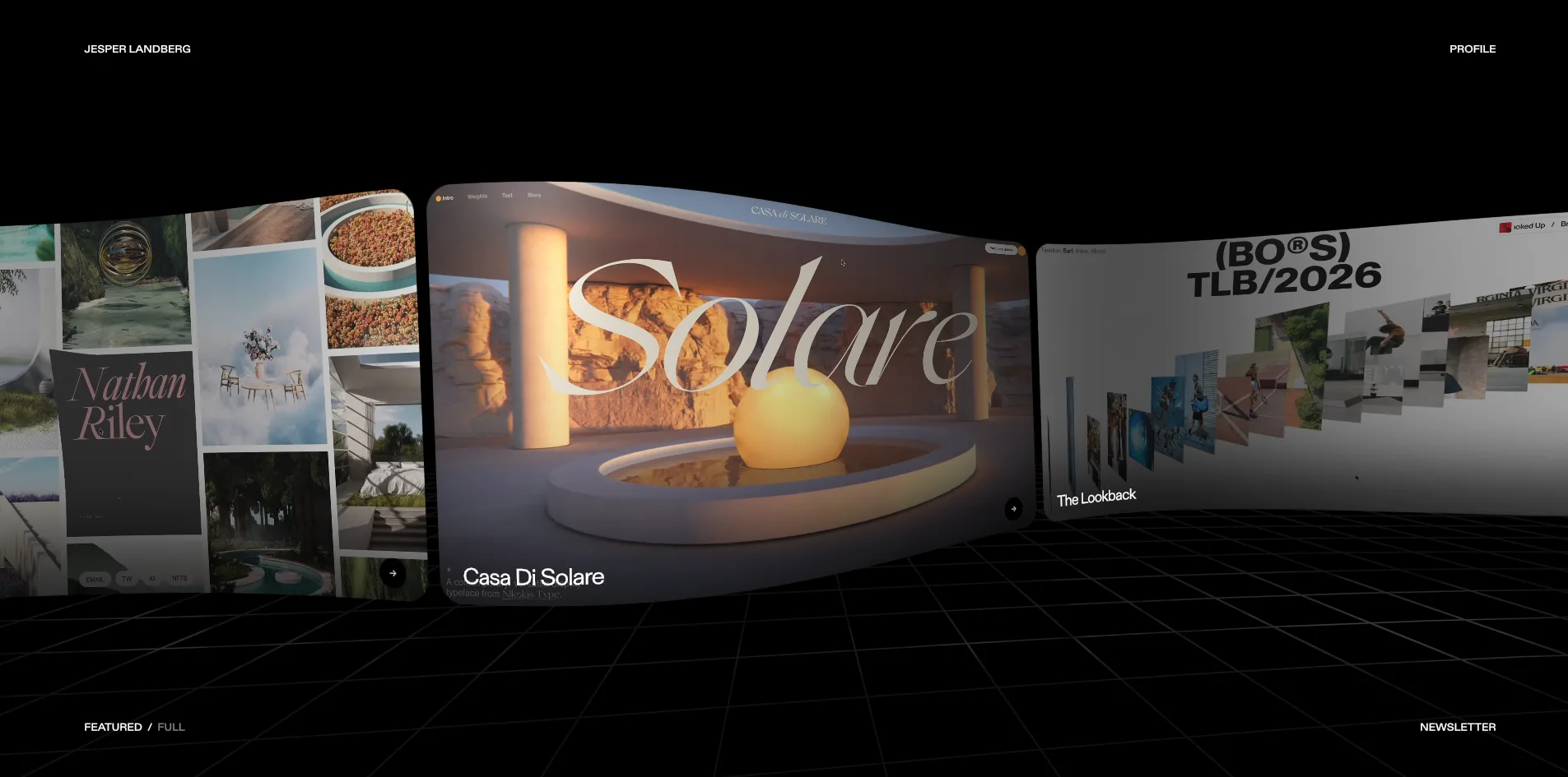
Jesper Landberg's portfolio treats the whole web page as a material that can be twisted, pushed up and swallowed. The eight featured projects sit on one curved ribbon, and the faster the visitor scrolls, the more the left end rears toward the camera while the two edges wring in opposite directions. As the cursor moves, it acts like a ball rolling under the page, raising a bulge in the picture wherever it passes before the bulge slowly settles. When the visitor opens Profile, a black hole opens in the middle of the page, and its gravity bends the surrounding picture into a ring of light with coloured edges. The navigation and card titles on the home page are drawn on the same canvas, so when the page bends, the words bend with it.
Jesper Landberg is a Swedish design engineer, and this is his own portfolio. It won Awwwards Site of the Day and the Developer Award, and a little over a month earlier it had also won FWA of the Day.
01Concept
Jesper Landberg is a freelance front-end developer who usually works as the lead or only developer on projects for international studios. His portfolio has to show those studios two things: what he has built, and how far he can push a web page. So he kept the content very small, with a two-sentence introduction, one line reading 77 awards, eight featured projects and a full project index, and handed the rest of the space to the presentation itself.
When the page opens the visitor first sees black, then three short dashes appear in the middle, stretch and grow into the outlines of three cards, and the home page is in place after about 3.6 seconds. The home page is a black space with a perspective grid on the floor, and eight rounded cards joined into a curved ribbon run across the middle of the frame. Each card plays a film or picture from one project, with the project's name at its lower left. The visitor can drag the ribbon or scroll the wheel to send it flowing in one direction, and after the last project it wraps back to the first. Each of the four corners holds a tiny all-caps link: the name at the top left, PROFILE at the top right, the FEATURED and FULL views at the bottom left and NEWSLETTER at the bottom right.
When the visitor opens a card, it unfolds into a white card that fills the screen, and that is the project page. The left column holds the project name, a one-line description, the year and sometimes a trophy mark, while the right column is a stack of project screenshots and films that scrolls forever, starting over when it reaches the end. A thin strip of the neighbouring projects shows at the left and right edges of the white card. When the cursor moves over one, it slides out a little, and a click switches to that project. Pressing Escape or the cross in the top right corner returns the visitor to the home page.
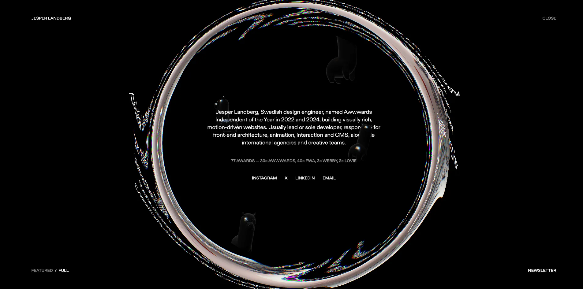
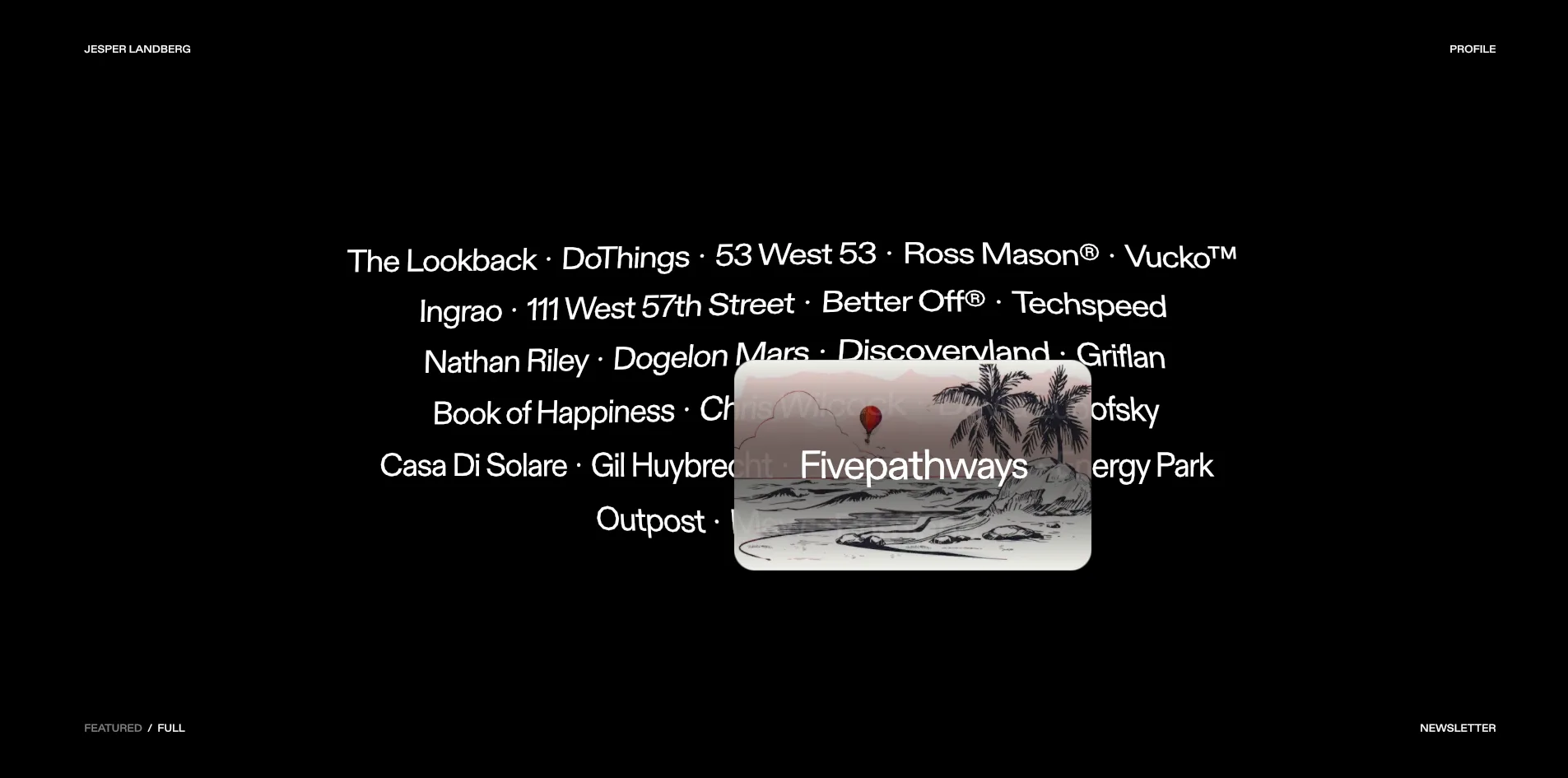
The FULL view sets all 23 projects as one centred paragraph of names separated by dots, which reads like a table of contents. When the cursor rests on a name, that project's thumbnail floats up behind it. PROFILE and NEWSLETTER each open a round window, the first with his introduction and social links and the second with an email field for an occasional newsletter of his thoughts as a design engineer.
02Design
The site's rule is black ground, white text, and colour only from the work. The background is pure black, the floor grid is made of fine dark grey lines, and the navigation and labels are all small white capitals, which matches the black and white palette Awwwards recorded for the site. Every colour in the frame comes from the screenshots and films on the project cards, so the pink portfolio, the golden sphere and the red client testimonial cards each glow brighter than the last against the black.
The site uses a single sans-serif typeface in two weights, 400 and 500. On the home page this typeface is not set by the browser. The site downloads the glyph data and draws every letter on the canvas itself. The navigation text is only a dozen or so pixels tall, all capitals, pressed into the four corners of the screen. In the FULL view the project names grow to about 30 pixels in ordinary sentence case, with twenty-three names arranged in six lines at the centre of the screen.
The layout is built almost entirely from cards. On the home page the rounded cards join into one continuous ribbon that makes an S-shape in depth. The left side is nearer the camera, the right side is further away, and the middle card faces the visitor. On the project page the same card turns white, which sets up the strongest contrast of light and dark on the whole site against the surrounding black space. Text sits on the left of the card and images on the right, with plenty of empty space.
The round window that PROFILE opens is the hardest picture on the site to understand at a glance. Its edge is a ring that looks like both glass and light, with a thin rainbow fringe. The inside of the ring is pure black, and the introduction, the award count and four social links sit in small type at its centre. Outside the ring, the home page is dragged around toward its edge.
03Motion
The ribbon's shape and the way it reacts to scroll speed are the site's main motion. At rest, the ribbon is a gentle S-curve in depth, leaning into the slope like a banked race track, and the whole strip rises slightly from left to right. As soon as the visitor scrolls, the faster the scroll, the higher the left end lifts and the closer it comes to the camera, while the two edges wring in opposite directions like a towel being twisted. When the visitor stops scrolling, the ribbon returns to its resting shape within a second or two. The author deliberately made the twist large, because a small twist would be turning in the maths without ever showing on screen.
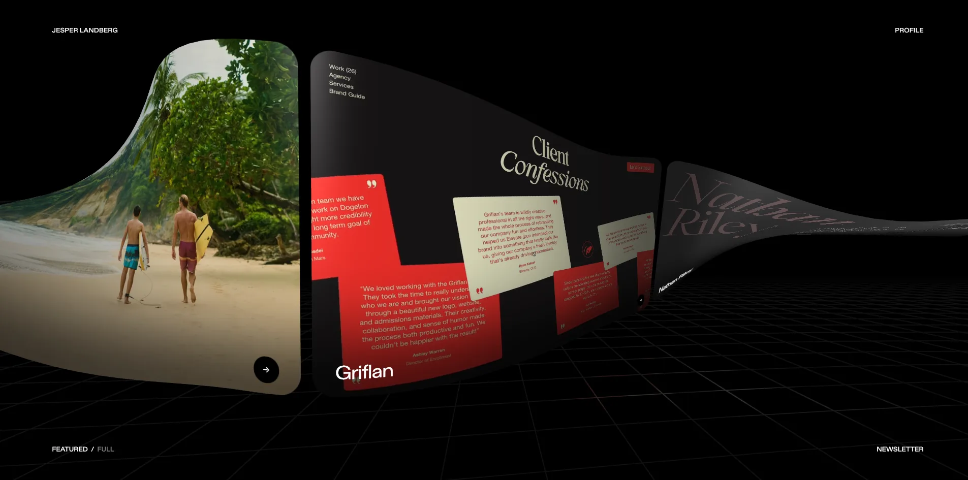
Even the cursor leaves its mark as a change in the material. As the cursor moves, the site paints its path onto an invisible height map, and each frame the map fades a little and spreads a little outward. The picture swells wherever the path went, lit on one side and shaded on the other, as if a ball were rolling under the page. The author deliberately did not make it a fluid, since a fluid would wash the ink away, and he wanted the bulge to stay where it was and settle slowly. The bulge is strongest in the middle of the screen and weakens toward the edges, so the navigation and titles do not wobble when the visitor reaches for them.
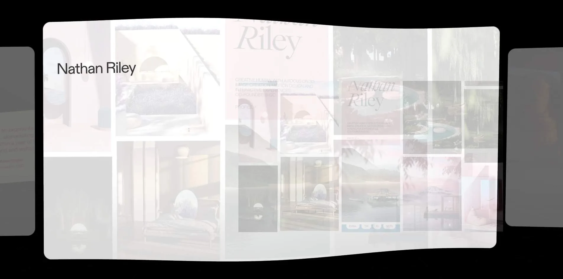
The transition from the home page to a project page takes only about half a second. About 0.12 seconds after the click, the chosen card starts to grow and flatten while the other cards fade out. By around 0.4 seconds it has become a large white card, with the project name appearing at the top left and the screenshots still showing through semi-transparently. By 0.54 seconds the screenshots and text are in their final places. Moving from one project to the next uses the neighbouring card sliding in from the edge and takes less than a second.
The round window that PROFILE and NEWSLETTER open imitates the gravitational lens of a black hole. The ring shows the picture from the centre of the page, stretched around the whole circle. That is exactly how an Einstein ring looks in astronomy photographs, where the light of something far away is bent into a full circle by a huge mass. The ring's edge is made of a few gentle swells, three and five of them overlapping at different speeds, so it seems to breathe. The picture around the ring also slowly rotates about the black hole, and the author capped that rotation at around fifteen seconds, or about ninety degrees of travel. If it kept turning, neighbouring pixels would sample points further and further apart and the ring would tear into rainbow streaks. Page changes that do not use the card transition use the same black hole. It opens from the centre of the screen with the new page inside it and keeps opening until it covers the four corners.
The hover in the FULL view borrows the lens as well. When the cursor rests on a project name, its thumbnail rises from behind the name and the names near it bend, some slanting and some stretching. All of these effects run steadily, and the page holds 60 frames per second on the home page, on a project page and with the black hole open, with no frame slower than 25 milliseconds.
04Engineering
Jesper Landberg built the site with Nuxt, a Vue framework, and keeps its content in the DatoCMS content management system. The picture is drawn by three.js on a single full-screen WebGL canvas, and animation uses GSAP. Project screenshots use KTX2, a compressed texture format the graphics card can read directly, and the project films are hosted on the video service Mux.
The home page text is not set by the browser. The site downloads a 401 KB glyph data file for each of the typeface's two weights and draws every letter on the canvas. This means the browser cannot see these words, so the site places a separate copy of the text in the page for screen readers and search engines, hidden from visitors looking at the screen.
The site also prepares a version of its content specifically for AI and other programs. At its root is llms.txt, a file written for large language models, which explains at the outset that the site is a WebGL piece and therefore serves its content as Markdown to anything that is not a browser. It then lists which projects he is right for, which he is not, and how to reach him. Every address on the site also returns a plain text page when it is asked for Markdown. A project page, for example, comes back with the project name, the description, the live address and links to the previous and next projects.
The heaviest part of this site is what it downloads, not what it computes. The server returns its first byte in 29 to 37 milliseconds, and the first contentful paint (FCP) comes after only 88 to 92 milliseconds. What is painted at that moment, though, is the hidden text, and the visitor only sees the ribbon at around 3.6 seconds. Within 10 seconds of opening, the browser has already downloaded 26.7 MB, 18.7 MB of it five project films. These films are complete MP4 files, the largest 7.8 MB, and they start downloading within a few seconds of the page opening whether or not the visitor ever looks at those cards. After 30 seconds of sitting still the total reaches 34.6 MB, and after one full turn of the ribbon, one project and the PROFILE window it comes to about 38 MB.
Each frame of the canvas costs little, and the home page needs 33 to 40 draw calls and about 90,000 to 110,000 vertices per frame. With the black hole open, that rises to 44 draw calls and 190,000 vertices. The canvas is drawn at 1x the screen's pixels, and every state holds a steady 60 frames per second.
Visitors using only the keyboard can get through the whole site, but they cannot see what they have selected. Pressing Tab moves through the eight projects, the full index, the newsletter link and the social links, Enter opens a project, and Escape closes a project page or the PROFILE window. The trouble is that what gets selected are buttons in the hidden copy of the text, placed off screen, so the canvas shows no highlight and the ribbon does not turn to the selected project. With the system's reduce motion setting on, the ribbon still twists with scroll speed, and neither the style sheets nor the scripts handle that setting.
05Scores and Team
| Award | Source | Date | Score |
|---|---|---|---|
| Site of the Day | Awwwards | 2026-09-29 | 7.73. Design 7.72 / Usability 7.52 / Creativity 8.04 / Content 7.77 |
| Developer Award | Awwwards | 2026-09-29 | 8.17. Semantics 7.60 / Animations 9.00 / Accessibility 7.00 / WPO 8.60 / Markup 8.00 |
| FWA of the Day | The FWA | 2026-08-14 | 84 POINTS, DAYS 3 |
Creativity scored highest of the four Awwwards categories at 8.04, and Usability lowest at 7.52. The high Creativity score fits the ribbon, the cursor bulge and the black hole, all of which are rarely seen on the web. The lower Usability score may have to do with the navigation, since every entry point is small text in a corner of the screen, and the invisible keyboard focus may have counted against it too. Among the five Developer Award categories, Animations is highest at 9.00 and Accessibility lowest at 7.00. FWA gave the site 84 points, with a two-sentence description introducing him as a Swedish design engineer who builds visually rich, motion-driven websites and has twice been named Awwwards Independent of the Year.
| Credit | Who | Record |
|---|---|---|
| Jesper Landberg | Swedish freelance design engineer who usually works with international studios as the lead or only developer, responsible for front-end architecture, animation, interaction and CMS | FWA 40 awards, including 38 FWA of the Day and 2 FWA of the Month. The site lists 77 awards, including 30 from Awwwards and 3 Webby Awards, and two Awwwards Independent of the Year titles (2022, 2024) |
Jesper Landberg has won 40 FWA awards, and in his newsletter blurb he says he has been freelancing for over a decade. His previous portfolio, jesperlandberg.dev, also won FWA of the Day in 2020. This version is credited to him alone on both platforms.
06Archive
- Award date
- 2026-09-29
- Awards
- Awwwards SOTD 2026-09-29, Awwwards DEV 2026-09-29, FWA FOTD 2026-08-14
- Site
- https://jesperlandberg.com/
- Credits
- Jesper Landberg
- Design
- spatial
- Build
- canvas
- Awwwards
- 7.73 / 10. Design 7.72 / Usability 7.52 / Creativity 8.04 / Content 7.77. Developer Award 8.17. https://www.awwwards.com/sites/jesper-landberg-4
- The FWA
- 84 POINTS, DAYS 3. https://thefwa.com/cases/jesper-landberg-p2
- Stack
- Nuxt, Vue, DatoCMS, three.js, GSAP, KTX2, Mux
- Total assets
- 26.7 MB within 10 seconds of opening, 18.7 MB of it project films. About 38 MB for one visit, about 30 MB of it films
- Speed
- FCP 88 to 92 ms (hidden text), visible picture after about 3.6 s, CLS 0.0006. 60 fps in every state