Maria Vasilyeva Portfolio
Maria Vasilyeva's portfolio writes the whole website as a musical score and then annotates that score by hand. When a visitor scrolls, a playhead sweeps across the seven staff lines of the home page, and whichever project it reaches has its pictures jump up off the line into a pile. In the menu, the four words NOTES, MELODY, OVERTURE and JAZZ are each crossed out with a handwritten scribble, with what they really mean written in beside them. One switch turns this handwritten layer off, and when it goes, the seven staff lines go with it.
Maria Vasilyeva, a visual and interactive designer in Barcelona, designed the site, and Surya Aditya in Bali developed it. It won FWA of the Day first, then Awwwards Site of the Day and the Developer Award.
01Concept
This is a designer's personal portfolio, and its job is to set out eleven projects and make people remember who made them. In the FWA description, Maria Vasilyeva writes that the site is inspired by music and sound, with each image a note and each project part of a melody. Nowhere does the site stop to explain the metaphor. The metaphor is the interface, and nearly every name, button and transition on the page is borrowed from a score or a music player.
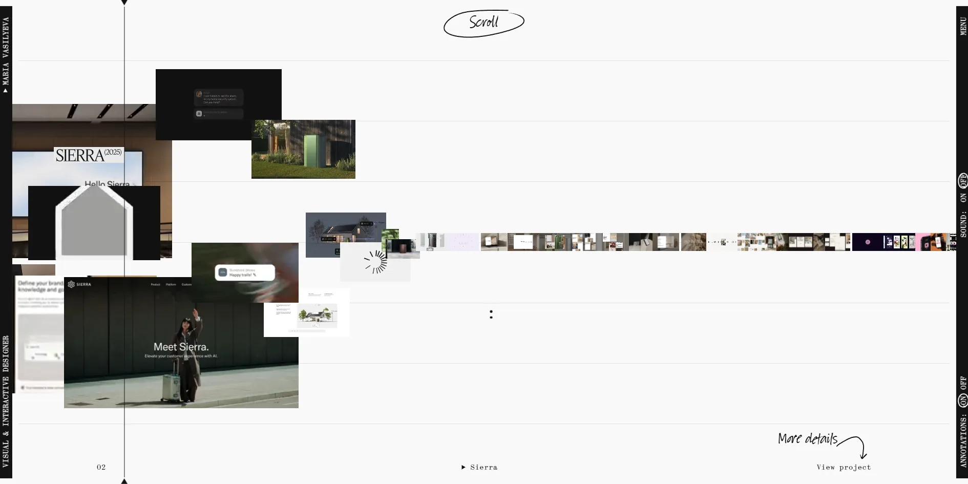
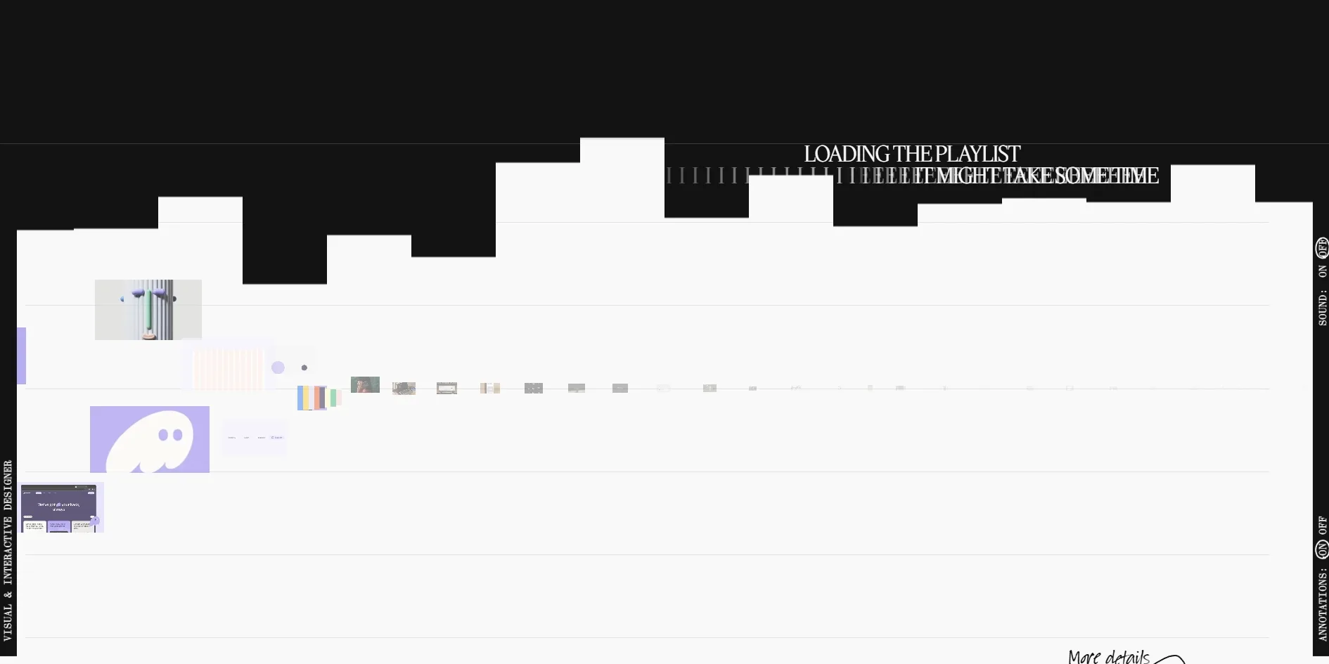
A black opening screen comes first and types out LOADING THE PLAYLIST, FINDING THE RIGHT TUNE and BE READY TO HIT PLAY letter by letter, three times over, like a playlist still loading. Once that screen moves aside, the home page is a pale score, with a long string of project thumbnails along the middle staff line. When the visitor scrolls, the playhead travels along the score, and the bottom of the screen shows the current project's number and name next to a View project link. The string holds nine projects, and after the last one it joins back onto the first and keeps looping.
Several more pages sit behind the menu, each named after a musical term. NOTES is the home page of selected work, MELODY lists all eleven projects, OVERTURE is the about page, and JAZZ links to the designer's essays on Substack. Each project has a long case page covering the designer's role, the collaborators and the client, followed by many website screenshots and photos and a closing line in large type, LET'S COMPOSE A BEAUTIFUL MELODY TOGETHER. The about page covers Maria Vasilyeva's interests and background, including work at Bakken & Bæck, Klarna, Fjord and Darwinex.
The other half of the metaphor is a layer of handwritten annotation laid over the whole site. Handwritten words and lines turn up everywhere, with a circle drawn round Scroll at the opening and More details written above View project, with an arrow pointing down to it. The vertical bar on the right holds two switches, SOUND for the sound and ANNOTATIONS for the handwritten layer. Annotations start switched on and sound starts switched off.
02Design
Only two colours appear in the interface, one close to black and one close to white, and every other colour comes from the project pictures. The pale score fills most of the page, with a narrow black bar standing at each side. The left bar carries Maria Vasilyeva's name and VISUAL & INTERACTIVE DESIGNER, the right bar carries MENU and the two switches, and the text in both is turned ninety degrees. When the visitor opens the menu, the whole page flips to white on black.
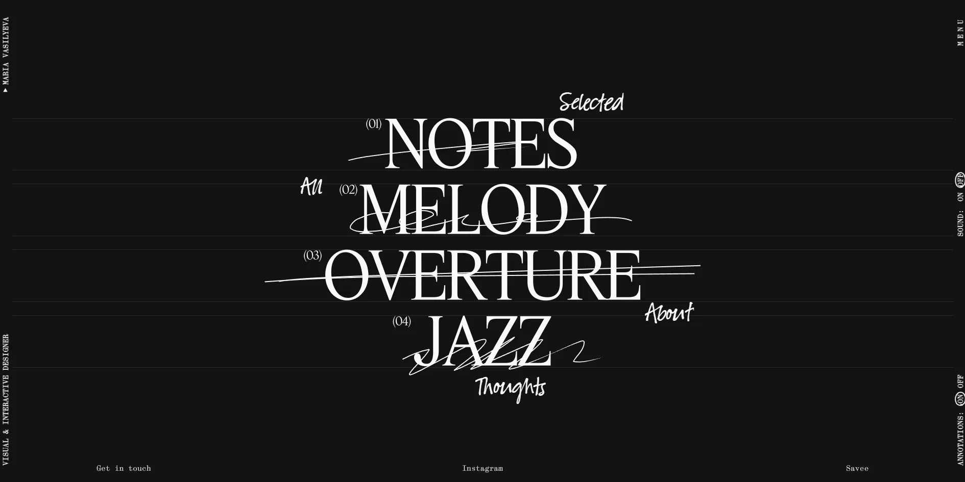
The type on this site falls into three layers, and each layer has one job. Project names, the four menu words and the large sentences on the about page are set tight in a high-contrast serif, which can grow to a third of the screen's width. Buttons, numbers, the text in the side bars and the body copy use a very small monospaced face, like the markings on a score or the readout on a player. The third layer is handwriting, which appears only in the annotations, for every crossing out, circle, added word and arrow. Side by side, the three layers read like a printed score that someone has covered in pencil notes.
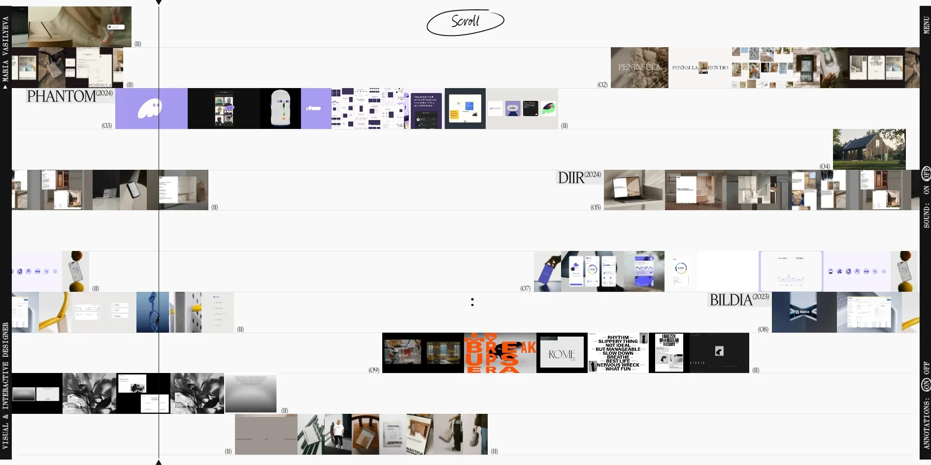
Nearly all the layout rules come from the staff lines. On the home page seven evenly spaced lines divide the screen into rows, and the string of projects sits on the middle one. The MELODY page lays the eleven projects out as eleven rows, each row a track with that project's pictures running along it and its number at the right. A playhead runs down through every track here too, so the page looks a lot like the multitrack editor in music software. These lines also belong to the annotation layer, so when the visitor turns the annotations off, the staff disappears and only the pictures and small type remain.
Most of the project pictures on the home page are short clips, mixing website screenshots, product renders and photographs of every size and shape. As the playhead passes, they jump up off the line into an unaligned pile, some covering the project name and some half hidden behind others. That disorder is the opposite of the tidy staff, so for the few seconds a project holds the home page, it looks like a chord that has just been struck.
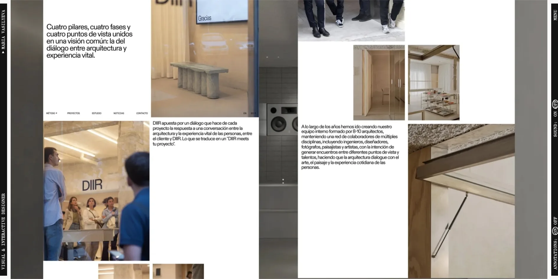
On the case pages the layout switches to a different rhythm. The page becomes a long scroll downwards, one large picture after another, with project notes set in the monospaced face in between, and the handwritten Scroll for more and Details follow along.
03Motion
The main action on the home page is the playhead sweeping across the score. Each turn of the wheel moves the whole string of projects a little to the left. The project the playhead reaches throws its pictures up off the line into a scattered pile, they settle back once the playhead has passed, and the next project jumps up in turn. This stretch of the home page holds a steady 60 frames per second while scrolling, with almost no stutter.
The other half of this motion is sound, though the visitor has to turn it on. Once SOUND is on, every thumbnail the playhead passes, or the cursor crosses, plays a short note of about a fifth of a second. When the visitor keeps scrolling, those notes run together, as if a melody were being played. Resting the cursor on one of the menu words plays a piece of music more than ten seconds long.
The opening and the page changes both borrow the look of a music player. Once the lines of the opening screen are typed out, a row of white bars of uneven height rises from the bottom of the screen like the level meter on a player, climbing until it reveals the home page. When the menu opens, the page first turns black, and only then do the four large words and their handwritten scribbles appear. None of these animations responds to the reduced motion setting in the system, so with it turned on, the typing, the level bars and the jumping and scattering pictures all play as usual.
04Engineering
No ready-made web framework sits underneath, and a single script written for the site runs the whole interface and draws it on a WebGL canvas that fills the screen, while the content comes from the content management system Sanity. The large serif lettering is drawn on the canvas as well, and for that the site turns the typeface into glyph data made for the graphics card to draw with. An invisible copy of the text stays in the page, and the project names and menu items that screen readers announce come from that copy.
About 4.9 MB comes down on a first visit to the home page, rising to about 6 MB after a full loop of the projects. The two largest files are the two sets of glyph data for drawing the lettering, about 0.76 MB together. The project pictures are dozens of very small clips, each under 100 KB on average, and each project's clips download only as the visitor reaches it. The site also fetches the content of every page when the home page opens, so moving between pages involves no further wait.
Speed is good in itself, as the server starts sending the page within 30 milliseconds and something first appears on screen after about 0.3 seconds, well ahead of the usual benchmarks of 0.8 and 1.8 seconds. What the visitor sees first, though, is the typed opening lines, and the home page is not fully revealed until about 5 seconds. The picture barely jumps while it loads, with a layout shift score of 0.03, under Google's recommended limit of 0.1.
Visitors who browse with the keyboard can hardly use the site at all. The site cancels every press of the Tab key, so the focus stays on the page itself and never lands on a link or button however many times Tab is pressed. This holds on the home page and the case pages alike, even though the stylesheet defines a focus outline. For screen readers, nine of the thumbnail links on the home page have no name, and the buttons of the SOUND and ANNOTATIONS switches are all called just ON and OFF, so a listener cannot tell which switch is which. There is no top level heading either, so screen reader users cannot jump straight to the subject of the page.
The site also has two pages that look unfinished. Get in touch in the menu leads to the contact page, but apart from the two side bars that page is empty. The contact details can only be found at the end of the about page or a case page. A test page called tile-demo is live as well. Nothing in the menu links to it, but its address opens directly, showing only the line HOVER A TILE TO EXPAND IT and a block of coloured tiles.
05Scores and Team
| Award | Source | Date | Score |
|---|---|---|---|
| Site of the Day | Awwwards | 2026-10-09 | 7.28 / 10 |
| Developer Award | Awwwards | 2026-10-09 | 7.33 / 10 |
| FWA of the Day | The FWA | 2026-08-26 | 85 POINTS |
Creativity was the site's strongest Awwwards category, at 7.56, and Usability the weakest, at 7.02. The high creativity score fits the way the site carries the score, the music player and the handwritten notes all the way through, with almost every interface name playing along with the metaphor. Usability may have come last because the site is easiest to use once the metaphor has been understood, and keyboard users cannot get in at all. The developer jury gave 7.33, and leaving out the responsive category, animation scored highest with 8.0. Accessibility came lowest, at 6.4, which matches the blocked Tab key and the unnamed links described above. FWA had already made it FWA of the Day on 26 August 2026, with 85 points.
| Credit | Who they are | Track record |
|---|---|---|
| Maria Vasilyeva | A senior visual and interactive designer in Barcelona | Awwwards works 1, SOTD 1, HM 1. FWA 1 |
| Surya Aditya | A web developer in Bali, Indonesia, named in the site's footer as responsible for development | Awwwards works 10, SOTD 8, HM 10. FWA 5 |
The records in the table count up to the time of writing. This site is Maria Vasilyeva's own portfolio, and it is the first award Maria Vasilyeva has won on either platform. Surya Aditya is a regular on both, with eight of the ten works listed on Awwwards winning Site of the Day.
06Archive
- Award date
- 2026-10-09
- Awards
- Awwwards SOTD 2026-10-09, Awwwards DEV 2026-10-09, FWA FOTD 2026-08-26
- Site
- https://www.mariavasilyeva.com/
- Credits
- Maria Vasilyeva, Surya Aditya
- Design
- interface
- Build
- canvas
- Awwwards
- 7.28 / 10. Design 7.31 / Usability 7.02 / Creativity 7.56 / Content 7.33. Developer Award 7.33. https://www.awwwards.com/sites/maria-vasilyeva-portfolio
- The FWA
- 85 POINTS, DAYS 5. https://thefwa.com/cases/maria-vasilyeva-portfolio-p2
- Stack
- Custom script, WebGL2 (glyph rendering on the canvas), Web Audio, Sanity
- Total assets
- About 4.9 MB on the first visit to the home page and about 6 MB after a full loop of the projects, the largest being two sets of glyph data for drawing the lettering, about 0.76 MB together
- Speed
- FCP 248–300 ms, home page fully revealed at about 5 s, CLS 0.03. Continuous scrolling 60 fps